• maiweb v0.1.0
  • ★
  • Feedback

#interiors

2 sources tagged with this.

  • Design Milk
  • Dezeen
  • Design Milk design-milk.com art design design-milk fashion interiors tech 2026-06-18 15:00
    ↗

    Norwegian sustainable aluminum purveyor Hydro erected a pavilion in the shape of the 90-year-old Iittala vase its commemorating

    At 3daysofdesign, The Iconic Aalto Vase Inspired a Monumental Pavilion

    Rising along Copenhagen’s ever-changing harbor waterfront at this year’s 3daysofdesign festival was a 22-foot-tall monolith undulating with variegated aluminum extrusions. Unbeknownst to those on the ground, this semi-enclosed, temporary structure replicated the exact contour of the iconic vase seminal designer Alvar Aalto developed for Finnish glassware brand Iittala 90 years ago. Conceived by local multivalent studio TABLEAU and constructed by Norwegian sustainable metal purveyor Hydro, the monumental undertaking was a clear celebration of the design principles that underlie Scandinavian design, carried across all three countries represented.

    Abstract view of a curved metallic structure with a round skylight showing blue sky and clouds.

    Two people stand inside a tall, gray, circular room with vertical walls and a round skylight overhead, allowing natural light in. Small objects are displayed on the walls.

    “To be given the opportunity to design a pavilion for Iittala to celebrate the anniversary of such an iconic design as the Aalto vase is a dream come true, and something we’re deeply grateful for,” says Julius Værnes Iversen, Founder and Creative Director of TABLEAU. “We wanted to create an impactful pavilion that gives visitors a space to experience the beauty of design.”

    A modern wall sconce with a metallic base and clear glass fixture is mounted on a vertical paneled wall; another sconce appears blurred in the background.

    The pavilion is a game of scale if there ever was one: an almost meta evocation amplifying the intrinsic links between object and architecture. Aalto trained as an architect and practiced across disciplines with little constraint, making the translation from vessel to inhabitable structure feel especially fitting.

    A modern wall-mounted light fixture with blue-tinted, curved glass panels on a metallic base against a vertically striped silver wall.

    “Bringing the Alvar Aalto vase to this measure required both the right material and engineering expertise, and the properties of aluminum extrusions made it the ideal choice for this kind of architecture,” says Asle Forsbak, Hydro Extrusions Marketing Director. “The project proved that it can be done on a large scale with a low carbon footprint.”

    Abstract reflection of light and shadow on a textured surface with vertical lines and blurred shapes in the background.

    After the short run of the display, the modular slatted components were recycled and put back into the company’s production cycle. “We brought our full capability to bear on a single, iconic shape,” he adds.

    A multicolored glass vase is placed on stacked metal beams within a gray industrial metal frame structure.

    Inside, versions of the former—the full gamut of the reissued Aalto City Vase collection—were strategically suspended on discrete, nearly invisible bases. True to the original form, this refreshed offering comes in carefully calibrated colorways reflective of waterfront capitals: Berlin, Amsterdam, Tokyo, New York, Helsinki, and, of course, Copenhagen. On offer are deep cobalts, clear whites, and bubbly golds. Much like the structure itself, an iridescent quality helps articulate the dramatic yet resolute curves.

    A modern, white, wavy-edged pavilion stands outdoors on a paved area under a partly cloudy sky, with people walking around and near its entrance.

    Curved, white, ribbed metal building exterior against a blue sky with scattered clouds, photographed from a low angle.

    To learn more about each party that contributed to the creative synergy, visit iittala.com, hydro.com, and tableau-cph.com.

    Photography by Haavard Holmaas.

  • Design Milk design-milk.com art design design-milk fashion interiors tech 2026-06-18 13:00
    ↗

    No screws, no hardware–no problem. The DADO System by AKO empowers users to create their own small structures within the home.

    The DADO System by AKO Takes Responsibility Seriously

    You’re one step away from finishing your new flat-packed furniture, only to realize that one final screw is missing. A devastating, yet very real, situation. While flat-packed furniture provides many benefits over traditional crating, there are still some pain points to resolve, and missing hardware is definitely one of them. Enter the DADO System by AKO, or Allen Kaufmann Objects. No hardware, no glue, no fastening — the system is meant to slot together with friction, precision, and finesse alone.

    Minimalist living room with black geometric furniture, a brass round side table, a light gray rug, and a black shelving unit against a white brick wall.

    Shown in its best light at Berlin Design Week 2026, AKO’s first complete collection cleverly combines the strength and lightness of solid wood with the detail-oriented construction logic designers expect. Developed within ALLEN KAUFMANN ARCHITEKTEN since 2014, AKO brings architectural thinking down to the scale of furniture and objects: things one can own, assemble by hand, take apart, repair, move, and keep.

    Minimalist living room with light wood furniture, a low bench, shelves, a small metal table, a vase with flowers, books, and a light gray textured rug on a white floor and brick wall.

    No hardware means no screw holes to cover up, no seams to conceal, no awkward underside telling a different story from the polished surface above. Everything is just where it should be—no more, no less. The pieces can technically be used in any direction: nothing to hide.

    A modern black modular shelving unit with intersecting horizontal and vertical panels is displayed against a white brick wall and plain backdrop.

    Close-up of a modern, minimalist black wooden shelf unit with clean lines and sharp angles against a white background.

    As simple as it is elegant, strong shapes emerge — a graphic grid, the architect’s plane. Thinner boards intersect with the larger frame to strengthen the structure, running diagonally along the shelves and propping up the horizontal planes as they bisect the legs. A load-bearing element that also serves as subtle decoration, this structural rhythm creates visual interest along the underside of the shelves while keeping the tops perfectly unencumbered, ready to store, display, and serve.

    Minimalist modern room with geometric furniture, black steps leading to a study area, monochrome artwork on white walls, and shelves with books and decor.

    A minimalist room features geometric black wooden furniture, a grid-patterned artwork on a white wall, and a window with a translucent curtain on the left.

    The DADO series is joined by AKO’s Dovetail pieces, which use interlocking dovetail geometry to transform a traditional joint into a structural, spatial, and visual principle. A stool joins the collection as well, with five expertly crafted pieces coming together to form a compact geometric seat. The assembly feels intuitive, with each cut quietly delineating where the next piece might go. As designers, it is our duty and privilege to make the things we create as comprehensible as possible.

    Wooden planks and slats of various lengths and shapes arranged vertically and horizontally on a white background.

    A collapsible wooden table shown in three stages: fully collapsed, disassembled into flat parts, and fully assembled with crossed legs.

    Entering the sunny space, one is immediately met with a row of chairs, adorned with pastel cushions in varying colors. The body of each chair creates a square, its sides extending to form the back, the seat, and the points of contact with the floor. Balanced, unobtrusive, yet elevated, the philosophy of AKO is just as much about what is not there as what is. No brackets. No clips. No one-off tool you will keep for six years and never find when you need it. No small landfill of unnecessary parts arriving inside the box.

    A minimalist wooden shelving unit with three levels and an additional wooden tray or rack placed on the top shelf, set against a plain white background.

    Demonstrating a commitment to the honest use of material, AKO takes this beyond product design and into a more philosophical approach. The work asks whether furniture can be materially clearer, structurally more honest, easier to understand, and more worthy of keeping. Wood, after all, is renewable and low-toxicity, but it is also difficult. It moves. It has grain, tension, and quirks — almost like a fingerprint. Rather than flattening out those qualities, AKO works with them through precision joinery, repeatable geometry, and construction that remains visible.

    Modern, minimalist waiting room with light wood furniture, large windows, and a cat sitting on a bench, while a person walks outside on the sidewalk.

    Justin Allen, co-founder of ALLEN KAUFMANN OBJECTS, shares the “why” behind DADO: “One material. Traditional joinery with invention. Flat packed. Made to last, and made to move with you. Flexible, like our lives. Flexible like wood.”

    A white building entrance labeled "AKA" with graffiti on the walls, a cobblestone walkway, and a glimpse of minimalist interior furniture.

    To learn more about the DADO system by Allen Kaufmann Objects, visit allenkaufmann.de or akobjects.com.

    Photography courtesy of Allen Kaufmann Objects.

  • Design Milk design-milk.com art design design-milk fashion interiors tech 2026-06-17 16:00
    ↗

    Archiwave Architects center their transformation of an office space into a home around a sculptural, space-delineating bookcase.

    The Titular Green Box at the Heart of This Greek Home

    Bookshelves became hallmark backdrops during the pandemic when students and academics were cast off into the virtual realm for lectures. Receding into the flat space of digital grids, these libraries often served more as wallpaper for the person gesticulating in front. But what if a bookcase was the essential parti of a home, rather than a surface or addition? This is the idea that Archiwave Architects—led by Dimitris Ntoupas and Anna Konstantopoulou—embodied in The Green Box, a 115-square-meter renovation project in Chalandri, Greece, that transforms a former office into a modern home for a young couple.

    Modern living room with wood flooring, built-in wooden and green shelving, a seating area with chairs and a sofa, and large windows with sheer curtains letting in natural light.

    Modern living room with large windows, sheer white curtains, a gray sectional sofa, a black chair, a coffee table, and a green built-in shelving unit on the right wall.

    A modern living room with green built-in shelving, a TV, fireplace, minimalist decor, and a blurred person walking past a black chair on wood flooring.

    Inspired by the client’s profession as an educator, the residence’s design centers on a custom-designed bookcase—the titular “Green Box”—which becomes the spatial and conceptual core of the home. Beyond acting as a library, the volume incorporates storage closets while subtly defining the boundary between private and shared zones. The shelves are the focal point of the bright, open-concept living area, while the zone behind includes the three bedrooms. Inside the primary bedroom, natural light streams in from the living area through a strategic opening above the bookcase.

    Modern kitchen with a marble island, built-in stovetop, stainless steel refrigerator, wooden cabinets, and open shelving with books and decor in the background.

    Modern kitchen with wood cabinetry, gray marble countertops, stainless steel range hood, built-in appliances, and large sheer white curtains covering windows.

    Modern kitchen with wood paneling, gray marble countertops, a black refrigerator, and a pegboard holding scissors, a postcard, and a lemon juicer.Complementing the rigid, rhythmic lines of the bookcase is a curved white wall at the entrance. Lit subtly from a recessed opening along the ceiling, this key design element welcomes visitors and guides them to the private zone, softening the transition from the open living space. The kitchen adjacent to the living area is built from oak to balance the earthy greens of the library. A perforated screen housing kitchen tools, set into the millwork, nods to the bookcase’s orderly grid, while a marble island provides the necessary contrast to separate domestic activities without sacrificing the home’s airy feel.

    A partially open white door with a silver handle revealing a room with green walls and wooden floor; a wardrobe with vertical handles is on the left.

    Minimalist hallway with white floor-to-ceiling cabinets, long metal handles, a large wall mirror, wooden floor, and natural light from a window with sheer curtains.

    A modern bedroom with a wooden headboard, two white pillows, minimalistic artwork, books, and spherical lamps on bedside tables.

    A young child in a red and white striped swimsuit stands in a modern shower with arms raised as water falls from an overhead showerhead.

    The bookcase itself reads as sculptural line work that wraps the entire wall and corner, with openings that expand and contract between horizontals and verticals to accommodate an ever-evolving collection of objects and homewares. Playful pops of color—the same cool green as the bookcase—bring personality to door trims and furniture, tying it all back to The Green Box. Archiwave Architects have reframed the library not just as an object or backdrop, but as a vessel for everyday living.

    To see this and other works by the firm, visit archiwavearchitects.com.

    Photography by Piyi Wong.

  • Design Milk design-milk.com art design design-milk fashion interiors tech 2026-06-17 14:00
    ↗

    Elmo Leather, in collaboration with TetuánCrea and Soulem, present Beyond Leather – a lighting collection born of material usually discarded.

    Beyond Leather Transforms Scrap Material Into Lighting

    Our modern world holds many contradictions at once. Many facets of our day-to-day lives would have been almost unimaginable even fifty years ago, shaped as they are by technological development, societal shifts, and a growing awareness of climate consequence. And yet, as much as we continue to innovate within a field, there are still techniques that remain tried and true, century after century.

    Assorted geometric shapes in yellow, gray, pink, and tan materials are arranged against a light blue background.

    Following the great humanist tradition of using the whole animal, Beyond Leather was born from an exploration between premium leather company Elmo Leather and Madrid-based creative studio TetuánCrea. Crafted in partnership with Soulem, an organization dedicated to supporting women in vulnerable situations through skill-building, craftsmanship, and community, the collaboration was presented as part of the Viveros project during Madrid Design Festival 2026.

    A person shapes leather around a rounded object, holding an orange geometric piece, with colorful materials visible in the background.

    A person uses scissors to cut orange fabric next to geometric objects covered in fabric on a wooden table.

    Leather is a controversial yet incredibly hardy material. Some of the oldest surviving leather objects reveal just how long humans have understood its resilience, using tanning and preservation techniques that predate much of what we now consider modern making. In a world of bonded leather, synthetic substitutes, and products—even within the luxury sphere—that can begin to fall apart after only a few years, the enduring quality of the real deal remains difficult to match. Color, texture, grain, and irregularities within the hide become collaborators in the process, forging a deeper relationship between creator, material, and creation.

    A person in a white lab coat cuts pink fabric with scissors; yellow and red cylindrical objects are on the table.

    A modern table lamp with a cylindrical shade and metal legs sits on a wooden surface against a concrete wall.

    Usually associated with upholstery, luxury bags, and car interiors, leather is used here as lighting. Glowing from within, the specific intricacies of each offcut create a unique look, each lamp slightly different from the next. Through composition studies, mock-ups, and prototypes, TetuánCrea designers Estrella Poza Ruiz and Ilaria Franceschini explored how cuts, tensions, overlays, and color combinations could transform remnants into objects with sculptural presence and functional purpose. Taking what could have been discarded and transforming it into a useful and beautiful object is a testament to materiality and process. Respect for the living and the dead is infused within the luminaire, a warmth that lends the simple geometries special significance.

    Stack of leather sheets in various colors, including white, teal, yellow, orange, and red, arranged in overlapping layers.

    Elmo Leather has long been committed to sustainable business practices, with documentation to back it up. Measurable and scalable goals are our truest path to sustainable design, and Beyond Leather points toward this kind of systemic change. Rather than treating waste as an aesthetic shortcut, the project elevates an existing resource, asking how design can create new narratives around materials that already carry value. “The true value lies in the process rather than the final objects. It is a shared effort in which every participant contributes to something greater,” shares Marta Pascual, Project Lead through U-Ak Social Design Project.

    Two women sit on chairs in a minimalist, light-filled room, each holding colorful geometric objects. Additional similar objects are placed on the floor in front of them.

    Aptly named, Beyond Leather investigates not only the systems that produce leather, but also the people who produce leather products. Each lamp reflects a network of collaboration built on craft, learning, and the creation of new opportunities. In this way, the cycle of design changes: from linear consumption to reuse, from isolated authorship to shared making, from material excess to material respect. An exciting opportunity to reclaim material while creating employment opportunities, this collaboration is yet another example of how true circular design can benefit everyone involved.

    Five women stand indoors in front of a sign reading "solle"; three hold colorful geometric objects, and all are facing the camera and smiling.

    To learn more about Beyond Leather, visit elmoleather.com. To learn more about Soulem, visit soulem.org.

    Photography courtesy of Elmo Leather.

  • Design Milk design-milk.com art design design-milk fashion interiors tech 2026-06-17 13:00
    ↗

    The tenth edition of IKEA’s most experimental design platform pairs rational usefulness with emotional delight, proving that democratic design can still surprise.

    IKEA PS 2026 Is a Love Letter to Playful Functionality

    In a world demanding design be more streamlined, relentlessly optimized, and endlessly useful, IKEA PS 2026 meets the moment with an alluring proposal to consumers: What if functional objects could also flirt? What if home furnishings could do their jobs beautifully while nudging us towards delight? And what if the things with which we live every day could remind us to sit, store, fold, light, or gather with joy?

    Modern green upholstered chair with chrome frame next to a small red side table holding an open book, set in a colorful, contemporary room.

    Those musings are the crux of IKEA’s latest PS collection, the tenth edition of the brand’s most experimental design platform. First launched in 1995 at the Milan Furniture Fair alongside the formalization of Democratic Design, IKEA PS has long served as a kind of creative postscript to the main range. It is the place where IKEA designers are invited to push further, test ideas more freely, and explore what Scandinavian design might become when simplicity is treated a provocation—where the minutia of daily living is more magical.

    A small red folding table holds an open notebook, a closed notebook, and a fanned-out deck of playing cards, next to a green chair on a green rug.

    For 2026, that provocation takes the form of “playful functionality,” a phrase that sounds almost paradoxical until you experience the collection’s emotional logic. Functionality, as Anna Granath, Range Identity Manager at IKEA of Sweden, explains, is essential to IKEA’s way of working. It is rational, useful, and one of the reasons people keep products in their homes over time. Playfulness, by contrast, is emotional. Some might see it as frivolous, even unnecessary. But for IKEA PS 2026, the two are inseparable.

    A pink metal grid cabinet with glass shelves stands against a pink wall, with books and decorative items on top and a green chair in the foreground.

    Through the lens of twelve designers, the collection explores what happens when those two forces meet—when an object earns its keep through utility but earns affection through surprise and delight. It is also, quietly, a love letter to designers. The contributors—Mikael Axelsson, Henrik Preutz, Lukas Bazle, Ellen Hallström, Ola Wihlborg, Matilda Lindstam Nilsson, Michelle Armas, Lex Pott, Friso Wiersma, Marta Krupińska, David Wahl, and Maria Vinka, led creatively by Maria O’Brian—were given an open brief to interpret Scandinavian design in their own way and make it anything but boring.

    Three colorful, abstract animal face wall decorations are mounted above a cabinet with books, a clock, headphones, and a green glass vase in a brightly painted room.

    The result is a 44-piece collection spanning furniture, lighting, textiles, storage, and decorative objects. Chairs, benches, dining and storage pieces, hand-blown glass vases, and graphic textiles are all rooted in Scandinavian simplicity but energized by small acts of mischief. Some pieces invite immediate interaction, like a rocking bench that sets the body in motion the moment someone sits down, or a height-adjustable stool that wears its lever mechanism openly rather than hiding its cleverness away. Others reveal their function more slowly: a solid wood dining table that folds completely flat, a lounge chair that transforms into a guest bed, a sofa built on pocket springs that doubles as a proper bed, or a chair that can hang on the wall like a cubistic artwork when not in use.

    A modern living room with a bright orange armchair, a colorful pillow, a blue floor lamp, a side table with books, and shelves filled with books and decor in the background.

    These are not gimmicks nor graphic elements dressed up as design. They are functional objects with a wink coyly built in. IKEA PS 2026 seems to understand that good design goes beyond solving problems, giving users permission to live with a greater sense of whimsy and ease.

    “I think we, maybe more than ever, need more fun and joy in our lives,” says Granath. “As we are in a time of quite a lot of uncertainty and stress, I think the relief of joy is something that resonates with people.” In that context, play is not an escape from seriousness, but a counterweight to it. It becomes a way to soften the home, to make everyday life feel less automatic, and to reconnect with the tactile world at a time when so much of our attention has been absorbed by screens.

    A room with modern furniture, including a blue tiered cart, a green armchair, a red desk lamp, a wooden stool, and a wooden screen, all on a light wood floor.

    Consumers will find grounding in the materiality, too. IKEA PS 2026 works with hand-blown glass, steel, cotton, rice paper, solid birch, solid pine, plywood, birch veneer, fiberboard, aluminum, and molded paper pulp. Longevity matters here, not only as a sustainability principle, but as an emotional one.

    IKEA PS has always had an unusually close relationship with its customers. Over the past three decades, pieces from earlier PS editions have become sought-after icons, appearing at auction houses and secondhand markets long after their original release. That afterlife says something important about the collection’s place in design culture. IKEA PS may be accessible, but it has never been disposable.

    A small wooden table with two blue cushioned chairs and a blue rolling cart holding glassware, utensils, and decorative items in a bright, modern room.

    Ultimately, IKEA PS 2026 feels like a love letter for several audiences. To customers, it offers objects that are useful enough to stay and joyful enough to be loved. To designers, it celebrates the value of experimentation at scale. And to the self, it extends a rare invitation: touch the lever, open the drawer, rock back and forth, sit the “wrong” way, and let the ordinary become strange again.

    To shop the IKEA PS 2026, visit IKEA.com.

    Photography provided by IKEA.

  • Design Milk design-milk.com art design design-milk fashion interiors tech 2026-06-16 18:00
    ↗

    The UpSpring podcast features the architecture and design industry's biggest names — including Amie Shao of MASS — in conversations that delve deep into its the profession's biggest ambitions.

    Play With Matches: 5 Design Lessons from the Podcast

    In each episode, Play With Matches, the podcast hosted by UpSpring CEO Tiffany Rafii, delivers major takeaways from designers and industry experts — on everything from how to center craftsmanship to how good design can positively impact health. It redefines what’s possible at the intersection of creativity and business. Here are a few lessons we’ve taken away from the first season:

    A man in a suit smiles. Text reads: “Attention is Earned, Not Pitched with Avi Rajagopal, Editor-in-Chief, Metropolis. Do Not Play With Matches.” Geometric logo at bottom right.

    Sustainability Isn’t Clear Cut

    Avi Rojagopal, editor of Metropolis, describes how he and his team navigate, report on and assess the ever-changing world of sustainable design. With new products and materials introduced regularly that make compelling claims for being the greenest solution yet, it’s often difficult to ascertain what’s scientifically sound versus what’s green washing. And as a magazine focused on providing perspective and a critical eye on green architecture, the stakes are high.

    One major conundrum: What to do about vinyl? “Over the last two or three years, we’ve had lots of different solutions come to the market around vinyl or PVC,” Rojapopal explains. “We have on the one hand a very vocal sustainability leadership that says we should completely do away with PVC in the built environment. On the other hand, we have manufacturers who are trying to develop what they think of as more responsible versions of PVC. And often when we promote one of those more responsible versions, even Metropolis sometimes is accused of clean washing. While I can hold true that we should extricate ourselves from harmful plastic in the built environment, the truth of the matter is millions of square feet of that material are continuing to be specified and specified by designers who are on the teams of the people who tell us we shouldn’t be specifying it. For those who are able to build a project that’s completely PVC free, you should do it. Get us more examples of that. Show us that it’s possible.”

    Two women stand side by side against a dark background, with a pink and red gradient overlay partially covering the image.

    Investing in Craft Is Worth It

    Cuff Studio, the Los Angeles outfit founded by Kristi Bender and Wendy Schwartz, started out in interior design, but has been creating bespoke furniture and lighting for fellow interiors professionals since 2018. “We said, let’s create a collection, put it out into the world and see what happens,” explains the duo. And it began with the right instinct: To connect with local artisans, from ceramics craftspeople to glass artists who can elegant their products. “All of the manufacturing, our first gallery and showroom on our home turf and to be very high touch, like with the clientele, with the artisans, learning, listening, asking questions. It was hugely important in being successful.”

    They aim for everything they do to be personal, available and authentic, constantly querying what’s missing in the industry to provide real solutions. “So when we’re talking to now our client, who’s an interior designer, we understand where they’re coming from. We understand the pressures and the stress that they can sometimes be under. I think that has really informed how we do business, how we communicate, how we take care of each of our clients.” At the end, clients have pieces that look very different and feel special compared to mass-produced retail pieces. They endure because they are made with care — and because they have embedded meaning. “You can see the hand, the love, the thoughtfulness.”

    A woman with long dark hair smiles at the camera, seated in front of leafy plants. The image features a pink and red gradient overlay on one side.

    Design Impacts Health — And Can Be Life-Saving

    Architecture isn’t neutral — it effects real outcomes, especially when it comes to health. Amie Shao, Principal and Senior Director at Model of Architecture Serving Society (MASS), leads listeners on her journey through maternal health, through her personal and professional experiences both. When she was pregnant with twins, Shao had complications that led to hospitalization and premature birth. She spent the first weeks of her babies lives reaching out to them through the holes in the plastic incubator that held them. “Then years later in Malawi, I was assessing a health facility when I heard this sobbing and I watched a mother collapse to the floor,” she recounts. “Her baby had just died from the same condition that mine had survived, and the hospital didn’t have the equipment to treat this really preventable death. The reason they didn’t have that equipment was because they didn’t have a designated space or the right space for newborn care.”

    Shao’s work in maternal newborn health is driven by her need to do something about the hospital spaces — often cold and unwelcoming — that many expectant mothers try to avoid altogether in Malawi. MASS’s Maternity Waiting Village is the response: It gets them to the hospital in the lead up to childbirth, and provides them and their companions with a dignified space to await labour. In a country with one of the highest maternal mortality rates, being at the hospital when the time comes is one of the most important factors in surviving and thriving. The MWV features small residential groupings clustered around courtyards, and filled with education, gathering and cooking spaces. After it opened, MASS conducted a survey with 600 women on their experiences there, in terms of privacy, sanitation, safety and comfort, and found that the new improved design scored much higher across every area than its predecessor.

    A woman with long hair smiles at the camera. The image is mostly black and white with pink and red gradients along the edges.

    Inclusion Needs to Be Intentional, From the Start

    “It’s always been fascinating to know that you could create something that people have these unique experiences in, and how you do that could influence if it’s a good experience or a bad experience,” explains Adaeze Cadet, design principal at HOK. “It really starts from a good beginning to the project, and understanding that every building we build, no matter what type, it is affecting the community around it, and it’s affecting the ecosystem that we’re building for as well.”

    Cadet emphasizes an engagement-led process that brings the focus on the plurality of perspectives at play. Who are we designing for — and what are their aspirations? “Some architects get very excited to just go and start proposing these ideas, but you really have to slow down and understand the problem and the challenges, and who’s it’s affecting. And from there build some creative solutions that really start to celebrate that community that we’re building for and in. It’s a lot of research at the beginning, a lot of just asking questions of the ownership, who are we designing for, who are those stakeholders, how are they going to be working. And then understanding the design challenges that they’re trying to solve for, and being open to proposing ones that maybe our clients haven’t even thought of.”

    Black and white portrait of a person with short hair, wearing a checkered shirt, with pink and red gradient borders.

    Be Yourself: The Personal Is Professional

    If you have a truly unique style, especially one that favours eclecticism and vibrancy over the safe, neutral tones and shapes that seem ubiquitous in interior design, how do you get clients on board? This episode featuring Pallavi Dean of Dubai studio Roar has loads of inspiration. If you’ve encountered Roar’s colourful, layered spaces in person or on Instagram, you can see the personality shine through. The studio’s DNA, according to Dean, weaves together three strands: an unapologetic point of view, a research-driven process and a clear sense of entrepreneurship. “It’s three-legged stool: If one leg is missing you fall over,” says Dean. “We’re not run of the mill. Sometimes that point of view contradicts the trends at the time. But it keeps away the people don’t want to work with, and creates synergy with people I do want to work with.” And it’s not just cheeky, un-boring design: It’s rooted in Dean’s research-driven approach.

    “I have a research driven approach, but how do I ensure every single project or every single client gets that when they sign up with us? We’ve developed something called UXD, User Experience Design. It’s a 25 step process that every single designer at Roar has to go through before they submit a project. Simple things like, is the space going to have a great story? Is the space going to make people smile? There are some more qualitative, experiential questions like that, but then they’ll be, has it hit the function?”

  • Design Milk design-milk.com art design design-milk fashion interiors tech 2026-06-16 15:00
    ↗

    Designed by Raw07, Solmé boutique serves as an understated backdrop for clothing brands, with an interplay of materials from stainless steel to plasterboard.

    This Clothing Boutique in Poland Embraces Understated Elegance

    Clothing retailers feature decor that appeals to the senses, but this can often be excessive and ultimately detract from the apparel on offer. So when the Raw07 team was tapped to design Solmé, a new boutique, the clothes were the key inspiration and not simply an afterthought. “Rather than relying on overt luxury or strong visual statements, the collections are defined by subtle details and a sense of effortless sophistication,” says Dominik Pierzchlewicz, founder and architect at Raw07. “We wanted the interior to reflect these qualities.”

    A modern, minimalist interior features a central table with a vase of flowers, stainless steel cabinets, and soft lighting, with sheer white fabric draped around the table’s base.

    Located in Poznań, Poland, the compact 861-square-foot store is a flexible and minimalist framework, with a layout that encourages customers to stay and discover a must-have outfit. The main entrance doubles as a backdrop for the fashion coordinates. A second gateway defines the fitting room zone, and also conceals essential equipment and accessories.

    A minimalist clothing store features garments on metal racks, a table with a glass top, frosted glass partition, and a wall mirror with an irregular edge.

    A pair of brown shoes displayed on top of a tall, vertical metal pedestal in a modern, minimalistic interior space.

    Display structures are constructed from aluminum, which have an industrial look and can be easily reconfigured by staff when new merchandise arrives. Custom stainless steel furniture left untreated retains its true character, plus it is recyclable. Individual pieces are combined and arranged in a variety of ways to meet changing space requirements.

    A minimal room with unfinished pink and white walls, a metal-framed chair with cushions, a clear side table, and a hanging pendant light.

    A modern room with unfinished pink drywall, a brown velvet armchair, a translucent side table, carpeted floor, mirrors, pendant lights, and a metal grid ceiling.

    There is an interplay of hard and soft materials throughout the shop. Polished metal contrasts with unfinished plasterboard, while softness is introduced via ribbons, curtains, and fabric-wrapped rails. The simplification of finishes not only has a contemporary feel, it also ensures that waste will be reduced during any future renovations.

    Modern fitting room with a full-length mirror, metal stool, and glass walls; a white t-shirt hangs on a rack inside the adjacent area.

    Several stacks of shiny metal pipes arranged parallel to each other on a speckled floor against a beige wall.

    The color palette is understated, and is largely derived from the materials utilized in the boutique. Gypsum boards with a pink hue bring in a warm glow. Translucent acrylic panels in a green-blue tone reflect light and add an ethereal touch. A range of textural elements are paired with etched mirrors on the walls to create the dream-like atmosphere, a perfect balance of raw and refined that beckons touch.

    A fitting room with muted pink walls, a tan carpeted floor, and a black textured skirt hanging on a rail inside.

    A modern interior features a metallic doorway with an irregular, jagged-edged mirror beside a muted pink door and walls, and soft beige carpet flooring.

    With an emphasis on modularity and reusable components, this project challenges the traditional model that prioritizes trendy over timeless. “Solmé offers an alternative vision of retail design,” Pierzchlewicz notes. “It is an environment that remains open to change and reinterpretation, evolving alongside the lines it presents.”

    A fitting room with mirrored walls displays a hanger with a black woven bag, a black long-sleeve top, and a pair of black shoes on the floor.

    A modern, minimalist room with a rectangular table with glass top, pendant light above, and frosted glass-paneled walls; a clothing rack with dark garments is partially visible.

    Clothing store interior with several black garments hanging on wooden hangers in front of floor-to-ceiling mirrors and frosted glass partitions.

    Minimalist clothing store interior with metal racks displaying black and neutral garments on hangers, a decorative mirror, and pastel-colored counters.

    Clothing store interior with black garments hanging on racks, a uniquely shaped mirror, and part of a display case in the foreground.

    Minimalist clothing store interior featuring a metal clothing rack with neutral-toned garments, a striped platform, and frosted glass partitions against beige walls.

    A clothing rack with wooden hangers holding black and white garments, including shirts and jackets, against a neutral background.

    Minimalist clothing store interior with neatly arranged racks of black and dark clothing, metal shelving units, and soft ambient lighting.

    Clothing items in neutral and black tones hang on racks, reflected in a wall mirror with an irregular edge in a modern retail store.

    Clothing racks with black and gray garments are reflected in a mirror next to a modern counter in a minimalist retail store.

    A clothing rack displays neatly hung shirts, jackets, and pants in neutral tones on wooden hangers in a modern, minimalistic store setting.

    A dark brown macrame bag hangs on a wooden hanger against a frosted glass background.

    Minimalist clothing store interior featuring a rack of neutral-toned garments on hangers and a modern display counter under a linear light fixture.

    A modern boutique interior with soft lighting, pastel green accents, a central display table with a flower arrangement, and clothing racks along the walls.

    A modern clothing store with a glass storefront labeled "solmé," displaying striped shirts and denim garments on racks inside.

    To see this and other works by the studio, visit raw07.com.

    Photography by Zasoby Studio.

  • Design Milk design-milk.com art design design-milk fashion interiors tech 2026-06-16 13:00
    ↗

    Messe Frankfurt’s Techtextil, Texprocess, and Heimtextil connect textile innovation, manufacturing technology, material application, and global distribution into one powerful industry ecosystem.

    Messe Frankfurt’s Textile Platforms Make Material Progress Tangible

    Textiles are no longer a quiet substrate. They are infrastructure, technology, protection, climate strategy, logistics challenge, and cultural signal all at once. A fabric might need to breathe, stretch, resist flame, withstand abrasion, reduce dependence on fossil resources, comply with safety standards, move through a digital supply chain, and still arrive as something desirable enough to be specified, purchased, worn, installed, or lived with. Simply put, textiles now sit at the center of some of the most urgent questions facing design and industry: What can materials do? How can they be made more intelligently? How quickly can innovation move from concept to application?

    Spools of colorful thread are displayed on a rack in the foreground, with two people examining an item in a blurred background at an indoor event or shop.

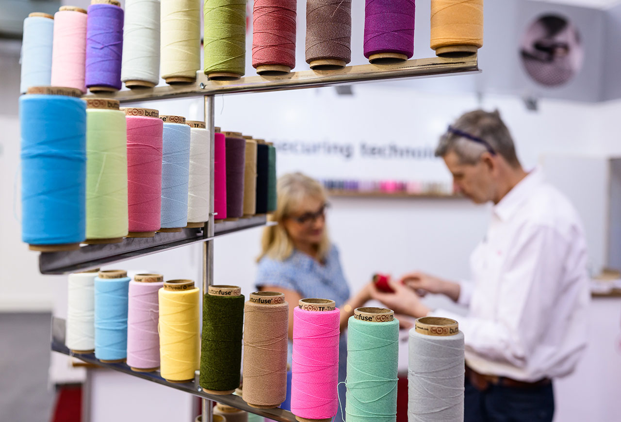
    Sewing Technology and Materials MMS UK /// Photo: Jean-Luc Valentin, courtesy of Messe Frankfurt

    For Messe Frankfurt, the answer is in an ecosystem. Through Techtextil, Texprocess, and Heimtextil, the organization has built a connected series of platforms that map the textile industry from fiber to finished application, from advanced material research to manufacturing technologies, and from technical performance to market-facing distribution.

    At Techtextil and Texprocess 2026, more than 36,000 visitors and 1,700 exhibitors from 112 countries gathered in Frankfurt. At a moment defined by geopolitical uncertainty, cost pressure, sustainability demands, and supply-chain disruption, the fairs functioned less like static exhibitions and more like working systems. Research institutions, technology providers, manufacturers, processors, brands, and application partners were placed in proximity, creating the conditions for ideas to move faster from possibility to practice.

    Three men sit at a table discussing products in a trade show booth displaying colorful spools of yarn and a diagram about coated yarns on a glass panel.

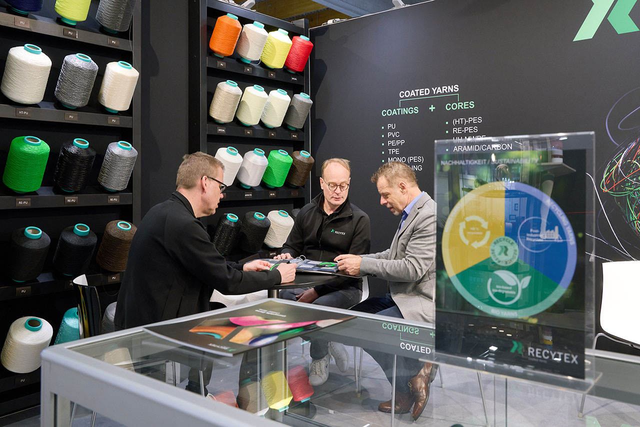
    Recytex GmbH & Co. KG /// Photo: Jean-Luc Valentin, courtesy of Messe Frankfurt

    Olaf Schmidt, Vice President Textiles & Textile Technologies at Messe Frankfurt, notes that the role of trade fairs is evolving because companies need new expertise, new partners, and access to new ideas. Techtextil and Texprocess act as strategic partners for the industry by bringing together players who might not otherwise meet. That connective tissue is crucial. Innovation rarely happens in isolation. It emerges where disciplines collide: material science with apparel, AI with cutting systems, bio-based chemistry with agriculture, industrial safety with fashion, or recycling technology with consumer brands.

    A person examines fabric samples in a showroom with colorful swatches displayed on racks and walls; other people are seated and talking in the background.

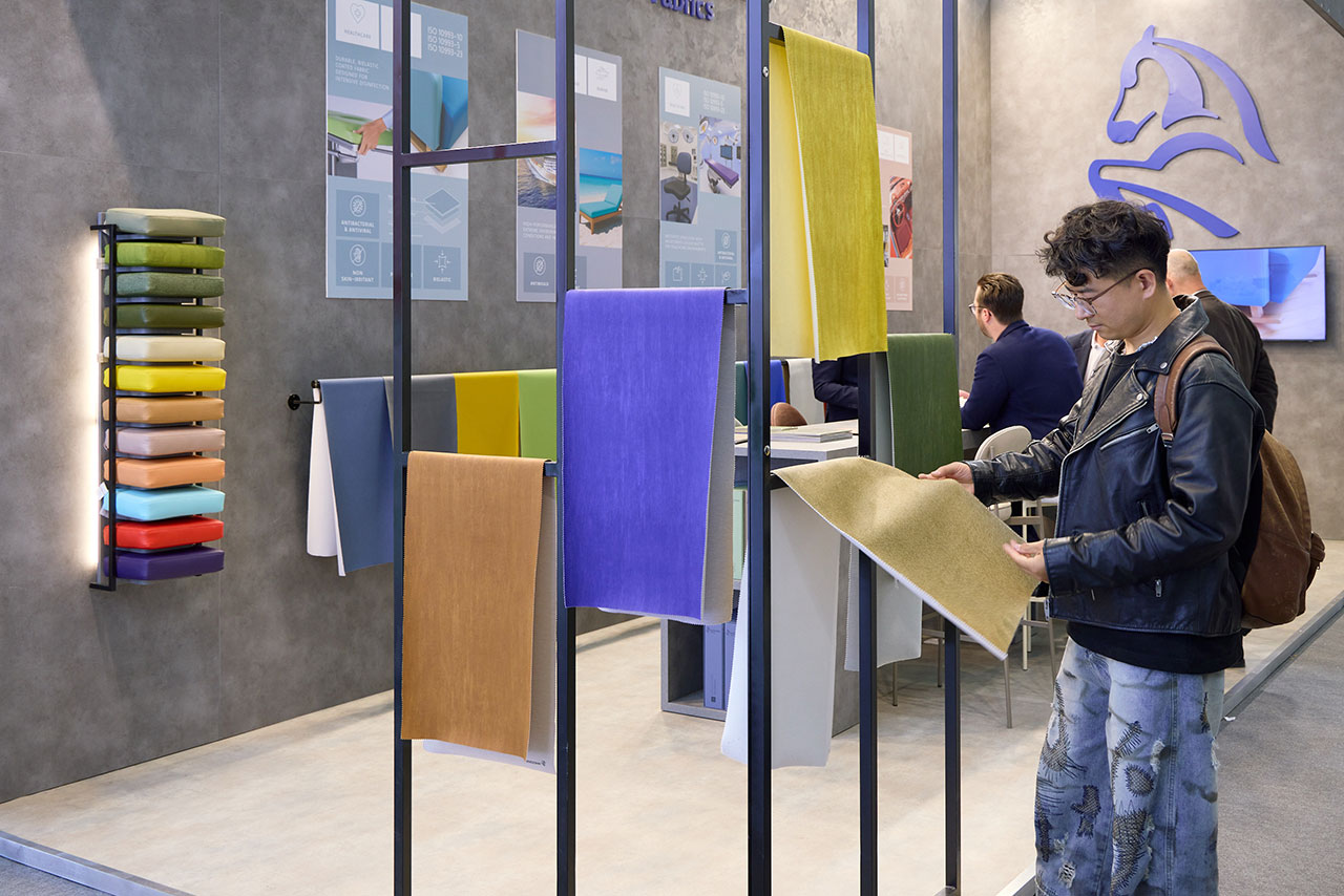
    Coated Textiles Monteiro Ribas Revestimentos /// Photo: Jean-Luc Valentin, courtesy of Messe Frankfurt

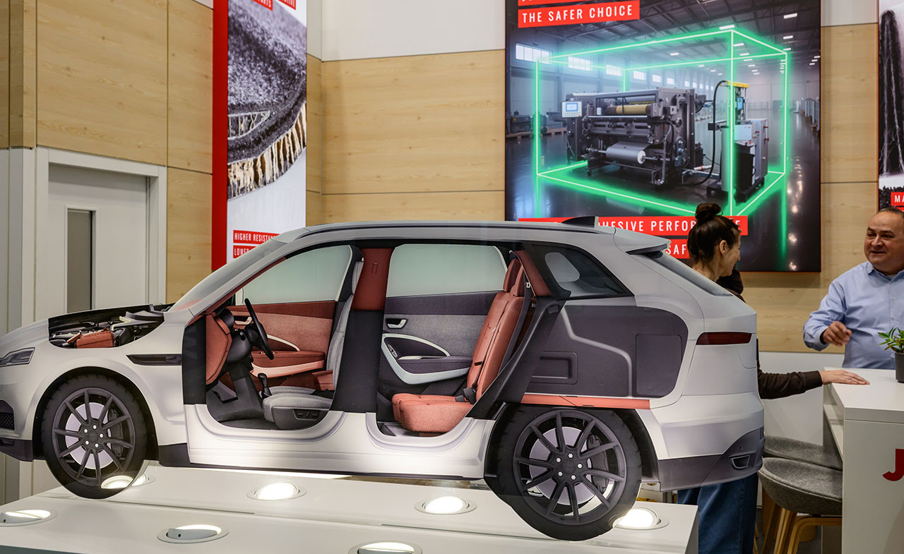
    At Techtextil, that convergence was visible through material innovation. The Nature Performance segment brought more than 110 exhibitors focused on natural and bio-based alternatives to synthetic fibers, underscoring a shift in how performance is now defined. Durability, breathability, heat resistance, and tear strength remain essential, but they are no longer enough. Increasingly, a high-performing textile must also answer questions of recyclability, biodegradability, CO₂ savings, and reduced fossil dependence. Compostable technical viscose fibers for agriculture and scalable bio-based polymers were presented as industrially relevant solutions.

    Two men stand in front of a display showcasing different wall covering materials, with one man pointing at the samples.

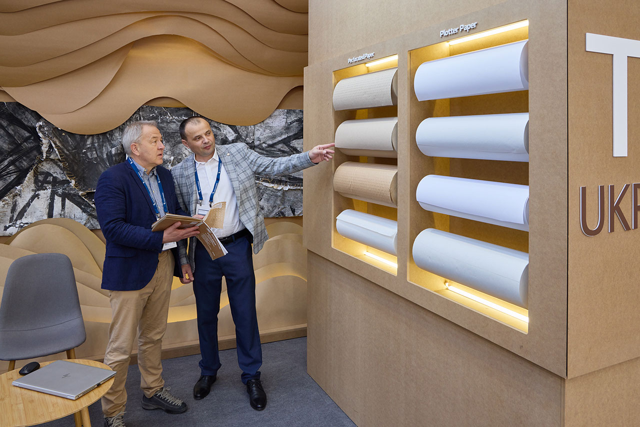
    Private Enterprise ‘Technical and Industrial Service’ /// Photo: Jean-Luc Valentin, courtesy of Messe Frankfurt

    The industry has moved beyond sustainability as a brand-friendly afterthought. It is becoming a technical expectation. Materials are being asked to perform environmentally as well as mechanically, and Techtextil gives those developments a place to be seen, tested, compared, and connected with application partners across sectors. Mobility, construction, medicine, protection, agriculture, sports, and fashion all come into view as advanced textiles expand well beyond traditional apparel.

    A mannequin in a NASA astronaut suit stands in a glass display at an Outlast booth, labeled "The Temperature Specialists in Textiles," at a trade show.

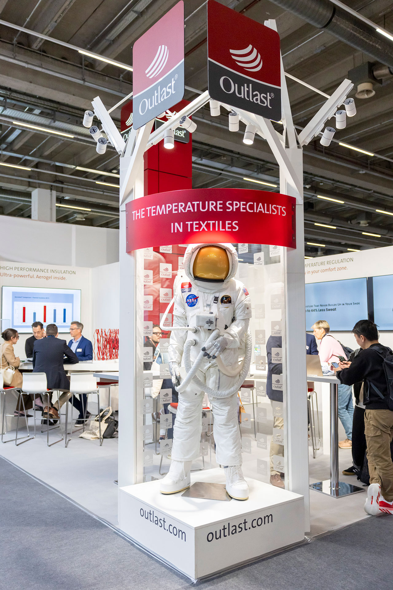
    Outlast Technologies GmbH /// Photo: Thomas Fedra, courtesy of Messe Frankfurt

    Performance apparel offered another clear signal. At Techtextil 2026, the Performance Apparel Textiles segment doubled compared with the previous edition, reflecting rising demand from security, defense, civil protection, outdoor, sports, fashion, military, and industrial safety markets. These are not areas where materials can rely on aesthetics alone. They require standards-compliant textiles that protect, adapt, endure, and support the body under specific conditions. The future of apparel, in this context, is not simply about dressing identity. It is about equipping people for increasingly complex environments.

    A mannequin in a blue ruffled dress is displayed in the foreground, with two people conversing near informational posters in the background.

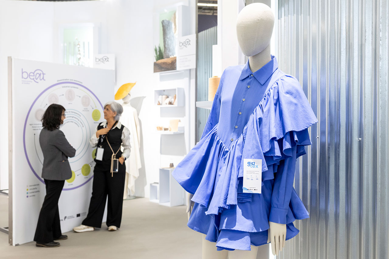
    Research, Development, Education, Consulting CITEVE – Centro Tecnológico Das Indústrias Têxtil e do Vestuário De Portugal /// Photo: Thomas Fedra, courtesy of Messe Frankfurt

    While Techtextil demonstrates what materials can become, Texprocess shows how they can be made. This is where progress shifts from fiber and fabric to system architecture. At the 2026 edition, connected solutions took center stage alongside machinery, linking design, resource planning, manufacturing, cutting, sewing, sourcing, and logistics. AI appeared as an operational tool supporting product development, real-time decision-making, artificial image processing, automated cutting, smart interfaces, and more efficient workflows.

    A car cross-section model is displayed indoors near an exhibit booth, with two people talking in the background and a large screen on the wall.

    Bondtec Jowat SE /// Photo: Pietro Sutera, courtesy of Messe Frankfurt

    Moving forward, competitiveness will depend less on isolated innovation and more on integrated systems. Manufacturers under pressure to move faster, waste less, and remain profitable need connected production models that can respond to demand in real time. That means linking product development, sourcing, planning, production, and logistics through digital workflows and usable data. It also means moving away from linear systems toward more flexible, resource-efficient models capable of adapting to volatile markets.

    Three people view textile displays and a screen reading "techtextil innovationaward 2026" in a brightly lit exhibition space with pink walls and floor.

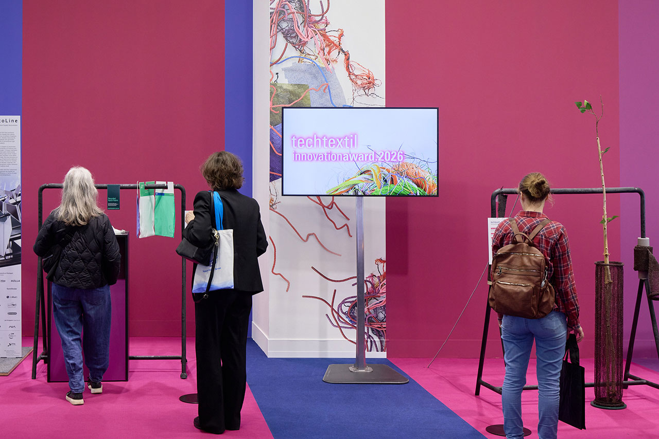
    2026 Innovation Award /// Photo: Jean-Luc Valentin, courtesy of Messe Frankfurt

    At a time when so much of the industry is being asked to accelerate, Messe Frankfurt offers something both fast and grounded, where innovation is stress-tested against real markets, real systems, and real production needs. Techtextil, Texprocess, and Heimtextil are instruments for making what is next possible.

    To learn more about these and other activations by the company, visit messefrankfurt.com.

    Photography courtesy of Messe Frankfurt.
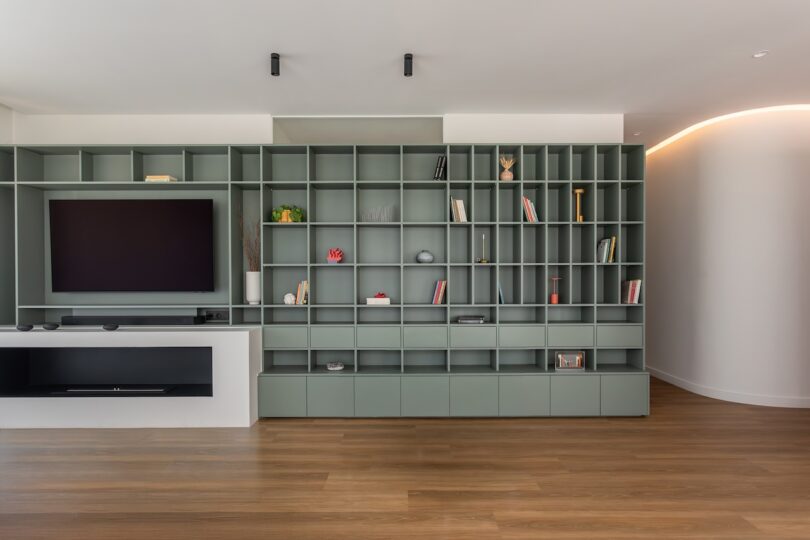
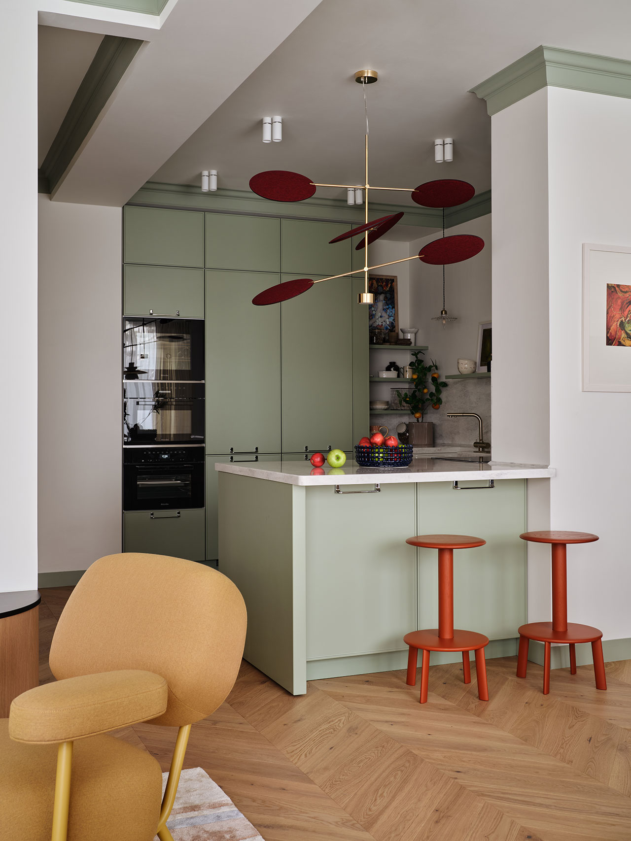
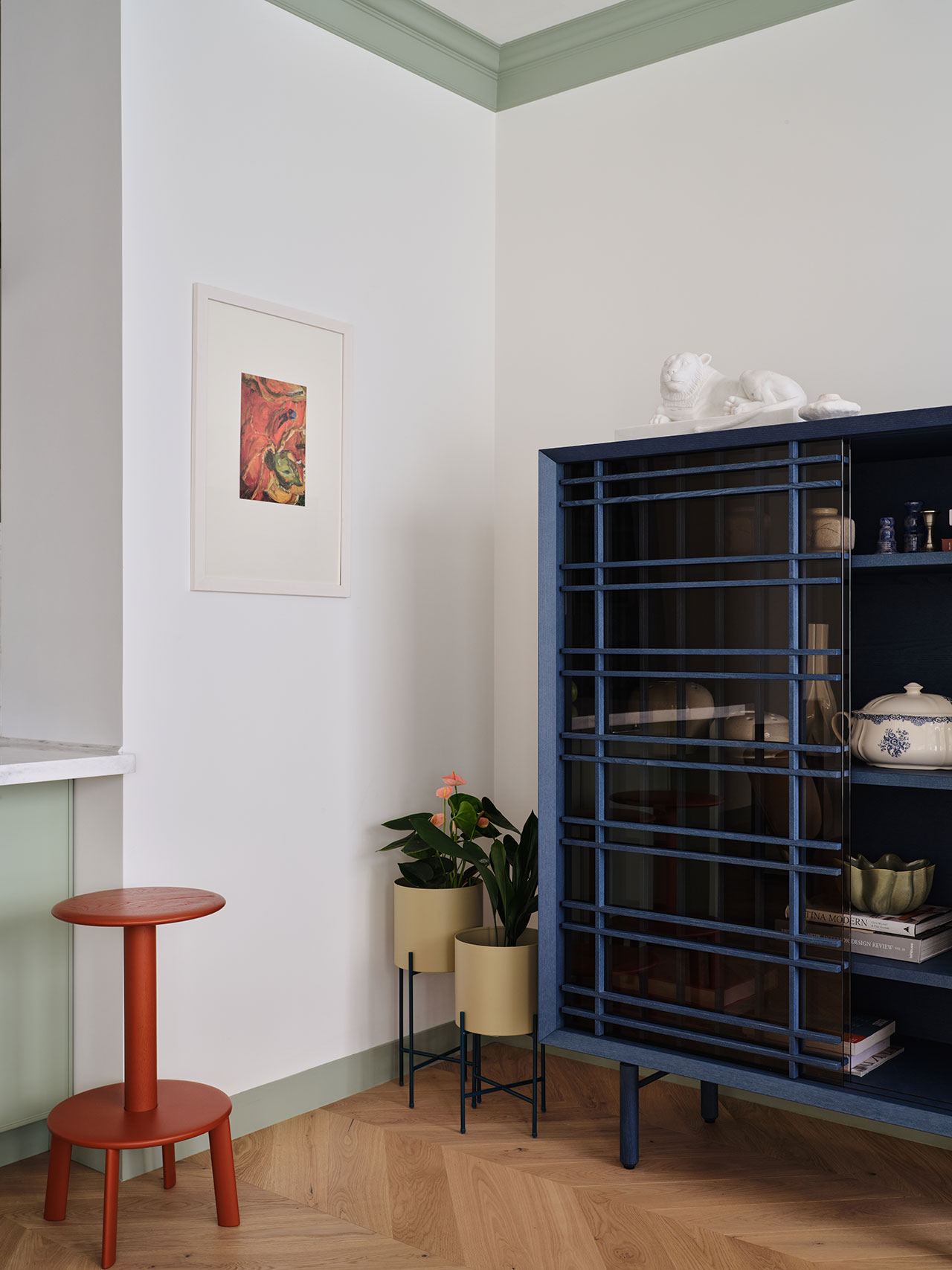
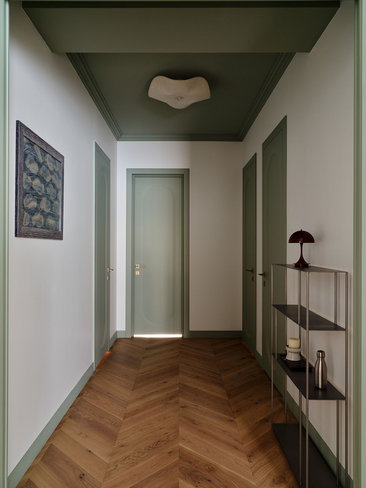
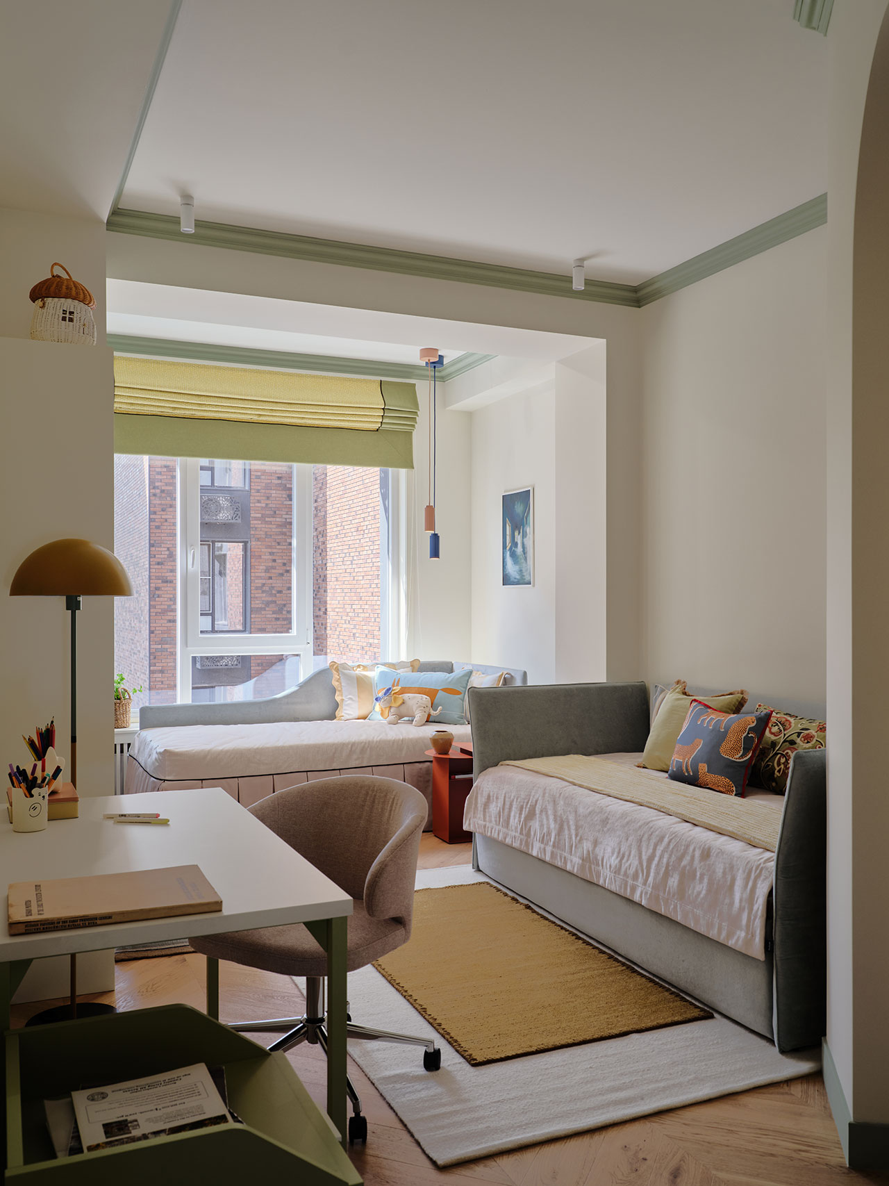
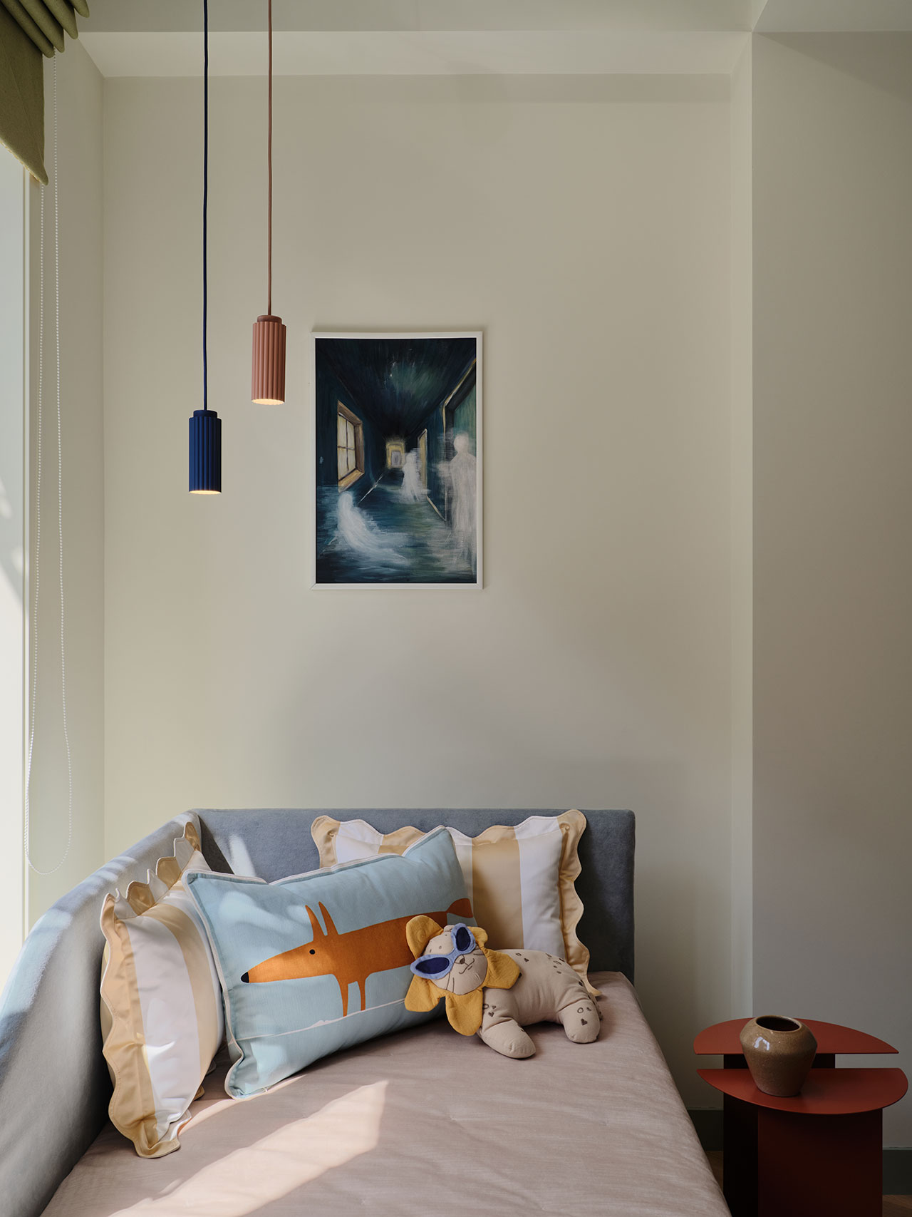
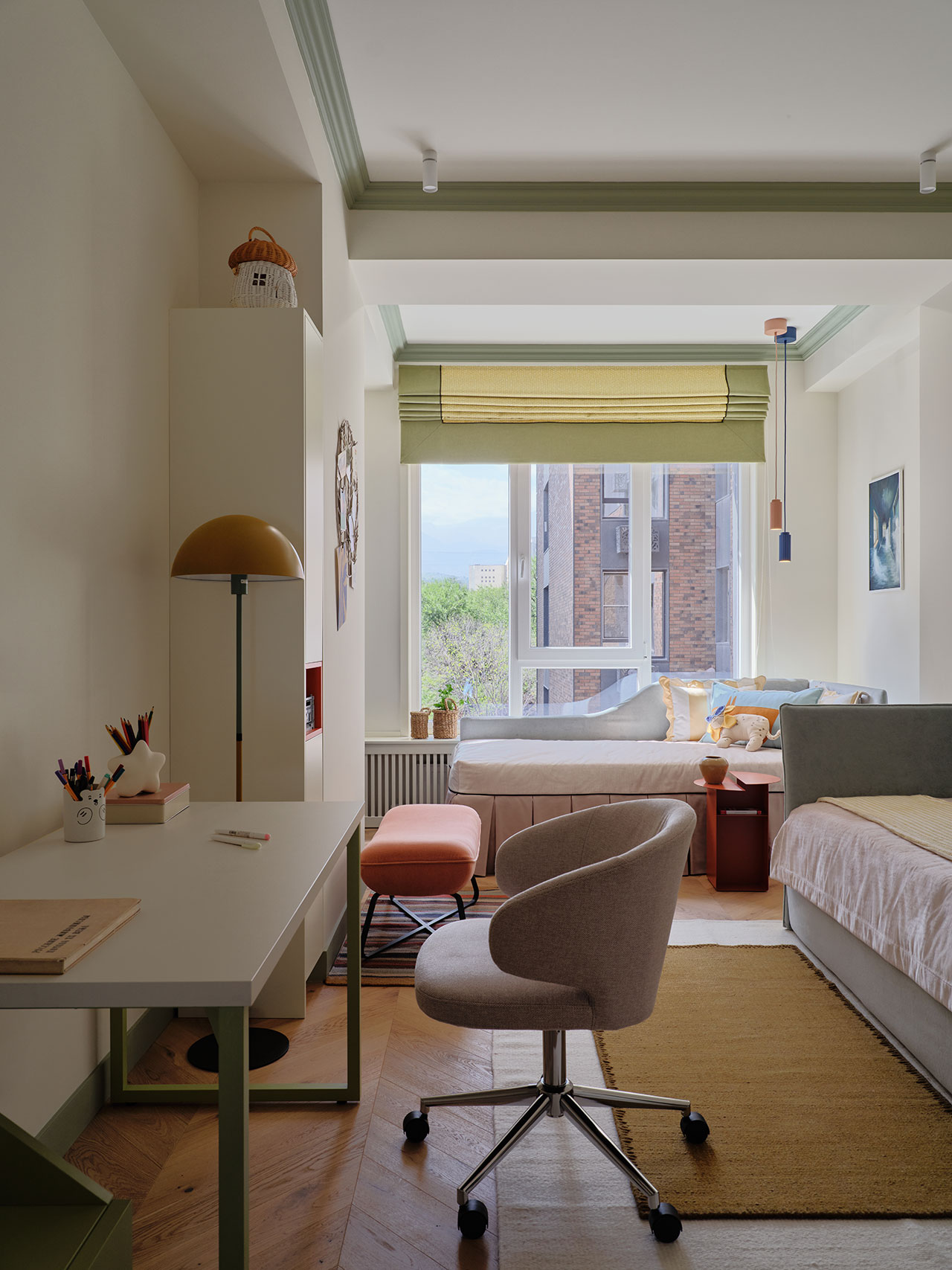
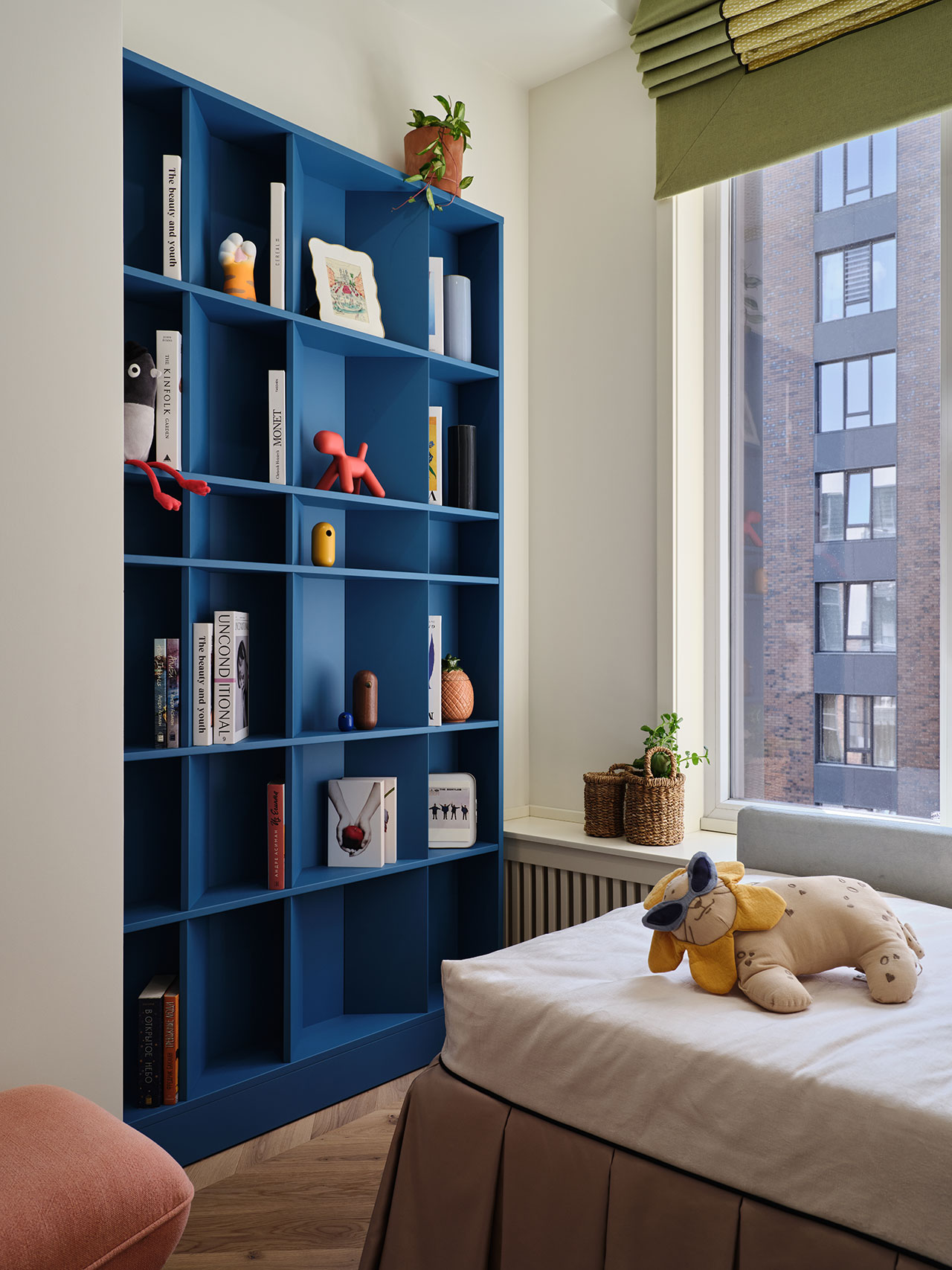
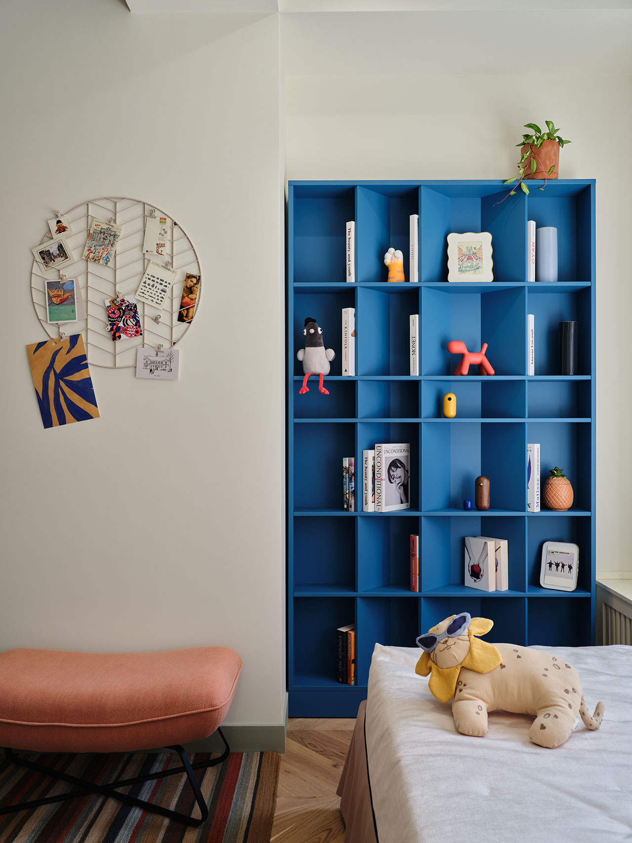
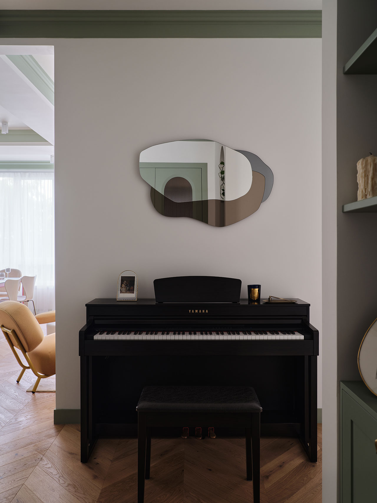
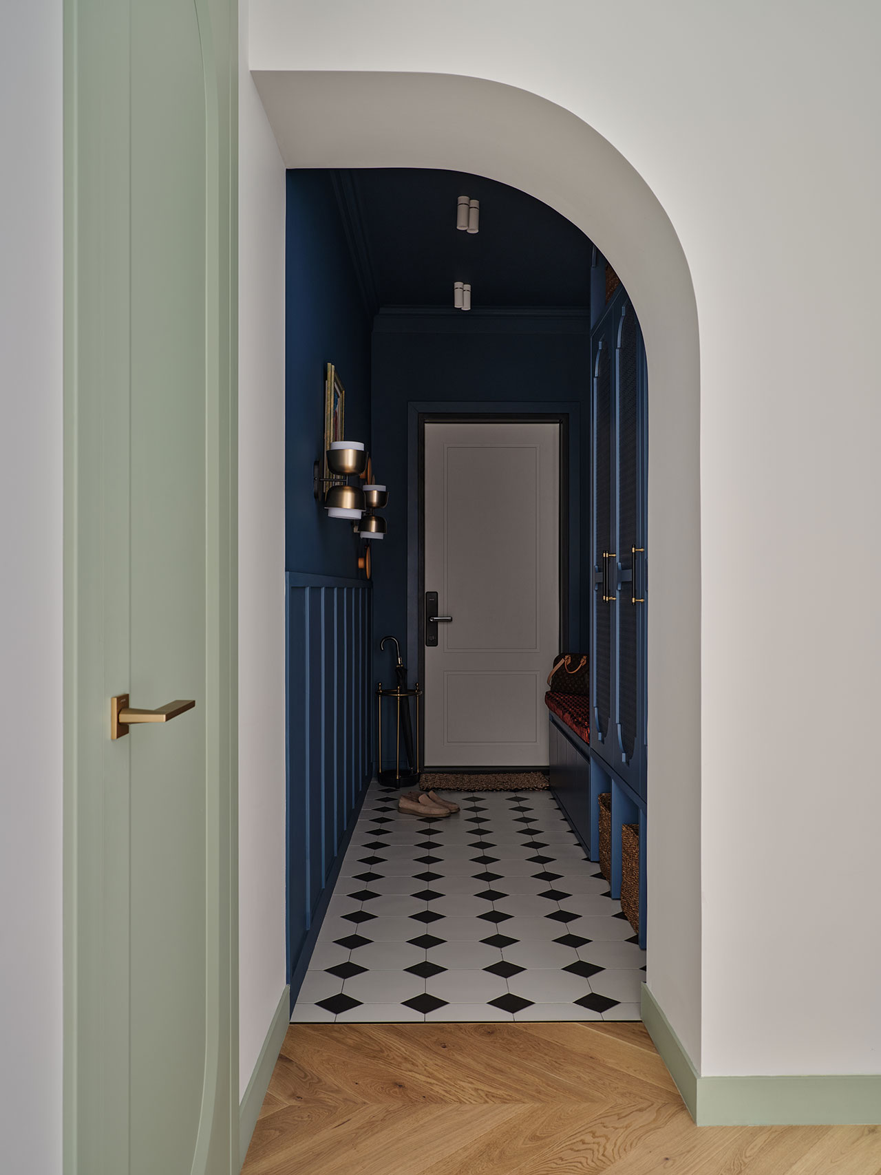
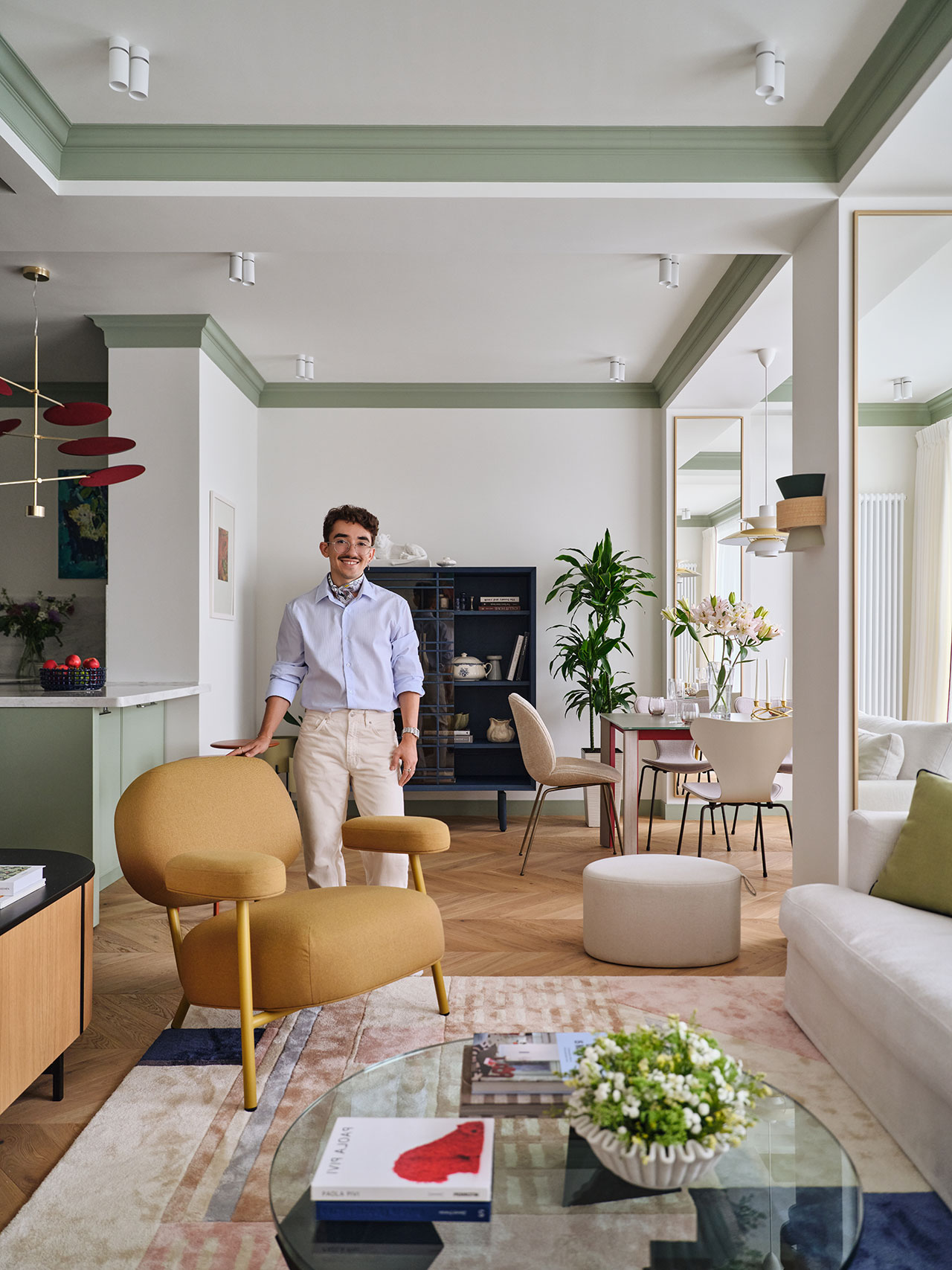
  • Design Milk design-milk.com art design design-milk fashion interiors tech 2026-06-15 16:00
    ↗

    Cateto Club channels the glamour, roughness, and roadside spectacle of the Costa del Sol into a contemporary meditation on place.

    Cateto Club: An Architecture of Afterglow

    Souvenirs are often dismissed as novelties, even clutter when they start to piles up: postcards, magnets, snow globes, the small ephemeral artifacts that compress a place into something portable. But at their best, souvenirs do something more profound. They preserve the feeling of a destination after the moments have faded. They hold atmosphere, exaggeration, fantasy, and longing in one condensed object. Cateto Club, an experimental hospitality space on Spain’s Costa del Sol, extends that logic into architecture itself. It is not a replica, nor a purely nostalgic revival. It is a spatial memento built from memory, pleasure, and the vernacular imagination of a coast that once understood leisure as an architectural language.

    A modern interior with warm yellow lighting features a large circular door, a counter with stools, pendant lights, and a decorative duck statue on the counter.

    A modern cafe interior with warm amber lighting, circular pendant lamps, brown cushioned seating, and round tables in a minimalist design.

    The project draws from an especially charged chapter of Spanish design history. In the 1960s, the Costa del Sol became a stage for tourism, escapism, and carefully manufactured freedom. Clubs, hotels, and roadside landmarks along the N-340 were designed to be seen, photographed, remembered, and mythologized. Their facades flirted with spectacle while their interiors offered refuge from a more restrictive social reality. Each establishment created small spaces of sensuality, color, music, and release. Cateto Club looks back to that world without flattening it into pastiche. And in doing so, designer Alejandro Cateto affords souvenir architecture equal cultural dignity as its peers.

    A dimly lit restaurant interior with curved booths, round tables, and modern amber and white lamps creating a warm, golden atmosphere.

    A modern, dimly lit restaurant interior with curved brown seating, round tables, and minimal decor, featuring shelves with bottles and globe-shaped table lamps.

    Cateto Club openly acknowledges the influence of Mario Bellini, Verner Panton, pop futurism, and radical Italian design, but it places those references alongside local leisure architecture: the Aqua-Tec diving club in Fuengirola, the brutalist Three Towers of Torremolinos, the Ciudad Sindical de Vacaciones Tiempo Libre in Marbella, and the rough, whitewashed language of places like the Marbella Club and Hotel Miami. Here, high design and vernacular architecture find themselves in a robust design dialogue.

    A round booth with brown cushioned seats surrounds a circular table with a small lamp, set in a warmly lit, yellow-toned interior beneath several hanging lights.

    Curved booth seating and round tables in a restaurant with warm brown tones, minimalist decor, and pendant lights hanging from the ceiling.

    That act of equivalence gives the project its force. Architectural history often reserves seriousness for famed authors, collectible objects, and polished movements, while the architecture of tourism, nightlife, and local pleasure is relegated to the realm of kitsch or backdrop. Cateto Club rejects that distinction, asserting that the buildings people remember most vividly are not always academically sanctioned. They may be marked by a strange roadside entrance glimpsed from a car window, the peculiar door to a club, the textured wall of a patio, or the neon-lit threshold between everyday life and temporary abandon. These spaces shape collective memory precisely because they are excessive, specific, and emotionally legible.

    A dimly lit, modern restaurant booth with a round table, curved seating, a small lamp, and shelves of liquor bottles against a warm beige interior.

    A round booth with brown cushioned seating surrounds a circular table with a white lamp, under a ceiling light, in a room with warm yellow and brown tones.

    The project’s organizing gesture is the cylinder, explored with near-obsessive focus. It appears as void in seating alcoves, as mass in the bar and stools, as threshold in doors and openings, as pattern across the ceramic floor, and as sculptural lighting in the Sentry Sculpture Light designed by Ewan Lamm for Ultramar Studio. The form feels both primitive and futuristic, soft and monumental, domestic and theatrical. It also allows the project to avoid superficial theming. Rather than applying retro references as decoration, Cateto Club turns geometry into a spatial language, one that can move between furniture, architecture, ornament, and atmosphere.

    A round metallic door with a warm bronze finish next to a curved beige sofa and a patterned floor in a modern interior space.

    The circular entrance door is the clearest expression of that language. At three meters in diameter, it is impossible to ignore, knowingly theatrical, and almost cinematic in its frontal force. Its monumentality is not heavy or institutional. It is playful, almost flirtatious. It nods to the old nightclub facades of Montemar and Torremolinos, where architecture functioned like roadside theater, luring passing drivers with exaggerated forms. In today’s hospitality landscape, where so many interiors are optimized for algorithmic recognition yet somehow end up visually interchangeable, that kind of audacity feels newly radical.

    A warmly lit, modern restaurant interior with curved booths, pendant lights, and geometric tiled flooring in shades of beige and gold.

    A curved brown bench and round table with white and yellow flowers inserted between the cushions, set on a tiled floor with a circular pattern.

    A round table with a mushroom-shaped lamp sits in a curved booth surrounded by yellow and white daisies in a softly lit room.

    Shelves display bottles and a speaker against a yellow wall, with single-stem flowers placed around a curved seating area.

    A modern interior with warm lighting, round seating, geometric wall décor, and circular pendant lights, featuring a minimalist, gold and beige color scheme.

    A round doorway with warm brown walls frames a small table and lamp in the background. The scene is softly lit, creating a cozy atmosphere.

    A minimalist interior features a large circular metallic sliding door next to a rectangular window opening, set in a textured yellow wall.

    A man in a beige suit sits on a stool in a warmly lit, modern room with round lights, tiled floor, and shelves displaying bottles.

    To see this and other design by the studio, visit catetocateto.com.

    Photography by Loveladrillo.

  • Design Milk design-milk.com art design design-milk fashion interiors tech 2026-06-15 13:00
    ↗

    A red-bellied spiral staircase, a sawtooth ceiling, and a borrowed dose of Milanese restraint reveal what happens when designers choose to listen to a mid-century house rather than talk over it.

    Ome Dezin Restores a Whitney R. Smith Home in the Hollywood Hills

    In The Colony, a tightly held enclave of the Hollywood Hills where mid-century houses survive in unusual numbers, a 1960 residence by Whitney R. Smith carries the quiet authority of a building that knew exactly what it wanted to be. Smith, a Case Study House architect and co-founder of Smith & Williams, belonged to the generation of Southern California modernists treated sawtooth ceilings and angular geometries as instruments for light, pulling it down into the volumes at measured intervals. The brief handed to Ome Dezin was less a renovation than a negotiation with that intelligence.

    Modern two-story house with large glass windows and balcony overlooking a pool, featuring geometric rooflines and surrounded by plants.

    The studio recognized early that the architecture would lead, and that the real discipline lay in restraint. Renovations through the 1980s and 1990s had blurred the home’s original logic, and the work became one of subtraction as much as addition. This required refining proportions, recovering flow, and resisting the temptation to over-design a house. The custom spiral staircase, the ceiling heights, and the structural rhythm were preserved rather than reinterpreted.

    A modern interior features a glossy white spiral staircase with red inner steps and wooden treads, set on a polished wood floor.

    A warm, grounded palette of rich woods, plaster, and tonal stone counterweights the sculptural drama of the architecture. The staircase, its curve resolving in a bold red underside, becomes the room’s highlight, a graphic gesture set against otherwise calm surfaces. An oversized pivot door opens into a double-height foyer where gallery proportions and the sawtooth ceiling deliver a deliberate flood of daylight.

    A modern living room with dark wood paneling, a black sofa, nested beige tables, a vase of white calla lilies, and natural light coming through large windows.

    Ome Dezin looked to Milan, and to Villa Necchi Campiglio in particular, Piero Portaluppi’s 1930s villa of lacquered surfaces, controlled luxury, and rooms that hold their composure under pressure. That sensibility surfaces in the color pairings and the low, structured furniture sourced from Dusty Deco, Made by Choice, NO GA, and Kallemo.

    A minimalist bathroom with wood-paneled walls, a stone bathtub, a circular window, and a potted plant beside the tub.

    A shared bath in the second wing commits fully to a lemony yellow, its copper accents and glass brick reading as period-correct mid-century optimism rather than pastiche. The primary suite, set under original high ceilings with a loft-like openness, trades color for a minimalist composure, its bathroom framing a clean view of the hills above the vanity. Graphic works from Creative Art Partners punctuate the calm at intervals.

    A modern interior with a red spiral staircase, wooden floors, a sunken seating area, and glass block wall, with natural light entering from large windows.

    Modern kitchen with wooden cabinets, large stone island, bar stools, and a window overlooking greenery. Natural light fills the room, highlighting minimalist decor and fruit on the counter.

    A modern kitchen with stone countertops, dark wood cabinets, a vase of white flowers on the island, and fruit scattered on the counter.

    A hallway with wooden flooring features three white floating shelves filled with books and decor, a potted tree, and soft ambient lighting.

    A modern interior with a tan daybed, a low dark wooden table with a vase of flowers, a large potted plant, a woven wall hanging, and a floor lamp with a pleated shade.

    A modern living room with dark wood paneling, a black sofa, nested beige tables, a vase of white calla lilies, and natural light coming through large windows.

    A modern living room with a large potted tree, dark velvet sofas, a wooden coffee table, a textured rug, and two colorful portraits on the wall.

    Dining area with a round black table, four wooden chairs, a modern pendant light, a fireplace, indoor plants, and large windows letting in natural light.

    A minimalist bedroom with a single bed, brown geometric blanket, wood-paneled wall, small wall lamp, vase with flowers on a floating shelf, and abstract portrait above the bed.

    A neatly made bed with a dark cover, a small wooden side table with books and a vase of flowers, a wall-mounted lamp, and a portrait painting on a cream-colored wall.

    To learn more about the studio behind the design, visit omedezin.com.

    Photography by Patrick Biller with styling by Lisa Rowe.

  • Design Milk design-milk.com art design design-milk fashion interiors tech 2026-06-12 17:00
    ↗

    Uneri is crafted from branches collected from Tokyo street trees or local parks, ensuring each piece was chosen with care and intention.

    Uneri Grounds Us in the Intricacies of Growth

    The physical manifestations of growth exist all around us. Plants sprout, live, and die, returning their nutrients to the soil – a perfect cycle of endless energy. Rivers cut through rock, forming new streams that offer less resistance as gravity pulls forever downward. Trees, our protectors of the air and soil, grow in distinct directions as well, beholden to the conditions and nutrients present. Crafted from branches collected from Tokyo’s street trees and local parks, Uneri by Sotanaka celebrates this unique growth.

    A modern black chair with a round seat, irregular stick-like legs, and an asymmetrical round backrest, set against a plain white background.

    Treating pieces like singular parts of a whole rather than separate elements, one can almost imagine shoots of green that could sprout out of the ends of the branches. The seats and backs are delicately rendered, a whimsical organicism permeating the whole collection. As it takes much longer to learn the rules as it takes to learn to break them, the attention to proportion and gesture is essential to understanding the magic behind Uneri, a pattern of life frozen in time.

    A modern black chair with a round backrest, an irregularly shaped seat, and legs and supports resembling tree branches, set against a plain white background.

    A minimalist chair with a round black seat and backrest, supported by irregular, branch-like black legs and frame, set against a plain white background.

    A small, round, black side table with three uneven, branch-like legs and additional crossbars, set against a plain white background.

    A barefoot person dressed in black pants and a black shirt holds a black stool while walking across a plain, light-colored floor.

    A small round table with a dark, smooth top and irregular, branch-like legs arranged in an abstract design against a plain white background.

    Wabi-sabi combines two interrelated concepts: wabi and sabi. Although there are many translations, wabi may be translated as “subdued, austere beauty”, and sabi as “rustic patina”. As this tenet is essential to Japanese design culture, each element is intentionally placed, and was collected from material that might be discarded otherwise. A careful examination of process and product combine to offer a touching ode to our natural world.

    A close-up view of a modern black side table with a smooth, rounded top and branch-like metal legs against a plain white background.

    A modern black coffee table with a smooth, oval top and irregular, branch-like legs set against a plain white background.

    Close-up of a modern black chair with a round seat and irregular, branch-like legs and supports, set against a plain white background.

    Established in 2020 by designer Soichiro Tanaka, Sotanaka is based in Tokyo, working to deepen our connections with the products that surround us. Each project is an opportunity to understand these relationships even better, to help us interact with our environments more easily, and ultimately, each other.

    Two black tables with uneven, branch-like legs and circular tops are connected together, set against a plain white background.

    To learn more about Uneri by Sotanaka, visit sotanaka.com.

    Photography courtesy of Sotanaka.

  • Design Milk design-milk.com art design design-milk fashion interiors tech 2026-06-12 16:00
    ↗

    FM Interiors Design Bureau balances soft Parisian references, Italian warmth, and contemporary Kazakh art in a home designed to feel personal, lasting, and alive.

    An Almaty Apartment Composed in Sage, Sunlight, and Serendipity

    Some homes begin with a site visit while others begin with a passing thought. But this project belongs solely to serendipity. Months before Fariz Mamedov of FM Interiors Design Bureau was formally approached to design this 150-square-meter apartment in central Almaty, Kazakhstan, he would often drive past the residential complex while it was still under construction––musing of one day working on its interiors. Soon after, clients reached out with an apartment in that very building.

    A modern living room with a mustard armchair, abstract wall art, a wood sideboard, and a view into a kitchen with green cabinets.

    Whether you call it coincidence, intuition, or something closer to good fortune, that story set the tone for a home shaped as much by feeling as by floor plan.

    Modern dining room with a rectangular table, beige chairs, a vase of pink lilies, a tall mirror, a potted plant, and large windows with sheer curtains.

    Modern kitchen with mint green cabinets, red accents, and gold lighting fixture; dining area with flowers and wine glasses in the foreground.

    The apartment belongs to a family of five: a warm, creative household whose interests orbit music, theatre, art, travel, and one another. Mamedov describes them not only as people whose energy immediately moved him. Their conversations were open, their connection instantaneous, and their sensibilities uncannily aligned with his own. That emotional fluency became the project’s quiet engine.

    Modern kitchen with sage green cabinets, a white countertop island, two red stools, contemporary pendant light, and a mustard yellow chair on herringbone wood flooring.

    A corner interior with a blue cabinet, a red stool, two potted plants, and framed art on a white wall with green accents and herringbone wood flooring.

    Mamedov speaks of color almost musically. When he looks at people, he says, he instinctively associates them with shades. Images appear; colors begin to play and sound. For this couple, the note that emerged was a complex sage, or light olive: calm, elegant, restrained, but far from simple. It became the apartment’s emotional foundation moving through the home like a recurring melody.

    Modern kitchen with a green island, marble countertop, and a dining area with round table and chairs by large windows with sheer curtains.

    Modern kitchen with sage green cabinets, white farmhouse sink, marble backsplash, wooden stool, potted plant, and wall art on white walls.

    Around that central tone, Mamedov layered a more expressive score: red appears as bold and energetic; blue brings depth and calm; and a sunny yellow elicits joy, play, and invention in the children’s spaces. In the primary bedroom, pastels meet burgundy in a quieter arrangement of tenderness, unity, and intimacy. Color is allowed to travel beyond the expected surfaces, appearing not only on walls, doors, baseboards, and wallpaper, but on ceilings as well. The result is restrained without being timid, colorful without becoming theatrical.

    A floor lamp, a vase with flowers, and a small cart with various items sit below a colorful abstract painting on a white wall.

    A hallway with green doors and trim, wood herringbone flooring, a ceiling light, a framed picture on the wall, and a metal shelf holding decor items.

    The palette also helps the apartment overcome one of its central architectural challenges. Because Almaty is in a seismically active region, the building came with a significant number of columns and beams, which Mamedov leveraged as a defining rhythm. Mirrored columns in the living area visually divide the open space into conceptual islands, while an accent-colored ceiling cornice frames the beams and unites the apartment as a coherent whole. What could have interrupted the home instead becomes part of its tempo.

    Modern home office with a desk, swivel chair, and lamp, featuring dark blue walls, light wood floors, and a partially open door. A basket and closed wardrobe are also visible.

    A modern, neatly arranged bedroom with a single bed, armchair, desk, large window, and city view. Natural light brightens the space, decorated in neutral and blue tones.

    The layout follows a similarly measured logic. Originally an open plan with structural columns and a narrow entry corridor, the apartment was reorganized into public and private zones. The kitchen, living, and dining areas form one generous family stage for cooking, reading, entertaining, watching films, or listening to music. Beyond double glass doors, the bedrooms retreat into a more intimate realm beyond a symbolic threshold.

    A modern desk with an open book, a lamp, a clock, stacked books, a framed picture, and a pencil holder against a striped wall.

    Modern bathroom vanity with a wood cabinet, white countertop, brass fixtures, wall-mounted mirror, candle holder, soap dispenser, and a towel hanging on a brass hook.

    Paris was an important reference, though not in any literal or overly styled way. The city offered a state of mind: soft light, refinement, intelligence, rhythm, and the ease with which new and old can coexist. To that Parisian sensibility, Mamedov added Italian warmth: sunshine, sensuality, softness, and a little more emotional volume. Yet the apartment never drifts away from its Kazakh.

    A modern bedroom features a daybed, a desk with a chair and lamp, a large mirror, an orange bench, and an open curtained closet with shelves. The decor includes warm and pastel tones.

    A modern desk with art supplies, a sculptural mug, a notepad, and a yellow lamp sits beside a light gray chair and a wavy-framed mirror in a minimalist room.

    French herringbone parquet, natural textiles, ceramic tile, rattan, raffia, wool, cotton, silk, wood, and metal create a home that feels layered and lived in. The furnishings and objects were gathered from many places, but the composition avoids the clutter of overdetermined eclecticism. Each piece seems to have arrived through conversation, travel, memory, or instinct.

    A modern, well-lit bedroom with two beds, a desk with a chair, a window with a city view, neutral walls, pastel decor, and a yellow rug on wooden flooring.

    A small sofa bed with decorative pillows and a plush toy sits beneath a framed painting; pendant lights hang above, and a side table is nearby.

    A custom rug made in India from Mamedov’s sketches sits alongside pieces from Saba Italia, Gubi, Louis Poulsen, Thonet, Fritz Hansen, &Tradition, Potocco, HAY, and more, while local craftsmanship grounds the apartment through custom cabinetry, benches, vanities, and other bespoke elements.

    A tidy bedroom with a desk, chair, bed, and large window with a green shade, featuring neutral and pastel colors, wooden flooring, and some decor items.

    A modern bedroom with a blue bookshelf filled with books and decorative objects, a bed with a plush lion toy, and a large window showing a building outside.

    This apartment feels less like a finished image than an ongoing state, its beauty found in the way the many elements make space for life to continue unfolding. It leaves room for new art, new routines, new conversations, new memories.

    A modern room with a blue bookshelf holding books and decor, a circular wall organizer with photos, a coral bench, a striped rug, and a stuffed animal on a bed.

    A modern bedroom with a beige bed, a white and red blanket, muted abstract wall art, a round white pendant light, and a glass door partially open. Flowers sit on the bedside table.

    A small wooden desk with an open book, lamp, decorative items, and a chair, set against a light wall with a large framed minimalist artwork above.

    Open double doors reveal a walk-in closet with hanging clothes, wooden shelves, a round mirror, a vase with flowers, and a lamp on a dark accent wall.

    Bathroom with green and white vertical tile, glass shower enclosure, wall-mounted toilet, two robes on hooks, a vanity with drawers, and a vase with greenery.

    Modern bathroom with patterned tile floor, wall-mounted toilet, glass-panel bathtub, wooden vanity, brass towel rack, and framed artwork above the toilet. Flowers sit on the sink.

    A hallway with light wood herringbone flooring, a green-trimmed arch, built-in shelves, and a black digital piano with a bench against the wall.

    A black Yamaha piano with a bench sits against a white wall, topped with a decorative mirror, photo frame, and candle; a yellow chair is visible in the adjacent room.

    A hallway with a white door, dark blue walls, black and white checkered floor tiles, and a light green arched doorway with a gold handle.

    A dark blue entryway features round, multicolored wall hooks next to a white door and an umbrella in a gold stand.

    A stacked washer and dryer are enclosed in a navy blue louvered closet with shelves, located in a small room with patterned wallpaper and a black-and-white tile floor.

    A man stands in a modern, stylish living room with light-colored walls, green accents, contemporary furniture, and decorative plants.

    To see this and other works by Fariz Mamedov, visit farizmamedovinteriors.com.

    Photography by Damir Otegen, with styling by Fariz Mamedov and Aigerim Mamyraliyeva.

  • Design Milk design-milk.com art design design-milk fashion interiors tech 2026-06-12 14:00
    ↗

    Designer-builder Lidia Valdivia shares some of her favorite destinations, from Egypt to Greece, and more.

    F5: Lidia Valdivia Talks Her Partner’s Art, Nights in Cairo, a Greek Island + More

    Born and raised in Nicaragua, Lidia Valdivia remembers her childhood residence fondly. “It was colorful, textured, imperfect, and full of personality,” she says. “Nothing was overly designed, but everything felt intentional. I think a lot of my work today still comes back to that.”

    After Valdivia migrated to the United States, she learned to refinish hardwood floors, which was her first job in construction. It wasn’t until she walked through a 1900s home though that she knew what she was meant to do.

    This time capsule of a place needed a lot of TLC, but Valdivia was enamored with the original woodwork, which was still intact, and she even appreciated the peeling wallpaper. At that moment she saw the potential of what this particular dwelling could become. Ready to spearhead unforgettable transformations herself, in 2024 she founded her Minnesota-based firm, Moonstone Design + Build.

    A woman in a black shirt and blue jeans stands and smiles inside a wooden house frame under construction, ready to celebrate with her Friday 5 team.

    At first, Valdivia took on smaller renovations, and as word spread about her skills, clients gave her more opportunities to stretch in new ways creatively. That trust from collaborators gave her the confidence to keep building the business and refine her perspective over time.

    Valdivia’s mobile phone serves as a mood board, with photos of materials, architecture, and restaurants that she discovers during her travels. Some of her best ideas, however, are often found in random moments. “A lot of inspiration doesn’t come directly from design,” she notes. “It comes from everyday life and paying attention to how spaces make people feel.”

    Today, Lidia Valdivia joins us for Friday Five!

    An easel with a colorful abstract painting stands in front of a fireplace; nearby are framed paintings, a vase, and artist supplies on a small wooden table—perfect inspiration for your next Friday 5 creative session.

    1. My Partner’s Art

    My partner’s art has become one of the most meaningful parts of our home. As an interior designer, I’m always fascinated by people who have artistic practices outside their primary work because it changes how they see space, texture, color, and emotion. Living with an artist has been incredibly fun because our home is never static; we swap paintings depending on the mood of the month, and each piece completely shifts the atmosphere of a room.

    A man in traditional clothing sits on the ground against a mural, playing a drum on a tranquil Friday 5 afternoon, surrounded by rocks and plastic bottles.

    2. Coffee Shops, Drums, and Cairo Nights

    Spending three months in Egypt changed me completely. I loved how alive everything felt — people talking for hours at coffee shops late into the night, music and drums constantly in the background, families gathering everywhere, spontaneous dancing, the call to prayer echoing through the city. There was such a strong sense of community and presence in everyday life. People made time for each other. Nothing felt rushed. Traveling through eight cities and
    experiencing that warmth and energy shifted the way I see life and connection.

    A young child in a striped dress stands on a small platform outside white buildings with blue railings and a Greek flag hanging from a balcony. Friday 5 scooters are parked in the foreground.

    3. Getting Lost in Tinos, Greece

    I was in awe of how beautiful Tinos was — marble everywhere, tiny winding streets where you could easily lose track of time, and the most incredible sunsets. Traveling there with my son and sharing those quiet moments together is something I’ll always hold onto.

    A hallway with floral wallpaper, a staircase with pink carpet, and an adjoining room with matching carpet and a chandelier set the scene for this charming Friday 5 property.

    4. Projects That Shape You

    There’s something incredibly special about an old home. The layers of wallpaper, worn staircases, faded carpets, imperfect details — every surface tells a story. I’m drawn to homes that feel lived in and evolving rather than untouched. Restoration is never just about making something beautiful again; it’s about preserving character while allowing a space to grow with you over time. The projects that stay with me most are always the ones that shape me in return.

    A living room with wooden furniture, a carved wooden door, lace curtains, indoor plants, and sunlight streaming through large windows creates the perfect Friday 5 retreat for unwinding at week's end.

    5. My Childhood Home in Nicaragua

    A lot of my design perspective comes from the home I grew up in in Nicaragua. It was colorful, layered, textured, and full of personality. My mom filled it with plants, carved wood, tile, collected objects, and pieces gathered over time. I think growing up in that environment shaped the way I see homes today. I’m naturally drawn to spaces that feel soulful, lived in, and deeply personal rather than overly polished. Even now, I find myself gravitating toward the same materials and feelings I grew up around — wood, plaster, tile, texture, color, natural light. I think, in many ways, I’m always trying to recreate the feeling my childhood home gave me.

    Works by Moonstone Design + Build’s Lidia Valdivia:

    Kitchen With Orange Hood
    This project was for clients who loved color and really wanted the home to feel fun and personal. Orange became the starting point for the kitchen and inspired the custom hood, which ended up becoming the focal point of the space. We paired it with walnut cabinetry, dark handmade tile, terrazzo floors, and warmer finishes throughout to keep everything feeling grounded and lived in. I love projects like this where clients fully embrace bold choices because the end result feels so much more layered and reflective of who they are.

    A wall with colorful paintings, plants, and decorative objects sits next to a wooden shelf and a kitchen in the background—the perfect inspiration for your next Friday 5 decor update.
    Home With Artwork
    I’m always drawn to homes that feel collected over time rather than perfectly styled. This space mixes artwork from Guatemala, Nicaraguan paintings, thrift finds, plants, and pieces that each carry memory or meaning. I love when a home reflects the people living in it and feels deeply personal instead of overly curated. To me, home should feel like a refuge, layered, comforting, and full of things that tell your story.

    A view through an open wooden door reveals a small entryway with floral wallpaper, green tile flooring, and a glass-paneled wooden door leading outside—inviting you to step into the charm of Friday 5.
    Tudor Home Entry
    This entry was part of a Tudor home restoration and easily became one of my favorite details in the entire project. We installed small-scale tile throughout the entry and spent months searching for a wallpaper that felt true to the original character of the home. When we finally found this print, everything clicked into place. I love projects like this where the goal is not to make a home feel new, but to bring it back to life in a way that still feels timeless.

    A woman walks past a colorful tiled fireplace in a living room with stacked books, a coffee table, and artwork from the Friday 5 collection displayed on the mantel.
    Tile Fireplace
    This project completely shifted the direction of Moonstone for me. The clients were fearless when it came to color and pushed me to be more playful and expressive with the space. The shaped tile on the fireplace became the heart of the room and instantly transformed the entire feeling of the home. I love projects like this where one bold design decision changes everything and gives the space so much personality and warmth.

    Modern open-concept kitchen and dining area with wood floors, a dark dining table, black chairs, light wood cabinetry, and large windows letting in natural light—perfect for hosting friends or a cozy Friday 5 gathering.
    Kitchen With Mix of Influences
    This kitchen felt like the perfect mix of mid century, Moroccan, and Spanish influences. We used pink tile throughout the backsplash to bring warmth and softness into the space, paired with lighter wood tones and patterned flooring to keep it feeling playful and layered. I love projects that embrace color in a quieter way where the materials still feel timeless, but there is personality in every corner.

    Project photography and headshot by Chelsie Lopez.

  • Design Milk design-milk.com art design design-milk fashion interiors tech 2026-06-11 17:54
    ↗

    Changes to iconic designs are somewhat rare, and even rarer are they welcomed – Aeron from Herman Miller never stops improving.

    Aeron Gets an Upgrade in Style and System

    What comes to mind when we think of sustainability in action? Is it in manufacturing, proximity, materiality, or a combination of the three? In terms of holistic design, every part of the process must be considered with tact, understanding the nuances of the world we exist within. Almost synonymous with the term ‘office chair’, the Aeron Chair from Herman Miller has been a symbol of peak American office design, long regarded as a well-earned gift for a job well done.

    A black ergonomic office chair is positioned in front of black cabinets and shelves filled with books, binders, and wire baskets in a well-lit office space.

    A stately way to take the load off of desk worker’s long-suffering backs, each metric on the Aeron Chair can be customized to fit your exact specifications, creating less strain on the body and therefore on the mind as well. Coming in four standardized sizes, each piece is designed with the human body in mind, creating a more harmonious relationship with the tasks at hand.

    Three mesh-backed chairs, one green and two black, are partially illuminated by sunlight against a dark background.

    Three empty mesh office chairs in green, brown, and blue are partially illuminated by light, set against a dark background.

    In this newer iteration, not only are there new colors to choose from, but systemic upgrades as well. Since 2022, Herman Miller has achieved carbon savings of over 7,000 metric tons, equivalent to taking nearly 6,000 cars off the road for a year. With no compromise on durability or performance, the Herman Miller team also reduced the material in Aeron’s aluminum base by 1.85lbs/0.84 kg. At scale, this translates to enough aluminum saved annually to exceed the weight of 16 adult elephants. These equivalencies clearly demonstrate how small changes can meaningfully reduce impact. Even stronger, they can back these numbers up with third-party studies, an inspiring turn toward transparency in a time of increased obfuscation.

    Close-up of the armrest and adjustment mechanism of an office chair, showing its smooth, dark green metallic finish.

    Close-up of a mesh office chair backrest with an adjustable lumbar support knob and a green frame.


    Close-up of a modern ergonomic office chair with a mesh backrest and armrests, shown in a dimly lit indoor setting.

    A modern ergonomic office chair with a mesh back is positioned in front of a wooden desk with drawers and neatly arranged items.

    A modern home office setup with a wooden desk, ergonomic chair, table lamp, decorative jar, and framed artwork, situated near a staircase and large window.

    A modern home office with a black ergonomic chair, a black desk with a lamp and books, wooden floors, and an abstract painting on the wall.

    A black ergonomic office chair with mesh back and seat is positioned at the corner of a wooden desk in an office setting.

    An ergonomic office chair with a mesh backrest sits near a wooden desk in a modern office with large windows and natural light.

    In keeping with the values that spur the type of innovation Herman Miller is known for, they invest heavily in the type of information gathering that is not only good for them internally, but good for all of us here on earth. The more we can understand distinct parts of the product cycle, the more we can make powerful and impactful decisions that will eventually shape our future. When a design is so ubiquitous, born of ergonomic ingenuity and meticulously designed, it begs the question: could improvements be made upon a system that inherently changes slowly? With the Aeron Chair, the answer has to be yes.

    Close-up of a black mesh office chair backrest next to a wooden table in a carpeted room with natural light.

    To learn more about Aeron from Herman Miller, visit hermanmiller.com.

    Photography by Pippa Drummond, courtesy of Herman Miller.

  • Dezeen dezeen.com architecture design dezeen interiors 2026-05-13 05:00
    ↗

    Creative agency Ogilvy has created a special edition packaging for KitKat that doubles as a kind of tiny smartphone jail once the biscuit is removed, allowing users to "have a break" from their hyperconnected lives. Read more

    Break Mode packaging by Ogilvy Colombia and KitKat Panama

    Creative agency Ogilvy has created a special edition packaging for KitKat that doubles as a kind of tiny smartphone jail once the biscuit is removed, allowing users to "have a break" from their hyperconnected lives. Read more

  • Dezeen dezeen.com architecture design dezeen interiors 2026-05-12 20:00
    ↗

    Promotion: with the opening of its showroom in New York, presence at ICFF and upcoming NYCxDesign debut, Brazilian brand Jaderalmeida intends to establish itself in the North American design scene. Read more

    Jaderalmeida furniture

    Promotion: with the opening of its showroom in New York, presence at ICFF and upcoming NYCxDesign debut, Brazilian brand Jaderalmeida intends to establish itself in the North American design scene. Read more

  • Dezeen dezeen.com architecture design dezeen interiors 2026-05-12 19:19
    ↗

    Danish landscape studio SLA is among the designers of a neighbourhood on an island in Toronto's Port Lands district, set to advance after receiving the all-clear from planning officials in the city. Read more

    SLA Toronto Harbourfront project renderings

    Danish landscape studio SLA is among the designers of a neighbourhood on an island in Toronto's Port Lands district, set to advance after receiving the all-clear from planning officials in the city. Read more

  • Dezeen dezeen.com architecture design dezeen interiors 2026-05-12 18:00
    ↗

    The latest edition of our Dezeen Debate newsletter features the opening of Morocco's tallest building. Subscribe to Dezeen Debate now. Read more

    Mohammed Vi Tower

    The latest edition of our Dezeen Debate newsletter features the opening of Morocco's tallest building. Subscribe to Dezeen Debate now. Read more

  • Dezeen dezeen.com architecture design dezeen interiors 2026-05-12 17:00
    ↗

    Canadian studio Bricault Design has created a cabin informed by adjacent mountain peaks, featuring green roofs and slate cladding, to age in tandem with its wooded site in British Columbia, Canada. Read more

    Whistler Hideaway cabin in Vancouver by Bricault Design

    Canadian studio Bricault Design has created a cabin informed by adjacent mountain peaks, featuring green roofs and slate cladding, to age in tandem with its wooded site in British Columbia, Canada. Read more

  • Dezeen dezeen.com architecture design dezeen interiors 2026-05-12 16:22
    ↗

    New York furniture show International Contemporary Furniture Fair will move from its May dates to a spot in November, after more than 35 years, starting in 2027. Read more

    Javits Center

    New York furniture show International Contemporary Furniture Fair will move from its May dates to a spot in November, after more than 35 years, starting in 2027. Read more

  • Dezeen dezeen.com architecture design dezeen interiors 2026-05-12 15:00
    ↗

    Dezeen School Shows: a creative redesign of an amphitheatre informed by dance is among the projects from the University of Dundee. Read more

    Cambré by Nicoletta Proto

    Dezeen School Shows: a creative redesign of an amphitheatre informed by dance is among the projects from the University of Dundee. Read more

  • Dezeen dezeen.com architecture design dezeen interiors 2026-05-12 13:00
    ↗

    Dezeen Showroom: designer Philippe Malouin's Smart Shelf for Italian brand Very Simple Kitchen combines air extraction, lighting and storage, and is operated with tactile knobs rather than touchscreens. Read more

    Smart Shelf by Philippe Malouin for Very Simple Kitchen

    Dezeen Showroom: designer Philippe Malouin's Smart Shelf for Italian brand Very Simple Kitchen combines air extraction, lighting and storage, and is operated with tactile knobs rather than touchscreens. Read more

  • Dezeen dezeen.com architecture design dezeen interiors 2026-05-12 10:30
    ↗

    Exposed concrete, steel-framed windows and handmade bricks reference the formerly industrial site of Agramonte House, a home in Portugal designed by local studio António Bessa Cruz Architects. Read more

    Agramonte House by ABCA

    Exposed concrete, steel-framed windows and handmade bricks reference the formerly industrial site of Agramonte House, a home in Portugal designed by local studio António Bessa Cruz Architects. Read more

  • Dezeen dezeen.com architecture design dezeen interiors 2026-05-12 10:00
    ↗

    We continue our Parametricism series by looking at Metropol Parasol by German architecture studio J Mayer H and engineering firm Arup, a flowing timber canopy perched above the historic Plaza de la Encarnación in Seville, Spain. Read more

    Metropol Parosol by J Mayer H and Arup

    We continue our Parametricism series by looking at Metropol Parasol by German architecture studio J Mayer H and engineering firm Arup, a flowing timber canopy perched above the historic Plaza de la Encarnación in Seville, Spain. Read more

  • End of feed
Maibook — your private personalized AI community
  • rcanand.com
  • mlaillc.com
  • @rcanand (X)
  • LinkedIn
  • Feedback
  • Credits