• maiweb v0.1.0
  • ★
  • Feedback

Design Milk

active · last success 2026-08-04 01:29

Visit site ↗ · Feed ↗

  • Design Milk design-milk.com art design design-milk fashion interiors tech 2026-08-03 18:39

    ↗

    After debuting at Burning Man, Jen Lewin’s towering bear sculptures now anchor Brooklyn’s Gowanus waterfront

    Jen Lewin’s Monumental ‘Ursas’ Find a Permanent Home Along the Gowanus Canal

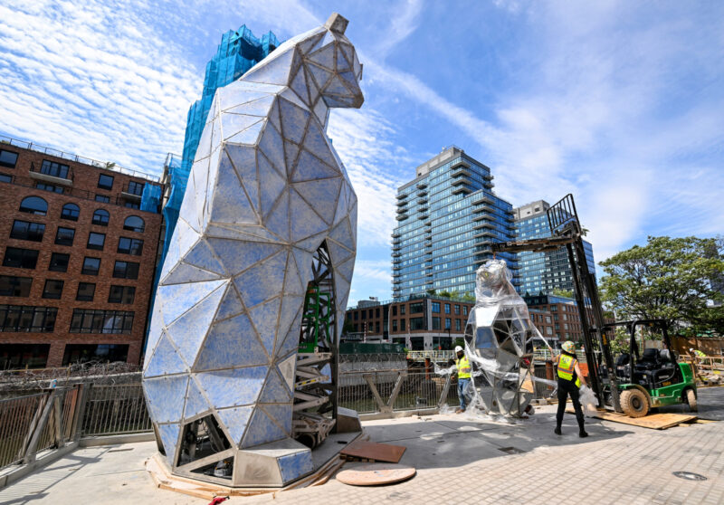
    For many public artworks, permanence is the exception rather than the rule. Jen Lewin’s The Ursas, however, has made the uncommon leap from the ephemeral landscape of Burning Man to a permanent installation along Brooklyn’s evolving Gowanus waterfront, where the monumental sculptures now anchor a newly accessible stretch of the canal.

    A metallic sculpture, Jen Lewin The Ursas, is being installed on a bridge over a canal in a city, with modern high-rise buildings and construction cranes in the background.

    ‘The Ursas’ were installed at their new home along the Gowanus Canal on Aug. 1. Photography by Diane Bondareff/AP Content Services for Charney Companies and Tavros.

    Installed at Nevins Landing on Aug. 1, the paired sculptures occupy a prominent position between the residential towers and the canal. The development, designed by Fogarty Finger with waterfront landscape architecture by Field Operations, is part of the larger Gowanus Wharf campus. The project adds a new public landmark to a neighborhood undergoing dramatic physical and cultural transformation, as former industrial sites are increasingly giving way to housing, parks, and civic spaces.

    Workers on a lift install Jen Lewin’s The Ursas, a striking geometric animal sculpture, in an urban setting surrounded by high-rise buildings and construction scaffolding.

    Photography by Diane Bondareff/AP Content Services for Charney Companies and Tavros

    Inspired by the Ursa Major and Ursa Minor constellations, The Ursas explores ideas of navigation, orientation, and environmental stewardship. The larger of the two works, Ursa Major, rises 30 feet and is constructed from reclaimed ocean plastic originally sourced from Lewin’s 2022 installation The Last Ocean. Visitors can step inside the sculpture, where an infinity-mirrored chamber contains hand-drawn illustrations of species listed as extinct or presumed extinct on the IUCN Red List. Beside it, the 13-foot-tall Ursa Minor is clad in infinity mirrors and programmable LED lighting that creates an ever-shifting sense of depth and reflection.

    Construction workers install two large geometric bear sculptures from Jen Lewin’s The Ursas outdoors in an urban area, with modern buildings and a forklift visible in the background.

    Photography by Diane Bondareff/AP Content Services for Charney Companies and Tavros

    “The Ursas grew out of my research into the melting Ross Ice Shelf while developing The Last Ocean,” Lewin says. “What began as scientific inquiry became a personal reckoning with the scale and speed of environmental change.”

    Lewin describes Ursa Minor as “a beacon” seeking the North Star, while Ursa Major carries illustrations honoring recently extinct species. “Together, the works hold two realities at once: grief and responsibility, but also direction,” she explains. “They ask us not only to reflect, but to decide how we move forward.”

    Workers in safety vests install Jen Lewin’s The Ursas, a large geometric animal sculpture, next to a wrapped sculpture on a city waterfront construction site.

    Photography by Diane Bondareff/AP Content Services for Charney Companies and Tavros

    The installation also marks a notable moment for Gowanus, where public art is increasingly being positioned as part of broader neighborhood redevelopment rather than an afterthought. The Ursas become one of the first permanent artworks to define the identity of the four-building Gowanus Wharf campus. (The project—which will ultimately introduce more than 2,200 residential units along the waterfront—is being developed by Tavros Holdings in partnership with Charney Companies.)

    Before arriving at their new home, the sculptures made a dramatic journey across the Verrazzano-Narrows Bridge before being hoisted over Brooklyn’s Union Street Bridge and lowered into place along the canal. What began as a temporary installation in the Nevada desert in 2023 is now part of the everyday fabric of the city.

    Editorial Transparency: This article was developed with the assistance of AI tools, which may have been used for research, outlining, editing, or copy refinement. Reporting, fact-checking, and editorial decisions were made by the Design Milk editorial team.

  • Design Milk design-milk.com art design design-milk fashion interiors tech 2026-08-03 17:05

    ↗

    Dvira Interiors leaned into the penthouse’s late-’80s character by pairing its curved architecture with global influences, tactile materials, and immersive interiors

    A Toronto Penthouse Finds New Life by Celebrating Its 1980s Roots

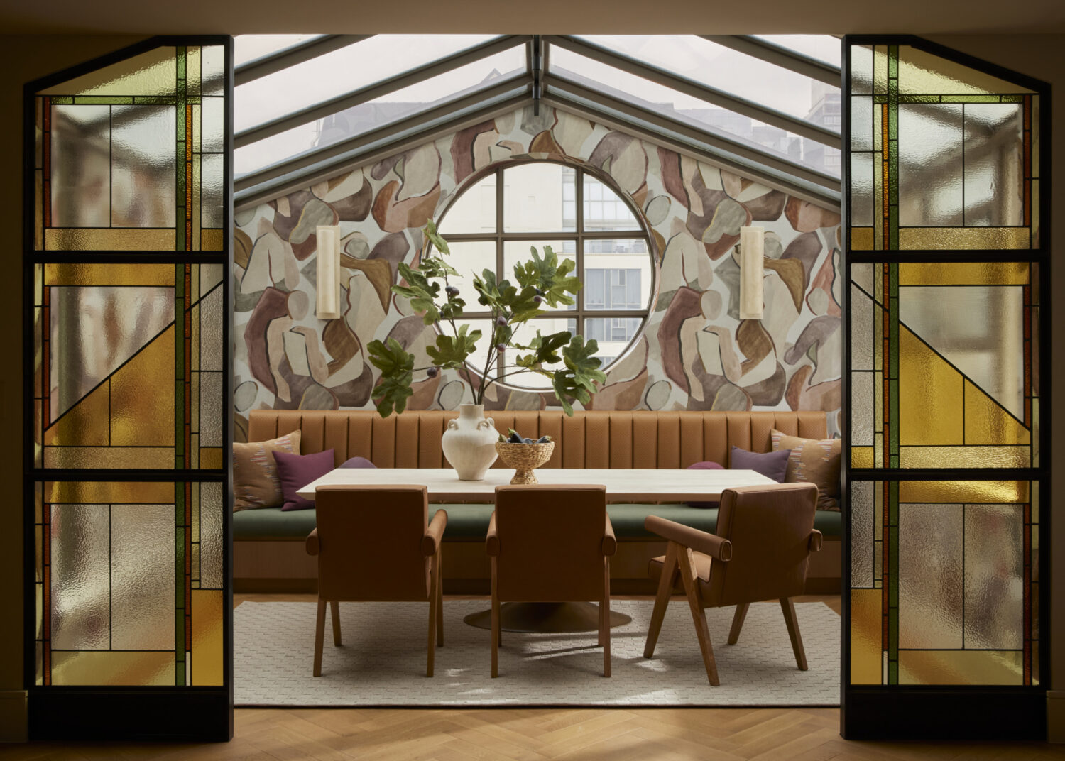
    Rather than disguising its 1980s origins, this three-story Toronto penthouse embraces them. Designed by Dvira Interiors for a creative couple in their 30s, the once-dated penthouse has been transformed into a layered sanctuary where sculptural architecture, earthy materials, and global influences coexist in effortless balance. 

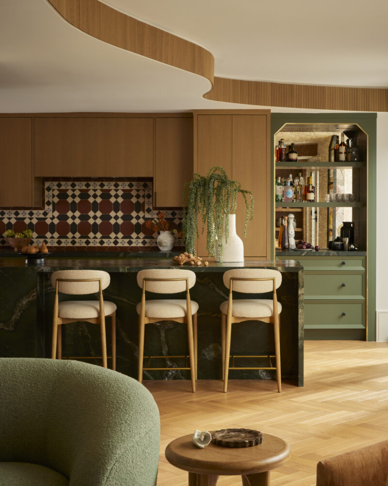
    Modern kitchen with wood cabinets, patterned tile backsplash, three bar stools, green accents, a curved ceiling detail, and a bar area with bottles and glassware in the background.

    Photography by Lauren Miller

    Located near Toronto’s historic St. Lawrence Market, the residence already possessed distinctive architectural bones, including subtly curved walls and dramatic half-arched windows characteristic of late-’80s modernism. Rather than flattening those details into something more conventionally contemporary, founder and principal designer Dvira Ovadia chose to amplify them. 

    “Throughout the apartment we discovered original walls that had subtle curves to them, a design feature we chose to celebrate and enhance further in our design,” Ovadia says. “By emphasizing and refining these curved walls, we reinforced the building’s inherent architectural language.”

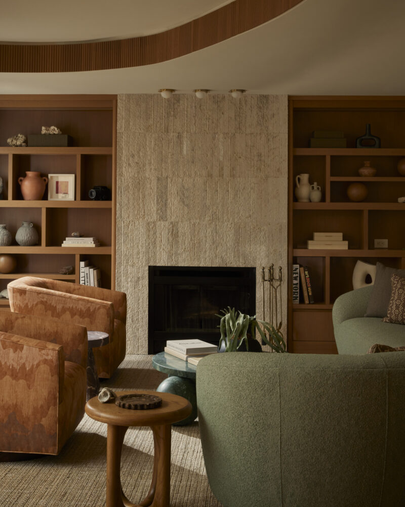
    A living room with a stone fireplace, built-in shelves, tan armchairs, a green sofa, and a round side table. Neutral tones and decorative vases create a warm, modern atmosphere.

    Photography by Lauren Miller

     The homeowners’ travels also informed the design, though the references remain subtle rather than literal. Drawing on the warmth of the Arizona desert, the lushness of Bali, and an effortless California ease, Dvira Interiors translated those influences into a palette of white oak stained in deeper honey tones, travertine, green marble, and richly textured finishes that feel warm, layered, and grounded. 

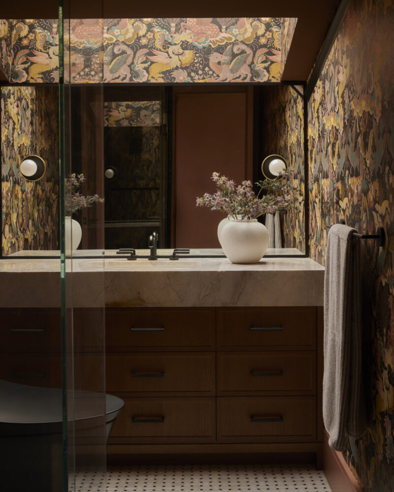
    A bathroom with floral wallpaper, a marble countertop, a large white vase with flowers, wall-mounted lights, and a towel hanging on a rack beside the sink.

    Photography by Lauren Miller

    Wallpaper becomes an architectural element rather than merely decorative, appearing across walls—and even ceilings—to create immersive environments unique to each room. A burlap-inspired covering envelops the primary bedroom, cork wallpaper adds tactile depth to the office, and lush botanical patterns reinforce the home’s connection to the outdoors.  

    “We drew strong inspiration from the jungle, most notably through the creative and expressive use of wallpaper throughout the condo, layering pattern and texture to bring depth and a sense of escapism to each space,” Ovadia says. The homeowners’ appreciation for the eclectic interiors of Austin’s Proper Hotel served as a point of reference for the home’s layered mix of pattern, texture, and atmosphere. 

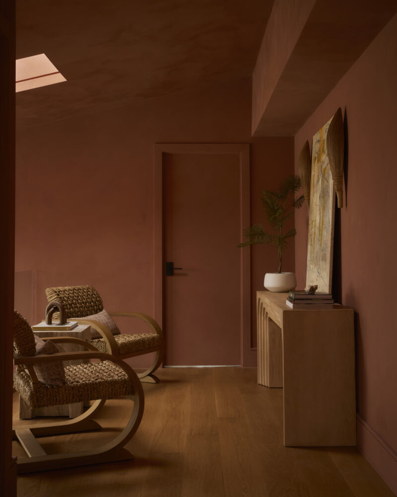
    A room with two woven chairs, a small side table, a console with a potted plant, and artwork on a wood floor, all in warm brown and terracotta tones.

    Photography by Lauren Miller

    That immersive quality reaches its peak on the third floor, where terracotta limewash coats nearly every surface, from walls and ceilings to doors and trim. The monochromatic treatment wraps the family room in cocooning warmth that shifts beautifully throughout the day as sunlight filters through the home’s expansive windows. Combined with a palette of earthy neutrals and honey-toned wood, the result is a retreat that feels worlds away from downtown Toronto.  

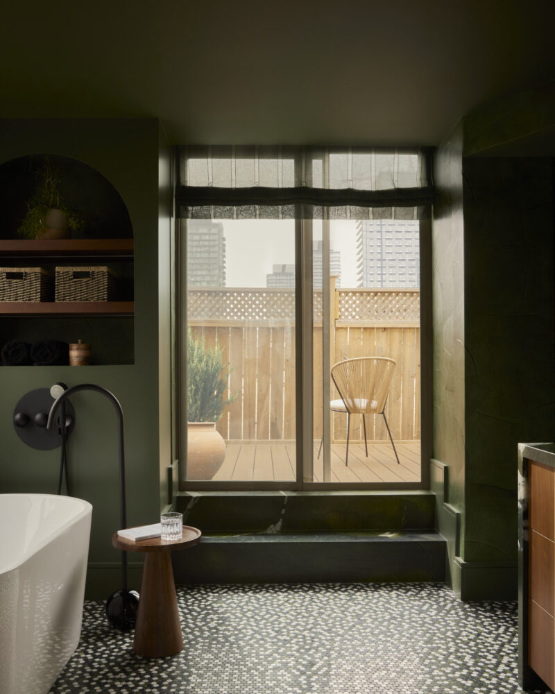
    Modern bathroom with a freestanding tub, black fixtures, a small wooden table, dark green walls, and a large window overlooking a balcony with a chair and potted plant.

    Photography by Lauren Miller

    Equally compelling is the penthouse’s relationship with the outdoors. Multiple balconies and patios extend from nearly every room, softening the line between inside and out while filling the home with natural light. The main level flows seamlessly between the kitchen, dining, living areas, and exterior terraces, while an open-to-above lounge visually connects the upper floors. 

    “We set out to create a home that feels equally suited for living, working, and entertaining,” Ovadia explains. “By fully embracing design through layered color, pattern, and texture across every room, wall, custom cabinetry, and furnishing, we achieved an atmosphere that feels immersive, welcoming, and uniquely their own.”  

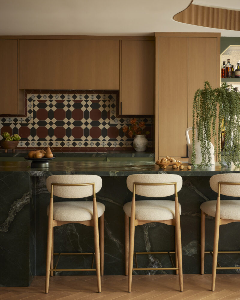
    Modern kitchen with wood cabinets, patterned tile backsplash, dark marble island, three upholstered barstools, and a potted plant on the counter.

    Photography by Lauren Miller

    The renovation also demanded creative problem-solving. Existing condominium infrastructure meant plumbing, HVAC, and ventilation systems could not easily be relocated. Midway through construction, the kitchen required a significant redesign after the original ventilation strategy proved impossible. Elsewhere, unforeseen plumbing conditions in the primary ensuite led to new bulkheads that the designers softened with graceful curves, transforming construction constraints into architectural features that now feel entirely intentional rather than imposed.  

    The finished residence resists easy categorization. It borrows the warmth of Mediterranean interiors, the lushness of tropical landscapes, and the sculptural confidence of late-modern architecture while remaining deeply personal to its owners. By working with the building’s original architecture instead of against it, Dvira Interiors created a home that feels at once rooted in its past and unmistakably contemporary. 

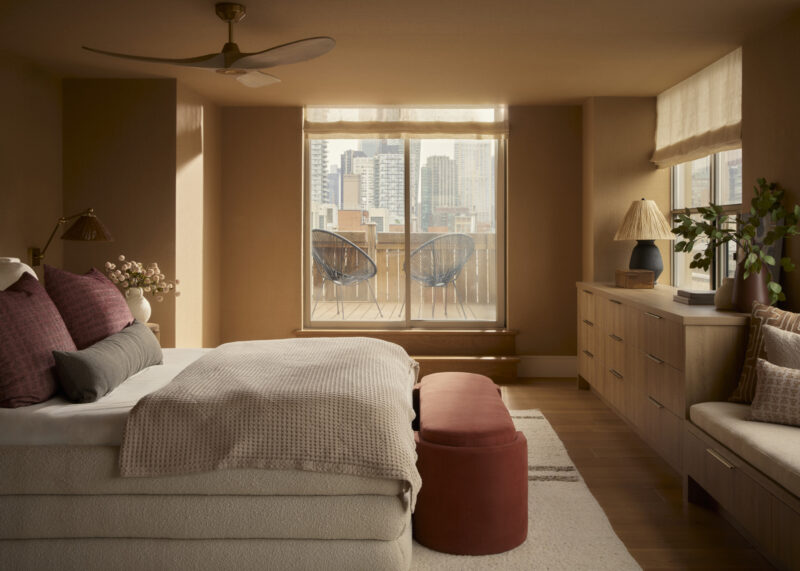
    Bedroom with beige walls, bed with pillows, red bench, wooden dresser, large window, city buildings view, and two chairs on the balcony.

    Photography by Lauren Miller

  • Design Milk design-milk.com art design design-milk fashion interiors tech 2026-08-03 15:18

    ↗

    Art goes beyond decor at Marty Hotel Bordeaux, where rotating exhibitions by local artists transform a boutique hotel into a cultural destination

    Marty Hotel Bordeaux Doubles as a Rotating Gallery for Local Artists

    Bordeaux is often regarded for its 18th-century limestone grandeur and UNESCO-listed classicism, as well as its role as the gateway to one of the world’s premier wine regions. A 10-minute walk from the historic Saint-André Cathedral, the Mériadeck district is defined by bold, 1970s brutalist-inspired modernist blocks and a brimming art scene. It’s here, amid a revitalized concrete landscape, that Marty Hotel Bordeaux has put down roots, not just as a boutique hotel tucked away from the tourist-heavy city center, but as an art hub for the surrounding community. The 61-key, independently managed urban stay is part of Hilton’s premium Tapestry Collection.

    Spacious lounge with mid-century chairs, modern chandelier, fireplace, wooden floor, abstract art, and large windows.

    Photography courtesy of Tapestry Collection by Hilton

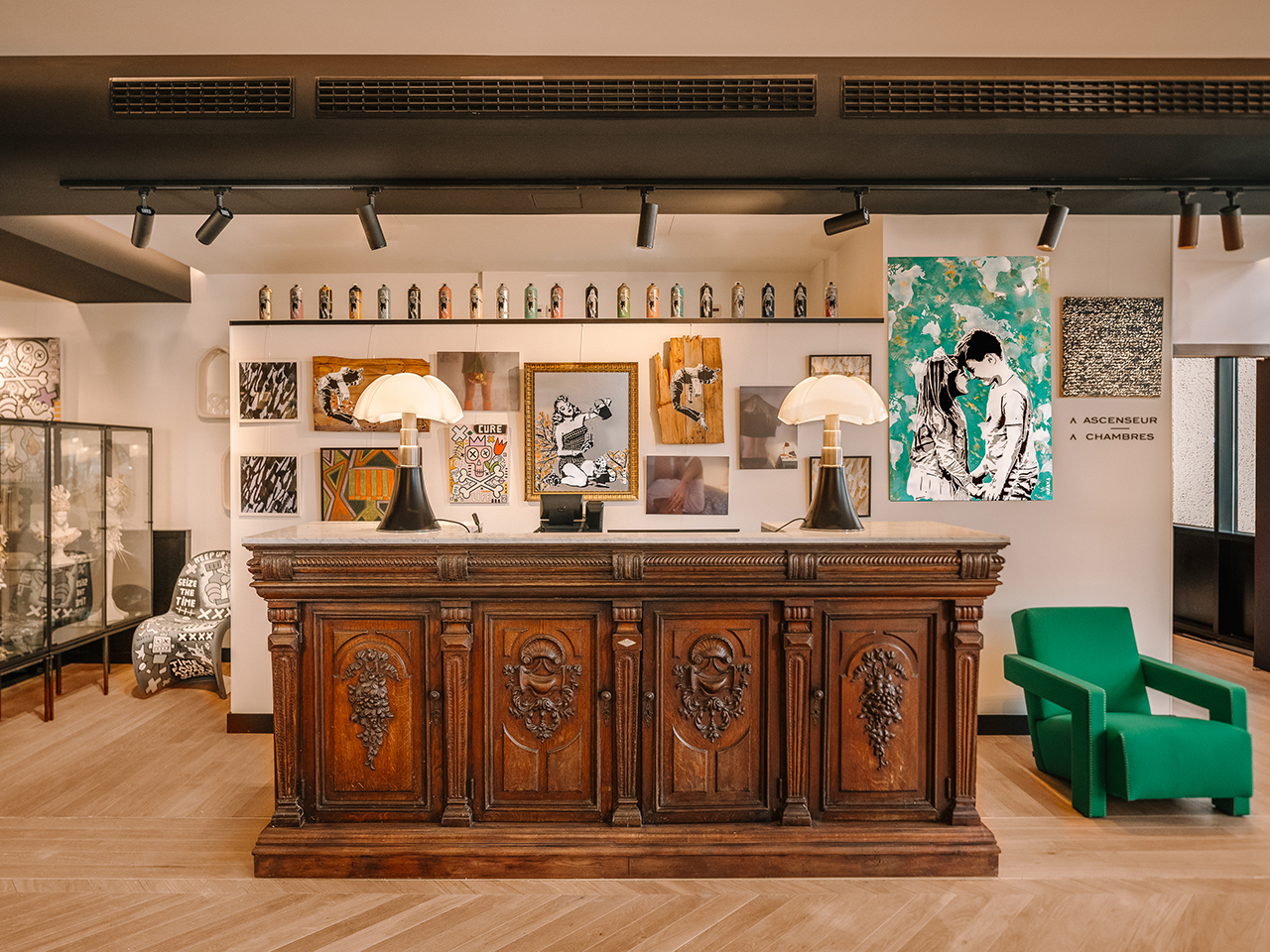
    The 4-star hotel’s name is a clever portmanteau—blending the “M” of Mériadeck with “arty”—signaling its intention to serve as a meeting point between the neighborhood’s commercial and industrial origins and its burgeoning creative scene. Home to the main restaurant, reception desk, and glass-walled business center and lounge, the ground-floor lobby hosts revolving exhibitions of Street, Pop, and Muralist movement-inspired art by mostly local artists, curated by MAGNETIC Gallery and L’Artillerie.

    Modern bar with a long counter, barstools, colorful armchairs, small round tables, and contemporary artwork on the walls. Neutral lighting creates a warm and inviting atmosphere.

    Photography courtesy of Tapestry Collection by Hilton

    “The idea for us was to present guests of the hotel with the chance to have an authentic perspective on a part of Bordeaux culture that doesn’t just focus on wine or historic architecture,” says Pierre Lecaroz, founding principal of MAGNETIC. “It’s been a veritable commercial success.”

    Hotel guests or visitors can purchase a piece on display and take it with them immediately (shipping is offered for larger pieces). The program benefits both artists and guests. And, although the hotel doesn’t take a commission, the program helps solidify its place in the arts district while attracting visitors for this specific amenity.

    Modern bar with seven green barstools, shelves of liquor bottles, ornate ceiling lights, and a framed artwork of a person with outstretched arms behind the counter.

    Photography courtesy of Tapestry Collection by Hilton

    Conceived as a “creative laboratory,” Marty Hotel eschews the static nature of traditional “white cube” galleries. Instead, it functions as a living, immersive experience where art is not merely decorative but integrated as a fundamental language of hospitality. Frequent exhibitors include the Monkey Bird Crew, Xavier Jambon, and Ërell.

    Modern lounge with a long wooden table, five black chairs, pendant lights above, and mixed seating areas in the background.

    Photography courtesy of Tapestry Collection by Hilton

    Beyond the artwork, the hotel has a sophisticated mid-century modern design vocabulary that mirrors the neighborhood’s architectural heritage. The interiors fuse raw industrial materials with warm wood paneling, vintage furniture, and layered textures. In the lobby, this industrial-chic aesthetic is anchored by a dramatic marble bar illuminated by Belle Époque chandeliers—a space that transitions seamlessly from a daytime coworking hub to a social gathering space at night. The restaurant’s comprehensive menu further reinforces a sense of place: The wine list naturally leans into nearby Margaux and Saint-Émilion, while charcuterie and fromage boards are locally sourced.

    Modern bar with marble countertop, four stools, glass shelves stocked with bottles, and ornate ceiling lights. Dining tables and decorative plants in the background.

    Photography courtesy of Tapestry Collection by Hilton

    The guest rooms carry this pared-back, warm aesthetic. Cozy and functional, they feature book-lined shelves and industrial lighting. Many come with terraces that overlook the neighborhood’s modernist grid. The materiality throughout is tactile and intentional, reinforcing the hotel’s dialogue between historical and contemporary influences.

    A modern bedroom with a green paneled headboard, white bedding, two marble nightstands, wall art above the bed, and contemporary lighting fixtures.

    Photography courtesy of Tapestry Collection by Hilton

    Marty Hotel Bordeaux is more than a place to sleep. It’s an immersive window into the dynamic, contemporary creative community currently reshaping the southern metropolis. It illustrates Hilton’s approach to the Tapestry Collection. Each of the 135 upscale lifestyle destinations in this global portfolio celebrates the distinct, vibrant personality and localized charm of their setting. Rather than adhering to a one-size-fits-all approach favored by business travelers, these properties are designed and programmed to encourage an off-the-beaten-path experience.

  • Design Milk design-milk.com art design design-milk fashion interiors tech 2026-08-01 13:00

    ↗

    From solar-powered outdoor lighting to 3D-printed homewares, these eco-conscious picks prove sustainable design can still be chic

    6 Sustainable Home Furnishings for Healthy Living

    For those of us striving to make our homes more sustainable, the magnitude of the task can often seem overwhelming. Unless you’re able to live a fully off-grid lifestyle, it may feel like small design decisions don’t make a difference. In reality, the items you choose to bring into your home matter, and purchasing with longevity in mind is key to designing homes that last. Below, we share six uber-sustainable home furnishings that will help you style your home without sacrificing sustainability.

    Six colorful vases hold assorted flowers, alongside a blue bowl with lemons and a black bowl with peaches, all arranged on a white surface with a plain white background—an inviting display that perfectly complements sustainable home furnishings.

    Photography by Arseni Khamzin; courtesy of Cyrc

    1. Cyrc

    For Cyrc, circularity is synonymous with style. The Montreal-based brand’s sculptural vases, bowls, and planters are designed in a closed-loop system—all products are 3D-printed and produced on demand, which eliminates surplus materials, warehouse costs, and waste. Plus, Cyrc boasts a formidable end-of-life program: Once you’re finished with a product, you can send it back to be recycled into something new. Aside from sustainability, their modern designs and sweeping silhouettes are equally alluring.

    Six minimalist, mushroom-shaped objects with wooden bases and smooth, rounded tops are arranged on a flat, neutral surface, casting soft shadows in the background—an elegant example of sustainable home furnishings that blend natural materials with modern design.

    Photography courtesy of Pebl

    2. Spark Collection by Pebl

    Available in three distinct materialities—teak, travertine, and aluminum—the Spark Collection by Belgian-designed brand Pebl offers a sophisticated take on solar outdoor furniture. With playful silhouettes resembling elevated gnomes, Spark lights absorb sunlight during the day and use their stored energy at night to illuminate automatically. Plus, all teak lamps are crafted from offcuts of wood furniture.

    Four geometric furniture pieces made of colored wire mesh are arranged against a plain beige background, including a blue zigzag table, a green shelf, and a red chair with a wooden seat—each thoughtfully designed as part of sustainable home furnishings.

    Photography by PJ Couture; courtesy of Lauren Goodman Studio

    3. Fresh Catch by Lauren Goodman

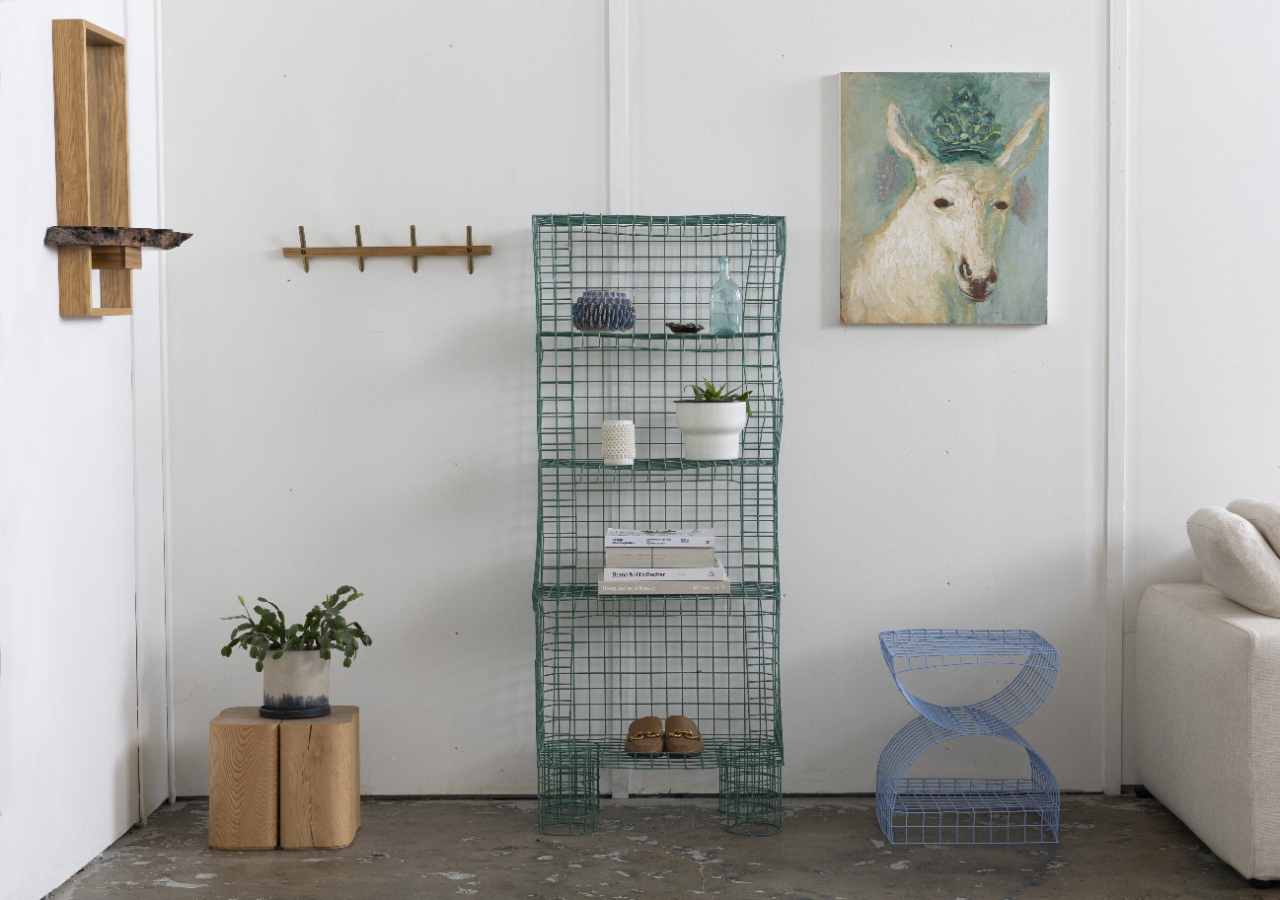
    Fresh Catch, by Montreal-based designer Lauren Goodman, was born from a rich sustainability story. Her sculptural pieces are made from abandoned lobster traps handpicked off the coast of Maine, where discarded fishing gear produces staggering annual waste and smothers nearby ecosystems. The raw material is reworked and thoughtfully welded to create a collection of one-of-a-kind home furniture. Exhibited at NeoCon this year, the Fresh Catch collection has a distinct, streamlined look that shows how reclaimed material can still be chic.

    A wood-burning stove is centered between a wooden cabinet and open shelving filled with dishes, all set against a tile floor and light wood ceiling that showcases sustainable home furnishings throughout the space.

    Photography courtesy of Inglis Hall

    4. Larder Cupboard. Chalk by Inglis Hall

    Built for acclaimed designer Jay Osgerby, the Larder Cupboard. Chalk by UK-based bespoke kitchen makers Inglis Hall started as a pair of utilitarian wood cabinets. Refined through premium materials, precise proportions, and a more functional inside, the updated freestanding cabinets are now a considerable presence yet still quite soft and appealing. The tension lies in its dual personality: open, the cabinets expand to offer a wide display, while closed, the forms are monolithic. Made to order in the brand’s Sussex studio, the handmade Larder Cupboard. Chalk is built to last in larch, raw oak, or walnut

    A modern bedroom featuring sustainable home furnishings, including a wooden adjustable bed—one side raised—situated beside a nightstand with a lamp and a window that lets in natural light.

    Photo courtesy of Avocado Green Mattress

    5. City Bed Frame by Avocado Green Mattress

    For a stylish yet sustainable bed frame, real wood is key. The City Bed Frame by Avocado Green Mattress places high-quality wood at the forefront: The low-profile platform is crafted from FSC-certified North American timber, available in natural blonde wood or solid American walnut. Handmade in Avocado Green’s woodshops, the bed frame features long, continuous solid-wood boards—no particleboard, paneling, or veneers here. Although it takes less than 45 minutes to assemble, the City Bed Frame doesn’t compromise on durability. The design is rated to support up to 1,000 pounds, while gently rounded edges soften the silhouette and enhance safety. Organic cotton ribbing beneath the slats helps minimize wood squeaks, while an adjustable base accommodates taller pillow-top mattresses or box spring setups for a highly customizable sleep experience.

    Three modern armchairs with ribbed bases and curved backs in beige, green, and brown—crafted as part of our Sustainable Home Furnishings collection—are arranged in a semicircle on a plain white background.

    Photography courtesy of Andreu World

    6. Bolete Lounge BIO by Andreu World

    A titan of the circular design industry, Andreu World was the first furniture company in the world to obtain 100 percent FSC certification. Bolete Lounge BIO is a testament to that. Designed by acclaimed designer Patricia Urquiola, its internal structure is made of seating foam and 100 percent recycled BIO thermopolymer—a fully recyclable, biodegradable, and compostable plastic that resembles the profile of wood. A delightful presence, the grooved texture of the base and the puffed upholstery feel modern and elevated.

  • Design Milk design-milk.com art design design-milk fashion interiors tech 2026-07-31 20:46

    ↗

    From a George Nelson home in Montauk to the beaches that fuel her creativity, the architect and designer shares 5 personal inspirations—and 5 projects that define her work.

    Lauren Rottet Shares the Places, Projects, and Inspirations That Shape Her Design

    Lauren Rottet already had a designer’s mindset as a child, creating structures at her home in Waco, Texas. “I did not realize it at the time, as I was only 5, but I spent most of my time outside building treehouses, digging lakes, and master-planning our backyard,” she says.

    Rottet’s family moved to Houston, where she was impressed by the various structures that dotted the downtown skyline—but was disappointed by the offices, which she thought were boring. In a full-circle moment years later, when Rottet was an architect at SOM, she designed spaces in the very same places and made sure they were just as compelling as the exteriors.

    She founded Rottet Studio in 2008, and since then the firm has completed more than 90 million square feet of built design. Her contemporary aesthetic is steeped in luxury, seen in the hotel properties, private residences, and even the ships that she envisions.

    Rottet launched her furniture company, Rottet Collection, in 2017 as a complement to her signature interiors. With lines that reference the art of James Turrell and Robert Irwin, the pieces double as sculpture in a variety of settings.

    Today, Lauren Rottet joins us for Friday Five!

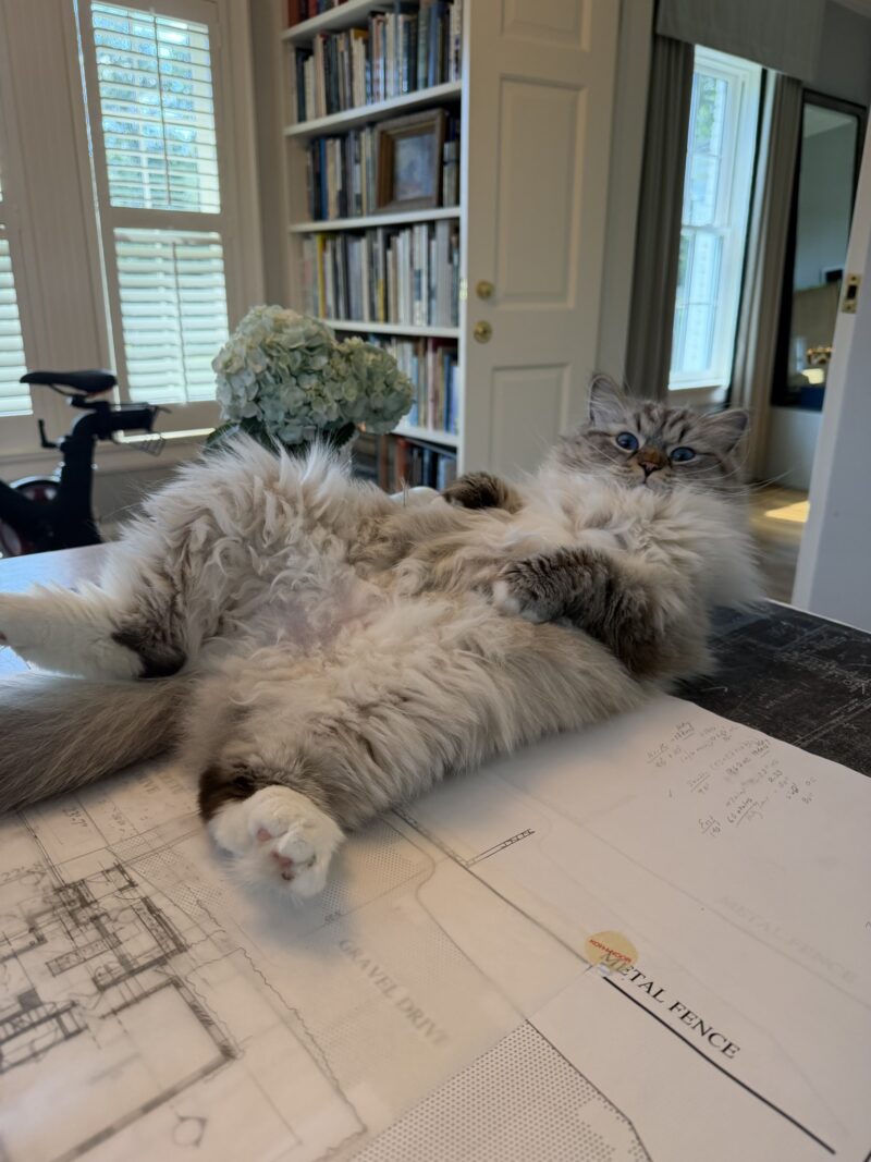
    Fluffy cat lying on its back atop architectural plans on a table in a home office with bookshelves and a window in the background.

    Photography by Rebecca Moses

    1. My Siberian Cat

    I love working on architectural and design plans at home with my Siberian partner, Sirree.

    Stylized painting of a woman with dark skin, short textured hair, large white flowers, hoop earrings, a bow tie, and a gold necklace against a blue background.

    Art courtesy of Rebecca Moses

    2. Rebecca Moses Artwork

    I have always been enchanted by the art pieces of my dear friend Rebecca Moses. Her kindness and grace are matched only by her immense talent.

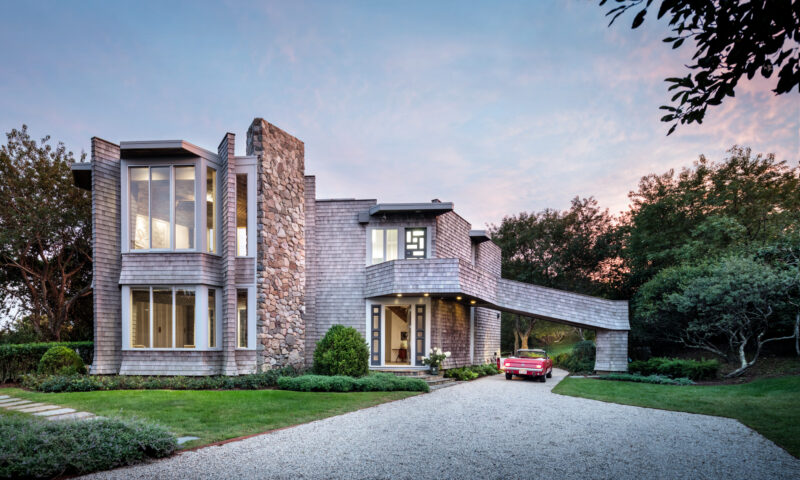
    Modern two-story house with stone and wood exterior, large windows, and a driveway leading to a red car parked outside amid landscaped greenery at dusk.

    Photography by Scott Frances Photography

    3. George Nelson and Gordon Chadwick 1962 Home in Montauk

    I own a replica of this home, which was built by the son of the original owners using the original plans and original built-in millwork, light fixtures, and some furnishings. This home is one of the most wonderful examples of mid-century modernism, when creatives like Nelson, Charles, and Ray Eames embraced organic shapes to create an emotional bond between humans and nature. Every room in the home is a hexagon, used for the efficiency of its shape.

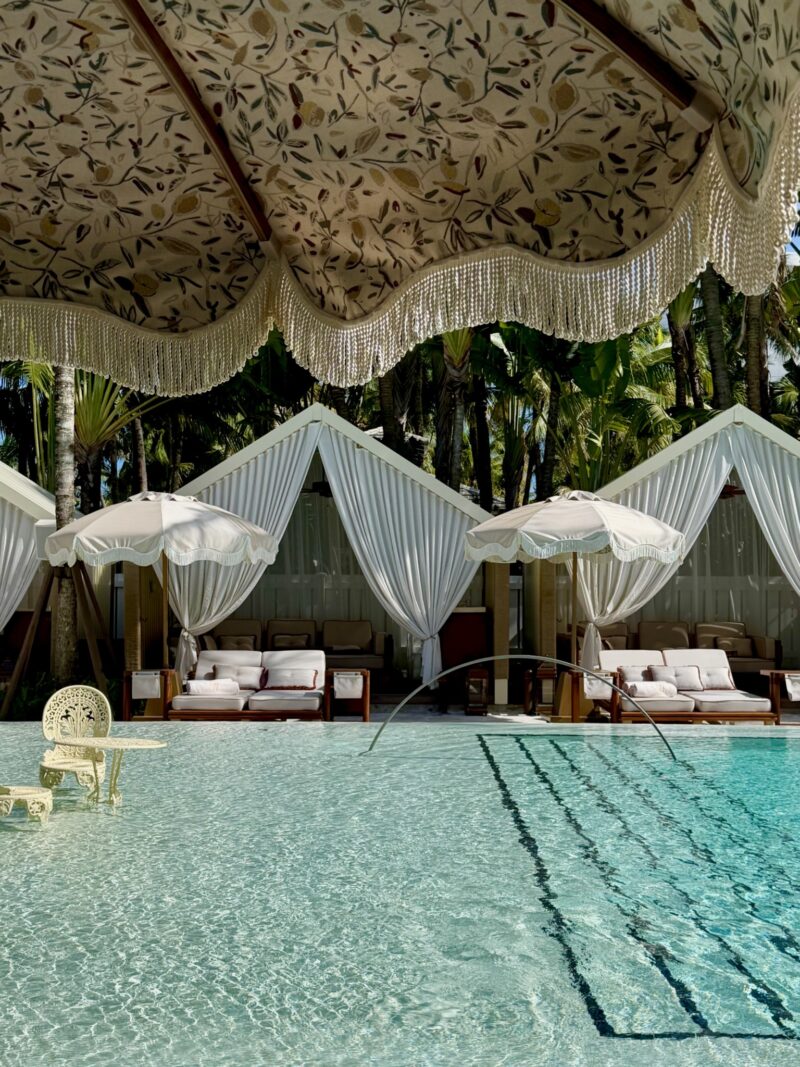
    Luxurious poolside cabanas with white drapes and umbrellas beside a clear swimming pool, surrounded by palm trees and an ornate canopy overhead.

    Photography by Lauren Rottet

    4. The Delano Hotel in Miami Beach

    The newly reopened hotel has kept some of the elements that have made it iconic through the years, such as the depth of the gorgeous pool.

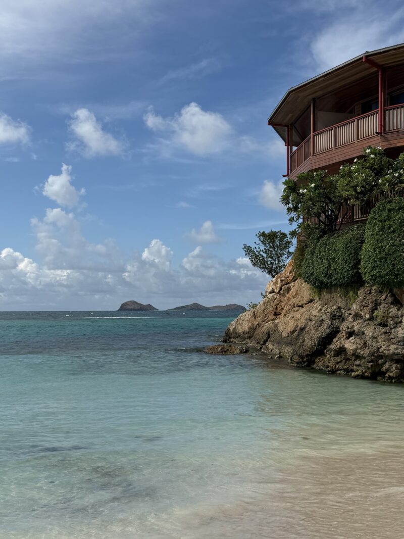
    A wooden balcony overlooks clear turquoise water and a rocky shoreline, with distant islands visible under a partly cloudy sky.

    Photography by Lauren Rottet

    5. Beaches

    The dichotomy of the powerful international connection and the perceived calmness is empowering and inspiring to me. I look, and all I see is light blue, dark blue, and many shades with hints of yellow sunlight or gray clouds—the calmness rests my mind and allows me to think. I always come back full of ideas and energy. I find that all beaches inspire, but not all relax. Some terrify, some motivate, and some calm. For me, it takes knowing a beach to relax around it.

    Works by Lauren Rottet

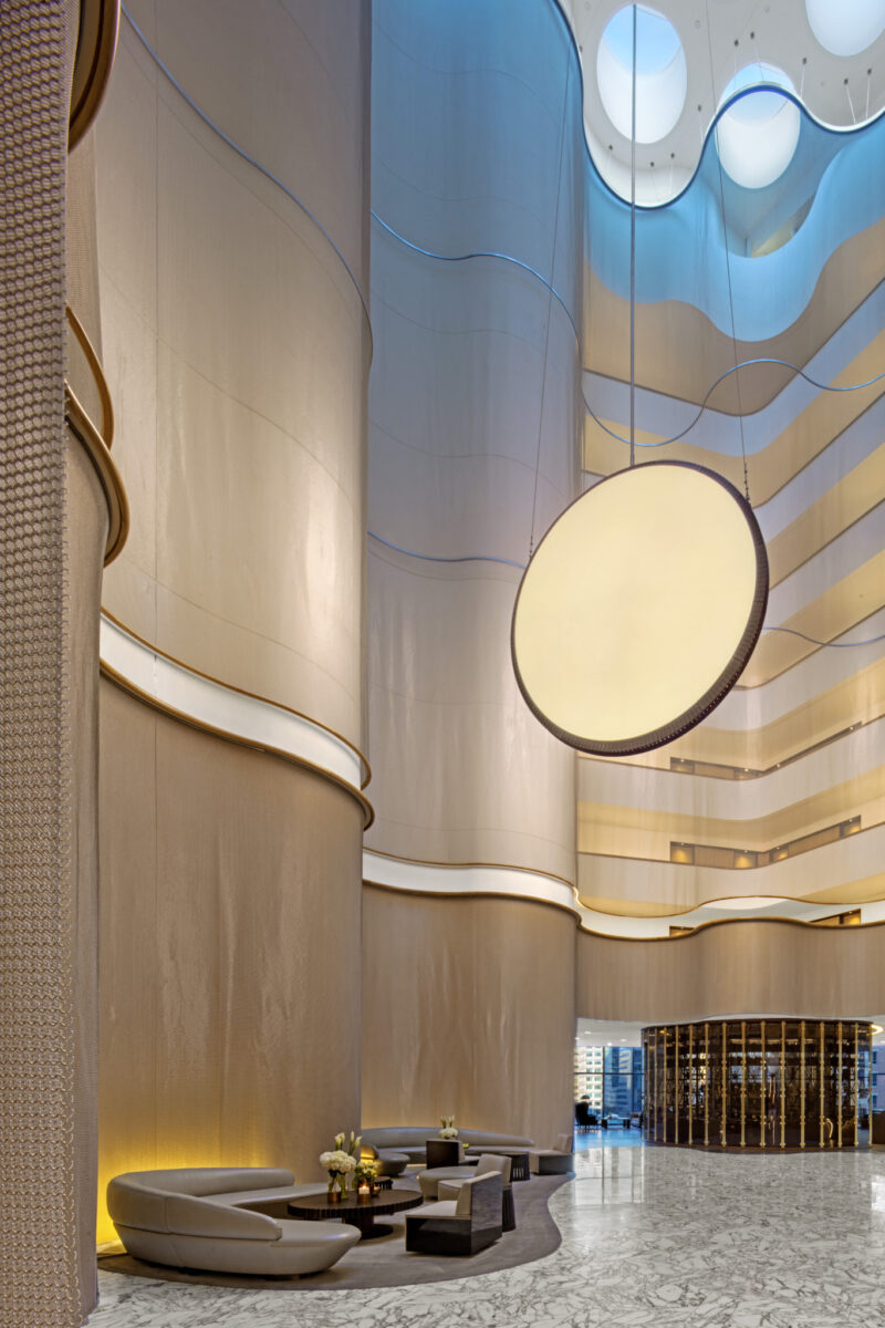
    Spacious modern hotel lobby with tall curved beige walls, a large circular light fixture, marble floors, and contemporary seating arrangements.

    Photography courtesy of Hilton

    1. Conrad Washington D.C. at City Center, Washington, D.C.

    The Conrad Washington D.C. is a classic representation of understated, stately power, reassurance, and comfort from early America to now. Herzog de Meuron created a building uniquely shaped by its surroundings to graciously house the Conrad. When designing a new hotel, I look at a city’s historical context and current influences.

    Modern lounge with armchairs, coffee tables, a large abstract painting, chandelier, fireplace, and floor-to-ceiling windows overlooking greenery.

    Photography courtesy of Lauren Rottet

    2. River Oaks Houston

    The building underwent a major renovation and complete overhaul of a 1963 concrete structure. Though it is now completely different aesthetically from the original building, it still preserves one of Houston’s great modern structures. The clean lines and modernist, minimalist attitude of the original building were maintained and enhanced. The modernist notion of indoor and outdoor spaces blending seamlessly is celebrated in our design approach.

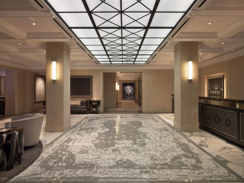
    A spacious, elegant hotel lobby with marble floors, modern lighting, lounge seating, and framed artwork on the walls.

    Photography courtesy of Corinthia

    3. The Surrey Hotel

    The Surrey will always hold a special place in my heart as my first hotel design that was ranked the #1 hotel in New York for 10 years in a row.

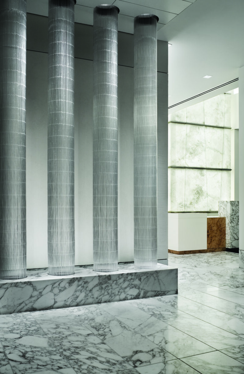
    Modern interior with four tall cylindrical columns, marble floors and walls, and natural light from large frosted windows.

    Photography courtesy of Lauren Rottet

    4. Paul Hastings LLP’s New York Office

    This office set the tone for my interiors career, and the lessons I took from this project continue to inspire me through smart spatial planning, lighting design, strategically placed mirrors, and art curation.

    Modern living room with floor-to-ceiling windows, gray sectional sofa, marble fireplace, minimalist decor, and views of an outdoor lawn.

    Photography courtesy of Lauren Rottet

    5. The Stolle House

    It is a contemporary reflection of a Mediterranean home. The rustic details combined with contemporary architectural details are a dream.

  • Design Milk design-milk.com art design design-milk fashion interiors tech 2026-07-31 14:48

    ↗

    The award-winning refrigerator backup battery swaps bulky utility hardware for a slim, appliance-inspired design that feels at home in contemporary kitchens

    Jackery’s FridgeGuard Makes Backup Power Kitchen-Friendly

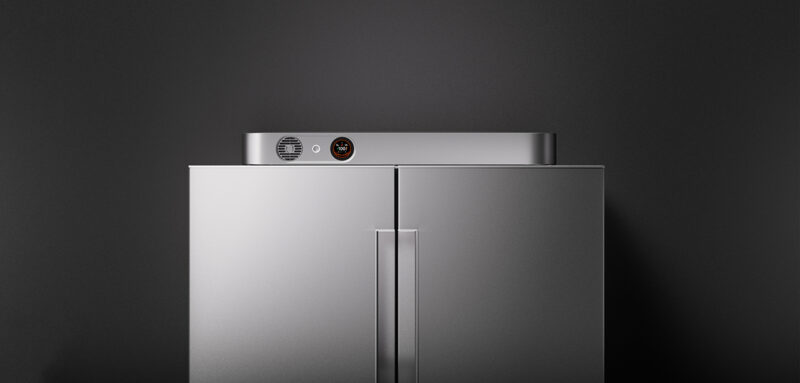
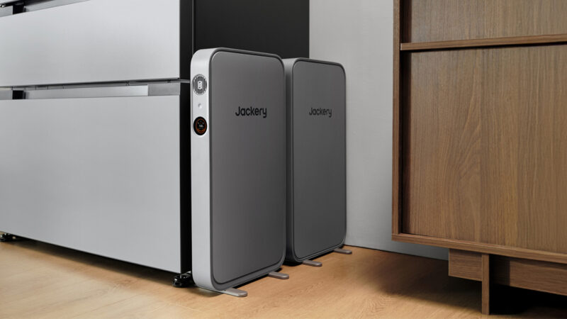
    Historically, residential backup power has been defined by bulky, industrial hardware—unwieldy generators and oversized batteries relegated to the utility room or basement out of aesthetic necessity. Jackery, a California-based home energy company, is changing this convention with FridgeGuard. The ultra-slim smart battery blends in seamlessly with stainless steel appliances. Contoured with sleek, rounded edges reminiscent of laptops and portable chargers, FridgeGuard can stand alongside other high-design kitchen appliances.

    A metallic double-door refrigerator stands against a dark gray wall, featuring a small control panel and vent on the top edge.

    Photography courtesy of Jackery

    A 2026 iF Design Award recipient, FridgeGuard represents a significant pivot for Jackery. Moving away from the brand’s signature rugged orange-and-black colorway, the unit debuts a sophisticated silver finish and a minimalist silhouette. The shift reflects a broader effort to transform backup power from utilitarian equipment into an object that feels at home in contemporary interiors. At just 2.6 inches thick and weighing 23 pounds, Jackery says it is the world’s slimmest and lightest refrigerator backup solution.

    Two Jackery branded portable battery units are placed upright on a light wood floor between a black-white cabinet and a wooden dresser.

    Photography courtesy of Jackery

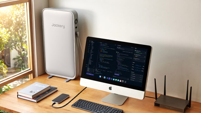
    Beyond its appearance, FridgeGuard is engineered for the specific high-draw demands of compressor-driven appliances. The unit features FridgeSafe Technology, which includes a sub-10ms UPS switchover to ensure that refrigerators never lose power during a grid failure. This instant response is critical for protecting temperature-sensitive items such as groceries and medications. With a 1024Wh capacity, a single unit provides up to 15 hours of off-grid runtime, which can be doubled to 30 hours when paired with an expansion battery. It can also power other household devices and appliances, including desktop computers, televisions, defibrillators, and air-conditioning units.

    A desktop computer, keyboard, and router sit on a wooden desk near a window, with a large Jackery device placed upright beside them.

    Photography courtesy of Jackery

    The product can also integrate into a broader smart home system via remote monitoring and time-of-use scheduling, allowing users to charge during off-peak hours to reduce energy costs. For installation, homeowners can choose between floor-standing, bracket-mounted, or wall-mounted configurations, further emphasizing its role as a permanent, integrated lifestyle asset rather than simply emergency equipment. Its somewhat retro-style dial adds to its pared-back yet distinctive aesthetic. Together, these details reinforce the idea that residential backup power no longer has to be tucked away—it can be thoughtfully designed as part of the home itself.

  • Design Milk design-milk.com art design design-milk fashion interiors tech 2026-07-30 19:58

    ↗

    SIGLA Studio places the bathroom at the center of a compact Barcelona apartment, challenging long-held assumptions about privacy and the way we live at home

    What If the Bathroom Became the Center of the Home?

    Pierre Bonnard, the French Post-Impressionist artist, never painted a bathtub as something to hide. In his interiors, the tub sits in the same light as the breakfast table, surrounded by wallpaper and windows, folded into the rhythm of an ordinary day rather than sealed behind a door. This apartment in Barcelona’s Turó Park neighborhood echoes that sentiment. A bathtub sits in full view of the living room, framed by an arched doorway and set beneath a vaulted ceiling of glazed green tile, as though someone had simply left out the wall.

    A glass door with a green frame and arched window opens to a room with bunk beds. Walls are wood-paneled; the floor is beige. The scene is softly lit with natural light.

    Photography by Marta Vidal

    Completed earlier this year, the 635-square-foot apartment was designed by SIGLA Studio for a client relocating to Barcelona. Her previous home was composed of fragmented rooms with little natural light. A new city presented an opportunity for a different way of living, so she traded that compartmentalization for open space and uninterrupted light. At the center of the resulting plan is a doorless bathroom that can be screened by glass when privacy is required.

    A minimalist living room with beige walls, a green sofa, a dark geometric coffee table on a patterned rug, built-in shelves holding decor, and a framed abstract painting leaning against the wall.

    Photography by Marta Vidal

    Along one side runs a galley kitchen wrapped in reflective aluminum-clad plywood, practical and understated. The bathroom, by contrast, is the belle of the ball—the space around which the apartment is organized. A freestanding stainless steel vessel sink sits beside the tub, while fluted glass catches and scatters the available light.

    A modern bathroom with green tiled walls and arched ceiling, a stainless steel sink, and vertical wall lights on either side of a mirror.

    Photography by Marta Vidal

    A modern bathtub is set within green tiles beneath an arched window, with a side table holding a glass and orange flowers nearby.

    Photography by Marta Vidal

    The enclosure is entirely bespoke. “The pivoting glass enclosure was custom designed by our studio and fabricated by our local metalworker specifically for this project,” says SIGLA Studio co-founder Bernat Riera. “It isn’t a standard commercial system or branded product.” During everyday use, the enclosure remains open, allowing natural light to pass through the bathing area and into the rest of the apartment.

    A green-tiled doorway leads to a room with orange walls, a window, a tan rug, a pink ladder, and a cushion on the floor. Vertical light strip glows by the wall.

    Photography by Marta Vidal

    SIGLA Studio’s response was rooted in a simple question: Why should the kitchen alone get to be sociable while every other private function stays hidden? The design removes the rigid hierarchy that typically separates public and private spaces, replacing it with a compact central volume that brings the kitchen, bathroom, and dressing area together.

  • Design Milk design-milk.com art design design-milk fashion interiors tech 2026-07-30 19:23

    ↗

    With its first New York City Lounge, MB&F creates a space for collectors—and unveils an exclusive LM101 EVO NYC Edition to commemorate the opening

    MB&F Has a New Home in Manhattan—and a New Watch to Mark the Occasion

    MB&F, one of independent watchmaking’s most inventive brands, celebrated a major milestone earlier this month with the opening of the first-ever MB&F Lounge in New York City. The concept space blends business operations with a hospitality-minded showroom and lounge. It is MB&F’s second directly managed retail venture, following the opening of the MB&F M.A.D.Gallery in Geneva 15 years ago, and marks a significant expansion of the brand’s U.S. presence after more than two decades of working through retail partners across the country.

    A modern office conference room featuring a large wooden table, light-colored chairs, a white credenza, a wall-mounted display, and large windows with a city view.

    Photography courtesy of MB&F

    The new MB&F Lounge is located on the fifth floor of Manhattan’s historic Fuller Building, at the corner of Madison Avenue and 57th Street. The vision behind the space was to allow guests to discover exceptional timepieces at a more relaxed pace and spend time surrounded by mechanical art. Designed in collaboration with Swiss-based Voltige Design & Architecture, the Lounge is flooded with natural light and characterized by flowing architectural lines, warm wood finishes, and a curated mix of objects that make it feel more like a private salon than a traditional retail space.

    Modern meeting room with a round wooden table, four chairs, white cabinets, and abstract art on the walls in a minimalist, well-lit space.

    Photography courtesy of MB&F

    Given that MB&F produces only 400 to 500 watches each year, the Lounge isn’t intended to function like a traditional luxury boutique. Instead, it reflects the independent watchmaker’s emphasis on cultivating relationships with collectors, offering a more intimate setting where visitors can discover the brand’s timepieces and connect with the people behind them.

    A person in a purple jacket zips it up, revealing a wristwatch with a black strap and visible watch mechanism on their left wrist.

    Photography courtesy of MB&F

    To mark the opening, MB&F also introduced a 25-piece LM101 EVO NYC Edition available exclusively through the New York Lounge. The original LM101 debuted in 2014; last year, MB&F marked its 20th anniversary by introducing the EVO, adding increased water resistance, a screw-down crown, a longer 60-hour power reserve, and a Super-LumiNova-enhanced display.

    The LM101 EVO NYC Edition maintains those updates and marks the first time the model has been offered in an 18K rose gold case. Paired with a black PVD-treated dial plate featuring a sunray-brushed finish, the combination gives the watch a dressier character despite its integrated rubber strap. Turning the watch over reveals a caseback engraved “MB&F NYC,” a subtle tribute to the Lounge’s opening.

    A luxury wristwatch with a black face and gold casing rests on a surface, with a modern cityscape and beams of light in the background.

    Photography courtesy of MB&F

    The MB&F Lounge New York is open weekdays from 9 a.m. to 6 p.m. by appointment only at 595 Madison Avenue, Suite 506, in New York City.

  • Design Milk design-milk.com art design design-milk fashion interiors tech 2026-07-29 15:50

    ↗

    September Collective’s first in-house design transforms the Bantu knot into a hand-blown glass vase, created with Kitengela Glass artisans in Kenya

    This Sculptural Vase Reimagines the Bantu Knot in Glass

    Leslie Rivers didn’t set out to start her own modern African home decor and art brand. But when the founder and curator went looking for high-quality pieces available locally and came up short, she decided to take on the challenge herself. Enter: September Collective, a curated homeware brand that celebrates African ancestry in modern living. Based in Toronto, Rivers sources handcrafted objects from across Africa and the African diaspora—from intricate, handwoven Ghanaian placemats to sculptural wooden furniture.

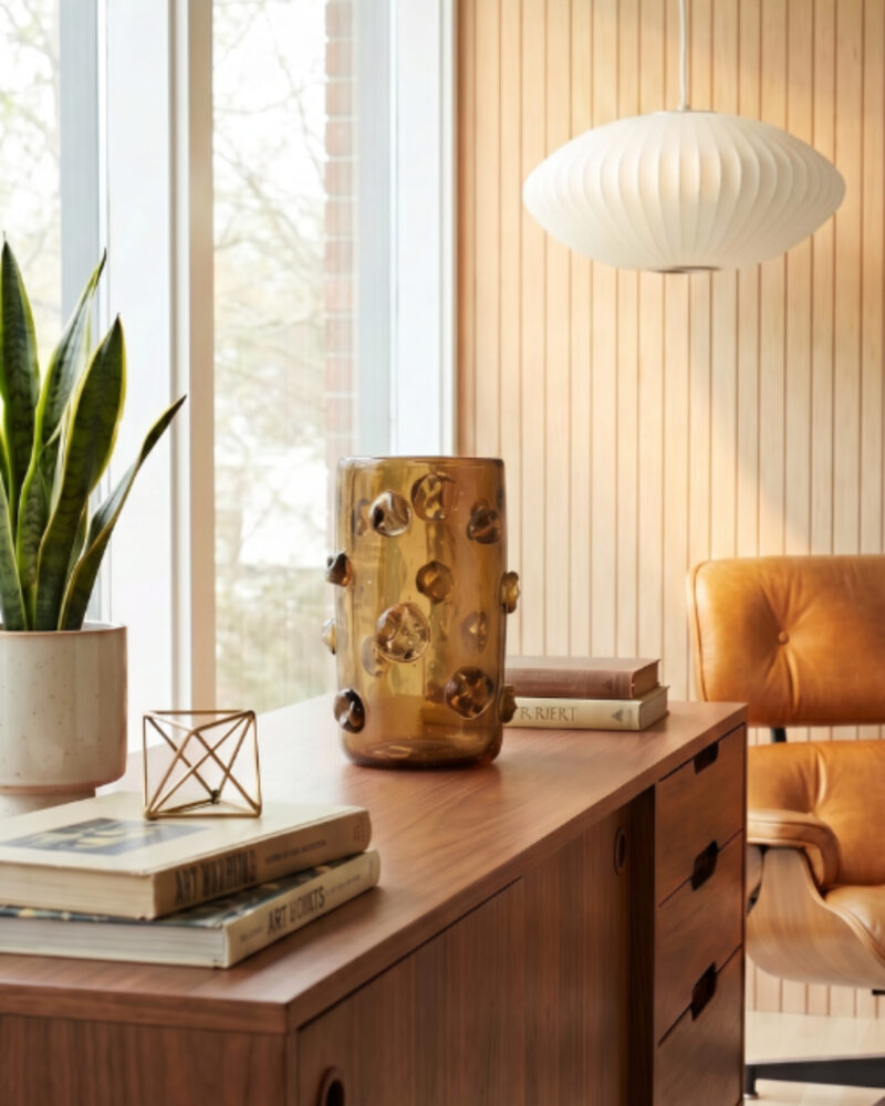
    A modern office with a wooden desk, brown leather chair, potted plant, books, amber vase, and a white pendant lamp—enhanced by subtle touches of Modern African Decor—set against vertical wood paneling and large windows.

    The Nywele Vase in Umber by Kitengela Glass for September Collective. Photography courtesy of September Collective.

    September Collective’s newest launch takes the brand to the next level. Designed by Rivers and brought to life by Kitengela Glass artisans in Kenya, the Nywele Vase is the brand’s first in-house designed product. These sculptural glass vases—available in citrine moss, umber, dark umber, moss, and onyx—reflect Rivers’ belief that every object should tell a story.

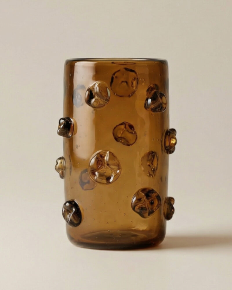
    A cylindrical brown glass vase with raised, rounded decorative bumps evenly spaced on its surface, set against a light background—an elegant piece that beautifully embodies modern African decor.

    The Nywele Vase in Umber by Kitengela Glass for September Collective. Photography courtesy of September Collective.

    Nywele is the Swahili word for “hair,” and the collection draws inspiration from the Bantu knot—a hairstyle that originated with the Zulu people of South Africa and is seen today across the African diaspora. Mimicking these coiled forms, the vase design brings the Bantu knot to life with a contemporary feel, resulting in “something that could sit in a modern home and still hold a cultural reference,” Rivers says.

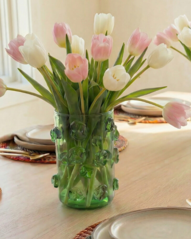
    A green glass vase with white and pink tulips is placed on a wooden dining table set with plates and cutlery, bringing a touch of Modern African Decor to the space.

    The Nywele Vase in Moss by Kitengela Glass for September Collective. Photography courtesy of September Collective.

    However, the design process for Nywele was not always straightforward. After Rivers tapped Nairobi-based Kitengela Glass to bring her glassware designs to life, the initial prototypes were too literal in the interpretation of the Bantu knot and needed more rhythm, restraint, and shaping. After rounds of refinement, Rivers and Kitengela’s glassmakers arrived at beautifully constructed, one-of-a-kind hand-blown vases made from recycled glass.

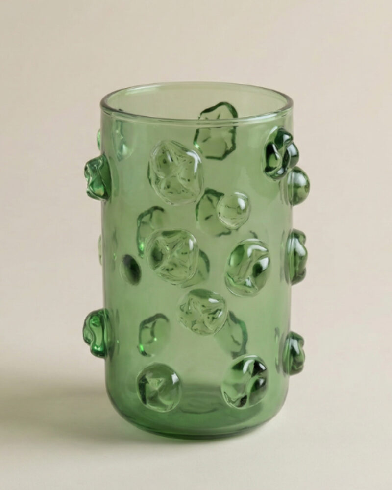
    Green glass tumbler with a cylindrical shape and raised, irregularly shaped bubble-like protrusions on its surface, set against a plain background—a striking piece that beautifully embodies the vibrant textures of Modern African Decor.

    The Nywele Vase in Moss by Kitengela Glass for September Collective. Photography courtesy of September Collective.

    “This is what I was always building toward: Not just a product, but a piece with a name, a maker, a meaning, and a place in the home that cannot be filled by anything else,” Rivers explains. “September Collective will never take credit for what an artisan’s hands have made. Our role has always been to honor the craft, share the story, and connect the maker with the people who will carry their work home. Nywele is that promise, made into an object.”

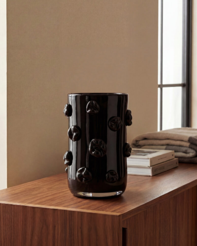
    A glossy black vase with raised circular knobs, inspired by modern African decor, sits on a wooden sideboard next to a small stack of books and folded blankets, near a window.

    The Nywele Vase in Onyx by Kitengela Glass for September Collective. Photography courtesy of September Collective.

  • Design Milk design-milk.com art design design-milk fashion interiors tech 2026-07-29 12:00

    ↗

    The interior stylist explains how thoughtful lighting brings warmth, depth, and flexibility to her mid-century-meets-Scandi home

    The Art of Layered Lighting: How Gemma Goldsmith Shapes a Home With Light

    Thoughtfully placed light can transform a space. It can soften architectural edges, draw attention to texture, create intimate corners within open floor plans, and subtly signal the transition from a productive morning to a quiet evening at home. It’s less of a finishing touch and more of a design tool in its own right.

    For interior stylist Gemma Goldsmith, that’s long been part of her approach. Her interiors balance mid-century silhouettes with Scandinavian simplicity, layering natural wood, tactile textiles, and warm neutrals into spaces that feel considered without appearing overly styled.

    A person in white loungewear sits on a green sofa in a modern living room with abstract art, layered lighting, a floor lamp, and minimalist decor.

    Interior designer Gemma Goldsmith uses the Govee Floor Lamp 3 to add layered lighting to her home. Photography courtesy of Govee.

    In her own home, warm wood tones, natural textures, and clean-lined furnishings create a calm backdrop where light becomes part of the composition. Lighting and furnishings work in tandem to shape the home’s ambiance.

    “I always think of lighting as the finishing layer,” Goldsmith says. “It adds warmth, highlights textures, and creates depth so the room feels inviting rather than flat.”


    View this post on Instagram


    A post shared by Gemma Mahabeer-Goldsmith (@gemmamgoldsmith)

    Designing Space with Layers of Light

    Furniture may define a room’s function, but Goldsmith sees lighting as the element that brings everything together.

    Mid-century furniture already carries warmth through its sculptural forms and wood tones, while Scandinavian interiors rely on softness and restraint. Rather than competing with those elements, lighting helps unify them, allowing materials and textures to take on new character as daylight shifts throughout the day.

    Modern living room with a green velvet sofa, abstract wall art, round coffee tables, decorative vases, layered lighting from a glowing floor lamp, and a window with white shutters.

    Photography courtesy of Govee

    That philosophy goes beyond simple illumination. Instead of depending on a single overhead fixture, Goldsmith builds rooms through layers of light that create distinct moments within the home.

    “A floor lamp is much more than a practical light source,” she explains. “I use them to create atmosphere and to define little moments within a room. They can make a reading corner feel cozy, add height to a space, or gently draw your eye to beautiful architectural details.”

    The result is a home that feels calm and lived in, rather than perfectly staged.

    Lighting That Respects the Room

    As lighting becomes increasingly connected and customizable, Goldsmith believes good design still begins with restraint.

    “The best technology is almost invisible,” she says. “I don’t want a product that dominates the room or looks overly technical. Good design should enhance the home, not distract from it.”

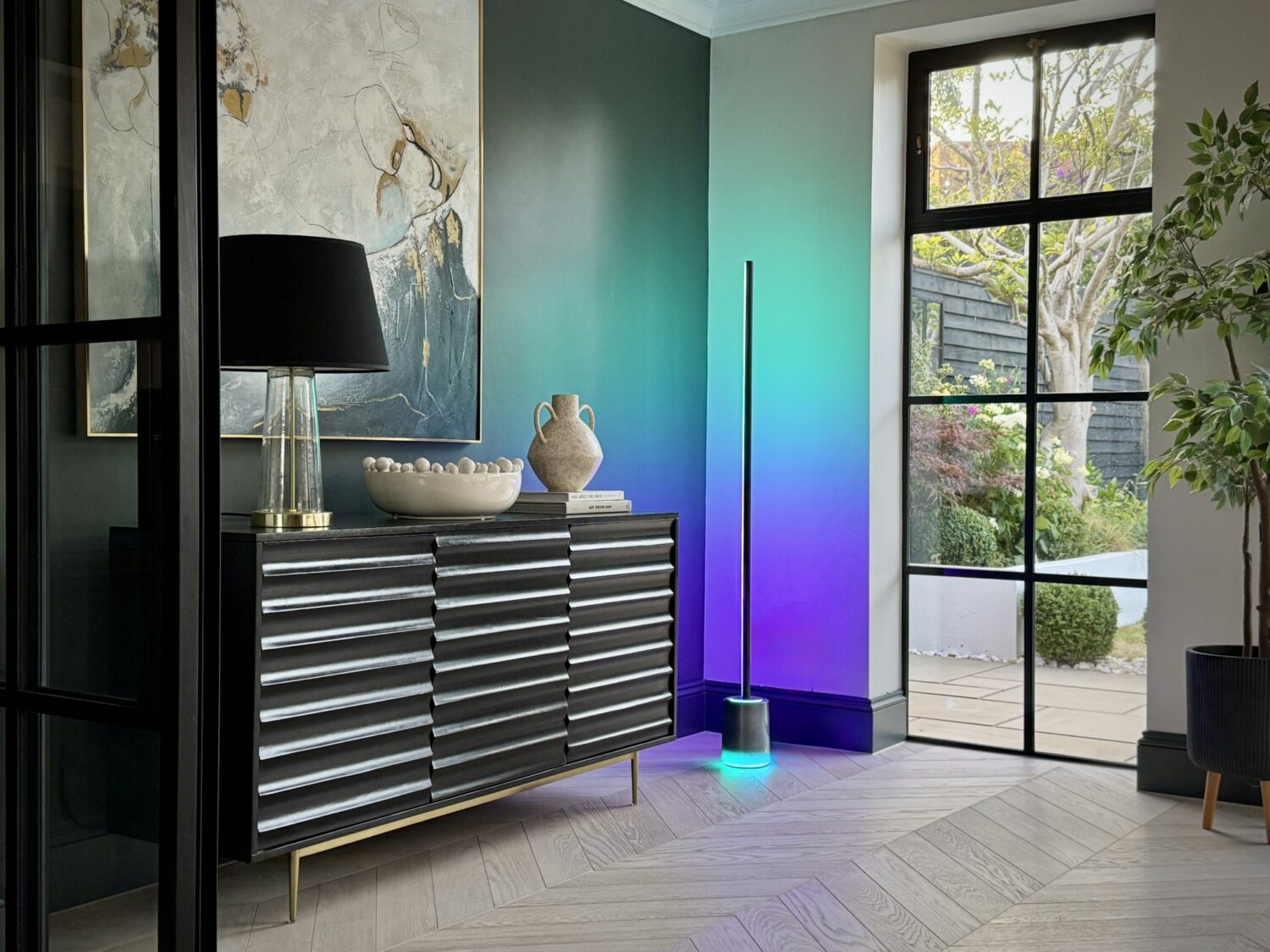
    That mindset made the Govee Floor Lamp 3 a natural addition to her interiors. Rather than becoming another object competing for attention, its slim, architectural silhouette quietly integrates into the surrounding space.

    Modern dining room with a wooden table, black chairs, abstract wall art, a large plant, and a colorful floor lamp providing layered lighting against a dark accent wall near large windows.

    Photography courtesy of Govee

    “The first thing I noticed about the Govee Floor Lamp 3 is how understated it is,” she says. “It has this really clean, architectural profile that almost disappears into the room, which I love because it lets the light become the feature rather than the lamp itself.”

    Positioned beside cabinetry or tucked into a corner, the lamp washes the wall behind it with soft light, adding depth without harsh contrasts. Goldsmith compares the effect to architectural lighting that’s built into a home rather than added later.

    “In my living room and dining area, it almost acts like architectural lighting you’d normally have built into the house, which is impressive from such a slim floor lamp.”

    A tall, thin floor lamp emits a gradient light with pink and orange tones, creating a soft glow against a dark background and enhancing the ambience with layered lighting.

    Photography by Govee

    A Room That Adapts with the Day

    Like many contemporary homes, Goldsmith’s home serves several purposes over the course of a day: It’s a workspace, a gathering place for family, and somewhere to unwind in the evening. Rather than rearranging the room for each activity, she relies on the Floor Lamp 3’s adjustable lighting to shift the atmosphere throughout the day.

    “During the day I lean into a brighter, cleaner glow that complements the natural daylight and makes working or cooking feel easy,” she says. “Then as the evening comes, everything softens—the tones deepen, the light becomes more amber and immersive.”

    One corner of her living room demonstrates that transition particularly well. Set beside a favorite mid-century armchair, the Floor Lamp 3 adds another layer to a room already rich in natural materials and texture. During daylight hours, it quietly complements the furniture. As evening falls, its warm glow transforms the reading nook into a more intimate retreat.

    “It makes the room feel cocooning and relaxed rather than simply illuminated,” Goldsmith says. “Because it’s so subtle, it never distracts from the furniture or artwork.”

    A Home That Feels Lived In

    For anyone looking to create a home that feels more comfortable and adaptable, Goldsmith’s advice is surprisingly straightforward.

    “Don’t rely on one light source,” she says. “That’s probably the biggest difference between a room that feels functional and one that feels really welcoming.”

    Instead, she recommends combining ceiling fixtures with floor and table lamps, plus accent lighting that can shift alongside changing daylight and daily routines.

    A modern living room with a green sofa, round marble coffee tables, decorative vases, wall art, and a tall floor lamp near a window with white shutters features thoughtfully layered lighting to create a warm and inviting atmosphere.

    Photography courtesy of Govee

    “Lighting shouldn’t just help you see,” she says. “It should help you feel something.”

    As homes continue to blur the boundaries between work, relaxation, and entertaining, lighting has become one of the most versatile tools in an interior designer’s toolkit. When thoughtfully integrated, it doesn’t simply brighten a room—it helps define how that room is experienced.

    In Goldsmith’s home, the Govee Floor Lamp 3 shows how thoughtfully integrated lighting can quietly shape the experience of a space while letting the architecture and furnishings remain the focus.

    Learn more about the Govee Floor Lamp 3 at uk.govee.com.

  • Design Milk design-milk.com art design design-milk fashion interiors tech 2026-07-28 18:24

    ↗

    Designed by Gudbjørg Simonsen, this Stavanger apartment replaces excess with integrated storage, carefully edited furnishings, and spaces that prioritize calm over clutter.

    A Norwegian Apartment That Treats Downsizing as a Design Opportunity

    Moving from a large villa into a 1300-square-foot apartment might seem like a loss, but this apartment in Stavanger, Norway, designed by interior architect Gudbjørg Simonsen for a couple in their early 50s, treats the reduction as a design opportunity rather than a constraint. The result is an interior organized around subtraction, where the discipline of limitation becomes the design language itself.

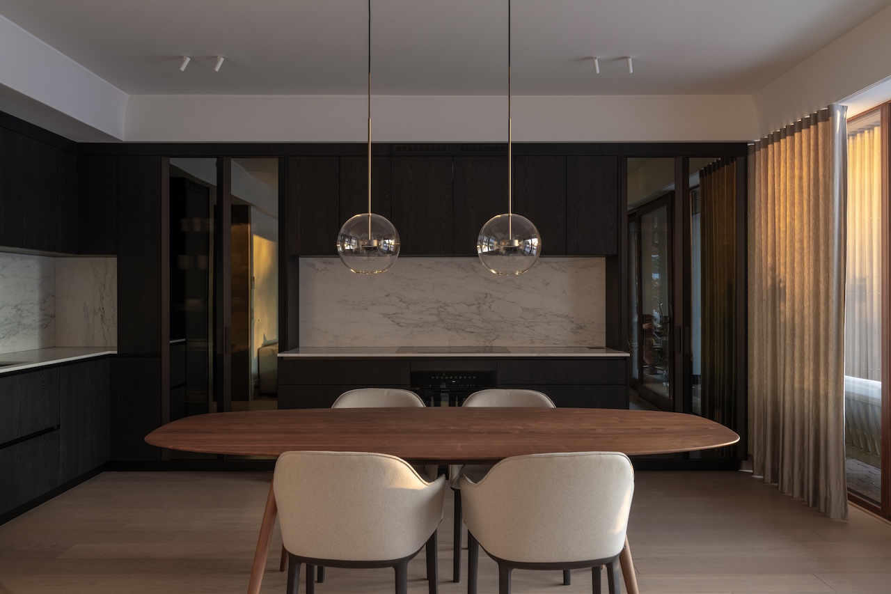
    Modern dining area with a wooden table, four upholstered chairs, dark cabinetry, marble backsplash, and two spherical pendant lights. Floor-to-ceiling window with sheer curtains on the right.

    Photography by Arne Bru Haug

    The clearest evidence is in how storage is handled. Rather than furnishing the rooms with cabinets and wardrobes, Simonsen absorbed storage into the architecture, running integrated volumes along the central circulation so that the corridor doubles as infrastructure. The approach recalls Danish designer Kaare Klint’s emphasis on storage tailored to everyday use, though here the idea is expressed through sleek Poliform joinery. The wardrobe becomes less an object in the room than an extension of the walls.

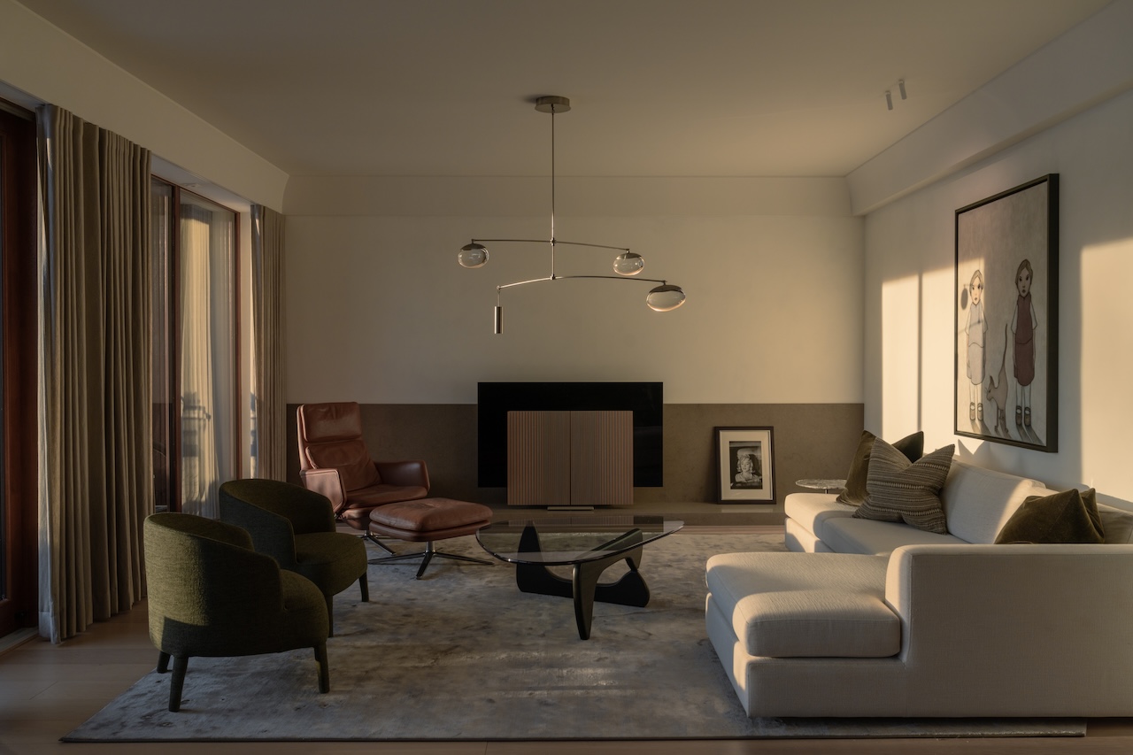
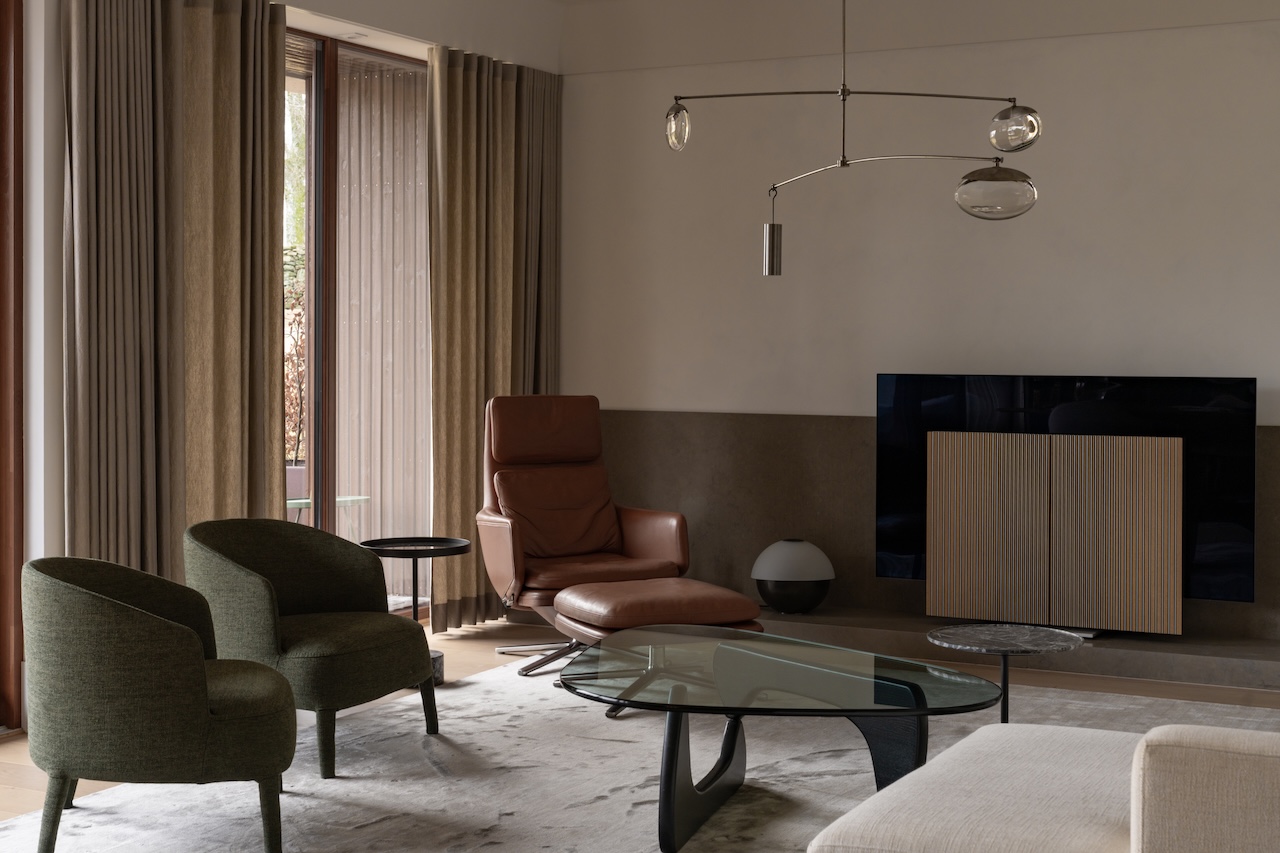
    Modern living room with green armchairs, brown leather recliner, glass coffee table, TV, and large windows with beige curtains. Neutral color palette and minimalist decor.

    Photography by Arne Bru Haug

    The living room, dining area, and kitchen occupy a single open volume along the park-facing facade, while the two bedrooms and bathrooms sit deeper in the plan. What makes it work is that the apartment carries no visual debt: There is no freestanding bookcase, no sideboard, no accumulation of the containers a larger house permits. Every object that remains earns its place.

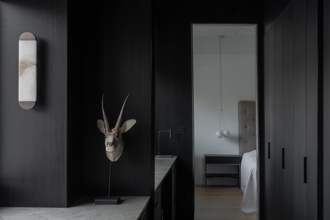
    A dark modern hallway with a mounted antelope skull leads into a minimalist bedroom with a tufted headboard and hanging bedside light.

    Photography by Arne Bru Haug

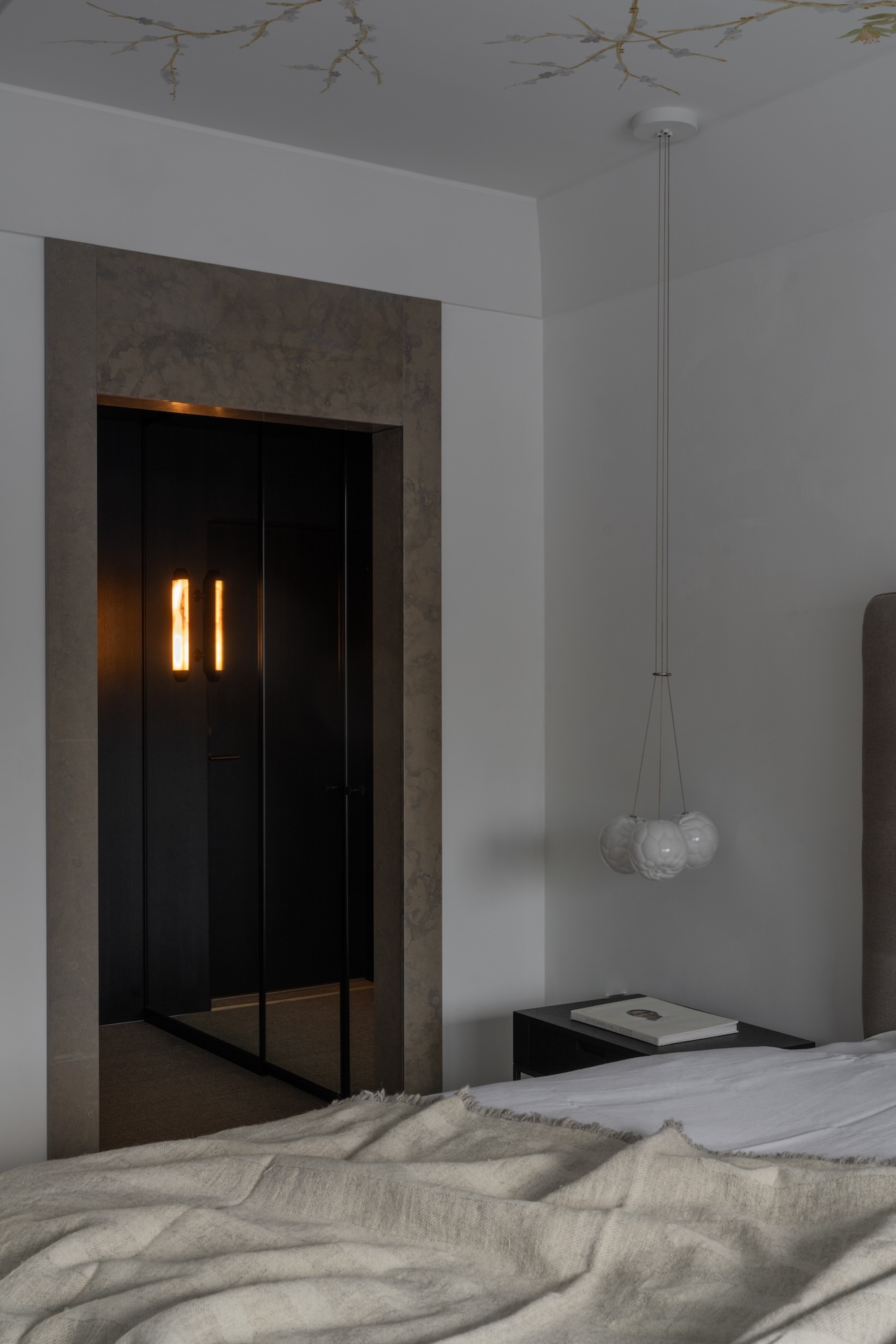
    Simonsen describes the apartment as “suite-like,” drawing on the hotel suite’s carefully considered balance of comfort and restraint. Having recently downsized from a large villa, the owners embraced an interior that prioritizes atmosphere over abundance, with lighting and furnishings by Bocci, Ochre, and Apparatus contributing to its calm, residential feel.

    Minimalist bedroom with a beige blanket on the bed, a dark nightstand with a book, modern pendant light, and a doorway showing a lit wall sconce in a dark hallway.

    Photography by Arne Bru Haug

  • Design Milk design-milk.com art design design-milk fashion interiors tech 2026-07-28 17:53

    ↗

    Obsidian House integrates greenery directly into its architecture, from a dramatic 24-foot indoor planter to lush outdoor spaces that blur the line between inside and out

    This Los Angeles Home Lets Nature Become the Architecture

    In Studio City, a Los Angeles neighborhood known for its blend of privacy and lush greenery, sits a modern sanctuary. Here, architecture, landscape, and interiors were conceived to strengthen the connection between nature and residential space. Designed by Shlomi Sfadia of SLS Properties with architecture by Avi Galili and landscape design by Studio Elico, the home evokes the feeling of a private retreat—despite being a full-time residence.

    Modern two-story Obsidian House with stone and dark wood exterior, large windows, and a landscaped walkway surrounded by greenery and a small pond.

    Photography by Nils Timm

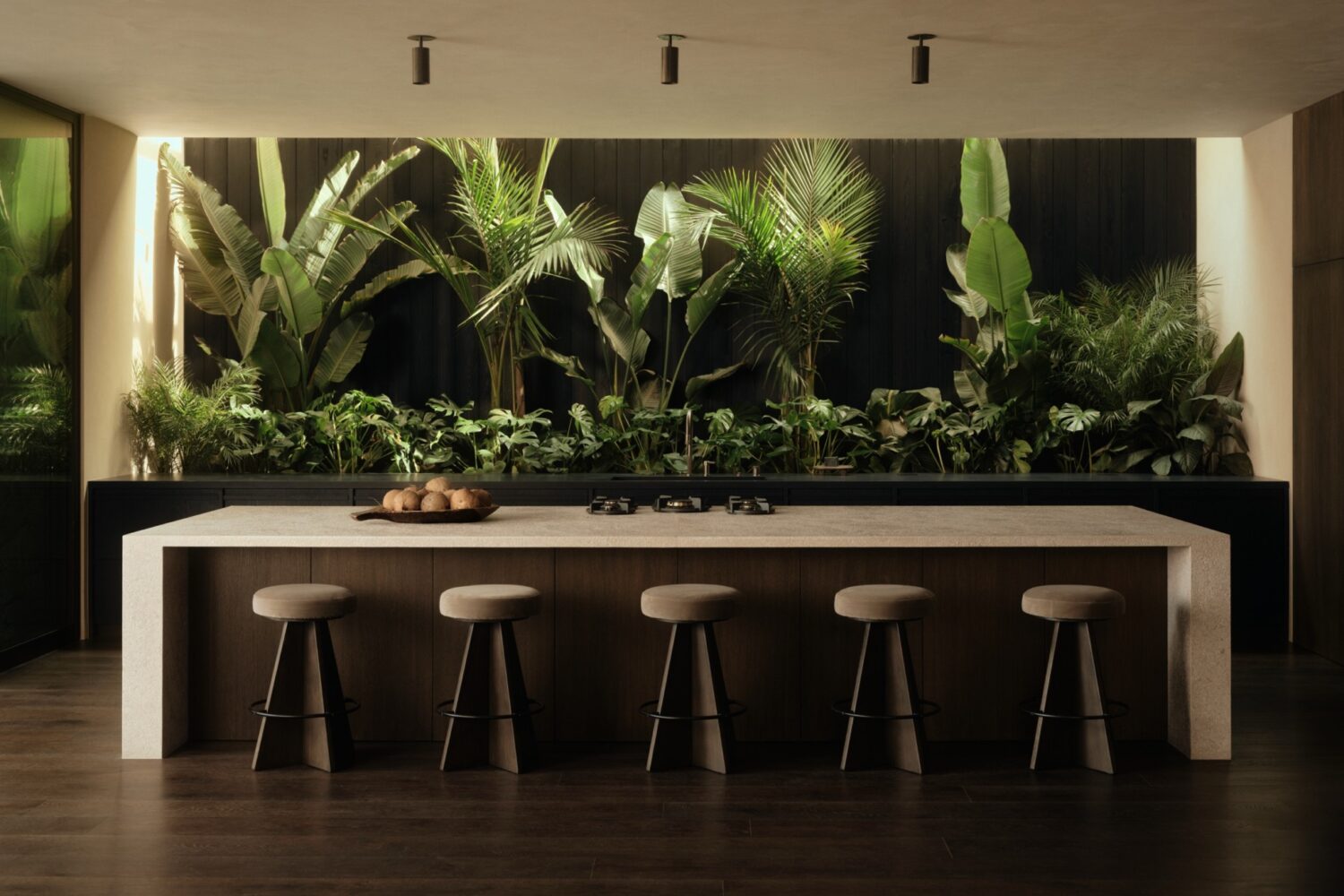
    A two-level home with roughly 5,550 square feet of interior space, Obsidian House was conceptualized to maximize the relationship between interior living and the surrounding landscape. Its showstopping kitchen is anchored by an impressive 24-foot indoor planter, while the open-plan main living area flows seamlessly between the kitchen, dining, and lounge spaces. Large glazing panels and sliding doors reinforce the home’s spatial flow, allowing natural light and greenery to extend deep into the interior.

    Modern living room with minimalist furniture, large windows, and a view of a stone wall and lush greenery outside evoke the serene elegance of an Obsidian House. Neutral tones and natural light create a calm, cozy atmosphere.

    Photography by Nils Timm

    For Sfadia, the 24-foot planter shaped the early stages of the design process. “I wanted nature to be more than something you looked at through a window; I wanted it to become part of the architecture itself,” he says. “It became the heart of the house, reinforcing the feeling that you’re living within a garden rather than simply next to one.” Once the central planter was established, it influenced every subsequent design decision.

    A modern bedroom in Obsidian House features a large bed, potted plant, wall art, and sliding glass doors opening to a patio with outdoor seating and lush greenery.

    Photography by Nils Timm

    In direct contrast to the bright hues typical of Southern California properties, Obsidian House’s color story aptly reflects its name. Deep charcoals and muted wood tones lend the residence a quiet drama, while limestone and layered greenery add livability and warmth. The palette creates depth and permanence, complemented by rich materials and textured finishes suited to the surrounding climate.

    Modern bathroom inside Obsidian House with a stone sink, wall-mounted faucet, decorative plant, candle, toiletries, and a mirror reflecting outdoor greenery. Natural light enters through a tall window.

    Photography by Nils Timm

    Charred wood cladding, lava stone, limestone, and textured finishes were selected for their raw, tactile qualities, helping connect the home to its natural setting. Prioritizing material resilience and the ability to develop visual richness over time, the design team opted for organic finishes and climate-appropriate materials.

    “Throughout the day, the house changes with the light,” Sfadia says. “It’s a home that reveals itself over time, rather than all at once.”

    A modern living room at Obsidian House with warm, neutral tones, a curved brown sofa, a wooden coffee table, a sleek chair, and large floor-to-ceiling windows looking out onto a sunlit, leafy garden.

    Photography by Nils Timm

    Studio Elico founder Eli Bahar led the landscape design, helping transform the house into an inviting oasis where nature is not merely decorative but seamlessly extends into the architecture. Vegetation and landscape elements are woven throughout the property, refining the home’s sculptural forms and contributing to the space’s sensory dialogue.

    Modern outdoor patio with black stone floor in an elegant Obsidian House style, wooden furniture with black cushions, a small pool, lush plants, and a beautiful stone wall.

    Photography by Nils Timm

    Bahar says that the collaboration between Avi Galili and SLS Properties was continuous from the earliest stages of the project. “We carefully coordinated planter locations, tree placements, views, lighting, and circulation so that the landscape became an extension of the architecture,” he explains. “Every space was designed to be experienced as one unified environment rather than separate disciplines.”

    Obsidian House: A modern house with large windows, outdoor seating area, striking stone walls, lush plants, and a swimming pool in the foreground.

    Photography by Nils Timm

    The challenge was to create impact through atmosphere and material consistency rather than through spectacle. From conception to completion, the project took 18 months, resulting in a two-level residence with five bedrooms and six baths.

    Obsidian House prioritizes fluidity and connection through its open-plan living areas. Outdoor patios create a seamless dialogue between exterior and interior spaces, while the kitchen’s indoor planter transforms a functional environment into a living tableau. Outfitted with a floating sink and a mirror positioned against a floor-to-ceiling window, the powder room integrates greenery directly into its material composition. A dedicated media room adds a sense of quiet intimacy to the home.

    Four woven stools surround a stone fire pit with a small fire, set in the gravel courtyard of Obsidian House, framed by dense tropical plants and a striking stone wall.

    Photography by Nils Timm

    The transitions throughout the house, from intimate spaces to light-filled courtyards, were designed by Avi Galili with great intention. “I’m most proud of the restraint,” he says. “It’s easy to create dramatic architecture by adding more, but much harder to create it through proportion, materiality, and carefully choreographed spaces.” The architecture creates moments where nature is not observed from a distance but experienced as part of daily life.

    Modern interior of Obsidian House with a dark wooden staircase, built-in shelving, and green indoor plants nestled beneath the stairs. Warm natural light illuminates the dark wood floor and neutral walls.

    Photography by Nils Timm

    Together, the interiors, architecture, and landscape design create a stunning oasis for Southern California living, creating a quiet retreat from the surrounding city. From the moment of arrival, natural materials, filtered light, water, and lush planting create an immediate sense of calm. As Sfadia says: “If someone walks in and immediately feels like they’re on vacation without knowing exactly why, then the design has done its job.”

    Modern two-story Obsidian House with large windows, stone facade on the lower level, black upper level, surrounded by lush green plants and trees. Gravel driveway leads to a black garage door.

    Photography by Nils Timm

  • Design Milk design-milk.com art design design-milk fashion interiors tech 2026-07-27 19:46

    ↗

    The Toronto-based designer layers color, texture, and personality into a Net Zero Ready suburban home built for everyday life

    Gillian Gillies Reimagines Sustainable Design as a Warm Embrace

    In the rapidly densifying landscape of Toronto, where a growing array of boisterous architectural statement pieces compete for attention, a new home designed by interior designer Gillian Gillies stands as a welcome reprieve. Sustainability, so often associated with clinical engineering, soaring towers, expansive campuses, and stark, performance-driven aesthetics, is here reimagined as a “warm embrace.” Located in the upmarket “urban village” neighborhood of Leaside, the Net Zero Ready Home project proves that advanced environmental stewardship and joyful, idiosyncratic interiors can coexist.

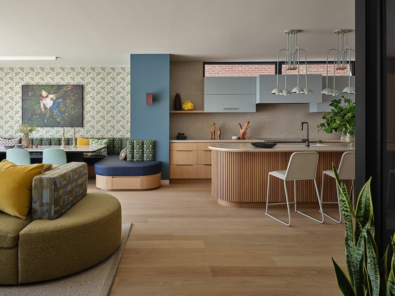
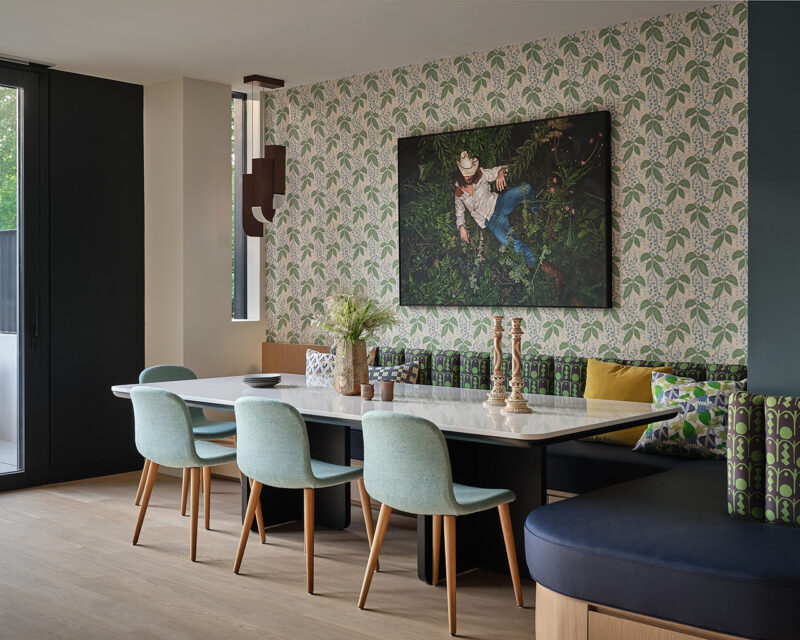
    A modern dining area with a marble table, light blue chairs, patterned wallpaper, a large plant-themed photo, and built-in bench seating with assorted cushions creates an inviting space inspired by Gillian Gillies Net Zero Ready Home design.

    Photography by Doublespace Photography

    The project is the result of a tight collaboration between Gillian Gillies (the designer’s eponymous practice), Dewson Architects, and builders Cliff & Evans. While the technical foundation is rooted in passive house principles—featuring meticulously tested air and moisture control layers to ensure a consistent year-round temperature—the sensory quality of the home is defined by texture, color, and family connection. “Comfort was paramount,” Gillies says, “and that meant a home that was properly constructed as well as [comfortable furniture].”

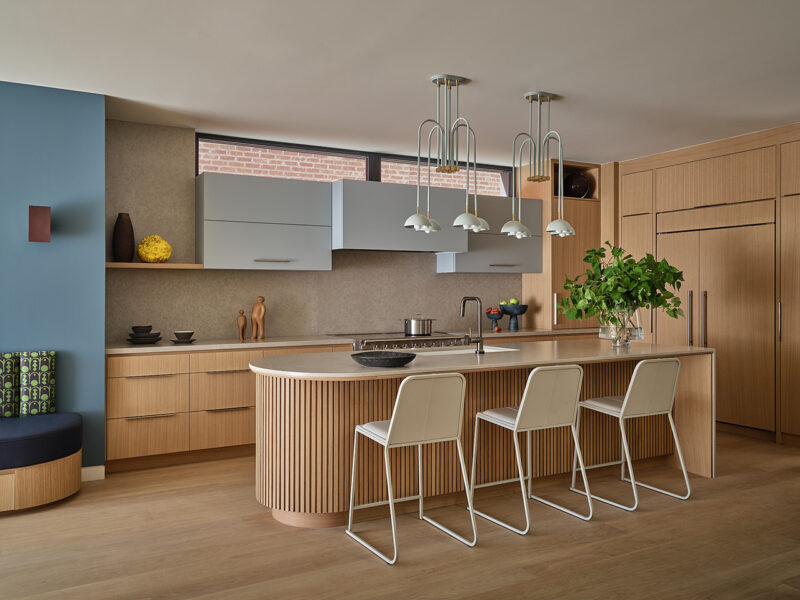
    Modern kitchen designed by Gillian Gillies in a Net Zero Ready Home, featuring light wood cabinets, a curved island with three white barstools, blue accent wall, and pendant lights. A plant and decorative items are arranged on the counters and shelves for a stylish, sustainable ambiance.

    Photography by Doublespace Photography

    Gillies, originally from Edinburgh, brings a sensibility rooted in the permanence of neoclassical and Georgian architecture, translated here through a palette of natural materials including white oak, walnut, and wool. Each room is tailored to its intended function, while bold floral wallcoverings and textured tile add personality. Rather than the sterile “newness” typical of contemporary high-performance homes, the interiors embrace deliberate juxtaposition.

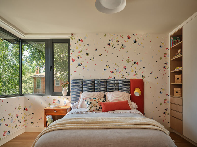
    A cozy bedroom with floral wallpaper, a bed with colorful pillows, a wooden nightstand, built-in shelves, and large windows overlooking green trees embodies the thoughtful design seen in a Gillian Gillies Net Zero Ready Home.

    Photography by Doublespace Photography

    “We don’t perfectly match textiles,” Gillies explains. “Instead, we like a little bit of tension, a little bit of a mismatch that makes the home feel more settled.”

    This philosophy is most evident in the communal spaces, where the design explicitly fosters human interaction. A double-sided sofa in the living room invites simultaneous yet distinct modes of engagement. A floating box window seat in the foyer provides a quiet nook for reflection. The color story—a grounding base of greens and blues punctuated by vibrant flashes of yellow and red—mirrors the family’s love of travel and the natural world.

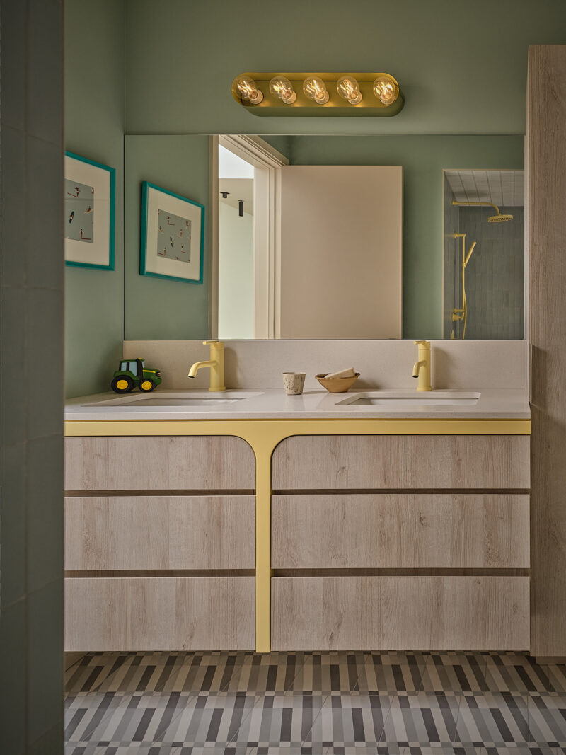
    Bathroom in a Gillian Gillies Net Zero Ready Home with dual sinks, light wood vanity, yellow accents, large mirror, wall-mounted lights, green walls, framed art, and a toy tractor on the counter.

    Photography by Doublespace Photography

    Throughout the four-story structure, strategically placed architectural and decorative lighting shapes the mood. A Lutron HomeWorks system seamlessly transitions the atmosphere from energetic to intimate. Sculptural pendants from Montreal-based boutique producers Lambert & Fils and Gabriel Scott add a layer of contemporary craft. Vintage Brazilian furniture and Oaxacan woven baskets reinforce the space’s warm, tactile quality.

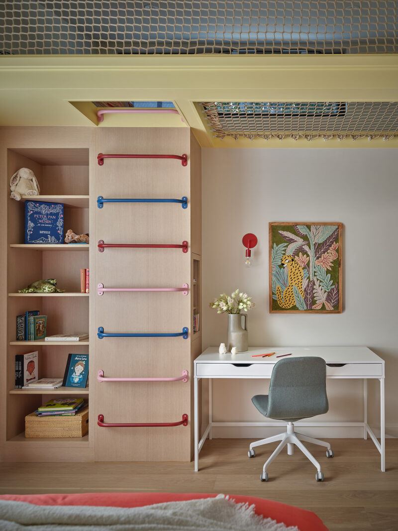
    Children’s bedroom in a Gillian Gillies Net Zero Ready Home, featuring a climbing ladder, built-in shelves with books and toys, a white desk with a chair, flowers, and a framed botanical artwork on the wall.

    Photography by Doublespace Photography

    Ultimately, this Toronto home stands as a testament to the idea that thoughtful architecture can improve everyday life. By prioritizing the wellbeing of both the planet and a specific family, Gillies created a structure that does more than just store carbon; it’s a space that holds life in all its complexity.

    “We create homes to be lived in and not simply looked at,” she says. In striking this careful balance, the designer has created a home that will undoubtedly last through the generations.

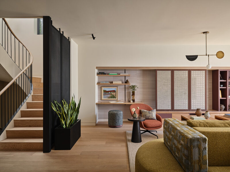
    Modern living room with wooden floors, a staircase, built-in shelves, a plant, contemporary furniture, and minimalist decor in neutral and warm tones—designed as a Gillian Gillies Net Zero Ready Home for stylish and sustainable living.

    Photography by Doublespace Photography

  • Design Milk design-milk.com art design design-milk fashion interiors tech 2026-07-27 18:29

    ↗

    Mapos Architects revealed the Design Research building's Brutalist character to create a retail experience rooted in restraint, reuse, and architectural clarity

    MUJI Has Transformed a Harvard Square Landmark Into a Lifestyle Destination

    Retail stores often take a more-is-more approach, filling their spaces with an overwhelming array of goods, so when one has just the right combination of products and aesthetic appeal, it can give the retailer an edge. That’s what MUJI in Cambridge, Massachusetts, banked on.

    In North America, the Japanese company is evolving from a purveyor of stationery into a full lifestyle retailer. For its new location in the Greater Boston metropolitan area, Mapos Architects, in collaboration with ACTWO Architects, was tasked with renovating the Design Research building in Harvard Square—in just 10 weeks.

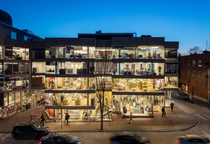
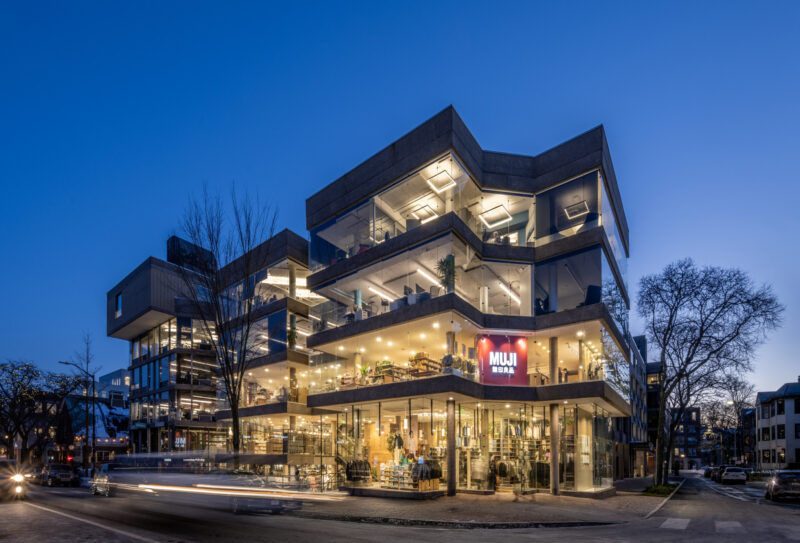
    A modern, glass-walled building at dusk shows three brightly lit floors with people inside and outside, as cars and pedestrians move along the street in the foreground near MUJI Harvard Square.

    Photography by Gunnar Glueck, Flaunt Boston.

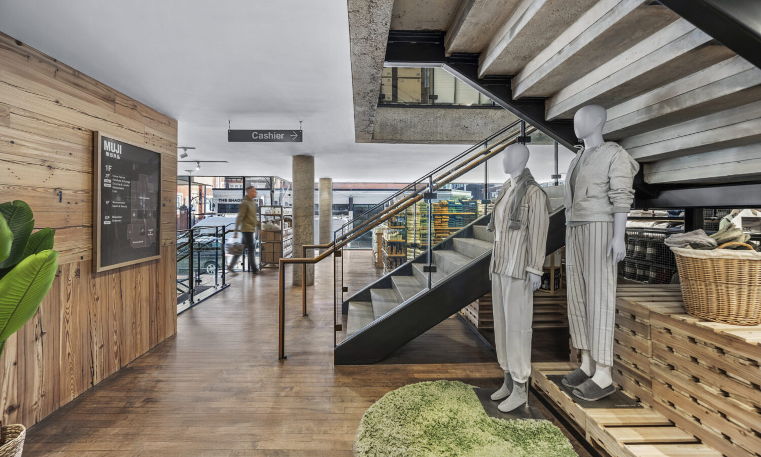
    When the Design Research building opened in 1969, it served as a showcase for architect Ben Thompson’s shop, which included European and Scandinavian housewares. For the MUJI revamp, the architects took a deliberately light-touch approach, revealing rather than replacing the building’s defining architectural elements.

    “We uncovered the existing textures to leverage what was already there and bring back the original beauty of the space,” says Colin Brice, co-founder and partner at Mapos Architects.

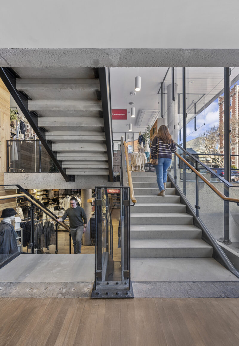
    A woman walks up a modern indoor staircase with glass railings at MUJI Harvard Square, while another person descends. The area features large windows and retail displays.

    Photography by Gunnar Glueck, Flaunt Boston.

    With a lightness not typical of the period, the structure boasts a balance of concrete and glass curtain walls, forming a jewel-box-like setting that feels surprisingly contemporary and welcoming.

    “It’s really an exceptional example of Brutalist architecture and how open it can be,” explains Caleb Mulvena, co-founder of Mapos Architects and partner in charge of the project. “The entire storefront opens to the community, and customers can start shopping from the street as they look in.”

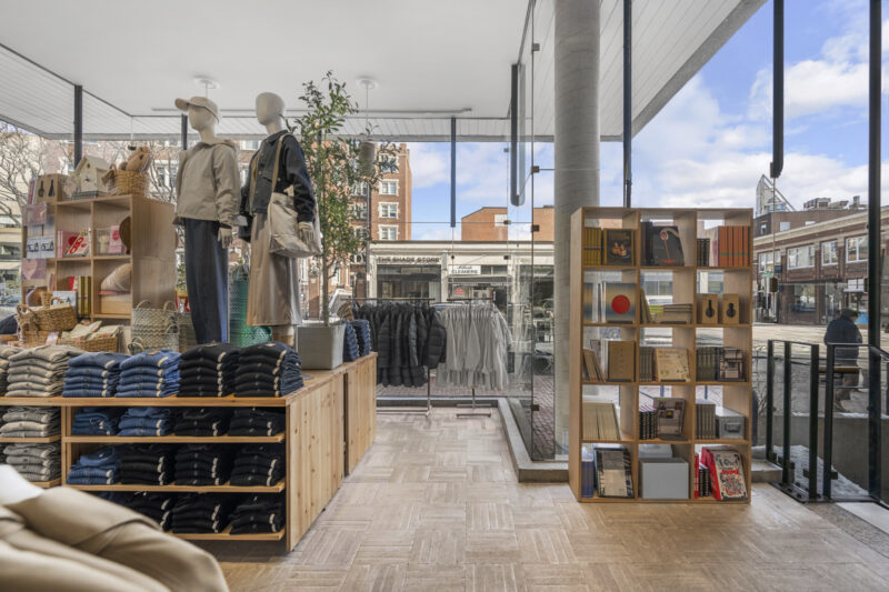
    Modern retail store interior with mannequins in casual clothes, shelves of folded jeans, jackets on racks, and a display of books and magazines by large windows showing a city street outside—evoking the minimalist aesthetic found at MUJI Harvard Square.

    Photography by Gunnar Glueck, Flaunt Boston.

    Enhancements begin at the entry, where brick flooring retains its patina, complemented by upgraded lighting and ceilings. Concrete columns, concrete masonry walls, and floating staircases were exposed to add character to the interior. White and gray tones are paired with accents of green and MUJI’s signature red. Accent walls made of locally sourced heart pine introduce warmth and align with the brand’s commitment to sustainable reuse.

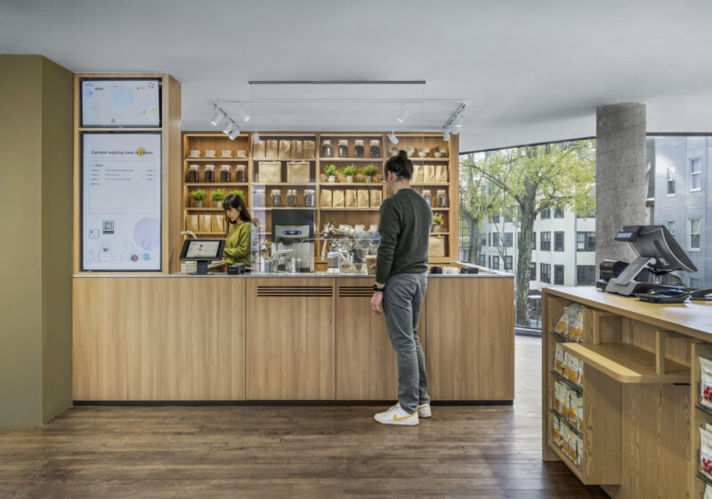
    A person stands at a modern coffee shop counter while a barista prepares an order. Shelves behind the counter display coffee bags and plants, evoking the minimalist aesthetic of MUJI Harvard Square. Large windows reveal trees and buildings outside.

    Photography by Gunnar Glueck, Flaunt Boston.

    Set across four levels, the 12,000-square-foot store encourages easy movement through an expansive, emporium-like layout. In the top-floor café, shoppers will find a robot barista, introducing a hospitality-inspired experience that reflects MUJI’s growing emphasis on stores as destinations rather than simply places to shop.

    “It was really about leaning into the space as we found it,” Mulvena adds. “By keeping our touch light, we were able to celebrate these features.”

    It is this simplicity, rather than ostentation, that makes the greatest impact. As the first step in MUJI’s broader North American evolution, the Cambridge location demonstrates how thoughtful restoration can reinforce a brand’s identity.

    A modern, multi-story building at dusk features large glass windows and illuminated interiors. A red "MUJI" store sign is visible on the ground floor, marking the MUJI Harvard Square location. Trees and street traffic are in the foreground.

    Photography by Gunnar Glueck, Flaunt Boston.

    MUJI Harvard Square is open daily from 10 a.m. to 8 p.m. (11 a.m. to 7 p.m. on Sundays) at 48 Brattle Street in Cambridge, Massachusetts.

  • Design Milk design-milk.com art design design-milk fashion interiors tech 2026-07-27 16:32

    ↗

    Designed by Analogy Design, the compact countertop tea maker preserves the rituals of traditional chai while rethinking how the beloved drink fits into contemporary kitchens

    Dostea Brings Thoughtful Industrial Design to the Chai Ritual

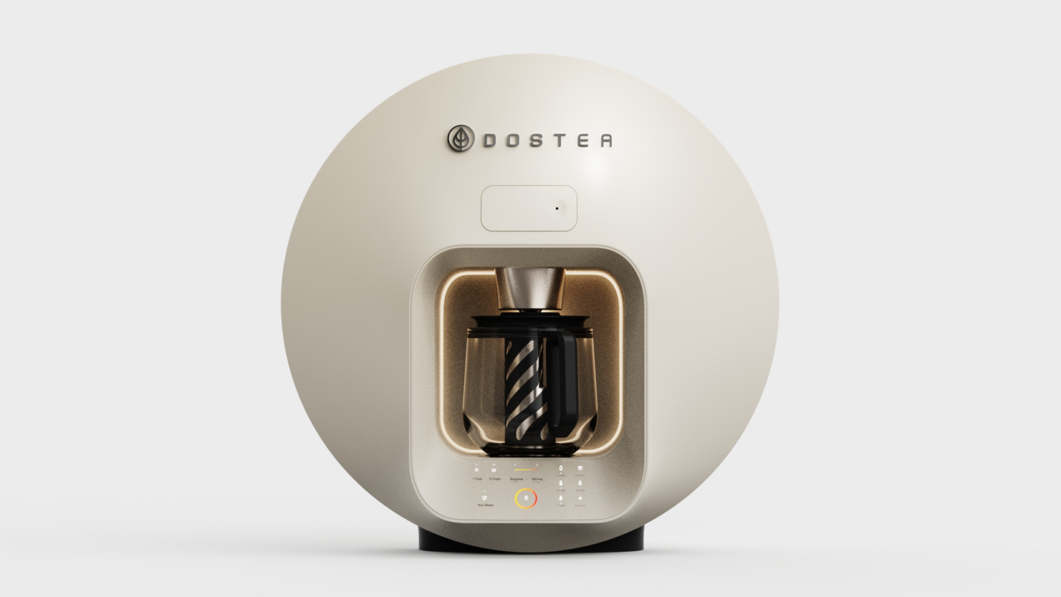
    Chai keeps its own time. Milk climbs to a boil while tea and spices steep loose in the pot, and the strength shows itself in color, deepening shade by shade until the foam begins to rise. The traditional method of making chai demands attention; it’s a process that has changed very little over time. Dostea, a compact countertop chai maker, was designed to preserve that ritual while bringing the process down to the push of a button.

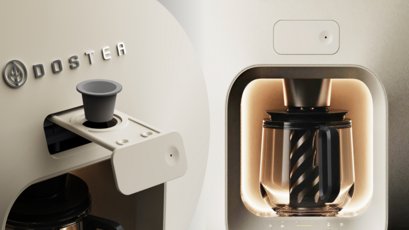
    Close-up of a modern DOSTER coffee machine, also compatible as a Dostea chai maker, showing the control button and glass carafe inside a softly lit compartment.

    Photography courtesy of Analogy Design

    In 2021, the UK startup behind Dostea engaged Analogy Design, an industrial design studio in India whose portfolio spans housewares and consumer electronics. Together, they took the beverage appliance from concept to product readiness. What Analogy set out to protect was the character of the drink itself while creating an appliance that people would want to leave on the counter, rather than hide away.

    “Our goal wasn’t to simplify the ritual but to preserve what people love about it while making it more intuitive for modern kitchens,” says Divya Rao, co-founder of Analogy.

    Round white kitchen appliance with control panel and glass pitcher; side images show hand maintenance, close-up details of the device, and the Dostea chai maker in action.

    The Analogy Design team built the first prototype. Photography courtesy of Analogy Design.

    While coffee has inspired generations of dedicated equipment—from espresso machines to pour-over systems—chai has largely remained a stovetop ritual involving multiple utensils, constant attention, and personal technique. Analogy worked without a template, arriving at a restrained form that combines warm color, material, and finish choices with detailing that references both Indian craft traditions and contemporary European minimalism. Its minimal controls reflect the familiarity of a drink made every day.

    “We wanted the product to feel rooted in the warmth and familiarity of chai while introducing a clean, contemporary aesthetic,” Rao adds.

    Two people discuss a circular Dostea chai maker prototype on a desk surrounded by sketches, material samples, and a tablet showing a digital 3D model.

    Working on a cardboard prototype of Dostea. Photography courtesy of Analogy Design.

    Inside, the mechanism was engineered alongside the shell, its part count pared down to fit the small footprint. The harder work was upstream of the hardware. “One of the biggest challenges was ensuring users could still customize their tea, whether that’s the strength, milk ratio, or brewing style, without losing the convenience of one-touch operation,” Rao explains. The machine preserves that flexibility, letting each household keep its own version of the cup.

    Analogy led the project from industrial design through product development and manufacturing planning, shaping not only how Dostea works but how it fits into contemporary kitchens.

    A modern black Dostea chai maker sits on a kitchen counter, with a clear carafe inside and a display screen below, near a set of glasses.

    Photography courtesy of Analogy Design

    To learn more about the project and its launch timeline, visit Analogy Design or follow the studio on Instagram.

  • Design Milk design-milk.com art design design-milk fashion interiors tech 2026-07-24 19:58

    ↗

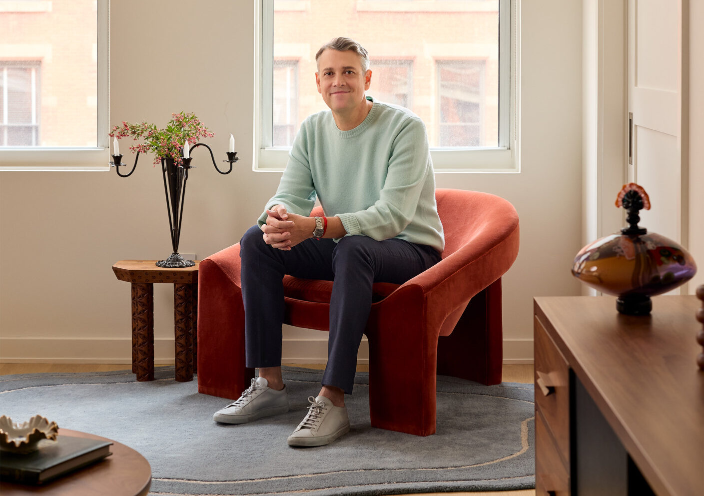
    Architect and designer Bryan Young shares the artwork, music, and places that continue to inspire him.

    F5: Bryan Young on the Dominican Republic, Alexander Girard Artwork + More

    Originally from Los Angeles, Bryan Young noticed buildings even when he was young, and one by Louis Kahn left a lasting impression. As a teenager, he surfed Black’s Beach in San Diego, California, where you could see the Salk Institute for Biological Studies.

    “It is still one of the clearest and most authentic buildings I have visited,” Young says.

    He decided to pursue his interest in the built environment at UC Berkeley, where he earned his bachelor’s degree in architecture, before completing his studies at Harvard Graduate School of Design.

    Founded in 2010, Young’s NYC-based studio, Young Projects, emphasizes materiality and often explores unique fabrication techniques like growing crystals or pulling plaster by hand.

    Young is also interested in interiors and display objects. He frequently collaborates with artisans to develop one-of-a-kind pieces and, in 2022, co-founded VERSO, a New York-based design gallery, with Amauri Aguiar. The gallery’s curated collection includes bespoke furniture and art pieces from designers and studios around the world.

    Today, Bryan Young joins us for Friday Five!

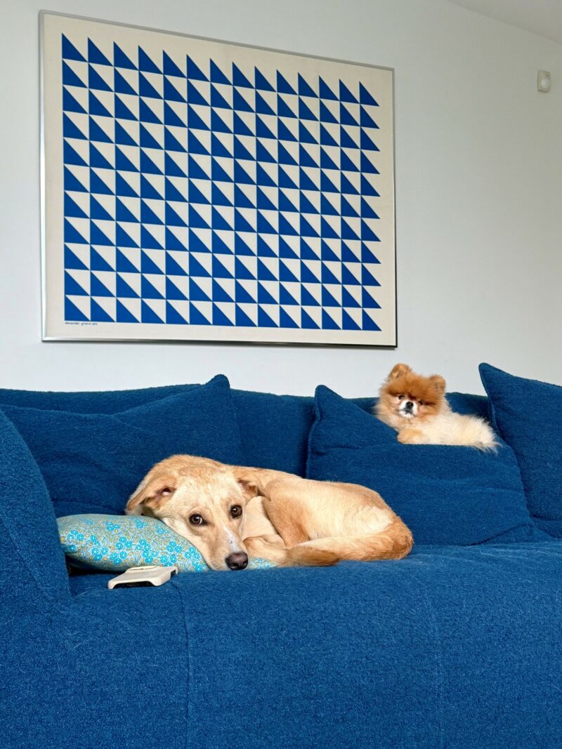
    A dog lies on a blue couch with its head on a cushion, while a fluffy dog sits nearby. Geometric blue and white art hangs on the wall behind them.

    Photography by Bryan Young

    1. Girard

    When you stare at something for a long time over many years, it is exciting to realize that it is becoming more interesting.

    The Blue Triangles by Alexander Girard dates to 1972 — my wife Marina’s birth year, which made it a lovely 40th birthday gift in 2012. Over the past 14 years, we have repeatedly examined this seemingly simple silkscreen with extreme fascination. Groups of triangles bundle together. Groups of groups of triangles bundle together. The blue triangles are both figures and ground to the naked white triangles of the canvas. After some duration of time, the surface seems to vibrate.

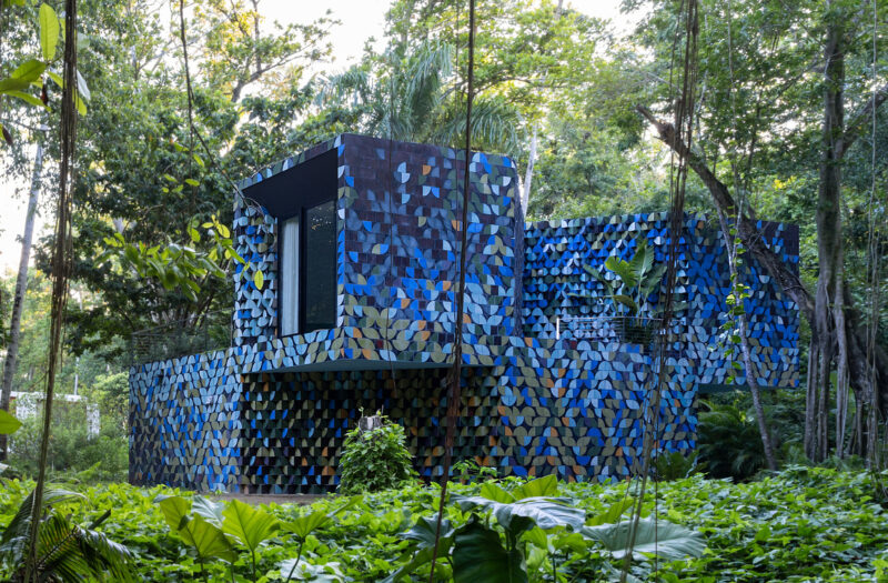
    Under very close examination, one can see that some triangles actually do not touch while others clumsily overlap. Discovering these nuances and related optical effects influenced the development of the tiling strategy at our Glitch House project in the Dominican Republic, and the subsequent silkscreens we completed in collaboration with the Soho gallery a83.

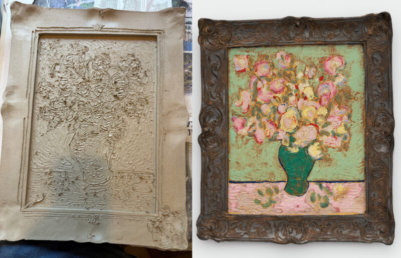
    Side-by-side comparison of a textured, unpainted relief of a flower vase and a finished, framed painting of a similar flower vase with colored flowers.

    Photography by Raina Lee

    2. Van Gogh’s Roses by Raina Lee

    When you know a painting for as long as you can remember and then see it anew, it is deeply mesmerizing.

    Raina Lee’s ceramic Roses, which sit in our kitchen in Brooklyn, is based on Van Gogh’s Roses from 1890, which are on display as part of the permanent collection at The Met. Her version is a truthful replica, restoring the pink color of the roses originally painted in geranium lake and faded over time. Yet the effect of the ceramic glaze casts an uncanny reflection on the masterpiece, as the surface’s sheen and the clay’s subtle dimensionality create a sense of depth that is both analogous to and foreign to Van Gogh’s brushstrokes.

    Lee’s unique glaze to make the pink color is the result of a chemical reaction between chrome and tin. A hand technique in which craft emerges through trial and error, and the actual making is engaged in the final aesthetics.

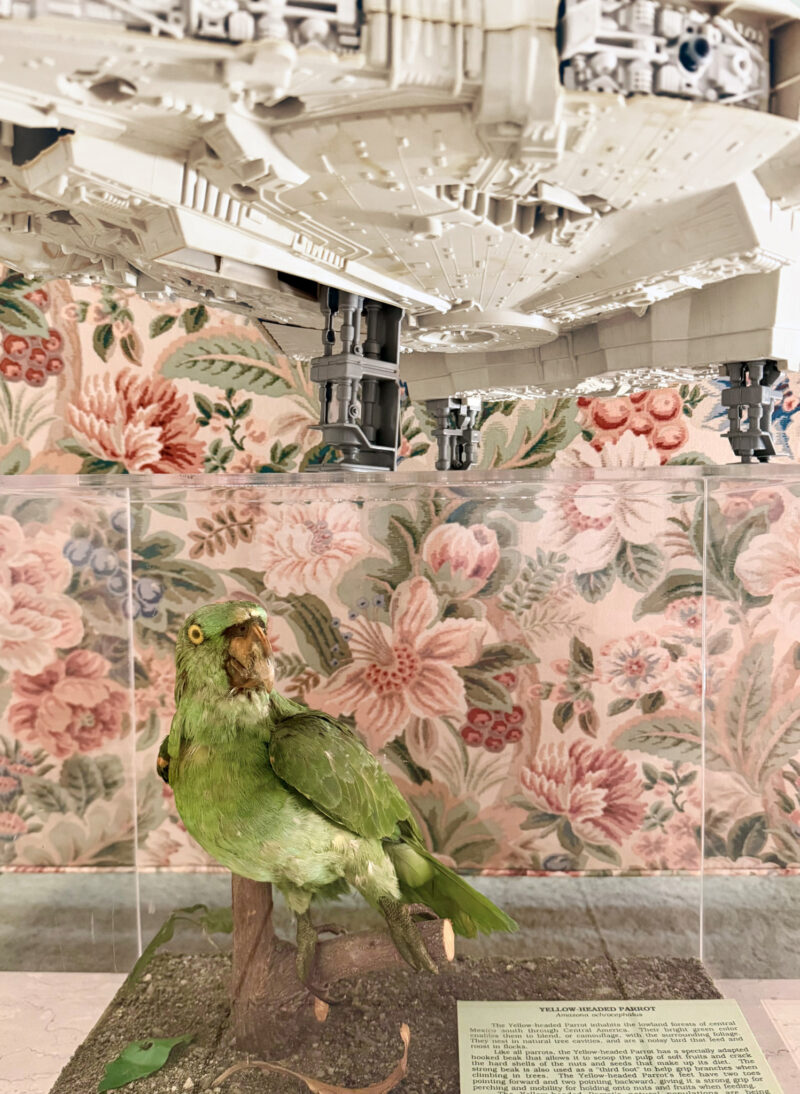
    A taxidermy green parrot is displayed on a branch beneath a model of the Millennium Falcon, with floral wallpaper in the background.

    Photography by Bryan Young

    3. The Parrot and The Falcon

    When things so familiar start to change because of their proximity to other things, it is quite exciting.

    The yellow-headed parrot inhabits the lowland forests of Central Mexico. The artwork came to me via my grandmother, who was a docent at the Los Angeles Natural History Museum. My brothers Mike and John and I share the Millennium Falcon by Kenner, which was released in 1979. The cockpit cover has been missing since 1981.

    Nostalgia and pop-culture references are as important to our concepts as novelty. The strange juxtaposition of the Parrot with the Falcon in front of my mom’s floral sofa is at once a collage of memories and at the same time seeks to provoke otherworldly qualities through their proximity. As objects from my childhood, these pieces fueled a fascination with collecting, shoebox dioramas, plex vitrines, and fictional narratives.

    A person stands in front of a large tree surrounded by dense green vegetation in a forested area.

    Photography by Bryan Young

    4. Playa Grande

    When you live in the concrete jungle where dreams are made of, the landscape of the actual jungle is even more dynamic than you can ever dream of.

    The photograph is of Young Projects’ partner, Noah Marciniak, standing in front of a magnificent ficus tree during an early site visit to Playa Grande in the Dominican Republic in 2015. It is a place that insists on being felt before it can be understood. Light moves through the canopy in rays. The air is thick and alive on your skin. It was clear from the beginning that any architecture placed here would have to answer to all of it.

    The main house for the retreat at Playa Grande takes its cues from the undulating canopy above. Its roof—assembled from 160 scissor trusses that shift and rotate—mimics the restless, fluid geometry of the jungle without touching it. At the center of the house, a courtyard holds another ficus tree. The architecture wraps around it like a conversation rather than a frame.

    A beige event calendar table lists artists, venues, and dates for concerts in Brooklyn, NY, Philadelphia, and nearby areas from October 2024 to May 2025.

    Courtesy of Bryan Young

    5. Shows

    When you have not done something you love for a long time, and then you get to do it again, it is astonishing to realize how much you had missed it.

    My first concert after lockdown was The Flaming Lips at Brooklyn Steel in October 2021. The room was full of people who had not been in a room full of people for a very long time, and everyone knew it. Something was released that night, something that had been held tightly for two years of isolation. Wayne Coyne reminded everyone in his space bubble that we must remain connected, even in bubbles.

    What followed is an ongoing list of concerts across five years: Kendrick Lamar with SZA, Billie Eilish, Bob Dylan, Wet Leg, IDLES, Iggy Pop under the Kosciuszko Bridge, Cameron Winter, The Boss at Barclays, Earl Sweatshirt and Peggy (with no beef on who is experimental). Small rooms and enormous ones. Solo acts and massive bands. The venues themselves are mapped throughout NYC: Bowery Ballroom, Carnegie Hall, Kings Theater, Warsaw, the Knockdown Center, MSG.

    What stays with you is not the setlists, but the people you went with. It is the special electricity of strangers dancing wildly next to people you love. Being fully in it. Being stoked.

    Works by Young Projects

    Modern building with a facade of blue and purple tiles stands amid dense green foliage and trees in a forested area.

    Photography by Iwan Baan and Karla Read

    1. The Glitch House in the Dominican Republic

    The Glitch House nestles into the jungle further inland from the Retreat House at Casa Las Olas. The small structure provides both guest accommodations as well as necessary landscape and maintenance workspaces for the overall property. The building’s exterior is clad in encaustic cement tiles handmade in the Dominican Republic.

    The simple quarter-arc pattern of each tile interferes with the shadows and graphic legibility of the staggered concrete block walls to a vibrating, oscillating effect.

    The Glitch House is the first structure a guest sees upon arriving at Casa Las Olas. Rather than marking this moment with a defined boundary or gatehouse, the Glitch House strangely smears itself into the jungle landscape and hints towards the immersive experiences that guide the design for the retreat in general.

    A modern living room with a grey sectional sofa, wooden coffee table, bookshelves, artwork on the walls, and decorative plants.

    Photography by Gieves Anderson

    2. Soho Loft in New York City

    This loft, located in Soho within a warehouse conversion, elevated a previously renovated three-bedroom layout. A plastered mob foyer, ending in a Scagliola archway, marks the entry to the open living area. Millwork of walnut and stainless steel helps ground the kitchen within the open floor plan, while a series of library bookcases wrap around framing entry to the primary suite, powder room, and laundry.

    A modern dining room with a round wooden table, six chairs with pink seats, a floral centerpiece, green rug, floral curtains, and a gold pendant light.

    Photography by Brooke Holm

    3. French Quarter Cottage in New Orleans, Louisiana

    An interior renovation of an 1820s Creole cottage compound with one of the largest private courtyards in the French Quarter, the property includes a main house and carriage house with a gallery overlooking a walled courtyard, swimming pool, and majestic old-growth trees.

    A classic four-square plan houses the primary rooms: bar, music room, salon, and dining room. The four adjacent rooms are treated as distinct spaces varying in color, finish, material, and furnishings. Each of the primary rooms is linked via “portals,” custom ombre-patinated gold-leafed open doorways serving as thresholds crossing from one distinct space to the next.

    A modern building corridor with wooden beams, metal railings, and greenery from nearby trees, featuring natural light and an open, airy design.

    Photography by Iwan Baan

    4. Casa Las Olas in the Dominican Republic

    Located on a previously undeveloped site, the Retreat House takes full advantage of the pristine beachscape at the front of the property, balancing expansive views of the Atlantic Ocean with the lush, dense jungle that dominates most of the site. Further inland, the Porch House and Glitch House provide additional guest accommodations and supplementary
    program.

    In the most diagrammatic sense, the Retreat House is simply a transformed courtyard parti. Directed by solar orientation, natural ventilation, and the desire to preserve all existing trees and vegetation, the evolved form is a drifting ring that shifts in plan and section just below the jungle’s canopy. The roof is a ruled surface of 160 scissor trusses; each is dimensionally unique, but simple in joinery and construction. The result is a highly complex and fluid structural condition that shifts along corridors, curves through primary double-height spaces, and rotates to navigate the geometry at each corner. The design facilitates a panoramic experience of the site, from its
    diverse jungle landscape to its vast ocean views.

    A green and white marbled chair and a metal table sit on a wooden deck surrounded by lush ferns and dense greenery.

    Photography by Michel Passos Zylberberg; co-designed and fabricated by Art in Construction in Brooklyn, New York; represented by VERSO

    5. Upside Down Chair

    Young Projects worked closely with master plaster artisans Art in Construction to develop this one-of-a-kind piece that combines the 17th-century plaster technique of scagliola with the aesthetics of rough concrete. The outcome is a vibrant marble-like finish that shifts from a smooth, refined sitting surface to a rough geological exterior. The Upside Down Chair’s durable but elegant form and material allow it to be used equally well indoors or outdoors.

  • Design Milk design-milk.com art design design-milk fashion interiors tech 2026-07-24 17:31

    ↗

    As its latest residential model opens in Philly, Urby continues to prioritize thoughtful design, shared spaces, and stronger neighborhood connections

    Urby Is Rethinking Apartment Living Through Design and Community

    For most young professionals, the prospect of renting a decently sized apartment in the center of a major U.S. metropolis like New York, Denver, or Miami can seem impossible. The cost of living in highly desirable urban centers has far outpaced overall salary increases. Urby is seeking to rectify this widespread dilemma and flip the script on what urban living looks like.

    Launched in 2010 by seasoned developer David Barry, the chain has expanded into secondary and tertiary markets near these major urban cores, with suitable transportation links. Though the units are smaller, the emphasis is placed on the communal spaces.

    A person stands with a dog in a landscaped courtyard outside Fishtown Urby, a green apartment building with a wooden entrance labeled "URBY.

    Photography by Robert Tsai; courtesy of Urby and Concrete Amsterdam

    “Apartment living in the United States has become especially transitory and sterile,” Barry says. “My goal has always been to create a more human experience and better facilitate social interaction.”

    In locations like Staten Island, Jersey City, and Washington, D.C., these complexes have emerged as alternatives—fully amenitized, condensed communities, but not hermetically sealed enclaves. Rather, they’ve been successfully implemented to open up and embrace their surroundings.  Innovative, concept-oriented Dutch architecture firm Concrete Amsterdam has been involved since day one.

    Aerial view of a fenced urban courtyard at Fishtown Urby with gravel paths, benches, green lawn, trees, and one person standing near the grass area.

    Photography by Robert Tsai; courtesy of Urby and Concrete Amsterdam

    The company has been instrumental in defining smart layouts and finishing options for the compact, flexible studio to three-bedroom residences, as evidenced in Urby’s latest property in Philadelphia’s Fishtown neighborhood. Beta-tested in a factory before being introduced at scale, these units were designed to more closely align with the needs of Millennial and Gen-Z renters. The kitchens are galley-style but feature all of the essential top-line appliances. Large enough to accommodate queen-size mattresses and a dresser, bedrooms are separated in the layout so roommates have privacy.

    A hallway at Fishtown Urby, with wooden doors, green mailboxes, and hanging lights, leads to a room filled with potted plants and wooden furniture.

    Photography by Robert Tsai; courtesy of Urby and Concrete Amsterdam

    Concrete Amsterdam has also been a crucial partner in shaping the program and design of shared spaces at each location, which include everything from a multifunctional work-from-home lounge that moonlights as a party room to an onsite hotel-style lobby restaurant, a fitness center, outdoor patios, and even a dog park.

    After 15 years of collaboration, Fishtown Urby represents how the two companies have developed a distinctive yet refined approach through trial and error. “You’re always balancing your own experience with how trends are shifting,” says Barry. One such tendency that has emerged in the past few years is the ability to seamlessly move between social and fitness spaces.

    Modern lounge area with wicker chairs, a sofa, coffee tables, numerous green plants, a wooden panel wall, and large windows—perfect for relaxing or gathering with friends at Fishtown Urby.

    Photography by Robert Tsai; courtesy of Urby and Concrete Amsterdam

    At Fishtown Urby, a larger-than-average gym sits on the ground floor. It connects directly to a large backyard barbecue area and dog park. Nearby, a well-lit living room features soundproof office pods and banquette seating. The lobby is preceded by a semi-enclosed entrance courtyard designed with native plants by Belgian landscape architect Bas Smets. Percy, a retro-style cafe serving regional staples, also opens into this calm green space.

    On the top floor, a hidden door leads into a purple-clad disco-style speakeasy with a picture window perfectly framing the Downtown Philly skyline. The rooftop patio serves as yet another gathering space; the strategically introduced cutaways help bring down the sheer scale of the block-wide, all-brick building, better aligning it with the proportion of the repurposed industrial structures and rowhomes in its vicinity.

    Rooftop patio at Fishtown Urby with red and white checkered tile, tables, chairs, potted plants, string lights overhead, and a city skyline in the background under a partly cloudy sky.

    Photography by Robert Tsai; courtesy of Urby and Concrete Amsterdam

    “Every architectural detail here is designed to enhance daily living, from the robust brick envelope to the smartly positioned transom windows that balance privacy with daylight,” says Erikjan Vermeulen, partner at Concrete Amsterdam. “It’s about creating spaces that are not only beautiful, but genuinely functional for urban life.”

    The most critical factor, Urby and Concrete’s key strategy across the chain, has always been to carefully introduce site-responsive elements that are functional, aesthetic, and allow the buildings to blend into the neighborhood. In Fishtown, the structure is emblazoned with a distinctive mural that honors the area’s industrial and creative heritage as well as the Dutch heritage of its maker, noted tattoo artist Henk Schiffmacher.

    A lounge area at Fishtown Urby is seen through an open curtain, with vintage rock posters on the wall and retro furniture including a pink chair and blue sofa.

    Photography by Robert Tsai; courtesy of Urby and Concrete Amsterdam

    True to form when considering the particular strain of ironic irreverence that has defined Dutch design over the past few decades, Schiffmacher collaborated with Royal Delft, the renowned ceramic producer, on a series of Delft Blue plates. The traditional painted pottery features playful, tattoo-inspired patterns and imagery, including dragons, crying hearts, swallows, sailors, and clipper ships.

    One of many in Fishtown, the mural also recalls the age-old tradition, developed by Dutch craftspeople in the 16th and 17th centuries, to imitate Chinese painted porcelain, which was hard to find at the time. Adding to the complex of cultural references embedded in the work, Schiffmacher also drew inspiration from the sacred songline motifs used by Aboriginal Australians as a form of wayfinding. Here, this type of pattern, introduced between the transom windows, is also chosen to honor the local indigenous Lenape people, who used beadwork as a means of communication.

    Corner of a brick building with patterned mural art and geometric tile designs under a clear blue sky, capturing the vibrant aesthetic of Fishtown Urby.

    Photography by Robert Tsai; courtesy of Urby and Concrete Amsterdam

    The rest of the layered imagery nods to the more recent past and present of the location: tools used in the seafood industry that once thrived and the supplies of many of the artists that now live here. The blue-on-white paint scheme is what brings everything together.

    Rather than functioning as a standalone apartment block, Fishtown Urby uses architecture, interiors, and public art alike to weave itself into the neighborhood it now calls home.

    A modern building with green walls and large windows displays the black letters "URBY" on a wooden ledge, partially obscured by tree branches—an inviting sight at Fishtown Urby.

    Photography by Robert Tsai; courtesy of Urby and Concrete Amsterdam

  • Design Milk design-milk.com art design design-milk fashion interiors tech 2026-07-24 14:16

    ↗

    D’Ora Tokai Designs transformed a once-heavy Spanish-style villa into a serene family home where sculptural arches, layered whites, and bespoke furnishings create a sense of everyday restoration

    This Sculptural Dubai Home Turns Arches and Light Into Everyday Luxury

    At first glance, The White Arcade feels almost weightless. Bathed in natural light and wrapped in a palette of warm whites, creamy stone, pale oak, and soft brass, the renovated Dubai villa could easily read as austere. Instead, thanks to a thoughtful interplay of sculptural architecture, tactile materials, and bespoke furnishings, D’Ora Tokai Designs has transformed the once-heavy Spanish-style home into a serene retreat that prioritizes restoration over spectacle.

    Minimalist living room with curved white sofa, a round coffee table, arched doorways, indoor tree, and light wood floor. Sunlight casts shadows on white walls.

    Photography by Casa Mia Visuals

    Created for a senior global executive, her husband, and their three children, the 7,265-square-foot residence in Dubai’s The Villa community was conceived as an antidote to the pace of everyday life. Having previously completed three homes for the family, D’Ora Tokai Designs approached the renovation with an intimate understanding of the client’s lifestyle.

    “Her life is fast, complex, and in constant motion,” says founder D’Ora Tokai. “She wished for a home that restores her the moment she steps inside.” That desire shaped a renovation guided by the studio’s philosophy of “artful minimalism, sculptural softness, and emotional clarity.”

    Modern kitchen with white cabinets, marble backsplash, a curved island with four wooden stools, gold fixtures, and neutral décor. Natural light enters through an arched window.

    Photography by Casa Mia Visuals

    Rather than erase the villa’s Spanish architectural roots, the studio chose to reinterpret them through a softer, more contemporary lens. Existing arches became the project’s defining motif, reappearing across doorways, windows, and passageways in a rhythmic sequence inspired by Moorish traditions. As Tokai explains, “arches became the architectural heartbeat of the project” and connect the home’s original character with the family’s Emirati heritage and the refined European sensibility they were seeking. Picture-frame wall moldings and light oak herringbone flooring provide a sense of order that balances the fluidity of the curves, resulting in interiors that feel both contemporary and timeless.

    Modern bathroom with a freestanding oval bathtub, marble accent wall, dual gold rain showers, built-in shelves, and white walls.

    Photography by Casa Mia Visuals

    The home’s strongest architectural moment unfolds in the central courtyard, a double-height, glass-roofed atrium where layered arches frame one another like a series of sculptural portals. Originally sunken, tiled, and visually disconnected from the rest of the house, the space was raised to align with the main floor, allowing daylight to pour through the overhead glazing and into the surrounding rooms. Mature trees soften the composition, while the curved DOT Objects sofa echoes the surrounding openings, blurring the line between furniture and architecture.

    Modern living room with a beige sectional sofa, round cushions, textured rug, wooden coffee table, floor lamp, and large arched windows with sheer curtains.

    Photography by Casa Mia Visuals

    Set just beyond the entry, the courtyard establishes the home’s quiet rhythm from the moment you step inside. “It sets the emotional tone immediately,” Tokai says, describing it as “welcoming, calm, and quietly powerful.”

    That bespoke approach extends throughout the home. Nearly every major furnishing—from the living room seating to the dining tables and beds—was designed by Tokai’s furniture brand, DOT Objects, allowing the interiors and architecture to speak the same visual language. The monumental formal dining table, crafted from two slabs of white onyx resting on arched bases, required 15 people to assemble, underscoring the studio’s commitment to treating furniture as an extension of the architecture rather than an afterthought. Even transitional spaces receive the same attention, with a softly curved staircase that transforms circulation into another elegant architectural gesture.

    Modern dining room with a long table, beige upholstered chairs, sculptural chandelier, arched doorways, light wood floors, and sheer white curtains letting in natural light.

    Photography by Casa Mia Visuals

    Despite its monochromatic appearance, the home’s material palette is rich with subtle variation. White is layered through textured plaster, Carrara marble, travertine, white onyx, quartz, and natural oak, creating depth through materiality rather than contrast. “White, for us, is a form of clarity and discipline,” Tokai says. “It heightens proportion, reveals light, and allows daily life to feel ordered without feeling strict.”

    Modern dining room with a round white table, six white sculptural chairs, gold geometric chandelier, wooden floor, arched windows, and sheer curtains letting in natural light.

    Photography by Casa Mia Visuals

    The restrained palette also echoes Pantone’s 2026 Color of the Year, Cloud Dancer, while the only intentional departure—a tucked-away sage-green preparation kitchen glimpsed through a playful circular interior window—adds warmth and personality without disrupting the home’s serene atmosphere. Delicate lighting fixtures that resemble floating leaves further soften the architecture, reinforcing the project’s emphasis on quiet beauty over visual excess.

    Throughout The White Arcade, restraint never feels minimal for minimalism’s sake. Every arch, carefully framed view, and custom furnishing contributes to a home designed around emotional well-being. “We sought to create architecture that supports people’s inner lives—spaces that restore, refine, and elevate everyday living,” Tokai says. It’s a philosophy that transforms the renovated villa into something more meaningful: a place where architecture doesn’t simply shelter its occupants but helps them exhale.

    A bright, modern atrium by D’Ora Tokai Designs features white curved seating, a round table, skylight, abstract hanging sculpture, large windows, and a potted tree on a light wood herringbone floor.

    Photography by Casa Mia Visuals

  • Design Milk design-milk.com art design design-milk fashion interiors tech 2026-07-23 19:54

    ↗

    Inside Hotel Perle, Charles & Julia reimagines a historic car dealership with vintage furnishings, rich materials, and quiet references to the city

    A Historic New Orleans Car Dealership Finds New Life as a Cocktail Lounge

    Hospitality design often leans into a destination’s most recognizable visual cues. In New Orleans, that can mean saturated colors, ornate detailing, or overt references to the city’s cultural iconography. For Charles & Julia, however, Anna Nicole Interiors chose a quieter approach.

    Located inside Hotel Perle, in a 1916 former Stutz motorcar dealership, the new cocktail lounge and rooftop bar draws more on the feeling of a lived-in European home than on a traditional hotel bar. Rich materials, collected furnishings, and layered textures transform the industrial shell into a series of intimate spaces, while subtle references to New Orleans keep the project grounded in its surroundings rather than relying on familiar clichés.

    A woman in a floral dress walks past the Charles & Julia bar with yellow stools, a large floral arrangement, and shelves of bottles, in a space decorated with botanical wallpaper.

    Photography by Laura Steffan

    The approximately 3,000-square-foot lounge occupies the building’s original ground floor, where soaring ceilings and exposed brick offered character but also posed the challenge of making an expansive space feel comfortable and inviting. Rather than subdividing the room, the design team used residential strategies—vintage rugs, generous drapery, conversational seating groupings, softened lighting, and custom millwork—to create a sequence of smaller moments throughout the interior.

    A red marble countertop at Charles & Julia features a cocktail, a menu, a lamp, a bowl of limes, and a vase of flowers; yellow stools are in front.

    Photography by Laura Steffan

    The result is a space that feels collected rather than decorated. Oxblood velvet drapery frames the street-facing windows, while grape-toned Bruno Rey chairs sit alongside vintage European furnishings and layered kilim rugs. A custom stained oak back bar anchors the room, complemented by a dramatic Calacatta Viola marble bar fabricated locally. Botanical wallpaper inspired by George Ehret’s 1773 Plantae Selectae introduces another layer of texture, balancing the weight of stone, wood, and brick with a softer visual texture.

    Outdoor bar area with a marble countertop, rattan barstools, potted plants, and metal framework, curated by Charles & Julia, overlooking a patio with tables and chairs.

    Photography by Laura Steffan

    Although the interiors evoke European residential design, the palette remains quietly connected to New Orleans. Rather than referencing Mardi Gras literally, muted chartreuse, aubergine, oxblood, and warm gold appear throughout the space in restrained ways, creating an atmosphere that feels timeless instead of thematic. The concept is loosely inspired by the fictional romance between Charles and Julia, whose imagined journey through Europe informs the layered aesthetic. Rather than telling the story literally, the narrative unfolds through materiality instead.

    Upstairs, the mood shifts completely. While the lounge embraces darker tones and richly layered interiors, the rooftop terrace offers a lighter counterpoint inspired by Sicily and Southern Europe. Sculptural iron furnishings, woven textures, lush greenery, and skyline views evoke an elevated garden overlooking downtown New Orleans. Together, the two levels function as complementary experiences—one intimate and enveloping, the other open and relaxed.

    Outdoor terrace with wicker and metal chairs, small tables, potted plants, and city buildings in the background under a partly cloudy sky—an inviting setting reminiscent of Charles & Julia’s favorite urban escapes.

    Photography by Laura Steffan

    The project also extends its residential sensibility through collaborations with New Orleans artists and makers. Hand-painted lampshades by Rachel Loyacono, original artwork by Tracy Mose, Jenn Leverett, and Casey Langteau, botanical installations by Luna Botanicals, and locally fabricated marble and custom upholstery reinforce the sense of a space assembled over time rather than installed all at once.

    Instead of recreating the New Orleans visitors might expect, Charles & Julia offers an alternative interpretation—one where the city’s history, craftsmanship, and hospitality are expressed through restraint and layered materials.

    Large gold curtains frame the view into Charles & Julia, a modern restaurant with wooden tables, purple chairs, hanging plants, and large windows letting in natural light.

    Photography by Laura Steffan

    Charles & Julia is open daily at Hotel Perle, 757 St. Charles Ave., New Orleans, Louisiana.

    Editorial Transparency: This article was developed with the assistance of AI tools, which may have been used for research, outlining, editing, or copy refinement. Reporting, fact-checking, and editorial decisions were made by the Design Milk editorial team.

  • Design Milk design-milk.com art design design-milk fashion interiors tech 2026-07-22 19:03

    ↗

    'Geometry of Play' transforms Pittsburgh’s newest civic space with a colorful mural that invites players to become part of the composition

    Sharmistha Ray Turns Pickleball Courts Into a Playable Work of Public Art

    Public art is meant to be observed, but Sharmistha Ray’s latest commission invites people to actually step into the composition. At Pittsburgh’s new Arts Landing civic space, the artist has transformed a pair of pickleball courts into a colorful geometric mural that doubles as a fully playable surface. Each match becomes part of the artwork itself.

    Aerial view of a vividly painted sports court featuring Sharmistha Ray Geometry of Play-inspired geometric patterns in bright colors, surrounded by benches and plants.

    Photography by Ross Ribblett; courtesy Pittsburgh Cultural Trust

    Titled Geometry of Play, the installation marks Pittsburgh’s first artist-designed pickleball courts and joins seven other public art commissions at Arts Landing, a new gathering space developed by the Pittsburgh Cultural Trust. The boundaries of the court serve as the foundation for an abstract composition, which was inspired by the visual logic of historic game boards.

    Drawing from board games such as the Indian game Pachisi (later adapted into Parcheesi in the United States), the mural layers interlocking circles, triangles, grids, and pathways into a kaleidoscopic composition. The design spans the full ROYGBIV color spectrum; the rainbow reference serves as a symbol of inclusion while encouraging shifting visual relationships as players move across the surface.

    A man in a suit throws a ring while a woman stands beside him holding a ball, in a colorful outdoor urban area with onlookers and people in costumes—a lively scene reminiscent of Sharmistha Ray’s Geometry of Play.

    Guests play pickleball at the unveiling of ‘Geometry of Play.’ Photography by Chris Uhren; courtesy of Pittsburgh Cultural Trust.

    Geometry of Play changes as the courts are used. The movement of players activates the design, reinforcing pickleball’s reputation as an accessible, social sport while transforming the courts into a shared civic space for recreation and gathering.

    The commission continues Ray’s interdisciplinary practice, which spans painting, installation, and public art. Born in Kolkata and raised in Kuwait before moving to the United States, the artist frequently draws from South Asian visual traditions while exploring themes of identity, belonging, and cultural exchange through geometric abstraction.

    A colorful painted court inspired by Sharmistha Ray Geometry of Play, featuring concentric circles, diagonal stripes in blue tones, and intersecting white lines on an orange background.

    Photography by Chris Uhren; courtesy of Pittsburgh Cultural Trust

    Ray’s recent projects include a large-scale installation at Grand Central Terminal, a commission for Pittsburgh International Airport’s new terminal, and animated works created with an original score by Grammy Award-winning musician Arooj Aftab.

    Designed by landscape architecture firm Field Operations, the $31 million Arts Landing development brings together public art, performance, recreation, and community programming in Pittsburgh’s Cultural District. Geometry of Play joins installations by artists including Vanessa German, Thaddeus Mosley, Shikeith, Mikael Owunna and Marques Redd, Lenka Clayton and Phillip Andrew Lewis, Darian Johnson, and John Peña, with the inaugural commissions remaining on view for at least one year.

    Aerial view of a colorful abstract mural inspired by Sharmistha Ray’s Geometry of Play, with vibrant geometric shapes and concentric circles, intersected by a black pipe and white grid lines.

    Photography by Ross Ribblett; courtesy of Pittsburgh Cultural Trust

    Arts Landing is free and open to the public daily from 7 a.m. to 10 p.m.

    Editorial Transparency: This article was developed with the assistance of AI tools, which may have been used for research, outlining, editing, or copy refinement. Reporting, fact-checking, and editorial decisions were made by the Design Milk editorial team.

  • Design Milk design-milk.com art design design-milk fashion interiors tech 2026-07-22 16:53

    ↗

    The Dolomites resort extends the design language behind its iconic Sky Pool and Heaven & Hell sauna into a reimagined lobby and panoramic wellness spaces

    Hotel Hubertus Completes Its Architectural Vision With a Spa Expansion

    For the past decade, Hotel Hubertus has made headlines for its bold, architecturally adventurous amenities. Now, the 75-key resort has turned its attention to the rest of its wellness spaces, applying the same design language to a reimagined lobby, bar, and panoramic sauna. Earlier additions include the dramatic 82-foot-long cantilevered Sky Pool, introduced in 2016, and the equally “diabolical” Heaven & Hell sauna and cold plunge facility from 2022. Both suspended structures embrace a pared-back aesthetic while subtly referencing the alpine architecture of the Dolomites.

    Modern wooden sauna with tiered seating, large floor-to-ceiling window offering a panoramic view of a green valley, mountains, and cloudy sky. White stones decorate the floor near the window, reflecting the refined design seen in the Hotel Hubertus spa expansion.

    A panoramic sauna at Hotel Hubertus. Photography by Markus Ranalter.

    Jutting out over the valley, the heated infinity pool is supported by timber beams sourced from the region. Also constructed from locally sourced timber, the sauna features a gabled roof shape mirrored upside down on its lower level.

    The pristine, sparsely populated region of northeastern Italy is known for its tall, jagged limestone peaks and clear blue lakes. Above all, these wellness spaces are designed to take full advantage of the striking vista that Hotel Hubertus frames from its eastern-facing mountainside perch. Overlooking the resort is Kronplatz, one of the region’s premier ski destinations, whose slopes become an extensive network of hiking and mountain biking trails during the warmer months.

    Person sits at the edge of an elevated pool, part of the Hotel Hubertus spa expansion, overlooking a misty valley with mountains and a sunrise in the background.

    The Sky Pool was revealed at Hotel Hubertus in 2016. Photography by Nicho di Biasi.

    When it came time to reimagine the rest of Hotel Hubertus’s spa and social spaces, it made sense to do so with the same distilled site-responsivity, without skimping on the effect of grandeur. A reimagined lobby includes a bar and a brand-new panoramic sauna, tucked beneath a green roof that extends from a sprawling grass terrace.

    Modern lounge with a central suspended fireplace, gray sectional sofas, wooden accents, open shelving, and overhead pendant lights—an inviting space reminiscent of the sophisticated elegance found in the Hotel Hubertus spa expansion.

    The reimagined Hotel Huberto lobby. Photography by Markus Ranalter.

    Replacing a set of small cabins, the new sauna is wrapped in a striking herringbone-patterned wood paneling. It plays host to guided infusion rituals at 180 degrees, bio-based treatments at a much more restorative 131 degrees, and steam baths at 112 degrees. Regardless of what guests choose, they’ll always have sweeping vistas in front of them.

    This is a far cry from most resorts, even those nearby, that tend to bury their wellness facilities in basements or away from the most captivating views. Here, every space—including all categories of accommodation—looks out over the valley and soaring mountains in the distance. The minimalist design language keeps the surrounding landscape front and center. The underlying intent is for Hotel Hubertus to integrate more fully into its natural setting.

    Two people walk along a winding path on a grassy hillside, with the modern wooden buildings of the Hotel Hubertus spa expansion and mountain peaks visible in the background under a clear sky.

    Photography by Manuel Kottersteger

    “It looks like one piece of architecture now,” says Markus Gasser, the resort’s second-generation co-proprietor. “We made sure these enhancements stayed true to the surroundings but have a contemporary look and feel.”

    Rather than relying on traditional chalet motifs, the redesign lets the landscape remain the focal point.

    Modern building with angular architecture extends over a hillside; two people sit in a rooftop hot tub, part of the Hotel Hubertus spa expansion, overlooking a scenic rural landscape with mountains and scattered houses at sunset.

    Hotel Hubertus’s Heaven & Hell sauna and cold plunge experience. Photography by Davide Anzimani & Rebecca Paviola.

    “Hotel Hubertus began as a place for my grandfather to gather with friends after a day of hunting,” Gasser explains. “Over the past five decades, we’ve slowly but surely expanded it into what it is now. The focus has always been on providing our guests with the best amenities possible, doing everything to help them enjoy the area, not necessarily maximizing our profit margins.”

    An outdoor pool, part of the Hotel Hubertus spa expansion, extends over a snowy landscape with mountains and a village in the background; one person swims in the pool under a clear sky.

    Photography by Manuel Kottersteger

    Many of the significant changes he and his family have introduced could only have been made because the operation remains so small. Unlike a larger hotel chain, Gasser doesn’t have to run these projects by a supervisory board or a group of outside investors.

    “While we’ve expanded over the years, we’ve kept the room number below 75,” he explains. “The idea is to have our most loyal customers come back time and time again and have something new for them to discover each time.”

    Aerial view of a terraced outdoor area with a linear pool, sun loungers, greenery, footpaths, and modern landscaping features, reflecting the innovative design seen in the Hotel Hubertus spa expansion.

    Photography by Manuel Kottersteger

  • Design Milk design-milk.com art design design-milk fashion interiors tech 2026-07-22 13:00

    ↗

    Designed by Gi21 Arquitectura, Maxcanú Station draws from the Yucatán’s climate, history, and craft traditions

    Maxcanú Station in Mexico Brings a Sense of Place to Transit Design

    Looping around the Yucatán Peninsula in Mexico, the Tren Maya is a 966-mile-long railway route that spans five states, connecting towns and cities, tourist destinations, historic Maya ruins and archaeological sites, jungle landscapes and sandy beaches. A multi-year project, the route features 34 stations (20 major and 14 smaller stops), which serve local passengers and visitors traveling across the region. One key stop is Maxcanú Station, designed by Gi21 Arquitectura.

    Modern building with tall red columns, patterned brick panels, and arched roof; surrounded by palm trees and a dry, sandy landscape under a partly cloudy sky.

    Photography by OHFA

    The Mexico City–based firm conceived the 68,470-square-foot terminal as more than a utilitarian passenger-boarding facility: Gi21 co-founders Eduardo Ramírez Plata and Ximena Beltrán Plata describe it as a “transitional space that offers visitors a place for contemplation and rest.”

    For Gi21, architecture begins with observing a place. The partners spent time in Maxcanú, roughly 40 miles west of Mérida, the capital of the Mexican state of Yucatán, before beginning the design. They said they wanted to “stand and watch everything, to visit the people and to see how they live.” Experiencing the nuances of sites—how the morning sun differs from the afternoon, the weather patterns, the vegetation, the surrounding architecture—informed a great deal of the end result.

    A person walks along a curved sidewalk next to a modern building with tall red columns and decorative panels under a partly cloudy sky.

    Photography by OHFA

    A historic colonial town, Maxcanú is known for its jicama production, Maya ruins, cenotes, and the Iglesia de San Miguel Arcángel, which dates back to the 16th century and boasts a stunning ochre-toned exterior. To maintain visual connection to these surroundings, the station (one of two on the Tren Maya line designed by Gi21) was devised as a curved volume that provides access through multiple entry points and views to the exterior from any position inside.

    Drawing on the ancient Maya city of Palenque in neighboring Chiapas, where vertical columns support horizontal platforms, the station translates that structural language into full-height plastered concrete brackets that frame entrances and guide circulation. The brackets also facilitate cross-ventilation and provide a system of sunshades to further control indoor temperatures.

    A modern building with tall red columns and decorative panels stands under a partly cloudy blue sky, with street lamps and a sidewalk visible.

    Photography by OHFA

    The entire building is tinted a deep terracotta made using a natural dye extracted from cochineal insects. The pigmented hue is significant in Indigenous cultures and was inspired by the nearby church’s tone. The red is complemented by local tropical wood pivot doors, which can be left open during the day to enhance ventilation and easily closed at night when the station is not in use.

    Above the doors are a series of lattice-like panels made from prefabricated concrete. The basket-weave detail of the panels references regional textile patterns while also increasing the amount of light and air that flow through the interior. A tighter weave pattern was used for panels on the platforms themselves, which provide shade and a sense of privacy and protection. In both scenarios, the interplay of light and shadow evokes the feeling of being under the canopy of the Maya Forest.

    Covered train station platform with patterned wall on the right, yellow tactile paving, and train tracks on the left under a partly cloudy sky.

    Photography by Pavelín

    Classified as Category A infrastructure, the station is built on a shallow foundation and reinforced concrete footings, a decision made to contend with the site. During construction, archaeological remains and cenotes were discovered, requiring a sensitive building process and further fueling criticism of the larger Tren Maya project.

    Collaborating with the National Institute of Anthropology and History (INAH) and the Ministry of Environment (along with SEDENA and the Government of Mexico), the architects accommodated the limestone terrain and subterranean structures while also meeting all seismic, subsidence, and wind load requirements.

    Spacious interior with patterned brick walls, wooden panels, glass partitions, and an exposed metal ceiling. Natural light enters through geometric brick screens.

    Photography by Pavelín

    Inside the station, programming is organized around a central atrium and includes ticket offices, lobbies, courtyards, and restrooms. An exposed beam-and-vault system reinforces the overall openness and helps minimize maintenance needs. Local travertine marble tiles line the floor, with the exposed metal framework painted a rich black for graphic contrast.

    Respectful of its surroundings and providing much-needed infrastructure to the area, Maxcanú Station is not only a stop on the railway line, but also a destination in its own right.

  • Design Milk design-milk.com art design design-milk fashion interiors tech 2026-07-21 18:02

    ↗

    Natural materials, subtle textures, and durable finishes prove minimalist interiors can be both elegant and eminently livable

    A Wellesley Home Where Quiet Luxury Meets Everyday Life

    Warm minimalism usually depends on empty space and quiet surfaces. This 14,500 sq. ft. home in Wellesley, 20 minutes west of Boston, applies that restraint to a house occupied by an active family of five, a large dog, and frequent entertaining. Tharon Anderson McEvoy, owner and principal of Tharon Anderson Design, treats minimalism as a durable framework rather than a set of precious surfaces, prioritizing tactile materials that withstand daily use.

    Modern open-concept living room and kitchen with neutral tones, marble backsplash, pendant lights, a sectional sofa, and a wooden coffee table with flowers and decorative items.

    Photography by Matt Kisiday; production by Karine Monié; styling by Katja Greef

    Ivory, gray, taupe, brown, and black establish a neutral field that Anderson McEvoy describes as both her default and a palette a client will not tire of. She builds variation through texture and tone rather than pattern, layering natural oak, plaster, stone, mixed metals, wool, linen, and mohair. Roman Clay walls in Portola limewash add hand-troweled depth to rooms that would otherwise read flat; it’s a finish closer to old-world fresco preparation than to modern paint.

    Modern living room with large windows, light wood walls, a gray sectional sofa, a dark armchair, and a round coffee table. A door opens to a patio with trees visible outside.

    Photography by Matt Kisiday; production by Karine Monié; styling by Katja Greef

    Modern kitchen with a marble island, four bar stools, pendant lights, light wood floors, and a large vase with dark red foliage.

    Photography by Matt Kisiday; production by Karine Monié; styling by Katja Greef

    Indoor-outdoor performance fabrics, normally used outside, move indoors to withstand the daily traffic of three children and the dog, keeping upholstery soft and serviceable. Anderson McEvoy designed each gathering space—from the open kitchen and great room to the living room and a dedicated cigar lounge—around the client’s request that a single room accommodate both adult dinner parties and weekend gatherings for the children.

    Modern living room with large floor-to-ceiling windows, neutral furniture, a marble fireplace, and a view of green trees outside.

    Photography by Matt Kisiday; production by Karine Monié; styling by Katja Greef

    Modern living room with a beige sofa, nested coffee tables, a black vase with white flowers, books, a lamp, and large windows with cream curtains and a view of greenery.

    Photography by Matt Kisiday; production by Karine Monié; styling by Katja Greef

    She conceived the project just after the pandemic, without the travel that usually informs her work, and drew instead on her classical architecture training and her early exposure to the traditional-coastal interiors of Nantucket. The result reflects that evolution, tailored and modern where her earlier work leaned coastal, and calm by intent.

    Modern dining room with a round wooden table, four chairs, large windows overlooking greenery, sideboard with a vase, abstract painting, and minimal pendant light.

    Photography by Matt Kisiday; production by Karine Monié; styling by Katja Greef

    Modern two-story house with large windows, white exterior, and attached garage. The lawn is well-manicured, and there are mature trees and outdoor seating in the backyard.

    Photography by Matt Kisiday; production by Karine Monié; styling by Katja Greef

    Catalano Architects gave the house its New England exterior, white-painted brick, stucco, and a cedar roof beneath steep peaks that reference tradition while the interiors remain modern. Soderholm Custom Builders completed the two-year build, with landscape design by Dan Gordon.

    Modern dining room with light wood table and chairs, minimalist decor, geometric lighting fixture, artwork, vase with white flowers, and large window with beige curtains.

    Photography by Matt Kisiday; production by Karine Monié; styling by Katja Greef

    The furnishings and commissions are substantial, including a Lindsey Adelman chandelier over the dining table, Apparatus lighting in the great room, Porter Teleo hand-painted wallpaper, and artwork by Kenny Nguyen and Holly Addi.

    Across three levels and six bedrooms, the basement is given over to family use, with a game room and a sports court where Babson basketball players run practices for the children and their teammates.

    Modern living room with neutral tones, wooden furniture, a white sofa, and textured abstract wall art beside a staircase. Books and decor items sit on the wooden table.

    Photography by Matt Kisiday; production by Karine Monié; styling by Katja Greef

  • Design Milk design-milk.com art design design-milk fashion interiors tech 2026-07-21 17:25

    ↗

    The expanded NKYINKYIM A CASA collection pairs USM’s modular Haller System with Portuguese textiles and West African symbolism

    Armando Cabral Reimagines USM Through a Cross-Cultural Lens

    Wrapped in elaborate, multi-directional striped fabrics, the cushions in Armando Cabral’s new USM-assembled furnishings reinterpret the centuries–old weaving traditions of Portugal’s Alentejo region in a new way. Featuring a daybed, love chair, bookshelf, side table, and valet wardrobe, the recently expanded NKYINKYIM A CASA collection reflects the value of cross-cultural exchange and demonstrates how furniture can serve as a means of personal and shared cultural expression. For Cabral, a former top-ranked model and now lifestyle entrepreneur, the fresh offering in the Haller System is a chance to reflect on his own multinational upbringing.

    Open doorway in ornate room with wooden floor, blue modular shelving unit from USM holding books and decor, chair to the left, and a portrait of Armando Cabral above the shelves on a decorated wall.

    Photography by Inês Silva Sá

    Born in Guinea-Bissau, raised in Portugal, educated in London, and now based in New York, Cabral’s reference points are diverse but also inherently interconnected. The first word of the eight-piece collection, “NKYINKYIM,” derives from the Adinkra symbol (a visual language developed by the Akan people of Ghana and Côte d’Ivoire) that represents the intertwining paths of progress and overcoming challenges, both as an individual and as a collective. “A Casa” is the Portuguese phrase for “at home.”

    A blue modular cabinet by USM with sleek chrome edges stands on a wooden floor beside blue and white patterned wall tiles; books and a decorative object, curated in the style of Armando Cabral, rest on top.

    Photography by Inês Silva Sá

    USM’s iconic Haller System reflects a hyper-rationalist mindset, one that might seem devoid of clear cultural identity, echoing the ideals of post-World War I modernism. Ironically, the pared-back, form-follows-function philosophy embodied by the modular furniture solution is emphatically Swiss: hyper-efficient and neutral. Despite its near-endless interpretations through USM’s many collaborations over the past few years, the Haller System still carries that sophistication—which serves as a canvas for Cabral’s exploration.

    Modern orange modular bench by Armando Cabral with a striped cushion and pillows, set in an ornate room featuring classic wooden floors, tall windows, a floor lamp, and sophisticated USM accents.

    Photography by Inês Silva Sá

    “To me, the modular nature of USM’s designs symbolizes the way each component forms a cohesive, functional structure,” he says.

    Through experimenting with color palettes and asymmetrical compositions, Cabral worked within the confines of the brand’s signature system. The result is a collection that integrates seamlessly with other components of the Haller System. In doing so, he pushed the potential of its use and function even further. It’s a sort of provocation for the viewer to reconsider what furniture, overall, can accomplish.

    A small beige USM metal side table holds a stack of books and a wooden shoe form, set against an ornate, painted wall—a subtle nod to the refined aesthetics admired by Armando Cabral.

    Photography by Inês Silva Sá

    For example, the Uno Bookcase takes on the unexpected shape of geometric symbolism through its steel tube-and-connector-ball structure, accented by colored insert panels. Meanwhile, the Bassarel Love Chair boldly reprises the age-old tête-à-tête typology. Two chairs are placed side by side while facing opposite directions to facilitate more intimate, gossipy exchanges. The collection balances both visual and practical attributes in a coherent, playful, yet refined fashion.

    A man stands indoors by large windows, surrounded by green potted plants and colorful-striped seating in a modern, industrial-style space—an ambiance that echoes the signature sophistication of Armando Cabral USM.

    Photography by Inês Silva Sá

  • Design Milk design-milk.com art design design-milk fashion interiors tech 2026-07-21 13:00

    ↗

    The Flos collaboration transforms an oversized Tyvek® diffuser into a customizable wall lamp

    Erwan Bouroullec’s New Flos Lamp Is Designed to Be Different Every Time

    French designer Erwan Bouroullec has designed plenty of lighting over the years, but his latest collaboration with Flos leaves the final form in the hands of its owner. Available on Jul. 21, Maap is a new wall-mounted lighting system built around a crumpled Tyvek® diffuser that transforms each installation into a one-of-a-kind composition. Rather than prescribing a final form, Bouroullec designed the lamp to be shaped, reshaped, and interpreted by the person living with it.

    “I see design as part of a whole,” Bouroullec says. “Designs need to cooperate with a given environment and somehow enhance it.”

    A sculptural light fixture resembling crumpled paper is mounted on a white wall above a black and wood desk and a wooden swivel chair.

    Photography courtesy of Erwan Bouroullec

    The project reflects Bouroullec’s long-standing interest in balancing precise geometry with the unpredictable qualities of nature. A simple steel framework and magnetic attachment points provide the underlying structure, while the oversized Tyvek envelope takes on unique folds and contours depending on how it’s arranged, ensuring no two installations are exactly alike.

    “Maap embodies flexible and combinative construction principles which make it ready for architects to play with,” Bouroullec says. “[It’s about] providing solutions instead of a given proposal, thinking about collaboration instead of uniqueness, play instead of execution.”

    A sculptural chair faces a glowing cloud-like light fixture on a dark wall, with a small statue displayed on a white pedestal nearby.

    Photography by Santi Caleca; courtesy of Flos

    The lamp’s seemingly delicate shell is made from Tyvek, a material Bouroullec selected after paper proved too fragile during development. Tear-resistant yet exceptionally lightweight, Tyvek can be repeatedly reshaped while maintaining its structure. Large magnetic “Dots” secure the material to a steel framework while allowing it to be repositioned and reconfigured over time, reinforcing the idea that the object remains open to interpretation rather than fixed in a single composition.

    A black circular disk placed on wrinkled white paper.

    Photography courtesy of Erwan Bouroullec

    Available in three sizes, with the largest spanning just over 10 feet wide, Maap transforms an entire wall into a softly glowing surface. Rather than emphasizing a single point of illumination, the oversized diffuser creates an ambient wash of light that Bouroullec likens to sunlight filtering through a window or glass wall, producing an atmospheric presence that feels as architectural as it is decorative.

    Two illuminated, crumpled paper-like wall sculptures with embedded black circular elements are displayed on adjacent white walls in a minimalist gallery space.

    Photography courtesy of Flos

    Maap is available through Flos flagship stores, flos.com, and at Design Within Reach (the exclusive launch partner), in stores and on dwr.com.

  • Design Milk design-milk.com art design design-milk fashion interiors tech 2026-07-20 18:00

    ↗

    Custom furniture, bold color, and clever spatial planning transform this compact São Paulo apartment into a flexible home that feels far larger than its 538 square feet.

    Studio Papaya Makes a Small Apartment Feel Surprisingly Spacious

    Small in size but clever in ideas, the 538-square-foot SBC Apartment in São Paulo, Brazil shows how thoughtful design can stretch a footprint beyond its physical limits. Studio Papaya approached the apartment as a kind of living system, where color, material, and custom furniture work in unison to show how the home is used from morning to night.

    Modern living space with a cushioned sofa, wooden modular shelves, artwork, plants, and a table with chairs; natural light streams in through large windows.

    Photography by Arthur Duarte

    The entry sets the tone immediately. A saturated green envelopes the threshold and pulls you inward, flowing from floor to walls and even overhead, so that moving through the apartment feels guided rather than simply walked. Storage is incorporated into arrival through a finely detailed wooden screen that hides everyday clutter while still letting light and air pass through. A low seat and built-in compartments make pausing, dropping a bag, or choosing a record part of the ritual of coming home. With the former balcony absorbed into the interior, the ground level reads as a single long, open plane rather than a series of chopped-up rooms.

    A modern living space with wooden shelving, books, framed art, two round stools, a cushioned bench, and a white table on a concrete floor.

    Photography by Arthur Duarte

    Modern interior with a wooden pegboard holding hats and bags, a bookshelf with books and art, and a green wall with framed artwork and a wall sconce.

    Photography by Arthur Duarte

    A statement piece of furniture was designed to do multiple jobs. A custom table slides and expands, shifting between prep station, dining surface, and worktop depending on what the day requires. Around it, the kitchen has the directness of a studio workspace with pale cabinet fronts revealing their plywood edges, while steel surfaces reflect light and keep things visually sharp. Subtle changes underfoot replace walls as the main organizers of space—one finish for cooking, another for lounging, and a third to signal movement through the apartment—so the eye understands where each activity belongs without a single partition rising.

    Modern kitchen with white cabinets, stainless steel appliances, wooden dining table, upholstered chairs, and built-in open shelves with dishes and fruit.

    Photography by Arthur Duarte

    Modern kitchen with white cabinets, stainless steel appliances, a gas stove, oven, and open shelving displaying dishes, glassware, and fresh fruit.

    Photography by Arthur Duarte

    Much of the home’s flexibility comes from bespoke joinery. On the lower level, shelving, screens, and storage units align like pieces of a puzzle, supporting everything from entertaining friends to stretching out on the sofa. Even the seating is adaptable, with movable elements that double as tables or ottomans. A soaring window fills the double-height volume with leafy views, effectively turning the facade into a green backdrop that blurs the line between inside and out. Artificial lighting is kept intentionally restrained, stepping in only when daylight fades.

    Modern kitchen and dining area with wooden furniture, large windows, built-in cabinets, pendant lights, and a view of trees outside.

    Photography by Arthur Duarte

    Modern living space with large windows, orange chairs, indoor plants, and wooden furniture, featuring natural light and a view of trees outside.

    Photography by Arthur Duarte

    A modern living space with a cushioned daybed, potted plants, a table set with baked goods, candles, and natural light from large windows.

    Photography by Arthur Duarte

    Modern kitchen with green accent wall featuring three circular mirrors, open shelving with plants, and white cabinets; wood details on ceiling and countertop.

    Photography by Arthur Duarte

    Modern green entryway storage unit with open shelves, a cabinet, a potted plant, three round mirrors, shoe cubbies, and a framed photo near stairs.

    Photography by Arthur Duarte

    Looking up, the mezzanine floats above this open living area, lightly defined by a slim guardrail accented with green panels. The color palette warms with earthy wall tones and honey-colored wood floors that create a relaxed zone for watching films or reading. Instead of solid walls, a slatted divider filters sightlines and sunlight, allowing privacy without sacrificing brightness. Shelving and mirrors along the circulation path add moments of reflection and depth, making the narrow passage feel animated rather than tight.

    A modern living room with a wooden slat partition, shelves holding plants and books, a brown sofa, and an orange accent wall.

    Photography by Arthur Duarte

    A modern living room with orange and white walls, a brown sofa, a flat-screen TV, wooden flooring, and pendant lights hanging from the ceiling.

    Photography by Arthur Duarte

    Modern living space with wooden floor, open vertical wood partition, wall shelves with decor, potted plants, and pendant lights, featuring a red sofa in the foreground.

    Photography by Arthur Duarte

    The bedroom continues this sense of calm. Custom millwork clears the floor, so the space feels larger and less cluttered. The bed is framed by a simple wooden headboard that discreetly integrates lighting and power, while the main wardrobe is cleverly positioned in the vertical void beside the room. From the inside, this frees up much-needed square footage; from the outside, it appears almost suspended, an unexpected architectural feature within the double-height space. Soft curtains diffuse the daylight, giving the room a cozy, cocoon-like quality.

    Modern upstairs hallway with wooden floors, green partition, potted plants, a built-in bench, shelving, and a view into a bright bedroom. Large window lets in natural light.

    Photography by Arthur Duarte

    A minimalist bedroom with a neatly made bed, white linens, wooden cabinets, a bouquet of flowers on the nightstand, and sheer curtains letting in natural light.

    Photography by Arthur Duarte

    A modern dining table with two wooden chairs, decorative items on the table, and a small side table with magazines on a terrazzo and concrete floor.

    Photography by Arthur Duarte

  • Design Milk design-milk.com art design design-milk fashion interiors tech 2026-07-20 17:11

    ↗

    Rather than completing its office space all at once, the Portland design studio spent three years refining the space as its practice grew

    Pat Austin’s Portland Studio Was Designed to Evolve

    Interior designers often use their studios as opportunities to express their fully formed aesthetic. Pat Austin has a point of view—it just didn’t come together all at once. Rather than rushing to complete its Portland office, founders Candace Cohu and Ally Hasche spent the last three years allowing it to evolve naturally, testing ideas, collecting vintage pieces, and refining details as the practice itself grew.

    That slower pace has resulted in a workspace that feels less like a static showroom and more like an extension of the studio’s design process.

    A wooden dining table with black chairs sits by large windows with autumn leaves visible outside; a modern light fixture hangs above.

    Photography by Pablo Enriquez

    Located in Portland’s Central Eastside inside the Historic Cully Building, an 1884 structure with exposed brick walls and heavy timber construction, the approximately 1,200-square-foot office immediately stood apart from the warehouse spaces the duo had been considering.

    “We were touring a lot of open warehouse-style spaces that were missing the warmth and character of our studio,” Cohu and Hasche explain. “We walked [into our current space], and it felt reminiscent of a Chicago or New York office. We loved the brick, the big windows, and the large oak tree.”

    Open double doors reveal a small table with two stools in a softly lit room; a potted plant stands to the right on a wooden floor under an exposed beam ceiling.

    Photography by Pablo Enriquez

    Those architectural bones became the framework for an office to grow over time. A generous open workspace brings together custom maple desks, a conference table, and a residential-style lounge, while a separate materials library provides space for quieter, focused work. Instead of filling every corner immediately, the designers allowed the office to develop alongside their practice.

    “We’ve been very thoughtful about pacing out the process,” the duo shares. “Naturally we’re designers, which means we like to test different iterations of things, collect items, and take our time on decisions when we have that luxury.”

    That philosophy is visible throughout the office. White walls create a quiet backdrop for a rotating mix of vintage furniture, custom pieces, rugs, and artwork. Earth-toned furnishings and natural materials—including wood, stone, and woven fibers—establish a sense of warmth, while rotating artwork and accessories allow the space to shift over time.

    A modern dining area with a round black table, four chairs, a sculptural hanging lamp, and a kitchen with shelves and various items in the background.

    Photography by Pablo Enriquez

    “The space easily came together as a reflection of us, and our appreciation for eclecticism,” they say. “It feels fluid and able to evolve while also feeling artful and warm.”

    Much of that evolution happened gradually. After moving into the building in 2022, the team continued refining the office before completing a major round of updates in late 2025, including custom upholstery, drapery, a sculptural pendant above the conference table, fresh paint, and an upholstered acoustic wall in the materials library. Rather than treating those additions as a finished renovation, they became another chapter in an ongoing process of experimentation.

    Black metal bookshelf with drawers, books, decorative items, and boxes stands against a white wall with exposed brick and wooden floor. A brown chair is partially visible in the foreground.

    Photography by Pablo Enriquez

    “We’ve always wanted the office to feel more residential than commercial,” Cohu and Hasche say. Comfortable seating encourages informal conversations, while the kitchen serves as a daily gathering place. Together, the spaces support both focused work and collaboration without feeling overly prescribed.

    That spirit of experimentation extends beyond the interiors practice. The office also serves as home base for Patty, the rug collection launched by Cohu, Hasche, and studio director Max Pluenneke. Inspired by travels through the South of France, the collection extends the studio’s ongoing interest in natural materials, earthy palettes, and craftsmanship.

    “Pat Austin and Patty work together in a very harmonious and symbiotic way,” the team says. “Our knowledge of interior design influences how we approach rug design, but it has also opened up new ways of thinking.”

    Nearly four years after moving into the Historic Cully Building, Pat Austin’s office continues to evolve alongside the practice. Shaped through careful additions rather than a single sweeping transformation, the space reflects the designers’ belief that the best interiors often emerge over time, through experimentation, and with thoughtful refinement.

    Editorial Transparency: This article was developed with the assistance of AI tools, which may have been used for research, outlining, editing, or copy refinement. Reporting, fact-checking, and editorial decisions were made by the Design Milk editorial team.

  • Design Milk design-milk.com art design design-milk fashion interiors tech 2026-07-20 13:00

    ↗

    Working from the same recycled HDPE sheets, six Lawrence Technological University students created a cohesive collection that earned ICFF’s Best of Schools award.

    How 6 Students Made Recycled Plastic an Award-Winning Collection

    Furniture, lighting, and even a room divider might not seem to have much in common at first glance, but Lawrence Technological University (LTU) in Southfield, Michigan, found unity in an unexpected place: sheets of 100% recycled HDPE made from post-consumer plastic, including discarded milk crates. Created by six sophomore Product Design students at LTU, the collection transformed the material into a cohesive series of objects that explored craftsmanship, experimentation, and the creative potential of circular design, earning the university the Best of Schools award at this year’s WANTED Schools Showcase during ICFF.

    A blue-walled exhibit displays modern furniture and lighting pieces made of light and dark materials, including a lamp, table, screen, and decor items, with Lawrence Technological University signage.

    Photography by Jenna Bascom Photography

    Developed in LTU’s Sustainable Systems course, the exhibition was created in partnership with Michigan-based manufacturer Design Declassified and supported by the Centrepolis Accelerator. Rather than treating recycled HDPE as a limitation, students embraced its unique properties, producing furniture and lighting that diverted approximately 1,300 pounds of plastic waste while demonstrating the material’s potential beyond conventional applications.

    What makes the achievement especially notable is that the exhibition wasn’t assembled from projects across the university’s design program. Instead, the entire collection was produced by a single undergraduate class. The exhibition featured work by Ashgen Boyer, Dante Cerroni, Lourdes Davish, Sofia Eddy, Delanie Shorten, and Ryan Sukhraj.

    A circular, speckled white and black sculpture with a hollow center stands upright on a matching arched black base, displayed on a white pedestal against a gray background.

    A design project by Dante Cerroni. Photography courtesy of Steve Kroodsma/LTU.

    “I teach the Sustainable Systems course,” says adjunct professor Erika Cross, who curated the exhibition and proposed applying to ICFF after seeing the caliber of work her students were producing. “Unlike most School Showcase booths, which feature curated collections of work pulled from across entire design programs, ours was a collection produced solely by undergraduate students within this single course.”

    Because every student worked from the same recycled material, the exhibition developed a shared visual language while leaving room for individual exploration. The resulting collection included Cerroni’s Loop Lamp, Davish’s Phoji Room Divider, Shorten’s Nested Coffee Table, and Sukhraj’s Cloud Puzzle, each approaching the shared material through a different lens.

    Three abstract, interlocking sculptural objects with a white and black speckled pattern rest on a plain white pedestal against a light gray background.

    A project by Ryan Sukhaj. Photography courtesy of Steve Kroodsma/LTU.

    “The students didn’t have to worry about their pieces fitting our collection,” Cross says. “The material was the common denominator, but the students’ unique methodologies were the variables.”

    That freedom led to unexpected discoveries throughout the semester. Davish collected waste shavings from the CNC router, melted them into translucent, veneer-like sheets, and stitched them together to create the Fade Floor Lamp, complete with a subtle black-to-white gradient. Eddy experimented with kerf-cut HDPE to create an expandable coffee table base that retained enough flexibility after heat-forming to accommodate multiple tabletop sizes.

    A cylindrical lamp with a dark top and base, and a translucent white body with speckled details, sits on a plain white pedestal against a neutral background.

    A project by Delanie Shorten. Photography courtesy of Steve Kroodsma/LTU.

    For Cross, those moments reinforced an important lesson: meaningful innovation often begins by understanding a material rather than imposing preconceived ideas upon it.

    “The real exercise was proving that recycled materials can achieve a high level of luxury and craft,” she says. “Ultimately, the goal was to design pieces so aesthetically compelling and structurally thoughtful that they stand on their own merits first, with their sustainable origin story as a beautiful secondary discovery.”

    Receiving the Best of Schools award validated not only the students’ work but also LTU’s emphasis on industry partnerships and hands-on learning. Cross hopes projects like this continue to shape the future of design education, giving students opportunities to engage directly with emerging materials, manufacturing processes, and real-world collaborators while developing thoughtful solutions to increasingly complex challenges.

    Tall, textured sculptural lamp with a columnar shape, transitioning from light at the top to dark at the base, standing on a plain background.

    A project by Lourdes Davish. Photography courtesy of Steve Kroodsma/LTU.

    Learn more about Lawrence Technological University’s Product Design program at ltu.edu, and follow the College of Architecture and Design on Instagram.

  • Design Milk design-milk.com art design design-milk fashion interiors tech 2026-07-17 15:00

    ↗

    The Alkemis Paint co-founder shares the artists, landscapes, and experiences that continue to shape her creative perspective

    F5: Price Latimer on Scuba Diving, Leigh Bowery, Yoko Ono + More

    Price Latimer grew up in Texas and lived just a few doors down from the Amarillo Museum of Art. With pieces by Georgia O’Keeffe, Larry Bell, and Louise Nevelson, the museum was a place that shaped her aesthetic sensibility. “Both of my grandmothers would frequently wheel me over in my pram before I could walk, and let me stare for what felt like hours at the permanent collection there,” she says.

    Latimer received a bachelor’s degree from Rhode Island School of Design, where she immersed herself in the study of art. While in New York City, she worked for neo-conceptual artist Peter Halley and contributed to his magazine, Index, where she brought her own creative touch to the pages.

    After moving to Los Angeles, she worked at local galleries before joining Italian furniture manufacturer Kartell, where she consulted with architects and interior designers to furnish spaces ranging from offices to large-scale hotels. She later co-founded Pizzanista!, a pizza restaurant, and served as its chief creative officer.

    Ever the entrepreneur, Latimer co-founded Alkemis Paint in 2021 with Maya Crowne. The company’s all-natural interior paint is formulated with clear quartz paired with proprietary mixes of pigments and minerals.

    When Latimer is not focused on day-to-day business, surrounded by color, she can probably be found on a flight headed to an exotic locale. “Exploring the far corners of the globe is one of my great passions, and I’ve been at it for as long as I can remember,” she says. “I relish finding those offbeat, weird hidden gems.”

    Today, Price Latimer joins us for Friday Five!

    A mannequin in a green and pink polka dot outfit stands in front of a red wall with photos and white circles, displayed in a gallery setting.

    Photography by Price Latimer

    1. Leigh Bowery at The Tate Modern

    Leigh Bowery lived fast, loud, and without apology, and he is hands down one of my all-time favorite creators. He truly blurs the lines between art and life. In a career that defied every attempt at categorization, Bowery twirled between performer, model, designer, musician, club promoter, and cultural provocateur, treating each identity not as a label but as a new frontier. Emerging from the electric chaos of 1980s London nightlife, he weaponized clothing and makeup as sculpture, turned his body into a constantly evolving canvas, and pushed the limits of aesthetics, sexuality, and gender. This incredibly comprehensive, immersive exhibition at the Tate Modern brought together his iconic “Looks” and his collaborations with Lucian Freud, Nick Knight, Michael Clark, and more, while pulling back the curtain on the creative underground through the eyes of the friends, freaks, and fellow visionaries.

    A person in a hat looks out over a green and rocky landscape with hills under a bright blue sky with scattered clouds.

    Photography by Price Latimer

    2. Palo Duro Canyon

    I grew up in the Texas Panhandle, not far from Palo Duro Canyon, one of the most underrated natural wonders in the United States. It’s the second-largest canyon in the country behind the Grand Canyon, and hardly anyone knows about it! Roughly 25 to 40 miles long with an average width of 6 miles, it reaches up to 20 miles wide in places. Millennia of water erosion have shaped its geological formations, including caves and hoodoos (which inspired Alkemis Paint color number 53). The stunning color striations of oxidized red, maroon, grey, yellow, cream, and lavender are formed by layers of siltstone, shale, gypsum, evaporite, opal, caliche, and sandstone. Inhabited by humans for 10,000–15,000 years, it is deeply tied to the history of the Comanches, serving as a historic stronghold for the Quahadi band. Georgia O’Keeffe also painted the canyon between 1916 and 1918, when she was an art instructor at a nearby college, prior to her move to New Mexico.

    A small wooden cabin stands in a dry, grassy field under a bright blue sky with wispy clouds; a group of people walks in the distance.

    Photography by Price Latimer

    3. The Lightning Field by Walter de Maria

    I was honored and fortunate to visit the incomparable land art work The Lightning Field by Walter de Maria (commissioned by Dia Art Foundation in 1977) in southern New Mexico a few years back with a handful of friends. It consists of 400 stainless steel poles with solid, pointed tips arranged in a rectangular 1-mile by 1-kilometer grid. De Maria scoured the Southwest for over five years before settling on this stunning site. Although photography of the artwork itself isn’t permitted, I’m sharing a photograph of the landscape. You’re dropped off at a remote homestead cabin in the high desert outside of Quemado, New Mexico. The vistas are colossal, and you can see for what feels like an eternity in every direction. Sitting down for sunset, we arranged ourselves in a semicircle looking out toward the horizon, watching the sun dip below the mountains. We collectively shared a meditative moment, and when we opened our eyes, there was literally a half-circle of rabbits in a mirrored formation, looking back at us. Unforgettable… as were the night skies!

    A scuba diver swims underwater behind a large school of yellow fish above a sandy ocean floor and coral reef.

    Photography by Price Latimer

    4. Scuba Diving

    I’ve been scuba diving since I was in my early teens, and I am completely obsessed. It is one of the most unbelievable and surreal feelings to enter this completely magical alternate reality, a veritable underwater kingdom. It goes without saying that I’m a huge proponent of ocean conservation (one of the underlying tenets of Alkemis Paint’s mission to keep harmful petrochemical-based paint out of our oceans and waterways). Being able to temporarily experience the unique, kaleidoscopic sea creatures, coral, reefs, and underwater landscapes up close makes it all the more poignant and urgent that we must protect, defend, and preserve this fragile and irreplaceable ecosystem.

    Typed text reads: "CLEANING PIECE III" with instructions to avoid negativity for varying periods and observe life changes. Signed "y.o. 1996.

    Photography by Price Latimer

    5. Yoko Ono’s Cleaning Piece III

    From Yoko Ono’s collected book called Acorn, which contains 100 brief thought experiments. I think this is pretty self-explanatory and is a beautiful mantra on how to live a more compassionate, kind and empathetic life. Yoko has been an intrepid force in art and music throughout her 60-plus-year career.

    Works by Alkemis

    A modern art gallery features vibrant textile artworks, geometric rugs, and two people seated on red woven chairs, engaged in conversation.

    Photography courtesy of RISD Museum

    1. RISD Museum

    Because it’s my alma mater, it’s such an honor to participate in anything related to Rhode Island School of Design. It holds the future of the best creative minds and is constantly pushing the envelope of innovative design, so we were thrilled to collaborate on the paint palette for the Liz Collins: Motherlode exhibition, celebrating the work of the queer feminist artist known for her bold abstract patterns, inventive use of materials, and radical experiments with fiber.

    A textured fiber wall art in neutral and blue tones hangs above a wooden bench in a sunlit modern interior with large windows and a green planter.

    Photography by Joyce Billett

    2. Design Miami

    Our favorite art fair of all time, and a dream come true to be part of it these last three years. It was the very first palpable thing we manifested when we started this business together, so seeing it come true never stops feeling like a pinch-me moment. We worked closely with the team to develop custom and handpicked paint palettes to colorfully complement and harmonize the curatorial narrative.

    Art gallery space with a round table featuring an organic, sculptural base, abstract sculpture on top, a blue wire artwork, and a colorful textile on pastel gradient walls.

    Photography by Logan Jackson

    3. Objects USA

    This gradient was out of control (shout out to muralist Nick Kuszyk for executing this)! It took what was displayed to a whole new level, accentuating nearly 100 works by 55 artists, designers, and studios from across the US. The exhibition walls were painted with Alkemis Paint in a curated color palette developed in conjunction with R & Company, using meticulous gradient decorative painting techniques as a deliberate antidote to the customary white box, setting the atmosphere with vibrant visual innuendo to guide attendees through the curatorial chronology.

    A cozy living room corner with a wooden cabinet, potted plant, floor lamp, cushioned chair, patterned ottoman, sculpture on a crate, and a window with curtains letting in natural light.

    Photography by Joe Kramm

    4. Joe Kramm’s Farmhouse

    Joe is an incredibly talented photographer specializing in art, design, and interiors. We are proud to call him a friend and so grateful to be part of this spectacular 1902 waterfront Pennsylvania farmhouse; it features Alkemis Paint throughout.

    Colorful ceramic vases displayed on dark wood shelves against a teal wall, featuring a gold decorative mural of birds and foliage above a faux fireplace.

    Photography by Joe Kramm; courtesy of Roberto Lugo and R & Company

    5. Roberto Lugo

    Roberto is a Puerto Rican-American ceramicist, activist, and poet who reimagines classical porcelain and pottery. Hearing him speak about the social justice messages in his work brought us to tears. It’s been incredible to watch his success and to play even a very small part in his journey as the vibrant backdrop to some of his exhibitions.

  • Design Milk design-milk.com art design design-milk fashion interiors tech 2026-07-17 14:00

    ↗

    The Swedish brand’s limited-edition Grand Open collection transforms the bold geometry of grass and clay courts into hand-loomed New Zealand wool rugs

    Nordic Knots Turns the Tennis Court Into a Graphic Rug Collection

    This summer has been defined by a number of major sports events, seeing the triumph of underdog players and teams along with some controversies. Though the somewhat fraught World Cup might have overshadowed the Wimbledon Championships, tennis has long been one of summer’s defining sports. Its distinctive visual language has long extended beyond the court. Swedish brand Nordic Knots’ latest rug collection brings that recognizable geometry indoors, translating grass and clay courts into graphic floor coverings.

    A black tennis racket and a yellow tennis ball sit on a green tennis court with white boundary lines, evoking the crisp, contemporary elegance found in the Nordic Knots Grand Open rug collection.

    Photography courtesy of Nordic Knots

    Deftly captured within the sumptuously decorated halls of stately southeast London manor Eltham Palace, The Grand Open rug collection is within reach of the more modest homeowner. The brightly colored rug brings the specifically delimited outdoor space inside—it’s simple in visual but doesn’t overwhelm with unnecessary or gimmicky details.

    The contrast between the grass green and white geometric lines of this pictorially represented playing surface and the medieval-meets-art deco setting are striking nonetheless. The rug also comes in a blue clay court variant. While the layering of this design is straightforward, the elaborate marquetry of the interior is far more complex. Designed by Eltham Palace’s architect, Rolf Engströmer (who is also Swedish), historic intarsia woodworking hints at the highest level of craftsmanship, a quality also intrinsic to The Grand Open rug offering.

    A blue grid mat from the Nordic Knots Grand Open rug collection is on the floor with a white fabric draped diagonally, inside a wood-paneled room with stairs and a round window.

    Photography courtesy of Nordic Knots

    Where one might perceive intricacy is in the 100 percent New Zealand wool, hand loomed and cut pile make-up of the design. The subtle textural and tonal shifts in the 14mm-thick rug replicates the nuances one might find in a closely cut field of grass or a meticulously brushed clay surface. Naturally, Nordic Knots has doubled down on the full narrative of this limited edition release, producing an even more limited run of branded rackets and tennis balls.

    In recent years, the rug has become a popular medium to re-assess; the form lends itself well to pictorial and representational depiction. Art brought down from the wall, the typology has been used to hold a vast variety of images, not just spatially referential but also entirely fantastical and trompe l’oeils.

    A metal basket filled with tennis balls, some yellow and some red and blue, sits on a green tennis court near white boundary lines, echoing the vibrant colors of the Nordic Knots Grand Open rug collection.

    Photography courtesy of Nordic Knots

    In terms of sports-related designs, one such recently released collection centers on the multivalent portrayal of the pool: a clearly defined environment perhaps as equally aspirational as the tennis court but still widely attainable in certain contexts: public parks for example.

    One can now furnish their home with tennis courts and pools without having to flip the exorbitant bill to have them built and then maintained.

  • Design Milk design-milk.com art design design-milk fashion interiors tech 2026-07-17 13:00

    ↗

    Inspired by the quiet strength of an elephant, the award-winning lounge chair balances sculptural expression with comfort and everyday functionality

    Heechan Kim’s Loxo Chair Blurs the Line Between Sculpture and Seating

    Inspired by the quiet strength of an elephant, Heechan Kim’s Loxo Chair explores the space where sculpture and furniture meet. Pairing a slender walnut frame with a generously upholstered cylindrical bolster, the lounge chair recently earned the Best of Students award at this year’s WANTED Schools Showcase during ICFF. Developed while Kim was pursuing an MFA in Furniture Design at the Savannah College of Art and Design, the project translates the reassuring qualities of an elephant into an object designed for everyday use.

    A modern interior with a pink wall, shelves holding small plants and decor, a black cylindrical cushion on a wooden bench, and a wooden wall-mounted shelf.

    The Loxo Chair on display at ICFF. Photography by Jenna Bascom Photography.

    Named for Loxodonta, the African elephant genus, the chair doesn’t mimic the animal’s form so much as it evokes its gentle character. A suspended upholstered bolster conveys weight and softness, while the walnut frame provides a refined counterpoint through its clean lines and carefully considered curves.

    The project grew out of Kim’s encounter with one of Maurizio Cattelan’s elephant sculptures. Rather than recreating the animal, he became interested in translating its emotional qualities into furniture.

    A wooden chair with a black cylindrical leather bag resting on the seat and backrest, with straps draped over the chair's top rail.

    Photography courtesy of Heechan Kim

    “I began wondering whether furniture could communicate the emotional connection and sense of reassurance one might experience when interacting with a large, gentle animal such as an elephant,” Kim says. “Rather than directly reproducing the animal’s form, my goal was to express the comfort and sense of trust associated with its presence through both visual and tactile experiences.”

    That philosophy also reflects Kim’s path into furniture design. After earning a BFA in Sculpture, he found himself wanting to create work that extended beyond gallery walls and into everyday life.

    A person in casual clothing sits on a platform in front of a modern black leather bench, with shelves and wooden decor on a mauve wall in the background.

    SCAD graduate student Heechan Kim with his award-winning design. Jenna Bascom Photography.

    “I became increasingly interested in moving beyond the creation of beautiful forms to consider how those forms could be used by people and influence their everyday lives,” he says. “I was drawn to furniture design because it brings together function and usability while also allowing objects to reach and connect with a wider audience through production and distribution.”

    While Loxo’s oversized bolster immediately draws the eye, the supporting frame is equally considered. Echoing the gentle U-shaped curve created as the suspended cushion settles under its own weight, the walnut frame becomes an integral part of the composition rather than merely supporting it.

    A display of modern furniture pieces and decor in maroon and pink tones at the SCAD Furniture Design exhibit.

    SCAD’s display at ICFF’s Wanted segment. Photography by Jenna Bascom Photography.

    Like many student projects, the Loxo Chair evolved through iteration. Working within a limited budget, Kim prototyped the chair in faux leather, while user testing revealed opportunities to refine the cushion’s proportions and seating comfort. Those lessons have already informed the next version, which he hopes to produce in natural leather or another high-performance upholstery material.

    For Kim, the chair’s sculptural presence only succeeds if it invites people to sit down.

    “I hope people experience a sense of visual unfamiliarity when they first encounter the chair, followed by a feeling of familiarity and comfort once they sit in it,” he says. “I want it to provide a satisfying and comfortable experience when it is actually used.”

    A modern lounge chair with a large cylindrical black leather cushion and wooden frame sits beside a slim, black floor lamp on a wooden floor against a plain wall.

    A rendering of the Loxo Chair; courtesy of Heechan Kim.

    Receiving the Best of Students award marked an important milestone as Kim prepares to transition from graduate school into professional practice.

    “It represented more than receiving a positive response to a single project,” he says. “It gave me confidence that I am ready to move beyond the student stage and take the next step in my career.”

    Kim is now developing a furniture collection that explores how furniture designed for broader production can retain a strong sculptural identity while remaining functional for everyday life. If the Loxo Chair is any indication, that balance between artistic expression and utility will continue to define his work.

    A cylindrical black leather cushion is secured with wide straps on a wooden frame, set against a plain white background.

    Photography courtesy of Heechan Kim

    Learn more about Heechan Kim’s work on his website and on Instagram.

  • Design Milk design-milk.com art design design-milk fashion interiors tech 2026-07-16 20:34

    ↗

    The food artist reimagines Rocco’s signature beverage fridge in a glossy Black Mirror finish and accompanying custom champagne coupe designed for entertaining

    Laila Gohar Brings Her Playful World to Rocco’s Beverage Fridge

    For nearly a decade, food artist Laila Gohar has blurred the boundaries between art, design, fashion, and hospitality. Through whimsical food installations for galleries and cultural institutions, she transforms hosting into an immersive form of storytelling. Guests engage with unexpected ingredients, surreal tablescapes, and playful interventions that encourage them to reconsider everyday rituals around food.

    Gohar has created an ecosystem around this approach: one forged around the idea of hosting as an interdisciplinary art practice. So it should come as no surprise that she was called on by boutique home appliance brand Rocco to create a limited-edition finish for its flagship Super Smart Fridge. Lending her playful yet discerning eye, Gohar developed the Black Mirror finish.

    A black mini fridge with a glass door stands in front of sheer curtains, topped with a lamp, a bottle of white wine, and two glasses.

    Photography by Adrianna Glaviano

    To achieve the inky finish, each fridge takes 18 days to complete, using an automotive finishing process. It includes premium lacquer, ceramic coating, three-stage polishing, and a final wax. The result is an ultra-reflective, piano-black appliance that feels more like a piece of furniture than a kitchen appliance.

    Conceived as a nod to celebration, the Black Mirror finish feels perfectly at home within Gohar’s own aesthetic—equal parts sleek and nostalgic, cheeky and refined. “As a rule, I always keep a bottle of chilled Champagne at home ready for any unexpected guests,” Gohar explains.

    Person with bright orange hair selects a canned drink from a black cart filled with assorted beverages, glassware, and a modern desk lamp.

    Photography by Adrianna Glaviano

    Equipped with an ultra-quiet, high-end compressor, Rocco’s smart beverage refrigerator is defined by its distinctly deco-esque half-bullnose edge contour. The appliance is fitted out with isolated temperature zones and a custom rack system perfectly suited for different types of bottles. Its setback top tray is ideal for mixing drinks or setting out glasses of bubbly. Configured like a piece of furniture—a dresser with an elevated core and long extended legs— the Rocco Fridge is easily transportable and plays well in different types of interiors, compact or capacious.

    A person holding stacked plastic cups sits by a desk with lamps and glassware, partially reflected in a mirror.

    Photography by Adrianna Glaviano

    Through their Gohar World homewares brand, Laila and her sister, Nadia, designed a custom coupe to accompany the launch. The fluting echoes the fridge’s semi-translucent glass door, while the campaign photographs the sisters in orange-red wigs as mirror-image alter egos to reinforce the collection’s playful sense of duality.

    Like much of Gohar’s work, the collaboration transforms an everyday object into part of a larger ritual—one where hosting becomes as thoughtfully designed as the space itself.

    A black cabinet with ribbed glass doors holds clear glassware and a pitcher with a colorful design on top.

    Photography by Adrianna Glaviano

  • Design Milk design-milk.com art design design-milk fashion interiors tech 2026-07-16 17:52

    ↗

    Thoughtful millwork, natural stone, and custom furnishings unify two pre-war Manhattan apartments into a warm, contemporary home for a young family.

    Lindye Galloway Reimagines Two Upper West Side Penthouses as One Home

    The most telling detail of this Upper West Side penthouse, designed by Lindye Galloway, is not a material or a fixture but a logistics marvel. Almost every large custom piece arrived by crane, lifted over Manhattan and swung into the top floor because the pre-war building’s elevator was too small to contain them.

    That single constraint speaks volumes about designing inside New York’s early 20th-century towers, the Emery Roth lineage of thick-walled, generously proportioned apartments that reward ambition and then quietly limit how that ambition physically enters the room. Working on her first New York project, Galloway treated the limitation as a brief rather than an obstacle, committing to bespoke work knowing each element would have to be engineered to navigate through the air.

    Modern kitchen with light wood cabinetry, marble countertops, beige upholstered dining bench, wooden chairs, pendant lights, and large windows overlooking city buildings.

    Photography by Mike Van Tassell.

    Having bought both the penthouse and the floor beneath it, the clients presented a single defining challenge: two stacked units that needed to read as one home for a family with young children. Galloway’s answer runs through the millwork, where consistent custom stains span both stories and the same wood extends from the flooring into the paneling. Marble does similar connective work, appearing as window casings, built-ins, and a carved nook in the primary bath.

    A modern living room with neutral tones, two armchairs, a wooden coffee table, a striped rug, built-in cabinets, fireplace, and a large black chandelier.

    Photography by Mike Van Tassell.

    In the great room, the challenge was defining zones without cluttering the floor with furniture that would compete with the view. Rather than float a dining table, Galloway attached banquette seating directly to the kitchen island, collapsing two functions into one intimate gesture and freeing the rest of the room. Above the seating, a ceiling treatment does a job typically reserved for the rug: drawing an invisible boundary that tells you where one area ends and another begins.

    A bright hallway with wood floors, beige walls, skylight, double doors on the left, wall sconces on the right, and a wooden door at the end.

    Photography by Mike Van Tassell.

    The clustered kitchen pendants are sculptural, and the palette of makers— Apparatus, Allied Maker, alongside custom fixtures—situates the project squarely within contemporary American craft. Apparatus brings a moody, deco-inflected richness, while Allied Maker offers a quieter, handmade clarity. In the bathrooms, Famosa tile and natural veining aim for something spa-like and organic, warmth pulled from stone rather than color.

    Modern kitchen with wood finishes, marble countertops, hanging pendant lights, open shelves, and large windows showing a cityscape in the background. Dining table with chairs in the foreground.

    Photography by Mike Van Tassell.

    Light wood kitchen cabinets, marble countertop, patterned tile backsplash, black faucet, two black jars, a vase with flowers, glasses on a shelf, and wall sconces above.

    Photography by Mike Van Tassell.

    Modern living room with neutral tones, a large artwork above a fireplace, built-in shelves, light wood furniture, a window with a city view, and two pendant lights overhead.

    Photography by Mike Van Tassell.

    A modern living room with neutral-toned furniture and decor, large window with cityscape view, wooden coffee table, and beige carpeting.

    Photography by Mike Van Tassell.

    A modern living room features a fireplace, built-in shelves with decor, a dark armchair, a beige sofa, and a light wood coffee table on a textured rug.

    Photography by Mike Van Tassell.

    Minimalist living room with neutral tones, featuring a round wooden coffee table, modern armchairs, floral arrangement, large window with sheer curtains, and wall with decorative plates.

    Photography by Mike Van Tassell.

    A modern bedroom with beige walls, a large bed with layered bedding, abstract wall art, and natural light streaming in from windows. Minimalist decor and soft, neutral tones throughout.

    Photography by Mike Van Tassell.

    A softly lit bedroom features a curved headboard, patterned wallpaper, neutral bedding, a round wooden nightstand with a vase of tulips, and an open wooden door leading to a light hallway.

    Photography by Mike Van Tassell.

    Modern bathroom with a freestanding tub, black fixtures, two towels hanging on the wall, and a window with a city view. A small vase with flowers sits on the windowsill.

    Photography by Mike Van Tassell.

    A round upholstered bench sits in front of a wood cabinet with marble accents, two vases with calla lilies, and a decorative bowl in a softly lit, neutral-toned room.

    Photography by Mike Van Tassell.

  • Design Milk design-milk.com art design design-milk fashion interiors tech 2026-07-16 16:47

    ↗

    Soft Imprints translates the duo’s shared instincts for color, pattern, and tactility into a limited-edition collection of rugs and pillows.

    Alex Proba and Salehe Bembury Turn Their Signature Motifs Into Home Decor

    Alex Proba and Salehe Bembury speak different design languages. The founder of StudioPROBA moves fluidly between murals, interiors, furniture, and public art to build exuberant compositions rooted in emotion and color. Bembury, meanwhile, has become one of contemporary footwear’s most recognizable designers, translating fingerprints, topography, and organic textures into highly coveted sneakers and products. Yet despite working in different disciplines, both have long shared an interest in how color and pattern shape the way people experience an object.

    Two people hold colorful, abstract-patterned pillows from the StudioPROBA x Salehe Bembury Soft Imprints collection. The man on the left wears a blue cap and patterned sweater, while the woman on the right wears glasses and a multicolored dress.

    Salehe Bembury and Alex Proba with their new collection, Soft Imprints. Photography courtesy of Alex Proba and Salehe Bembury.

    That common ground forms the basis of Soft Imprints, the duo’s second collaboration (Absorbed Language launched in 2021). The limited-edition collection of rugs and pillows combines Bembury’s signature fingerprint motif with Proba’s abstract forms and saturated palettes, creating tactile pieces that feel like functional furnishings as much as collectible works.

    Two colorful, abstract-patterned pillows from StudioPROBA’s Soft Imprints collection and a matching rug are arranged on the floor near a window; a stack of books sits beside them.

    Photography courtesy of Alex Proba and Salehe Bembury.

    Rather than treating pattern as decoration, the collection uses repetition, texture, and color to create movement across woven surfaces. Two rug designs and two pillow styles merge the designers’ visual vocabularies into what feels less like a mash-up than a natural evolution of individual ideas.

    “I’ve always believed that objects should make you feel something,” Proba says. “With Soft Imprints, we wanted every piece to feel joyful, tactile, and full of life.”

    Modern living room with large windows, neutral armchairs, colorful abstract rug and cushions inspired by StudioPROBA Salehe Bembury Soft Imprints, wood-paneled wall, floating shelves, and contemporary decor.

    Photography courtesy of Alex Proba and Salehe Bembury.

    That emotional dimension has long been central to Proba’s practice, which spans painting, interiors, sculpture, and public installations. For Bembury, whose work frequently draws inspiration from nature and the human touch, the collaboration reflects a shared confidence in intuition over trends.

    “I’ve always admired how fearless Alex is with color,” Bembury says. “We both trust our instincts, and that’s a much more interesting place to start than a trend forecast.”

    Color is one of the collaboration’s strongest points of connection. Even though their careers have developed in different industries, both designers see color as something that fundamentally changes the relationship between people and objects.

    Modern living room with a beige sectional sofa, colorful StudioPROBA Soft Imprints abstract pillows and rug, metallic wall, small metallic side table, and decorative sculpture, with sheer curtains in the background.

    Photography courtesy of Alex Proba and Salehe Bembury.

    “Alex and I have always shared a similar way of looking at color,” Bembury explains. “Even though we work in different mediums, we both believe color can completely change how someone experiences an object.”

    That mutual understanding also shaped the creative process itself. Soft Imprints embraces the distinctiveness of both practices, rather than trying to soften the individual aesthetics.

    Curved white sofa with two colorful abstract StudioPROBA Soft Imprints pillows, geometric side table with books, and a multicolored abstract rug in a modern living room with large windows and city view.

    Photography courtesy of Alex Proba and Salehe Bembury.

    “The best collaborations happen when both people have a clear point of view,” Bembury says. “Alex’s work is unmistakably hers, and that’s what makes building something together interesting.”

    Proba echoes that sentiment, describing the collection as the product of a long creative dialogue rather than a one-off partnership.

    “Design is a conversation,” she says. “This collection is the result of years of mutual respect, curiosity, and a shared desire to create objects that people want to live with.”

    Modern beige sofa with metal arms, two colorful abstract-patterned pillows inspired by StudioPROBA, and a vibrant rug featuring matching Soft Imprints designs in a contemporary living room setting.

    Photography courtesy of Alex Proba and Salehe Bembury.

    Produced as a limited edition of just 80 rugs and 200 pillows, Soft Imprints will be available in limited quantities on probahome.com and salehebembury.com.

    Editorial Transparency: This article was developed with the assistance of AI tools, which may have been used for research, outlining, editing, or copy refinement. Reporting, fact-checking, and editorial decisions were made by the Design Milk editorial team.

  • Design Milk design-milk.com art design design-milk fashion interiors tech 2026-07-15 22:25

    ↗

    As Aman, Four Seasons, Ritz-Carlton, Waldorf Astoria, and Orient Express launch branded yachts, each is translating its signature design philosophy into a new form of luxury travel.

    Luxury Hospitality Brands Bring Their Design DNA to the Sea

    The luxury hospitality industry is undergoing a massive sea change. In an unprecedented wave of creative evolution, five of the world’s most elite hotel brands are officially venturing beyond their land-based properties into the sleek, hyper-curated intimacy of the yachting world. Aman, Four Seasons, Ritz-Carlton, Waldorf Astoria, and the legendary Orient Express are among the luxury hospitality brands reimagining ocean voyages by launching bespoke, residential-style mega-yachts. For them, it’s not simply about entering a new market; it’s about creating a meticulous, fluid translation of architectural identity, spatial design, and six-star hospitality, collaborating with architecture and interior experts to rethink marine design from the keel up.

    Here, we take a closer look at how these brands are bringing their distinct identities to the water—and what their ambitious yacht concepts reveal about the future of cruising.

    Four Seasons Yachts: Mid-Century Glamour
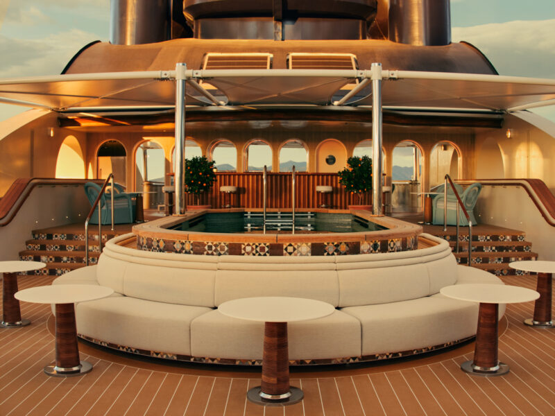
    Luxury yacht deck with a round pool, curved sofa seating, white tables, tiled steps, and decorative plants in the background.

    Centered around an adults-only plunge pool, the Horizon Lounge pairs wraparound banquette seating, arched openings, and handcrafted mosaic detailing with the relaxed feel of a Mediterranean beach club. Photography courtesy of Four Seasons Yachts.

    Inspired by the romance of classic yachting, Four Seasons made the connection to the ocean the guiding principle in its foray into the yachting space. The brand launched with the maiden voyage of Four Seasons I in March 2026, offering just 95 all-suite accommodations and hosting approximately 200 guests.

    “Rather than focusing on maximizing capacity, we focused on maximizing the quality of the guest experience,” says Ben Trodd, CEO of Four Seasons Yachts. “From the beginning, we were inspired by the golden age of yachting and a desire to create a deeper connection to the sea. While we wanted the yacht to feel distinctly Four Seasons, we also wanted to embrace the romance and heritage of classic yachting, with subtle nods to iconic vessels such as Christina O and maritime-inspired details woven throughout the design.”
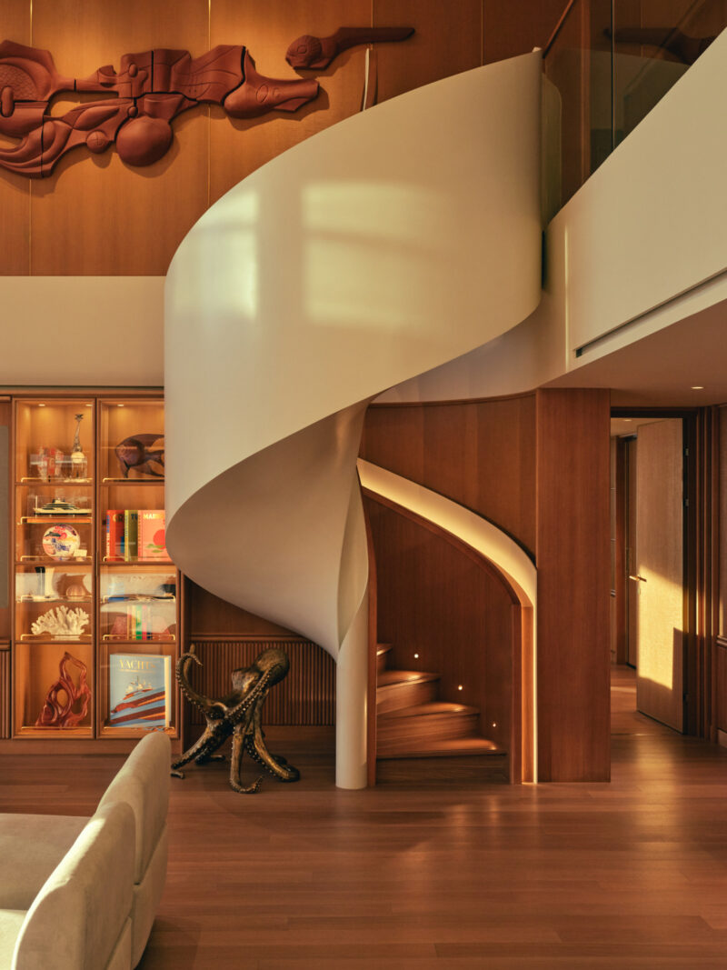
    Curved white spiral staircase in a warm-toned interior, with bookshelves, art, and sculptural decor surrounding the modern wood and glass space.

    A Nautilus-inspired spiral staircase serves as the sculptural centerpiece of the suite, winding through warm wood interiors accented with curated art and maritime touches. Photography courtesy of Four Seasons Yachts.

    The brand worked with a team of partners, including Fincantieri, Tillberg Design of Sweden, MBDS, and Prosper Assouline, to help bring this vision to life. “What sets the design apart is how nautical influences are paired with Four Seasons’ residential philosophy. The generous scale of the accommodations, expansive private terraces, and the absence of interior rooms make the yacht feel more like an elegant private residence at sea,” says Trodd.

    Achieving that connection required an engineering pivot: instead of placing the yacht’s structural support beams along the exterior walls, designers routed them through the ship’s interior core. This freed up the hull to feature expansive, uninterrupted walls of floor-to-ceiling glass, maximizing ocean views and ensuring the horizon remains visible wherever guests are onboard. “Every design decision ultimately stemmed from that desire to keep guests connected to the sea,” Trodd says.
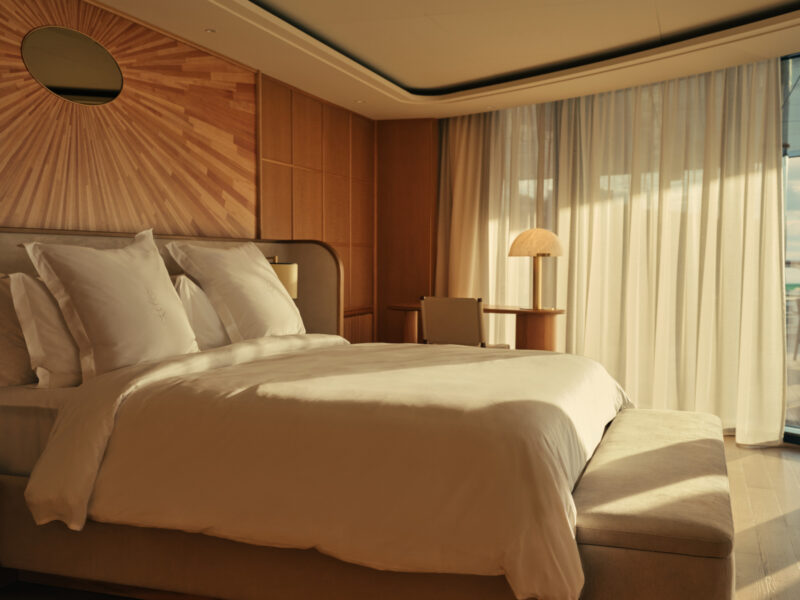
    Modern hotel room with a large neatly made bed, cushioned bench, wood paneling, sunburst wall art, desk, lamp, and sheer curtains letting in natural daylight.

    A radiating wood-marquetry headboard serves as the suite’s focal point, while floor-to-ceiling glass, sheer drapery, and custom millwork create the feeling of a private waterfront residence. Photography courtesy of Four Seasons Yacht.

    What makes the yacht particularly special are the handcrafted details woven throughout the vessel. Intricate mosaic work draws inspiration from both classical and contemporary art, while elements such as a Nautilus-inspired spiral staircase pay homage to the natural world.

    “Guests will discover curated displays of books, objects, and collected artifacts within the suites, hand-selected by Prosper Assouline to create a sense of personality and place,” Trodd explains. “If they leave feeling like they’ve experienced the comfort and service of the Four Seasons in a way that could only exist at sea, then we’ve achieved what we set out to create.”
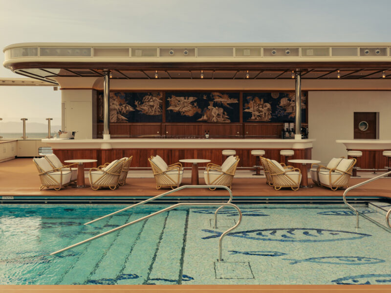
    A poolside bar with wicker chairs and tables sits adjacent to a swimming pool with a fish mosaic. Wall art with ocean motifs decorates the bar area.

    Aboard the Four Seasons, custom fish mosaic animates the pool floor, while warm wood millwork and Mathilde Nivet’s mythological sea-inspired murals transform the adjacent bar into an architectural focal point. Photography courtesy of Four Seasons Yachts.

    The brand has already announced plans to expand the fleet, with a slightly smaller, even more intimate sister ship, Four Seasons II, slated to debut in 2028 with just 79 suites.

    Orient Express Sailing Yachts: Cinematic French Minimalism
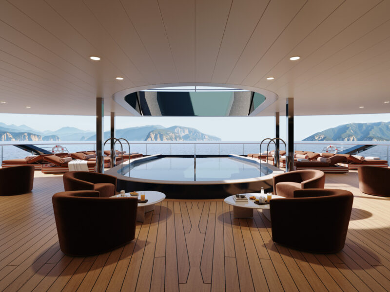
    Luxurious yacht deck with circular pool, brown lounge chairs, and side tables. Ocean and mountains are visible in the background through open sides. Bright, modern setting.

    On Orient Express Sailing Yachts, a circular pool anchors the open-air deck, where wraparound teak decking, striped daybeds, and low-slung lounge seating frame panoramic views and reinforce the yacht’s clean architectural lines. Photography courtesy of the Orient Express.

    Echoing the heritage of the great ocean liners that shaped the golden age of travel alongside the brand’s legendary trains, the Orient Express has extended into yachting with Orient Express Sailing Yachts.

    “The objective was to remain faithful to a certain idea of travel, its rhythm, refinement, and continuity, and transpose it into life at sea while maintaining a constant dialogue between the interior, exterior, and movement,” says Maxime d’Angeac, artistic director of Orient Express and the creative force behind the yacht’s overall design.
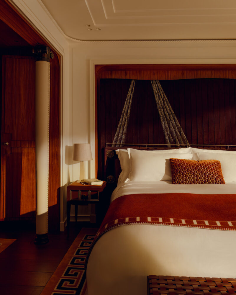
    A neatly made bed with white and rust-colored linens, pillows, and a throw pillow, next to a wooden nightstand and lamp in a warmly lit bedroom.

    The suites layer richly figured wood paneling, fluted columns, custom metalwork, and tailored textiles to reinterpret the glamour of 1930s rail travel in a contemporary yacht setting. Photography courtesy of the Orient Express.

    The brand made its maritime debut with the launch of the Corinthian in June 2026. Measuring 220 meters, the yacht blends the intimacy of a superyacht with the grand, sweeping scale and romantic legacy of an iconic ocean liner. The yacht maintains an intimate footprint with just 54 suites, hosting a maximum of 110 guests.

    A large, modern yacht with three masts sails near rocky cliffs at sunset under a partly cloudy sky.

    The 721-foot Orient Express Corinthian combines a sleek hull with three towering rigid sails, creating a striking silhouette that reimagines the elegance of classic sailing yachts on an unprecedented scale. Photography courtesy of the Orient Express.

    The vessel is defined by a disciplined architectural language. “It’s not about style in the decorative sense, but about proportion, clarity, and the way spaces are composed,” d’Angeac says. While the Corinthian was not designed as an extension of any existing property, its inspiration comes from the legendary Orient Express brand and its unique vision of travel expressed through architecture, craftsmanship, and attention to detail.

    “The challenge was to transpose that language into a new context, at sea, while maintaining its coherence and its high standards of craftsmanship,” he adds. Equally important was the relationship between light and the horizon. “At sea, everything is defined by movement and openness, so the way interiors frame and accompany that experience has to be absolutely precise,” says d’Angeac. “This is why particular attention was given to proportions, openings, and sightlines, especially in the suites and main living spaces.”
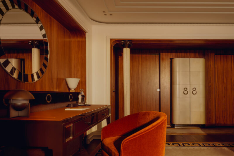
    A modern hotel room features a wooden desk with a lamp, an orange chair, a large mirror, and a wardrobe with decorative door handles.

    Custom millwork, fluted columns, sculptural furnishings, and geometric detailing give the suites a richly layered character inspired by the craftsmanship of the legendary Orient Express train. Photography courtesy of the Orient Express.

    One of its defining features is the yacht’s naval engineering. The yacht’s distinctive profile was engineered by Chantiers de l’Atlantique and relies primarily on wind propulsion through SolidSail technology, with three carbon-fiber masts supporting rigid sails and LNG-hybrid engines providing complementary power.

    “That already places it in a different relationship to movement, to silence, and to the sea itself compared to traditional cruise formats,” d’Angeac says.

    Inside the public spaces and sprawling suites, natural light becomes a defining core element. “The luxury here is rooted in carefully considered material transitions between plush velvet, rich wood, supple leather, and stone,” says d’Angeac. Across the yacht, bespoke furnishings, custom carpets, sculptural lighting, and finely crafted details reinforce the brand’s commitment to French craftsmanship. A palette of warm neutrals is layered with polished woods, marble, and rich textiles to create interiors that feel refined and timeless.
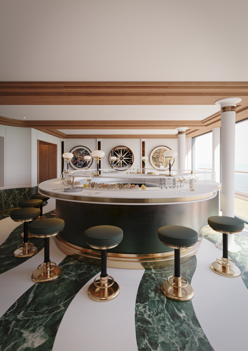
    Elegant bar area with green stools, marble flooring, a curved counter, and large decorative wall pieces behind the bar. Floor-to-ceiling windows reveal an ocean view on the right.

    L’Encre, the yacht’s champagne bar, pairs a sculptural circular bar with deep green veined marble flooring, polished brass detailing, and fluted millwork, giving the space a contemporary interpretation of Art Deco design. Photography courtesy of the Orient Express.

    The result is a contemporary architectural design language that balances timeless elegance with a strong sense of place and connection to the sea. “More than a specific object or space,” d’Angeac says, “I would hope our guests remember the feeling of movement, light, and horizon coming together in a very calm, coherent atmosphere, where everything is precise, but nothing distracts from the experience of travel itself.”

    Aman at Sea: Restrained Ryokan Minimalism
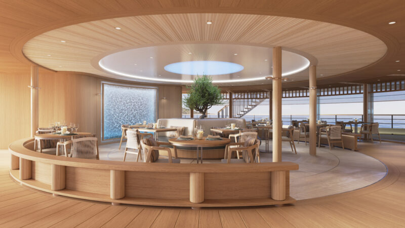
    Modern restaurant with wooden decor, round tables, and a central tree under a skylight. Large window shows ocean view; ambient lighting and neatly set tables create an inviting atmosphere.

    Alira, the Aman at Sea yacht’s all-day dining restaurant, pairs pale millwork, sculptural circular ceiling details, and floor-to-ceiling glass walls with woven furnishings. Photography courtesy of Aman.

    Aman is set to offer one of the most exclusive guest experiences among the new hotel-branded yachts with the spring 2027 launch of Amangati (Sanskrit for “peaceful motion”). Measuring 183 meters across nine decks, the motor yacht welcomes just 94 guests across 47 expansive, ocean-facing suites. With a two-to-one staff-to-guest ratio, the yacht is designed to function less like a cruise ship and more like a floating private retreat, operating on hybrid diesel-electric propulsion that prioritizes quiet operation as a defining element of the onboard experience.

    Aerial view of a luxury yacht with a helipad, swimming pool, lounge areas, and several small boats docked at the stern, floating on blue water.

    Viewed from the stern, Amangati’s tiered decks, softened curves, and floor-to-ceiling glass walls create a clean, sculptural silhouette that emphasizes light, openness, and uninterrupted ocean views. Photography courtesy of Aman.

    The project grew from Aman’s belief that there was room for a more personal travel experience between traditional cruising and private superyacht charters. To bring its design philosophy to the ocean, Aman partnered with Sinot Yacht Architecture & Design to develop the ship’s interiors, while T. Mariotti S.p.A. in Genoa, Italy, is building the yacht.

    The design draws on Aman’s long-standing architectural language, particularly the minimalist principles of the Japanese ryokan, interpreted through Sinot’s Scandinavian design sensibility. Conceived as private sanctuaries, the suites feature soaring 2.5-meter ceilings, full-height glass walls, and expansive private terraces, while a material palette of ash wood flooring, eucalyptus and sen woods, travertine, hand-carved glasswork, woven linens, and custom joinery reinforces the yacht’s restrained aesthetic.
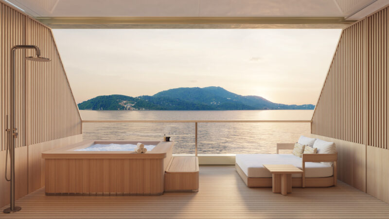
    Modern yacht deck with a hot tub, outdoor shower, and lounge seating, overlooking calm water and a distant green island at sunset.

    The spa’s private treatment terrace pairs pale sinwood cladding, vertical slatted screens, and built-in furnishings with an open-air soaking tub. Photography courtesy of Aman.

    That same design language extends throughout the yacht, from the two-deck wellness center and Japanese serenity garden to the open-sky infinity pool and Selora lounge, creating interiors that feel calm, spacious, and deeply connected to the sea.

    One of Amangati’s defining architectural features is the Aman Spa, conceived as an integral part of the yacht rather than just a standalone amenity. Spanning more than 11,000 square feet, it includes eight ocean-facing treatment suites, each opening onto a private terrace and whirlpool. A Japanese serenity garden anchors the space alongside a hammam, banya, fitness studio, beauty lounge, and Medi Spa.

    “Wellness has always been woven into the fabric of every Aman property—not as an amenity, but as a philosophy,” says Jonathan Wilson, CEO of Aman at Sea. “The opportunity to realize that at sea, with genuine space and without compromise, was central to the design of Amangati from the outset, creating a destination in itself.”
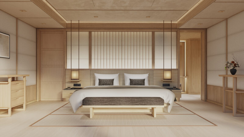
    Minimalist bedroom with a large bed, wooden furniture, neutral tones, soft lighting, and Japanese-inspired design elements.

    The Grand Suite layers pale sinwood millwork, shoji-inspired screens, suspended pendant lighting, and low-profile furnishings into a serene composition defined by symmetry, proportion, and natural materials. Photography courtesy of Aman.

    Beyond the suites and wellness spaces, the yacht’s layout reflects Aman’s emphasis on privacy and spaciousness. Despite accommodating just 94 guests, Amangati offers four distinct dining venues and expansive outdoor gathering spaces that avoid the density of traditional cruise ships. Two helipads and a fleet of limousine tenders extend the travel experience beyond the yacht itself, while the retractable Selora Marina transforms the stern into a waterside lounge that strengthens the connection between the yacht and the sea.

    “Every detail of the design was shaped by the same principles that define Aman on land—generosity of space, privacy, wellbeing, and unparalleled service,” Wilson says.

    Rear view of a large luxury yacht named "Amangiri" docked on calm water, with a helicopter flying overhead and green hills in the background under a clear sky.

    Viewed from the stern, Amangati’s tiered decks, softened curves, and floor-to-ceiling glass walls create a clean, sculptural silhouette. Photography courtesy of Aman.

    The yacht’s design is guided by the idea of “peaceful motion,” balancing fluid lines, generous proportions, and uninterrupted sightlines that keep the horizon in view.

    “Bringing the spirit of Aman to the world’s seas and oceans means giving guests to truly connect with the water, salt air, and the sanctuary experience of Amangati,” says Jonathan. “It’s a journey that restores balance and inspires discovery.”

    The Ritz-Carlton Yacht Collection: Yacht-Club Sophistication
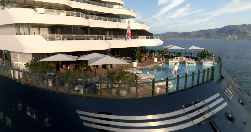
    Luxury yacht deck with pool, sun loungers, umbrellas, and potted plants, docked near a coastline with mountains and blue sky in the background.

    Sweeping terraces wrap around the stern, where the infinity pool is surrounded by layered lounge areas, lush plantings, and shaded seating, creating a series of distinct outdoor living spaces. Photography by Edgardo Contreras.

    The Ritz-Carlton was the first major luxury hospitality brand to bring its design language to the sea, embracing a residential, contemporary aesthetic inspired by private yacht clubs. The collection spans three vessels—Evrima, Ilma, and Luminara. Instead of recreating one of its hotels at sea, the brand’s goal across the fleet was to move away from the scale of traditional cruise ships. Ilma accommodates 448 guests, Evrima 298, and Luminara 452.

    The smaller size influences every aspect of the design. Public spaces are designed to feel like those of a private yacht, with an emphasis on comfort and craftsmanship.
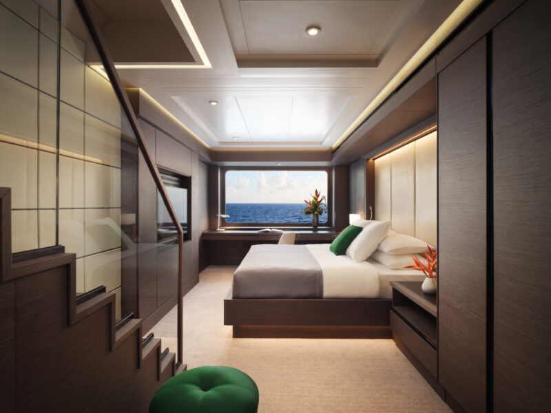
    Modern yacht bedroom with large bed, desk, and window overlooking the ocean; staircase leads upstairs, and tropical flowers decorate the room.

    The Loft Suite aboard Evrima pairs a split-level layout with floor-to-ceiling dark wood millwork, integrated lighting, and a panoramic window that makes the sea an extension of the living space. Photography by Jack Hardy.

    To translate its land-based luxury to the sea, The Ritz-Carlton Yacht Collection leaned heavily into residential-style interior design, utilizing a material palette that feels organic and deeply rooted in natural materials, such as rich walnut finishes, Italian Arabescato Corchia stone, and Emperador marble.

    The brand bypassed commercial cruise suppliers to source pieces from residential furniture brands like Minotti, Giorgetti, and Poltrona Frau, creating seamless layouts where open-air lounges and private terraces dissolve the boundaries between indoors and the sea. To bring this vision to life, the brand tapped Helsinki-based studio Aivan to shape the sleek exterior, AD Associates to craft the interiors with creative direction by Chapi Design, and DPA for the lighting design.
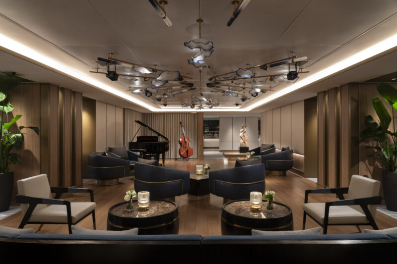
    Modern lounge with circular seating, a grand piano, double bass, and contemporary ceiling lights. Plants and drinks decorate the space, with a statue visible at the far end of the room.

    The Living Room is anchored by a sculptural ceiling installation that floats above tailored lounge seating, warm walnut finishes, and curated artwork, creating a residential gathering space centered around live music. Photography courtesy of The Ritz-Carlton Yacht Collection.

    Each yacht has its own design narrative, reflected through its name, interiors, and art collection. Luminara, which debuted in 2025 and takes its name from the Latin and Italian words for light, features a collection of 731 artworks displayed throughout the yacht. Commissioned pieces include The Pharos, a seven-deck light sculpture inspired by ancient lighthouses, and Alfhild Külper’s six-story textile installation, Path to Light, inspired by the Maltese hawk moth.

    Evrima, launched in 2022 and named after the Greek word for “discovery,” emphasizes exploration through cozy social spaces, an expansive marina that opens directly onto the sea, and a curated art collection reflecting the destinations along each voyage.

    Ilma, which debuted in 2024 and takes its name from the Maltese word for “water,” draws on Malta’s mythology, coastline, and native fauna through layered materials, curated artwork, and seamless transitions between interior and exterior spaces.
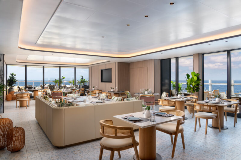
    Modern restaurant dining area with wooden tables and chairs, set for service, large windows offering ocean views, and natural light filling the space.

    Pale oak tables, woven cane chairs, patterned tile floors, and floor-to-ceiling glass give the Beach House restaurant aboard Ilma the relaxed elegance of a contemporary coastal residence. Photography by Don Riddle.

    The goal is for guests to leave with a sense of how effortlessly the yacht connects to the world around them, whether they’re waking up to panoramic ocean views from their suite, enjoying a quiet moment on a private terrace, or gathering with friends as the sun sets over a new destination. The experience is designed to feel intimate, unhurried, and effortlessly connected to the sea. Ultimately, the most meaningful impression is not a single design feature, but the overall experience of being aboard a private yacht.

    Waldorf Astoria River Vessel: Grand-Hotel Glamour on the Nile
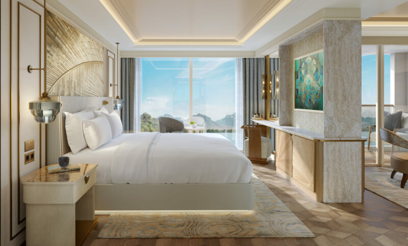
    A modern hotel room with a large bed, bedside tables, a desk, a seating area by large windows, and neutral decor with gold accents.

    The bedroom is anchored by a sculptural Art Deco-inspired headboard, geometric pendant lighting, parquet wood flooring, and a marble-clad room divider, while floor-to-ceiling glass doors extend the sleeping space to a private balcony overlooking the Nile. Editor’s note: Images are artist renderings intended for illustrative purposes only. Design, furnishings, finishes, views, and other features depicted are subject to change. Rendering courtesy of Waldorf Astoria.

    Waldorf Astoria takes a focused approach by choosing the historic currents of the Nile River over the open sea. Scheduled to debut in late 2026, the Waldorf Astoria Nile River Experience is a five-deck river vessel featuring just 29 suites. By limiting the passenger count, the brand moves away from the crowded, multi-deck scale of traditional river cruise lines and positions itself as a floating boutique hotel designed for slow, immersive travel between Luxor and Aswan while translating its signature hospitality into a highly private maritime setting.

    What sets this venture apart is its embrace of heritage: while other luxury hospitality brands are leaning into contemporary residential design, Waldorf Astoria draws on its identity as a grand luxury institution.

    Tasked with executing this distinct vision, the design team looked beyond contemporary trends to interpret the brand’s hotel heritage for a moving hull. The interiors feature a richly layered palette of wood finishes, marble surfaces, polished metals, and warm neutral tones that evoke an atmosphere of understated grandeur.
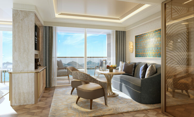
    Modern hotel suite with seating area, artwork, and balcony overlooking water and mountains, featuring neutral tones and floor-to-ceiling windows.

    In the suite’s living room, curved upholstered seating, a brass pedestal table, a subtly patterned area rug, contemporary artwork, and a soft neutral palette create a residential atmosphere, while expansive glass doors frame uninterrupted river views. Editor’s note: Images are artist renderings intended for illustrative purposes only. Design, furnishings, finishes, views, and other features depicted are subject to change. Rendering courtesy of Waldorf Astoria.

    The ultimate design statement onboard is a reinterpretation of Peacock Alley—the iconic, Art Deco-inflected social heart found in Waldorf Astoria’s land properties—now reimagined as a sun-drenched river lounge. Framed by panoramic glass windows that turn the ancient Egyptian landscape into a living gallery wall, the design seamlessly bridges classic elegance with a quiet, sophisticated sense of place.

    Instead of simply translating one of its hotels to the Nile, Waldorf Astoria has reinterpreted the design language that has defined the brand for more than a century. The result is a river vessel that feels unmistakably Waldorf Astoria while remaining deeply connected to one of the world’s most historic waterways.


  • Design Milk design-milk.com art design design-milk fashion interiors tech 2026-07-15 13:00

    ↗

    Rather than leaning into overt branding or alpine clichés, the Love Chalet layers vintage furnishings, architectural color, and residential warmth into a memorable brand experience.

    Studio Coco Greenblum Brings Warmth to Bumble’s Aspen Chalet

    Branded environments often prioritize visibility over atmosphere. Every surface becomes an opportunity for a logo, while spaces are designed with social media in mind. For Bumble’s seasonal Love Chalet in Aspen, however, Studio Coco Greenblum took a different approach. The temporary hospitality space was designed less like an activation and more like an inviting mountain residence where conversation could unfold naturally.

    A wooden sideboard with vases and bowls stands below a neon Bumble sign on a yellow plaid wall, under a chandelier in the inviting style of Studio Coco Greenblum.

    Photography by Kylie Fitts

    Commissioned by the dating app for a series of post-ski gatherings, collaborations, and events, Bumble’s Aspen installation came together in just three weeks—including design, procurement, and installation. Instead of allowing that compressed timeline to dictate the outcome, studio founder Coco Greenblum says it sharpened her studio’s priorities.

    “There wasn’t time to overthink every decision,” she explains. “We focused our energy on creating a strong overall narrative through color, texture, and a few memorable moments.” The result, she says, is proof that decisiveness can sometimes strengthen a project’s point of view rather than diminish it.

    Cozy sitting area with two white fluffy chairs, a wooden sideboard, unique lamp, round gold ceiling accent, and large window with city view—perfectly capturing the inviting spirit of Studio Coco.

    Photography by Kylie Fitts

    The challenge wasn’t simply translating Bumble’s recognizable visual digital identity into a real space. Aspen carries equally strong visual associations, from rustic chalets to après-ski culture. Instead of leaning into either aesthetic too literally, Studio Coco Greenblum searched for common ground.

    “We wanted the space to feel unmistakably Bumble without feeling overly branded, while honoring Aspen’s warmth,” Greenblum says. “The goal was to create a hospitality experience that felt sophisticated and inviting with subtle nods to both worlds rather than a literal interpretation of either.”

    Exterior view of a storefront with yellow-tinted windows, displaying the words "LOVE CHALET" and "Bumble." Inside, cozy furniture and wall art are visible through the glass, reflecting elements of Studio Coco Greenblum’s inviting design aesthetic.

    Photography by Kylie Fitts

    One of the clearest expressions of that strategy is Bumble’s signature yellow. Rather than applying it as graphic branding, the studio integrated it into the architecture itself, wrapping baseboards, trim, doorframes, ceiling details, and window surrounds.

    “The space had a series of long, narrow rooms,” Greenblum explains. “Applying the color architecturally helped unify the areas and create a sense of rhythm. It became a wayfinding device of sorts but also added an unexpected playfulness that felt true to Bumble.”

    Bright hallway with yellow plaid wallpaper, geometric ceiling, and vases of yellow flowers inspired by Studio Coco Greenblum, leading to a sunlit room with white chairs and large windows.

    Photography by Kylie Fitts

    That architectural framework is softened through layers of vintage furnishings, Murano lighting, French and European antiques, Nordic Knots rugs, and textured materials that introduce permanence into a temporary installation. The bar, in particular, feels intentionally residential, combining 1970s casework, shearling seating, patterned wallpaper, and intimate lighting.

    “It was less about creating a typical event space and more about capturing the warmth and comfort of being invited into someone’s beautifully collected mountain home,” Greenblum says.

    The Love Chalet included spaces for hospitality, wellness, retail, beauty, and content creation, but the studio resisted treating each program as a separate activation. Instead, repeated architectural details and materials created continuity throughout the experience.

    A storefront window displays shelves with hats, small objects, and a hanging light fixture from Studio Coco; the scene is framed by cream and brown architectural details.

    Photography by Kylie Fitts

    “We approached the Love Chalet as if we were designing a home,” Greenblum explains. “Each area had its own personality, but they all spoke the same language… like discovering different rooms within a beautifully collected home rather than moving through a branded event.”

    That same philosophy shaped the project’s more overtly experiential moments. Custom neon installations and a playful “dripping honey” motif in the photography room certainly lend themselves to social media, but Greenblum argues those elements only succeed when they’re rooted in the larger spatial narrative.

    A wicker lounge chair with a fur throw and pillow sits beside a small stone table with flowers, under a hanging metal lamp in a sunlit room with yellow accents, evoking the cozy charm of Studio Coco.

    Photography by Kylie Fitts

    “If a moment is memorable, beautifully executed, and contributes to the feeling of the space, it doesn’t have to sacrifice sophistication,” she says. “The goal is always to create experiences people genuinely connect with, not just backdrops for a photo.”

    Just as importantly, the studio intentionally avoided many of Aspen’s familiar design tropes. “There were no antlers, traditional plaids, or overly literal references to chalet culture,” Greenblum says. “The goal was to evoke the feeling of Aspen rather than recreate a stereotype of it.”

    Cozy room with yellow walls and ceiling, two armchairs with white fur throws, a wicker seat, small tables, flowers, and a curtained doorway. The inviting space at Studio Coco exudes a Bumble Love Chalet vibe, while a large window lets in natural light.

    Photography by Kylie Fitts

    The project ultimately demonstrates that temporary environments can aspire to something more lasting. Rather than designing for photographs alone, Studio Coco Greenblum focused on how the space would make people feel.

    “We wanted it to feel collected, not staged, so people remembered how it felt and not just how it photographed,” she says. Looking back, she believes the project showed that “branded environments can be imaginative without sacrificing warmth, authenticity, or good design.”

    Editorial Transparency: This article was developed with the assistance of AI tools, which may have been used for research, outlining, editing, or copy refinement. Reporting, fact-checking, and editorial decisions were made by the Design Milk editorial team.

  • Design Milk design-milk.com art design design-milk fashion interiors tech 2026-07-14 20:52

    ↗

    Created with Melbourne-based SMAC Studio, the new architectural hardware collection pairs brushed brass and polished nickel to encourage a more layered approach to interiors.

    Lo & Co’s Duet Collection Makes the Case for Mixing Metals

    Once upon a time, mixing gold and silver jewelry was considered a fashion faux pas. Interior design has long had a similar rule: Whether it’s brass, chrome, nickel, or blackened steel, you pick one finish and stick with it. Thankfully, both worlds are evolving. Lo & Co’s new Duet collection challenges the idea that cohesion requires uniformity, pairing brushed brass and polished nickel in hardware inspired by the layered elegance of fine jewelry.

    A person wearing a white ruched glove and a gold ring is touching a polished wooden surface with brass handles and rods.

    Photography by Liam West/Lightly Salted; courtesy of Lo & Co.

    The Australian architectural hardware brand’s first mixed metals collection was developed in collaboration with Melbourne-based SMAC Studio, pairing brushed brass with polished nickel across cabinet pulls, knobs, and levers. Rather than using two finishes simply for visual effect, the collection explores how different materials interact with light, proportion, and one another to create depth.

    Gloved hands holding a brass door handle emerge from behind red velvet curtains.

    Photography by Liam West/Lightly Salted; courtesy of Lo & Co.

    The timing wasn’t accidental. According to founders Arielle Lopresti and Teegan Cocchiaro, the idea had been building for years before becoming a reality.

    “We’ve always been drawn to mixed metals,” they share. “We were inspired while visiting Milan for Design Week and found that many Italian spaces mixed metals.”

    That trip included a visit to designer Vincenzo De Cotiis’ Milan apartment, where fearless combinations of materials left a lasting impression. Combined with the renewed popularity of mixed-metal jewelry, it helped shape a collection that feels both contemporary and enduring.

    Gold door handle with a green tassel keychain on a glossy burgundy door, next to burgundy curtains.

    Photography by Liam West/Lightly Salted; courtesy of Lo & Co.

    Jewelry has long served as a point of reference for Lo & Co, whose founders often describe their hardware as “jewelry for the home.” With Duet, that influence became more literal. While the knobs and levers borrow the boldness of statement jewelry, the elongated pulls reference finer pieces, using subtle detailing where the two finishes meet to create the collection’s defining gesture.

    Balancing brushed brass and polished nickel required restraint as much as contrast. Rather than allowing one finish to dominate, the designers relied on texture and reflectivity to create equilibrium.

    Glossy olive green cabinet doors with gold oval handles, each decorated with a cream-colored tassel tied in a knot, shown in a symmetrical close-up.

    Photography by Liam West/Lightly Salted; courtesy of Lo & Co.

    “The contrast was entirely intentional,” they explain. “We chose to highly polish the nickel and softly brush the brass, so each catches the light differently. Both are quite subtle in color, which means neither overpowers the other.”

    The collaboration also reflects SMAC Studio founder Shona McElroy’s long-standing interest in two-tone hardware. Her early sketches established the collection’s jewelry-inspired direction before Lo & Co refined the forms, proportions, and finishes into the final product family.

    A black leather glove with a large gold button lies flat below a horizontal gold rod on a polished wooden surface.

    Photography by Liam West/Lightly Salted; courtesy of Lo & Co.

    Perhaps the collection’s most compelling idea isn’t aesthetic at all, but psychological. Many homeowners hesitate to mix finishes, worried that cohesion requires consistency. Lopresti and Cocchiaro see it differently.

    “Cohesion doesn’t have to mean uniformity,” they say. “A considered mix of metals brings depth and interest to a space.”

    That philosophy extends beyond a single launch. Rather than treating mixed metals as a one-off experiment, the founders hope Duet becomes part of Lo & Co’s evolving design language while giving customers the confidence to be more adventurous in their own homes.

    A gloved hand holds a silver tray with a gold handle and two rings on top, set against deep red curtains.

    Photography by Liam West/Lightly Salted; courtesy of Lo & Co.

    The Lo & Co Duet collection is available at loandcointeriors.com.

    Editorial Transparency: This article was developed with the assistance of AI tools, which may have been used for research, outlining, editing, or copy refinement. Reporting, fact-checking, and editorial decisions were made by the Design Milk editorial team.

  • Design Milk design-milk.com art design design-milk fashion interiors tech 2026-07-14 19:37

    ↗

    A deep midnight anodized finish joins the Original collection permanently, extending across aluminum luggage, leather bags, and travel accessories.

    RIMOWA Introduces Ink Blue to Its Original Luggage Collection

    Anodized aluminum takes to color the way paper takes to ink. Pigment sinks past the surface and seals there, fixed inside a thin layer of oxide. RIMOWA builds its palette this way, and its newest shade makes the kinship literal: Ink Blue, a near-black blue joining the Original collection permanently.

    A black Rimowa suitcase sits in front of a window with a city skyline blurred in the background at night, its sleek design reminiscent of the signature RIMOWA Ink Blue collection.

    Photography courtesy of RIMOWA.

    It arrives across the line of grooved suitcases in Cabin, Check-In L, and Trunk Plus sizes, each backed by the German brand’s lifetime guarantee. A metallic sheen lifts the darkness, the aluminum still legible beneath the blue.

    “The Original collection has always been about elevating functional design through craftsmanship and innovation,” says Fanny Schricke, chief product officer at RIMOWA. “Inspired by the permanence and richness of ink, the new Ink Blue Collection explores how color can become part of the material itself. The deep midnight hue brings new depth to our signature aluminum, using our anodization process to create a finish that highlights the character and beauty of the metal.”

    Three RIMOWA Ink Blue hard-shell suitcases are placed on a blue carpet next to a bed with white bedding and a small bedside table holding a lamp and some items.

    Photography courtesy of RIMOWA.

    The hardware is color-matched throughout, down to the TSA-approved locks, and the case rolls on the Multiwheel® system RIMOWA pioneered. A newly engineered handle incorporates a damper mechanism, so it lowers slowly and in silence, and an updated Flex Divider takes a squared shape with a zipped storage pocket for tidier packing.

    A light blue bucket hat rests on a navy hard-shell suitcase, with a black RIMOWA Ink Blue bag nearby, all placed on a blue carpet in front of a white bed.

    Photography courtesy of RIMOWA.

    Ink Blue extends into calf leather with a Groove Cross-Body Bag in two sizes and a Zipped Pouch, both made in Italy. A run of seasonal accessories cut from denim carries the same shade: Packing Cubes, a Toiletry Pouch Trifold, and the brand’s first reversible bucket hat. A Card Holder in anodized aluminum completes the lineup, made to match the cases.

    A campaign film starring actress Sydney Lemmon accompanies the launch, following her to Shanghai, where handwritten letters send her searching across the blue-tinted city.

    A closed RIMOWA Ink Blue suitcase lies on a dark blue carpet with two sheets of paper partially visible underneath, next to a white pillow.

    Photography courtesy of RIMOWA.

    Ink Blue is available at RIMOWA stores worldwide and at rimowa.com.

  • Design Milk design-milk.com art design design-milk fashion interiors tech 2026-07-14 13:00

    ↗

    The Canadian artist's intervention in the Gothic church makes magic of transparent laboratory-grade glass.

    Jordan Soderberg Mills Transforms a Historic Chapel With Light

    The phenomenon of light—in all its glory—is central to Jordan Soderberg Mills’ oeuvre. He has created numerous immersive works for temporary and permanent commissions around the world with a wonderful simplicity that belies the complex physics that make them possible. And his latest prismatic experimentation is now woven into the very architecture of a decommissioned 15th century church in Brussels. Framed in black ironwork, the Boondael Chapel’s 14 windows now refract light to create rainbow effects that shift throughout the day and the seasons.

    A small brick church with a central arched window and bell tower stands in front of trees, with a blue and yellow barrier at its base under a clear blue sky.

    Photography by Franziska Krieck.

    Two arched windows with gradient-colored glass set in a brick wall; greenery grows at the base of the wall.

    Photography by Franziska Krieck.

    A brick building with an arched window reflects a rainbow pattern. Four metal hooks protrude from the wall, and the sky is clear and blue.

    Photography by Franziska Krieck.

    The Canadian artist, who also works and lives in Europe, had earlier participated in a Design Museum Ghent exhibition inspired by Jan Van Eyck, who invented techniques that layered transparent glazes in a certain way to create distinct optical effects. “There was a very specific altar piece that’s in Ghent, with an inscription saying the Virgin Mary is the reflection of eternal light,” Soderberg Mills says. “I thought, How can I represent eternal light? How can I create something that uses this idea of multiple layers and glazes that the Renaissance painter used? So I made Eternal Light + a Spotless Mirror.”

    Two arched windows with translucent panels cast rainbow-colored light patterns onto white brick walls and a gray floor in a minimalist room.

    Photography by Franziska Krieck.

    That piece gave Soderberg Mills visibility in Belgium, but the exhibition’s opening coincided with COVID-19 lockdowns. It made him all the more eager to have his work seen and felt. Then came the open call for the former church and present-day arts venue in Brussels. It had a very specific requirement: The glass had to be colorless and completely transparent. This, too, presented a challenge. “Because my practice is such an exploration of color and perception and light,” he says, explaining his thought process, “how can I kind of cheat the system or be cheeky a little bit in order to produce glass that is colorless but that transmits color?”

    A large room with white brick walls, arched windows, and two square frames with translucent panels displaying rainbows, mounted in front of the windows.

    Photography by Franziska Krieck.

    In Gothic churches, light was treated as a divine element. “A church window is a really mystical thing,” he says. While researching the adaptive reuse of old churches in Belgium, Soderberg Mills came across chapels along the coast of the North Sea where bell towers doubled as lighthouses. It prompted him to reference Belgian architecture in an interesting way; he sought to create something “mythical or magical realist” while also honoring the now-secular use of the church building.

    Arched window with circular divided glass; upper part is clear showing green trees outside, lower part is frosted blue, set in a white brick wall.

    Photography by Franziska Krieck.

    Whatever he envisioned, he needed to collaborate with Belgian fabricators—another criterion of the open call. Soderberg Mills found one that supplies beakers to local laboratories, and a company that makes iron work windows for train stations. The laboratory glass is especially important—it takes the shape of long borosilicate tubes, or canes, that are star-shaped in cross-section. Together, they form a ribbed surface. The canes are internally etched with billions of microscopic apertures that scatter light into spectral bands.

    A translucent, ribbed window with a black frame displays a rainbow gradient, allowing light to enter a white brick-walled room. Trees are visible outside through an arched window above.

    Photography by Franziska Krieck.

    A tall arched window with frosted and clear glass is set above a closed wooden door in a white brick wall, with wooden flooring below.

    Photography by Franziska Krieck.

    Another lab, this one in California, produced the film that is embedded inside the glass extrusions. “The film is used in spectrography,” Soderberg Mills explains, “anything that reflects light will have a chromatic signature and the composition of the rainbow will tell you what a star is made of.” Together with the etched glass canes, the film refracts daylight into “vibrant, shifting spectral color, turning the chapel into both a sanctuary and a living lens.”

    An arched window with a corrugated, partially rainbow-tinted glass pane set in a brick wall, with sunlit green leaves in the upper left foreground.

    Photography by Franziska Krieck.

    By curving the light, the iron-framed windows produce different perspectives at different times of the day and the year. Soderberg Mills likens it to a sundial, which produces a completely unique experience depending on when you enter the church. “It’s about creating something that’s fixed that also gives this sense of motion and movement, which is really the motion of the planet through through space—this cosmological dance,” he says.

    A diagram shows how light moves through a prism-shaped object, illustrating emission, refraction, and diffusion with arrows and subtle rainbow effects.

    Diagram courtesy of Jordan Soderberg Mills.

  • Design Milk design-milk.com art design design-milk fashion interiors tech 2026-07-13 19:00

    ↗

    Khanna Schultz reimagines the suburban home as a series of interconnected pavilions with a hidden bourbon room.

    Explore a Modern Michigan Home Designed Around a Rare Porsche Collection

    In Birmingham, Michigan, a northern suburban neighborhood of Detroit, a distinctive residence redefines the relationship between architecture, privacy, and display. Designed by Khanna Schultz, the House for a Collector project caters to a collector with a passion for rare Porsches and fine bourbon, seamlessly integrating his prized possessions into the fabric of daily life.

    Modern house with large windows and a brown facade, featuring an olive-green sports car parked on the driveway. Autumn trees with orange leaves are on the left.

    Rather than conforming to the conventional approach of a monolithic suburban home, the architects fragmented the structure into a series of interconnected volumes, arranged symmetrically around a central courtyard. This design choice not only mitigates the visual dominance of a single large building but also fosters a dynamic interplay between indoor and outdoor spaces. The courtyard itself serves as a unique focal point, where automobiles and social spaces coexist in a fluid, open environment.

    Aerial view of a modern building with a flat roof, surrounded by landscaped lawns and autumn trees. A car is parked on the street above the property.

    A key departure from traditional suburban design is the positioning of the garages. Rather than being tucked away out of sight, they are an integral part of the courtyard, bringing the car collection into direct dialogue with the home’s living areas. This deliberate fusion of functionality and aesthetics challenges conventional notions of how vehicles and residential spaces interact, emphasizing the client’s appreciation for automotive design.

    Modern house exterior with large glass windows, surrounded by a green lawn and vibrant autumn trees.

    Materiality plays a crucial role in shaping the home’s character. The structure is enveloped in insulated precast concrete panels—an industrial material choice more commonly associated with large-scale commercial buildings. Where sections of this concrete shell have been removed, weathered steel cladding introduces a warm contrast, adding depth and texture. Inside, a carefully curated palette of blackened steel, polished concrete, unpainted plaster, and pre-finished wood reinforces the balance between refined luxury and raw utility.

    Modern living room with large windows, dark furniture, abstract artwork, and a decorative piano. Glass wall reveals a parked car in the adjacent area.

    Sustainability is woven into the project through strategic design and technological integration. A high-performance building envelope, triple-glazed windows, and a geothermal heating and cooling system work in unison to enhance energy efficiency, ensuring the home is as environmentally conscious as it is visually striking.

    Modern living room with large windows, dark grey sofas, a round table with red flowers, and a piano. Sunlight streams in illuminating autumn trees outside.

    Modern kitchen with large windows, black island countertop, wooden dining table, and views of trees and neighboring houses.

    Modern dining room with a wooden table, chairs, and a minimalist black kitchen. Large windows provide natural light. Artwork on wall, vase with branches on table. Greenery visible outside.

    Beyond its architectural achievements, the home functions as a stage for the client’s curated collection. The whiskey display, concealed behind a steel-clad wall, emerges via motorized panels, offering a dramatic reveal when desired. This element of surprise adds functionality and theatricality, allowing treasured items to remain hidden or showcased at the owner’s discretion.

    A wall of neatly arranged wine bottles in a dimly lit room with additional storage visible through an open doorway.

    Modern interior with a study nook featuring a desk, chair, and bookshelf. In the background, a dining table with chairs and a vase with yellow flowers on a rug.

    Modern architectural interior with a narrow corridor featuring glass walls and a wooden floor, connecting two sections of a building. Horizontal beams are visible through the glass.

    Inside, a monochromatic color palette and scaled back details lend toward the client’s wishes to feature their beloved objects, including the cars, curated furnishings and art, and the extensive whiskey collection. Unexpected details, like a floating bridge connecting the upper volumes and a hanging Jim Zivic hammock swing in the primary suite, add to the minimalist interior.

    Modern room with dark walls, a suspended sofa facing a large window with autumn trees visible outside, and a linear fireplace on the left wall.

    Minimalist living room with gray sectional sofa, lounge chair, and large window showcasing autumn foliage. Neutral tones dominate with a dark rug and simple decor.

    Modern bathroom with matte black fixtures, minimalist design, large mirror, towel on a hook, and a freestanding tub next to a floor-to-ceiling window with a view of trees.

    Modern house exterior at dusk, featuring large windows and wooden beams. Warm lighting inside contrasts with the blue evening sky. Sparse trees with autumn leaves are visible in the courtyard.

    Modern building with large glass windows revealing a bright interior with chairs and a table. It's adjacent to a lawn and a tree with autumn-colored leaves, set against a twilight sky.

    Photography by Michael Moran.
    Photography styling by Carin Scheve.

  • Design Milk design-milk.com art design design-milk fashion interiors tech 2026-07-13 14:00

    ↗

    The new Restore Gel pairs a reusable dispenser with home-compostable refills and a science-backed toothpaste formula.

    SURI Reimagines Toothpaste With a Refillable, Displayable System

    You know the expression, “You can’t put the toothpaste back in the tube.” Except … now you can. SURI, the company behind the eco-friendly sonic toothbrush, just introduced another sustainable option in your dental routine: refillable toothpaste.

    Refillable soaps, shampoos, and household cleaners have become increasingly common, but toothpaste has largely remained tied to its single-use tube. SURI’s Restore Gel Refillable Toothpaste—a product two years in the making—attempts to change that.

    Three reusable water bottles in white, pastel blue, and pastel green stand upright on a neutral background with shadows cast diagonally across the surface, complementing a minimalist lifestyle alongside essentials like SURI Restore Gel Refillable Toothpaste.

    Photography courtesy of SURI.

    “We crafted the product experience from the ground up with the user at the center of every design decision, rethinking how people buy, use, and dispose of toothpaste,” explains Seb Wetherall, SURI’s head of innovation.

    This meant creating a new product architecture entirely, one designed around the full life cycle of toothpaste. The Restore Gel refillable system is designed to stay on the countertop—or taken on-the-go thanks to a secure lid—and to be used over and over.

    The design is anchored by a precision-dosed airless pump made from 50 percent recycled plastic. Made in partnership with Shellworks, the refill bottles are made with Vivomer™, a plant-based home-compostable material. Simply drop a refill into the dispenser, which delivers a precise amount of paste with each pump. Once the bottle is empty, it can return to nature and you can pop a new one in.

    A white, cylindrical bottle labeled "SURI Restore Gel Refillable Toothpaste" stands on a surface with a blurred leafy background and condensation on the window.

    Photography of SURI.

    All together, SURI Restore Gel Refillable Toothpaste reframes toothpaste as a reusable object rather than disposable packaging. “The result is a reusable dispenser designed to feel at home on the bathroom countertop or in a wash bag,” Wetherall explains, “uniting performance, sustainability and considered design in a seamless everyday experience.”

    Even if your go-to toothpaste doesn’t get messy with bright blue paste after extended use, it’s likely not an item you want to leave on your curated bathroom counter. SURI’s Restore Gel, on the other hand, is designed to be displayed. It’s available in Sky, Meadow, or Stone, three soft, muted pastels that fit with a variety of wellness-inspired palettes and bathroom styles.

    A bottle of SURI Restore Gel Refillable Toothpaste in wild mint flavor stands upright on a light surface, with a blurred bottle in the background.

    Photography courtesy of SURI.

    The redesign extends beyond the packaging. The Restore Gel formula features high-grade nano-hydroxyapatite (n-HAp), a synthetic calcium phosphate compound that is becoming increasingly popular in oral care products, shown to help strengthen enamel.

    You may not be able to put toothpaste back in the (traditional) tube—but you can cut back on your reliance on single-use plastics without compromising. SURI co-founder and CEO Gyve Safavi says that Restore Gel Refillable Toothpaste was created “so you don’t have to choose between a formula that works, a system that looks beautiful on your shelf, and more considered packaging.”

    Whether refillable toothpaste becomes the next everyday standard remains to be seen, but SURI makes a compelling case that even one of the bathroom’s most overlooked objects deserves better design.

    A light blue, cylindrical bottle with a rounded cap stands upright on a beige surface, casting a shadow. The word "SURI" is printed vertically on the front, subtly hinting at the innovative SURI Restore Gel Refillable Toothpaste contained within.

    Photography courtesy of SURI.

    SURI Restore Gel Refillable Toothpaste is available to purchase on trysuri.com, starting at $34.99.

  • Design Milk design-milk.com art design design-milk fashion interiors tech 2026-07-13 13:00

    ↗

    The CEO of ALL3D.AI is betting on the steady evolution of AI to help designers and clients create the spaces of their dreams.

    Amra Tareen and the Future of AI Visualization For Designers

    Barriers to Entry, a SANDOW Design Group podcast hosted by Andrew Lane of House of Digby, recently released an episode featuring serial entrepreneur Amra Tareen, the CEO of ALL3D.AI. Tareen, who was influential in scaling up Decorist, the E-design platform later acquired by Bed Bath & Beyond, discusses how ALL3D.AI is the new go-to for designers, decorators, retailers, and customers—really anyone seeking to faithfully and creatively visualize an interior scheme.

    Keep reading to discover a few of Tareen’s highlights from the podcast.

    Woman with long dark hair smiles in front of a grey background with bold white text reading "BARRIERS" wrapped around her. Yellow label states "Amra Tareen CEO & Co-Founder, ALL3D.AI.

    From Decorist to ALL3D.AI

    With Decorist, we created a 3D version of their room, and then a designer developed a mood board with all the products. We created 3D models of the product, and then our modelers did the layout of the whole room and rendered the images. And we noticed the conversion rates: They went up by 50%. It was 2016, so obviously e-commerce wasn’t doing a lot of 3D modeling. But there were cameras coming out on the market that would create 3D versions. There was a whole movement in 3D and looking at spaces in 360 degrees.

    A living room with a blue floral sofa, wooden coffee table, lamps, built-in shelves with vases, and a large tree artwork on a tan wall.

    ALL3D.AI for All People

    The whole concept of giving that tool to a designer or an end user or someone in merchandising or e-commerce was the whole impetus behind ALL3D.AI. I wanted to make a browser-based tool that anyone could use, and that’s what we ended up doing at ALL3D.AI. You could upload any of your products, you could upload photos of a space, and in the backend we would get a whole marketplace of 3D modelers to create it pretty fast. There was a lot of automation built into the platform.

    A bedroom with a striped bed, patterned bedding, two nightstands, lamps, and a large wall mural of trees behind the bed. Thick curtains and a rug complete the room’s decor.

    Quality Control, Always

    We have an internal team of interior designers who are always using our product. So they’re on the front lines, to see if any features missing. But when AI imaging came to the market, we also decided how can we use a foundational model and train it for more control, because AI would hallucinate elements.

    Dining room with dark green walls, a wooden table, six blue plaid chairs, a sideboard with a vase of branches, two tall candles, modern chandelier, and a large window with white shade.

    Customization and Transparency

    We know from our customers that they want extreme customization. So the editing on a base foundational model image is very important. How do you give that control to the creatives in the industry? Our marketing person said, “You are using these foundational models to do the base generation. Let’s show our customers all the models that we’re running.” For instance, there’s Gemini’s Nano Banana Pro, FLUX (by Black Forest Labs), and Quinn. We are giving you four generations of models when you just upload—and we show you what those foundational models are—and then you can pick one or regenerate.

  • Design Milk design-milk.com art design design-milk fashion interiors tech 2026-07-10 19:25

    ↗

    Hens on Martha Stewart’s Bedford farm helped shape Hachiman’s latest buckets and watering cans, developed with Chilewich.

    Martha Stewart’s Backyard Eggs Inspired Hachiman’s New Color Palette

    The eggs come out of the coop in soft hues of green, one washed toward sage, the other toward olive. They are laid by the Olive Egger and Cream Legbar hens at Martha Stewart’s farm in Bedford, New York, and their pale shells set the palette for a collection of buckets and watering cans by Hachiman, the cult houseware maker named for its hometown, a riverside pocket in the mountains of Japan’s Gifu prefecture.

    Woman wearing a denim jacket stands by a chicken coop, holding a fluffy white chicken and smiling at the camera, channeling Martha Stewart's signature blend of warmth and style.

    Martha Stewart with one of her farm hens. Photography courtesy of Marquee Brands.

    The five-piece special edition grew out of Stewart’s ongoing collaboration with Chilewich, the company that introduced Hachiman to North America. Two egg-derived tones are added to a pair of the brand’s best-known indoor/outdoor designs: a lidded multi-purpose bucket and an open-top watering can, both made in Japan.

    “Hachiman products first caught my attention in Rome a few years ago when I was visiting the design store Nozzoli, a Chilewich wholesale partner,” says John McPhee, chief executive officer of Chilewich. “The signature buckets were displayed superbly, and the combination of beauty and utility—thoughtful design—was instantly apparent.”

    A ribbed, pale green bucket—evoking Martha Stewart’s signature style—filled with multicolored pastel eggs sits on a white surface, with a few eggs and a clothespin resting nearby.

    The Multi-Purpose Bucket in Sage. Photography by Megan Senior.

    Soon afterward, the Hachiman team happened to stop by the Chilewich stand at Ambiente trade fair in Frankfurt, and talk turned to working together. A curated selection launched in January 2025 with a variety of colors, like mustard and navy.

    Chilewich has collaborated with Stewart since 2024 and had sent her Hachiman pieces to try at home. “When we asked her what a ‘Martha’ version of these items might look like, she didn’t hesitate,” McPhee says.

    “When we first shared our Hachiman collection with Martha, she was sitting in her kitchen, a basket of eggs on the counter,” says Kristin Harris, Chilewich’s vice president of design and creative. A brief minute with the dark green watering can and bucket was all it took: Stewart wanted the hues of her favorite eggs on Hachiman’s forms.

    Two eggs, one brown and one pale green, placed on ribbed, round, green mats overlapping on a white surface.

    The Multi-Purpose Bucket lids are a perfect match for Martha Stewart’s Olive Egger and Cream Legbar hen eggs. Photography by Kristin Harris.

    Transported very carefully, the eggs made the trip from Bedford to Chilewich’s design studio in the Flatiron District, where the team held the shells against Pantone chips in search of colors that would keep their beauty once translated into plastic. “I’ve matched a lot of unexpected items in my career—yarn, hosiery, handprinted swatches, nail polish—but never eggshells! There were lots of smiles in the studio that day.” Hachiman achieved the color on the first try.

    The Multi-Purpose Bucket, a winner of Japan’s Long Life Design Award, is a ribbed, stackable container that holds far more than water. An opening in the handle grips a garden hose for hands-free filling, and the lid supports up to 330 pounds, enough to serve as seating. The new colorways come in three sizes, from a 1.1-gallon mini to a 5.3-gallon extra-large.

    “The lidded buckets are exceptionally versatile,” Stewart says. “They are ideal for all kinds of outdoor tasks and double as stools, side tables, coolers, and compost bins. Use them indoors to store everything from children’s toys and treasures to pet food and crafting supplies.”

    Green rubber boots and a light green plastic bucket are placed on a textured dark green rug, which sits on a light-colored floor—an arrangement reminiscent of Martha Stewart’s classic style, with a touch of Hachiman practicality.

    The Green Beetle Watering Can has a grooved spout for a softer water flow. Photography by Megan Senior.

    The Garden Beetle Watering Can, recognized with the Red Dot Design Award and Japan’s Good Design Award, pours through a widened spout with grooved channels.

    “The watering cans have a grooved spout,” Stewart explains, “so the water flows more like a sprinkler than a hose, and the open-top design makes it easier to incorporate plant food—no more clogged nozzles.”

    The smaller of the two sizes, 0.4 gallons, nests inside the 1.3-gallon larger one for storage. Both designs are molded in recyclable polypropylene, free of phthalates and PFAS, and finished to withstand sun exposure.

    The collection is available now through chilewich.com, the Chilewich Store in New York City, and selected retailers worldwide.

  • Design Milk design-milk.com art design design-milk fashion interiors tech 2026-07-10 15:00

    ↗

    At Fulton Market Design Days, the group installation featured Tom Dixon, Extremis, Flos, and more.

    In Chicago, the Coalesse Co.Lab Pop-Up Championed Collaborative Design

    At Fulton Market Design Days last month, the streets were packed with designers, architects—and pop-ups. On a main auxiliary, a row of pink shipping containers housed temporary room-sized exhibits from emerging designers and more (think: modern furnishings and a giant gumball machine). Down the street, a large-scale installation outside the Steelcase WorkLife Center immediately caught the eye.

    Circular window with a blue border shows a modern seating area with four chairs and a small table, set within the inviting ambiance of the Coalesse Co.Lab, with the word "coalesse" illuminated on the wall inside.

    Photography courtesy Coalesse.

    The Coalesse Co.Lab pop-up was rooted in contrast—from rich colors to textures to materials. On its exterior, light-colored plywood paired with pops of royal blue and a boxy silhouette set off circular cutouts that opened onto the street—each element standing solidly on its own, while simultaneously harmonizing as a whole. The interactive installation brought the power of collective energy and co-creation to life.

    Designed for people to sit, gather and engage with furniture together, the Coalesse Co.Lab’s immersive, interactive space was a hub for connection—and the space itself facilitated this community spirit through interactive lighting and sound systems. And the project’s central idea emphasized this connection: that when people come together, space—and work—becomes more dynamic.

    Modern outdoor seating area with glass tables, woven-back benches, green plants, and a large white canopy—featuring innovative Coalesse Co.Lab elements—set against a backdrop of light wood panels and a blue "sale" sign.

    “At Coalesse, we understand the power of great communal spaces, and we believe they’ve never been more relevant,” states Meghan Dean, General Manager, Design Brands and Partners.

    Clustered spherical Tom Dixon pendant lights hang in front of mirrored panels, reflecting the lights and patterned chairs in a interior.

    Bringing together different designers and partner brands to create spaces that felt cohesive, flexible, and complete, the experience started outside. A small outdoor seating area welcomed you in—complete with Panigiri Picnic Tables and a Sensu single square shade parasol from Extremis—while offering a taste of what could be found within.

    Modern lounge with assorted colorful chairs, small side tables, and "Coalesse" lit on the wall. Large windows provide natural light to the contemporary Coalesse Co.Lab space.

    Inside, the space was brimming with design inspiration—from new launches to fan favorites. A testament to the impressive array of brand partners under the umbrella, the Coalesse Co.Lab included interactive displays of Peaks, the new modular system by Yves Behar for Moooi; Tom Dixon’s iconic Fat chairs and Whirl lighting; SuperWire by Formafantasma for Flos; and Viccarbe’s Common modular benches by Naoto Fukasawa and Burin Mini tables by Patricia Urquiola.

    Orange chair and ottoman with a round white side table on a tiled floor in a modern indoor setting.

    Also on view, the curving forms of the Jean Nouvel Seating Collection encouraged exploration, offering a seat with playful charm. Designed for Coalesse and debuted at last year’s Fulton Market Design Days, the collection draws inspiration from the smooth edges of rocks in a riverbed or shifting sand dunes.

    A large black wall with tan text reads: "let's create brilliant work together." This inspiring message, reminiscent of the collaborative spirit at Coalesse Co.Lab, is displayed beside a sidewalk in an urban area.

    With lively designer meet-ups and discussions—and the diversity of design talent on offer—the Coalesse Co.Lab sparked conversations on the future and importance of collaborative design, to create a space where new ideas can coalesce. Driven by a desire to co-create, the Coalesse activation offered an engaging invitation: let’s create brilliant work together.

  • Design Milk design-milk.com art design design-milk fashion interiors tech 2026-07-10 13:00

    ↗

    The Aranda\Lasch principal shares his love of his kids’ art, Piranesi, chairs, and more.

    F5: Benjamin Aranda Talks His Kids’ Art, Chairs, Pigeons + More

    Every architect has a particular process, and for Benjamin Aranda, a blend of basic and intricate aspects shape his projects. “At the studio, we relish the challenge of breaking complex systems down into simple automated logics and then using these strict recipes to push the limits of physical craftsmanship,” he says.

    Aranda met Chris Lasch during their final semester as graduate students at Columbia University, and in 2003 the pair founded their firm, Aranda\Lasch. Located in New York City and Tucson, the studio is led by Aranda, Lasch, and Joaquín Bonifaz.

    Not limited to architecture, the firm’s output includes a diverse range of creations from art to software. Each team member works deftly with both material and digital languages, and even in this Agentic Era, they still honor the past.

    They also celebrate different cultures, and Aranda\Lasch’s two-decade collaboration with Terrol Dew Johnson was an impactful one. Johnson, who was a Tohono O’odham weaver, taught Aranda to view traditional native knowledge as a framework for solving contemporary problems, which he still does today.

    Aranda’s daily trek from the office to home helps him switch from job to personal mode. He rides his bike from Jackson Heights, Queens to the Brooklyn Navy Yard, which is hardly an easy trip. ”No one, and I mean no one, obeys traffic lights,” he notes. “My commute is less of a transition and more of a harrowing, near-death experience. It works every time.”

    Today, Ben Aranda joins us for Friday Five!

    Several pigeons, mostly white, stand and walk on a rooftop ledge. Some birds have small devices attached to their backs. The city skyline is visible in the background.

    Photography courtesy of Aranda\Lasch.

    1. Pigeons

    We like pigeons because, like us, they inhabit cities and pair for life. They also happen to be the reason our studio exists. Our earliest defining project was funded by a film grant to study the dying sport of pigeon flying in New York City. It bootstrapped the office. By filming the birds and using code to model their flocking formations, we learned to look at the world through an algorithmic lens. That changed the way we approached architecture, open to the decentralized and non-human perspective, so we want to explicitly credit these pigeons for launching our trajectory. Even Darwin said, “Everyone is interested in pigeons.”

    Round woven straw mat with a star pattern in the center, resting on a plain white background; some loose straw strands are visible at the top.

    Photo courtesy of Aranda\Lasch

    2. Tohono O’odham Basket

    This is an unfinished basket by the late weaver Terrol Dew Johnson of the Tohono O’odham Nation. It holds a personal place in the studio because Terrol was a long-time collaborator, mentor, and dear friend. This piece is one of the simpler, more traditional versions of a Tohono O’odham basket featuring their distinctive squash blossom pattern. Working with Terrol taught us a profound lesson: to deeply respect traditional practices and to approach design as a way to honor, protect, and push cultural traditions. It’s an unfinished piece, but to us, it’s entirely complete.

    A man wearing glasses and black clothes examines a modern black reclining chair with a metal base in a design studio filled with chairs and sketches.

    Photography courtesy of Aranda\Lasch.

    3. Eames Chair

    No surprise here but we like chairs and arguably have too many in the studio. But the number isn’t interesting, the details are. Of all the variations of the Eames Aluminum lounge chair, we like the original swivel joint version with the “moon landing” base.

    Abstract painting featuring a mix of blue, black, red, and white colors with bold red shapes and scattered cloud-like areas on a rectangular canvas against a white wall.

    Photography courtesy of Aranda\Lasch

    4. My Kids’ Art

    I’m a gushy father to a 5 year old and an 8 year-old boy. Consequently, my office and my home are entirely papered with artifacts like this one. In architecture, I spend my life overthinking things so when they make these effortlessly, I am completely humbled.

    Open book displaying a black-and-white illustration of a city square with two domed buildings, an obelisk in the center, and groups of people in the foreground.

    Photography courtesy of Aranda\Lasch

    5. Piranesi

    This is a favorite book of mine detailing the drawings of Giovanni Battista Piranesi. Piranesi is a timeless reference for architects and we are certainly not alone in our obsession. There is something intoxicating in his etchings, not just the technical mastery, but also his ability to draw ephemeral things. Look at those clouds.

    Works by Aranda\Lasch

    Rectangular modern building with three tall chimneys and a flat roof stands in an open, arid landscape with mountains in the distance under a clear sky.

    Photography courtesy of Aranda\Lasch.

    1. We:sic ‘em ki: (Everybody’s Home)

    We:sic ‘em ki: (Everybody’s Home) is a family home on the Tohono O’odham Nation that draws on Indigenous knowledge of building and living in the desert. Following 20 years of collaboration between master basket weaver and activist Terrol Dew Johnson, this collective home for the Johnson family, their farming and basket weaving practices, is inspired by traditional O’odham homes that pair a wa:ato, or whole-tree mesquite shade structure, with a ki:, an earthen enclosure.

    Four abstract sculptures made from wire, plant material, and fiber are displayed against a plain white gallery wall.

    Photography courtesy of Aranda\Lasch.

    2. Baskets

    Terrol Dew Johnson (1971-2024) was a prolific Tohono O’odham artist, weaver, educator, and activist. For close to 20 years we made baskets with Terrol, collaborating on a range of projects. Our interest in craft and traditional wisdom comes from him. The Baskets project began in 2006 at Artists Space in New York and continues to this day. They have been shown at the MoMA, MOCA Tucson, Chicago Biennial, Sarasota Museum of Art, Volume Gallery, Heard Museum, and Institute of American Indian Arts, among others. Several works from the Baskets project are in the permanent collections of these institutions.

    Tall, white Dior store facade with wavy vertical designs; several people walk on a glossy marble floor, some wearing traditional Middle Eastern clothing.

    Photography by Gerry O’Leary.

    3. DIOR

    The design for DIOR Femme is inspired by the brand’s legendary couture: dynamic, ethereal, and crafted with precision. The boutique’s facade reflects the structure and flow of DIOR’s iconic pleated dress.

    Spacious modern living and dining area with wood floors, high ceilings, tall windows, and minimalist furniture. Large glass doors open to a garden.

    Photography courtesy of Aranda\Lasch.

    4. Garden Apartment

    Garden Apartment is designed to accommodate the needs of a growing family. The project centers on the home’s connection to their garden—a rare opportunity in the city.

    Stone sculptures are arranged in a circular pattern on a grassy field at sunrise, with trees in the background and sunlight streaming through.

    Photography courtesy of Aranda\Lasch.

    5. Another Circle

    Another Circle is a new public space for Mill Race Park in Columbus, Indiana. Its 2,800 pieces of salvaged limestone are organized to create a large 3.5 acre field of activity. This rough circle contains a diffuse programming of spaces for outdoor recreation; a loose gathering of function inside a scattering of stone.

  • Design Milk design-milk.com art design design-milk fashion interiors tech 2026-07-09 21:19

    ↗

    The duo’s largest museum exhibition to date traces 15 years of work that blurs the boundaries between art, design, craft, and technology.

    The Haas Brothers Bring ‘Uncanny Valley’ to New York

    For more than 15 years, the Haas Brothers have built a body of work that isn’t easily categorized. Their surreal creatures, anthropomorphic furniture, and intricately beaded sculptures occupy a space somewhere between collectible design, contemporary art, and playful experimentation. This spring, that evolving practice takes center stage in Haas Brothers: Uncanny Valley, the duo’s largest museum exhibition to date, on view at New York City’s Museum of Arts and Design.

    The exhibition traces the artistic partnership of twin brothers Nikolai and Simon Haas through 85 works created between 2014 and 2025, including several new pieces. Curated by Laura Mott of Cranbrook Art Museum in Detroit, Uncanny Valley includes sculpture, ceramics, painting, furniture, and process studies.

    A gold and white furry sculpture with four legs stands on a round platform beside a wall reading "HAAS BROTHERS UNCANNY VALLEY" in pink letters, embodying the whimsical style of the Haas Brothers Uncanny Valley collection.

    Photography by Jenna Bascom; courtesy of the Museum of Arts and Design, New York, and Boesky Gallery, New York and Aspen.

    After founding their LA-based studio in 2010, the Haas Brothers have become known for biomorphic forms that feel simultaneously whimsical and rigorously constructed. The MAD exhibition reveals the systems beneath that playfulness through works like the Accretion ceramic series, inspired by coral growth, and intricately beaded botanical sculptures made with thousands of antique Venetian glass beads. Digital processes appear through algorithmically generated landscapes and self-generating sculptural forms, which expand the studio’s ongoing dialogue between craft and technology.

    Five large, fantastical animal sculptures with exaggerated features and fur—characteristic of the Haas Brothers' Uncanny Valley aesthetic—are displayed on purple platforms against a purple wall in a gallery setting.

    Photography by Jenna Bascom; courtesy of the Museum of Arts and Design, New York, and Boesky Gallery, New York and Aspen.

    The exhibition’s title borrows from the psychological concept of the same name, which Simon Haas sees as a throughline in their work.

    “The ‘uncanny valley’ generally refers to robotics, where empathy for a robot increases the more human you make it—up to a point. When the robot becomes too human, empathy switches to revulsion. The solution for this is to add cuteness,” Simon says. “Looking at our 15-year career from a
    bird’s eye view, the ‘uncanny valley’ came into focus as a core theme.”

    A colorful, yarn-covered animal sculpture with a green beard and orange eyes stands on a purple surface near a green, cactus-like structure, evoking the whimsical style of Haas Brothers Uncanny Valley.

    Photography by Jenna Bascom; courtesy of the Museum of Arts and Design, New York, and Boesky Gallery, New York and Aspen.

    Rather than choosing between art and design, beauty and humor, or function and fantasy, the exhibition embraces those tensions, inviting visitors into a world where each category becomes a little harder to define.

    A colorful striped bird art piece hangs on a yellow wall above three vertical Haas Brothers Uncanny Valley-inspired cactus sculptures in green and blue hues on a yellow floor.

    Photography by Jenna Bascom; courtesy of the Museum of Arts and Design, New York, and Boesky Gallery, New York and Aspen.

    Haas Brothers: Uncanny Valley will be on view at the Museum of Arts and Design in New York through Aug. 16, 2026, before traveling to the Blanton Museum of Art in Austin, Texas, and the Mint Museum in Charlotte, North Carolina.

    Editorial Transparency: This article was developed with the assistance of AI tools, which may have been used for research, outlining, editing, or copy refinement. Reporting, fact-checking, and editorial decisions were made by the Design Milk editorial team.

  • Design Milk design-milk.com art design design-milk fashion interiors tech 2026-07-09 19:00

    ↗

    A Marylebone pied-à-terre makes room for art, enhanced light, and a barely-there kitchen that almost never was.

    VAREY Gives a Victorian London Flat Gallery-Like Calm

    When architect Nick Varey received the brief for Moraine House, one request stopped him in his tracks. For more than two decades, the clients, a couple based primarily outside Cambridge, made use of their two-bedroom, two-bathroom Marylebone flat—located in a Portman Estate mansion block dating back to the 1890s—a few nights a week mainly for work. While in town, they habitually took to the city’s vast culinary scene. A kitchen, they reasoned, was simply unnecessary. It was a first for Varey.

    Modern open-plan kitchen and dining area with wood flooring, colorful abstract art on the walls, and built-in bookshelves.Photography by Taran Wilkhu.

    He probed, prodded, and eventually brought the clients around when he discovered that family and friends also stay there and might occasionally want to dine in. Melded discreetly within the open-plan living space and presented more as furniture than function, a single run of low, handleless cabinetry sits flush with the oven, the induction surface in the same stone hue as the countertop. A large figurative canvas hung directly above completes the illusion.

    A wooden bookshelf filled with books and two decorative items sits between a small home office area and a fireplace in a modern living room.Photography by Taran Wilkhu.

    More than adding, this refurbishment was about subtracting. Since the owners had acquired the pied-à-terre some 23 years earlier, they hadn’t changed a thing; every room was sealed from the next and the corridors were narrow and dark. The homeowners had one abiding ambition beyond the kitchen question: a considered backdrop for an art collection they had been assembling for years and never had the chance to properly display. “They described it as something they were going to get to at some point, thinking it would be a few years,” says the owner of eponymous studio VAREY. “It ended up being 23.”

    A modern living-dining space with a round window above a bookshelf, a wooden dining table, wall art, and a console table with a lamp and a vase.Photography by Taran Wilkhu.

    The reconfiguration was precise in its attention to flow and light. The narrow entrance hallway, which received no direct sunlight unless the front door was open, was widened and fitted with a coat closet and a compact laundry, both in the same stepped oak millwork that threads throughout the flat. At the end of the hallway, a full-width pocket door slides away and when open pulls light from the living space deep into the entrance. “At that point the hallway sort of disappears,” Varey explains. Inside, Belgian parquet runs from the front door to the far wall, uninterrupted by thresholds or transitions, guiding the eye toward the living space in a single continuous sweep.

    A neatly made bed with white bedding is next to a small table with a lamp, a wood-paneled headboard, and a framed flower artwork on the wall.Photography by Taran Wilkhu.

    Almost directly opposite the hallway door, a round marine-style window, original to the building and impossible to replace without demolishing the surrounding wall, presides over the living room. Varey spied the perfect spot for a bespoke bookcase nook beneath it, the window above given a new double-glazed insert, the alcove below offering the kind of compressed, book-lined intimacy that open-plan living rarely provides. Against the opposite wall, where the original flat once had a fireplace, a new stone surround reinstates it as the room’s visual anchor. “It is open plan and it is also delicately zoned,” says Varey. “The goal was to ensure the property feels cohesive and fully considered.”

    Between the primary bedroom and the ensuite, a section of wall glazed in fluted glass borrows light from the bedroom window, keeping the relocated bathroom luminous and soft.

    A modern, minimalist bedroom with a desk, gray chair, and a sliding wooden door leading to a bathroom with a sink and window.Photography by Taran Wilkhu.

    The most extraordinary light source, however, was not designed at all. During demolition of the original bathroom, contractors uncovered a window hidden from view, sealed behind plasterboard on the interior, bricked up within an archway on the exterior, its original timber frame and glass still perfectly intact. The building’s own records had never captured it.

    “On the outside, the joint lines were so finely painted over they had become invisible to the naked eye,” says Varey. “You would really need to be looking for it.” The reinstated window now opens onto the building’s internal courtyard.

    Varey’s approach is intentional restraint. “Our architecture and materiality work within the space, and the clients dress it with their art and furniture,” he says. “We want our spaces to be canvases they can use for their lives.” Limewash covers every wall across the flat’s 80 square meters, its soft, matte finish allowing the Victorian brickwork to breathe. While Belgian parquet flows underfoot throughout, a large-format porcelain with a woven texture, lines the family bathroom; the ensuite in a slate-style porcelain.

    A painting of evenly spaced vertical stripes in various colors hangs on a white wall above a bookshelf in a modern room with wooden accents.Photography by Taran Wilkhu.

    The collection, figurative canvases alongside atmospheric abstracts, a still life and a striking geometric panel, hangs one work to a wall, each piece given room to assert itself against the limewash. A dedicated lighting layout was drawn to serve each one. The stepped oak millwork threads from the entrance through every door surround and bed frame, culminating in a bespoke oak surround built to house the collection’s most compelling work: a geometric sculpture of dovetail-shaped metal rods that reads entirely differently depending on where you stand. It had never found a proper home. Here, it finally has one. Moraine House doesn’t compete with what hangs on its walls. It holds them.

  • Design Milk design-milk.com art design design-milk fashion interiors tech 2026-07-09 13:00

    ↗

    Designed to be wrapped, the modular Slate Truck celebrates creativity and self-expression

    Slate’s First Collab Brings Crayola Colors to Its Customizable EV

    Electric vehicles are often defined by their technology. Slate’s first product, however, puts equal emphasis on customization. Less than a month after opening preorders for the Slate Truck, the company announced its first collaboration: a series of Crayola-inspired wraps that reflect just how important creativity is in the Slate ownership process.

    Starting at $24,950, the modular Slate Truck is designed to evolve alongside its owner. The U.S.-based company aims to build vehicles that people can not only afford, but also customize. Personalization wasn’t an afterthought—it shaped the truck’s design.

    Close-up of a black side mirror on a blue Slate Truck door with a small wave design detail and tinted windows in the background.

    The Cerulean mirror decal is one of the customizable details included in Slate’s first collaboration with Crayola. Photography courtesy of Slate.

    “The Slate Truck is a blank canvas, designed to be personalized and to give people the freedom to make it their own,” says Ben Whitla, Slate’s Head of Brand and Marketing.

    One way to achieve that is through car wraps. In collaboration with Crayola, Slate will offer five vehicle wraps in licensed colors Cerulean, Dandelion, Fern, Jersey Tomato, and Razzmatazz. This palette combines the formerly retired fan-favorite Dandelion with newcomers like Fern and Jersey Tomato.

    A bright pink Slate Truck with black wheels is parked in front of a building with two closed gray garage doors.

    The Razzmatazz wrap is one of five Crayola-inspired color options available for the modular Slate Truck. Photography courtesy of Slate.

    While wraps are often seen as an aftermarket upgrade, Slate designed the truck with the expectation that owners would wrap it as part of making it their own. To make the process easier, designers broke the exterior into smaller panels. Whitla says that makes wrapping more approachable for owners. “The Slate Truck has few compound curves on the exterior, which in turn makes it easier,” he adds.

    So why Crayola? “[The brand] has inspired creativity and self-expression for generations,” Whitla says. Slate wanted to create a truck design that was timeless and approachable—but it also wanted options that added nostalgia and, as Whitla puts it, “a layer of fun.”

    Close-up of an orange vehicle door with a black handle and a black side skirt labeled "Jersey Tomato" and "dogpod," parked on a concrete surface—this Slate Truck stands out for its bold design elements and distinctive details.

    Finished in Jersey Tomato, the Slate Truck features coordinating graphic decals. Photography courtesy of Slate.

    Unlike factory paint, wraps aren’t meant to be permanent: They’re designed to be updated as owner needs change. And that’s the intention for many aspects of these EVs. Slate Chief Commercial Officer Jeremy Snyder says the company wants to create ways for owners to “make a vehicle their own again and again over time.”

    A green Crayola crayon and a black car key fob with green accents are placed on a bright green surface, beside a miniature Slate Truck that adds an industrial touch to the vibrant scene.

    Finished in Crayola’s Fern, the collectible Slatelet and coordinating key fob cap reinforce Slate’s philosophy of personalization. Photography courtesy of Slate.

    The Slate x Crayola starter packs start at $1,550 and include complementary decals, a key fob cap, and a clip-on dashboard Slatelet. (Think of a Slatelet like a jeep duck: It’s intended to be collected and swapped with other Slate owners.)

    In addition to the five Crayola colors, more than 100 wrap options will be available through the Slate Marketplace. The Slate Truck can be preordered for $300, with initial deliveries expected in late 2026.

    A yellow Slate Truck labeled "SLATE" is parked in a driveway near a house. In the background, children and an adult play near a swing set in the yard.

    The Dandelion wrap gives the Slate Truck a cheerful, unmistakable presence. Photography courtesy of Slate.

  • Design Milk design-milk.com art design design-milk fashion interiors tech 2026-07-08 20:15

    ↗

    Garret Cord Werner Architects, HB Design, and Donohoe Living Landscapes transform two neighboring lots into a seamless composition.

    A Layered Modern Farmhouse Takes Shape in North Vancouver

    Two neighboring lots in North Vancouver, British Columbia, were combined into a single ground plane where a main residence, a pool house, and a greenhouse sit not as standalone buildings but as moments within one continuous landscape. Designed by Garret Cord Werner Architects with interiors by HB Design, landscape by Donohoe Living Landscapes, and built by Meister Construction, the project treats architecture, interiors, and terrain as a single continuous material argument – one where no element claims hierarchy over the others and every threshold between inside and outside is deliberately blurred.

    Modern dining room with a light wood table, six chairs, abstract art on the wall, and cluster pendant lights above. Large sliding glass doors open to an outdoor area.

    Photography by Ema Peter.

    Roughly 6,100 square feet of built space splits between a three-level main house at 4,235 square feet and a 1,870-square-foot pool house. No corridor or breezeway connects them – only an alley that the landscape plan transforms into a true threshold. When the interior gates open, a view corridor cuts cleanly through both properties toward the North Shore mountains. The greenhouse and vegetable planters face the public lane, while boulevard plantings extend beyond the property line, softening the transition between private residence and neighborhood street.

    Modern kitchen with dark wood cabinets, a large island with gray countertop, built-in appliances, bar stool seating, and a marble backsplash.

    Photography by Ema Peter.

    For Ryan Donohoe, founder of Donohoe Living Landscapes, that gesture was intentional. “I’m quite opposed to landscapes that completely block out the neighbors,” he says. “Treating the laneway as part of the design allowed the landscape and its functionality to anchor into the local community rather than shutting it out.” Instead of a conventional fence line, the team developed a layered system of clipped hedging and sculptural metal screening that modulates privacy while guiding views through the site.

    A modern dining area with a light wood table, beige chairs, a built-in bench, minimalist wall art, and a large window overlooking greenery. A vase with branches sits on the table.

    Photography by Ema Peter.

    Materially, the garden mirrors the architecture’s restrained palette. Basalt paving and concrete define the pool deck, red cedar fencing adds warmth, and powder-coated steel forms pergolas, gates, and fire elements. A metallic bronze finish ties these elements together. “It’s a bit of a chameleon,” Donohoe notes. “From some angles it reads almost black, while from others it shifts toward a light brown that harmonizes with the brick and greenery.”

    Modern staircase with glass railing and wooden steps in a contemporary living room with a beige sofa and large windows.

    Photography by Ema Peter.

    Modern bedroom with neutral tones, large window, and sliding glass door opening to a view of houses and greenery outside. Gray bedding and a cushioned chair are visible.

    Photography by Ema Peter.

    Planting reinforces the sense of a landscape still unfolding. Native species dominate much of the site, while the pool garden introduces a layered composition of Japanese maples, tassel ferns, forest grass, smoke bush, and switch grasses. Over time, these plantings will thicken into a lush envelope around the architecture. “The hardscape is extremely precise,” Donohoe says, “but the softscape is designed to grow into itself, creating layers that cool the ground and bring a sense of calm away from the busyness of modern living.”

    Modern living room with light wood ceiling and walls, sectional sofa, glass stair railing, wall-mounted TV, and open view to outdoor pool area and trees.

    Photography by Ema Peter.

    The modern farmhouse vocabulary of brick, wood slat, and expansive glazing finds its counterpoint in HB Design’s interior strategy. Partner Shannon Bradner led the interiors alongside principal Jennifer Heffel, joining the project at an advanced stage yet delivering a remarkably coordinated drawing package.

    Modern indoor-outdoor living room with vaulted wood ceiling, neutral sofas, wall-mounted TV, fireplace, and view of a patio with pool and trees. Spherical light fixtures hang from the ceiling.

    Photography by Ema Peter.

    “The architecture already had a strong presence,” Bradner explains, “so our goal was to soften that rigor through layers of natural materials and subtle tonal shifts.” The palette remains neutral and earthy, drawn from the surrounding North Shore landscape, but the interiors reveal themselves through texture rather than color alone. Porcelain tile, quartzite, and carefully selected woods were chosen for how they capture and shift light throughout the day while complementing the brick exterior.

    Modern dining area with a long wooden table, neutral chairs, hanging spherical light fixtures, and a view into a contemporary kitchen with large windows showing greenery outside.

    Photography by Ema Peter

    The sourcing process stretched across several months, calibrating undertone and grain so that materials feel timeless rather than trend-driven. Custom millwork integrates storage directly into the architecture, minimizing visual clutter while highlighting natural surfaces.

    Modern house with vertical metal siding and large windows, adjacent to a rectangular swimming pool, surrounded by greenery and trees under a clear sky.

    Photography by Ema Peter.

    The three-level main house organizes family life across an open-plan ground floor with bedrooms above, while the basement introduces a guest suite for visiting family and friends. Across the alley, the pool house acts as a social hub, its sliding glass doors opening onto a sunken lounge and pool deck. A gym, spa, and private office occupy quieter corners of the structure.

    Modern house with large windows, outdoor dining area, and well-manicured lawn bordered by concrete paths and landscaped plants on a sunny day.

    Photography by Ema Peter.

    Modern two-story house with light-colored brick exterior, large windows, and dark accents, surrounded by trees and landscaped greenery.

    Photography by Ema Peter.

    For Meister Construction, maintaining the clarity of the design intent was central to the build. “Our objective was to protect the design vision while delivering a home that feels calm, coherent, and enduring,” says owner Gordon Gildemeister. Close coordination between consultants and trades allowed details to be resolved through mockups and sequencing rather than on-site improvisation.

    Modern two-story house with dark metal siding and large windows, surrounded by trees and landscaped greenery.

    Photography by Ema Peter.

    Durability also guided many decisions. Natural materials were selected not only for their character but for how they weather over time in the Pacific Northwest climate. “Assemblies need to manage water and movement properly,” Gildemeister explains. “Our goal is a house that performs reliably and becomes easier – not harder – to own over time.”

    A car on the road.

    Photography by Ema Peter.

    Seen together, the architecture, interiors, and landscape resolve into a quiet thesis on West Coast living – one that privileges light, durability, and a generous relationship to the outdoors. Or, as Donohoe puts it: “modern living set into a West Coast vernacular where outdoor life matters just as much as what happens inside.”

  • Design Milk design-milk.com art design design-milk fashion interiors tech 2026-07-08 19:54

    ↗

    Photographed among cacti and tropical plants of Giardino Botanico La Cutura, the collection blurs the boundary between furniture and landscape.

    Saba’s Oasi Outdoor Seating Finds Its Natural Habitat

    Outdoor furniture is often photographed against nature, using it as simply a setting, but Saba‘s latest campaign imagines its products as part of the landscape.

    To showcase Oasi, its modular outdoor seating system designed by Robin Rizzini, the Italian furniture brand traveled to Giardino Botanico La Cutura in Puglia. Among towering succulents, rare cacti, and lush tropical vegetation, photographer Piergiorgio Sorgetti captured the collection as though it had emerged from its surroundings. Rather than serving as a picturesque backdrop, the garden becomes an active participant in the story that reinforces the collection’s close relationship with the natural world.

    Modern gray lounge chair placed among various cacti and succulents inside a greenhouse with large glass windows and earthy pathways.
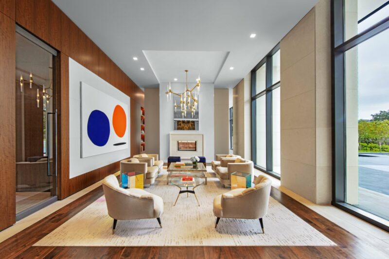
    Photography by Piergiorgio Sorgetti; courtesy of Saba.

    That dialogue with nature extends beyond form. Cork side tables and integrated planters introduce living greenery directly into the seating system, softening the boundary between furniture and garden. Rather than treating plants as decorative accessories, the become part of the composition.

    A green cactus grows in a brown planter between two beige cushioned seats, with a mural of large cacti and arches in the background.

    Photography by Piergiorgio Sorgetti; courtesy of Saba.

    The setting reinforces that idea at every turn. Spanning more than 80 acres in the Salento countryside, Giardino Botanico La Cutura houses one of southern Italy’s most significant collections of cacti, succulents, and tropical plants. Themed gardens unfold across the historic country estate. Its towering greenhouse, rock gardens, and carefully cultivated landscapes provide an environment where Oasi feels like an extension of the ecosystem.
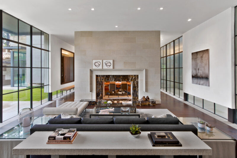
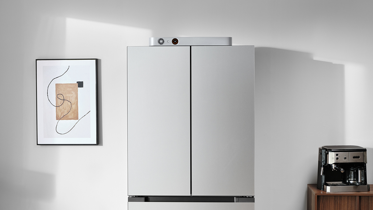
    Outdoor seating area with modular sofas, a side table, and potted cacti, set against a stone wall and surrounded by various desert plants and trees.

    The Oasi modular seating system by Robin Rizzini set within Giardino Botanico La Cutura in Salento, Italy. Photography by Piergiorgio Sorgetti; courtesy of Saba.
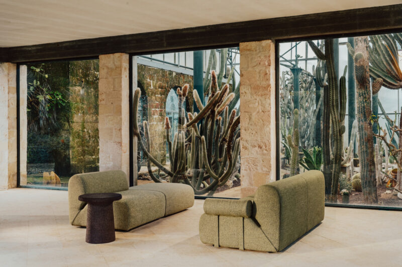
    The campaign continues an ongoing series in which Saba places its collections within architecturally and culturally significant locations, allowing each setting to shape the narrative around the design. Here, the La Cutura country estate offers more than visual drama—it provides a fitting context for a collection conceived to evolve along everyday living.

    Modern lounge with two green sofas and a small round table, set inside a room with large windows overlooking a cactus garden.

    Photography by Piergiorgio Sorgetti; courtesy of Saba.

    Oasi demonstrates how thoughtful product photography can do more than showcase a new collection. By placing furniture within an environment that mirrors its design philosophy, Saba transforms a traditional campaign into a reflection on the increasingly fluid relationship between design, landscape, and wellbeing.

    Editorial Transparency: This article was developed with the assistance of AI tools, which may have been used for research, outlining, editing, or copy refinement. Reporting, fact-checking, and editorial decisions were made by the Design Milk editorial team.

  • Loading more…
Maibook — your private personalized AI community
  • rcanand.com
  • mlaillc.com
  • @rcanand (X)
  • LinkedIn
  • Feedback
  • Credits