• maiweb v0.1.0
  • ★
  • Feedback

#dezeen

2 sources tagged with this.

  • Dezeen
  • Dezeen
  • Dezeen dezeen.com architecture design dezeen 2026-08-04 18:00

    ↗

    The latest Dezeen Debate newsletter features the Donald Trump-backed plans to extend Eero Saarinen's terminal at Dulles airport. Subscribe to Dezeen Debate now. The US Department of Transportation announced the plan in partnership with The Metropolitan Washington Airports...

    Saarinen's Dulles terminal set to be enveloped by Trump-backed airport

    The latest Dezeen Debate newsletter features the Donald Trump-backed plans to extend Eero Saarinen's terminal at Dulles airport. Subscribe to Dezeen Debate now.

    The US Department of Transportation announced the plan in partnership with The Metropolitan Washington Airports Authority and United Airlines, after dozens of architecture studios submitted proposals to an RFI from the government last year.

    Commenters are unsure about the proposal, with one calling it "shameless", referring to President's signature choice of gold on the interior. Another discouraged reader wrote, "the cultural vandalism knows no bounds".

    Decoy Font protects messages from being read by AI
    Decoy Font protects messages from being read by AI

    Other stories in this week's newsletter included an optical illusion font that protects messages from being read by AI and the news that Frank Gehry's Guggenheim Abu Dhabi is set to open in December.

    Dezeen Debate

    Dezeen Debate is sent every Tuesday and features a selection of the best reader comments and most talked-about stories. Read the latest edition of Dezeen Debate or subscribe here.

    You can also subscribe to our other newsletters; Dezeen Agenda is sent every Thursday, containing a selection of the most important news highlights from the week, Dezeen Daily is our daily bulletin that contains every story published in the preceding 24 hours and Dezeen In Depth is sent on the last Friday of every month and delves deeper into the major stories shaping architecture and design.

    The post Dezeen Debate features "shameless" proposal for Dulles airport appeared first on Dezeen.

  • Dezeen dezeen.com architecture design dezeen 2026-08-04 17:30

    ↗

    Local studio River Architects has designed a wood-clad structure to Passive House standards, orienting gabled volumes around a pond in New York's Hudson Valley. Known as the China Pond Passive House, the 4,318-square-foot (400-square-metre) home sits on a wooded 2.2-acre...

    River Architects China Pond Passive House

    Local studio River Architects has designed a wood-clad structure to Passive House standards, orienting gabled volumes around a pond in New York's Hudson Valley.

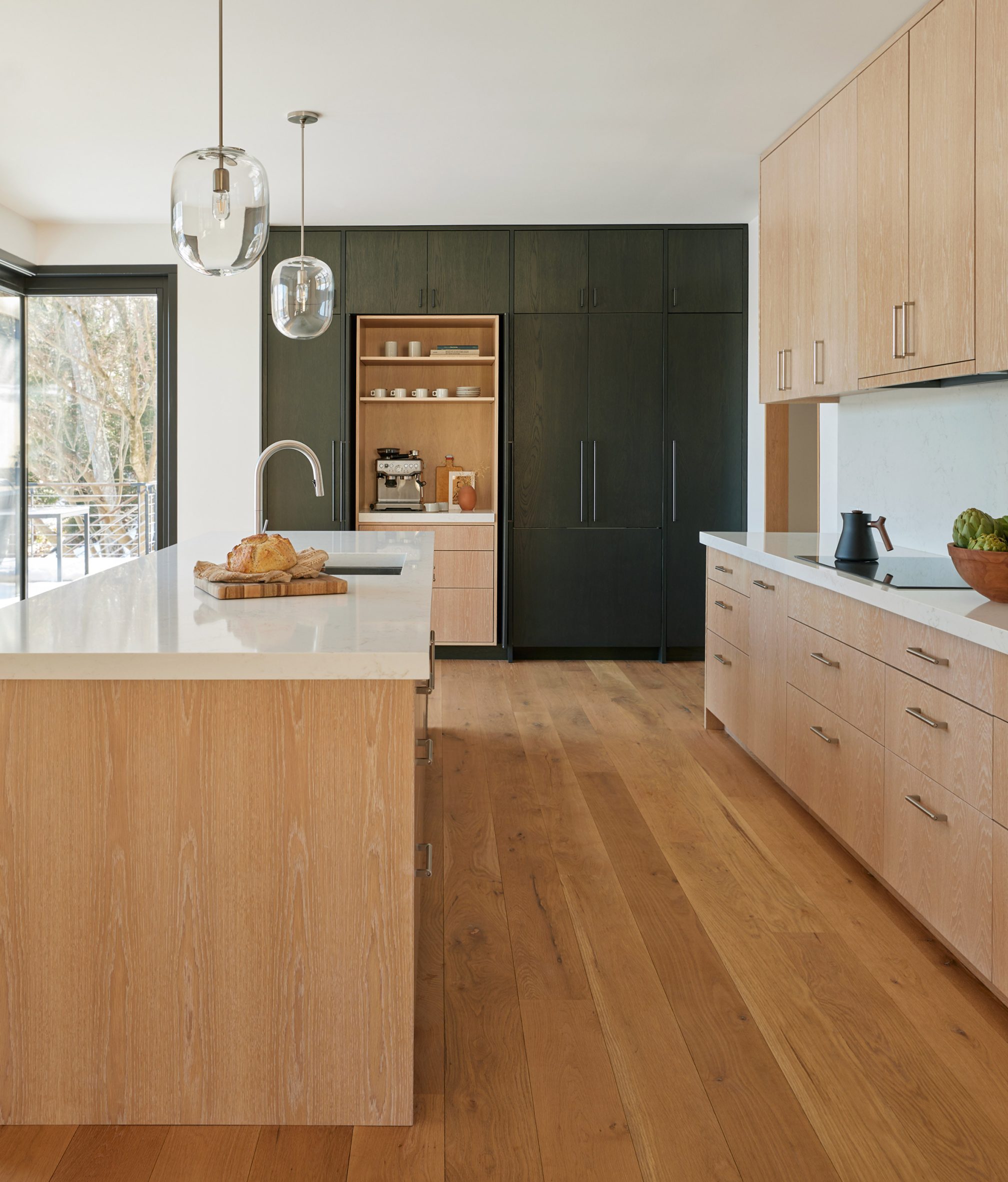
    Known as the China Pond Passive House, the 4,318-square-foot (400-square-metre) home sits on a wooded 2.2-acre property in Carmel, New York.

    River Architects, which is based in nearby Cold Spring, completed the house in November 2025, replacing an earlier residence with a similar footprint.

    River Architects China Pond Passive House
    River Architects has created a Passive House in Upstate New York

    The studio built the new home from the ground up but didn't approach the site as a blank slate.

    "We wanted to maintain that sense of evolution in the new house, a decision which also helps break up the overall form so it doesn't seem overwhelming," James Hartford, principal and partner of River Architects, told Dezeen.

    "The result is a playful push and pull in massing, resulting in unusual in-between places and quirky angles."

    River Architects China Pond Passive House
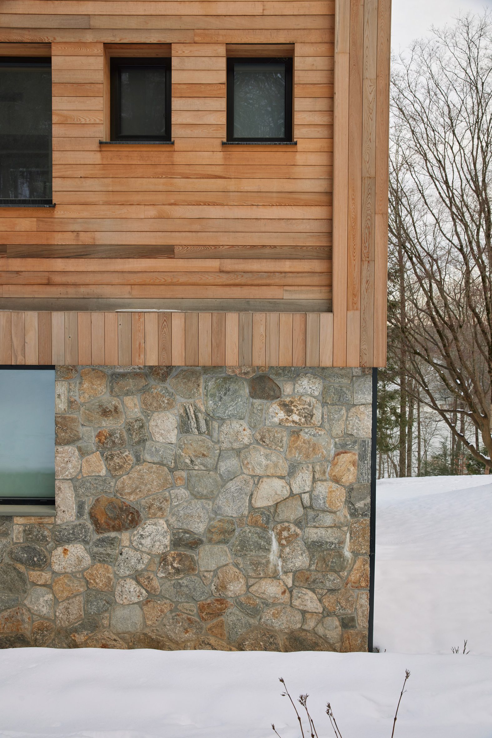
    Reclaimed wood clads the structure above a stone foundation

    Connecting with the site's existing infrastructure and stonework, the house works in dialogue with its surrounding trees and views of the water, capturing the spirit of the original house – a collection of spaces that balance a sense of retreat with the encouragement to gather.

    In order to echo the additive nature of camp buildings and reduce the scale of the house, the massing is broken into a series of smaller volumes.

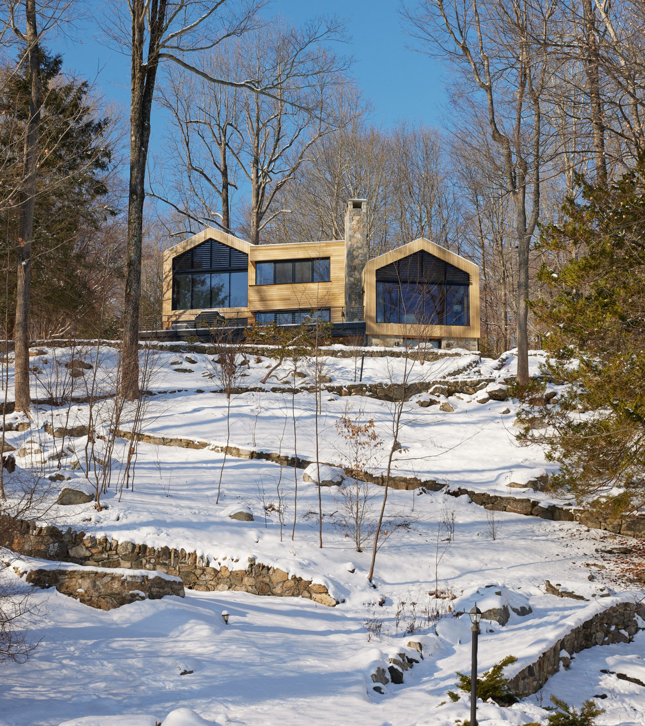
    Two gabled forms – a two-level bar that faces east and west and a three-level bar that is rotated slightly – are joined by a flat-roofed wedge.

    The forms are wrapped in reclaimed cypress and Douglas fir above the native stone foundation that is partially embedded in the sloped site.

    River Architects China Pond Passive House
    The structure consists of interconnected gabled volumes

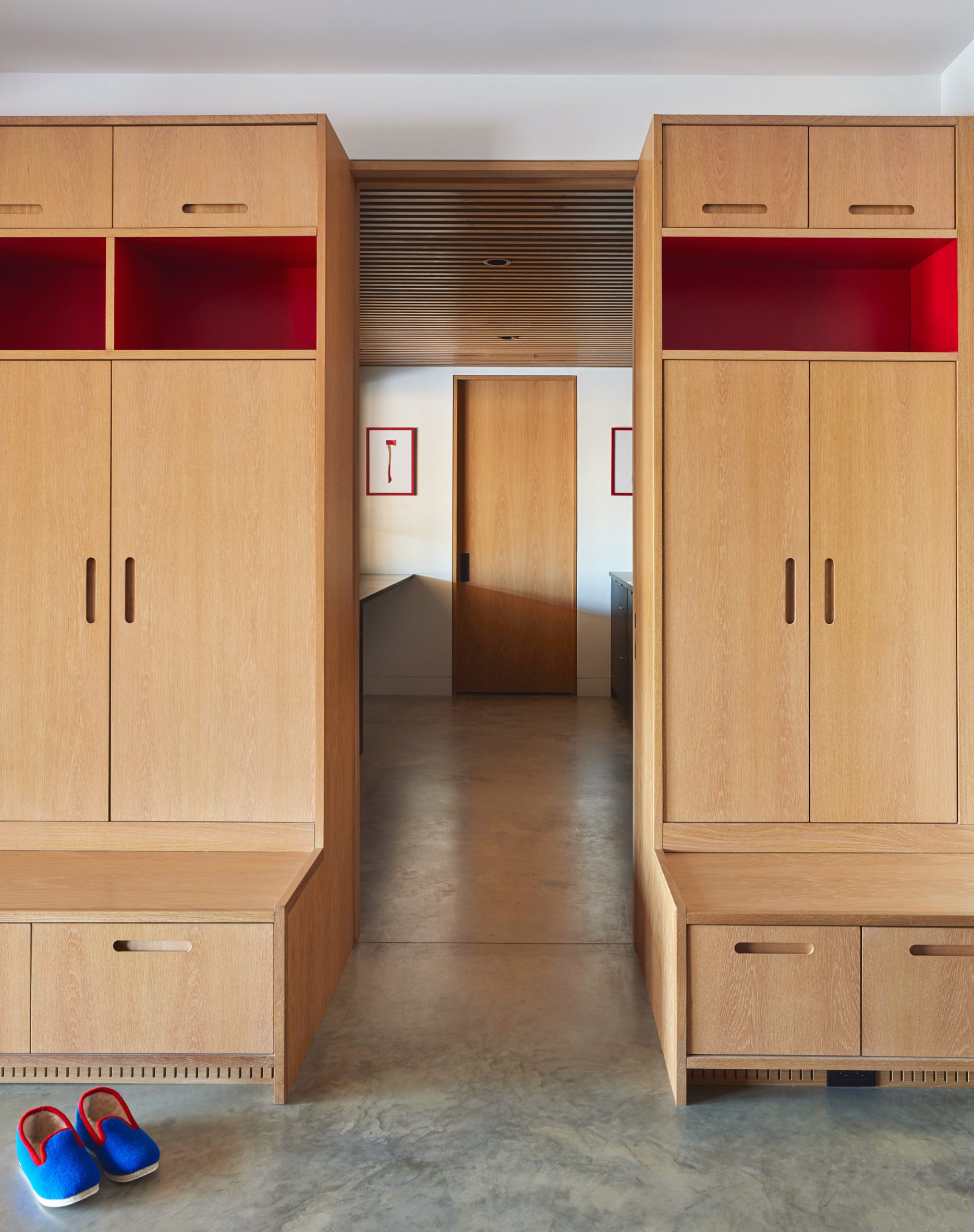
    Inside, the team worked to recreate the feeling of the original library in the great room to be both intimate and expansive for entertaining, with views and daylight. Private sleeping spaces are ganged to the southern side of the house, while the communal areas blend between the central and northern portions.

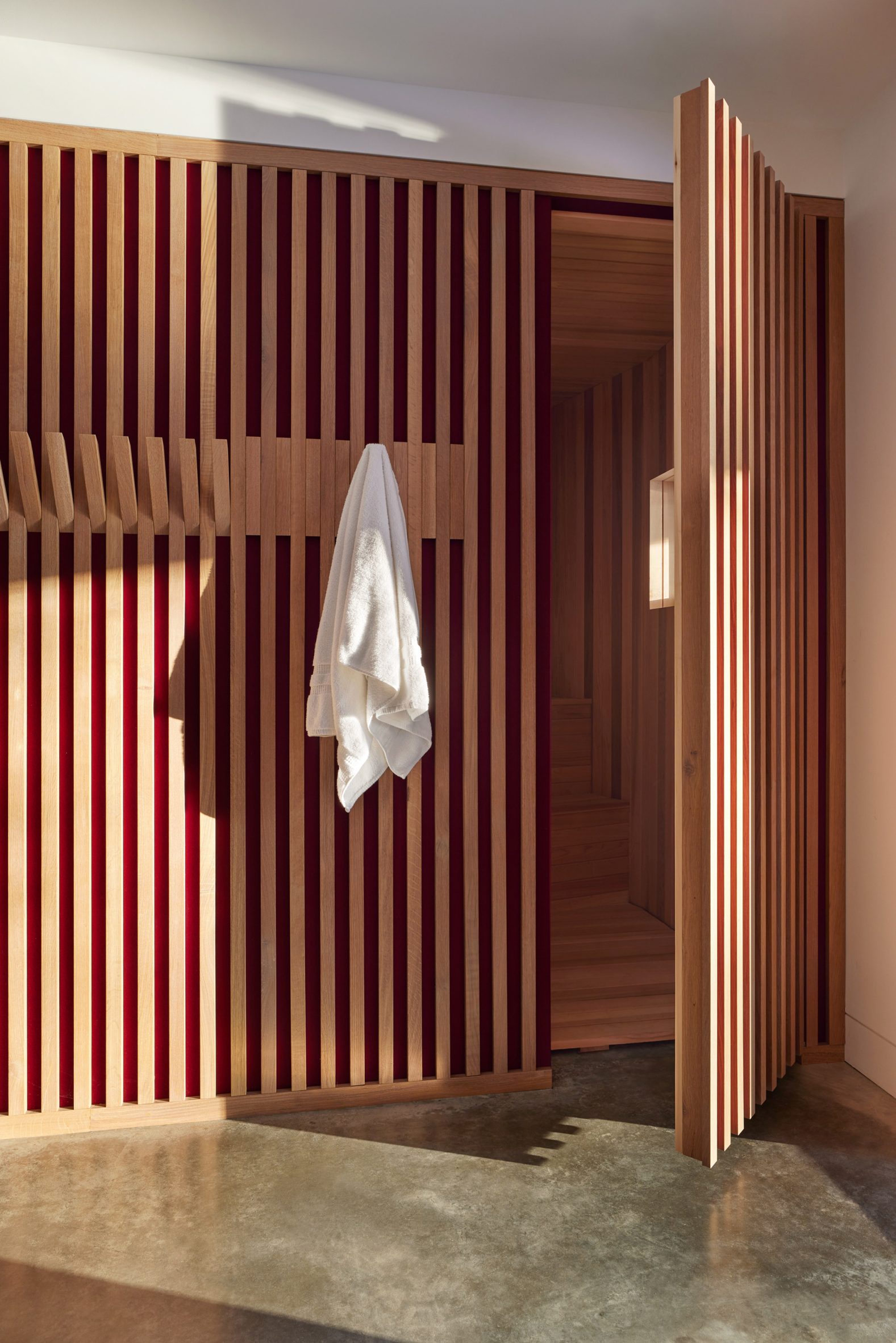
    The lower level is more informal with recreation space, a sauna and access to a large deck that mimics the terrace on the main level.

    River Architects China Pond Passive House
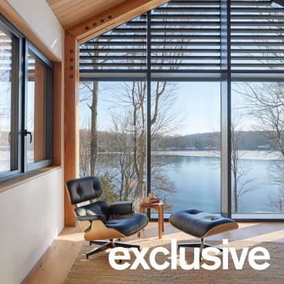
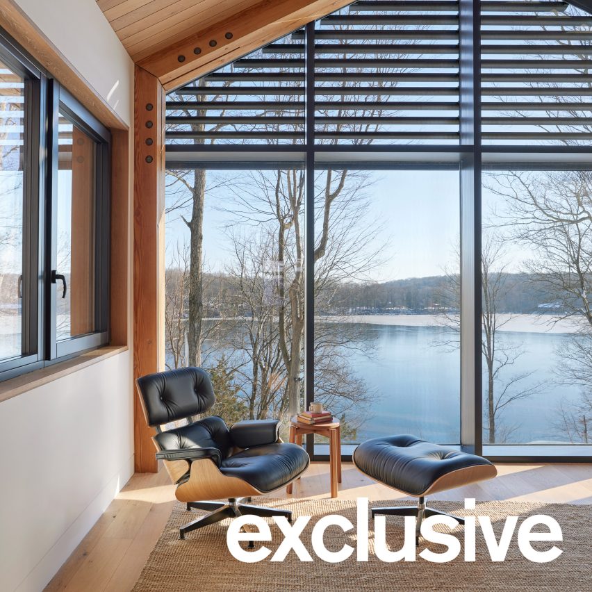
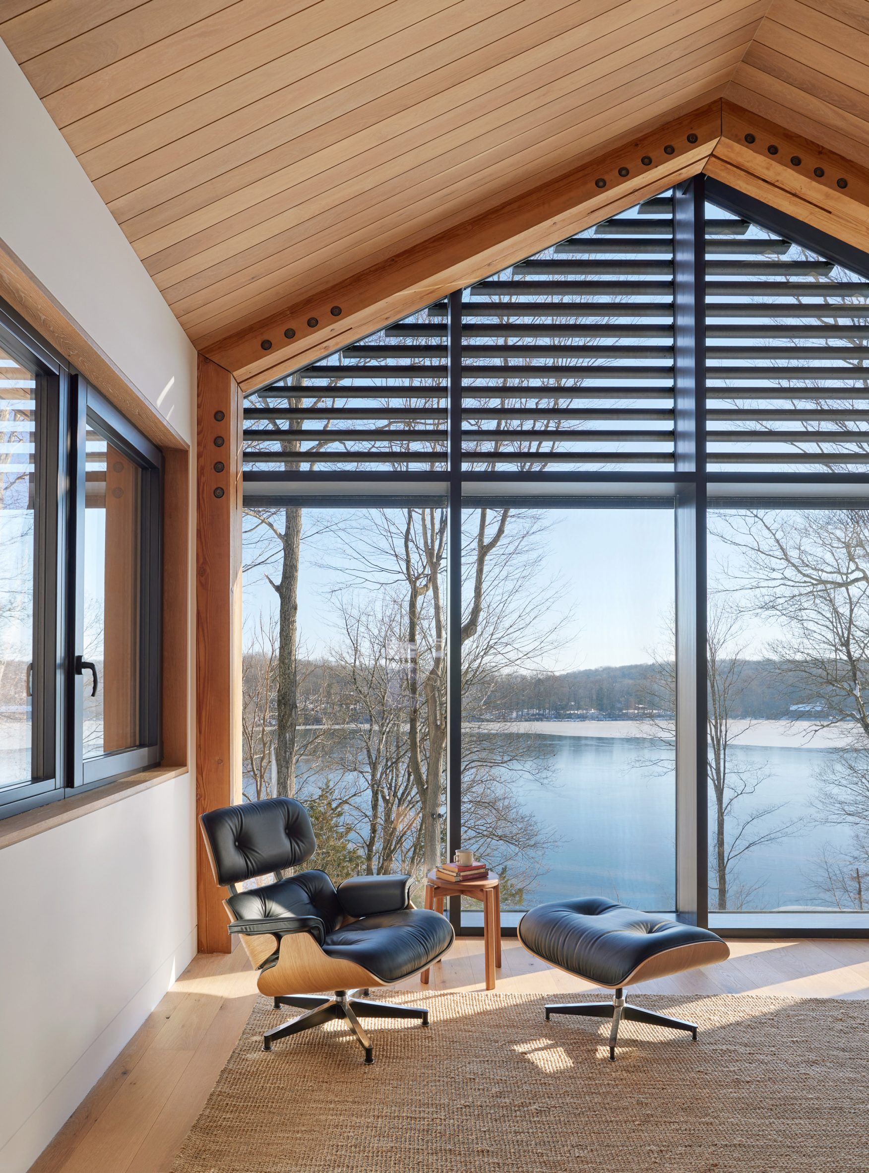
    The studio prioritised views of the water

    "A central stone chimney serves as the physical and social heart of the home, organizing the primary living and outdoor spaces while anchoring views and activity around it," Hartford said.

    "The house opens to the landscape, balancing expansive lake views with moments of privacy and shelter."


    In order to achieve Passive House certification, sustainable elements were embedded in the project from the outset.

    The house features a highly insulated and airtight building envelope, triple-pane glazing, careful solar orientation and shading strategies that reduce energy demand while improving comfort.

    River Architects China Pond Passive House
    Passive strategies and high-quality insulation allowed the studio to meet high standards of energy use

    The locally sourced wood reduced carbon impact and maintenance, while active systems – all-electric heat pumps, energy recovery ventilation and infrastructure for renewable energy generation – contribute to the performance.

    "Together, these measures enabled the project to achieve Phius certification and provide exceptional indoor comfort with significantly reduced operational energy use and no fossil fuel use," the studio said.

    River Architects China Pond Passive House
    A sauna was included in the lower levels

    Other recently built single-family Passive Houses include a retrofitted terrace house in Queens by CO Adaptive, a courtyard home in Chile by Paralelo Transversal and a retrofitted Victorian home with a "fabric first" approach in London by GS Architecture.

    The photography is by Pamela Cook.


    Project credits:

    Architecture: River Architects
    General contractor: Heitmann Builders
    Passive building certification: Phius
    Structural: Murray Engineering
    MEP: Baukraft
    Phius rater: Integral Building + Design, Yaro Windows and Doors, Lighthouse Solar
    Tadelakt installer: Deco Plaster Studio
    Acoustic felt vendor: CSI Creative Acoustic

    The post River Architects replaces Hudson Valley structure with gabled Passive House appeared first on Dezeen.

  • Dezeen dezeen.com architecture design dezeen 2026-08-04 14:40

    ↗

    New York studios Schlaich Bergermann Partner and Snøhetta have replaced an ageing bridge in Upstate New York with a steel half-arch span that is mounted on one side of a gorge and cantilevers across to the other side. The Sentry Bridge replaces a decaying structure of the...

    Watkins Glen State Park

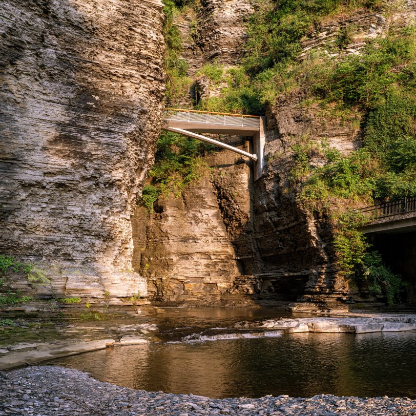
    New York studios Schlaich Bergermann Partner and Snøhetta have replaced an ageing bridge in Upstate New York with a steel half-arch span that is mounted on one side of a gorge and cantilevers across to the other side.

    The Sentry Bridge replaces a decaying structure of the same name located in Watkins Glen State Park in the Finger Lakes region of New York.

    Sentry Bridge
    SBP and Snøhetta have completed a bridge in Upstate New York

    The bridge is wedged between two cavernous rock walls among the park's twisting, mossy trails that navigate along Watkins Glen gorge, and overlooks a low riverbed at the base of a waterfall.

    It marks the beginning of the gorge path, and, according to the team, "sets a tone for adventure".

    Sentry Bridge
    It links two sides of a narrow gorge

    "The bridge and pathways honour the histories and craft traditions of the gorge, protect unique cliff and creek ecosystems. and heighten the experience of stone and water," said Snøhetta project director Matt McMahon.

    The bridge was fabricated locally and is made of a stainless steel structure. It is primarily affixed to the north side of the gorge, where the bedrock is stronger, and cantilevers 46 feet (14 metres) to the other side.

    Sentry Bridge
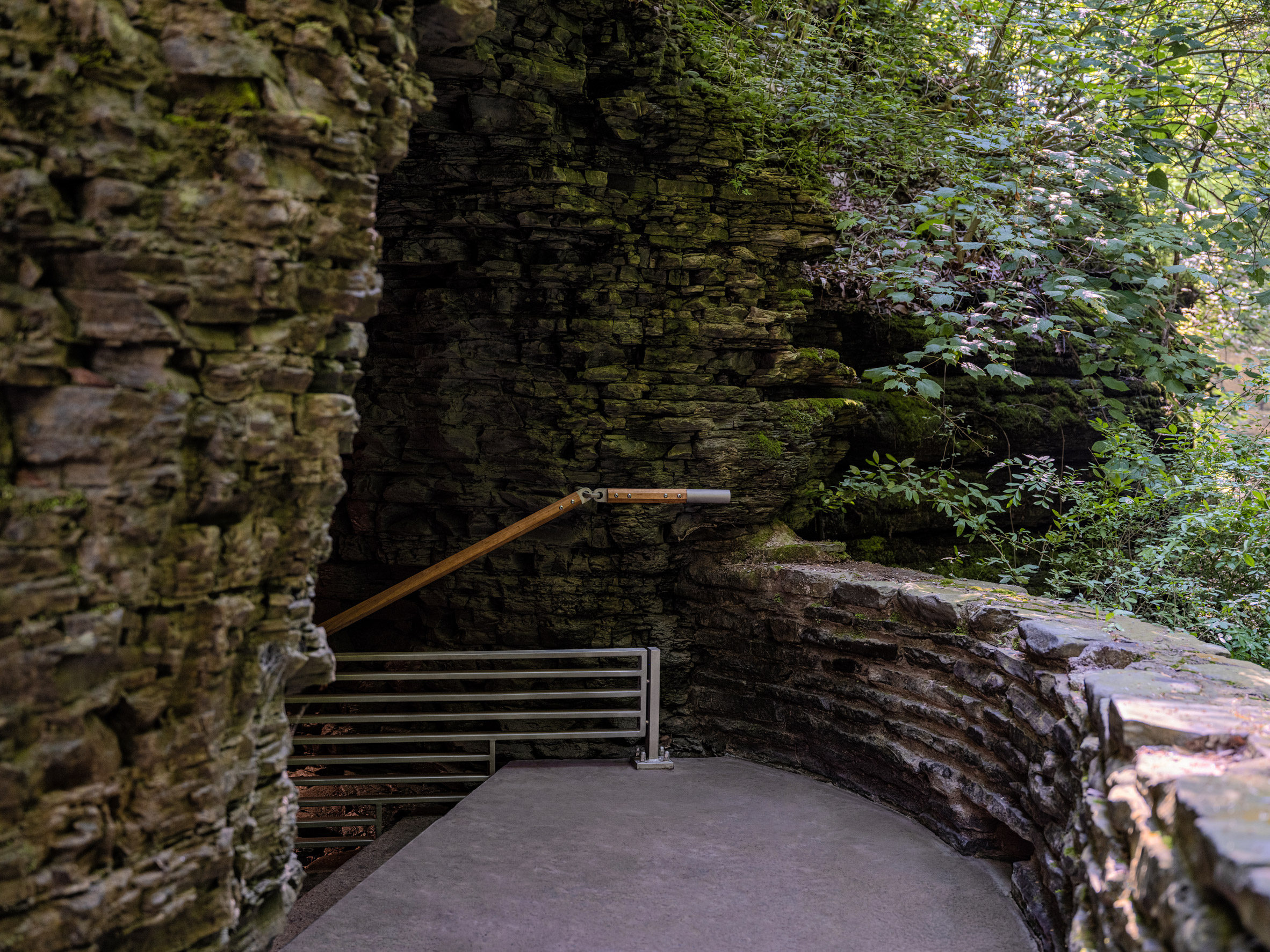
    It is lined with black locust wood rails

    The main structure was pre-fabricated and slotted into the slim site via crane.

    The team then finished the bridge with black locust wood rails, concrete formed of rough-sawn hemlock, and a bluestone landing.

    Gairnshiel Jubilee Bridge by Moxon Architects

    Read:

    Moxon Architects adds "functional and graceful" bridge to Scottish highlands

    Custom bronze castings of local flora and fauna such as an endangered dragonfly, a rare plant, and a model of the historic arch bridge were also distributed throughout the site for visitors to "pause and examine" the regional heritage of the area.

    According to the team, the bridge frames views of the surrounding waterfalls and "heightens awareness of the mist and shifting light".

    Sentry Bridge
    It marks the entrance to the state park's gorge path

    "The bridge demonstrates how thoughtful engineering can support both performance and experience," said Schlaich Bergermann Partner managing director Michael Stein.

    "By developing a lightweight, cantilevered structure that could be prefabricated and installed with minimal impact on the gorge, we were able to create a resilient crossing that responds to the site's environmental sensitivities while enhancing the journey through one of New York’s most remarkable landscapes."

    Other recently completed pedestrian bridges include a footbridge in France that spans over a 19th-century viaduct over the River Tarn and a low-lying bridge over a Belgian river.

    The photography is by Barrett Doherty


    Project credits:

    Owner: New York State Office of Parks, Recreation and Historic Preservation
    Prime consultant/bridge design and engineering: schlaich bergermann partner, New York, NY
    Bridge design architect and landscape architect: Snøhetta, Brooklyn, NY
    Civil and environmental engineering: Lu Engineers, Rochester, NY
    Historic preservation: Old Structures Engineering, New York, NY
    Wayfinding and signage: Moniteurs Communication Design, Berlin, Germany
    Lighting design: schlaich bergermann partner, New York, NY
    Geotechnical engineering: Langan, Parsippany, NJ
    Electrical engineering: SJH Engineering, Princeton, NJ
    Land surveyor: GdB Geospatial, A SAM Company, West Henrietta, NY
    Contractor: Twin Tier Constructors, Inc., Scottsville, NY
    Owner's representative: C & S Companies, Syracuse, NY
    Steel fabricator: LMC Industrial Contractors, Inc., Dansville NY
    Bronze castings: Erie Bronze & Aluminium, Erie, PA; Matthews International, Pittsburgh, PA
    Wood fabricator: Tri-Lox, Brooklyn, N

    The post SBP and Snøhetta cantilever bridge between rock faces in Upstate New York appeared first on Dezeen.

  • Dezeen dezeen.com architecture design dezeen 2026-08-04 10:30

    ↗

    Agricultural barns and sheds informed the corrugated metal-clad volumes of House in a Clearing, a house in East Sussex completed by UK studio TaylorHare Architects. When the clients purchased the site nestled in a woodland clearing near Uckfield, it was occupied by a small...

    House in a Clearing by TaylorHare Architects

    Agricultural barns and sheds informed the corrugated metal-clad volumes of House in a Clearing, a house in East Sussex completed by UK studio TaylorHare Architects.

    When the clients purchased the site nestled in a woodland clearing near Uckfield, it was occupied by a small structure but already had planning permission for a much larger, two-storey dwelling.

    Children playing outside House in a Clearing
    TaylorHare Architects has completed a family home in East Sussex

    The new owners, however, sought a quieter design that would feel more connected to the landscape, leading to TaylorHare Architects creating a cluster of three single-storey barns organised around a central courtyard informed by traditional farmsteads.

    "Every design decision was measured against a simple question: did it strengthen the relationship between house and landscape?" director and project principal Christopher Taylor told Dezeen.

    Family home by TaylorHare Architects
    Its three barn-like volumes are clad in corrugated metal

    "Drawing on the character of rural agricultural steadings, the composition creates a home that feels both grounded and quietly expressive," he continued.

    At the centre of House in a Clearing, a slightly larger building clad in black metal contains the main social spaces, which overlook both the paved courtyard and surrounding landscape through large windows.

    House in a Clearing by TaylorHare Architects
    The home's main social spaces are held within the larger black metal volume

    A snug leads through into the bedroom wing, where a row of more intimate spaces sit off a long corridor and have also been given minimal, white finishes to emphasise external views through large openings framed in black metal.

    To the south, a glazed link connects the living areas to an ancillary building, which contains a garage, home gym and guest room and is finished with a gable end of brickwork that the studio said "anchors the building in the landscape".

    Oblique view along the length of the house showing the row of cylindrical concrete columns and landscaped garden

    Read:

    Charles Gillespie Architecture completes Somerset house with wildlife-friendly colonnade

    All of the volumes are united by their finish of corrugated metal, which covers both their walls and roofs. According to the studio, this was chosen for its ability to make the home feel "both contemporary and deeply rooted in its setting".

    The internal finishes of the home were kept purposefully minimal, with white walls and high gable ceilings complemented by pale oak timber in the bedrooms and stone paving in the kitchen and bathroom.

    Living space interior at House in a Clearing by TaylorHare Architects
    White walls are complemented by pale oak timber

    "White-rendered walls and natural timber create calm, light-filled spaces where the changing landscape, rather than the architecture itself, becomes the primary focus," Taylor told Dezeen.

    "Ultimately, the materials were never intended to make a statement in their own right. Instead, they work together to create a building that feels enduring, familiar and quietly connected to its place."

    Ancillary building at House in a Clearing
    An ancillary building contains a garage, home gym and guest room

    Other recent homes in the UK that have taken cues from agricultural buildings include the transformation of a former tractor shed in Dorset into a low-carbon home by architecture practice Bindloss Dawes.

    The photography is by Nick Dearden.

    The post Farmsteads inform corrugated metal-clad home in Sussex appeared first on Dezeen.

  • Dezeen dezeen.com architecture design dezeen 2026-08-04 09:30

    ↗

    Designer Joyce Wang has completed an interior renovation at the Mandarin Oriental The Landmark hotel in Hong Kong, designed to evoke the feel of living in a colonial mansion. Located on Queen's Road in Hong Kong's Central district, the hotel was first established a decade...

    Mandarin Oriental The Landmark Hong Kong by Joyce Wang Studio

    Designer Joyce Wang has completed an interior renovation at the Mandarin Oriental The Landmark hotel in Hong Kong, designed to evoke the feel of living in a colonial mansion.

    Located on Queen's Road in Hong Kong's Central district, the hotel was first established a decade ago. It recently reopened after the completion of interior renovation by Joyce Wang Studio and a new facade design by Neri&Hu.

    Mandarin Oriental The Landmark Hong Kong by Joyce Wang Studio
    Terracotta tones in the lobby nod to Hong Kong's colonial architecture

    Joyce Wang Studio referenced Hong Kong’s historic architecture and skyline when designing the hotel, whose interior was informed by the city's colonial country manors.

    "We took inspiration from the colonial country manors frequented by the Tai Kwuns of a bygone era to celebrate the beauty of these historic homes that still fascinate today," Wang, principal of her eponymous studio, told Dezeen. "Our vision this time has a greater focus on local relevance and the heritage of the building."

    The studio also aimed to fuse art into the hotel.

    "We also used art as an integral part of our philosophy for the space, with a commitment to adding local flavour. The artwork program is rigorous in that there is a story behind each piece," Wang added.

    Mandarin Oriental The Landmark Hong Kong by Joyce Wang Studio
    Undulating staircase extends around a large-scale contemporary artwork

    The hotel lobby features a mix of materials including stone, timber and textured wallcoverings. Custom eglomisé glass was added as detailing to create a contemporary atmosphere.

    Terracotta tones within the space nod to Hong Kong's colonial architecture and were combined with a touch of green and orange in response to the city's lush green parks.

    Mandarin Oriental The Landmark Hong Kong by Joyce Wang Studio
    The interiors of the hotel aim to reimagine the feel of a historical mansion

    Throughout the hotel, a collection of artworks was carefully curated to create an authentic lived-in residence.

    Artwork, objects and accessories scattered around an undulating staircase, artwork bays and sculptural plinths invite guests to pause and interact with them while venturing into the space.

    Mandarin Oriental The Landmark Hong Kong by Joyce Wang Studio
    The bar features a backdrop of patinated brass, verdigris and bronze panels

    Custom artworks capturing Hong Kong's signature skyline were created by the studio and integrated into carpet designs, tapestries and the églomise glass located at the lobby, as well as lifts and guestroom corridors.

    According to the Hong Kong-based studio, the artistic intervention aims to celebrate the hotel's prominent location in the city, while presenting a series of treasured objects as if collected over time for one's own home.

    Mandarin Oriental The Landmark Hong Kong by Joyce Wang Studio
    Artworks informed by Hong Kong’s signature skyline were integrated into carpet designs

    Joyce Wang Studio aimed to create an intimate and residential feel in Mandarin Oriental The Landmark's 109 rooms and suites.

    Details include bespoke wallcoverings by wallpaper brand Fromental, featuring hand-painted and silk elements, and cracked gesso wall finishes. Custom rugs on top of timber floors reference Hong Kong's historic brickwork.

    A new communal bar was reimagined as a contemporary family gathering space. Here, the design is defined by a backdrop featuring patinated brass, verdigris, and bronze panels, allowing the space to adapt seamlessly between day and night service.

    Mandarin Oriental The Landmark Hong Kong by Joyce Wang Studio
    The green and yellow hues reference Hong Kong's parks

    Ceiling lamps in matching patinated finishes pay homage to the domestic lighting found in the historic mansions of Yuen Long, a town in the western north of Hong Kong's New Territories, where several notable historic mansions and grand residences are located.

    Fluted jade-toned tiles wrap the bar front, recreating the roofline silhouettes of traditional housing.

    Tangerine and cherry-toned bar chairs contrast with the bar table. Their backs are adorned with a crest-like motif that symbolises a contemporary family emblem inherited through generations.

    Mandarin Oriental The Landmark Hong Kong by Joyce Wang Studio
    The studio curated a collection of artworks throughout the hotel

    "For this latest renovation, we were inspired by the identity of our hotel as a pied-à-terre for our guests to feel the pulse of Hong Kong, intimately. The curation of pieces are windows into expressions of our city through lenses of both local and international, emerging and established artists," said Wang.

    "As you journey through the hotel, we hope these storied perspectives fill you with curiosity and contemplation, at the ready to strike up conversations," she continued.

    Mandarin Oriental The Landmark hotel facade by Neri&Hu

    Read:

    Neri&Hu wraps Hong Kong hotel in "urban tapestry" facade

    For the hotel spa, Joyce Wang Studio added design details informed by breathwork and calligraphy to create a sense of calm.

    Custom flooring patterns were designed to mimic the natural rhythm of inhalation and exhalation, allowing guests to connect with the space as if it is breathing with them.

    Mandarin Oriental The Landmark Hong Kong by Joyce Wang Studio
    Hand-painted and silk elements feature on the walls of guest rooms

    Two distinct wood veneers were paired together within the gym, yoga, and pilates studios, creating a balanced, organic environment that encourages a sense of focused calm.

    The sinuous and fluid lines on the ceiling and decorative screens aim to recreate the brush strokes of Chinese calligraphy.

    Mandarin Oriental The Landmark Hong Kong by Joyce Wang Studio
    The hotel renovation was completed recently and includes a new facade design by Neri&Hu

    The hotel has officially reopened since June, while the spa will fully reopen later this year.

    Established in 2011, Joyce Wang Studio is known for luxury hospitality and residential design, with offices in London and Hong Kong.

    Elsewhere in Hong Kong, Studio Paolo Ferrari designed a "timeless futurism" cocktail bar, while the Dragon-i nightclub renovated by local interior designer Pirajean Lees captured the romantic atmosphere of director Wong Kar Wai's films.

    The photography is by Common Studio.

    The post Joyce Wang draws on "colonial country manors" for Hong Kong hotel interior appeared first on Dezeen.

  • Dezeen dezeen.com architecture design dezeen 2026-08-04 08:00

    ↗

    Wood, aluminium and artworks made from reused textiles were used to create speaker brand Dynaudio's new showroom in Copenhagen, which local studio Norm Architects has filled with wooden furniture by Japanese manufacturer Karimoku. The showroom is located in Copenhagen's...

    Dynaudio showroom interior with textile artwork

    Wood, aluminium and artworks made from reused textiles were used to create speaker brand Dynaudio's new showroom in Copenhagen, which local studio Norm Architects has filled with wooden furniture by Japanese manufacturer Karimoku.

    The showroom is located in Copenhagen's picturesque, central Indre By neighbourhood, in a former flagship store for Danish shoe brand Notabene that was also designed by Norm Architects.

    For  Dynaudio, however, the studio wanted to create an interior that would reference the brand's products.

    Showroom with textile details
    Norm Architects designed the new showroom for speaker brand Dynaudio

    "We looked to create an environment where both the material and colour palette of the space is experienced as if you imagined the speaker components unfolded and fitted into the space itself," Norm Architects partner Frederik Werner told Dezeen.

    "Elements of wood, aluminium and textile act as counterparts to the concrete surfaces of the building and create an environment that is both raw and soft."

    The 250-square-metre showroom was designed in collaboration with Dynaudio and branding agency Kontrapunkt.

    Wooden staircase with zigzag shape
    A zigzagging wooden staircase connects the three floors

    It is spread over three floors, including a wooden mezzanine floor that holds a large table and chairs for meetings, all connected by a sculptural, zigzagging wooden staircase.

    Since the space was designed for a speaker company, Norm Architects also aimed to include materials with acoustic properties.

    Black and white artwork
    Artworks made from recycled fabrics decorate the walls

    The most notable are perhaps the large, striking black-and-white artworks that decorate the walls, which were made by Amsterdam studio Buro Belén using recycled fabrics from textile brand Kvadrat.

    "Besides the textile murals, we added elements of eelgrass panels from Danish manufacturer Søuld in the ceiling as they benefit both the acoustic experience and create an overall healthier environment, by for instance stabilising the humidity of the space," Werner said.

    Mezzanine floor with wooden table
    Furniture by Karimoku was used throughout Dynaudio's showroom

    As well as the eelgrass panels and recycled-textile artworks, Norm Architects also collaborated with Corkinho, a Portuguese brand that makes furniture and other elements in cork, which were added to the interior to also help with the acoustics.

    "We used cork volumes as 'vibration buffers' between the speakers and aluminium plinths," Werner explained.

    The furniture in the showroom was supplied by Karimoku since the Japanese manufacturer already had a strong working relationship with Dynaudio, having produced all the wooden elements for Keiji Ashizawa's Book Shelf speaker and the louvres for the Opus One soundbar.

    Interior of Galleri Sonja

    Read:

    Norm Architecture draws on "Scandinavian simplicity" for Danish gallery interior

    Among the Karimoku pieces on display are dark-wood tables and chairs, as well as comfy sofas and custom-made acoustic designs.

    "We found it natural to invite them into this case and to design a collection of furniture that fulfilled and heightened the listening experience and curated service concept in general," Werner said.

    Norm Architects Dynaudio showroom
    The showroom also has comfy sofas

    The studio also designed a specific listening area in the basement for visitors to get the full audio experience.

    "In the basement, guests will be able to experience the full capabilities of Dynaudio, in a small acoustically optimised cinema-like listening room – which I can highly recommend," Werner concluded.

    Showroom with white curtains
    It showcases products including Dynaudio's soundbar

    Other recent projects by Norm Architects include the first Audo House in New York and a gallery space on the Danish island of Bornholm.

    The photography is by Karl Tranberg Knudsen.

    The post Norm Architects designs Dynaudio showroom to resemble "speaker components unfolded" appeared first on Dezeen.

  • Dezeen dezeen.com architecture design dezeen 2026-08-04 05:00

    ↗

    A stripped-back interior of concrete surfaces and timber joinery lets sustainable production practices take centre stage at Melbourne's Contraband Coffee cafe and roastery, designed by architecture studio Taylor Knights. The cafe is located in Melbourne's buzzy Brunswick East...

    Contraband Coffee in Brunswick East, Melbourne, designed by Taylor Knights

    A stripped-back interior of concrete surfaces and timber joinery lets sustainable production practices take centre stage at Melbourne's Contraband Coffee cafe and roastery, designed by architecture studio Taylor Knights.

    The cafe is located in Melbourne's buzzy Brunswick East neighbourhood and is the second Contraband Coffee branch to be designed by Taylor Knights, which also devised the interiors of the company's inaugural site in nearby Preston.

    Contraband Coffee in Brunswick East, Melbourne, designed by Taylor Knights
    Contraband Coffee takes over an old industrial warehouse

    As part of a move to eradicate fossil fuels from its roasting and distribution process, Contraband Coffee has set up this location to be entirely solar powered.

    Inside there's an all-electric coffee bean roaster, and deliveries will be made with electric vans. The company also partners with local business Reground to recycle its used soft plastic packaging, coffee grounds and chaff – the dried skin surrounding coffee beans that falls off during the roasting process.

    Contraband Coffee in Brunswick East, Melbourne, designed by Taylor Knights
    Inside, timber fixtures are set against bare concrete walls

    Taylor Knights was asked to reflect this sustainability-focused ethos in the cafe's design.

    "For us, the project demonstrates that environmental responsibility doesn't need to be expressed through technology alone; it can also be found in the careful reuse of buildings, materials and places that already exist," Taylor Knights' director Peter Knights told Dezeen.

    Contraband Coffee in Brunswick East, Melbourne, designed by Taylor Knights
    A glass-and-timber curtain wall separates the cafe from the roasting facilities

    The cafe occupies a former industrial warehouse, and although the double-storey brick building was structurally sound, Taylor Knights said it felt "dark, inward-looking and largely isolated from its surroundings".

    The studio decided to puncture a sequence of glazed openings along the northern facade to allow more natural light into the plan and create a better visual connection to the newly established courtyard at the side of the building.

    Contraband Coffee in Brunswick East, Melbourne, designed by Taylor Knights
    The coffee roaster runs on solar-powered electricity

    The rest of the interior was retained, with the existing concrete ceiling beams and slab flooring cleaned where necessary.

    "The material palette was guided by a desire to reveal rather than replace," explained Knights. "The restrained palette allows texture and material honesty to take precedence, with planting and subtle green accents softening the industrial character and strengthening the connection to the landscape beyond."

    Brunswick West House by Taylor Knights

    Read:

    Taylor Knights opens up garden views at Melbourne home with glass-fronted extension

    Customers make their orders at a chunky service counter crafted from locally sourced timber. Coffee machines stand at one end, while the other houses a built-in glass case for baked goods.

    Next to the counter are a few tables accompanied by sage green chairs; directly behind stands a curtain wall, also constructed from local timber.

    Half of it is inlaid with glass so that customers can see through to the room where the electric roaster is and watch staff process the coffee beans.

    Contraband Coffee in Brunswick East, Melbourne, designed by Taylor Knights
    Double doors grant access to the cafe's adjoining courtyard

    Double doors lead out to the courtyard, conceived by Taylor Knights with the help of landscape architects TCL.

    At its centre is a communal high table and stools, but customers can also perch on one of the benches or circular seating platforms. Cylindrical concrete planters stand dotted throughout.

    Contraband Coffee in Brunswick East, Melbourne, designed by Taylor Knights
    Concrete planters were placed among the courtyard's pockets of seating

    Additional seating is offered at the front of the cafe, where the building's old car parking area was populated with more benches, supported by aluminium frames repurposed by Taylor Knights from its 2021 installation Pond[er] at the National Gallery of Victoria.

    The wall beside the entrance doors has also been decorated with a cartoonish mural by artist Chris Costa.

    Contraband Coffee in Brunswick East, Melbourne, designed by Taylor Knights
    More outdoor seating was introduced at the front of the cafe

    Beyond cafes, Taylor Knights has completed several residential projects in and around Melbourne. Examples include a bungalow in Brunswick West, which features a glass-fronted extension quietly inspired by a Wassily Kandinsky painting.

    The photography is by Jack Lovel. 

    The post Taylor Knights designs responsible Melbourne coffee roastery to "reveal rather than replace" appeared first on Dezeen.

  • Dezeen dezeen.com architecture design dezeen 2026-08-03 17:56

    ↗

    A glass-walled pavilion sandwiched between historic buildings is the leading feature of an Oregon art museum revamp, which was designed by US studios Hennebery Eddy Architects and Vinci Hamp Architects to improve the visitor experience. Spanning two urban blocks, the Portland...

    Portland Art Museum

    A glass-walled pavilion sandwiched between historic buildings is the leading feature of an Oregon art museum revamp, which was designed by US studios Hennebery Eddy Architects and Vinci Hamp Architects to improve the visitor experience.

    Spanning two urban blocks, the Portland Art Museum is located in the city's downtown district.

    Portland Art Museum
    Hennebery Eddy Architects and Vinci Hamp Architects have completed an expansion to the Portland Art Museum

    It primarily consists of two historic buildings: the Belluschi Building, designed by architect Pietro Belluschi and completed in 1932, and the Mark Building, designed by Frederick Fritsch and dating to 1926. The latter originally served as a masonic temple and was acquired by the museum in the 1990s.

    Local studio Hennebery Eddy Architects and Chicago-based Vinci Hamp Architects were tasked with updating the museum's existing buildings and adding a connector building – with the overall goal to provide a "more streamlined and holistic visitor experience".

    Portland Art Museum
    The studios updated existing buildings and added contemporary volumes

    For the connector building, the team conceived the Mark Rothko Pavilion, named after the abstract expressionist artist who grew up in Portland.

    The multi-storey, 24,000-square-foot (223-square-metre) structure sits between the two historic buildings.

    Portland Art Museum
    A new pavilion creates a new entry

    "The pavilion establishes a new main entry and links previously discontinuous circulation and disparate floor elevations, creating an intuitive and cohesive venue for art," the team said.

    Rather than a simple box, the pavilion has setbacks that give it a more dynamic look. Along one side, the team cut away a portion of the ground level to form a breezeway for pedestrians and cyclists.

    Portland Art Museum
    The main addition links two historic buildings

    "The passageway connects the east and west entry plazas, where key pieces from the museum's sculpture collection are accessible to the public, establishing a uniquely Portland feature that offers passersby sheltered views into galleries and extends the museum experience into the public realm," the team said.

    Designed to respect the context, the pavilion has glazed walls lined with long, metal mullions and white-ceramic frit.

    Portland Art Museum
    Glass walls line the pavilion

    These elements are a nod to the historic neighbours – specifically the travertine trim found on the Belluschi Building and the vertical elements that characterise the Mark Building.

    "The crystalline, contemporary form of the Rothko Pavilion projects a distinctly modernist character but respects its historic partners," the team said.

    Portland Art Museum
    White oak flooring and a restrained palette was used for the interior

    Within the pavilion, extensive glazing provides a connection to the surrounding neighbourhood. A restrained material palette includes white oak flooring in galleries and granite pavers in other areas.

    The pavilion's ground level contains the museum's Community Commons, which is free to enter and was conceived "as a gathering space for all".

    Portland Art Museum
    The project included updates to existing gallery spaces

    Upper-level terraces offer visitors the chance "to step outside and take in Portland's skyline and iconic South Park Blocks", the latter a reference to a 12-block stretch of green space.

    In addition to the new Rothko Pavilion, the museum project also included renovations to the existing structures, with a focus on improving the galleries in a way that "puts art first".

    Portland Art Museum
    Gallery updates aimed to "put art first"

    In the Belluschi Building, traditional-style galleries have been refreshed. The team also added a volume that holds an upper-floor gallery and a receiving dock on the lower level.

    Within the Mark Building, the team "simplified" the galleries and updated an auditorium.

    Multnomah County Library Operations Center

    Read:

    Vacant supermarket in Portland converted into library facility by Hennebery Eddy

    It also converted a library into a 2,700-square-foot (251-square-metre) gallery dedicated to contemporary work by emerging artists. The library was moved to another part of the building.

    The project also entailed a revamp of the museum's cafe, store, and spaces for the conservation and education departments.

    Portland Art Museum
    The cafe, store and office spaces were also renovated

    Overall, the renovation and expansion have greatly improved the visitor experience and solved challenges that have plagued the museum for decades, according to the team.

    "The $111 million expansion is one of the most significant capital investments in the arts in the history of Oregon," the team said.

    Portland Art Museum
    The design also aimed to connect to the surrounding neighbourhood

    "The updated campus balances the needs of its urban neighbourhood and the city and reinforces the museum's role as a cultural beacon of downtown Portland."

    Other recent projects in Portland include the conversion of a vacant supermarket into a library facility by Hennebery Eddy and a ZGF-designed expansion of the main terminal at Portland International Airport, which features a giant mass-timber roof.

    The photography is by Jeremy Bittermann.


    Project credits:

    Architecture: Hennebery Eddy Architects and Vinci Hamp Architects
    Hennebery Eddy Architects team: Timothy Eddy, Andrew Smith, Josh Stein, Cara Wessel, Tereza Wiest, Jason Smith, Leif Halverson, Alexander Lungershausen, Liz Bray, Marci Krauss, Nick Oelrich, Mike Beamer
    Vinci Hamp Architects team: Philip Hamp, Paul Kraemer, Chris Bartek, Dan Roush, Ivan Silvestre, Tony Prom
    Contractor: Mortenson Construction
    Structural and civil engineer: KPFF Consulting Engineers
    Mechanical and electrical engineer: Interface Engineering
    Landscape architect: Walker Macy and Andrea Cochran Landscape Architecture
    Facade consultant: Studio NYL
    Lighting designer: Lux Populi
    Elevator consultant: EWCG
    Code consultant: Code Unlimited (now Jensen Hughes)
    Kitchen equipment designer: Halliday Associates
    Sustainability consultant: Brightworks Sustainability
    Traffic engineer: Kittelson & Associates
    Daylight and glare consultant: RWDI
    Cafe and retail concepting: The Felt Hat

    The post Glazed pavilion with "distinctly modernist character" added to Portland Art Museum appeared first on Dezeen.

  • Dezeen dezeen.com architecture design dezeen 2026-08-03 15:00

    ↗

    Plans unveiled by architecture studio Buckley Gray Yeoman for offices, homes and a data centre near Brick Lane in London have been approved. Planned for three sites in the east London neighbourhood, the Truman Brewery masterplan will comprise eight buildings designed by...

    Truman Brewery by Buckley Gray Yeoman

    Plans unveiled by architecture studio Buckley Gray Yeoman for offices, homes and a data centre near Brick Lane in London have been approved.

    Planned for three sites in the east London neighbourhood, the Truman Brewery masterplan will comprise eight buildings designed by Buckley Gray Yeoman (BGY), alongside London-based studios Carmody Groarke, Morris+Company and Henley Halebrown.

    Approved last week by the Ministry of Housing, Communities and Local Government, the contentious proposal will include a 5,200-square-metre data centre designed by Morris+Company.

    Render of Truman Brewery by Buckley Gray Yeoman
    Plans for the Truman Brewery by Buckley Gray Yeoman have been approved

    Additionally, plans for 35,000-square-metres of office, retail and community space will include the redevelopment of the existing Truman Brewery. This will see a two-story extension and public space added to the building's grade II-listed Boiler House.

    Forty four homes will also be built as part of the development, six of which will be social housing specifically designed to accommodate larger Bangladeshi-heritage families.

    Renders of the proposal reveal a series of multi-storey buildings flanked by courtyards and signposted by the Truman Brewery chimney.

    Truman Brewery by Buckley Gray Yeoman
    It will contain offices, homes and a 5,200-square-metre data centre

    Plans originally submitted by BGY in 2024 were strongly opposed by the Tower Hamlets Council and local campaign group Save Brick Lane, which argued the development could displace local residents and businesses.

    Despite controversy over the plans, the UK Housing Secretary Angela Rayner suggested that the Truman Brewery proposal will bring "increased footfall" to local businesses and generate employment.

    Rayner and Labour minister Matthew Pennycook also praised the data centre for its "very significant" public benefits and "associated economic benefits".

    London Museum by Stanton Williams and Asif Khan

    Read:

    Images of relocated London Museum by Stanton Williams and Asif Khan revealed

    In response to the approved plans, Save Brick Lane expressed that it was "deeply disappointed".

    Tower Hamlets mayor Lutfur Rahman also criticised the lack of social housing, noting a "missed opportunity" to address the borough's "acute housing crisis", according to the BBC.

    "Against that backdrop, development of this scale delivering only six homes for social rent falls significantly short of addressing local need," Rahman said.

    Truman Brewery by Buckley Gray Yeoman
    The proposal was opposed by the local council and Save Brick Lane campaign group

    In other architecture news, plug-in solar panels, which can be fitted onto balconies, are set to become available in the UK and the UK Net Zero Carbon Buildings Standard has been launched by certification company Bureau Veritas in a bid to minimise greenwashing.

    The renders are by Conica Studio. 

    The post Data centre approved as part of Truman Brewery masterplan in east London appeared first on Dezeen.

  • Dezeen dezeen.com architecture design dezeen 2026-08-03 10:30

    ↗

    Irregularly placed and mismatched openings puncture the terracotta-toned, double-layered exterior of 100 Windows, a multigenerational home in Vietnam designed by local architecture practice Inrestudio. Designed for two generations and three households – a couple, their two...

    Multi-generational home in Vietnam by Inrestudio

    Irregularly placed and mismatched openings puncture the terracotta-toned, double-layered exterior of 100 Windows, a multigenerational home in Vietnam designed by local architecture practice Inrestudio.

    Designed for two generations and three households – a couple, their two sons and the sons' families – the 639-square-metre home is located close to the Red River in the suburbs of Hanoi.

    Multi-generational home in Vietnam by Inrestudio
    A double-layered envelope with irregular openings characterises 100 Windows

    Responding to both the region's tropical climate and the likelihood of extensive development in the future, Inrestudio wrapped the home with a double-layered exterior to create pockets of private outdoor space and help filter air through its interiors.

    "The project is shaped around ambiguity," studio founder Niko told Dezeen. "The suburb itself is ambiguous, neither city nor countryside, and so is its future; even 'family' is an ambiguous unit here, three households whose composition will keep changing,"

    "As a vessel for this indeterminate program, an abstract house form retains a minimal symbol of 'house', while the many openings set the building apart from its neighbours," he added.

    Multi-generational home in Vietnam by Inrestudio
    Pockets of outdoor spaces were wedged between the double-skin facade

    While the home features multiple windows, its name 100 Windows was intended "as a symbolic expression of abundance, rather than a literal count of one hundred windows," Niko said.

    The home is elevated atop a slightly setback base of dark, textured concrete. A floor paved in basalt unites an external patio with a swimming pool and the ground floor living, dining and kitchen areas.

    Above, two storeys of bedrooms and a top floor with a second living, dining and kitchen area have been designed to adapt to a variety of family arrangements, with the whole being encased within the home's distinctive double-skin facade.

    Terracotta Breath by Live Out Studio

    Read:

    Perforated brick wall fronts breezy home in Vietnam by Live Out Studio

    Numerous openings puncture both layers of this facade. Many of these openings align to give the home's windows unobstructed views, while some have been offset to provide shade and privacy to recessed balconies and thin terraces.

    Inrestudio also used the additional thickness of this double-layered exterior to create shelving, desks, storage and ventilation channels that help to cool the interiors, which have been finished with dark timber floors and exposed concrete ceilings.

    Dining room and pool at a multi-generational home in Vietnam
    Inside the home, a dining room opens onto a swimming pool

    "The plan is kept as generic as possible so it can accept many futures, and the 'loose double skin' sustains a relationship with the surroundings that can stay open and diverse over a long time," Niko said.

    "Life does not complete itself at the centre of the house but seeps out toward its edges. These in-between places have no proper names, but they are where people gather and time is well spent," he continued.

    "This richness of the periphery is something an urban house cannot afford; in the countryside it is not needed, because a generous exterior is already there. Securing richness at the edge of the building itself is, to us, a very suburban act."

    Roof terrace at a multi-generational home in Vietnam
    Concrete beams create a gridded ceiling over the roof terrace

    The rooftop living area of 100 Windows opens out onto a large terrace, which sits beneath an open grid of terracotta-toned concrete beams that is angled to continue the slope of the home's roof.

    Other homes in Vietnam recently featured on Dezeen include an extension by ODDO Architects informed by Hanoi's narrow alleyways, and a home in Da Nang by Live Out Studio that is fronted by a perforated brick wall.

    The photography is by Trieu Chien.

    The post Inrestudio uses double-layered envelope to create "in-between spaces" for Vietnamese home appeared first on Dezeen.

  • Dezeen dezeen.com architecture design dezeen 2026-08-03 10:08

    ↗

    Work has begun on the demolition of the never-opened Rike Concert Hall in Tbilisi, which was designed by Italian practice Studio Fuksas. Local news organisation TV Pirveli filmed the cladding being removed from the Rike Concert Hall in central Tbilisi last week. The work...

    Rike Concert Hall

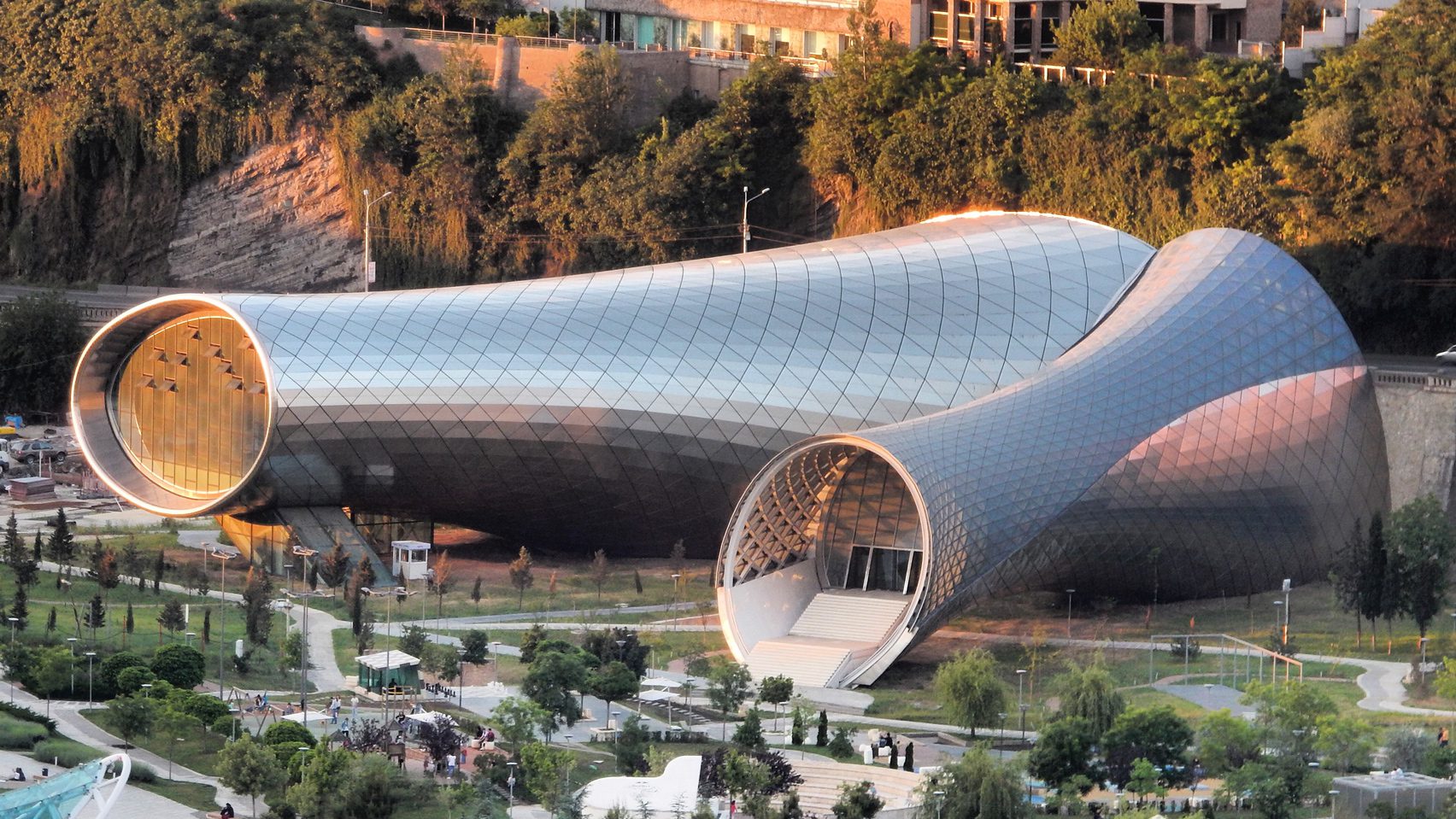
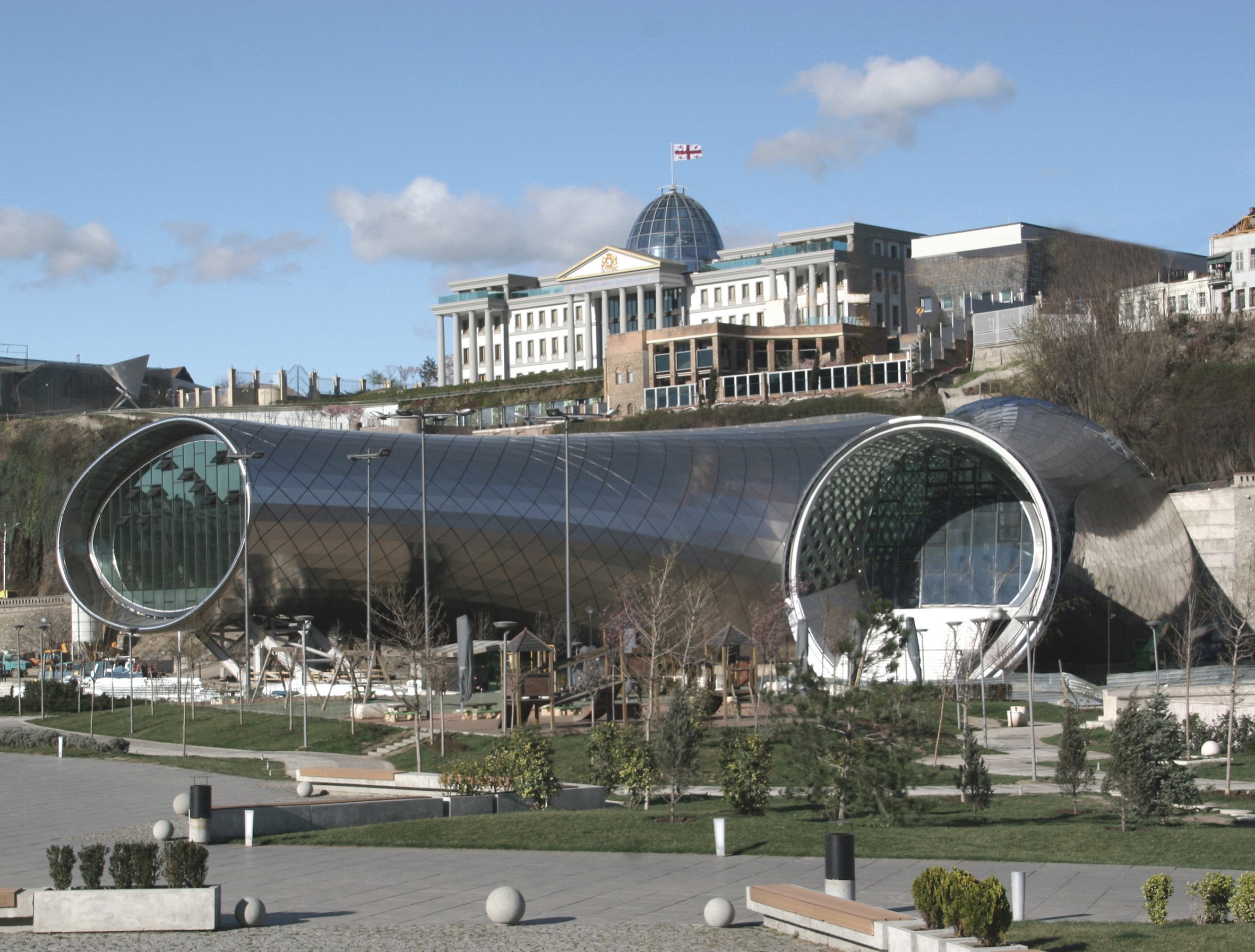
    Work has begun on the demolition of the never-opened Rike Concert Hall in Tbilisi, which was designed by Italian practice Studio Fuksas.

    Local news organisation TV Pirveli filmed the cladding being removed from the Rike Concert Hall in central Tbilisi last week.

    The work began less than two weeks after the Tbilisi city hall architecture department issued a permit allowing the building's owner to demolish the concert hall.

    Studio Fuksas-designed Rike Concert Hall in Tbilisi set to be demolished comments update
    The Rike Concert Hall in Tbilisi is being demolished

    Designed by Studio Fuksas, the building in the central Rike Park has remained empty and closed since 2012, when it was largely complete.

    The building was built as part of a rejuvenation plan for the city enacted under previous president Mikheil Saakashvili.

    Georgia's change of government in 2012 is largely seen as the reason the project was abandoned, with the concert hall connected to the previous regime.

    Studio Fuksas-designed Rike Concert Hall in Tbilisi set to be demolished dezeen debate
    Studio Fuksas-designed Rike Concert Hall in Tbilisi set to be demolished

    The extremely distinctive building consists of two tube-shaped volumes that open out onto the riverside park. Each of the tubes was covered in square stainless-steel panels that resemble scales.

    In the news report published by TV Pirveli last week, a video was captured showing these cladding panels being removed and the structure underneath exposed.

    Studio Fuksas founders

    Read:

    Planned demolition of Tbilisi concert hall "a significant cultural setback" says Studio Fuksas

    The demolition has begun less than 15 years after construction of the building's structure was largely complete, although the internal fit-out never happened.

    After a decade of closure, the building was sold to a property developer in 2022, who in turn sold it to the current owner – Makro Constructions – in 2025.

    Tbilisi Music Thether and Concert Hall by Fuksas
    The building never opened to the public

    Following news of the planned demolition last month, Studio Fuksas described the plans as "a significant cultural setback". In a statement to Dezeen, it claimed that the studio had received no response to efforts to contact the local government.

    "Over the past months, the studio repeatedly offered to work with the Georgian authorities to explore alternative solutions that could preserve and repurpose this iconic building, avoiding what we believe would be a premature and irreversible demolition," said the studio.

    "Unfortunately, these proposals have received no response."

    The photography is courtesy of Studio Fuksas.

    The post Demolition of Studio Fuksas concert hall underway in Tbilisi appeared first on Dezeen.

  • Dezeen dezeen.com architecture design dezeen 2026-08-03 09:32

    ↗

    Scottish architect Ruairidh Moir has launched a campaign to rebuild the fire-torn Mackintosh Building at the Glasgow School of Art, calling on "an independent body to own and take forward the project". The campaign calls for the building's ownership to be transferred to an...

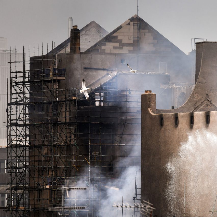
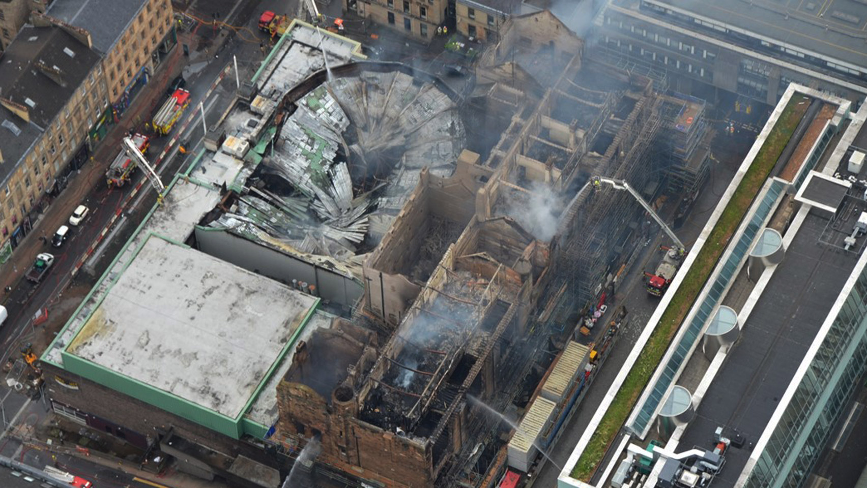
    Glasgow School of Art fire

    Scottish architect Ruairidh Moir has launched a campaign to rebuild the fire-torn Mackintosh Building at the Glasgow School of Art, calling on "an independent body to own and take forward the project".

    The campaign calls for the building's ownership to be transferred to an independent organisation to deliver a "faithful restoration and reinstatement". It also asks the Scottish and UK governments for financial assistance.

    At the time of writing, it has 5,406 signatures. The target is 100,000, at which stage the petition will be "hand-delivered" to both Scottish and UK Governments and the board of Glasgow School of Art (GSA).

    The campaign follows GSA's recent announcement that it cannot afford to rebuild the iconic Mackintosh Building, known affectionately as The Mack, without external funding.

    Moir, a conservation architect and founder of Glasgow studio BARD, said he initiated the petition to "reflect the views of many people who have cared deeply about the school for years".

    "We owe it to Charles Rennie Mackintosh"

    "There has been frustration at the GSA's stewardship of the building, both before the fires and in the years that have followed," Moir told Dezeen.

    "The recent statements by the School of Art governors have galvanised many to step forward and unite to remove the obstructions and demonstrate support for Mackintosh's masterpiece," he continued.

    The fire-torn art school is the best-known building designed by Charles Rennie Mackintosh, Scotland's most famous architect.

    A fire ripped through the building in 2014, before a second and more destructive fire occurred during a £35 million restoration project in 2018.

    The Mack fire
    The school was damaged by fires in 2014 and again in 2018. Photo courtesy of Police Scotland

    Shortly after the second blaze, the former director of the GSA Tom Inns said that it would be rebuilt. But restoration works are now on hold.

    In Moir's view, it needs to be rebuilt as "it is genuinely one of the finest achievements of architecture".

    "The Mack must be rebuilt because it is so important. Architecture of such renowned and recognised quality is not that common. This one sits amongst the very highest tier of architectural achievement and is beloved," he explained.

    "We owe it to Charles Rennie Mackintosh, Margaret Macdonald Mackintosh, Fra Newbery, and to all those who have loved the building; to our culture and heritage; and to our sense of self, to get this right for Scotland and for the world."

    GSA has "continually failed"

    While the campaign calls for the ownership of the building to be transferred, it also states the building should be made available "on a lease-back arrangement to GSA" to make sure it can remain as an art school.

    Moir added that a panel of experts would need to be created to advise a new design and project team.

    "The need for an independent body to own and take forward the project, protecting it for future generations, is borne out by the fact that the GSA board has continually failed to deliver it," explained Moir.

    "There is understandably little confidence in allowing the body that has failed Mackintosh's masterpiece in this way to have a third attempt. Time for a fresh start."

    For Moir, the thought of the school being left as a ruin "leaves [him] cold".

    While there is also always a risk of pastiche in reconstruction work, the architect believes it can be achieved to the same quality as the original.

    Read:

    Glasgow School of Art "cannot rebuild" Mackintosh Building

    "There are huge challenges in achieving it, but the will, finance, client, leadership and skills all need to be there for a successful outcome," he said. "We cannot allow incompatible or phoney materials to be used; it must be authentic to the way Mackintosh left it for us to care for."

    "Few buildings are as comprehensively recorded as the School of Art. Backing away from a full and faithful reinstatement because of loose arguments around pastiche or authenticity would, in my view, be a profound mistake. We have almost everything at our fingertips to faithfully reinstate the building."

    Since GSA's announcement, many industry figures have spoken out with views similar to Moir. Among them was British designer Thomas Heatherwick, who compared the need to rebuild to Notre-Dame Cathedral.

    "To accept a diminished future for it would show a worrying lack of cultural confidence," he wrote in an Instagram post shared by Humanise.

    "When Notre-Dame burned, Paris didn't shrug and scale down its ambition. It responded with imagination, leadership and national will. Paris came out stronger afterwards," he said.

    "Let's all urge the Scottish Government, Glasgow City Council, businesses, funders, cultural leaders and communities to work together with GSA to find a way to restore the Mackintosh Building with the care, seriousness and ambition it deserves."

    The post Scottish architect launches campaign to rebuild Mackintosh Building appeared first on Dezeen.

  • Dezeen dezeen.com architecture design dezeen 2026-08-03 09:00

    ↗

    Plans for a large new building in Rotterdam intended to encourage people to lead more environmentally friendly lifestyles are wrong-headed and should be scrapped in a blaze of publicity, writes Barnabas Calder. Putting plants on a building doesn't make it sustainable, any...

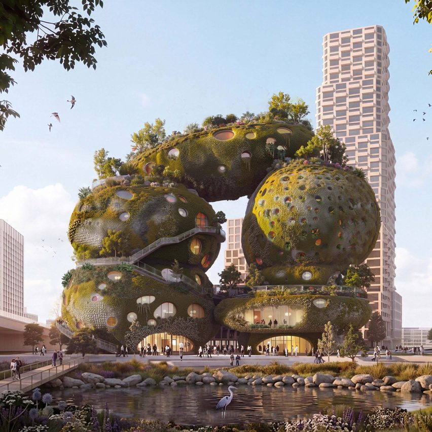
    Rotterdam Rocks! by MVRDV

    Plans for a large new building in Rotterdam intended to encourage people to lead more environmentally friendly lifestyles are wrong-headed and should be scrapped in a blaze of publicity, writes Barnabas Calder.


    Putting plants on a building doesn't make it sustainable, any more than dropping a basil leaf on a steak makes it vegan. Yet image searches for "sustainable architecture" puke out a page of gas-guzzling big new buildings with greenery on their walls or balconies.

    Dutch architecture studio MVRDV has won a competition with a new specimen of plant-washing, the Shift Embassy. Let's hope it remains unbuilt.

    The client, social enterprise Shift, declares that "a fossil-fuel-based economy built on the unsustainable myth of perpetual economic growth [is] leading us toward ecological and social catastrophe." True, and each summer the proof obtrudes itself in longer, hotter heatwaves, bigger wildfires and worsening crop failures.

    I would be happy for it to look considerably worse if it were less harmful environmentally

    The Shift Embassy, also called "Rotterdam Rocks!", is a bizarre response to the organisation's anti-growth stance: a 200-bed hotel, posh restaurant, offices, and a 5,000-square-metre exhibition space for attracting international tourists to Rotterdam, in the hope that once they are there they will think hard enough about sustainability to go home and change their lives.

    Its aesthetics are attracting the usual derision that clusters round different-looking buildings – comparisons with the Flintstones, with faeces and with genitalia. The same practice's Marble Arch Mound showed how hard it can be to make urban vegetation schemes convincing.

    Looks, though, seem a trivial concern in the face of ecological catastrophe. I would be happy for it to look considerably worse if it were less harmful environmentally.

    Rotterdam Rocks! by MVRDV

    Read:

    MVRDV wins competition for "new world wonder" in the Netherlands

    The "rock-like" surfaces of the architects' press release turn out, on some more clicking around, to be concrete. MVRDV promises "low-carbon concrete", but if that's a matter of swapping cement for industrial co-products such as GGBS the benefits for emissions may be negligible at best. As the Institution of Structural Engineers warns, the supply of GGBS is already almost at capacity, so trucking it in for this building likely means another project will miss out, and have to use normal higher-carbon cement instead.

    The engineering relies on reclaimed steel. Reusing a beam is often better than melting it down, but again, if not reclaimed for this project the same steel would be either reclaimed or recycled for another project. Around 70 per cent of all steel still comes from ore, with recycling and reclamation already using most scrap steel. Reclaimed steel is, in other words, also no magic bullet for decarbonisation.

    There are some good initiatives in the proposal. The exhibition area will be allowed a certain latitude of temperature variation across the year, as opposed to the offices, hotel and restaurant, which require "high-quality indoor environments" – code, presumably, for the uncomfortably excessive cooling of most commercial interiors in summer, and overbearing heating during winter.

    The message given by the building as a whole is wrong

    The restaurant will be plant-based. Shift also aims to grow as much greenery as it can around the building. If you really must build a new building, a wider temperature range, extensive planting and meat-free catering are good measures.

    There is a welcome honesty to the way Shift discusses the downsides of an "iconic" new building. Its argument is that by influencing visitors' future behaviour, "the societal impact is estimated to be 10,000 times greater than the environmental impact associated with the building's construction and energy use".

    This figure assumes that over 50 years, 20 per cent of 25,000,000 projected visitors will lastingly drop two tonnes per year from their personal carbon footprint as a result of the visit.

    Skip full of construction waste

    Read:

    "It's time to see all those circular economy strategies for what they are"

    But even if that figure proves robust, what about the societal impact of the architecture itself? Unfortunately, the more successfully Shift establishes itself in the minds of a wide international public as a leader in sustainability, the more harm its building can do.

    Whatever nuanced analysis Shift conducts of the qualities and problems tied to experimenting with low-carbon materials, the message given by the building as a whole is wrong. It supports the myth that sustainable architecture means new, tall concrete and steel buildings with lifts and powerful air-treatment systems, but some plants on them.

    Shift acknowledges that retrofitting an existing building would have been more sustainable, but says there was no suitable candidate in the big new Waterkant development its embassy will be part of. Instead, the organisation ran a major architecture competition for something new, dense and iconic – a brief that could only realistically be executed with profoundly unsustainable materials and methods, and that depends thereafter on millions of tourists flying round the world in environmentally destructive pursuit of distraction and novelty.

    If Shift now abandons this project in a blaze of publicity it will do immense good

    This is not the degrowth that Shift calls for, but it's not too late to fix things. If Shift now abandons this project in a blaze of publicity, explaining that the environmental cost is too high – an example of outdated and profoundly unsustainable architectural thinking – it will do immense good, and will demonstrate a profound and inspiring commitment to degrowth.

    Should that lose the organisation some funding, so be it. Maximising income, investment and capital expenditure is not a degrowth approach.

    Shift's own estimates of the good its building will do are based on pilot activities where it reports participants dropped their emissions by an average of 30 per cent. Why not spend the reported €240,000,000 that the building will cost delivering more of these remarkably effective pilot activities instead?

    Building fixed with air-conditioning units

    Read:

    Can we quit our air-con addiction?

    That would save the 15,000 tonnes of carbon-dioxide-equivalent emissions that it reports will be required to produce and power the MVRDV building over 50 years, and the 35,000,000 tonnes it assumes will be emitted as a result of people travelling there. More importantly, though, Shift could push back against architecture's devastating environmental harms by setting such a powerful, well-evidenced example of having the courage not to go ahead with an avoidable building project.

    At present, the construction industry and the running of buildings together amount to 37 per cent of global carbon emissions. The most inspirational thing that any architecture practice or client can do is to radically opt out of this harm: make brilliant use of what's already here; tweak and improve in modest, impactful ways; spread the word about the immense ecological harms done by our making and running new buildings.

    Shift has the chance to be the ambassador for a real shift – a shift to understanding that sustainable architecture means a new wooden shutter on an old window, not a big bulk of concrete, steel and HVAC peeping out guiltily from behind a leafy toupée.

    Barnabas Calder is head of the History of Architecture Research Cluster at the University of Liverpool, and author of Architecture: From Prehistory To Climate Emergency (2021) and Raw Concrete: The Beauty of Brutalism (2016).

    The image is by MVRDV.

    Dezeen In Depth

    If you enjoy reading Dezeen's interviews, opinions and features, subscribe to Dezeen In Depth. Sent on the last Friday of each month, this newsletter provides a single place to read about the design and architecture stories behind the headlines.

    The post "Plants on a building doesn't make it sustainable, any more than a basil leaf on a steak makes it vegan" appeared first on Dezeen.

  • Dezeen dezeen.com architecture design dezeen 2026-08-03 07:00

    ↗

    Exhibitions Architecture's Inscriptions, Maggie's: Architecture That Cares and Wellbeing in the City are among the architecture and design events featured in Dezeen Events Guide this August. Other events taking place during the month include Helsinki Design Week, Jia Curated...

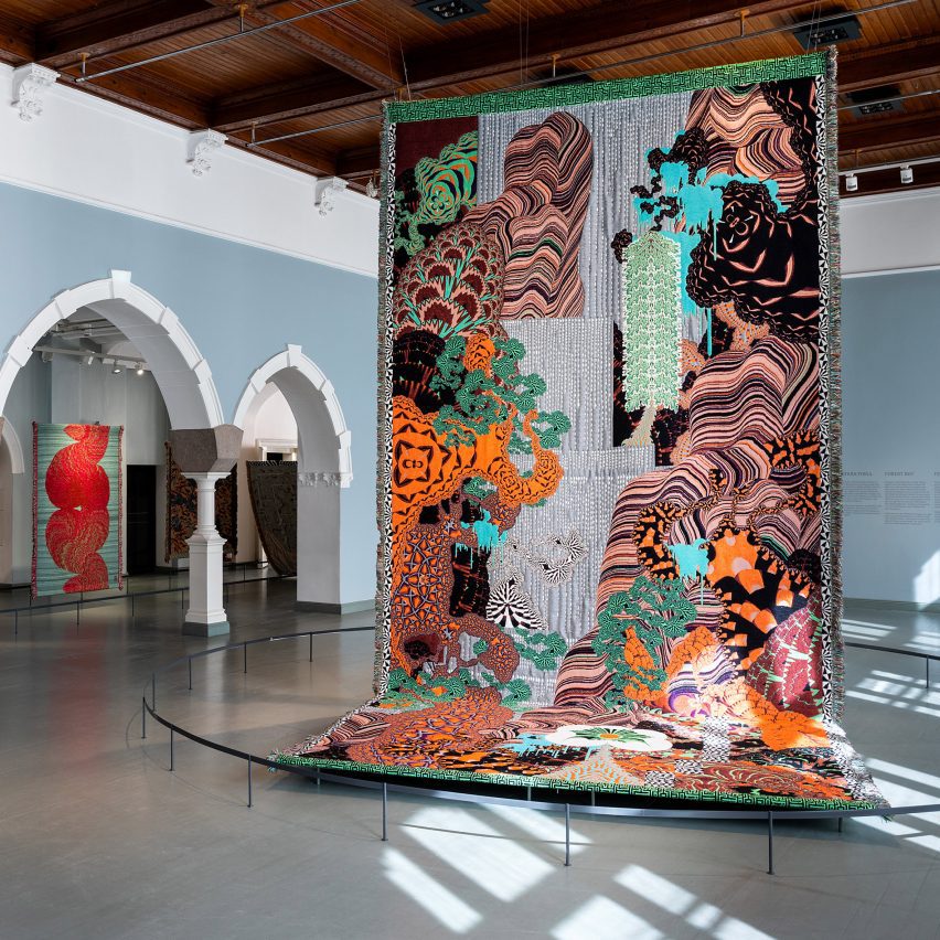
    Photo of Kustaa Saksi's In the Borderlands

    Exhibitions Architecture's Inscriptions, Maggie's: Architecture That Cares and Wellbeing in the City are among the architecture and design events featured in Dezeen Events Guide this August.

    Other events taking place during the month include Helsinki Design Week, Jia Curated and The Art-Marotte Masterclass Series.

    Maggie's: Architecture That Cares exhibiton at V&A Dundee
    Maggie's: Architecture That Cares features work by Zaha Hadid and Norman Foster. Photo is by Grant Anderson, courtesy of V&A Dundee. Above photo is by Paavo Lehtonen

    Maggie's: Architecture That Cares
    6 March to 1 November, UK

    Presented at the V&A Dundee, Maggie's: Architecture That Cares is an exhibition celebrating the architecture behind UK-based charity Maggie's.

    The exhibition features models of the cancer care centres, including work by architects Norman Foster, Frank Gehry, Zaha Hadid,  Richard Rogers and Benedetta Tagliabue.

    Wellbeing in the City
    24 April to 20 September, Spain

    The Wellbeing in the City exhibition explores how traditional architecture has impacted the biological, social and spatial experiences of people living in urban spaces.

    The display outlines eight key elements of impact, including birth, nurturing, eating, healing, sleeping, playing, courting and walking.

    The showcase is curated by architecture practice Izaskun Chinchilla and takes place at La Arquería de Nuevos Ministerios in Madrid.

    Photo of the Architecture's Inscriptions exhibition
    Architecture's Inscriptions takes place at Tank Shanghai. Photo is by Runzi Zhu

    Architecture's Inscriptions
    9 July to 7 October, China

    This exhibition demonstrates the influence ancient manuscripts, calligraphy, scholar's rocks, paintings and rubbings have on the work of contemporary Chinese architects.

    Architects Huang Wenjing, Li Hu, Liu Jiakun, Liu Yichun, Zhang Ke, Zhu Xiaofeng and Zhuang Shen and artists Ding Yi, Xu Bing and Zhan Wang are all taking part in Architecture's Inscriptions, which takes place at Tank Shanghai.

    Jia Curated
    13 to 17 August, Indonesia

    Jia Curated is an annual design, craft and culture festival taking place in Bali, welcoming over 250 brands across the fields of art, architecture, materiality, landscape design and construction.

    This year's event will follow the theme Nature Weave, addressing "interwoven relationships" between people and nature, and the impact on design and craft, such as biophilia practices.

    The Art-Marotte Masterclass Series
    17 to 21 August, Belgium

    A five-day workshop programme will take place at Château Art-Marotte in Braives, Belgium, inviting postgraduate students to experiment with ceramics and materiality.

    The masterclass series will offer students the experience to develop their skills in ceramic screen printing and sculpture, using materials such as slumped glass and plaster.

    Photo is courtesy of Maiju Suomi and Elina Koivisto

    Helsinki Design Week
    28 August to 6 September, Finland

    Helsinki Design Week celebrates its 21st anniversary in August with the theme The Oncoming Other, spotlighting community, collaboration and connection in urban space.

    The programme of exhibitions, talks and open showrooms explores a range of disciplines, including textile, product, industrial, fashion, interior and graphic design.

    About Dezeen Events Guide

    Dezeen Events Guide is our guide to the best architecture and design events taking place across the world each year. The guide is updated weekly and includes virtual events, conferences, trade fairs, major exhibitions and design weeks.

    Inclusion in the guide is free for basic listings, with events selected at Dezeen's discretion. Organisers can get standard, enhanced or featured listings for their events, including images, additional text and links, by paying a modest fee.

    In addition, events can ensure inclusion by partnering with Dezeen. For more details on inclusion in Dezeen Events Guide and media partnerships with Dezeen, email eventsguide@dezeen.com.

    The post Six architecture and design events in August from Dezeen Events Guide appeared first on Dezeen.

  • Dezeen dezeen.com architecture design dezeen 2026-08-03 05:00

    ↗

    The UK government has announced the arrival of plug-in solar panels that can be fitted onto balconies to reduce household energy costs. Expected to be sold in UK stores before the end of summer, the low-cost panels, which are already widely used across Europe, connect...

    Plug-in solar panels

    The UK government has announced the arrival of plug-in solar panels that can be fitted onto balconies to reduce household energy costs.

    Expected to be sold in UK stores before the end of summer, the low-cost panels, which are already widely used across Europe, connect directly to a mains socket and can be placed on balconies, roofs or any outdoor space without installation.

    Following an announcement by the government in March, recent changes to existing plug and electricity safety regulations in the UK will allow the use of these plug-in solar devices from 27th August.

    The new legislation means that UK households, including flat owners and renters, will be able to generate their own electricity and cut energy bills.

    New legislation "a major win" for UK households

    "Seeing these systems available in stores by summer would be a major win for households, enabling people to take advantage of the longer, brighter days and start generating their own clean electricity straight away," head of UK communications for EcoFlow Lorna Wallace-Smith said.

    "For many households – particularly those living in flats or rented homes – solar has not always been straightforward. Plug-and-play systems remove that barrier, making it far easier to get started," Wallace-Smith added.

    Swift brick

    Read:

    New homes in England to have bird-friendly swift bricks in planning reform

    The move, which was published under the Starmer Labour government, is part of a wider clean energy initiative that aims to reduce the UK's dependency on global fossil fuel markets as energy costs soar amid ongoing conflict in the Middle East.

    Solar panels to become standard for new homes

    Alongside the legislation, new rules for the Future Homes Standard are set to come into force next March, mandating low-carbon heating and on-site solar panels for the majority of new homes.

    According to the government, these new measures could reportedly save households up to £830 a year on energy bills, as well as create 75 per cent less carbon emissions than homes built to the 2013 standards.

    "The Future Homes Standard is a landmark moment for clean energy in Britain," Energy UK's chief executive Dhara Vyas said.

    "New homes built under this standard will benefit from clean heating solutions and solar, protecting households from volatile gas prices and putting energy security within the home itself," Vyas added.

    Other recent sustainability initiatives in the UK include policy changes to the National Planning Policy Framework requiring new builds to be fitted with bird-friendly swift bricks.

    Meanwhile, in the US, the American Institute of Architects has "celebrated" a recently passed bill aimed at speeding up the building and access of affordable housing in the country.

    The top image is by Ingrid Balabanova via Shutterstock.

    The post Plug-in solar panels to be available in UK by end of summer appeared first on Dezeen.

  • Dezeen dezeen.com architecture design dezeen 2026-08-02 17:00

    ↗

    Brooklyn-based Studio Vural has renovated a loft apartment inside a former herring canning factory in New York's West Village, adding tonal green accents throughout. Studio Vural overhauled the loft within a 1920s building on Barrow Street, which dates back to the era when...

    Herring Factory Loft by Studio Vural

    Brooklyn-based Studio Vural has renovated a loft apartment inside a former herring canning factory in New York's West Village, adding tonal green accents throughout.

    Studio Vural overhauled the loft within a 1920s building on Barrow Street, which dates back to the era when the West Village was an industrial port.

    Loft renovation with
    The loft renovation involved the introduction of "pods" that create extra flexible bedroom space

    "Starting with the Vita Herring Factory, our design unveils layers of architectural history and creates a new chapter by contemporising historic elements," studio founder Selim Vural told Dezeen.

    "On the exact same concrete slab of an iconic building, a new family, a new life, a new architecture come into being."

    A mezzanine reading nook accessed via flight of felt-covered stairs
    One of the pods includes a mezzanine reading nook accessed via flight of felt-covered stairs

    The building was converted into co-op residences in the late 1980s by architect Cy Winthrop, who resided in this apartment.

    "[Winthrop's] labour of love completely obscured the original structure with smoky mirrored walls, laminate everything and a small koi pond in a corner of the living room," said studio founder Selim Vural.

    Staircase with oak millwork storage underneath
    Oak millwork is used to create storage throughout the apartment

    Stripping all of these elements back, apart from a few unique details, the team was able to unveil a layered history of the building while incorporating new additions.

    "We exposed the original concrete columns and beams and managed to save the 80s parquet floors and (some) cabinetry," said Vural. "We added contemporary elements such as earthy cement tiles, acoustic felt panels and glass blocks in warm wood."

    Tonal green accents incorporated in a kitchen to contrast oak cabinetry
    Tonal green accents are incorporated in the kitchen to contrast the oak cabinetry

    The brief was to create an open space for hosting parties, with three flexible bedrooms and a private primary suite.

    Squeezing all of these elements into the 1,500-square-foot (139-square-metre) space proved challenging, so the team had to play with their proportions, scale and positions in order to fit.

    Custom built-in furniture in a living area that's designed for hosting parties
    Custom built-in furniture in the living area is designed for hosting parties

    "We think of the layout as 'pods in a box' with a home office/flex bedroom, a loft reading area and a sleeping nook nestled in a large shell," said Studio Vural.

    These pods are wrapped in oak and lit via spandrel windows and large glass blocks.

    A large green-painted wall divides a living area from a primary suite
    A large green-painted wall divides the living area from the primary suite

    Green felt was used to cover concrete ceiling beams above the lofted area, as well as the treads and risers of the stairs used to reach it.

    Opposite, the kitchen also features oak millwork, while a dining table nestled against a custom built-in seat can accommodate eight.

    Japanese-influenced living room at Warren Street Townhouse

    Read:

    Studio Vural reinterprets Japanese interiors for Warren Street Townhouse

    The living area beyond features more bespoke furniture that faces a green-painted wall and tiled fireplace.

    Behind this wall is the primary bedroom, which is neutrally decorated and includes plenty of built-in storage.

    A factory building's original columns are incorporated into an apartment interior
    The factory building's original columns are incorporated into the interiors

    The green and oak colour combination reappears in the bathrooms, where tiles in various verdant tones clad the walls inside the shower and around the vanities.

    All of these elements interplay with the original concrete and metal columns, some of which are tucked away while others are more visible.

    Green tiles, oak millwork and brass fixtures in a bathroom
    Green tiles, oak millwork and brass fixtures continue in the bathroom

    Studio Vural has previously renovated a townhouse in Brooklyn using Kyoto merchant houses as a reference point, and also imagined a Manhattan tower draped in colourful flowers and an off-the-grid Dune House for Cape Cod.

    Other West Village residences that have received an upgrade include a duplex apartment in which a "garden folly" was inserted and a home that was transformed into a show space for contemporary art and design.

    The photography is by Kate Glicksberg.


    Project credits:

    Creative director: Kerry Robertson
    Architectural design: Selim Vural, principal architect; Efecan Zeybek, design architect; Ceren Kalayci, design architect
    Construction: Don Kwok

    The post New York loft renovation by Studio Vural comprises "pods in a box" appeared first on Dezeen.

  • Dezeen dezeen.com architecture design dezeen 2026-08-02 10:00

    ↗

    French studio PCA-Stream has completed La Source Vive, a domed copper-clad concert hall in Évian, France, designed "as a musical instrument". Nestled into a sloping woodland site overlooking Lake Geneva, La Source Vive is a 490-seat chamber music hall situated next to Patrick...

    La Source Vive copper-clad concert hall

    French studio PCA-Stream has completed La Source Vive, a domed copper-clad concert hall in Évian, France, designed "as a musical instrument".

    Nestled into a sloping woodland site overlooking Lake Geneva, La Source Vive is a 490-seat chamber music hall situated next to Patrick Bouchain's existing 1993 concert hall La Grange au Lac.

    La Source Vive copper-clad concert hall by PCA-Stream
    PCA-Stream has created a copper-clad concert hall in Évian

    Designed to complement the existing venue, La Source Vive provides a dedicated space for chamber music rehearsals, performances and recordings, while the restored 1,000-seat timber hall La Grange au Lac continues to host large-scale orchestral performances.

    Together, the two halls form part of Les Mélèzes, a cultural complex encompassing music and performing arts, founded by French philanthropist Aline Foriel-Destezet.

    La Source Vive concert hall by PCA-Stream exterior
    La Source Vive is situated next to La Grange au Lac concert hall

    Achieving high-quality acoustics was the central idea guiding the design of La Source Vive, influencing decisions about the building's geometry and material palette.

    Philippe Chiambaretti and Patrick Bouchain worked alongside acoustician Albert Xu to "design the building as a musical instrument", exploring how its form, materials and finishes could influence sound quality.

    Chapel of Sound was designed to look like a rock

    Read:

    Open Architecture unveils rock-like concert hall in a valley outside Beijing

    The design process involved acoustic sketches, digital modelling, simulations and repeated on-site testing during construction.

    PCA-Stream also developed a digital twin of the project to monitor and refine the hall's acoustic behaviour at different stages.

    La Source Vive concert hall by PCA-Stream woodland site
    It is nestled into a sloped woodland clearing

    La Source Vive is set across three volumes – a glazed foyer, the domed concert hall and a separate backstage building containing dressing rooms.

    By positioning the project within an existing clearing, the architects aimed to minimise the impact on the woodland site, while enhancing biodiversity through planting more than 150 trees and 200 shrubs alongside landscape studio Coloco.

    La Source Vive concert hall by PCA-Stream glazed foyer
    A glazed foyer connects the new and existing concert halls

    Linking the old and new halls, the glazed foyer was rebuilt and expanded to include a bar, ticketing area and timber terrace. Rainwater collected beneath the terrace is reused to irrigate the surrounding landscape.

    From the foyer, visitors pass through a rock-cut passage before entering a lobby that opens onto the auditorium.

    La Source Vive concert hall by PCA-Stream copper
    Copper tiles catch and reflect light

    Housed within a domed "partially-buried shell", the concert hall is clad with pre-patinated copper tiles which catch and reflect light, and are designed to weather over time to blend into the surrounding woodland.

    Structurally, the concert hall is formed of an acoustic concrete shell wrapped with a second timber frame beneath the copper roof.

    La Source Vive concert hall by PCA-Stream
    The hall was designed to optimise acoustics

    Inside, the 490-seat auditorium combines elements of the rectangular "shoebox" concert hall with the more contemporary "vineyard" model, placing audiences on terraced seating around the performers.

    The studio opted for a pared-back material palette of concrete, raw plaster, timber and leather throughout.

    La Source Vive concert hall by PCA-Stream interior
    Plaster walls were sculpted with undulating recesses

    Curved plaster walls are sculpted with undulating grooves that project up to eight centimetres at audience level, helping to diffuse and reflect sound. Above the stage, a bespoke aluminium canopy was designed to further optimise acoustics.

    Solid rose beech timber beams were used for the stage backdrop and flooring, while custom-made dusty orange leather benches are arranged asymmetrically around the stage to create a closer relationship between audience and performers.

    La Source Vive concert hall by PCA-Stream
    Terraced seating is arranged asymmetrically around the stage

    An oculus in the ceiling draws natural light inside, fitted with a blackout screen that allows the space to be darkened when required.

    Alongside chamber-music performances, La Source Vive accommodates theatre, dance and literary readings, as well as a recording studio space. There are also spaces for workshops, exhibitions and lectures.

    La Source Vive concert hall by PCA-Stream backstage volume
    The backstage building is clad with larch and clapboard

    A separate volume upslope from the concert hall contains dressing rooms and backstage facilities. Clad in larch and clapboard, its base is made from recycled stone. Elsewhere, stone from the nearby Meillerie quarry was also used for landscaped rockwork.

    Other concert halls recently featured on Dezeen include a University of Oxford performing arts centre set around a four-storey atrium by Hopkins Architects and a trio of rectangular red-brick music buildings for MIT by SANAA.

    The photography is by Salem Mostefaoui.


    La Source Vive founder: Aline Foriel-Destezet
    Artistic director:
    Patrick Bouchain
    Acoustic consultant:
    Albert Xu
    Acoustic engineering:
    Meta
    Lead architect:
    Philippe Chiambaretta, PCA-Stream
    Architects: Sébastien Truchot, Francesco Cazzola, PCA-Stream
    Structure and facade engineering:
    Bollinger + Grohmann
    Lighting:
    Atelier de l'éclairage
    Landscape architect:
    Coloco

    The post Acoustics shape design of copper-clad concert hall in Evian appeared first on Dezeen.

  • Dezeen dezeen.com architecture design dezeen 2026-08-02 09:00

    ↗

    A flat-pack wardrobe that can be assembled with a single Allen key and a concrete bench made of clam shells feature in this roundup of furniture and lighting, spotted by Dezeen's design team over the past month. ReFrame by Becca Panter This flat-pack wardrobe by design...

    Becca Panter shelving

    A flat-pack wardrobe that can be assembled with a single Allen key and a concrete bench made of clam shells feature in this roundup of furniture and lighting, spotted by Dezeen's design team over the past month.


    ReFrame by Becca Panter

    ReFrame by Becca Panter

    This flat-pack wardrobe by design graduate Becca Panter took home no less than three different awards at this year's New Designers showcase.

    The project was born from the discovery that one furniture piece in student halls tends to break above all others: the built-in chipboard wardrobe, which is usually completely unrepairable and mostly ends up in a skip when it is inevitably damaged.

    Panter's alternative, made entirely from folded steel for easy recycling, can be assembled and disassembled with a single Allen key and proves that just because furniture is affordable and flat-packed doesn't mean it can't be demounted, repaired and recycled.


    View this post on Instagram


    A post shared by JERMAINE GALLACHER (@jermainegallacher)

    Lamps by City Girls

    City Girls is an anonymous London design duo causing a stir with its one-of-a-kind lamps made from a mishmash of found treasures.

    The professional scavengers leave no stone unturned when sourcing reclaimed materials to transform into lighting – from lace trim, coat hangers and bakelite found across eBay, Facebook Marketplace, and even on the side of the road.

    Each lamp is finished as a "city girl" in her own right, affectionately named things like Zoe, Pamela and Jean to give the pieces distinct identities.

    The lighting was recently displayed in an exhibition curated by Jermaine Gallacher at the Ragged School in London Bridge, which concluded in July.


    Screwssssss stool by Matteo Voisin
    Photo by Atsuya Morioka

    Screwssssss stool by Matteo Voisin

    For fans of Mikael Axelsson's wood-clamp IKEA stool (guilty as charged), French designer Matteo Voisin has delivered a whole furniture collection that builds on the idea of designing objects to playfully communicate their function.

    His most distilled and successful take on the theme is the Screwssssss stool – three identical oak boards held together by colourful, oversized hex nuts to signal that the piece can be easily dismantled, repaired and understood by its owner.


    Barefoot table
    Photo by Enric Badrinas

    Barefoot Table by Kilzi

    Barcelona brand Kilzi sought to capture a sense of "motion held in balance" with Barefoot Table, which was designed with playfully slanted legs to look as if they are moving.

    Crafted from solid dyed chestnut, the dining table was created as "an ode to the quiet movement that exists even in moments of stillness", according to studio founder Jorge Suárez-Kilzi.


    Heimtlos Chair

    Heimatlos Chair

    A trio of interlocking components makes up this dining chair by the emerging Berlin- and Frankfurt-based Em Ef Studio.

    The studio painstakingly 3D-printed grooved layers of biodegradable polylactic acid (PLA) to create the seating, which was designed with an ornate back to recall traditional handcrafted furniture despite the contemporary process.

    The result is a smart meeting of past and present design languages.


    Minjae Kim lighting

    Othko Lamp by Minjae Kim

    New York designer Minjae Kim wrapped two sheets of beautifully translucent fibreglass around a central bulb to create this pendant lighting.

    A subtle layer of paint was applied to the inner sheet, creating a ghostly outline on the facade of the lamp. When illuminated, you could be forgiven for thinking that a couple of ice-cold negronis were trapped inside the lamp itself – an illusion that makes for a particularly pleasing design.


    View this post on Instagram


    A post shared by Emily Savill (@limeydesign)

    Lopsy Lily stool by Emily Savill

    So far, the design of posture-improving seats has left much to be desired, usually resembling a kind of cross between sex furniture and medieval torture devices.

    Kingston University graduate Emily Savill has delivered a rather more elegant take on the theme with her Lopsy Lily stool. Perched on a circular base and an angled "hoof" cast from recycled aluminium, it subconsciously forces the user to engage their core, improve their posture and maintain lower-body movement to reduce pain and stiffness.


    Clam Crete bench by Sami Kimberley
    Photo by Brendan Stewart-Jacks

    Clam Crete bench by Sami Kimberley

    Regenerative designer Sami Kimberley has given invasive Golden Clam shells that she collected from the Thames a second life – crushing them up to make more sustainable concrete and forming them into multi-purpose building blocks.

    These blocks can be adapted to fulfil a menagerie of different functions, as a planter, a bench or an entire shelving system, using only readily available materials.

    By inviting interaction, the project hopes to demonstrate how materials can help us rebuild a closer relationship to the places we call home and the ecosystems that sustain us.

    The post Dezeen's favourite furniture and lighting from July appeared first on Dezeen.

  • Dezeen dezeen.com architecture design dezeen 2026-08-02 05:00

    ↗

    British designer Beth Morgan Lundie has developed a refillable skincare dispenser that lets users combine different ingredients to create a bespoke formula at home and "bypass the need for toxic additives". The Meld system was Morgan Lundie's graduation project from London...

    Meld cosmetics

    British designer Beth Morgan Lundie has developed a refillable skincare dispenser that lets users combine different ingredients to create a bespoke formula at home and "bypass the need for toxic additives".

    The Meld system was Morgan Lundie's graduation project from London design school Central Saint Martins and earned her the PriestmanGoode Rising Star Award at this year's New Designers showcase.

    Refillable skincare dispenser exploded view
    Beth Morgan Lundie has developed a refillable skincare dispenser for personal formulas

    It consists of a digital platform that enables users to create their own skincare formulas, together with a physical dispenser that combines the ingredients at the point of use.

    The system aims to facilitate the co-development of products and improve ingredient transparency, as well as eliminate the need for additives that are commonly used in the skincare industry to increase shelf life.

    Digital platform
    A digital platform assists users

    Studies suggest that more than 60 per cent of cosmetics currently contain preservatives such as parabens, which have been shown to interfere with the body's natural hormones.

    As awareness of this issue grows, many consumers are seeking natural alternatives and greater clarity about the ingredients they are putting on their bodies.

    Biodegradable cartridges
    Formulas are delivered in biodegradable cartridges

    "I was fascinated by the disconnect between rituals of personal care and the harsh reality that they could be slowly deteriorating our physical health," the designer told Dezeen.

    "I wanted to develop a solution that tackled skincare consumption end-to-end," she added. "Not only was it necessary to rethink the packaging materiality, but to completely bypass the need for toxic additives."

    Meld interface
    Meld invites users to create their own skincare profile

    Her Meld concept invites users to create a profile and recommends personalised products based on a series of questions about their current routines, concerns and skin type.

    Its digital interface outlines the properties of each formula, along with the natural ingredients it contains and the outcomes users can expect.

    Meld dispenser
    The biodegradable cartridges are loaded into a dispenser

    The platform includes an option to update the formula to improve its texture, scent, hydration, weight or intensity in response to changes in the user's skin over time.

    "By championing ingredient literacy and continuous adaptation to personal needs, the service enables people to better connect with their products and skin health," Morgan Lundie explained.

    Consent Soap by Binus University students from D&AD New Blood Awards 2025

    Read:

    Consent Soap provides sex education for people with learning disabilities

    Formulas are ordered as a collection of individual ingredients delivered in biodegradable cartridges that can be composted after use.

    The cartridges are loaded into a dispenser that was designed for prolonged reuse, made from stainless steel, aluminium, earthenware ceramic and rubber.

    It pumps ingredients out in carefully dosed quantities onto a removable mixing lid, which allows users to combine them manually before applying the finished formula.

    The device features simple, intuitive shapes and robust materials, including ceramic, stainless steel and natural rubber, to ensure it will last a long time.

    Meld
    Morgan Lundie hopes to play a part in transforming the cosmetics industry

    "Meld reframes skincare as a participatory ritual built for longevity of use," Morgan Lundie explained

    "Creating a feeling of soft tactility was important to the overall experience of the dispenser," she added. "The lid is curved to swipe the contents out with your finger, and the ceramic casing is chamfered for subtle grip."

    "Because longevity was also integral to the design language, the resulting form is intentionally simple for efficient cleaning. so that each component can be sterilised in the dishwasher for safe continued use."

    Morgan Lundie said she hopes Meld can act as a blueprint for positive changes in the cosmetics industry by promoting a more transparent approach while fostering a sense of personal connection and ritual engagement to the skincare experience.

    Other innovations featured at New Designers this year included Safaa Fojdar's portable device for removing creases from clothing on the go.

    Another Central Saint Martins graduate, Audrey Levy, recently designed a fuzzy fridge grown from bacteria.

    The images are courtesy of Beth Morgan Lundie.

    The post Meld skincare dispenser allows users to mix their own preservative-free formulas appeared first on Dezeen.

  • Dezeen dezeen.com architecture design dezeen 2026-08-01 17:00

    ↗

    Japanese minimalism has informed the interiors of this light-filled Italian restaurant in Montreal, designed by locally based Ivy Studio with its first in-house designed chairs. Located on the ground level of a Downtown high-rise residential tower, Minnibar utilises the...

    Minnibar by Ivy Studio

    Japanese minimalism has informed the interiors of this light-filled Italian restaurant in Montreal, designed by locally based Ivy Studio with its first in-house designed chairs.

    Located on the ground level of a Downtown high-rise residential tower, Minnibar utilises the 20-foot (6-metre) ceilings, corner aspect and almost square floor plan to its advantage.

    A pale stone-clad cafe counter drops in height to become an omakase-style ledge
    At the entrance to Minnibar, a pale stone-clad cafe counter drops in height to become an omakase-style ledge

    Ivy Studio left the building's structure entirely visible, and only added elements where functionally necessary – using the principles of Japanese minimalism as a guide.

    "Minnibar embraces its raw shell," said the studio. "Exposed base-building elements – including the naturally sealed concrete floor, formidable concrete columns, walls, and the ceiling slab – are left untouched."

    A slender black ledge along large windows provides space for dining
    A slender black ledge along the windows provides space for dining

    The kitchen, bar and pizza counter are housed within an enclosed central core, allowing the cafe and restaurant spaces to flow openly around the perimeter.

    Morning patrons have easy access from the entrance to the cafe counter, which is clad in monolithic, cream-colored stone with a leather finish.

    Restaurant interior with triangular shapes in the wall-mounted lighting and millwork details
    Triangular shapes can be spotted in the wall-mounted lighting and millwork details

    As it continues into the space, the counter drops in height and is replaced with an omakase-style ledge crafted from white oak.

    Opposite, a black shelf runs along the windows to provide additional bar dining space, accompanied by circular white stools.

    A main dining area arranged symmetrically around glowing wall-mounted artwork
    The main dining area is arranged symmetrically around glowing wall-mounted artwork

    "The design employs a strict monochromatic palette, playing with off-white and grey shades punctuated by sharp black integrations," said Ivy Studio.

    "To give the minimalist aesthetic a profound sense of depth, the design introduces subtle, highly tactile finishes: hand-plastered walls, heavily textured stones, opaque stained wood grains, and translucent textiles."

    A custom stainless steel DJ booth sits at the apex of sight lines in two directions
    A custom stainless steel DJ booth sits at the apex of sight lines in two directions

    The main dining space features freestanding black tables for flexibility, which are typically arranged in a symmetrical layout around an adjustable glowing artwork on the back wall.

    Several custom furnishings, which represent "a study in contrast and craftsmanship," are installed throughout the restaurant.

    Restaurant with a largely monochromatic palette, evoking a Japanese minimalist aesthetic
    A largely monochromatic palette evokes a Japanese minimalist aesthetic

    These include Ivy Studio's first in-house designed chair, which features softly curved legs and a delicate backrest – all crafted from ash wood and stained soft yellow.

    The sculptural, stainless steel DJ booth was created in collaboration with local shop Procedures Industries and is equipped with built-in vinyl players.

    Limousine by Ivy Studio

    Read:

    Ivy Studio designs "bold and glamorous" Montreal restaurant

    Triangular details recur throughout, including in the stainless steel bar counter footrest, windows into the wine cellar, wall-mounted light fixtures and millwork.

    Rice-paper screens help to shade the interiors from bright sunlight and also form acoustic buffers across the ceiling.

    Omakase-style bar and accompanying chairs crafted from white oak
    The omakase-style bar and accompanying chairs are crafted from white oak

    "Minnibar successfully harmonises the gritty, raw shell of downtown Montreal's urban architecture with the refined, atmospheric principles of Japanese minimalism," said the studio.

    "By contrasting heavy, exposed concrete with custom monolithic furniture, dynamic lighting, and an uncompromising dedication to sound and culinary craft, the space transcends the traditional restaurant model to offer a truly immersive, day-to-night destination."

    Yellow wooden chair with a black table
    The restaurant features Ivy Studio's first chair designed in-house

    Ivy Studio has completed multiple restaurants across Montreal, including the "bold and glamorous" Limousine, the marble-filled Hayat, and Piatti, which was resurrected after a fire.

    The firm's portfolio also includes an indoor golf club, an ad agency in a converted bank and a creative hub with a "work in progress" aesthetic.

    The photography is by Alex Lesage.


    Project credits:

    Design and architecture: Ivy Studio
    Project team: Gabrielle Rousseau, David Kirouac, Guillaume B Riel, Philip Staszewski, Vincent Maillé, Sandra Zimmerman
    Construction: Groupe Général Construction

    The post Montreal restaurant Minnibar by Ivy Studio "embraces its raw shell" appeared first on Dezeen.

  • Dezeen dezeen.com architecture design dezeen 2026-08-01 10:00

    ↗

    Spanish studio NUA Arquitectures has completed Casa Juià, a farmhouse in Catalonia that draws on the craftsmanship of the surrounding region. Located in the village of Juià, at the foot of the Gavarres mountain range in Spain, the 283-square-metre home comprises three...

    Casa Juià by NUA arquitectures in Catalonia, Spain

    Spanish studio NUA Arquitectures has completed Casa Juià, a farmhouse in Catalonia that draws on the craftsmanship of the surrounding region.

    Located in the village of Juià, at the foot of the Gavarres mountain range in Spain, the 283-square-metre home comprises three parallel wings wrapped in porches and galleries.

    Casa Juià reinterprets the region's traditional farmhouse typology, known as masia, and also takes cues from neighbouring structures, local roof forms and the site's original terrain.

    Casa Juià by NUA arquitectures in Girona, Catalonia
    NUA arquitectures has completed Casa Juià

    "The project is conceived as a contemporary interpretation of the traditional Catalan farmhouse," NUA arquitectures co-founder Arnau Tiñena told Dezeen.

    Casa Juià was built for a family of five who returned to rural life after several years in a city.

    The house stands opposite a traditional rural farmhouse on Mas Nadal, a road on the edge of Juià, at the transition between the village and a forest of cork, pine and oak.

    Casa Juià by NUA arquitectures, a farmhouse in Catalonia
    Casa Juià is located in Catalonia, Spain

    "Its central idea is to inhabit the transition between the village and the forest, creating an architecture that is deeply rooted in its context while expressing a clear contemporary identity," said studio partner Ferran Tiñena.

    "The house mirrors an existing farmhouse and reinterprets it in typology, moving away from romanticism and literal imitation," added Arnau.

    Casa Juià by NUA arquitectures uses timber, cement and lime mortar
    The house reinterprets the traditional Catalan masia

    The farmhouse's layout, materials and handcrafted construction methods were chosen to celebrate local knowledge, while also tending towards more contemporary design.

    It is arranged as three parallel, two-storey wings that give the building a clear order within the rougher surrounding terrain.

    Casa Juià by NUA arquitectures is a contemporary farmhouse in Catalonia
    Local materials were used throughout

    "The linear structure allows the dwelling to unfold as a sequence of interconnected spaces that extend toward the landscape," said Ferran.

    A staircase leads from the garden up to a double-height entrance, which opens onto the ground-floor living areas, with bedrooms above.

    The Threshold House by Madras Spaces

    Read:

    Madras Spaces creates rural Indian home using "only what was necessary"

    On the ground floor, the interiors extend onto a covered porch, while upstairs they lead onto a gallery – opening the house to scenic views. The staggered arrangement of these porches and galleries is intended to evoke the layout and passive climate control found in the local farmhouses.

    The east-west axis of the site is left open to maximise sunlight, cross-ventilation and views over the fields, while the enclosed north-south axis borders the forest and adjacent properties, and features solid, thermally efficient walls.

    Casa Juià by NUA arquitectures built for a family of five
    The interiors extend onto a series of porches and galleries

    "The design is entirely shaped by the specific conditions of the site, reinforcing the idea of the house as a passage through the land," said Arnau.

    "Equally significant is the careful framing of views, which establishes a constant dialogue with the surrounding landscape."

    Casa Juià by NUA arquitectures with porches and galleries
    Downstairs features the living areas, and upstairs the bedrooms

    Casa Juià's material palette was chosen for its texture and durability. Timber, ceramic and lime mortar are used throughout the project, each locally sourced and central to the local construction industry.

    "All three of the primary materials used in Casa Juià are natural, locally sourced materials with a low environmental footprint, deeply rooted in the region's construction culture," said Arnau.

    Casa Juià by NUA arquitectures near Gavarres mountain range
    The staggered porches and galleries open the house to its surroundings

    Timber is used for the house's floor beams, joinery and custom-designed furniture, while ceramic forms the roof covering and protective waterproof cladding on the facades, as well as the flooring and wall finishes inside.

    Lime mortar glazes the exterior facade and many of the interior walls.

    "Materiality plays a fundamental role in the identity of the project," said Arnau. "It celebrates the honesty of construction rather than concealing it."

    Casa Juià by NUA arquitectures in Juià village, Catalonia
    The house stands opposite a traditional rural farmhouse

    Local craftsmanship shaped the handmade finishes and custom-built elements throughout, which were designed to preserve the imperfections and character of the structure rather than smooth them away.

    "Materials are not only a construction system but also an expression of local culture, craftsmanship and time," Ferran continued. "By prioritising local materials, collaborating with regional craftspeople and supporting traditional building techniques, the project reinforces local knowledge and contributes to the circular economy."

    Casa Juià by NUA arquitectures in Juià, girona, spain
    It is described by the studio as "a passage through the land"

    Other farmhouses recently featured on Dezeen include a Highlands house with blackened-larch extension by Loader Monteith, a 1970s timber-and-brick farmhouse by Bastiaan Jongerius Architecten and a 19th-century Somerset by Forgeworks.

    The photography is by José Hevia.

    The post Catalan farmhouse designed as "a passage through the land" appeared first on Dezeen.

  • Dezeen dezeen.com architecture design dezeen 2026-08-01 09:00

    ↗

    A large multi-generational home in India and a low-lying stone farmhouse in rural Scotland are among the mix of residences in this eclectic edition of Dezeen's houses of the month. Also on the list of the five most popular houses featured on Dezeen in July are a gridded...

    Double Courtyard House in New Zealand

    A large multi-generational home in India and a low-lying stone farmhouse in rural Scotland are among the mix of residences in this eclectic edition of Dezeen's houses of the month.

    Also on the list of the five most popular houses featured on Dezeen in July are a gridded forest dwelling in the Netherlands, a rammed-earth courtyard house in New Zealand and a stepped home on the Mexican coast.

    Read on to find out more about Dezeen readers' favourite houses this month:


    Exterior of Dulnain showing the restored granite cottage beside a blackened-larch extension
    Photo by Dapple Photography

    Dulnain, Scotland, by Loader Monteith

    The most popular house on Dezeen this month was Dulnain, a three-bedroom family home in the Scottish Highlands.

    Designed by Loader Monteith, the project involved rebuilding a derelict farmhouse and adding a blackened-larch extension that divides the home into two wings. Approximately 90 per cent of the building's original granite blocks were repurposed for the build.

    Find out more about Dulnain ›


    Forest Villa MB, the Netherlands, by Tom Kneepkens
    Photo by Peter Baas

    Forest Villa MB, the Netherlands, by Tom Kneepkens

    A gridded timber roof overhangs Forest Villa MB, which architect Tom Kneepkens designed to feel connected to its woodland site in the Netherlands.

    The roof incorporates openings through which trees can grow, while large expanses of glazing allow plenty of views out to nature.

    "Rather than imposing itself on the landscape, the architecture adapts to the natural environment, allowing the built structure and the existing vegetation to coexist," said Kneepkens.

    Find out more about Forest Villa MB ›


    Double Courtyard House, New Zealand, by Roberts Gray Architects
    Photo by Samuel Hartnett

    Double Courtyard House, New Zealand, by Roberts Gray Architects

    Rammed earth was used to form the low-slung Double Courtyard House, designed Roberts Gray Architects on a sand dune near Auckland.

    Within its heavy walls are two contrasting courtyards – one shaded and one exposed to sun – around which the living spaces are organised, giving the home its name.

    Find out more about Double Courtyard House ›


    Casa Diez Pies, Mexico, by Studio Font
    Photo by Alberstudio

    Casa Diez Pies, Mexico, by Studio Font

    Casa Diez Pies was conceived as a series of stepped terraces, supported by 10 chunky concrete columns, which descend a coastal cliff in Mazunte.

    The 10 supports, which give the home its name Casa Diez Pies or Ten-Foot House, were designed to minimise the impact on the site while creating spaces for staircases, bathrooms and storage spaces.

    Find out more about Casa Diez Pies ›


    Splitscape Residence, India, by SpaceDNA
    Photo by Studio f/8

    Splitscape Residence, India, by SpaceDNA

    This multi-generational house in India is organised across split-level floors and an orange staircase, encased by facades of perforated steel screens.

    The jaali-like screens filter light into the home, including a triple-height living space at its heart, while allowing natural ventilation and creating a sense of openness.

    "The interior design was intentionally kept minimal so that spatial experience, light and materiality could take centre stage," the studio told Dezeen.

    Find out more about Splitscape Residence ›

    The post Dezeen's top five houses of July 2026 appeared first on Dezeen.

  • Dezeen dezeen.com architecture design dezeen 2026-08-01 05:00

    ↗

    This week on Dezeen, we unveiled a pair of slides that heat up and vibrate feet to help athlete's recover. Created by sportswear company Nike and health technology company Hyperice, the slides contain a device in their straps that can heat and massage the top of feet....

    Nike heated slide

    This week on Dezeen, we unveiled a pair of slides that heat up and vibrate feet to help athlete's recover.

    Created by sportswear company Nike and health technology company Hyperice, the slides contain a device in their straps that can heat and massage the top of feet.

    Birmingham City Football Club, UK, by Heatherwick Studio and Manica Architecture
    This week we concluded our Future Stadium series

    Continuing our Future Stadium series we investigated why stadiums are becoming more outlandish and impactful.

    To conclude the series, we rounded up the world's record-breaking stadiums including, the biggest and the most expensive.

    Frank Gehry's Guggenheim Abu Dhabi set to open in December dezeen agenda
    The Guggenheim Abu Dhabi museum is set to open in December

    In architecture news, we revealed that the long-awaited Guggenheim Abu Dhabi museum, designed by the late Frank Gehry, is finally set to open in December.

    The museum will become the latest attraction on Saadiyat Island, alongside Foster + Partners' Zayed National Museum, Mecanoo's National History Museum and Jean Nouvel's Louvre Abu Dhabi.

    Glasgow School of Art
    Rory Olcayto suggested the Glasgow School of Art gives up the Mackintosh Building

    Following the news that the Glasgow School of Art cannot afford to renovate the Mackintosh Building after two major fires, Rory Olcayto suggested the institution give up the building in an opinion on Dezeen.

    "We should rebuild the Mackintosh Building without the Glasgow School of Art – it has clearly exhausted its mandate as steward," he said.

    UNESCO World Heritage List
    Buildings by Aino, Elissa and Alvar Aalto were added to the UNESCO World Heritage List

    While the future of Charles Rennie Mackintosh's best-known work remains very uncertain, numerous other significant building were protected this week as UNESCO added several additions to its World Heritage List.

    In total, 13 modernist buildings in Finland designed by architects Aino, Elissa and Alvar Aalto were added to the list along with a collection of 10 Soviet modernist buildings in Tashkent, Uzbekistan.

    Gordie Howe international bridge
    The Gordie Howe bridge opened this week

    In North America, a bridge connecting the United States and Canada opened to the public this week.

    Named after Canadian-born Detroit Red Wings hockey player Gordie Howe, the design of the curved bridge was informed by a hockey slapshot.

    Tobe Zoo Toilet by YanoAoyama
    A Japanese toilet was one of this week's most popular projects

    Popular projects this week included a public toilet in Japan topped with a sweeping timber canopy, a charred wood house in Vermont and a relaunched 1986 Dieter Rams door handle.

    Listen to our journalists talk about the key design and architecture stories of the past seven days on our Dezeen Weekly podcast, which this week focused on the new, world's tallest timber building.

    This week on Dezeen

    This week on Dezeen is our regular roundup of the week's top news stories. Subscribe to our newsletters to be sure you don't miss anything.

    The post This week we revealed heated Nike slides appeared first on Dezeen.

  • Dezeen dezeen.com architecture design dezeen 2026-07-31 17:00

    ↗

    New York City studio Martin Hopp Architect has completed a building with a mass-timber structure for a school in Hempstead, New York, prioritising healthy living spaces and materials on a tight budget. Evergreen Charter School opened in 2025 on a suburban site on Long Island...

    Martin Hopp timber school in Hempstead, New York

    New York City studio Martin Hopp Architect has completed a building with a mass-timber structure for a school in Hempstead, New York, prioritising healthy living spaces and materials on a tight budget.

    Evergreen Charter School opened in 2025 on a suburban site on Long Island in New York state. The K-12 school comprises 89,000 square feet (8,270 square metres) of conditioned space and 106,000 square feet (9,850 square metres) of non-conditioned space and prioritises healthy, resilient learning environments.

    Martin Hopp timber school in Hempstead, New York
    Martin Hopp Architects has completed a mass-timber school in New York state

    "From the outset, we focused on creating high-performance spaces filled with daylight, fresh air and natural materials – environments that would actively support students' wellbeing and concentration," said studio founder Martin Hopp.

    "With a very limited budget, we made a deliberate decision to pursue a 'most from least' approach."

    Martin Hopp timber school in Hempstead, New York
    The structure was split into two volumes to bring light into the centre of the plan

    The studio invested in performance with a mass timber structure, efficient systems, durable materials and flexible classrooms that can change over time to meet the school's needs.

    "The ambition was not spectacle, but generosity – to demonstrate that even under tight constraints, a school building can be uplifting, responsible and deeply supportive of learning," Hopp said.

    Martin Hopp timber school in Hempstead, New York
    The mass-timber structure is hinted at by the wooden sunscreens and louvres

    The limited footprint prompted the team to divide the building into two volumes with a slot carved through the massing that allows daylight to reach deep into the plan.

    The circulation spine aligns with the junction of the two volumes, allowing cross views across the five floors.

    Martin Hopp timber school in Hempstead, New York
    It includes classrooms and student spaces, with many exposed timber elements

    "In this way, the layout balances efficiency with environmental performance," the studio said.

    "The compact footprint maximizes usable space on the site, while the split massing strategy prioritizes daylight, ventilation and a strong sense of spatial organization for students and staff."

    Martin Hopp timber school in Hempstead, New York
    Acoustics and thermal comfort for the students was enhanced by the interior materials

    The whole school was designed around a classroom model that prioritised natural light, acoustics, thermal comfort and indoor air quality.

    In addition to the structure that reduces the building's embodied carbon, mass timber is used throughout the entire building as the finish material, adding warmth, texture, and visual calm to the environment.

    Martin Hopp timber school in Hempstead, New York
    The architecture studio prioritised "generosity over spectacle" for the design

    On the exterior, timber shading devices run in long fins up the primary facade, providing a warm, natural contrast to the grey cementitious panels. Above the upper enclosed floor, a timber pergola topped with solar arrays shades the rooftop soccer pitch.

    Inside, the ceilings of the classrooms, gymnasium and cafeteria are partially exposed mass timber, while acoustic ceiling panels help maintain noise levels.

    Ocean innovation hub

    Read:

    AMMA completes mass-timber modular school "that breathes" in Barbados

    The project is tracking toward LEED Platinum certification with a range of passive and active sustainability strategies.

    "Together, these passive and active systems reinforce the project's core ambition," the studio said. "To create a high-performance learning environment that reduces operational costs while supporting student health and environmental awareness."

    Martin Hopp timber school in Hempstead, New York
    A covered outdoor space sits on the roof

    Mass timber architecture has spread to education architecture over the last several years with projects like the University of Arkansas' architecture and design school by Grafton Architects, a treehouse-like social hub at Harvard University by Studio Gang and a lantern-like research centre for the University of Toronto by Montgomery Sisam Architects.

    The photography is by Frank Oudeman.


    Project credits:

    Architect: Martin Hopp Architect
    Structural, MEP, sustainability: WSP USA Buildings Inc.
    Exterior enclosure: Entuitive
    Acoustics: Cerami
    Lighting: Lighting Beyond
    Food service: Corsi
    Civil engineering and geotechnical services: Langan
    Landscape design: Martin Hopp Architect
    Plant selection: Hortus Inc.
    Specifications: Geoffrey Turner and Misty Gonzalez
    Irrigation: Hines Inc.
    Construction management: Consigli Construction

    The post Martin Hopp Architect puts generosity over spectacle at mass-timber school in New York appeared first on Dezeen.

  • Dezeen dezeen.com architecture design dezeen 2026-07-31 14:03

    ↗

    A horizontal glass skybridge connects residential and office skyscrapers at this project by Königsberger Vannucchi Arquitetos Associados in São Paulo to preserve the "individual reading of each tower while simultaneously reinforcing their unity". Located in São Paulo as part...

    A horizontal glass skybridge connects residential and office skyscrapers at this project by Königsberger Vannucchi Arquitetos Associados in São Paulo to preserve the "individual reading of each tower while simultaneously reinforcing their unity".

    Located in São Paulo as part of the larger Eixo Platina mixed-use development by developer Porte Engenharia e Urbanism, the Almagah 227 skyscrapers were designed to respond to demand for commercial and corporate spaces in the city's East Zone.

    Sao Paulo Brazil
    Königsberger Vannucchi Arquitetos Associados has completed Almagah 227 in São Paulo

    Almagah 227 consists of one 25-floor residential tower and one 27-floor office tower. They are linked by the skybridge on the 13th through 14th floor, which contrasts the towers' warm, porcelain facade with dark glazing.

    "By articulating the two buildings, the bridge preserves the individual reading of each tower while simultaneously reinforcing their unity as a single ensemble," said Königsberger Vannucchi Arquitetos Associados."It expands the functional integration of the development and consolidates the identity of the complex."

    Almagah 227
    A skybridge connects the skyscrapers at the 13th and 14th floors

    The buildings also stand on a broad, glass base that is clad in the same dark glazing as the bridge above. At the bottom of the residential skyscraper, the platform runs into a large pool deck and recreation area.

    Along the entirety of the ground floor, the base contains commercial spaces, while the 2nd and 3rd floors contain open-plan coworking areas.

    Sao Paulo Brazil
    The base contains coworking and commercial spaces

    The bridge itself contains corporate programming, along with a restaurant, while the residential tower includes "compact" and studio apartments.

    The studio said the facade was constructed using a ventilated facade system, which contains a small gap between its porcelain cladding and the masonry structure.

    Sao Paolo Pinheiros Station interior revamp

    Read:

    Nitsche Arquitetos integrates timber kiosks into São Paulo metro station renovations

    Constant air circulating through this space removes "approximately 20 per cent" of absorbed heat, according to the team, while the system also allowed expedited construction time, reduced waste generation and "less maintenance".

    As part of the broader Eixo Platina masterplan, the area is intended to provide mixed-use programming in São Paulo's dense East Zone. It contains several skyscrapers along a broad strip in the city, some of which have already been completed.

    Almagah 227
    The project is part of a larger mixed-use masterplan that spreads throughout the area

    "Almagah 227 reflects the core principles of Eixo Platina by incorporating programmatic diversity, strong integration with its surroundings and architectural solutions that enhance the city."

    "The complex stems from the same principle that structures the entire masterplan: bringing housing, work and leisure into closer proximity, reducing daily commutes and qualifying the urban environment through diverse and connected infrastructure," said the studio.

    Elsewhere in the city, Königsberger Vannucchi Arquitetos Associados completed a skyscraper with porcelain and wood cladding, while FGMF Arquitetos completed a pixelated skyscraper in the Pinheiros district.

    The photography is by Pedro Vannucchi


    Project credits:

    Architecture: Königsberger Vannucchi Arquitetos Associados
    Development and construction: Porte Engenharia e Urbanismo
    Structural engineering: Edatec Engenharia
    Building systems engineering: Projetar Engenharia
    HVAC design: Teknika Projetos e Consultoria
    Interior design: Suíte Arquitetos
    Landscape design: Tagü
    Façade consultancy: P&S Consultores
    Certification consultancy: CTE
    Fire Safety consultancy: Engepoint
    Elevator consultancy: MB Engenharia
    Foundations: Consultrix Engenheiros Associados
    Waterproofing: Imper Solutions
    Lighting design: Esther Stiller
    Operations: Geiah
    Wind tunnel testing: IPT – Instituto de Pesquisas Tecnológicas
    Envelope design: Addor & Associados
    Coordination and BIM compatibility: Sena Arquitetura
    Façade system: Venfaq and Portobello

    The post São Paulo skyscrapers by Königsberger Vannucchi linked by glass skybridge appeared first on Dezeen.

  • Dezeen dezeen.com architecture design dezeen 2026-07-31 10:30

    ↗

    British studio Charles Gillespie Architecture has completed The Linhay, a family house in rural Somerset wrapped by a deep concrete colonnade that provides sheltered nesting spaces for birds. Designed by the studio's founder Charles Gillespie for himself and his young family,...

    Oblique view along the length of the house showing the row of cylindrical concrete columns and landscaped garden

    British studio Charles Gillespie Architecture has completed The Linhay, a family house in rural Somerset wrapped by a deep concrete colonnade that provides sheltered nesting spaces for birds.

    Designed by the studio's founder Charles Gillespie for himself and his young family, the house draws on the traditional linhay – an agricultural barn found across Somerset and Devon with a distinctive open-fronted form.

    Front elevation of the two-storey house with a pitched roof, concrete colonnade, timber facade and planting in the foreground
    The Linhay is located on a former farmstead in rural Somerset

    Rather than recreating the historic building type, the studio translated its defining characteristics into a full-length colonnade formed from precast concrete columns.

    Behind this row of precast concrete columns is a sheltered terrace, which leads directly to main living spaces through large glazed openings. The recessed facade blocks high summer sun and admits lower winter light.

    Corner view of the house showing cylindrical concrete columns, timber cladding, stone walls and planting around the sheltered terrace
    The house features a full-length colonnade formed from precast concrete columns

    The cylindrical columns reference the historic linhay barns, where rounded supports made it easier for livestock to pass through the open-fronted structures, while giving the facade a regular rhythm.

    Bird and bat boxes, bee bricks and nesting spaces are integrated into this area, allowing it to double as habitat for local wildlife.

    Oblique view along the length of the house showing the row of cylindrical concrete columns and landscaped garden
    Bird and bat boxes are integrated into the colonnade

    "The colonnade gives the house its identity, controls sunlight, extends the living space and provides shelter for wildlife," Gillespie told Dezeen.

    "Environmental performance, biodiversity and architectural character do not need to be separate ambitions."

    Side view of the farmhouse-style home with pale stone walls, timber cladding and a pitched roof surrounded by long grasses
    The colonnade shades the south-facing facade while creating a sheltered terrace

    Gillespie recalled that the distinctive structure initially sparked some confusion among neighbours during construction.

    "The precast colonnade was erected quite early during the build," Gillespie said. "I'd say our neighbours had a bit of a shock, perhaps with the fear we were building some kind of Greek revival building in the middle of a field!"

    House of Blue Lias by Forgeworks

    Read:

    Forgeworks revamps Somerset farmhouse with low-lying stone extension

    The two-storey home sits on West Farm in Babcary as part of an intergenerational development that also includes Highlands, a second house for Gillespie's parents.

    Together, the buildings replace a collection of former agricultural outbuildings while allowing three generations of the same family to live independently on the same site.

    View across meadow grasses towards the rear of the house, showing its pitched roof, stone walls and lower wing extending into the landscape
    The family home draws on the form of a traditional linhay barn

    Gillespie described the arrangement as a "family campus", with the two houses connected by shared gardens and daily routines while remaining separate homes.

    From the approach, the Linhay resembles a deliberately simple pitched-roof farmhouse combining pale stone with vertical timber cladding.

    View across meadow grasses towards the rear of the house, showing its pitched roof, stone walls and lower wing extending into the landscape
    A smaller volume with a green roof extends into the former farmyard

    A lower wing with an intensive green roof extends into the former farmyard, creating the impression that part of the surrounding field has been folded over the building.

    Inside, the home is organised around an open-plan kitchen, dining and play space that projects into the garden, giving it views in three directions across meadow planting and surrounding fields.

    Rear elevation of the house with large glazed openings facing meadow planting and the surrounding landscape
    The lower wing is bordered by meadow planting and a lawn

    Exposed timber ceiling beams, lime-plastered walls, polished concrete floors and cherry timber joinery create a restrained material palette, punctuated by a pink pigmented concrete staircase.

    Timber was sourced from the nearby Stourhead estate, while the stone came from a quarry seven miles from the site.

    Courtyard beside the house with stone walls, timber cladding, sliding glazed doors and outdoor dining furniture
    Stone from a nearby quarry and locally sourced timber were used throughout the project

    Around the house, meadow planting, an orchard and pollinator-friendly species replace areas of former hardstanding.

    The green roof and surrounding planting are intended to strengthen biodiversity across the farmstead.

    Open-plan kitchen and dining space with exposed timber beams, cherry cabinetry, polished concrete floor and a large dining table
    The open-plan kitchen features exposed timber ceiling beams and cherry joinery

    The all-electric home combines passive environmental strategies with an air-source heat pump, mechanical ventilation with heat recovery and rooftop photovoltaic panels.

    Charles Gillespie Architecture was founded by Gillespie in 2024 in Castle Cary, Somerset. The studio focuses on homes and rural projects, with The Linhay and the neighbouring Highlands house among its first completed works.

    Other British houses recently featured on Dezeen include the brick-clad Skylark home, for which House of EM referenced mid-century design principles, and Westview Cottage in Dungeness, which Hollaway Studio completed with a monochrome palette.

    The photography is by Dave Watts.

    The post Charles Gillespie Architecture completes Somerset house with wildlife-friendly colonnade appeared first on Dezeen.

  • Dezeen dezeen.com architecture design dezeen 2026-07-31 10:00

    ↗

    Certification company Bureau Veritas has launched the UK Net Zero Carbon Buildings Standard, a voluntary verification scheme that determines a building's carbon performance. Now open for submissions, the UK Net Zero Carbon Buildings Standard assesses net-zero claims of...

    Building with solar panels

    Certification company Bureau Veritas has launched the UK Net Zero Carbon Buildings Standard, a voluntary verification scheme that determines a building's carbon performance.

    Now open for submissions, the UK Net Zero Carbon Buildings Standard assesses net-zero claims of buildings against an industry-agreed definition, aiming to minimise greenwashing.

    New buildings, existing buildings and retrofit projects can be entered voluntarily to the standard, which grants a Net Zero Carbon Aligned verification to buildings that meet the set criteria.

    Verification requires 12 months of in-use building data

    Buildings submitted to the scheme will be assessed by Bureau Veritas based on 12 months of in-use energy data and as-built upfront embodied-carbon data.

    To be verified as Net Zero Carbon Aligned, buildings must remove on-site fossil fuels, generate on-site renewable energy and minimise the upfront embodied carbon and measured in-use energy consumption.

    Offsets cannot be used to meet any of the required limits, but can be considered to tackle residual carbon when mandatory requirements are met.

    Standard "marks a pivotal shift in the industry"

    Bureau Veritas hopes that providing a set standard for net zero in the building industry will build credibility in carbon claims, shifting the focus from design-stage modelling data to in-use performance.

    "The launch of verification under the UK Net Zero Carbon Buildings Standard marks a pivotal shift in the industry, moving from predicted outcomes to measured, independently verified in-use performance," said Bureau Veritas vice president Antoine Giros.

    "As verification administrator, Bureau Veritas will ensure that net-zero claims are accurate, reliable, and backed by rigorous assessment," he continued. "Our role is to provide independent expertise in building performance and carbon assessment, to give investors, occupiers, and stakeholders genuine confidence in building performance."

    "With nearly 200 years of credibility in testing, inspection and certification, we're proud to support the industry's transition towards a low-carbon future."

    Skip full of construction waste

    Read:

    "It's time to see all those circular economy strategies for what they are"

    Prior to final verification, buildings can undergo a verified check at the practical completion stage to gauge whether they are on track to meet the standards when in use.

    Bureau Veritas also provides a carbon performance evaluation for buildings that do not meet all the requirements for Net Zero Carbon Aligned verification, to track their decarbonisation progress.

    "It is now only a matter of time before the first buildings are verified as Net Zero Carbon Aligned," said UK Net Zero Carbon Buildings Standard CEO Katie Jackson-Clements.

    "These front-runners will represent environmental leadership within the UK built environment industry and pave the way for many more verifications to follow."

    Sustainable buildings that have recently featured on Dezeen include a net-zero campus in Washington for the American Institute of Architects and a house in the Hamptons designed to be net-positive-energy.

    Photo by Watt A Lot via Unsplash.

    The post Net zero verification scheme launched for UK buildings appeared first on Dezeen.

  • Dezeen dezeen.com architecture design dezeen 2026-07-31 09:30

    ↗

    Is building tall with timber more than an architectural gimmick? Why is a new robotic hand a big step towards sci-fi becoming reality? And what's special about Dezeen's editor's new tattoo? Listen to the latest episode of Dezeen Weekly now. In this episode, Dezeen editor Tom...

    Dezeen Weekly 31 July 2026

    Is building tall with timber more than an architectural gimmick? Why is a new robotic hand a big step towards sci-fi becoming reality? And what's special about Dezeen's editor's new tattoo? Listen to the latest episode of Dezeen Weekly now.

    In this episode, Dezeen editor Tom Ravenscroft and features editor Nat Barker discuss the world's tallest hybrid timber tower, which recently topped out in Sydney. To read more about mass timber buildings, check out our Timber Revolution series.

    Next, we hear a conversation between Barker and design editor Jennifer Hahn about the announcement from 1X Technologies that it has developed a hand for its humanoid robot that has human-level dexterity.

    Finally, Ravenscroft tells us about his new tattoo, which was inked with a world-first pain-free method devised by a London start-up.

    Dezeen Weekly artwork is by Simon Volt. Editing is by Miguel Santa Clara.

    Dezeen Weekly is an original Dezeen podcast in which our journalists talk about the key design and architecture stories of the week. Listen to the latest episode using the player above or on your favourite podcast app, including Spotify and Apple Podcasts.

    The post Are timber skyscrapers the future? appeared first on Dezeen.

  • Dezeen dezeen.com architecture design dezeen 2026-07-31 09:00

    ↗

    In this week's comments update, readers are discussing Yano Aoyama Architecture Design's public toilet for the Tobe Zoological Park in Ehime Prefecture, Japan. Comprising a pair of sculpted concrete blocks topped by a naturally curved cedar roof, the design of the public...

    Yano Aoyama Architecture Design tops public toilet in Japan with sweeping timber canopy comments update

    In this week's comments update, readers are discussing Yano Aoyama Architecture Design's public toilet for the Tobe Zoological Park in Ehime Prefecture, Japan.

    Comprising a pair of sculpted concrete blocks topped by a naturally curved cedar roof, the design of the public bathroom cubicles draws from the zoo's wooded surroundings.

    Yano Aoyama Architecture Design tops public toilet in Japan with sweeping timber canopy comments update
    Yano Aoyama Architecture Design tops public toilet in Japan with sweeping timber canopy

    "Simple, beautiful forms"

    Commenters were on the same page, doling out high praise for the Japanese public toilet.

    "This is powerful, correct, elegant, vaguely historical, well-made... I could go on," wrote Ben.

    Pa Varreon agreed, saying, "Very much elegant. I would almost travel to Japan to visit and use these facilities."

    "Simple, beautiful forms," remarked Steve Hassler. "Thanks for this."

    Andy Enock wrote, "Japan takes this seriously; they have some brilliant designs."

    "It is magnificent and beautiful, I wish we could have something like this in the USA," wrote Joaquin. "Pay here is not the same as pee here, people," he added.

    What are your thoughts? Join the discussion ›

    Tiered skyscraper by SOM tops out on Chicago lakefront comments update
    Tiered skyscraper by SOM tops out on Chicago lakefront

    "The 90s called and asked for their clunky designs back"

    Another story gaining traction this week was the North Tower skyscraper in Chicago by architecture studio SOM, which features a series of cascading terraces.

    "I actually like the 80s throwback to geometric play," said Frank Lloyd Wrong.

    In accord, Layla wrote, "This is a great contrast to the confused hodge-podge of residential buildings on the other side of the river. Looks good to me!"

    "This is much more interesting than the typical glass box condo tower with wafer balconies," said Fremp. "It's like a new take on a classic art deco massing. Great addition to the Chicago skyline."

    "Sleek and sane!" said Blau.

    Other commenters weren't so keen.

    "The 90s called and asked for their clunky designs back," wrote RK. "'Tired skyscraper' would have been a more apt article headline."

    Luc Helterbrand said, "In person this building appears very heavy and clumsy. Disappointing addition to the skyline of this great city."

    "It's not finished, but I doubt it will look better when it is," wrote This is not Hank in agreement.

    Have you had your say yet? Join the discussion ›

    World's tallest timber tower tops out in Sydney comments update
    World's tallest timber tower tops out in Sydney

    "1970s inspired tower with beaver chew"

    A project that intrigued readers was the Atlassian Central skyscraper in Sydney by SHoP Architects and BVN Architecture, which has become the world's tallest hybrid timber tower.

    "Appropriate then that the shape resembles a tree about to be felled," said Jim Angrabright.

    Milton Welch responded to this, calling it a "1970s inspired tower with beaver chew".

    "Intrigued by the structure, but also the final enclosure," wrote JZ. "As far as high-rises go, it appears to have its own unique, coherent and tasteful resolution."

    "Looking good," agreed Matthew. "But those slanted glazings are providing fantastic ledges for pigeons."

    Though replies were overwhelmingly positive, some commenters expressed doubts.

    "Where is the heavy timber shipped from? Do they consider this travel distance in the calculations of the amount of embodied energy?" asked DEvODA. "Sometimes these things are all show and no real benefit."

    "What staggers me is the sheer volume of the voids around the intriguing internal wooden floors and walls," wrote John. "What purpose do these spaces serve?"

    Just as unimpressed, Tom Roberts said, "Who cares what it is made of, it is an ugly and unbalanced design."

    What do you reckon? Join the discussion ›

    Comments update

    Dezeen is the world's most commented architecture and design magazine, receiving thousands of comments each month from readers. Keep up to date on the latest discussions on our comments page and subscribe to our weekly Debate newsletter, where we feature the best reader comments from stories in the past seven days.

    The post "Japan takes this seriously" says commenter appeared first on Dezeen.

  • Dezeen dezeen.com architecture design dezeen 2026-07-31 08:00

    ↗

    One message for humans and another for artificial intelligence are contained in the letters of Decoy Font, made by the company Mixfont for those who want to avoid having their data scraped. Decoy Font makes use of a well-known optical illusion to trick contemporary artificial...

    Decoy Font by Mixfont

    One message for humans and another for artificial intelligence are contained in the letters of Decoy Font, made by the company Mixfont for those who want to avoid having their data scraped.

    Decoy Font makes use of a well-known optical illusion to trick contemporary artificial intelligence (AI) chatbots into misreading messages.

    The font features two layers of image – one in thin but clear outlines in the foreground, and another in blurry dark shapes in the background.

    Decoy Font
    Decoy Font lets humans hide their writing from AI

    Humans can read both letterforms by shifting focus, squinting, or moving further or closer to the screen, but usually see the dark letters in the background more vividly.

    However, current large language models (LLMs) like ChatGPT, which work by reading the pixels of an image up close, automatically read the less visible, crisply outlined forms in the foreground, Mixfont founder and AI researcher Eric Lu explained.

    Lu created Decoy Font and a similar earlier experiment, Ghost Font, which obscures messages in moving animations, to explore the potential of "anti-AI" fonts to protect text from being scraped or read by LLMs.

    Decoy Font

    At the same time, he wanted to more open-endedly explore the limits of AI perception and how quickly they are changing, in line with Mixfont's AI-led business. The digital font foundry and research lab offers AI-powered products such as a text-to-image font generator.

    "In my work at Mixfont I've been researching ways that AI and typography intersect," he told Dezeen. "I tested many different techniques [to create an anti-AI font], including Ghost Font to test the limits of what LLMs would easily solve."

    "Decoy Font emerged out of these attempts as an effective try – the idea that we could combine two letters that are readable in different ways proved to be difficult for AI models to reason about clearly."

    Screenshot of an interaction with Gemini 3.5 with Thinking responding to an image that says SLEEP EARLY in bold but fuzzy letters. The human asks 'tell me what this image says' and the chatbot response 'The image says: BINGE SHOWS'
    Gemini 3.5 with Thinking also failed to recognise the real message

    Lu demonstrated the effectiveness of Decoy Font on Mixfont's blog with screenshots that show him fooling the advanced models GPT-5.6 Sol and Gemini 3.5  with an image that to humans clearly reads "sleep early". Both models pronounced that the image says "binge shows".

    Other examples on the blog include text that says "day dream" for humans and "pay bills" for AI, or "happy human" for humans and "sorry robot" for AI.

    Decoy Font can be used either as a web application that encodes specific hidden messages or as a downloadable TTF font file, which produces text that AI will perceive as gibberish. This gibberish text triggers suspicion from some chatbots and suggestions that it could help analyse it.

    Decoy Font
    A gibberish decoy message also works but prompts suspicion

    The technique behind Decoy Font is that of the "hybrid image", where an image with a low spatial frequency – usually typified by big shapes, flat tones and broad gradients – is combined with another with a high spatial frequency, usually with edges, fine lines and noise.

    It is most famously demonstrated in an image of Marilyn Monroe that, up close, looks like Albert Einstein. There are also examples of textual hybrid images.

    Mixfont created Decoy Font using their own code and the public domain font DejaVu Sans Mono as a reference for the background letterforms.

    Neo Gamma robot by 1X vaccuming

    Read:

    Eight actually interesting uses of AI from 2025

    Lu told Dezeen that it took many iterations to get the right balance of line thickness, blurriness and letter spacing to optimise readability, and that Mixfont also experimented with red and blue colours before settling on grey as the most legible and effective choice.

    In addition to being used for private messaging, Lu thinks Decoy Font could have applications for technologies like CAPTCHA, where simple tests are used to determine if a computer user is human.

    He also considers the project to be a useful conversation starter around issues of AI and public trust, even if the technology's rapid advancement means it may not have practical value for long.

    Users can encode their own messages on the Mixfont site
    Users can encode their own messages on the Mixfont site

    "It started as an exploration of how AI and typography intersect, but it was also meant to raise awareness of the growing reach and capabilities of AI," said Lu. "I think the reaction to the font shows that there are many folks who feel strong AI fatigue, and want a way to defend themselves against the presence of AI in their lives."

    "In practical terms, however, I think it's important as a benchmark today.," Lu continued.

    "AI might not be able to read Decoy Font (at least at first glance) today, but it's possible that in just a few months it will be able to read it easily. Tracking this progress will be interesting to see."

    Another recent project to look critically at AI is Domenico di Paolo and Kieran Feechan's Imago audio player, which suggests a creative alternative to commercial AI music systems with scraped training data.

    The post Decoy Font protects messages from being read by AI appeared first on Dezeen.

  • Dezeen dezeen.com architecture design dezeen 2026-07-31 05:00

    ↗

    German architecture studio Holzrausch drew inspiration from cinematic interiors when designing this townhouse in Munich, which combines dark wood with natural stone and lush tropical planting. The clients for the Private Club project are film producer Cornelia Popp and her...

    Holzrausch townhouse renovation

    German architecture studio Holzrausch drew inspiration from cinematic interiors when designing this townhouse in Munich, which combines dark wood with natural stone and lush tropical planting.

    The clients for the Private Club project are film producer Cornelia Popp and her husband, who created a storyboard evoking 1970s South American movies as inspiration for the project.

    Munich townhouse interiors
    Holzrausch drew inspiration from South American cinema when interior designing this Munich townhouse

    Instead of a typical bright and minimalist German aesthetic, Holzrausch leaned into the darker, secluded and more theatrical atmosphere presented to them by the couple.

    "The house isn't experienced all at once – it unfolds scene by scene," Holzrausch co-founder Sven Petzold told Dezeen.

    "Every transition, every change of light and every material is part of a spatial narrative that makes the home feel immersive rather than simply functional."

    Holzrausch Munich house
    The home is located within a typical 1990s development

    A carefully chosen material palette combined with ambient lighting contributes to the interior's moody, club-like feel, while the extensive use of wood and plants introduces a sense of natural comfort.

    The townhouse is located within a typical 1990s development with no strong architectural identity. Instead of responding to this context, the architects chose to give the home a distinct style that is unrelated to its surroundings.

    Holzrausch-designed dining space
    Holzrausch used dark-toned materials to lean into the theatrical palette

    "We wanted the architecture to disappear into the background so that atmosphere, light and material become the defining experience," Petzold added.

    A small vestibule and a narrow wood-panelled staircase, envisioned by the architects as a kind of gorge, form a dramatic entry sequence that culminates in the bright, naturally lit living space.

    Double height living space
    The naturally lit living space is double height

    The double-height room features large glazed doors that open onto a balcony, along with clerestory windows that allow daylight to filter through plants arranged along the top of the built-in cabinetry.

    Joinery throughout the home is crafted from smoked oak, which complements the dark-stained okoume wood floors. A wood-panelled ceiling contributes to the cohesive, tonal aesthetic.

    Smoked oak joinery
    Smoked oak joinery complements the dark-stained okoume wood floors

    "The deliberate use of darker materials creates a sense of intimacy and a club-like atmosphere – almost like a refined, contemporary cave," said Petzold.

    "The enveloping tones absorb light, add depth and warmth, and create a calm, immersive environment that feels both protective and inviting."

    Wood-panelled staircase
    Wood panelling defines the staircase

    In the kitchen and bathrooms, the warm wood meets cooler and smoother materials such as Vitoria Regia quartzite, Wachenzeller limestone, stainless steel and coloured glass.

    The kitchen's marbled quartzite backsplash and countertop catch the eye, along with pops of vibrant yellow provided by the bar stools, dining table and cabinets, contained in a niche that functions as a pantry.

    Kinderoase an der TUM by Kéré Architecture

    Read:

    Kéré Architecture creates "vertical playground" for kindergarten at Technical University of Munich

    The central island is fabricated from stainless steel, which introduces a cool and precise contrast to the wood. The metal's brushed finish subtly reflects light and movement within the space.

    Holzrausch sourced all of the furniture, lighting, textiles and plants for the home.

    Yellow interior by Holzrausch
    Pops of colour feature throughout

    The interior features bespoke carpentry, joinery and furniture crafted by Holzrausch in its own workshop, along with selected pieces by Dimore Milano, Tacchini, Haymann and vintage Pierre Chareau.

    Holzrausch was founded in Munich in 1998 by Sven Petzold and Tobias Petri.

    Bathroom with colourful accents
    Warm wood meets cooler and smoother materials in the bathrooms

    Previous projects from Holzrausch include a penthouse in Frankfurt with living spaces that open onto a large terrace.

    The studio has also created a holiday home in Mallorca informed by the colourful style of Mexican architect Luis Barragán.

    The photography is courtesy of Holzrausch.

    The post Holzrausch evokes South American cinema at renovated Munich townhouse appeared first on Dezeen.

  • Dezeen dezeen.com architecture design dezeen 2026-07-30 19:25

    ↗

    The husband-and-wife founders of California studio SPF Architects have renovated their octagonal house in the Santa Monica Mountains and added elements to protect it against wildfire. Called the Mountain Residence, the project involved the renovation and redesign of a 1980s...

    Mountain Residence

    The husband-and-wife founders of California studio SPF Architects have renovated their octagonal house in the Santa Monica Mountains and added elements to protect it against wildfire.

    Called the Mountain Residence, the project involved the renovation and redesign of a 1980s house that sits on a 17-acre (6.9-hectare) site in Los Angeles County.

    Mountain Residence
    The founders of SPF Architects have renovated their own home in the Santa Monica Mountains

    When Zoltan Pali and Judit Fekete-Pali, founders of SPF Architects, purchased the home, they knew they wanted to overhaul it.

    Octagonal in plan, the house had stucco cladding, outdated interior finishes, heavy ornamentation, and a compartmentalised layout.

    Mountain Residence
    The exterior is clad in Class A, fire-resistant asphalt shingles

    "The goal was to simplify and modernise the original house while working within its unusual octagonal footprint," said Zoltan Pali, who co-founded his studio in 1995.

    "Rather than attempting to alter the home's geometry, the design embraced it."

    Mountain Residence
    The studio completely overhauled the octagonal interior

    The couple and their team embarked on a massive overhaul that would improve functionality, strengthen connections between inside and out, and bolster the structure's ability to withstand wildfire.

    The house was stripped down to its structural frame and rebuilt.

    Mountain Residence
    The home was re-organised for better flow and sight lines

    On the exterior, the building envelope was reconstructed using "a layered assembly" that enhances thermal performance and fire resistance.

    The assembly consists of existing stucco, furring strips, rigid insulation, gypsum sheathing and a vapour barrier. The outer surface is clad in a continuous layer of Class A, fire-resistant asphalt shingles.

    "The shingles extend across both the walls and roof, creating a unified exterior expression and a continuous protective shell around the residence," the team said.

    Outdated windows were replaced with high-performance glazing, and openings were enlarged in certain areas.

    Mountain Residence
    Douglas fir was used as an interior finish

    In addition to the asphalt shingles, the team incorporated fire-protection measures such as exterior fire sprinklers, supplemental water storage tanks, backup generators and "defensible landscape strategies".

    "Together, these systems provide both passive and active protection measures designed to support the home's long-term performance in a high-fire-risk environment," the team said.

    The project also entailed structural upgrades, such as the addition of shear walls and moment frames to "strengthen the building's lateral stability and seismic performance".

    Within the home, the layout was reconfigured to create better flow and sight lines.

    Mountain Residence
    The floor plan was opened up to connect the different living spaces

    "Compartmentalised spaces were reconfigured to create a more open floor plan while preserving the home's distinctive geometry," the team said.

    "Several walls and three fireplaces were removed, hallways were eliminated, and the floor plan was opened up to create more connected living spaces."

    On the ground level, social spaces were moved to the centre of the home, while bedrooms were placed on the perimeter.

    The upper level, which formerly held a family room, now contains the primary suite and an architectural studio for 20 people.

    Bronze and Black House by SPF Architects

    Read:

    SPF Architects clads cantilevered Beverly Hills house in black and bronze panels

    New interior finishes include Douglas fir, which is found throughout the residence. The house has ample space for Pali and Fekete-Pali's art collection.

    "The house does not have all the wall area for some of our largest pieces, but we created enough wall space for us to enjoy the lion's share of what we accumulated over the years," the team said.

    While the couple initially envisioned the space being a main office for their architecture firm, most of their employees and collaborators prefer to work at their Culver City office because it is closer to their homes.

    Mountain Residence
    The space is occasionally used for design sessions by the studio

    In turn, the Mountain Residence has become a retreat-like space used for occasional design sessions, in addition to being the couple's primary dwelling.

    "The renovation transformed what had been a highly compartmentalised and ornamented interior into a more restrained, light-filled environment rooted in geometry, natural materials and views of the site," they said.

    Other projects by SPF Architects include a cantilevering Beverly Hills house clad in black and bronze aluminium and a three-winged residence that stretches across a hilltop in LA's Bel Aire neighbourhood.

    The photography is by Renzo Pali.

    The post SPF Architects wraps Los Angeles house in asphalt shingles for fire protection appeared first on Dezeen.

  • Dezeen dezeen.com architecture design dezeen 2026-07-30 18:00

    ↗

    The latest edition of our weekly Dezeen Agenda newsletter features news that the much-anticipated Guggenheim Abu Dhabi, designed by the late architect Frank Gehry, is set to open in December. Subscribe to Dezeen Agenda now. Abu Dhabi's department of culture and tourism...

    Frank Gehry's Guggenheim Abu Dhabi set to open in December dezeen agenda

    The latest edition of our weekly Dezeen Agenda newsletter features news that the much-anticipated Guggenheim Abu Dhabi, designed by the late architect Frank Gehry, is set to open in December. Subscribe to Dezeen Agenda now.

    Abu Dhabi's department of culture and tourism released a statement which stated that the museum, located on Saadiyat Island, will open on 11 December 2026.

    Glasgow School of Art
    Glasgow School of Art "cannot rebuild" Mackintosh Building

    This week's newsletter also included news that Glasgow School of Art cannot afford to rebuild the iconic Mackintosh Building and London biotech company CipherX has created the first commercially available microdot and pain-free tattoo.

    Dezeen Agenda

    Dezeen Agenda is a curated newsletter sent every Thursday containing the most important news highlights from Dezeen. Read the latest edition of Dezeen Agenda or subscribe here.

    You can also subscribe to our other newsletters; Dezeen Debate is sent every Thursday and features the hottest reader comments and most-debated stories, Dezeen Daily is our daily bulletin that contains every story published in the preceding 24 hours and Dezeen In Depth is sent on the last Friday of every month and delves deeper into the major stories shaping architecture and design.

    The post Dezeen Agenda features Guggenheim Abu Dhabi opening date appeared first on Dezeen.

  • Dezeen dezeen.com architecture design dezeen 2026-07-30 16:00

    ↗

    Architecture studio HOK has released designs for Bank of America Stadium in North Carolina featuring a new facade treatment and luxurious amenity spaces to "meet the expectations of fans and athletes for decades to come". Tepper Sports & Entertainment, owner of the stadium,...

    HOK design for Panthers stadium renovation

    Architecture studio HOK has released designs for Bank of America Stadium in North Carolina featuring a new facade treatment and luxurious amenity spaces to "meet the expectations of fans and athletes for decades to come".

    Tepper Sports & Entertainment, owner of the stadium, commissioned HOK to revamp the 75,000-seat Bank of America Stadium. It was originally designed by Wagner Murray Architects and Populous (then HOK Sport) and opened in 1996.

    HOK design for Panthers stadium renovation
    HOK has redesigned Bank of America Stadium in Charlotte, North Carolina

    The architecture studio highlighted the decision to renovate rather than replace the stadium, the latter a move that many teams are making as they seek to create facilities better suited to year-round operation.

    "Rather than replace the venue, the renovation of Bank of America Stadium aims to modernize one of the NFL's most recognizable stadiums and ensure it continues to meet the expectations of fans and athletes for decades to come," said HOK.

    HOK design for Panthers stadium renovation
    The design features a revamp of the fan experience

    HOK's exterior intervention will be most visible where the concrete bowl is visible above the exterior shell. The current configuration features a series of concrete arches at the bowl's crest, resembling a crown, in line with Charlotte's moniker – Queen City.

    The new crown will be smoother, with metallic bands wrapping the arches.

    HOK design for Panthers stadium renovation
    Luxurious amenity spaces will be installed in the interior

    Below, a roof will wrap the stadium's current exterior mezzanine, while the domes that crest the entrance arches will be converted into blocky forms. The remainder of the facade will be covered in glass, obscuring the columns and spandrels visible on the current facade.

    Amenity spaces are top of mind for the redevelopment, with a new social patio at the top of the stands as well as improved and expanded gathering spaces and athletic facilities.

    Renderings show a lounge with white walls and a modern chandelier in a double-height space with a mezzanine looking down.

    HOK design for Panthers stadium renovation
    A social patio will be placed in the upper bowl

    HOK said the redesign was meant to draw from the locale without being "overtly thematic".

    "Drawing inspiration from the landscapes and culture of the Carolinas, the design establishes a strong sense of place through materiality, texture and restrained detailing rather than overt thematic expression," said HOK.

    "Interior environments subtly reflect the region's mountain, coastal, urban and local identities. A clean, forward-looking palette of metal, glass and wood with refined finishes inside and out creates a contemporary architectural language designed to endure for decades."

    Olympic Stadium

    Read:

    Renovation of problematic Montreal Olympic Stadium roof keeps "original intention" in mind

    Landscaping new public plazas will be integrated into the area surrounding the stadium, as well as an entertainment venue that will be able to seat more than 4,000 people. The entertainment venue is a boxy structure attached to the stadium and is not part of HOK's scope.

    HOK said these moves were aimed at making the stadium more public-facing.

    "Strategic interventions, including new public plazas, social gathering spaces, park-like landscaping and ground-level activation, transform a once inward-facing facility into a transparent multi-use environment, reinforcing the stadium's important role in the community," said the studio.

    HOK design for Panthers stadium renovation
    The stadium will be re-clad but remain operational

    Groundbreaking is planned for 2027, with the team saying it plans on keeping the building operational during renovations.

    Dezeen recently launched a series called Future Stadium that examines the past, present and future of stadium design worldwide.

    In other NFL news, the Kansas City Chiefs recently announced a new Populous-designed stadium.

    The post HOK to revamp Carolina Panthers NFL stadium in Charlotte appeared first on Dezeen.

  • Dezeen dezeen.com architecture design dezeen 2026-07-30 15:54

    ↗

    US president Donald Trump has unveiled conceptual renderings for an overhaul of Dulles International Airport in Washington DC, with a design that builds on top of architect Eero Saarinen's famous terminal building. Yesterday, the US Department of Transportation (DOT)...

    Dulles Airport Concept Renderings

    US president Donald Trump has unveiled conceptual renderings for an overhaul of Dulles International Airport in Washington DC, with a design that builds on top of architect Eero Saarinen's famous terminal building.

    Yesterday, the US Department of Transportation (DOT) announced the plan in partnership with The Metropolitan Washington Airports Authority and United Airlines, after dozens of architecture studios including ZHA and Adjaye Associates submitted proposals to an RFI from the government late last year.

    Trump said he selected the designs "after an extensive review of more than 30 proposals with the top architects anywhere in the world".

    Dulles Airport Concept Renderings
    Trump's Department of Transportation has released concept renderings of a renovated Dulles International Airport

    However, no architecture studios is explicitly attached to the project at present and a spokesperson from United Airlines told Dezeen that the conceptual renderings could be attributed to their organisation.

    "The Airports Authority and United will partner on this transformation to reshape many aspects of the Dulles journey, with new and modernized facilities designed to create a smoother, more efficient and elevated experience from curb to gate, while preserving architect Eero Saarinen's iconic main terminal design," said United Airlines.

    Dulles Airport Concept Renderings
    The designs show Eero Saarinen's 1960 terminal covered by a sloped structure

    The renderings show a sloped structure with clerestory glass directly attached to the columned Saarinen design. Sloped arms on either side of the main terminal will extend outwards while new facilities will be added including a parking garage Trump said will be "the largest garage in the world", according to NBC News.

    According to the DOT, the project scope will add 5 million square feet (464,515 square metres) of additional space to the airport.

    Dulles Airport Concept Renderings
    The project includes an addition of new concourses and entry programmes

    It will include enhancing the entry with new check-in facilities, "building new and modernized concourses" and replacing the C and D concourses, while installing tunnels to replace the "people movers" – trams that transported people between concourses.

    The DOT said the project will be completed over the next "several years" and announced an increase of as much as $13 billion to the original renovation funds.

    Dulles Airport renderings
    New tunnels will reduce reliance on people movers

    "The investment of more than $20 billion represents a significant increase over the $7 billion previously allocated for the Dulles modernization program," said the DOT.

    "MWAA, working with airlines serving Dulles, will finance the new concourses and terminal facilities through municipal bonds, which offer significantly lower interest rates than bonds available to private-sector firms."

    IAD proposal

    Read:

    Flurry of famed architects submit designs for Trump airport terminal

    The design comes after a masterplan was announced by the airport in July of last year.

    In December, Trump called Dulles "incorrectly designed" and a "terrible airport", though he did compliment the design of the main terminal designed by Saarinen in the 1960s.

    The DOT did not respond to Dezeen's request for comment.

    The images are courtesy of United Airlines. 

    The post Saarinen's Dulles terminal set to be enveloped by Trump-backed airport appeared first on Dezeen.

  • Dezeen dezeen.com architecture design dezeen 2026-07-30 15:00

    ↗

    Dezeen School Shows: a clothing line informed by hip-hop music and the work of fashion designer Dapper Dan is among projects from the Lebanese American University. Also featured are handover pieces designed to reflect Pakistani culture and clothing that takes inspiration from...

    Trap Époque by Farah Alawiye

    Dezeen School Shows: a clothing line informed by hip-hop music and the work of fashion designer Dapper Dan is among projects from the Lebanese American University.

    Also featured are handover pieces designed to reflect Pakistani culture and clothing that takes inspiration from sculptor John Chamberlain's creations.


    Lebanese American University

    Institution: School of Architecture and Design
    Course: B.F.A. in Fashion Design
    Tutors: Jurgi Persoons, Jalal Moghraby and Ana Har

    School statement:

    "This year, the Lebanese American University (LAU) celebrated its 10th graduating cohort in fashion design, marking a decade of cultivating emerging talent through the School of Architecture and Design's Fashion Design Program, developed in collaboration with renowned Lebanese fashion designer Elie Saab.

    "Combining rigour with creative exploration and critical inquiry, the program encourages students to engage with fashion as both a global industry and a cultural practice.

    "Titled Ten, the 2026 graduate show reflected on a decade of growth while considering what it means to create fashion during a time of uncertainty and transformation.

    "In a world driven by data, fashion remains a deeply human industry of measurements and economics, yet equally a space for emotion, identity and memory.

    "For this graduating cohort – mentored by Jurgi Persoons, Jalal Moghraby and Ana Har – design became an act of presence. A way of reclaiming hope, agency and the power of imagining what comes next despite months of a raging war in Lebanon and the Levant that left scores of students displaced and homeless.

    "Ten marked a milestone achieved against all odds. Ten – a perfect number – may be a threshold, but it certainly is not a limit."


    Rogue by Malak Al Ayyash

    Rogue by Malak Al Ayyash

    "Taking home the coveted Prix du Jury, which includes a six-month internship at the Elie Saab studios in Beirut, Lebanon, Ayyash's collection explores the tension between the human body – namely the female body – and the constructed ideals that have historically governed it.

    "Satirically fashioned through architectural silhouettes inspired by dolls, both infantile and grotesque, the collection challenges human expectations surrounding representation and conventional perceptions of propriety."

    Student: Malak Al Ayyash
    Email: malak.alayyash[at]lau.edu


    The Fall by Reem Daher

    The Fall by Reem Daher

    "Winner of the Excellence in Craftsmanship award, Daher meticulously hand-wove an entire collection informed by a reflection on identity, emotion and social structure in Pakistani society.

    "Through myth-inspired storytelling based on Adam and Eve, each piece symbolises a creature of feeling, revealing how power, labour and culture define the human experience in the age of AI."

    Student: Reem Daher
    Email: reem.daher02[at]lau.edu


    Manifesto for the Post-Apocalyptic Lover by Myriam Atallah

    Manifesto for the Post-Apocalyptic Lover by Myriam Atallah

    "Recipient of the Excellence in Concept Development award, Atallah's collection evokes the aftermath of the world, where garments become obsolete relics: costumes performed into the void, severed from function, gender and the gaze of the other.

    "Her collection imagines dressing as an act of solitary delirium – a surreal self-entertainment staged for no audience but the self and the ether.

    "Amidst ruin, the body adorns itself in absurdity, as if performance persists long after humanity has disappeared."

    Student: Myriam Atallah
    Email: myriam.atallah[at]lau.edu


    Fake Replica by Lea Fares

    Fake Replica by Lea Fares

    "Receiving the Excellence in Construction and Technique award, Fares' collection explores how we have all turned into dandies in the age of social media.

    "Existing in a state of artificial sublimation, identity is formed behind the screen. The flattened garments become a facade of identity, while the back reveals the hidden reality behind the image."

    Student: Lea Fares
    Email: lea.fares02[at]lau.edu


    Brushing Shoulders by Elias Makhoul

    Brushing Shoulders by Elias Makhoul

    "Winner of the Coup de Coeur award, this collection questions who has the authority to define good taste in the contemporary era.

    "Inspired by John Chamberlain's sculptures from discarded car parts, the collection is fashioned around fictitious narratives and imaginings of interactions of strangers in the streets, pushing the idea of individuals exchanging not only feelings but parts of themselves through garments, textures and physique."

    Student: Elias Makhoul
    Email: elias.makhoul[at]lau.edu


    Ctrl C by Reem Hennaoui

    Ctrl C by Reem Hennaoui

    "'Man is an imitative creature.' – Aristotle.

    "Ctrl C explores the instinct to disappear into the crowd, to imitate, repeat and blend in as a method of survival. Superposing patterns of urban archetypes to create novel and unpredictable realities, where familiar is shielded in the arbitrary."

    Student: Reem Hennaoui
    Email: reem.hennaoui[at]lau.edu


    The Innocent Gaze by Lea Kelechian

    The Innocent Gaze by Lea Kelechian

    "Kelechian's collection explores unlearning, letting go of conventions in fashion to view the world through a child's eyes, as per Jonathan Fineberg.

    "The garments were designed intuitively, abandoning traditional techniques in favour of free-form draping inspired by children's drawings that Kelechian had collected with the help of her kindergarten teacher."

    Student: Lea Kelechian
    Email: lea.kelechian[at]lau.edu


    Antithesis by Alex Kassardjian

    Antithesis by Alex Kassardjian

    "Antithesis explores the tension between desire and restraint, questioning the visual codes through which power, masculinity and attraction are constructed

    "Drawing on masculine iconography and the language of fetishism, the collection subverts familiar symbols to challenge conventional notions of desirability.

    "Rather than celebrating excess, it proposes restraint as a conscious act, examining how societies regulate desire through expectations of propriety, discipline and self-control."

    Student: Alex Kassardjian
    Email: alex.kassardjian[at]lau.edu


    Smells Like Bloomsbury by Hanin Bzeih

    Smells Like Bloomsbury by Hanin Bzeih

    "Bzeih's collection traces the recurring struggles experienced by artists across different eras, backgrounds and social contexts, exploring the complex relationship between creativity, vulnerability and psychological turmoil.

    "Through references to figures such as Virginia Woolf and Kurt Cobain, it reflects on how vastly different lives can be shaped by shared experiences of isolation, emotional intensity and inner conflict, questioning the pressures placed upon artistic expression and the human condition."

    Student: Hanin Bzeih
    Email: hanin.bzeih[at]lau.edu


    Trap Époque by Farah Alawiye

    Trap Époque by Farah Alawiye

    "Drawing from the bold visual language of hip-hop culture and the pioneering legacy of Dapper Dan, this collection reinterprets streetwear through the lens of classical luxury.

    "References to iconic fashion houses are balanced with timeless expressions of feminine elegance, shaped by Alawiye's upbringing and exposure to fashion through her mother, a stylist who instilled in her an appreciation for refined craftsmanship."

    Student: Farah Alawiye
    Email: farah.alawiye[at]lau.edu

    Photography is by Tarek Moukaddem.

    Partnership content

    This school show is a partnership between Dezeen and the Lebanese American University. Find out more about Dezeen partnership content here.

    The post Streetwear informed by hip-hop among projects from the Lebanese American University appeared first on Dezeen.

  • Dezeen dezeen.com architecture design dezeen 2026-07-30 10:30

    ↗

    Local architecture studio DoDesign has completed the Nanhai Buddha Pavilion in Chongqing, China, creating a shelter with gridded metal walls that are filled with thousands of loose cedar logs. The origins of the pavilion lay in the discovery of a Ming-dynasty Buddhist shrine...

    Nanhai Buddha Pavilion by DoDesign

    Local architecture studio DoDesign has completed the Nanhai Buddha Pavilion in Chongqing, China, creating a shelter with gridded metal walls that are filled with thousands of loose cedar logs.

    The origins of the pavilion lay in the discovery of a Ming-dynasty Buddhist shrine on the site – a wooded hill near Nanhai Village – which the owner marked with a Buddha sculpture carved into the large trunk of a crape myrtle tree.

    Exterior view of the Nanhai Buddha Pavilion in China
    DoDesign has completed a gridded metal pavilion in Chongqing

    This sculpture has since become a local pilgrimage site, but after a shed-like structure housing it proved insufficient at sheltering it from the sun and rain, DoDesign was commissioned to create a new pavilion.

    Rather than designing a more traditional structure, the studio designed a pared-back shelter, lined with thousands of small cedar logs inserted into its gridded metal walls with which visitors could interact and rearrange.

    View over metal shelter by DoDesign
    Its walls are filled with thousands of loose cedar logs

    "From the beginning, the intention was never to create an elevated religious monument," said the studio.

    "Instead, we hoped to make a place where the spirit could quietly settle – a space capable of holding both devotion and everyday life," it added.

    Nanhai Buddha Pavilion interior by DoDesign
    The structure is centred around a Buddha sculpture

    Black-steel columns support the gridded timber roof of Nanhai Buddha Pavilion, with partitions and shaded spaces created by standalone walls made from welded grids of black-steel rods.

    While around 4,000 of these small logs were cut – enough to fill the walls of the entire structure – only half have been put into place, with visitors invited to place the remainder and rearrange them as they see fit.

    Earthen Comforts Airing Earth by Liz Galvez

    Read:

    Liz Gálvez "reframes" air conditioning with shade pavilion in Los Angeles

    According to DoDesign, both this interactivity and the weathering of the cedar wood over time represent an "exploration into change and indeterminacy" that was informed by the teachings of Buddhism.

    "Wood remains unfixed, walls continue to weather, light constantly drifts, and people themselves complete the architecture through participation," it said.

    Person placing a cedar log at shelter in China
    Skylights puncture the pavilion's flat timber roof

    "Perhaps the true meaning of this pavilion lies in becoming a gentle medium through which people may, amid impermanence, briefly encounter their own Buddha-nature," added the studio.

    Atop the pavilion, the flat timber roof shelters the Buddha sculpture and has also been given a black finish, with skylights at both its centre and in a band close to the perimeter allowing daylight to enter.

    Metal shelter in China by DoDesign
    Its roof is supported by black-steel columns

    Previous projects by DoDesign include the Drifting Stones Pavilion, also in Chongquing, for which the studio concealed a glazed viewpoint beneath a stepped stack of imitation stones designed to blend with the surrounding rocky site.

    Other pavilions recently featured on Dezeen include a barrel-vaulted community greenhouse at the Barbican in London and a structure formed of cord and earthen blocks in Los Angeles to showcase the potential of urban shade.

    The photography is courtesy of DoDesign.

    The post Rearrangeable cedar logs fill walls of Nanhai Buddha Pavilion in China by DoDesign appeared first on Dezeen.

  • Dezeen dezeen.com architecture design dezeen 2026-07-30 10:00

    ↗

    Stadiums are often vying to be record-breaking structures. To conclude our Future Stadium series, we look at those that top the lists, from the biggest and tallest to the most expensive. Biggest by capacity and size: Rungrado 1st of May Stadium, Pyongyang, North Korea...

    The Singapore National Stadium

    Stadiums are often vying to be record-breaking structures. To conclude our Future Stadium series, we look at those that top the lists, from the biggest and tallest to the most expensive.


    Rungrado 1st of May Stadium, Pyongyang, North Korea
    Photo by Shutterstock

    Biggest by capacity and size: Rungrado 1st of May Stadium, Pyongyang, North Korea

    Claiming the title for largest in both size and capacity is North Korea's Rungrado 1st of May Stadium, which is distinguished by its unique roof composed of 16 sweeping, concrete arches.

    Encompassing 207,000 square metres, the multi-purpose stadium boasts a capacity of 150,000 across eight levels and contains a 22,500-square-metre main arena alongside tracks, training halls and indoor pools.


    SoFi Stadium interior
    Photo by Nic Lehoux

    Most expensive: SoFi Stadium, Los Angeles, California, US

    Completed in 2020 at a cost of $5.5 billion, the SoFi Stadium in the Inglewood area of Los Angeles is the most expensive stadium ever built.

    Its expansive structure, which holds 70,000 seats beneath a large curved roof, was designed by architecture studio HKS for development company Kroenke Sports & Entertainment to embody "the spirit of southern California".


    Montreal Olympic Stadium, Montreal
    Photo by Stéphane Brügger

    Tallest: Montreal Olympic Stadium, Montreal, Canada 

    A 165-metre-tall office tower beside the Montreal Olympic Stadium in Canada renders the concrete sports venue the tallest stadium in the world.

    Originally realised by French architect Roger Taillibert for Montreal's 1976 summer Olympics, the stadium and its adjoining tower remain in use, with its retractable roof and interiors currently being revamped.


    The Singapore National Stadium
    Photo courtesy of DP Architects

    Largest free-spanning dome: The Singapore National Stadium, Singapore 

    Engineering firm Arup led the design for the world's largest free-spanning dome, which shelters the multipurpose Singapore National Stadium.

    Spanning 310 metres, the dome crowns the 55,000-seat multipurpose venue and features a retractable roof complete with an integrated lighting system.


    Climate Pledge Arena, Seattle, US
    Photo by Populous and Climate Pledge Arena

    Most sustainable: Climate Pledge Arena, Seattle, US

    Completed in 2022, The Climate Pledge Arena became the first arena in the world to achieve Zero Carbon certification by the International Living Future Institute (ILFI).

    Its structure was originally built for the 1962 World's Fair before being revamped by architecture studio Populous in line with sustainability initiatives set out by tech giant Amazon's Climate Pledge.


    Wembley Stadium
    Photo courtesy of Foster + Partners

    Longest spanning roof: Wembley Stadium, London, UK 

    Designed by British studio Foster + Partners, London's Wembley Stadium is the largest stadium in the UK and features the longest single span roof support structure in the world.

    The distinctive Wembley Arch has a steel lattice structure that stretches 315 metres over the 90,000-seat stadium, eliminating the need for any pillars to support the weight of its retractable roof.


    Deepdale, Preston, England
    Photo via Shutterstock

    Longest occupied: Deepdale, Preston, England 

    Somewhat contentiously holding the spot as the longest-occupied stadium is the Deepdale stadium in England, which is home to Preston North End football team.

    Built in 1875, the stadium has been in continuous use since 1878, with gradual additions over the years expanding its capacity to 23,000.


    Daniel Alcides Carrión Stadium
    Photo by Kpachascondor courtesy of Wikimedia Commons

    Highest altitude: Daniel Alcides Carrión Stadium, Cerro de Pasco, Peru 

    Perched 4,338 metres above sea level in the city of Cerro de Pasco, the Estadio Daniel Alcides Carrión is recognised by global football association FIFA as the highest stadium in the world.

    The open-air venue holds up to 12,000 people and serves as the home ground for Peruvian football teams Unión Minas and Ecosem Pasco.

    The post Eight record-breaking stadiums from the biggest to the most expensive appeared first on Dezeen.

  • Dezeen dezeen.com architecture design dezeen 2026-07-30 09:45

    ↗

    British youth organisation Girlguiding has unveiled the first update to its formerly regimented uniform in 30 years, intended to allow more freedom of expression. Completed in collaboration with London studio Hemingway Design, the redesign includes 30 garments and 15...

    Girlguiding uniforms

    British youth organisation Girlguiding has unveiled the first update to its formerly regimented uniform in 30 years, intended to allow more freedom of expression.

    Completed in collaboration with London studio Hemingway Design, the redesign includes 30 garments and 15 accessories and neckerchiefs created for Girlguilding's four age groups known as Rainbows, Brownies, Guides and Rangers.

    Girlguiding uniforms for Rainbows
    Girlguiding has received the first update to its uniform in 30 years

    Hemingway Design consulted 55,000 girls and women part of the groups, who co-designed the new uniform alongside the studio.

    Although the range includes various garments, the emphasis is on a series of colourful tops that Girlguiding members can wear with any other items of their own clothing and still be considered in full uniform, from T-shirts to long-sleeves or hoodies.

    Brownies uniform
    Hemingway Design has created uniforms for each age group of the youth organisation

    The move comes in stark contrast with Girlguiding's previous, more formal uniforms, which were last updated in 1990 by British fashion designer Jeff Banks.

    Research from Girlguiding found that 93 per cent of members, aged six to 16 years old, feel most comfortable when they can choose how to dress themselves. Forty-seven per cent of these girls agreed that they are at their most confident when they do so, too.

    Girlguiding uniform
    The emphasis is on a series of colourful tops that Girlguiding members can wear with their own garments

    "Girlguiding's new uniform has been designed to be styled any way the girls want," said the youth organisation. "With a focus on self-expression and flexibility, to be considered in uniform, all members need to wear is a top from the new range."

    The collection is characterised by a series of design features specifically requested by young members, from secret pockets in the waistbands of leggings and shorts to badge sashes that double as useful cross-body bags.

    Read:

    Christopher Raeburn designs new uniforms for V&A staff

    Each of the age group's garments and accessories were designed with colour schemes that represent their histories.

    For example, the Brownies' uniform was created in the group's recognisable brown and yellow hues.

    Girlguiding uniforms
    The collection includes design features specifically requested by young members

    The new Girlguiding uniform is being launched shortly before 6 September, when transgender girls and women will be forced to leave the youth organisation after the 2025 UK Supreme Court ruling on biological sex.

    Hemingway Design previously created the 100th anniversary logo for the Dreamland amusement park in Margate, Kent. The studio also collaborated with local designer James Shaw to transform the Shepherd's Bush store interior for London charity shop, Traid.

    The photography is courtesy of Girlguiding.

    The post Girlguiding redesigns uniform "to be styled any way the girls want" appeared first on Dezeen.

  • Dezeen dezeen.com architecture design dezeen 2026-07-30 09:30

    ↗

    Dezeen Showroom: Australian design brand Soktas has released a sculptural wall lamp with a fluid glass shade mounted onto a metal plate. Flo is intended for use in bedrooms, bathrooms and living areas, where it casts a gentle glow that pools on the wall around it. According...

    Flo wall light by Soktas

    Dezeen Showroom: Australian design brand Soktas has released a sculptural wall lamp with a fluid glass shade mounted onto a metal plate.

    Flo is intended for use in bedrooms, bathrooms and living areas, where it casts a gentle glow that pools on the wall around it.

    Flo wall light by Soktas
    Being handmade results in each light being unique in shape

    According to Soktas, each fixture is individually made, resulting in subtle yet characterful variations that make each one unique, particularly the hand-blown glass shades.

    The contrast between the metal disc that serves as the mounting plate and the more natural aesthetic of the glass results in a sculptural effect.

    Flo wall light by Soktas
    Users can select the finish of the metal disc component

    The glass element comes in various amorphous shapes. Users are able to select between warm white or warm bulb colours, and from a choice of metallic finishes for the plate.

    The brand envisages them being installed solo or in pairs for a symmetrical appearance.


    Product details:

    Product: Flo wall light
    Designers: Oliver Höglund and Ryan Roberts
    Brand: Soktas
    Contact: ryan@soktas.co

    Materials: hand-blown glass, metal
    Colours/finishes: clear glass, metal (Brass Finish, Matte Black, Matte White, Bronze, Steel Finish)

    Dezeen Showroom

    Dezeen Showroom offers an affordable space for brands to launch new products and showcase their designers and projects to Dezeen's huge global audience. For more details email showroom@dezeen.com.

    Dezeen Showroom is an example of partnership content on Dezeen. Find out more about partnership content here.

    Dezeen Showroom new releases newsletter

    Click here to subscribe to our Dezeen Showroom new releases newsletter, a quarterly bulletin highlighting our editor's pick of the products we have published in the previous season.

    The post Flo wall light by Soktas appeared first on Dezeen.

  • Dezeen dezeen.com architecture design dezeen 2026-07-30 09:15

    ↗

    Plans have been announced for a technology and innovation museum in Bengaluru, India, which has been designed by a consortium of international architecture studios. Designed by Dublin-based Heneghan Peng Architects, London-based DROO and local studio Cadence Architects, the...

    Museum of Innovation, Startup & Technology

    Plans have been announced for a technology and innovation museum in Bengaluru, India, which has been designed by a consortium of international architecture studios.

    Designed by Dublin-based Heneghan Peng Architects, London-based DROO and local studio Cadence Architects, the Museum of Innovation, Startup & Technology will house an innovation hub and exhibition hall within an overhauled factory at the city's historic NGEF campus.

    Renders of the proposal reveal the factory's spacious, steel-framed volume complete with sawtooth roofs and large operable windows that will overlook a surrounding 105-acre forest.

    Museum of Innovation, Startup & Technology
    A consortium of architects have designed a technology and innovation museum in Bengaluru

    According to the team, once complete, the Museum of Innovation, Startup & Technology, or MIST, will be the country's first museum dedicated exclusively to "modern India's journey in innovation, technology, and entrepreneurship".

    "MIST is the public space Bengaluru has always needed – a place where the city can gather, connect, and create," Cadence Architects said.

    "By transforming industrial heritage into a vibrant civic landscape, MIST fosters chance encounters, shared experiences, and collective exchange that fuel innovation, laying the foundation for Bengaluru's technological future."

    Grand Egyptian Museum by Heneghan Peng Architects

    Read:

    Grand Egyptian Museum reaches completion in Giza

    The building will encompass two institutions: the museum, which will contain exhibition space, and a government-led innovation hub dubbed the Innoverse. Its programmes will be split between two wings, which were conceptualised by the team as a "reciprocal structure" designed to facilitate cross-pollination.

    "Rather than separating exhibition from production, the design creates an active exchange between the two institutions," the team said.

    "This reciprocal structure transforms the two wings into an evolving ecosystem: MIST becomes a living archive of ongoing innovation, while Innoverse becomes a responsive workshop shaped by public curiosity and critique," it added.

    Museum of Innovation, Startup & Technology
    The museum will house an exhibition hall and innovation hub

    Renders of the spaces reveal a lofty exhibition hall and a split-level communal area fitted out with large concrete columns and raised wooden platforms.

    The Museum of Innovation, Startup & Technology forms part of a larger redevelopment of the existing NGEF campus into a cultural hub and "tree park", which is being developed by the local Karnataka Government.

    Previous civic projects by Heneghan Peng Architects include the Grand Egyptian Museum, which reached completion in Giza last year, more than three decades after plans were announced.

    Elsewhere, the sinuous Shenzhen Natural History Museum in China was recently completed by architecture studios 3XN, B+H Architects and Zhubo Design to "emulate a piece of landscape".

    The renders are courtesy of DROO. 

    The post Industrial-style technology museum set to be built in Bengaluru appeared first on Dezeen.

  • Dezeen dezeen.com architecture design dezeen 2026-07-30 05:00

    ↗

    Brunel University graduate Wing-See Yau has designed Yomi, a device that encourages children to read by linking their progress to the growth of digital pets. Yomi is a compact device that converts reading time into points. These rewards are visualised in the form of a digital...

    Brunel University graduate Wing-See Yau has designed Yomi, a device that encourages children to read by linking their progress to the growth of digital pets.

    Yomi is a compact device that converts reading time into points. These rewards are visualised in the form of a digital avatar that grows and evolves over the course of a 14-day cycle.

    Tamagotchi-like device
    Wing-See Yau has designed Yomi, a Tamagotchi-like device that encourages reading 

    Yau developed the project during her final year of studies at Brunel University and presented it at the recent New Designers graduate fair, where it earned her the Cadbury-Mondelez International Award.

    She told Dezeen that the self-initiated brief was informed by her childhood struggles with reading and her desire to make the experience more enjoyable for other children.

    Digital pet by Wing-See Yau
    The virtual pet converts reading time into points

    Her research identified that reading rates in the UK are declining, with only 33 per cent of children saying they enjoy reading and many turning instead to digital forms of entertainment.

    With educators and parents increasingly keen to encourage young people to re-engage with reading from an early age, Yau set out to create a simple and fun solution that gamifies this activity.

    The back of the Tamagotchi-style toy
    A built-in microphone recognises when the child is reading aloud

    "This approach showed me that daily streaks, visual feedback, badges and collectable items can significantly increase motivation and engagement," the designer told Dezeen.

    "I wanted to incorporate these elements into my design to make reading feel more rewarding, interactive and enjoyable for students."

    Yomi device
    Yomi's name is derived from the Japanese word 'yomu'

    Yomi's name is derived from the Japanese word 'yomu' which means 'to read'. Yau explained that she wanted a short and simple name that represents the toy's playful and approachable nature.

    The product aims to build positive associations by linking reading with a digital reward, transforming it into a fun and engaging activity.

    Monkey interface on the Tamagotchi-style device
    Bright colours feature on the interface

    Yau chose to develop a dedicated device, rather than an app, to prevent children from switching their attention to other activities like social media or games.

    Daily reading time is converted into points that translate into the growth of a digital pet, from a baby to a child, teen, adult and culminating in a wise, mythic version of itself.

    'Tree of Knowledge' interface
    Long-term reading progress is mapped by the growth of the 'Tree of Knowledge'

    This form of incentive was informed by Yau's conversations with parents, who explained that children enjoy collecting and trading digital pets in video games. The idea of ownership, collection and social motivation also references the 1990s Tamagotchi toys.

    Children use a built-in camera on the device to scan a book's barcode and begin a reading session. This also allows them to log the book's genre, with the most-read genre determining the bi-weekly outfit of their pet monkey.

    Sweekar by Takway

    Read:

    Sweekar is world's "first emotionally intelligent" pocket-sized pet

    They can choose to read aloud to their pet to practice their storytelling and pronunciation, or they can read silently to help build their focus and develop independent reading skills.

    A built-in microphone recognises when the child is reading aloud. At the end of the session, the reading duration is converted into points that help the monkey to grow.

    Tamagotchi-style virtual pet
    The pet's reading cycles last for 14 days

    Reading cycles last for 14 days, at the end of which a new pet is introduced and the process begins again.

    Long-term reading progress is mapped by the growth of the 'Tree of Knowledge' on a dedicated screen. Users can also collect a series of badges linked to the different genres of books they read.

    Yau said she designed the product to support young children as they begin their reading journey, while also encouraging them to develop important life skills.

    "Many children lack confidence when reading aloud in class, something I personally experienced," she added. "I wanted to address this issue in my product because it is key to supporting both literacy development and self-expression."

    Other projects featured at New Designers this year included a service for formulating bespoke natural skincare products and a children's chair that transforms into an abstract interpretation of a castle.

    The photography is courtesy of Wing-See Yau.

    The post Wing-See Yau designs Tamagotchi-like toy to help make reading fun appeared first on Dezeen.

  • Dezeen dezeen.com architecture design dezeen 2026-07-29 20:00

    ↗

    Promotion: British furniture maker Joint Design Direction has used Autodesk's Fusion software to help expand its offering of homegrown workplace furniture, including a sleep pod that hides a full-size single bed. The company now offers more than 30 products, which customers...

    JDD's Nita sofa pod designed with Autodesk Fusion

    Promotion: British furniture maker Joint Design Direction has used Autodesk's Fusion software to help expand its offering of homegrown workplace furniture, including a sleep pod that hides a full-size single bed.

    The company now offers more than 30 products, which customers can personalise at will, all designed and manufactured at its headquarters in Dudley.

    To support this level of complexity, Joint Design Direction (JDD) recently transitioned its team from standard computer-aided design (CAD) software to Autodesk Fusion.

    James Mercy
    James Mercy (above) founded JDD with Joe Duffell in 2010

    Autodesk Fusion is a centralised, cloud-based platform that allows the company's 90-strong team to take products from concept to production in one place. It combines 3D modelling and simulation tools with computer-aided manufacturing (CAM) software for producing CNC machined parts.

    The system also includes parametric design functionality, allowing JDD's production designers to tailor the final product to the needs of their clients – tweaking the height or width without having to redraw the whole design.

    "Something that might have taken maybe three hours in AutoCAD takes three minutes now with Fusion," explained JDD production designer George Hopkins.

    Autodesk Fusion screenshot
    The company uses Autodesk Fusion to streamline its workflow

    This has proved particularly helpful with the design of JDD's Yume Rest Pod, which incorporates a full-size single bed alongside a built-in table, multiple power outlets and adjustable lighting.

    "For the design of our new rest pod, Fusion was particularly helpful," remembered production designer Charlie Adlem.

    "During prototyping, we might need to adjust the design to make something wider to fit or determine the standardisation of the mattress," he added. "Parametric modelling came in handy. It's a click of a button rather than redrawing the whole thing."

    The Yume Rest Pod
    The Yume Rest Pod features a full-size single bed

    The system also offers a more user-friendly interface than other options on the market, according to Adlem.

    "I've used other software in the past, like SolidWorks and Rhino, and they seem so complicated compared to Fusion," he explained. "The user interface and icons are easy to use. The tools in Fusion are easy to pick up, and there are loads of tutorials online."

    JDD didn't originally launch as an office furniture brand. The idea was born at London's 100% Design trade show in 2010, where founders James Mercy and Joe Duffell encountered the architects furnishing Google's headquarters in Europe, West Asia, and Africa.

    They were having trouble sourcing specific products such as high-back sofas for the offices, and asked the JDD duo if they could help.

    Fresh off their respective design degrees, the recently reunited school friends said yes despite having no prior experience in manufacturing. They told themselves, "we'd figure it out later", Mercy remembered.

    Since then, the company has grown into a team of nearly 100, with showrooms in Birmingham, London, Glasgow and Dubai.

    The Yume Rest Pod
    It was designed for workers in demanding professions such as healthcare

    To bring furniture to life more quickly and efficiently, keep up with new demand and further grow the business, JDD decided to switch to Autodesk Fusion around a year ago,

    The software, which combines design, data management and collaboration tools, has allowed members of the product design, manufacturing and production design teams to work from the same files for the first time.

    Previously, product designer Henry Watson would model new JDD products in 3ds Max and test them in OnShape.

    Nita sofa den
    Among the company's office furniture offerings is the Nita sofa den

    But to share his vision with the production design team, he would have to use stripped-back STEP files or 2D drawings.

    "It really made sense for me to move into the same software with Fusion because now we can just share the documents and models," Watson said.

    "When you share a STEP file, you lose all the history, notes, and little nuances because you're just exporting it as a dumb file. Then Charlie and George would have to rework it, and there was a lot of unnecessary back-and-forth communication. Now everything is there in one place."

    Autodesk Fusion screenshot
    Autodesk Fusion offers a streamlined way to bring products from concept to production

    The production designers, in turn, can then share the link for the final file with the team on the factory floor.

    "Before we'd have to do drawings for the wood mill and the person assembling it," Hopkins remembered. "But now we share the file link, and they can just open it up on a tablet or a phone. It makes the process much faster."

    Ultimately, JDD's founders said this improved workflow has proven beneficial not just for the team but also for the company as a whole.

    "As long as things make their jobs easier or more efficient and enjoyable, then that's a win for me," Mercy said. "If using Fusion helps them, it helps the company."

    To learn more about Autodesk, visit its website.

    Partnership content

    This article was written for Autodesk as part of a partnership. Find out more about our partnership content here.

    The post JDD creates customisable British-made office furniture using Autodesk Fusion appeared first on Dezeen.

  • Dezeen dezeen.com architecture design dezeen 2026-07-29 18:34

    ↗

    The first phase of a floating pool planned for the East River is nearing completion in Brooklyn, with a barge and an infiltration system designed to clean river water as it flows into the structure. The in-progress pool, called Pool 1, is a rectangular pilot version of the...

    Pool 1

    The first phase of a floating pool planned for the East River is nearing completion in Brooklyn, with a barge and an infiltration system designed to clean river water as it flows into the structure.

    The in-progress pool, called Pool 1, is a rectangular pilot version of the larger +Pool concept, a cross-shaped floating pool that was first proposed for New York City in 2011 and has since faced a long road of city and state approvals.

    Plus Pool
    The barge of the floating pool Pool 1 is nearing completion

    Upon completion, Pool 1 is approved to float in the East River off of Pier 35 between the city's Two Bridges and Lower East Side neighbourhoods. A team is currently building the structure in Erie Basin Bargeport in Red Hook, Brooklyn before its installation at the Manhattan site.

    The initial construction phases have focused on testing the concept's patented infiltration system and included towing the initial metal frame from Mississippi to New York City last summer.

    The finalised version of +Pool is set to be a 9,000-square-foot (836 square metre) cross-shaped structure, where each arm holds different programming. Its filtration system, engineered in collaboration with Arup, is designed to filter river water into the pool's body without the use of chlorine.

    Plus Pool
    The pool basin structure is lined with stainless steel

    The team's most recent update stated that "construction of the pilot pool's floating barge and innovative filtration system is nearing completion".

    The team has also been prepping the site at Pier 35, including installing utility lines to power the pilot pool, and the eventual Olympic-length full design. The site initially "lacked the power, water, and sewer lines needed to operate the river-water-filtering swimming pool".

    Plus Pool
    Pool 1 is a pilot version of the large +Pool concept

    The project, run by non-profit Friends of + POOL, has grown from a local project into a statewide initiative.

    It is supported by New York state governor Kathy Hochul under the NY Swims initiative launched in 2024. If the project is successful, +Pools would be deployed across water bodies in Upstate New York.

    Plus Pool
    The prototype is being constructed in Brooklyn before installation off Pier 35 in Manhattan

    The +Pool team says it "has been actively coordinating with government partners" during the testing phase of the project and that a required "17 approvals across city, state, and federal agencies" have now been received.

    The team said it is also coordinating with the Brooklyn Bridge-Montgomery Coastal Resilience (BMCR), a coastal flood-prevention project that shares the Pier 35 site.

    Read:

    Central Park recreation facility designed as "ultimate fusion of landscape and architecture"

    A public demonstration of the project has been pushed back until 2027 from its original date this year, as +Pool is unable to "attach to the permitted sewer lines for waste discharge until the critical waterfront shoreline resiliency project is complete".

    "While this shift comes at a cost to the organisation and the project, those realities will feel insignificant when we are living in a New York City that has advanced infrastructure to protect from storm surges while opening up safe public river access for healthful recreation," said Friends of + POOL managing director Kara Meyer.

    Plus Pool
    Filtration piping is being installed below deck

    The founders of architecture studio Playlab Inc Archie Lee Coates IV and Jeff Franklin, architect and founder of Food Architects, Dong-Ping Wong and architect Oana Stănescu first developed the project as a group of young designers before it went fully public.

    Coates IV, Franklin and Stănescu are still attached to the project, but Wong has claimed he was frozen out of the project after raising concerns about diversity to the board.

    Elsewhere in New York, a public pool in Central Park recently received a restoration.

    The photography is courtesy Friends of + POOL.

    The post Images show near-complete prototype of swimming pool designed to float in New York river appeared first on Dezeen.

  • Dezeen dezeen.com architecture design dezeen 2026-07-29 17:30

    ↗

    Montreal-based studio ACDF Architecture has rounded select corners of an apartment building in Quebec, Canada, and used a two-tone brick cladding system to create an interesting optical effect. Known as Mellem Manoir-des-Trembles, the building contains nearly 200 rental units...

    Mellem Manoir-des-Trembles apartment

    Montreal-based studio ACDF Architecture has rounded select corners of an apartment building in Quebec, Canada, and used a two-tone brick cladding system to create an interesting optical effect.

    Known as Mellem Manoir-des-Trembles, the building contains nearly 200 rental units in Gatineau, just north of Ottawa.

    ACDF Architecture has completed an apartment building north of Ottawa

    ACDF Architecture teamed up with developer Maître Carré to explore how density and financial viability can be achieved alongside a smaller environmental footprint.

    "At a time when environmental challenges and limited resources demand that we do more with less, this approach has evolved into a genuine philosophy: creating architecture that is at once responsible, expressive and meaningful," the studio said.

    Apartment building Canada
    The design is centered an arch motif

    "Here, the balance between rootedness, longevity and comfort is not only expressed through a distinctive architectural signature, but also through a deliberate pursuit of measured equilibrium – between restraint and richness of expression, between constructive efficiency and spatial generosity."

    The building's entry face has a series of flattened arches along the ground floor that root it to the site. The arches form voids in a red-brick volume with the interiors coated in white, a scheme repeated throughout the building's exterior.

    Apartment building Canada
    The apartments are set back from the perimeter of the brick facade

    Above, seven levels of residential units are set back from the perimeter of the building, turning the red brick facade into a frame for an exterior white brick wall and a series of offset, cantilevered balconies that project out from the recessed face.

    The architecture studio said that the structure was intended to reinterprete the classical style

    BRUJ Cabinet de Curiosites by Studio Jean Verville Architecte

    Read:

    Studio Jean Verville Architectes adds "graphic dimension" to brutalist apartment

    "The project is guided by a subtle sense of balance, reinterpreting the classical colonnade to express both rootedness and permanence," ACDF associate architect Christelle Montreuil-Jean-Pois told Dezeen.

    "Its style could be described as quiet elegance: an architecture that attracts the eye with precision, without ever seeking to dominate."

    "Perpendicular wall projections frame these compositions, creating a dynamic interplay of depth and shadow that gives the project a painterly dimension, perceptible even at the neighborhood scale."

    Apartment building Canada
    The units feature cantilevered balconies

    The curved forms and two-toned material palette continue around the building, where a C-shaped floor plan is formed by an interior courtyard.

    Where the edges of the buildings meet the ground, the corners have been curved, so that the courtyard is framed by an upside-down arch that mirrors the arches in the front and provides privacy for the ground floor.

    Apartment building Canada
    Shared amenity spaces are located on the ground floor

    The residences range from studios to five-bedroom units, and a partially submerged parking level accommodates 375 bikes and 20 electric vehicles.

    The shared amenity spaces are located on the ground floor to serve as a gathering place for residents and connect with the city.

    Quebec apartment building
    A helical staircase connects public spaces

    A white, helical staircase connects the ground floor to a communal lounge and the courtyard.

    "Rather than isolating residents within an individualistic housing model, the project celebrates the 'we' over the 'I', emphasising the collective value of multifamily living," the team said.

    "The ground floor thus acts as a true inhabited threshold, a lively space that contributes to the vibrancy of the public realm, while fostering a sense of belonging among residents."

    ACDF boasts a large portfolio of commercial, hospitality and both single-family and multi-family residential projects. Previously, the studio completed a 30-story retirement tower for "sophisticated seniors" in Laval, a copper-clad hotel and entertainment venue in Vancouver and a black-and-white hotel in Montreal.

    The photography is by Adrien Williams.


    Project credits:

    Client / Developer: Maître Carré
    Architecture: ACDF Architecture
    Interior design: ACDF Architecture
    Design styling and coordination: Maripier Edwards
    Civil engineering: Desjardins Expert Conseil
    Structural engineering: Génimac
    Mechanical and electrical engineering: Desjardins Expert Conseil
    General contractor: Pomerleau

    The post Two colours of brick give Quebec apartment building "painterly dimension" appeared first on Dezeen.

  • Dezeen dezeen.com architecture design dezeen 2026-07-29 15:30

    ↗

    Next up in our Future Stadium series, we take a look at Hangzhou Sports Center in China, a flower-like stadium designed by American studio NBBJ to use less steel and complement the surrounding city's growth. Completed in 2019, nearly 10 years after the groundbreaking,...

    Hangzhou Sports Center

    Next up in our Future Stadium series, we take a look at Hangzhou Sports Center in China, a flower-like stadium designed by American studio NBBJ to use less steel and complement the surrounding city's growth.

    Completed in 2019, nearly 10 years after the groundbreaking, Hangzhou Sports Center was designed to anchor Qianjiang Century City in China as one of the most prominent stadiums built during the boom of "new town" developments in the country.

    "The client wanted to have something powerful that anchored their new town, but they also wanted something forward-looking," NBBJ managing partner Robert Mankin told Dezeen.

    Hangzhou Sports Center
    Hanzhou Sports Center anchors a new town with an 80,000-seat stadium

    The complex sits on the Qianjiang River across from the city proper. Its 80,000-seat stadium is crested with massive panels that fold over the top to form a lotus flower – a symbol germane to the city's heritage. A 10,000-seat tennis arena and several other plazas and recreational areas spread out perpendicularly to the river.

    "A lot of the new towns in China can be a little bland," said Mankin. "They actually had the foresight to take advantage of the riverfront site and create something that gives a national presence but also welcomes the community."

    By capacity, its stadium is still the second largest in the country, behind the Beijing National Stadium, which was under construction during the original planning for Hangzhou.

    Hangzhou Sports Center
    NBBJ designed the stadium as part of a wider complex that features retail and connections to transit

    NBBJ sought to reflect the lightness of the flower that gives it its form, and also to show that stadium construction did not always require the massive amounts of steel typical at the time. NBBJ maintains that Hangzhou used as much as 67 per cent less steel than its Herzog & de Meuron-designed counterpart in Beijing.

    "The direction to us was 'make it lighter'," said Mankin. "[The clients] wanted to make it big but not consume as many materials as some of the other stadiums that were being built around that time," he continued.

    "Hangzhou's volume is larger than the volume of the Bird's Nest [Beijing National Stadium], but it used considerably less steel tonnage."

    Hangzhou Sports Center
    The steel shell is connected to the concrete bowl at each level

    On top of the question of materials, the studio wanted to fulfil the "welcoming" brief and depart from the rigid design of other stadiums.

    "When we started this project, most of [the other stadiums] were very axial and straight, and you could only enter at certain points," said Mankin. "You had to walk around for great distances [to get inside]."

    A structural move achieved both of these goals.

    Hangzhou Sports Center
    The steel used in the stadium was significantly less than other stadiums at the time

    Using parametric design and computational tools, including an early version of Grasshopper, the studio devised a system where the identical panels that form the lotus-like shell come to a taper at ground level to create multiple entrances to the site.

    Most importantly, instead of the steel shell and concrete bowl being separated, NBBJ connected the two on every level of the structure, allowing for a generous cantilever over the field while facilitating the reduction in steel.

    From here, a series of organic paths snake through the outdoor courts and plazas, while the complex continues two levels underneath, with shops, a cultural centre, convention centre, aquatic centre and a connection to a transit line, all integrated through NBBJ's masterplan.

    Hangzhou Sports Center
    The steel shell cantilevers over the field. Photo by Terrence Zhang

    The arena features a structural system similar to the stadium, but with an interlocking operable roof system that allows it to be used all year.

    A small stream runs through the site, and now, nearly a decade on from its completion, the studio said the plantings are finally growing in. The porous greenscaping helps manage runoff, while the greenery was implemented to reduce the heightened temperatures from the hard concrete paving used to shore up the multi-level complex.

    The openings at the base of the stadium itself work with the general flow of the complex, constituting a rethinking of the way that the stadium complex opens up to the public.

    "We've really rethought the entire edge of the stadium, learning from what we did at Hangzhou," according to NBBJ design partner Jonathan Ward.

    Hangzhou Sports Center

    In what was once fields, the complex has become the centrepiece of an active district, and it was planned in tandem with the new town, to the extent that the clients early on reduced the size of adjacent skyscrapers because they didn't want residents to look down into the stadium.

    Ward believes that the flower imagery in the structure is apt for the development.

    Tottenham Hotspur Stadium in London by Populous

    Read:

    Tottenham Hotspur Stadium by Populous "democratised the stadium experience"

    "This is a new part of the city, and in a way we were seeding it and growing something new," he said.

    "It's also meant to be very light, very open, and very welcoming, and almost fluttering on the edge of the river."

    Hangzhou Sports Center
    Its facade was based on lotus petals. Photo by Terrence Zhang

    In terms of lasting impact, the stadium showed that more could be done with less when it comes to stadium design. However, Ward doesn't think this goal has been advanced as much as it could be.

    "I think the material issue has definitely become something that everybody's moved forward on," he said. "It certainly was a big issue back then to reduce the amount of materials."

    "However, we quickly forget those lessons, depending on what the client's driving towards or what needs to be done," he continued.

    "I would like to say that it's the norm, but it's probably not. I think even now, years later, we could use even less tonnage. I'm not sure that's driving the conversation at the moment. That's something I fear."

    The photography is by Shao Feng unless otherwise mentioned.


    Future Stadium series intro
    Illustration by Jack Bedford

    Future Stadium

    This article is part of Future Stadium, our series exploring the growing role of monumental sports buildings in architecture and urbanism around the world.

    The post Desire to "make the stadium lighter" drove design of Hangzhou Sports Center appeared first on Dezeen.

  • Dezeen dezeen.com architecture design dezeen 2026-07-29 15:00

    ↗

    Dezeen School Shows: an interior project that provides an encouraging space to foster the talent and growth of autistic children is among the projects by Canadian University Dubai. Also featured is an adaptable learning environment that promotes movement through modular...

    Render of children playing in an autistic-inclusive space

    Dezeen School Shows: an interior project that provides an encouraging space to foster the talent and growth of autistic children is among the projects by Canadian University Dubai.

    Also featured is an adaptable learning environment that promotes movement through modular furniture and a culinary museum that explores food as an "evolving system".


    Canadian University Dubai

    School: Canadian University Dubai
    Institution: School of Architecture and Interior Design
    Course: BSc Interior Design and ARC 502 Senior Project – Design
    Tutors: Sophie Johnson and Serkan Gunay

    School statement:

    "Interior Design at Canadian University Dubai (CUD) provides an exciting learning environment at the heart of Dubai – the design capital of the Middle East and home to Dubai Design District (d3), a regional hub for creative industries.

    "Our strong connections to local and global industry provide students with a vast playing field to prepare for careers with enormous potential.

    "Recognised as one of the top interior design programs in the UAE, our BSc in Interior Design is aligned with the Council for Interior Design Accreditation (CIDA). It offers a unique education at the forefront of design, preparing students for leadership positions in the industry.

    "The Canadian University Dubai ARC 502 Senior Project Design Studio represents a crucial stage in a student's educational journey, serving as a bridge between academic exploration and professional architectural practice.

    "As the culmination of years of architectural education, the studio challenges students to synthesise research, design thinking, technical knowledge and critical inquiry into comprehensive architectural proposals that address contemporary issues shaping the built environment."


    Render of educational space with illustrative elements added to it, including a large, yellow sun

    Hope by Noura Farahmandi and Zainab Faisal

    "Existing educational spaces do little to counteract digital dependency, creating environments that compete for attention rather than supporting concentration, mindfulness and purposeful learning.

    "Conventional classrooms are designed around static teaching models, limiting flexibility, collaboration and movement.

    "Hope offers adaptable learning environments that encourage movement and active participation through modular furniture, multifunctional spaces and flexible spatial arrangements.

    "Digital technologies are strategically embedded to enrich learning experiences rather than dominate them, promoting purposeful engagement and enhancing focus through connections to nature, daylight and sustainable materials."

    Students: Noura Farahmandi and Zainab Faisal
    Course: BSc Interior Design
    Tutor: Sophie Johnson
    Emails: 20220002559[at]students.cud.ac.ae and 20210001583[at]students.cud.ac.ae


    Bird's eye view render for a regenerative coastal settlement prototype

    Madd: A Living Edge Between Land and Sea by Camelia Yaghi

    "Madd is a prototype regenerative coastal settlement designed for the UAE in response to rising sea levels, climate instability and ecosystem degradation.

    "Positioned along a fragile shoreline, the project reimagines architecture not as a static object, but as a living metabolic infrastructure where ecology, research and community coexist within a single adaptive framework."

    Student: Camelia Yaghi
    Course: ARC 502 Senior Project – Design
    Tutor: Serkan Gunay
    Email: 20220001884[at]students.cud.ac.ae


    Render of a sustainable fashion store

    Where to Next? by Sara Safi

    "Where to Next? is a sustainable fashion retail store centred around the idea of circular fashion and conscious consumption. That concept became the foundation of the project and informed the name itself.

    "Where to Next? is meant to spark curiosity and encourage people to stop and think about the future of the clothes they consume.

    "The project explores how fashion can move beyond waste by creating spaces that support circular design, community interaction and conscious choices."

    Student: Sara Safi
    Course: BSc Interior Design
    Tutor: Sophie Johnson
    Email: 20220001210[at]students.cud.ac.ae


    Render of a coffee shop with staff behind the counter

    Dar Naseej by Rozalin Al Shehazeh and Natali Al Khorie

    "Working women often move between multiple locations to meet their daily needs – offices for work, cafes for meetings, gyms for wellness and separate spaces for childcare.

    "This lack of an integrated environment creates stress, reduces productivity and limits opportunities for meaningful connection.

    "Dar Naseej addresses this challenge by combining professional, personal and family responsibilities under one roof.

    "The project delivers a comprehensive wellness and coworking centre for working women in the UAE, supporting both productivity and wellbeing in a unified, accessible environment."

    Students: Rozalin Al Shehazeh and Natali Al Khorie
    Course: BSc Interior Design
    Tutor: Sophie Johnson
    Emails: 20220001669[at]students.cud.ac.ae and 20220001943[at]students.cud.ac.ae


    Render of children playing around a community hub

    Building(ing) A Design Hub for Spaces in Becoming by Rahmath Sharfa

    "Building(ing) is a flexible, future-ready community hub where play becomes the medium for cultural co-creation and living memory. The climate-adaptive proposal bridges art, play and archives with resilient design.

    "In response to the UAE's rapid demographic shifts and rigid civic infrastructure, the project creates a dynamic space where transient communities can root themselves, stories can be continuously rewritten and architecture can evolve alongside changing needs."

    Student: Rahmath Sharfa
    Course: ARC 502 Senior Project – Design
    Tutor: Serkan Gunay
    Email: 20210001307[at]students.cud.ac.ae


    Render of a research centre

    Nafas Research Center by Maya Al Hajali

    "Nafas Research Center positions itself as a test bed where architectural engineering and environmental science are conceived as a single integrated system.

    "Rather than designing an isolated building, the project constructs a transferable framework demonstrating how passive and active environmental technologies can be embedded directly into spatial organisation, everyday use and long-term operation."

    Student: Maya Al Hajali
    Course: ARC 502 Senior Project – Design
    Tutor: Serkan Gunay
    Email: 20210001744[at]students.cud.ac.ae


    Render of a climate-adaptive cultural institution

    Museum of Memory: Where Memory Moves in Motion by Dana Albastaki

    "Safeguarding identity through participation and design, Museum of Memory is a climate-adaptive cultural institution where heritage becomes an experience and the community becomes a co-creator.

    "The architecture offers a dynamic framework that allows historical narrative and collective memory to evolve continuously through visitor movement and engagement."

    Student: Dana Albastaki
    Course: ARC 502 Senior Project – Design
    Tutor: Serkan Gunay
    Email: 20210001144[at]students.cud.ac.ae


    Graphic image of project

    The Archive Street: Regenerating the UAQ Community by Leen Tasneem

    "This project imagines a new kind of public centre for the growing city of Umm Al Quwain – one that grows, adapts and learns from the most resilient ecosystems on Earth.

    "The scheme operates as a living social and ecological infrastructure designed to thrive amid shifting urban and environmental conditions."

    Student: Leen Tasneem
    Course: ARC 502 Senior Project – Design
    Tutor: Serkan Gunay
    Email: 20220001761[at]students.cud.ac.ae


    Render of a culinary museum

    Savorium: Culinary Museum by Jumana Alaqili

    "Savorium proposes a culinary museum that explores food as an active, evolving system rather than a static exhibit.

    "The scheme investigates how architecture can express the processes of food – preparation, transformation, interaction and sharing – through spatial design.

    "Rather than adopting a conventional museum typology, the project creates a dynamic environment where visitors move through interconnected spaces that reflect how food is created, experienced and understood."

    Student: Jumana Alaqili
    Course: ARC 502 Senior Project – Design
    Tutor: Serkan Gunay
    Email: 20210001288[at]students.cud.ac.ae


    Grey image of buildings situated next to water

    Evercrest Ridge: Hatta Retirement Community by Danica Ferrera

    "This project explores architecture as a spatial mediator between human wellness and old age in Hatta, Dubai.

    "The proposal orchestrates stimulation, independence and community through layered thresholds, shared landscapes and seamless environmental integration."

    Student: Danica Ferrera
    Course: ARC 502 Senior Project – Design
    Tutor: Serkan Gunay
    Email: 2021000256[at]students.cud.ac.ae


    Render of The Mangrove Experience Center

    Mangrove Experience Center by Keren Ronad

    "The Mangrove Experience Center is a hybrid architectural typology that merges environmental restoration with public engagement through play, technology and learning.

    "By embedding interactive water play zones, sensory installations and digital storytelling platforms, the project transforms the mangrove edge into a participatory landscape.

    "Here, visitors, researchers and children experience the natural rhythms of tide, salinity and coastal biodiversity."

    Student: Keren Ronad
    Course: ARC 502 Senior Project – Design
    Tutor: Serkan Gunay
    Email: 20210002050[at]students.cud.ac.ae


    Render of children playing in an autistic-inclusive space

    Lets Unite by Farah Alariki and Halla Dhafer

    "The project Lets Unite addresses autism not only as a medical or educational topic, but as a deeply humanitarian issue. Children and adults with autism possess unique talents and capabilities that deserve dedicated support.

    "Recognising this potential, parents often seek environments that go beyond basic care to actively nurture, develop and empower these gifts. The interior provides a tailored space designed to foster talent, growth and community inclusion."

    Students: Farah Alariki and Halla Dhafer
    Course: BSc Interior Design
    Tutor: Sophie Johnson
    Emails: 20220001912[at]students.cud.ac.ae and 20220001442[at]students.cud.ac.ae

    Partnership content

    This school show is a partnership between Dezeen and Canadian University Dubai. Find out more about Dezeen partnership content here.

    The post Interior designed to support autistic children among Canadian University Dubai projects appeared first on Dezeen.

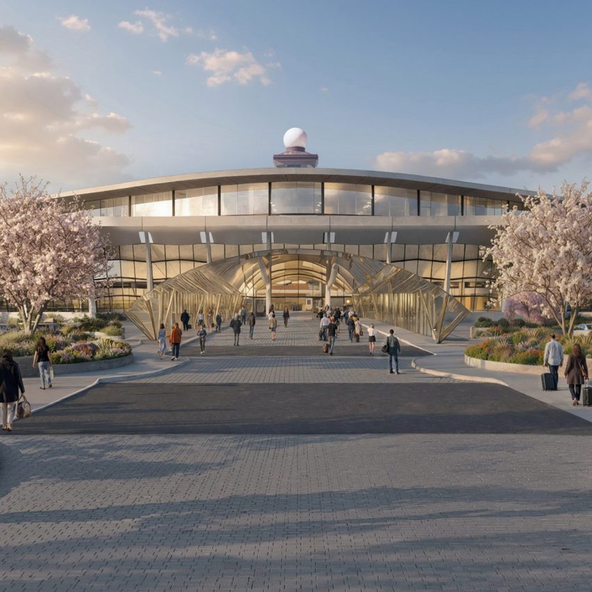
  • Dezeen dezeen.com architecture design dezeen 2026-07-29 10:30

    ↗

    London studio Bricolage has self-built Castlands Road, a house in Lewisham defined by a budget-friendly palette of salvaged bricks and clay blocks. The three-bedroom home was designed and built by Bricolage founder Will Howard and his wife, Sogand Howard, for their own family...

    Castlands Road by Bricolage

    London studio Bricolage has self-built Castlands Road, a house in Lewisham defined by a budget-friendly palette of salvaged bricks and clay blocks.

    The three-bedroom home was designed and built by Bricolage founder Will Howard and his wife, Sogand Howard, for their own family on a back-garden site at the rear of a Victorian terrace.

    Informed by the borough's rich history of self-build architecture – including the Walter Segal-led Walter's Way – the couple looked to demonstrate how "building by hand can become an act of belonging", creating much of the home's joinery and linings by themselves.

    Exterior view of Castlands Road in London
    Bricolage has self-built a family home in London

    "We see community and citizen-led housing delivery as a way to deliver more sustainable and better housing, and it could be the future of housing delivery for urban densification," Will Howard told Dezeen.

    "The project is both personal and prototypical: a low-energy self-build home, made with limited means, but with an architectural idea strong enough to suggest a broader model for urban densification," he added.

    Bricolage described the concept of Castlands Road as a "terraced house in waiting", mimicking the form of its neighbours with blank white-brick side walls that anticipate neighbouring properties being added in the future.

    Home exterior by Bricolage
    Details include an asymmetric gable roof and timber awning

    While its proportions match the nearby terraces, the building is set apart by contemporary details such as an asymmetric gable roof, timber awning, pale green window frames and doors and cast concrete lintels.

    The home's bricks were saved from other construction sites, with an alternating grey-and-white pattern used for its corners. Inside, the large structural clay blocks of the walls were left exposed and sealed with a parge coat.

    View into Castlands Road home by Bricolage
    It was built using salvaged bricks and clay blocks

    "The material choices respond to the context and to the wider idea of anticipating adjacent self-builds," Howard said.

    "This includes white, expressed party walls, conceived as a blank canvas for new homes to connect to, and a more detailed grey brick treatment to the front and rear garden facades," he added. "While at a glance it is quite conventional, the details are unique, and the house is generally much more generous than its counterparts on the street."

    Dining space at self-build home in London
    A dining area sits at the front of the home

    Following a gentle slope on the site, the ground floor steps down from a dining area at the front of the home, through a central kitchen to a living space level with the garden.

    The living space connects to the garden through folding glass doors framed in pale green metal.

    Leyton House by Joe Burke

    Read:

    Joe Burke bookends 1960s London terrace with compact brick home

    All of these spaces are finished with a dark, paved floor, creating a feeling of continuity with both the garden patio and a paved yard at the front of the home.

    Overhead, the ceilings are finished in British larch, complemented by oak and plywood joinery for storage in the kitchen, the majority of which was "constructed slowly alongside family life" by the couple themselves.

    Kitchen interior at Castlands Road
    Paved flooring is used throughout the ground-floor spaces

    "The stepped ground plane naturally creates taller ceilings, and there is a feeling of the house opening up to the garden while also becoming more private as you move through it," said Will Howard.

    "For example, you can stand in the living space and see the entire room, while still interacting with people in the dining space. But when you sit on the sofa, you can no longer see the front windows," he added.

    Interior view of London home by Bricolage
    Folding glass doors connect the living space to an adjacent garden

    Another self-build home in London recently featured on Dezeen is Leyton House by local architect Joe Burke, which bookends a 1960s terrace with a block in rough, pale brickwork.

    We also recently rounded up seven self-build housing projects to inspire your own.

    The photography is by Will Howard.

    The post Bricolage uses salvaged bricks for self-build home in London appeared first on Dezeen.
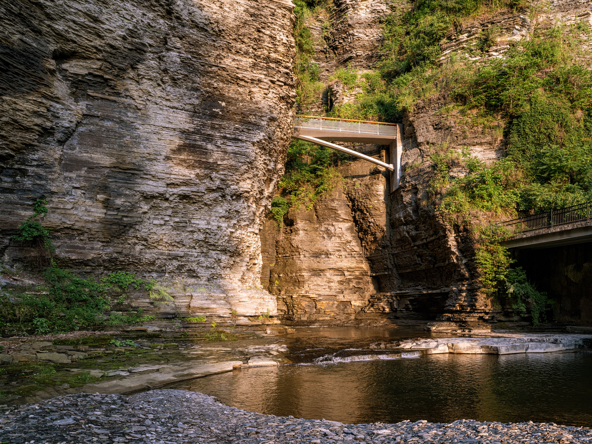
  • Dezeen dezeen.com architecture design dezeen 2026-07-29 10:00

    ↗

    Sportswear brand Nike and health technology company Hyperice have created a slider that uses heat and vibration to help athlete's feet recover. Named Nike Air Zoom Hyperslide, it is the latest product released by Nike that aims to aid athletes in their recovery. The slides...

    Sportswear brand Nike and health technology company Hyperice have created a slider that uses heat and vibration to help athlete's feet recover.

    Named Nike Air Zoom Hyperslide, it is the latest product released by Nike that aims to aid athletes in their recovery.

    Nike Air Zoom Hyperslide
    Nike has unveiled the Nike Air Zoom Hyperslide

    The slides combine a cushioned Nike Air Zoom sole that provides comfort with a strap that contains a device developed by Hyperice that can heat and massage the top of the feet.

    According to the brand, this will reduce tension in the feet and speed up recovery times.

    Nike Air Zoom Hyperslide
    The slider can vibrate and heat the foot to aid recovery

    "Athletes leave everything on the field, and the approach to recovery needs to meet them at the same level," said Nike senior director of athlete innovation Tobie Hatfield.

    "With the Nike Air Zoom Hyperslide, we wanted to create a solution that kickstarts recovery the moment you power it up – helping athletes feel more relaxed, restored and ready to take their performance to the next level."

    Hyperslide Pod
    It is powered by the Hyperslide Pod

    The heat and vibrations are produced by a removable, magnetic Hyperslide Pod that fits in a pocket on the strap of the sliders.

    Levels of heat and vibration can be adjusted to suit the athlete's preferences, from 45, 47 and 49 degrees centigrade and 50, 75 and 100 Hertz.

    Nike's Mind 001 and Mind 002 are its first neuroscience-based footwear

    Read:

    Nike's first neuroscience-based footwear "designed from the brain down"

    "Our partnership with Nike has always been driven by a shared commitment to innovation for the athlete," Hyperice founder Anthony Katz said.

    "With the Nike Air Zoom Hyperslide, we're making premium recovery more accessible than ever, combining Nike's iconic footwear expertise with Hyperice technology to help people recover smarter with every step."

    Nike slider in black
    It is set to be released in September

    Unveiled earlier this week, the Nike Air Zoom Hyperslide will be available in September.

    Its release follows the creation of a mule that was described as Nike's first neuroscience-based footwear, which was "designed from the brain down".

    The photography is courtesy of Nike.

    The post Nike unveils warming and vibrating "recovery slider" appeared first on Dezeen.
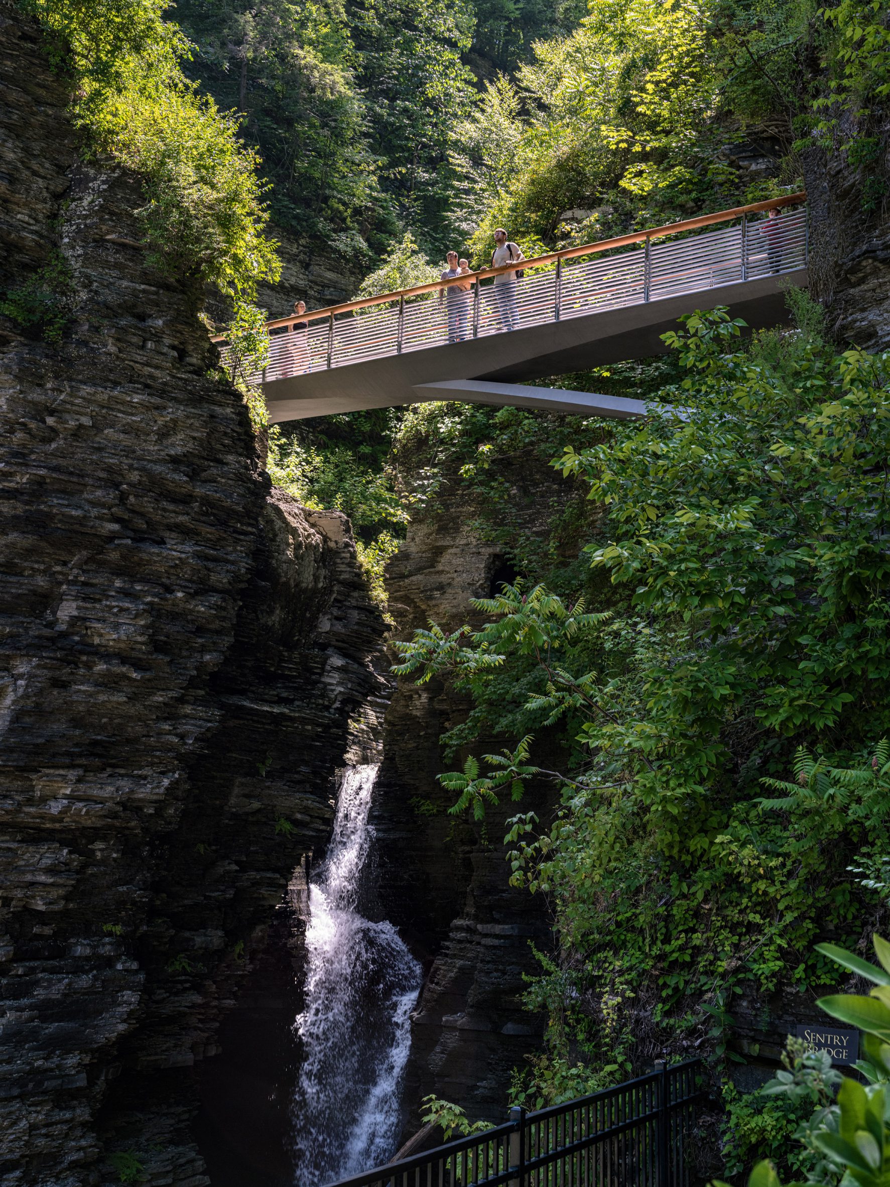
  • Dezeen dezeen.com architecture design dezeen 2026-07-29 08:30

    ↗

    Handmade bricks, wooden shakes and a cob wall enclose a trio of buildings at this community garden in London, which has been designed by local studio Jan Kattein Architects. Nestled on a triangular plot in King's Cross, the garden serves as an educational space for the local...

    Triangle Site by Jan Kattein Architects

    Handmade bricks, wooden shakes and a cob wall enclose a trio of buildings at this community garden in London, which has been designed by local studio Jan Kattein Architects.

    Nestled on a triangular plot in King's Cross, the garden serves as an educational space for the local community and permanent home for educational charity Global Generation.

    Built primarily from bio-based materials, the garden was constructed over two years through a community build programme, which employed a team of on-site architects, builders and trainees, along with the help of 3,000 volunteers.

    Aerial view of the Triangle Site
    A community garden designed by Jan Kattein Architects has opened in King's Cross

    "It was a very unconventional construction process," studio founder Jan Kattein told Dezeen.

    "We made Global Generation into the principal contractor because that would open up the door for volunteer development."

    "The project was never about doing the buildings quickly," Kattein continued. "It was about involving and engaging as many people in the process as we could."

    Person walking through new community garden by Jan Kattein Architects
    The garden serves as a community space and new home for Global Generation. Photo by Alex Sturrock

    Three compact buildings housing a classroom, office and community kitchen occupy the site and converge at a small, central courtyard designed as a space for socialising.

    Wrapping around these structures is the garden, which features an "edible forest", rubble garden, polytunnel and pond.

    Looking to embed the buildings within the surrounding garden, Jan Kattein Architects opted for distinct structures with direct access to the outdoors as opposed to one large volume.

    Exterior view of kitchen space at the Triangle Site
    The site's three buildings were constructed with the help of 3,000 volunteers

    "It was really critical that the buildings connected to the garden," Kattein said.

    "We've done three small buildings rather than one big one because that means each of the buildings, as you step out of the door, you're in the garden," he continued.

    "Whereas if you connected them all with the corridor, you wouldn't."

    Classroom exterior at Kings Cross garden
    A thick cob wall frames the garden's classroom

    The largest of the volumes is the community kitchen, distinguished by its pyramidal roof structures and textured exterior clad with 12,000 handmade shakes.

    Contained within the building alongside the kitchen are storage spaces and separately-accessed toilets, which are each crowned with deep skylights to create lofty, well-lit interiors.

    LifeLine Community Centre by Assemble

    Read:

    Assemble turns former dairy warehouses into adaptable community hub

    Alongside this, the classroom's low-lying rectilinear volume has been arranged around a spinal cob wall, which was made on site from locally-sourced waste earth and coated with a lime render.

    Its interior, which was sized to accommodate a primary school class, is illuminated by a large circular skylight, along with a band of clerestory glazing above the cob wall and full-height, glazed openings.

    Opposite, the office is housed within an angular structure featuring 2,000 handmade bricks inscribed by their makers, and topped with a green roof.

    Classroom interior at Triangle Site by Jan Kattein Architects
    Deep skylights draw daylight into the interiors

    According to Kattein, the use of bio-based materials was guided by the build's participatory approach and an overarching goal to introduce new skills to the volunteers.

    "The building materials and techniques used are all informed by the construction process," Kattein explained. "We needed to use skills that volunteers could acquire and where they would feel they could make a meaningful contribution."

    Previous projects by the studio include the conversion of derelict garages into 35 affordable workspaces for entrepreneurs in north London.

    Elsewhere, Assemble has transformed a pair of former dairy warehouses into a community centre and church in east London.

    The photography is by Jan Kattein Architects unless otherwise stated.

    The post Bio-based community garden by Jan Kattein Architects opens in London appeared first on Dezeen.
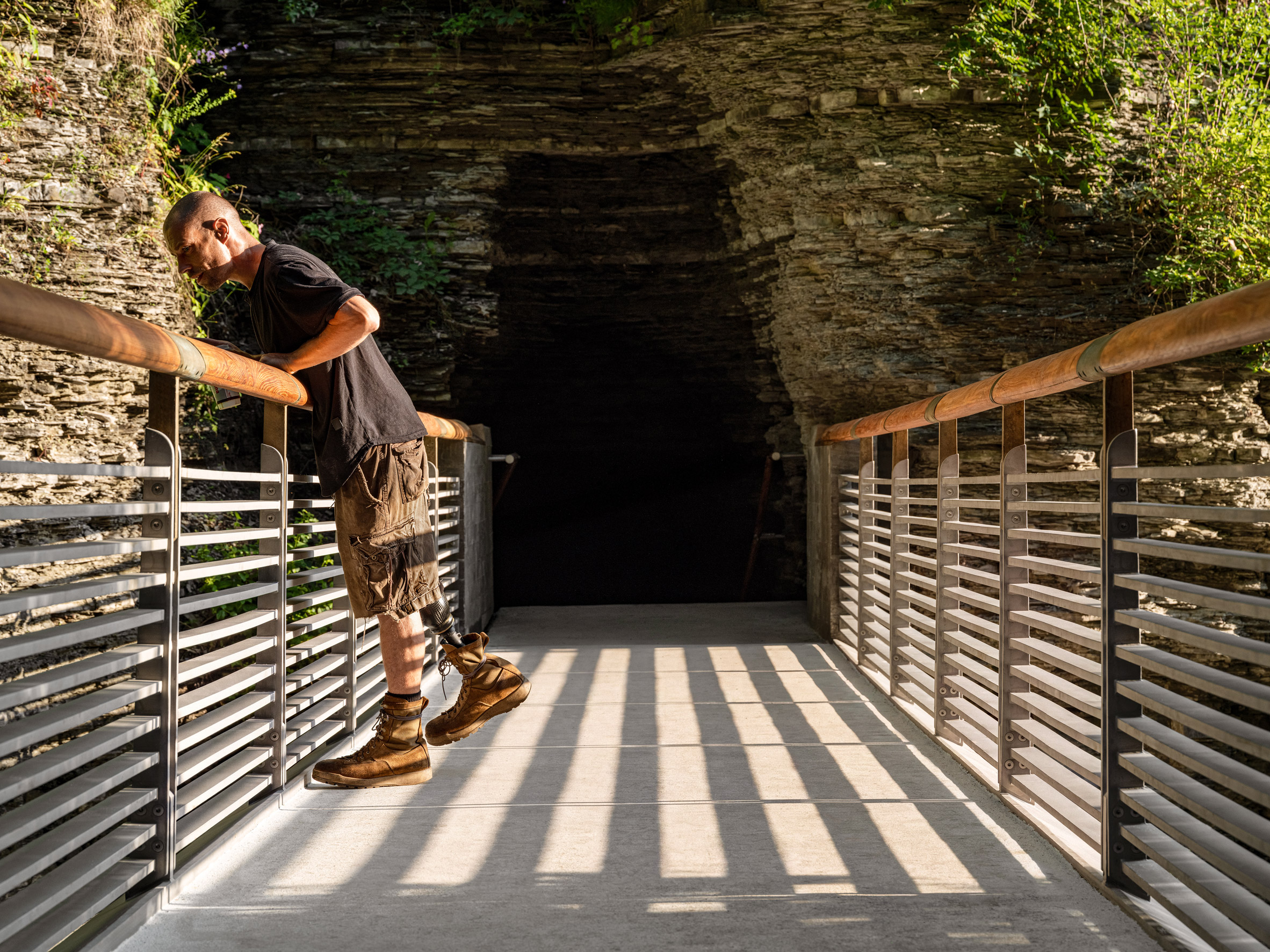
  • Loading more…
Maibook — your private personalized AI community
  • rcanand.com
  • mlaillc.com
  • @rcanand (X)
  • LinkedIn
  • Feedback
  • Credits