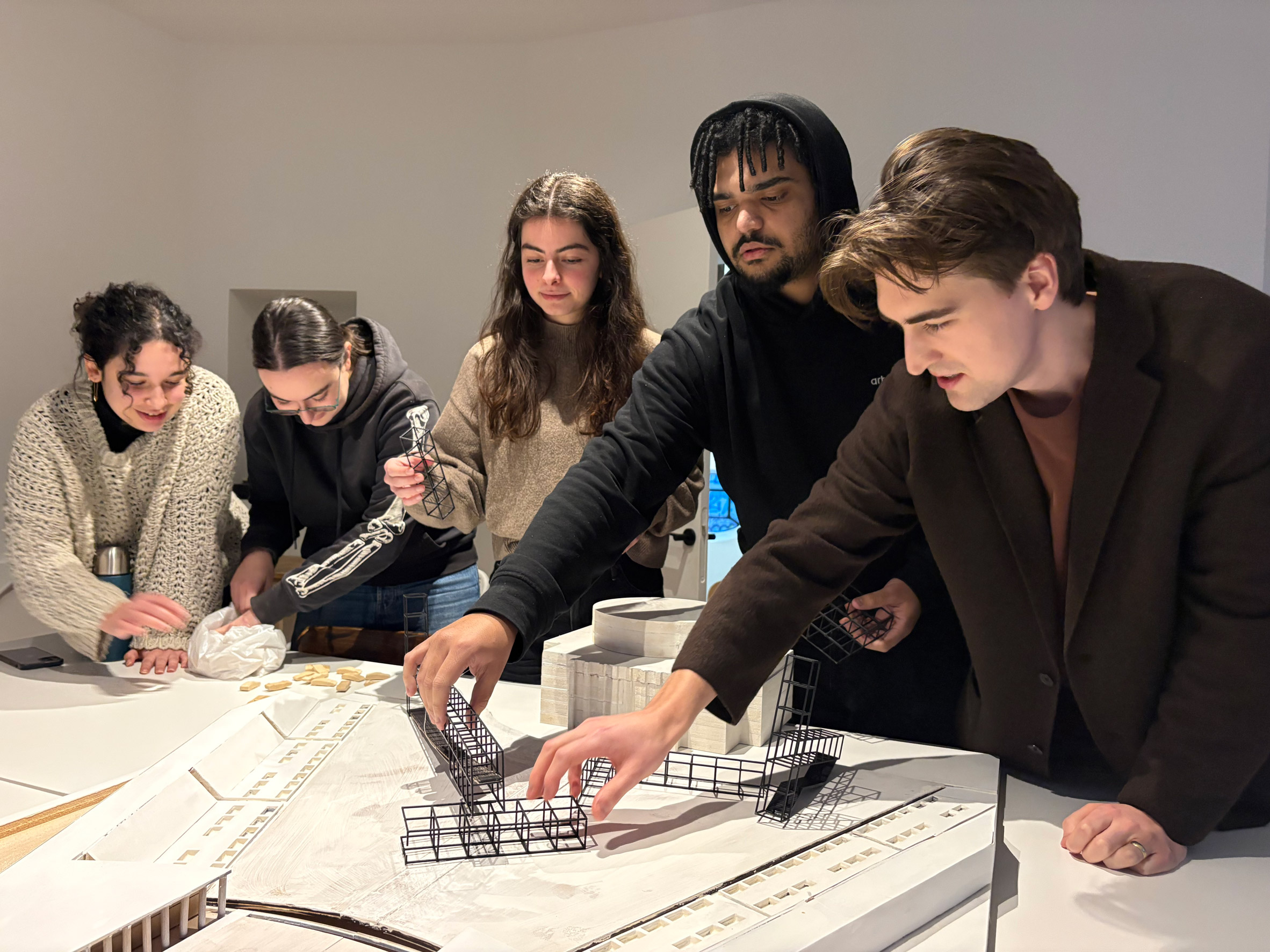
Dezeen School Shows: a cultural centre designed for riverside communities in Colombia is among the culturally diverse projects by architecture students at the American University in Dubai.
Also featured is a museum preserving the tradition of Julfar pottery, and a project that transforms an abandoned desert settlement into a venue for cultural events and festivals.
American University in Dubai
Institution: American University in Dubai
Course: ARCH 502 – Architectural Studio X
Tutors: Abdellatif Qamhaieh, Mattia Gambardella and Nicolas Turchi
School statement:
"This capstone course allows students to implement their thesis research by developing a project that integrates all principles of design, showcasing a comprehensive understanding of architectural design and professional capability.
"The course culminates in a senior showcase, where a panel of experts evaluate the projects. The 2026 Architecture Senior Showcase was held online from 9 to 17 May, concluding with an in-person exhibition and award ceremony on 26 June 2026.
"A jury of international experts from industry, academia and the press reviewed the projects, awarding first, second and third places.
"Additional awards involved the local and global community, including professors, alumni and faculty members. A special Future Architect Award from a jury of selected high school students was presented to one student.
"For the third consecutive year, all senior projects addressed one or more Sustainable Development Goals (SDGs), in alignment with the commitments outlined during COP28 in Dubai."
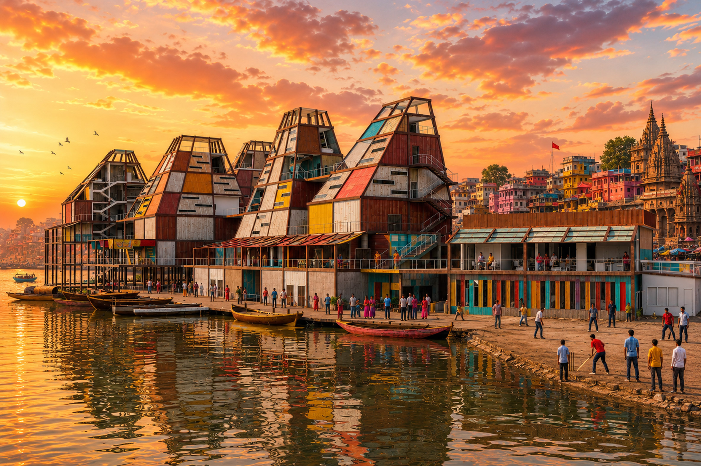
Moksha: A Journey to Liberation by Aastha Yadgouda
"There are two attributes that all humans can experience regardless of status, achievement, culture or background – we are all born one day, and we shall all die another day.
"This project explores the relationship between ritual, death, community and architecture through the sacred landscapes of Varanasi and the lived experiences of the Dom community.
"Through research, mapping and community engagement, it examines how spirituality, cultural heritage and everyday life shape the city, while revealing the social and spatial challenges faced by the Doms.
"Moksha responds through a series of interconnected interventions that seek to improve living conditions, strengthen community wellbeing and honour Varanasi's sacred identity.
"The project celebrates the dignity of those whose invisible labour sustains the city's spiritual traditions."
Student: Aastha Yadgouda
Course: ARCH 502 – Architectural Studio X
Email: aastha.yadgouda[at]mymail.aud.edu
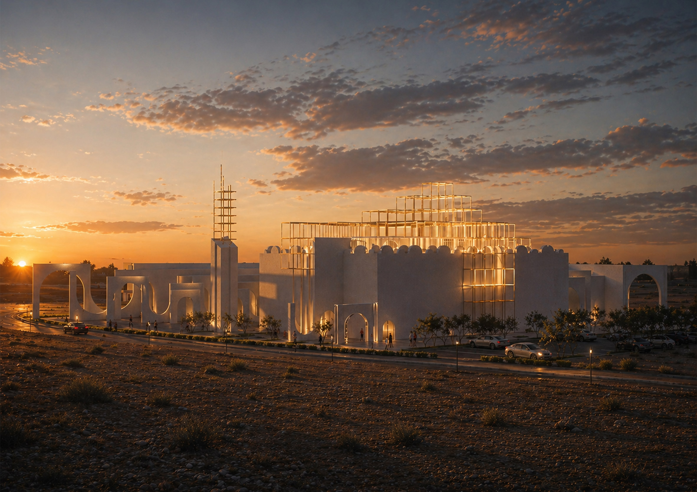
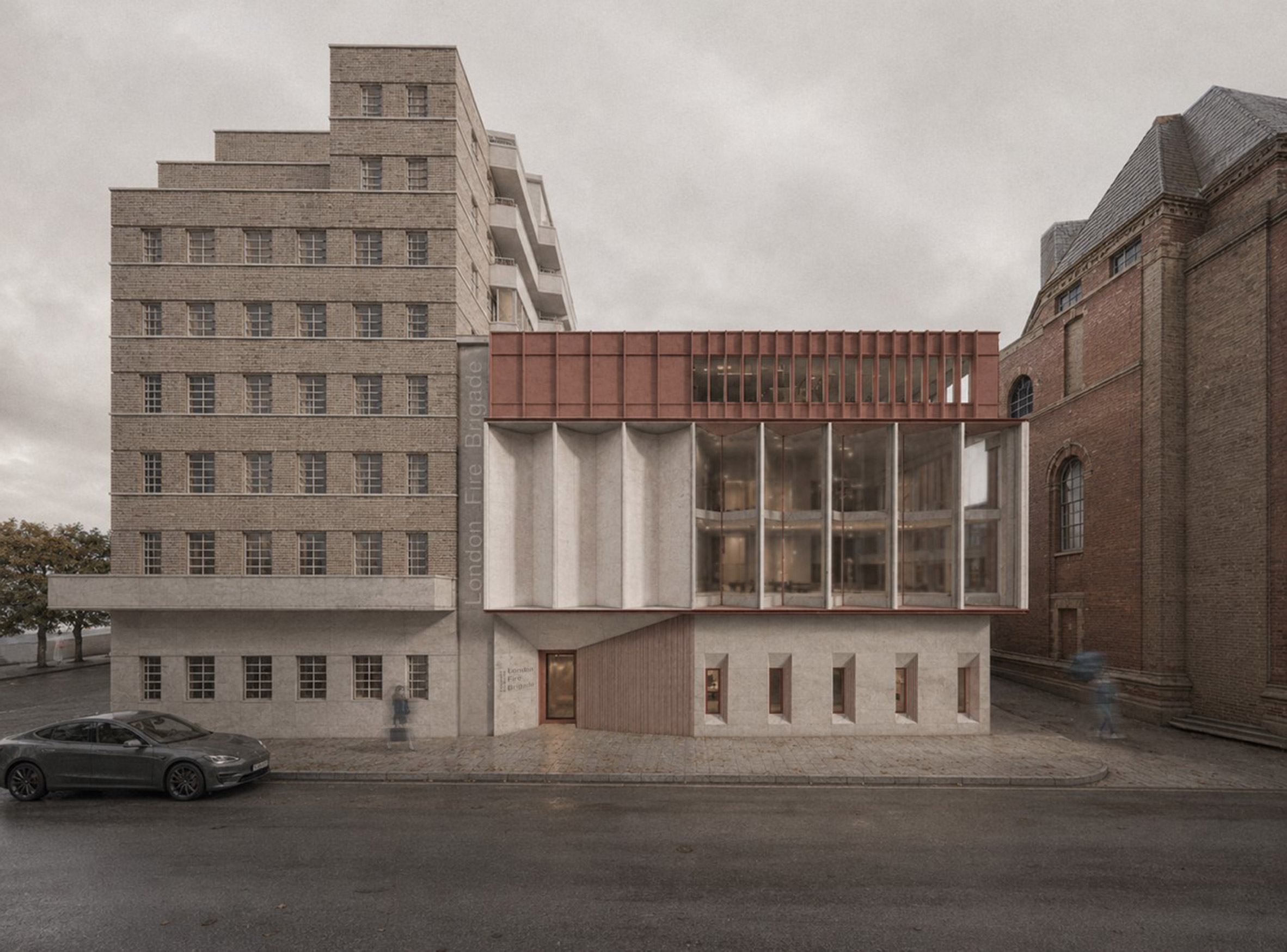
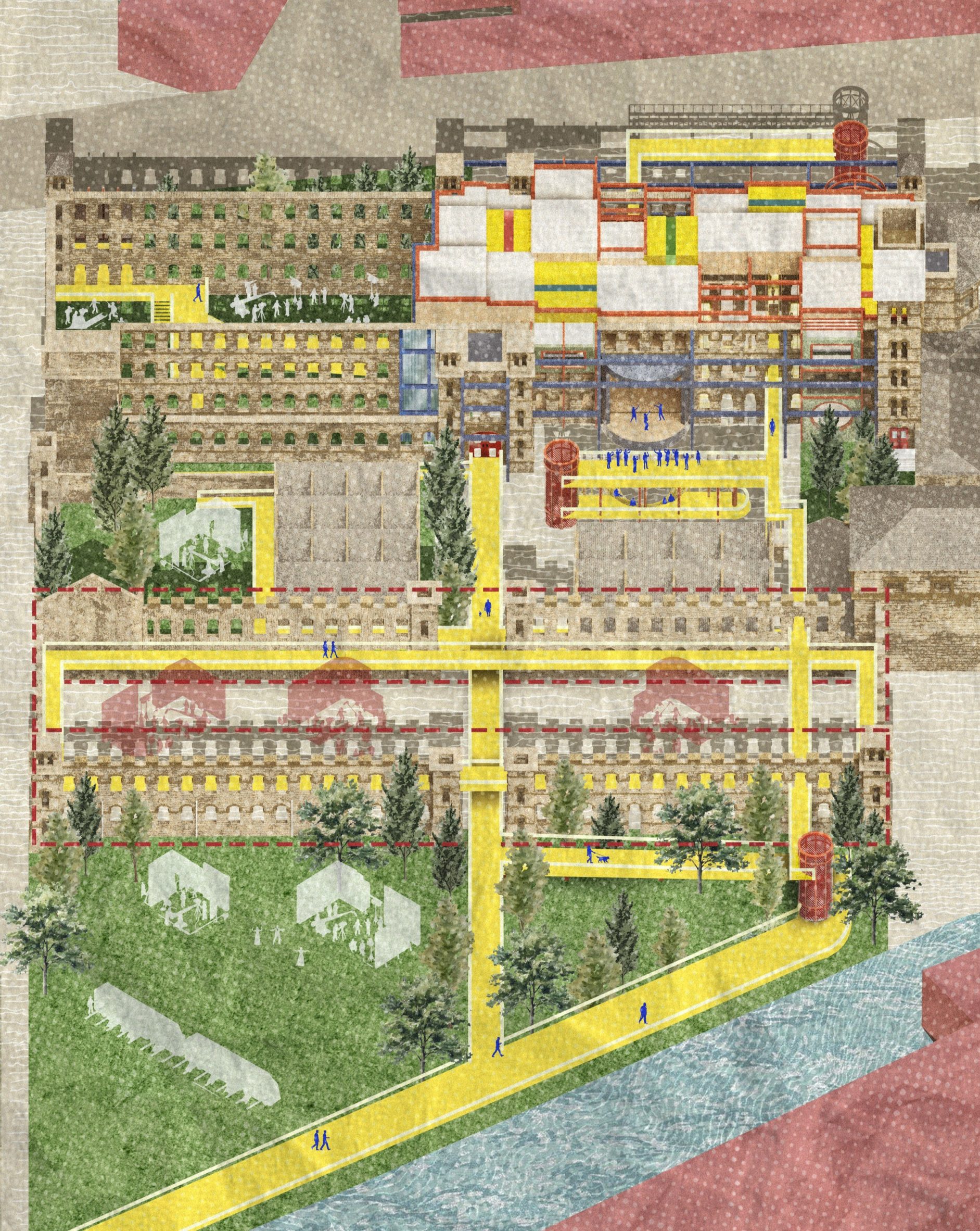
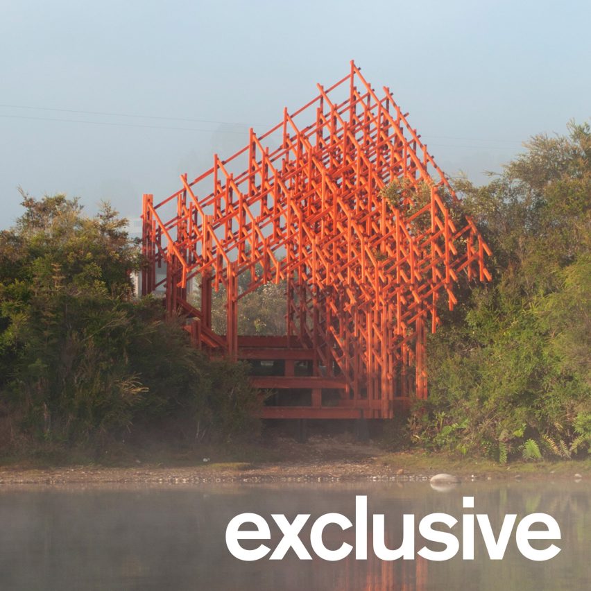
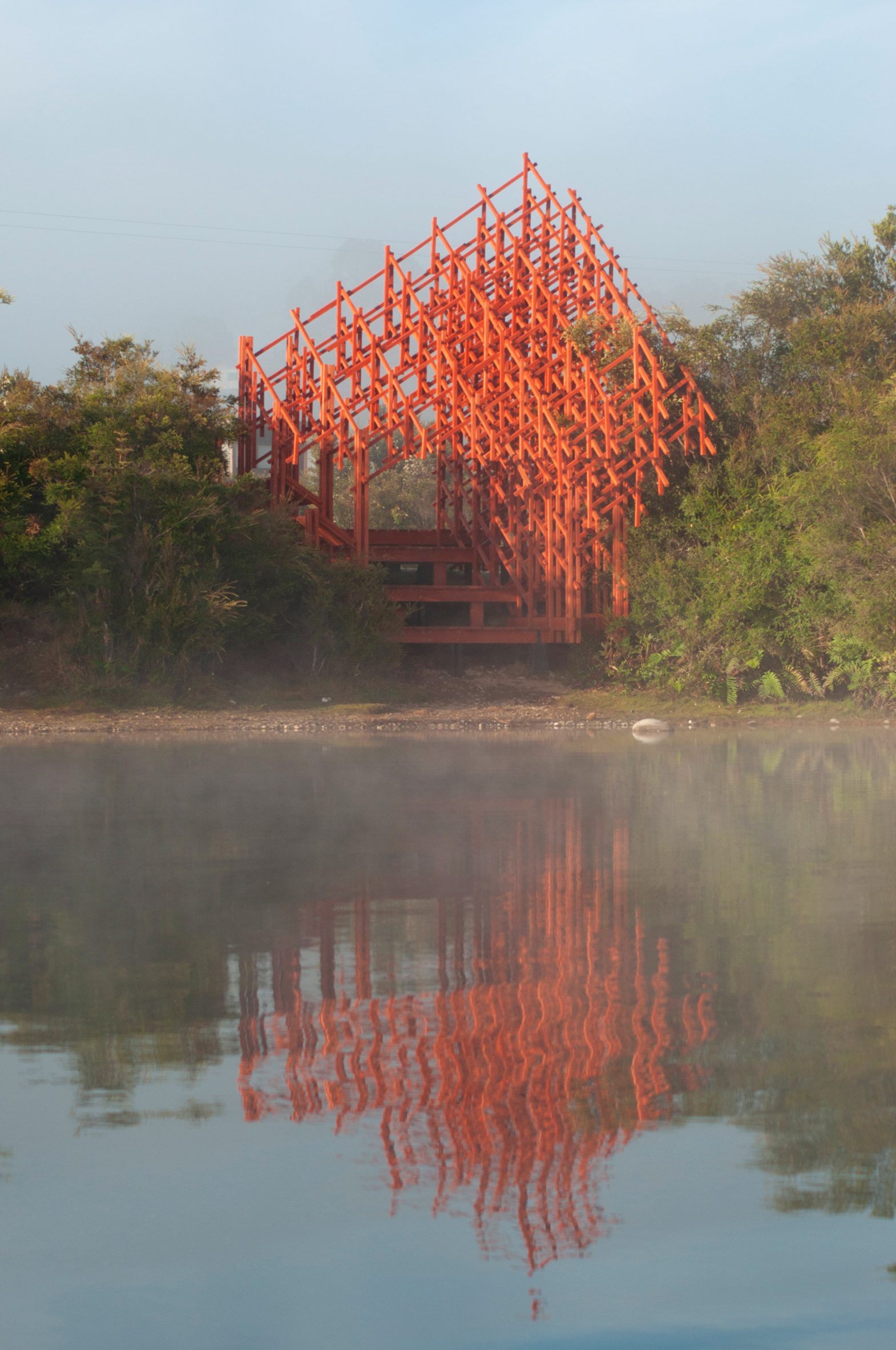
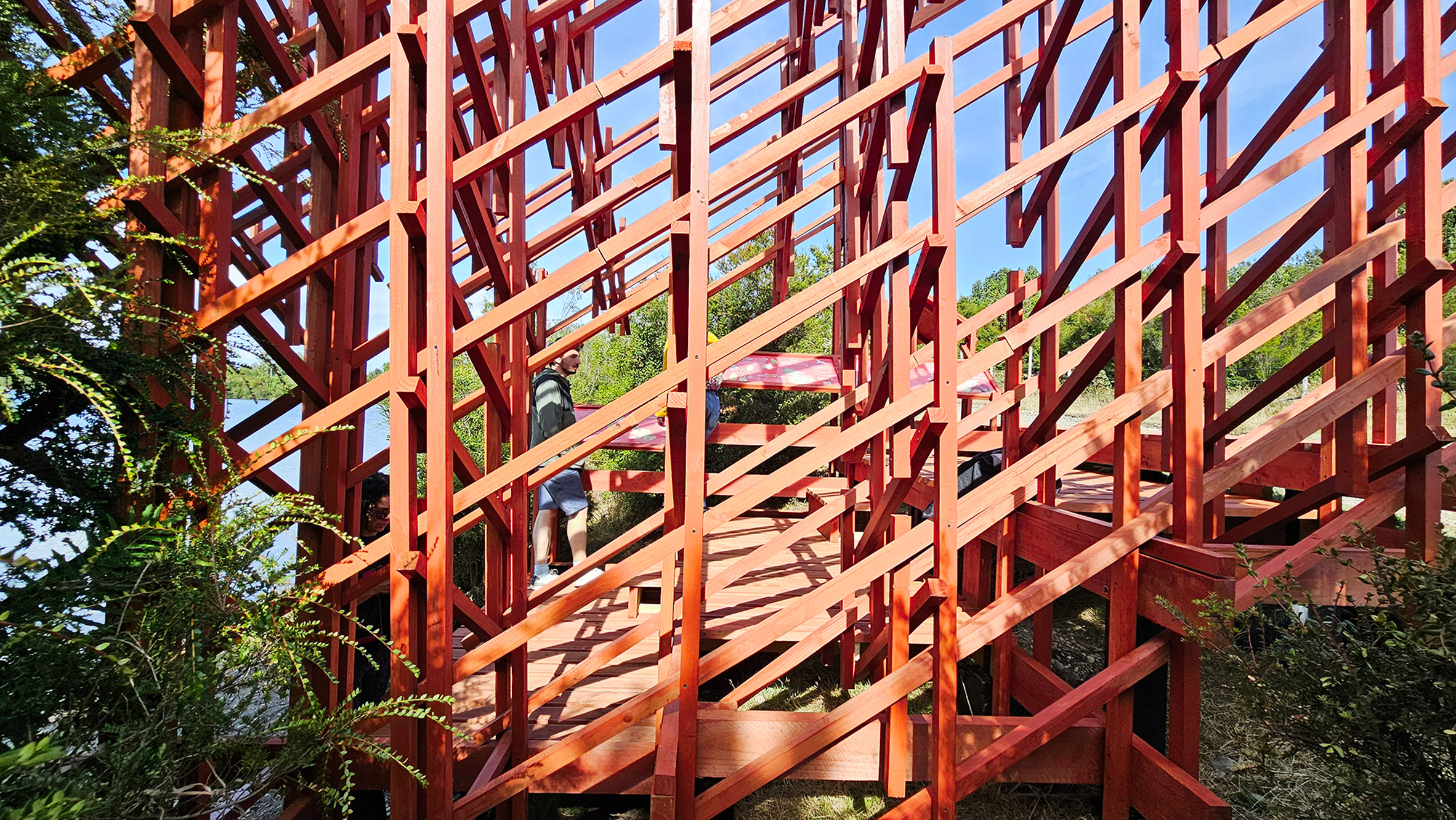
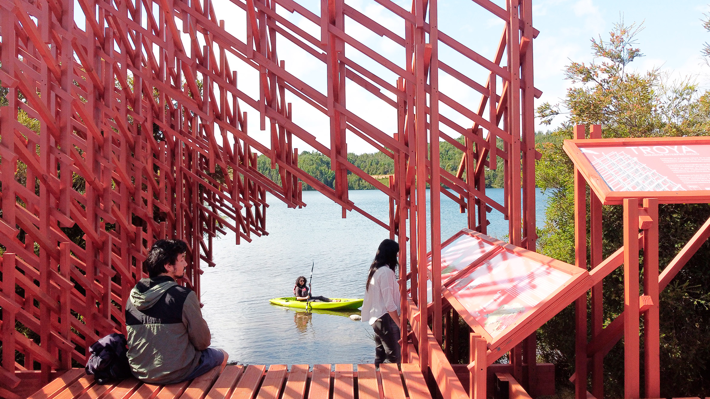
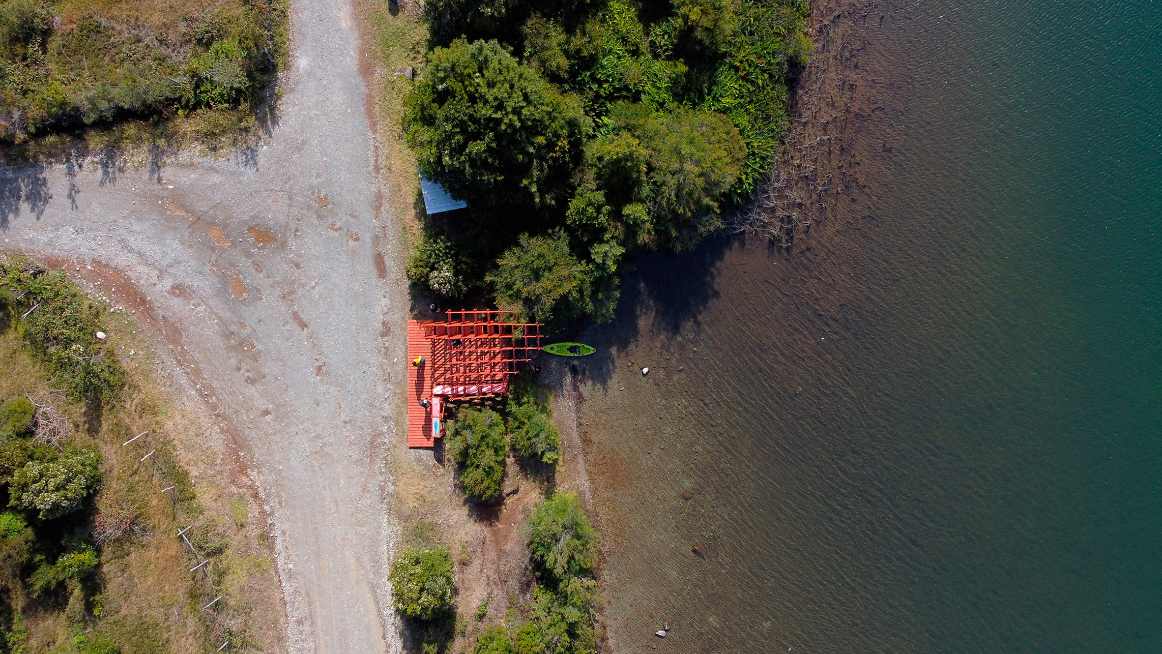
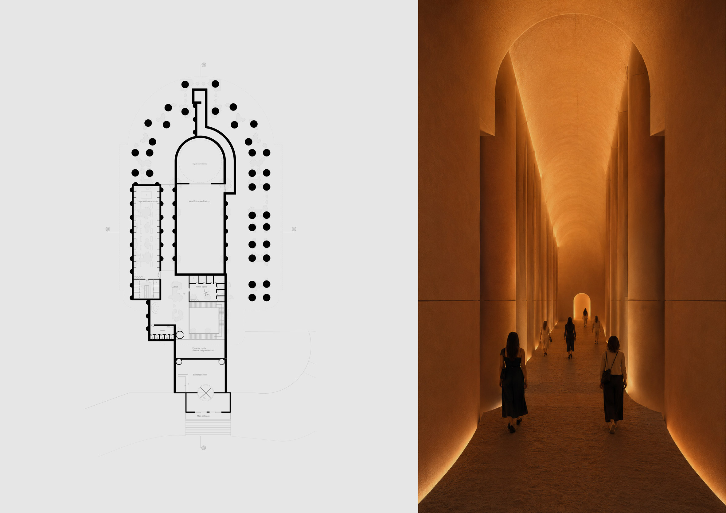
Layers of Loss by Nahla Fahl
"Layers of Loss explores absence as a spatial and structural condition, rather than a void to be resolved.
"Located in Jobar, Damascus and centred around Al-Ourfan Mosque, the project repositions the site as a museum where memory, ruin and continuity coexist within a single evolving framework.
"The proposal is organised as a lightweight structural field that extends across the site and partially envelopes the mosque without dominating it.
"This scaffold-like armature acts as an ordering system for space, establishing a secondary layer above the ground that filters light, frames views and defines spatial relationships across the ruins.
"The mosque remains the central and protected reference point, around which all interventions are carefully calibrated.
"Rather than reconstructing what has been lost, Layers of Loss creates an open architectural field where structure, landscape and memory are interwoven, allowing the site to remain in a state of continuity and transformations."
Student: Nahla Fahl
Course: ARCH 502 – Architectural Studio X
Email: nahla.fahl[at]mymail.aud.edu
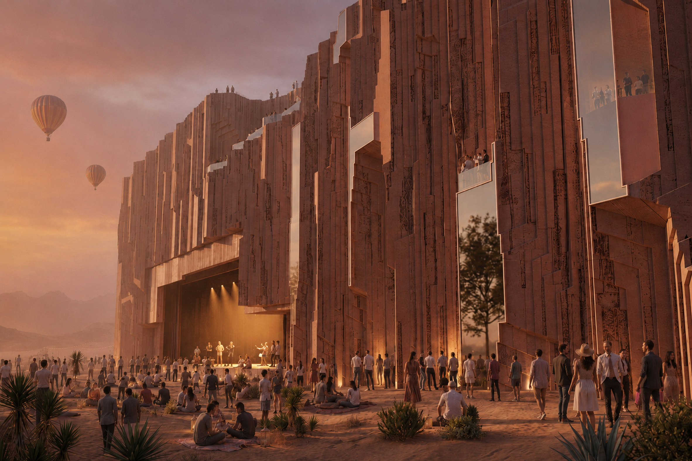
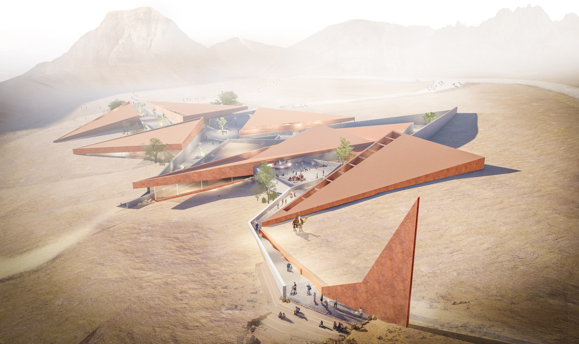
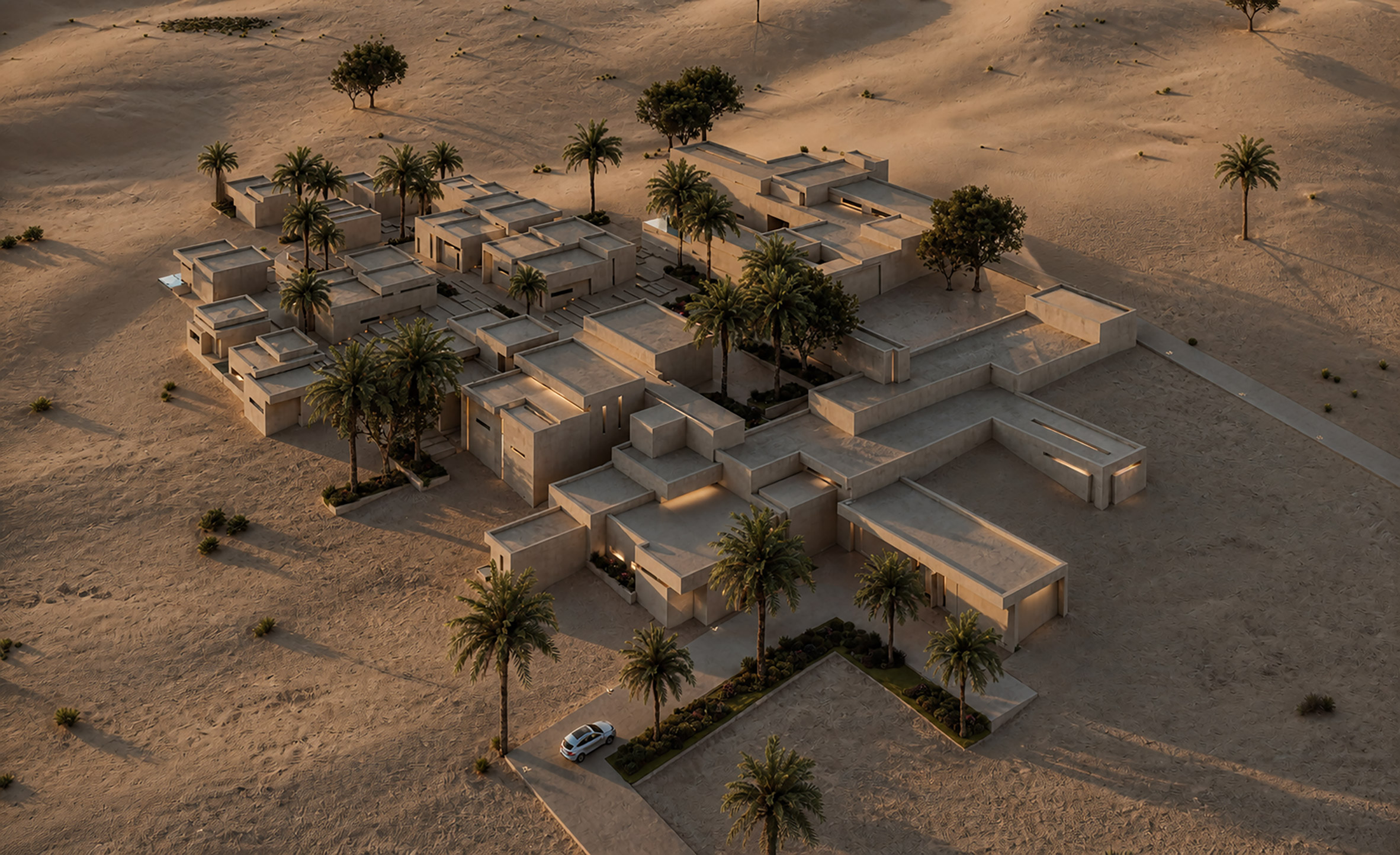
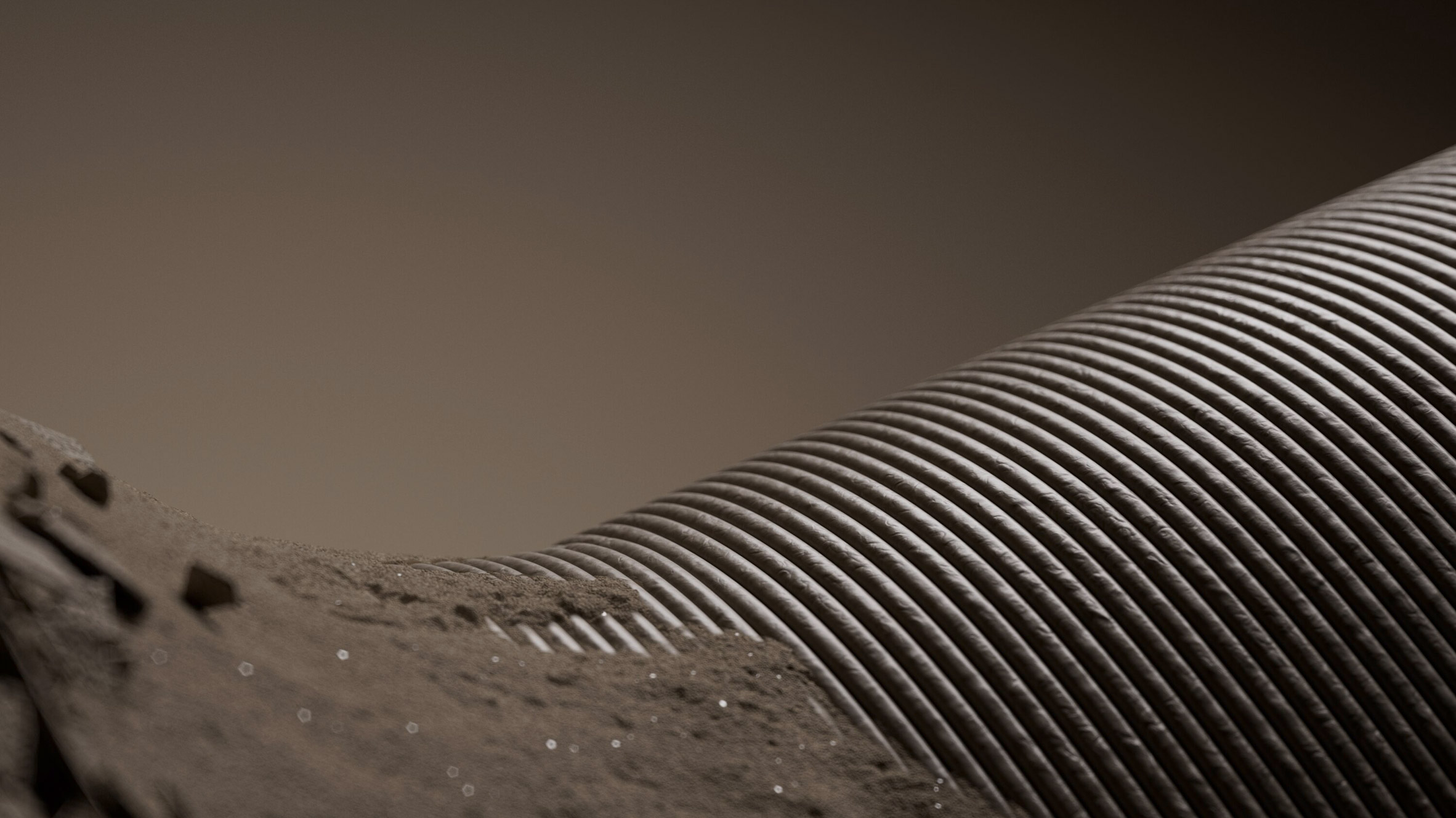
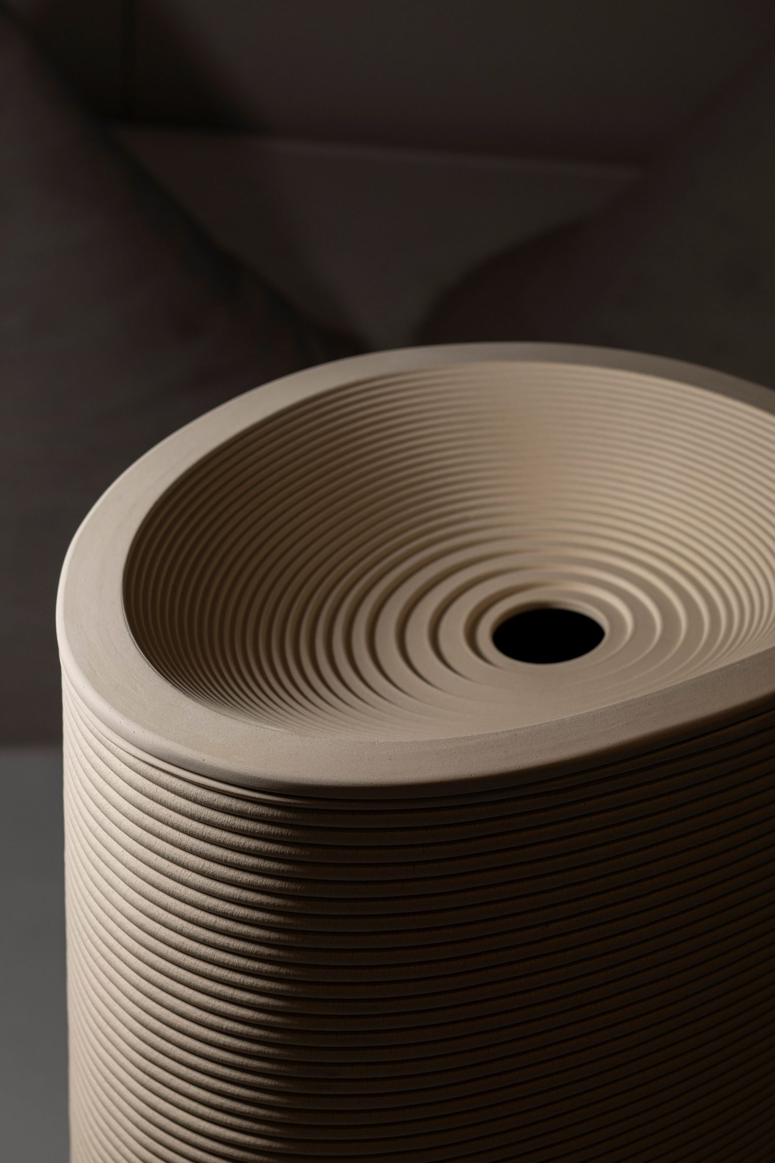
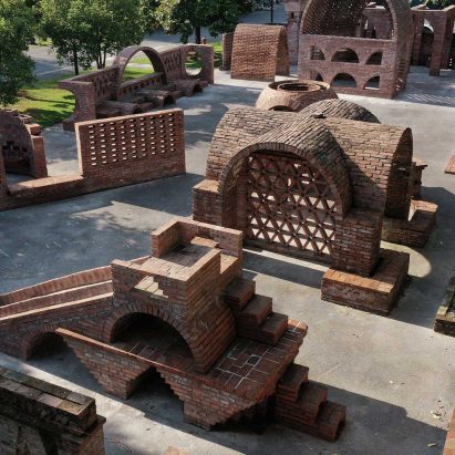
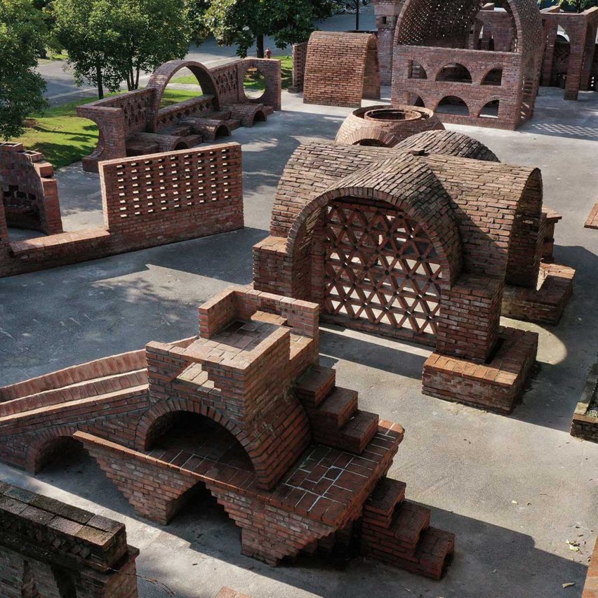
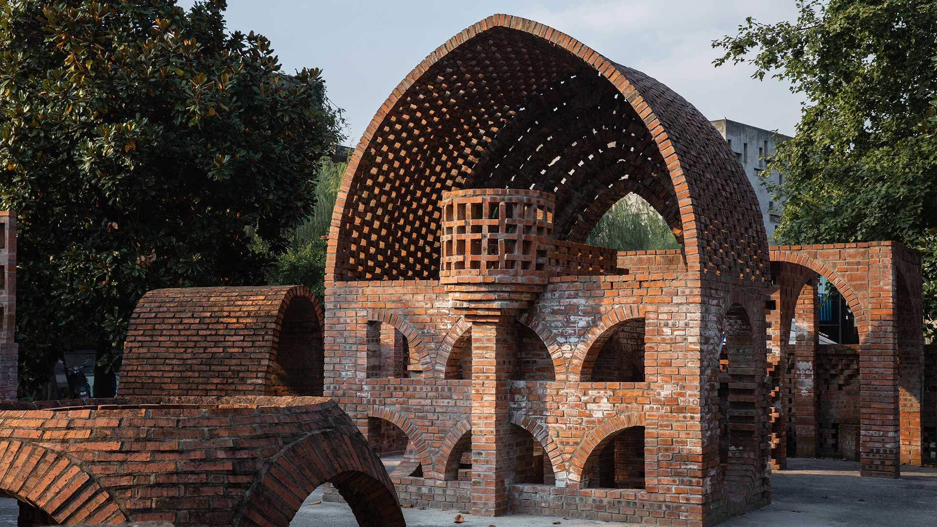
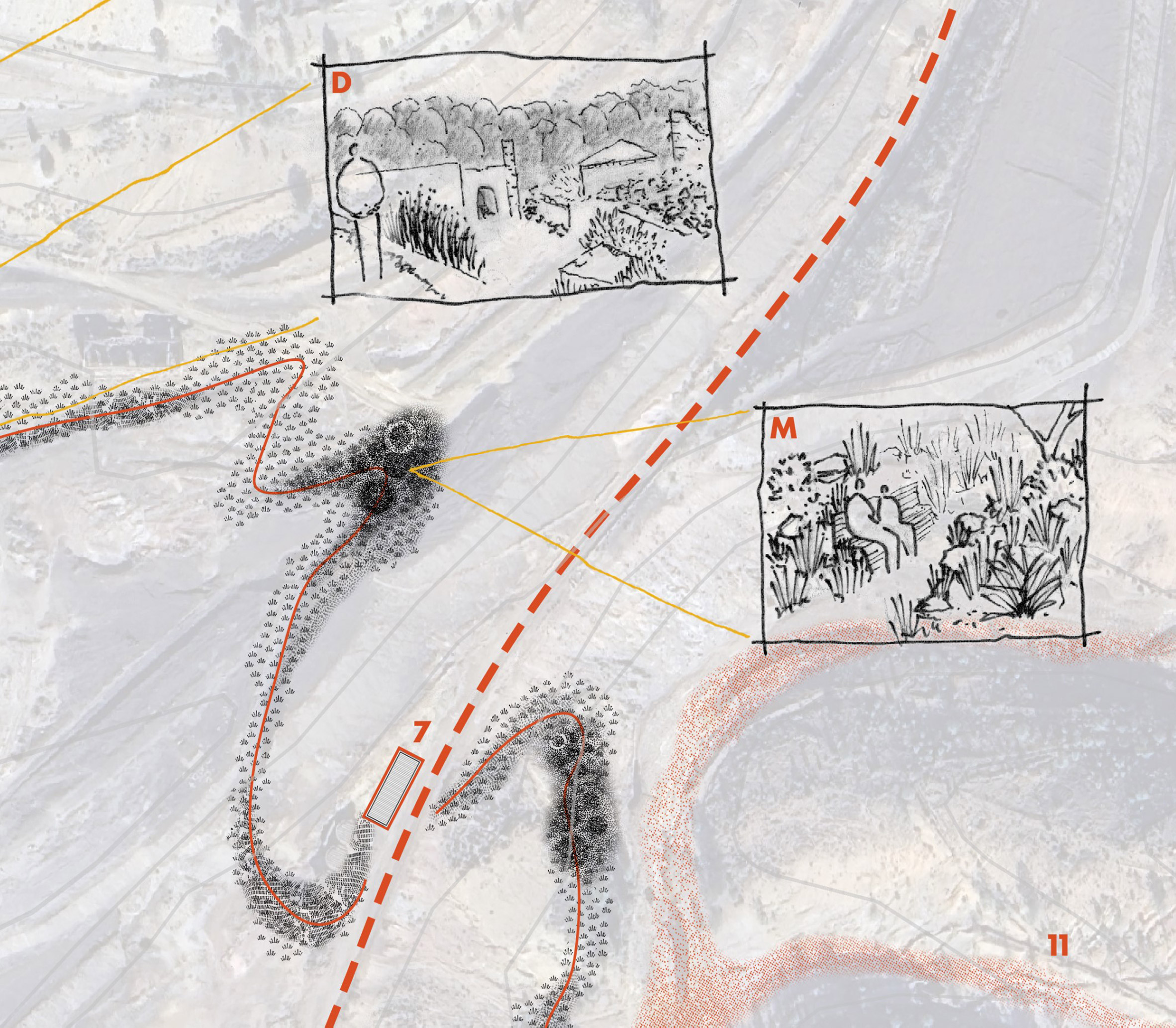
Architecture of Decay: The Sacrificial Ruin by Alia Taher
"Architecture of Decay is an architectural thesis located in Al Madam, a desert settlement in the United Arab Emirates that has gradually been abandoned and reclaimed by sand.
"Rather than treating decay as something to resist, the project explores how architecture can engage with natural processes of erosion, burial and transformation, while preserving the collective memory of place.
"Programmed as a cultural festival destination, the project combines performance spaces, exhibition areas, workshops, markets, storytelling venues and camping facilities.
"These activities transform the abandoned settlement into a seasonal gathering place that celebrates local heritage, while attracting new forms of cultural engagement.
"Constructed using 3D-printed sand and Corten steel, the architecture is designed to weather and evolve alongside its environment. As sand accumulates and surfaces erode, the building becomes part of the same natural processes that shaped the site itself."
Student: Alia Taher
Course: ARCH 502 – Architectural Studio X
Email: alia.taher[at]mymail.aud.edu
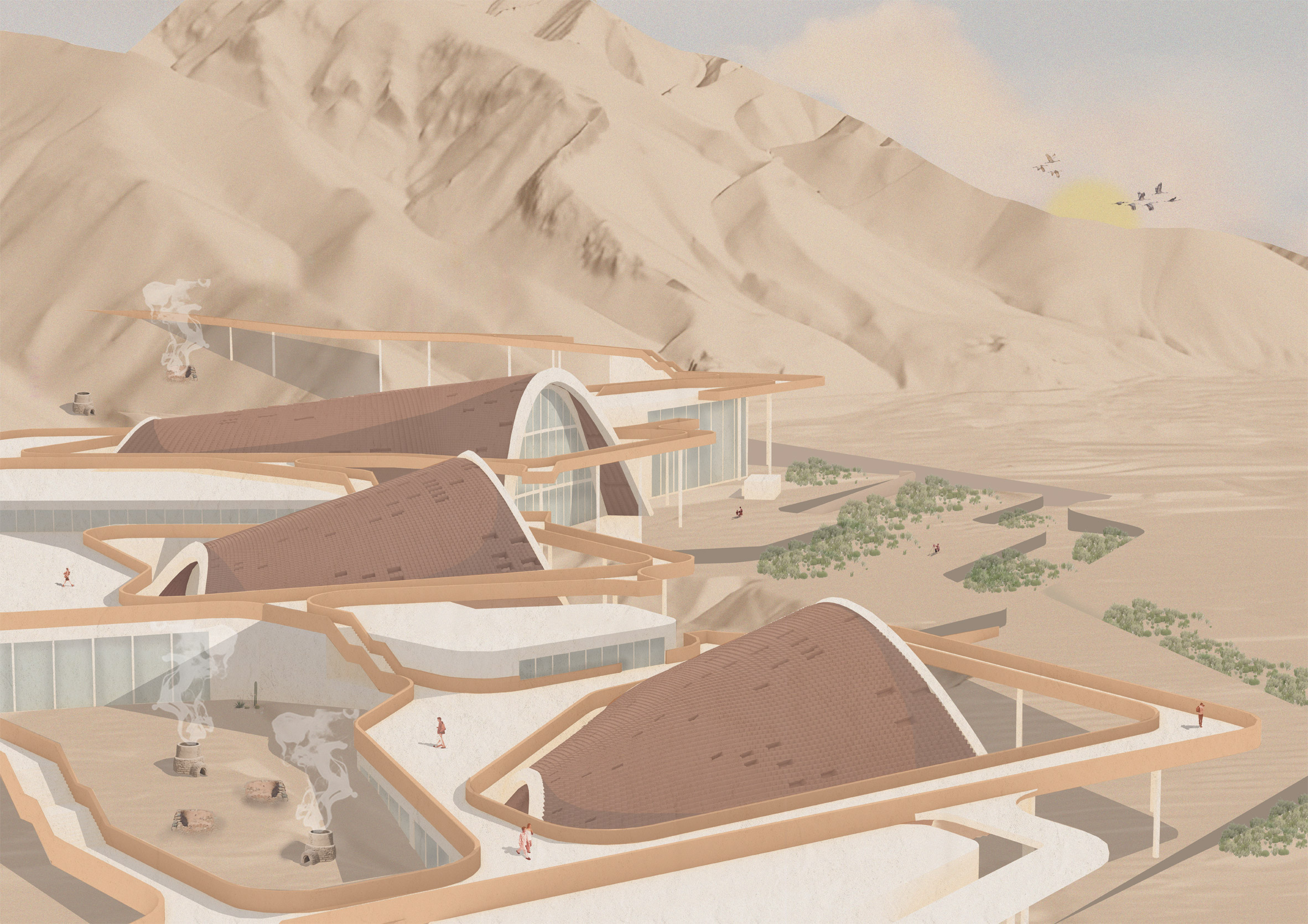
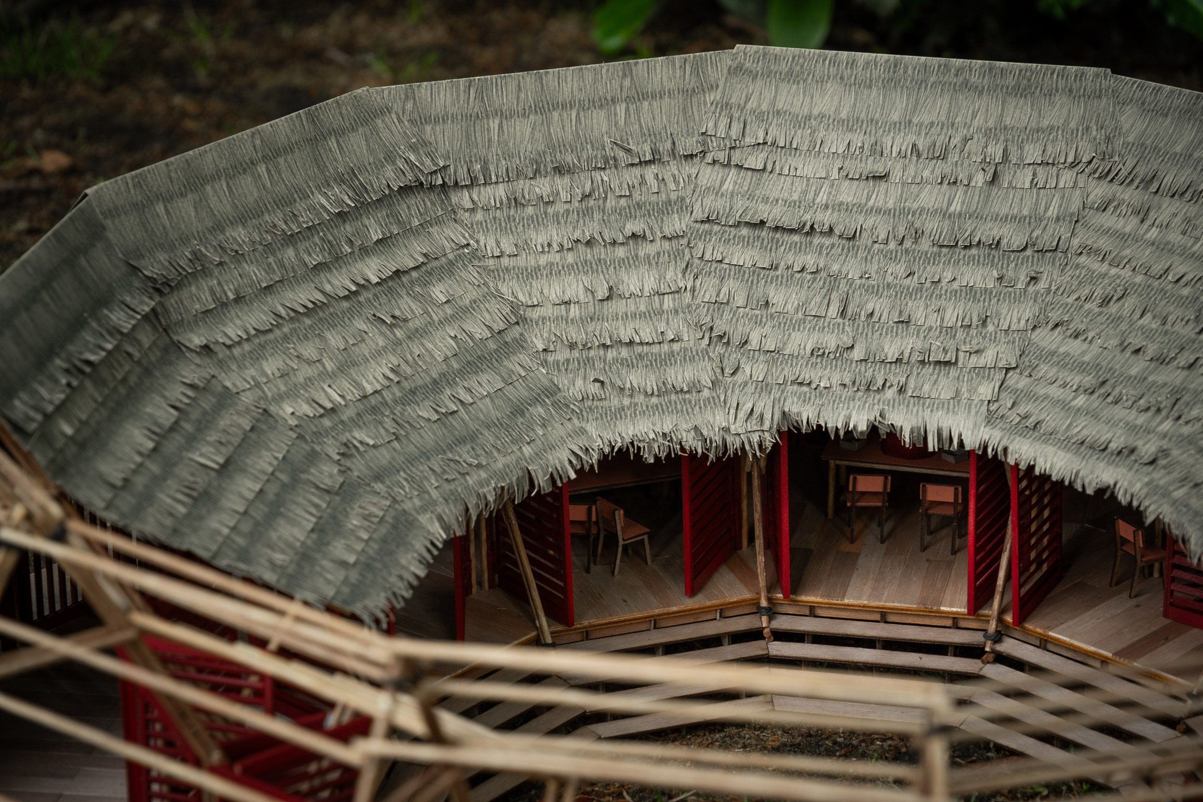
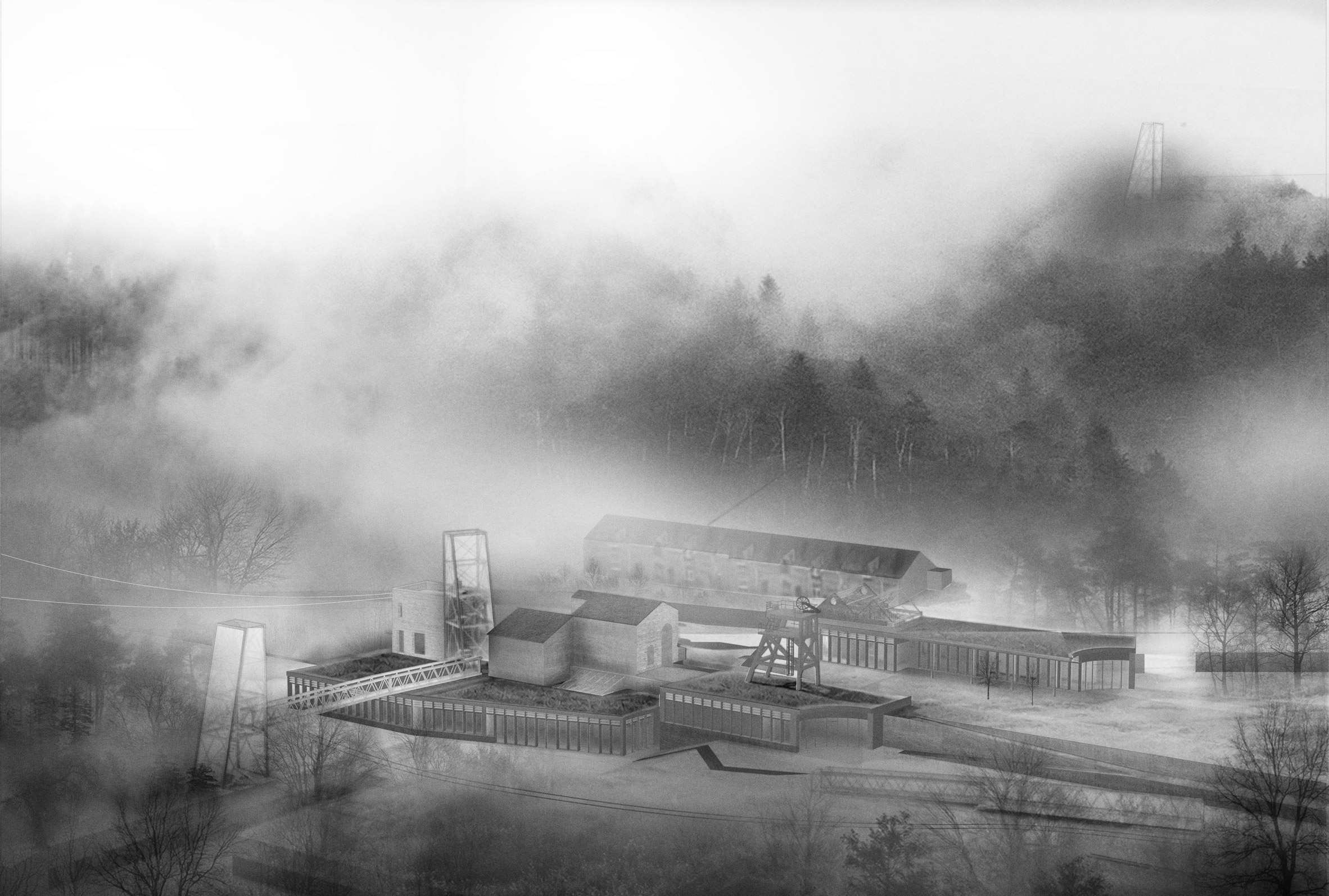
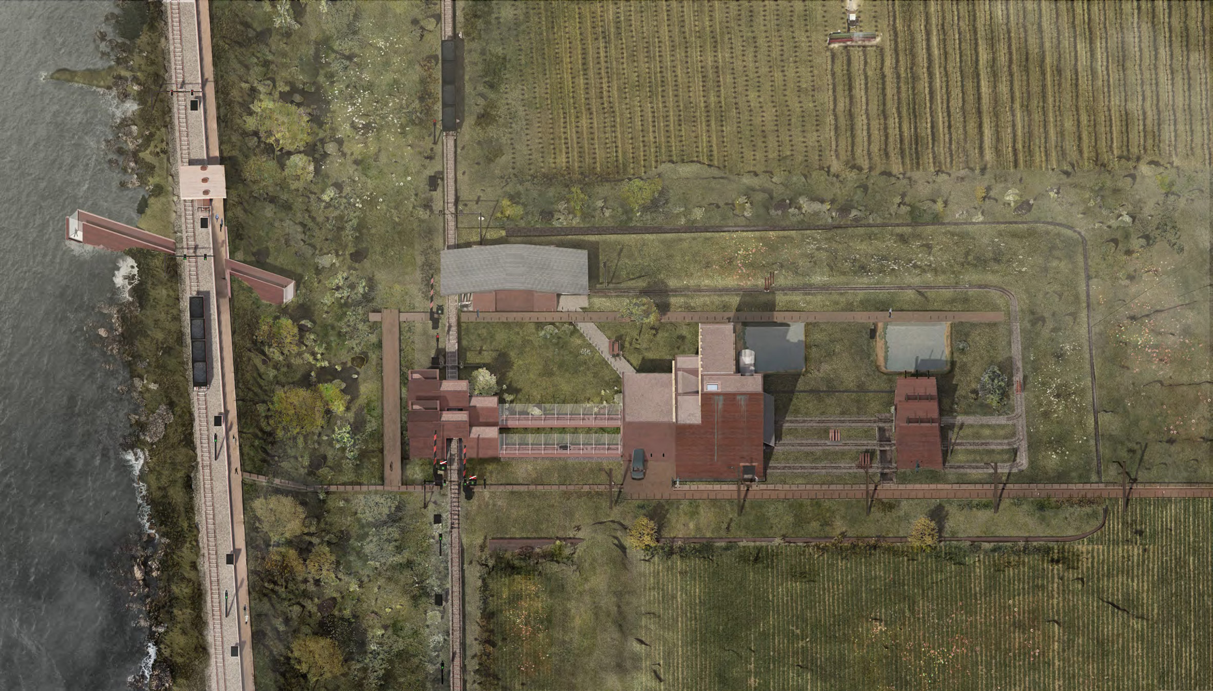
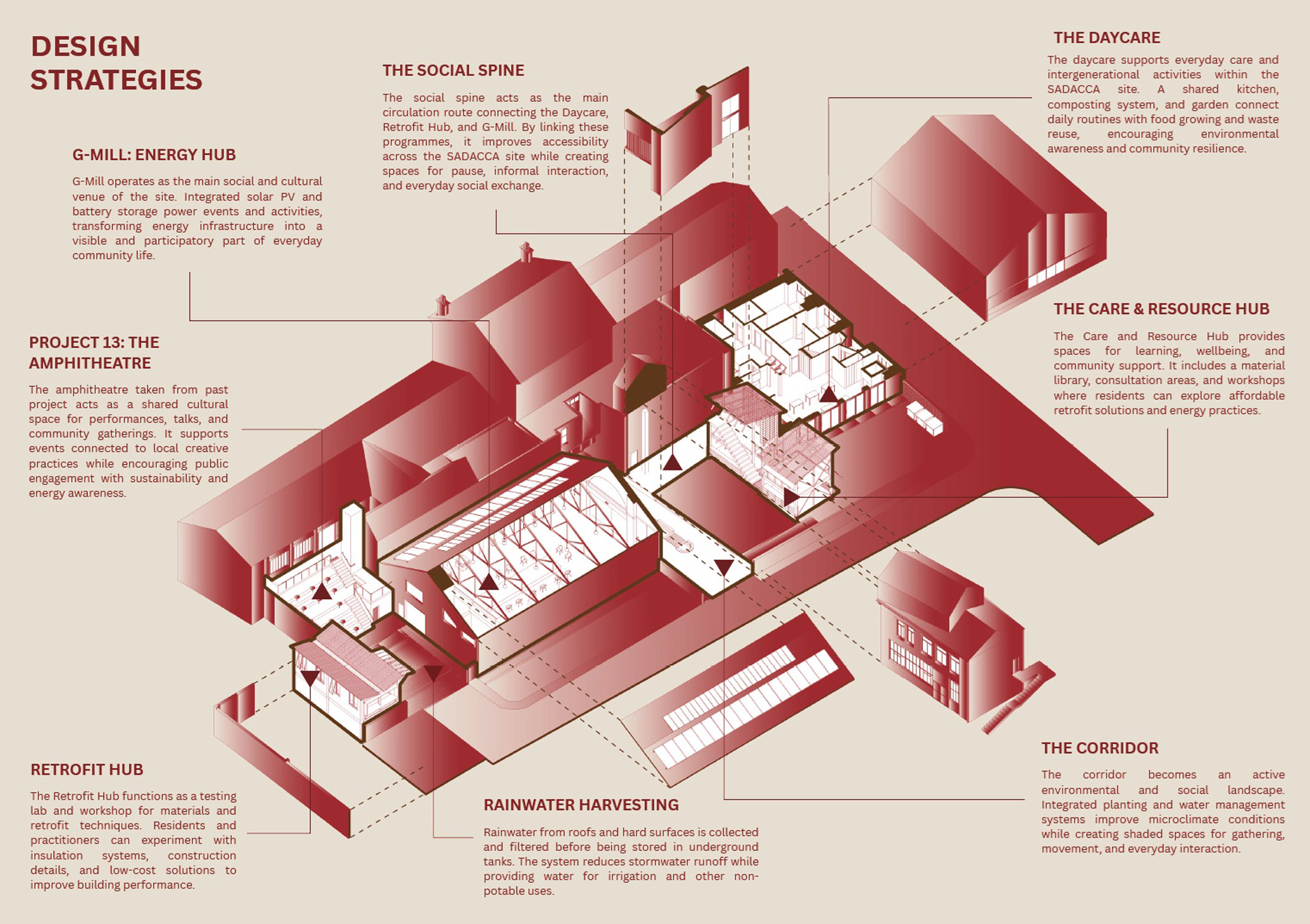
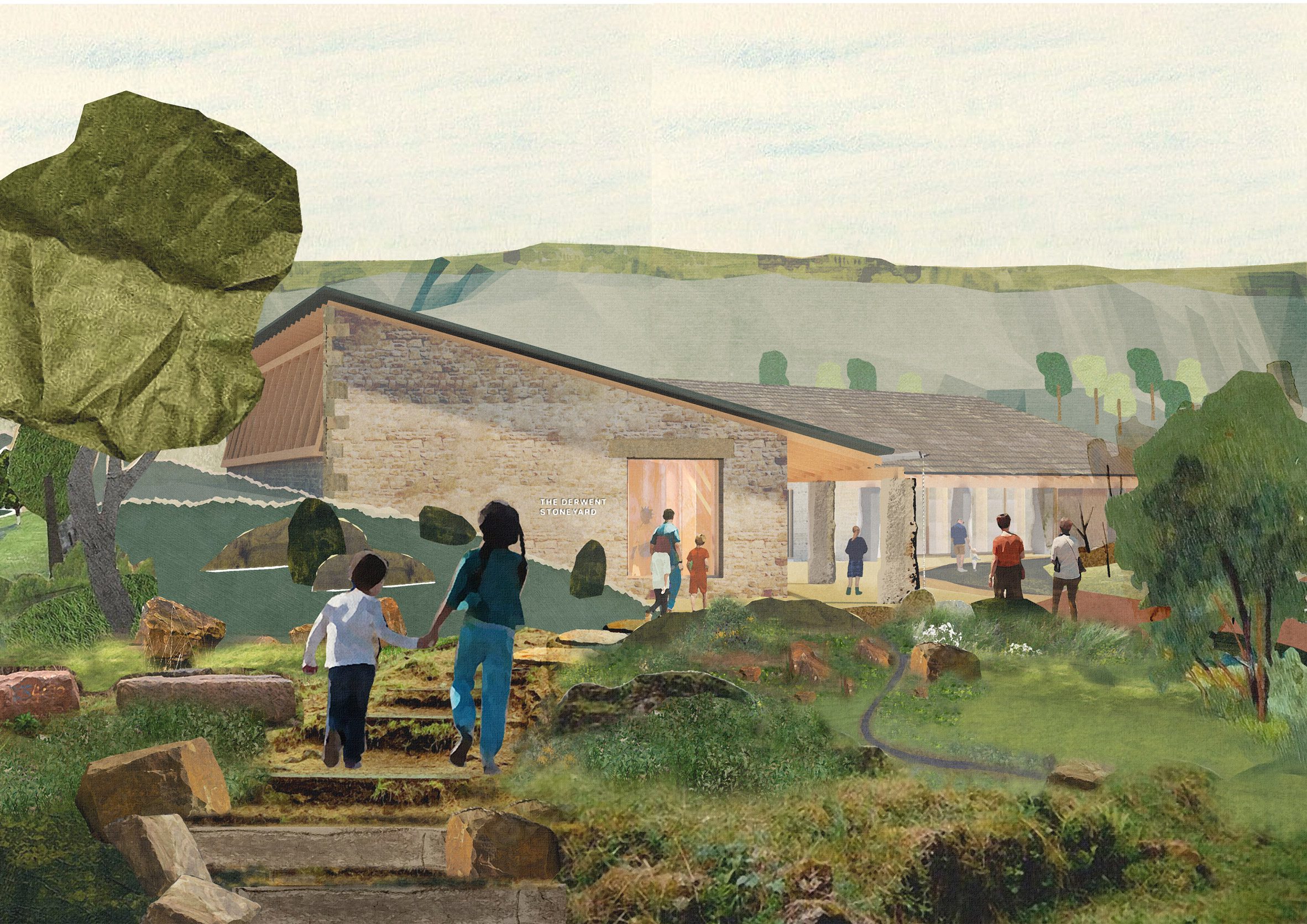
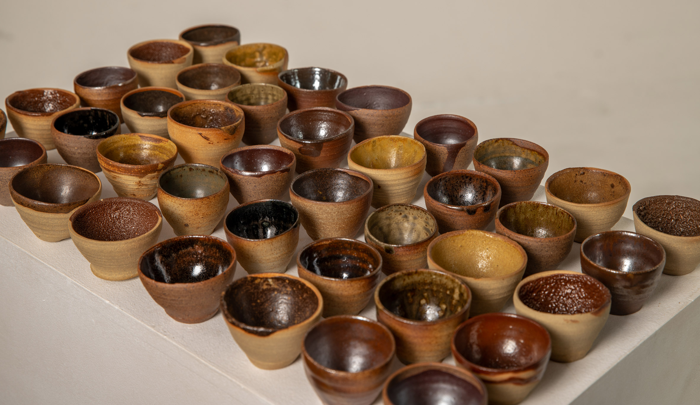
Kilnscape by Hanin Ali
"Julfar pottery is a significant part of Ras Al Khaima's cultural identity. However, it is at risk of disappearing due to the lack of people who practice it, and due to the kilns slowly deteriorating.
"Kilnscape is a museum that exhibits artefacts and protects kiln remains, while also operating as a pottery school where new generations can learn and experiment with the craft through hands-on experience.
"By combining exhibition, education and practice, the project encourages an active engagement with pottery.
"The goal is to transform Julfar pottery into a living tradition in which the past and present coexist, allowing the craft to be preserved, shared and carried forward into the future."
Student: Hanin Ali
Course: ARCH 502 – Architectural Studio X
Email: hanin.daryanavard[at]mymail.aud.edu
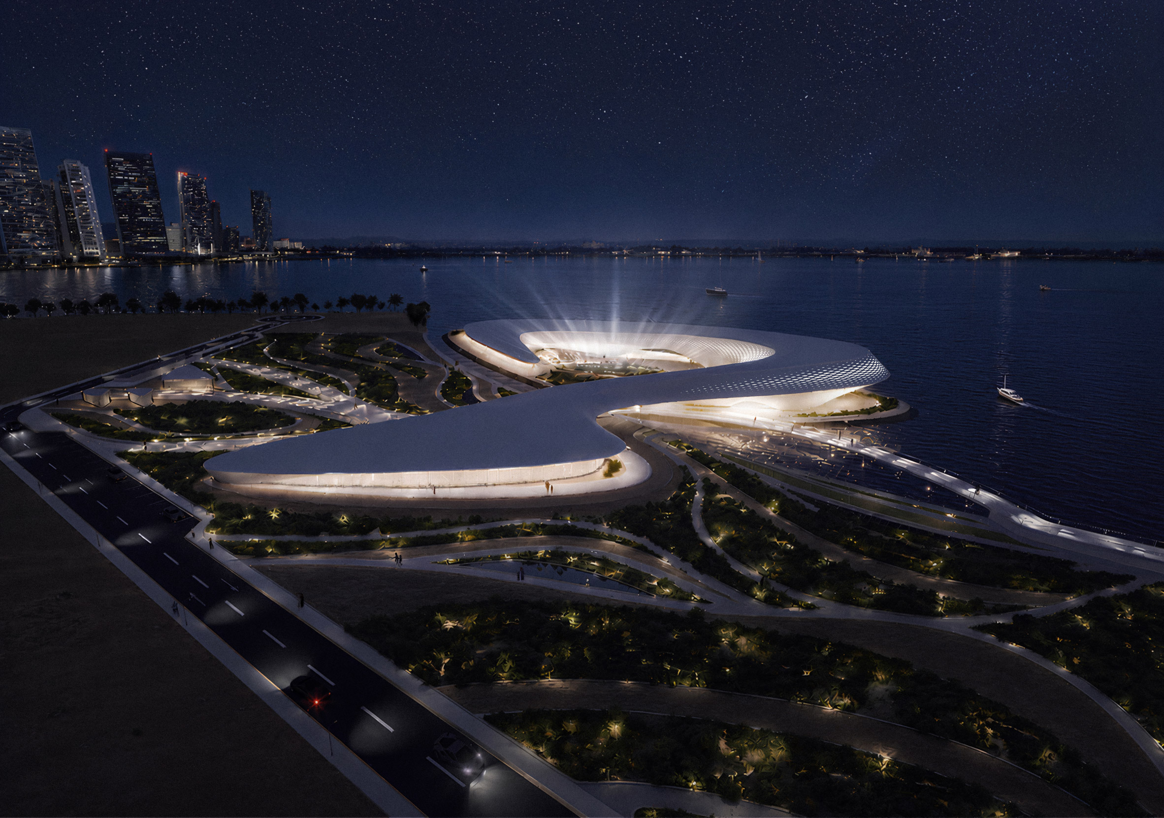
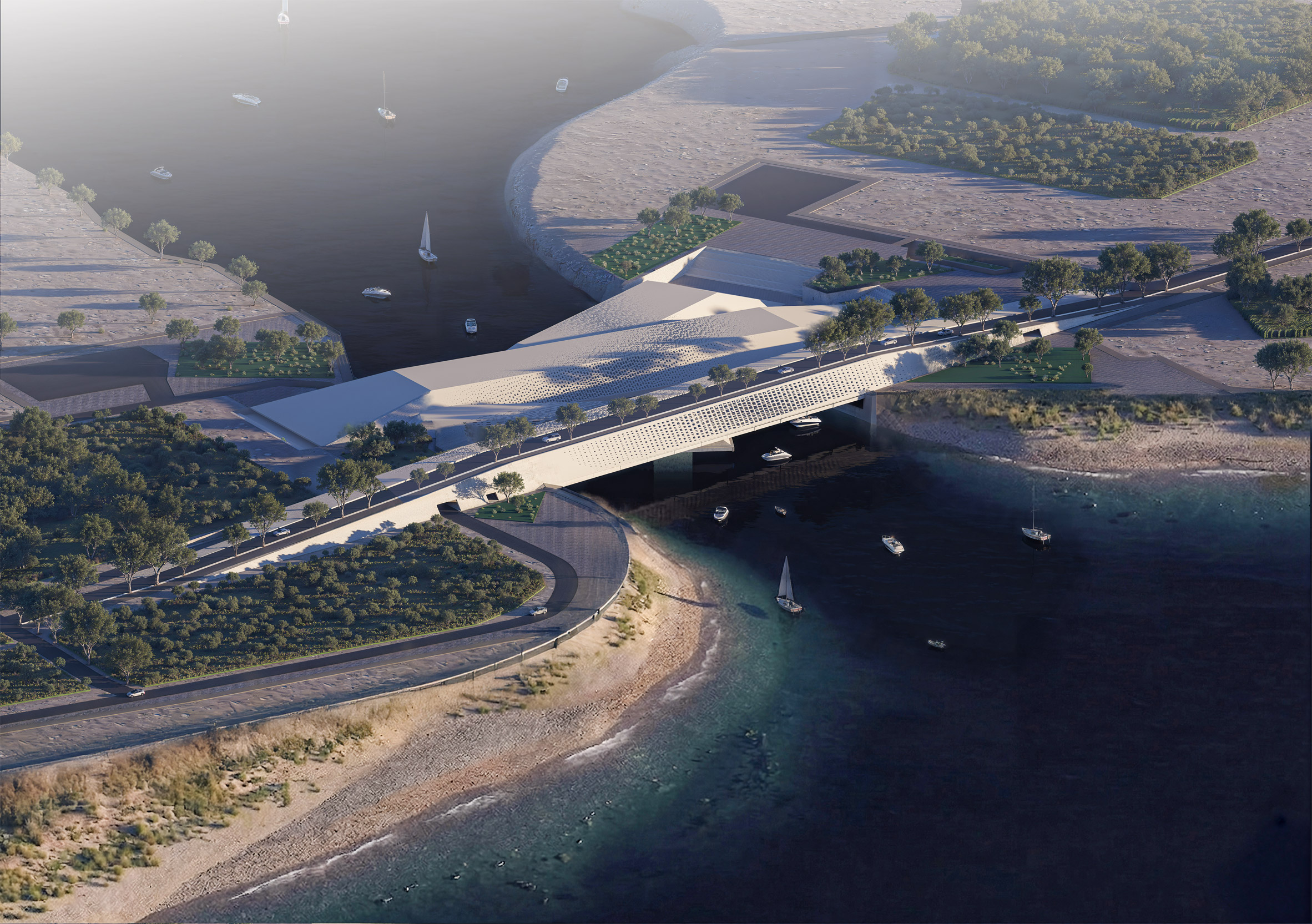
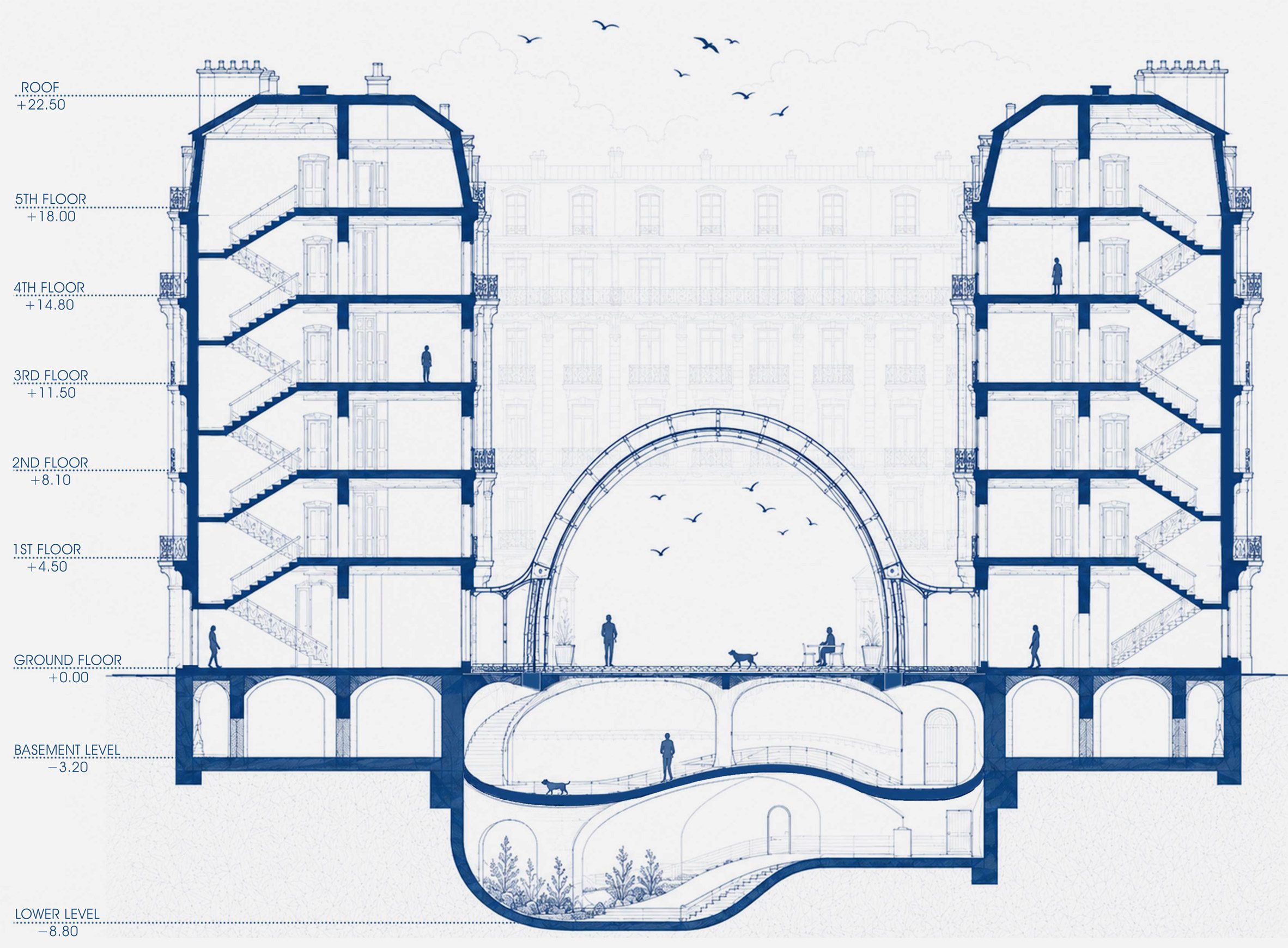
Unfolded by Sima Assaf
"Mass tourism has turned Petra – one of the world's most important UNESCO-protected sites – into a landscape under pressure. Visitors come to admire Petra, but the intensity of this admiration has begun to harm the very site they came to see.
"Unfolded begins with this problem. It asks: how can architecture protect Petra without hiding it, controlling it or competing with it?
"The project responds by creating a visitor centre where movement slows down and visitors rest before reaching the most fragile area. It's a place where the story of Petra can be understood beyond a single photograph.
"The project is placed strategically to unfold new parts of Petra. The centre introduces new routes, framed views, shaded paths, exhibitions and gathering spaces that guide people toward a wider understanding of the site.
"By revealing overlooked areas, the project aims to spread tourism more evenly across Petra and reduce the pressure on the places that are currently over-occupied."
Student: Sima Assaf
Course: ARCH 502 – Architectural Studio X
Email: sima.assaf[at]mymail.aud.edu
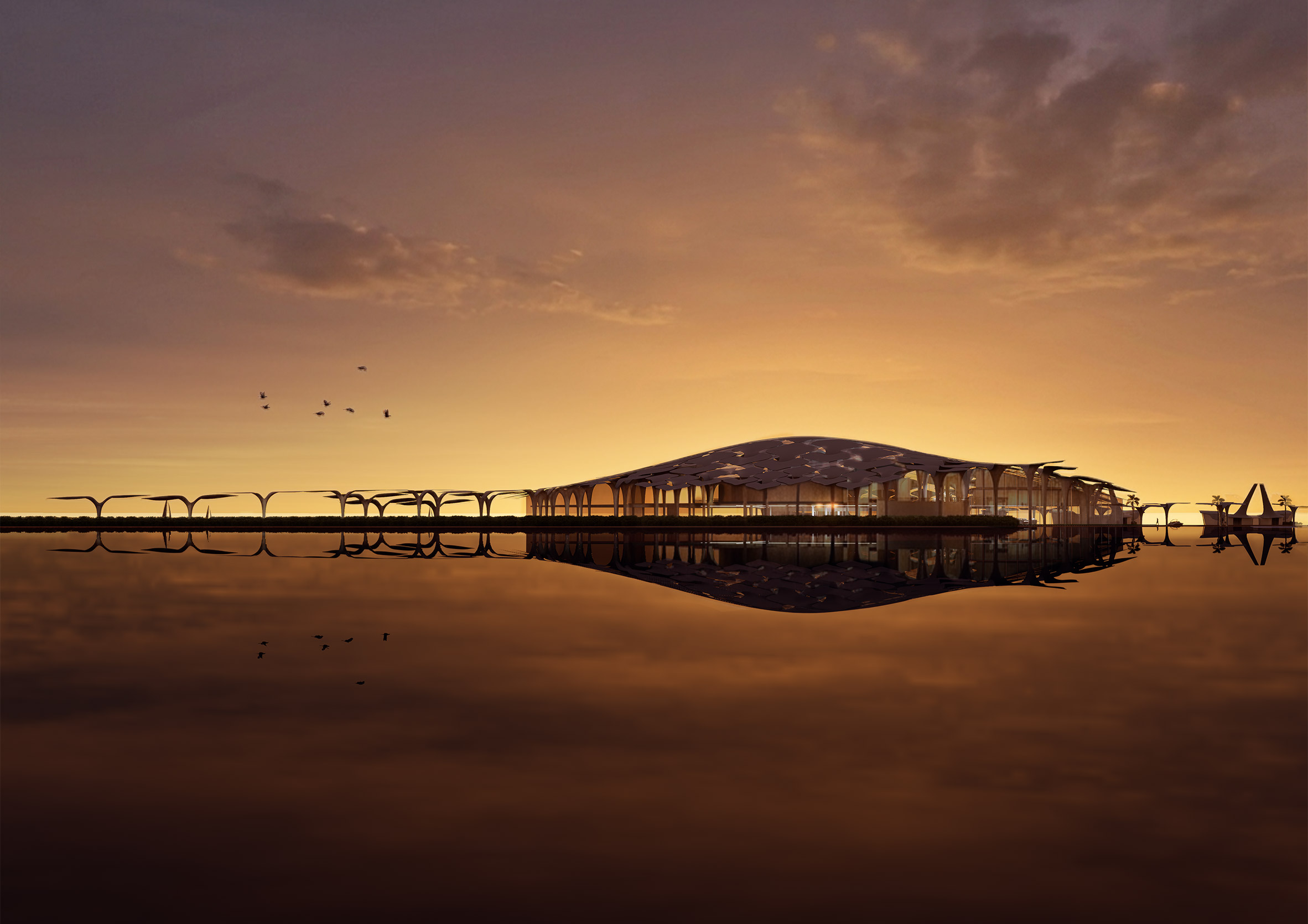
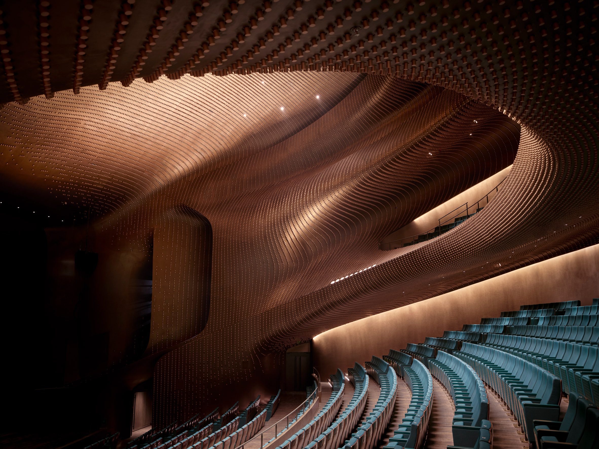
Insiyab by Mohammed Saeed
"Insiyab explores the revival of Arabic poetry in Dubai through architecture that listens, gathers and transforms voice into spatial experience.
"The thesis begins from the idea that sound has shaped collective memory, identity and cultural life across the Arab world.
"Before poetry was preserved through writing, it lived through rhythm, silence, echo, repetition and shared listening. The spoken verse carried values and social memory from one generation to another.
"Insiyab is a poetry performance hall and civic centre that brings oral heritage back into public life. The concept shapes the building as a sound buffer between the noise of the city and an inner world of listening.
"The project uses Grasshopper for seating organisation, acoustic studies, roof panel development and sound ray testing, allowing the architecture to respond directly to performance, listening and spatial acoustics."
Student: Mohammed Saeed
Course: ARCH 502 – Architectural Studio X
Email: mohammed.saeed[at]mymail.aud.edu
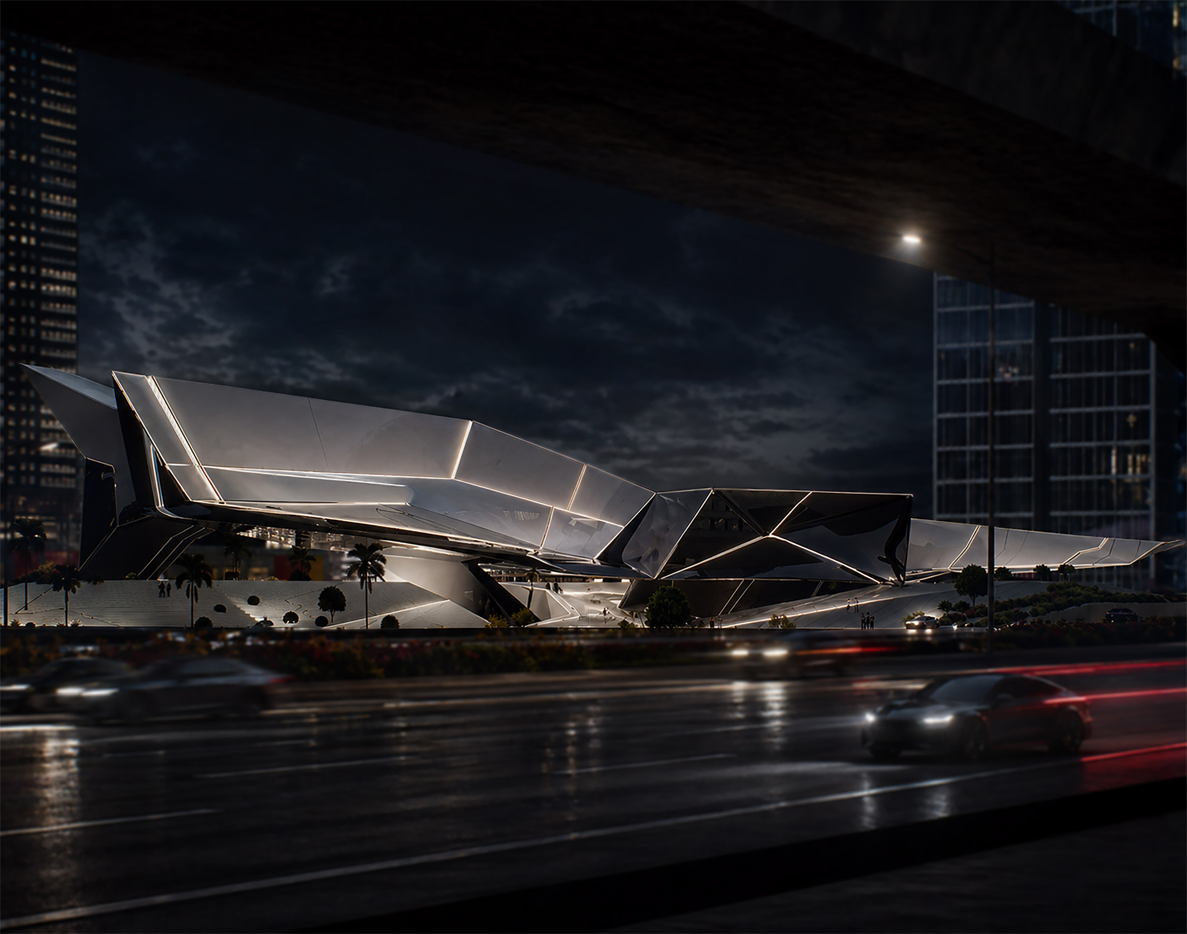
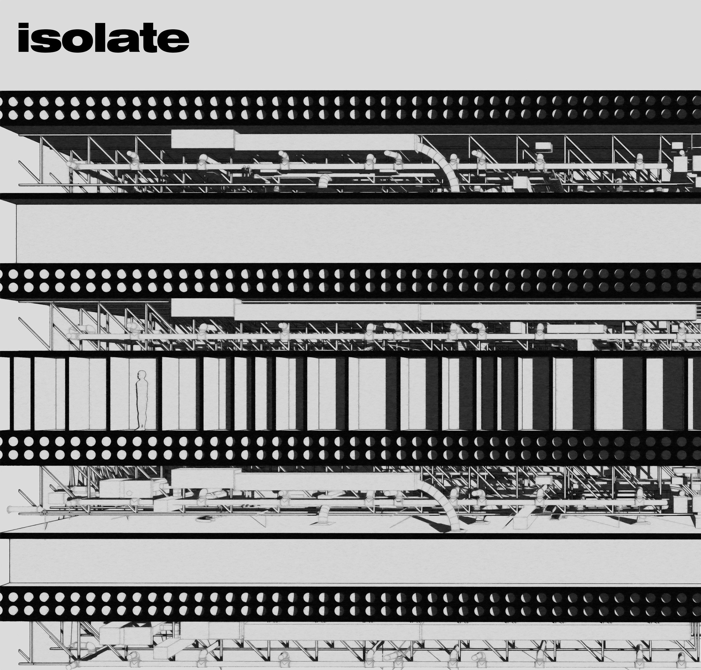
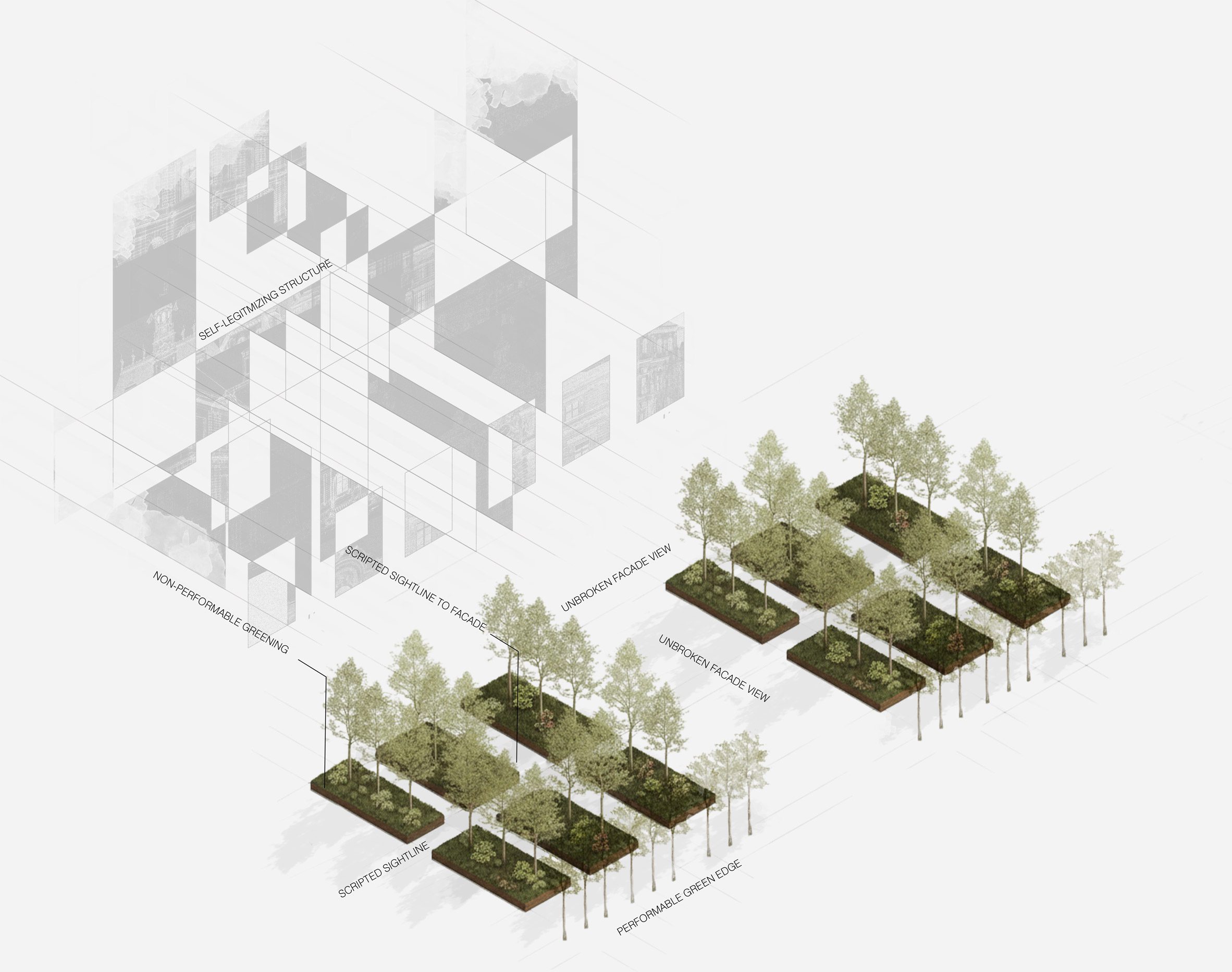
The Contraform by Ammar Raj
"Contraform explores how architecture can respond to the invisible systems of AI and surveillance that shape contemporary urban life.
"The project operates within a highly monitored environment where movement, behaviour and identity are constantly observed.
"Rather than resisting these conditions directly, it transforms surveillance pressures into spatial strategies that distort visibility, slow circulation, and reduce predictability.
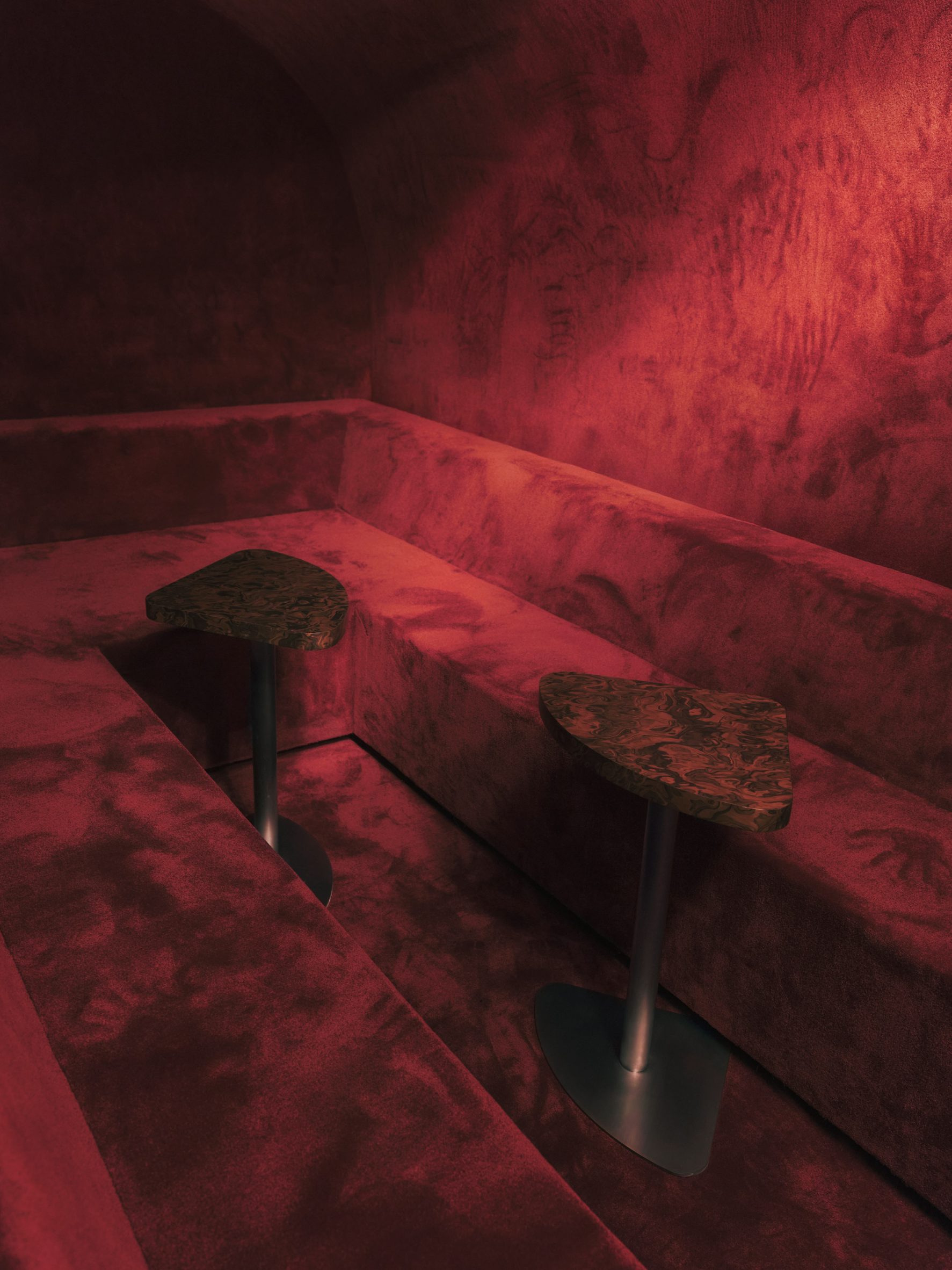
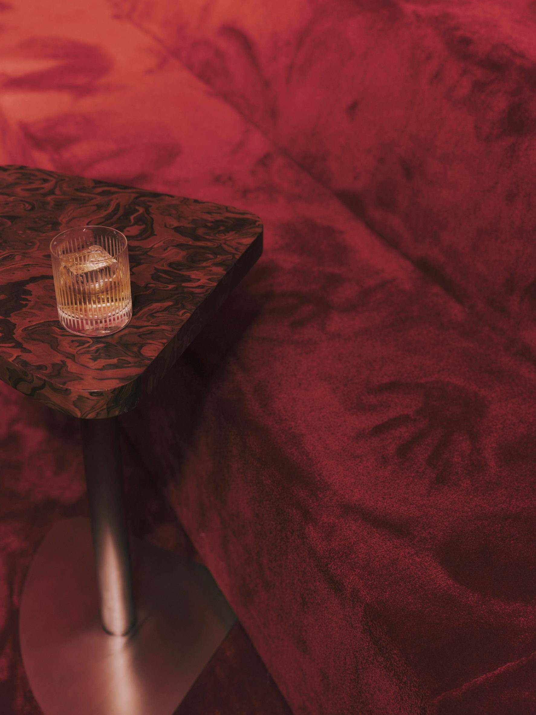
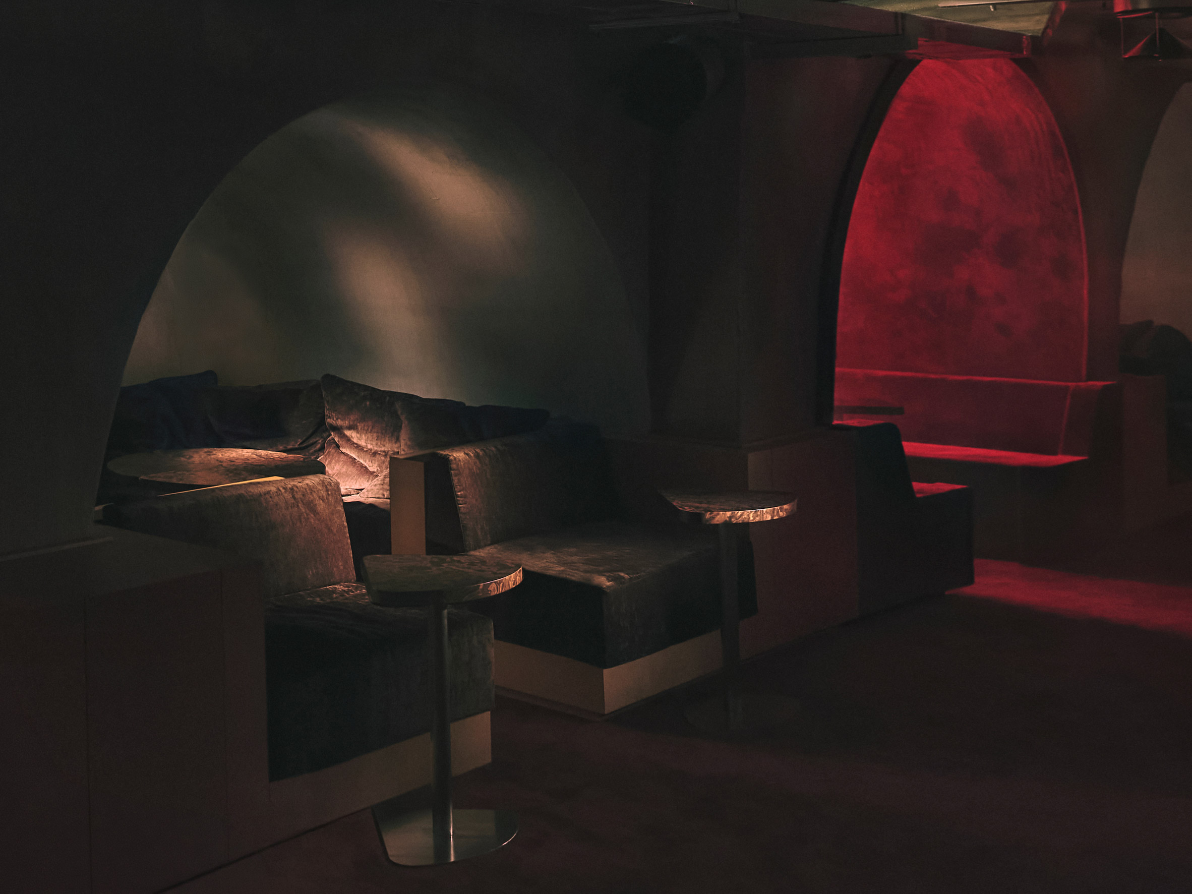
"At the centre of the project is the Black Box Retreat, a space designed for gradual disconnection. As users descend, the architecture thickens, compresses and fragments, disrupting sight lines and limiting exposure to both physical and digital surveillance.
"The project presents architecture as an evolving interface between human agency and systemic observation. By embracing uncertainty as a design strategy, Contraform proposes a new spatial language that redefines how visibility, autonomy and control are experienced and negotiated within the contemporary city."
Student: Ammar Raj
Course: ARCH 502 – Architectural Studio X
Email: ammar.raj[at]mymail.aud.edu
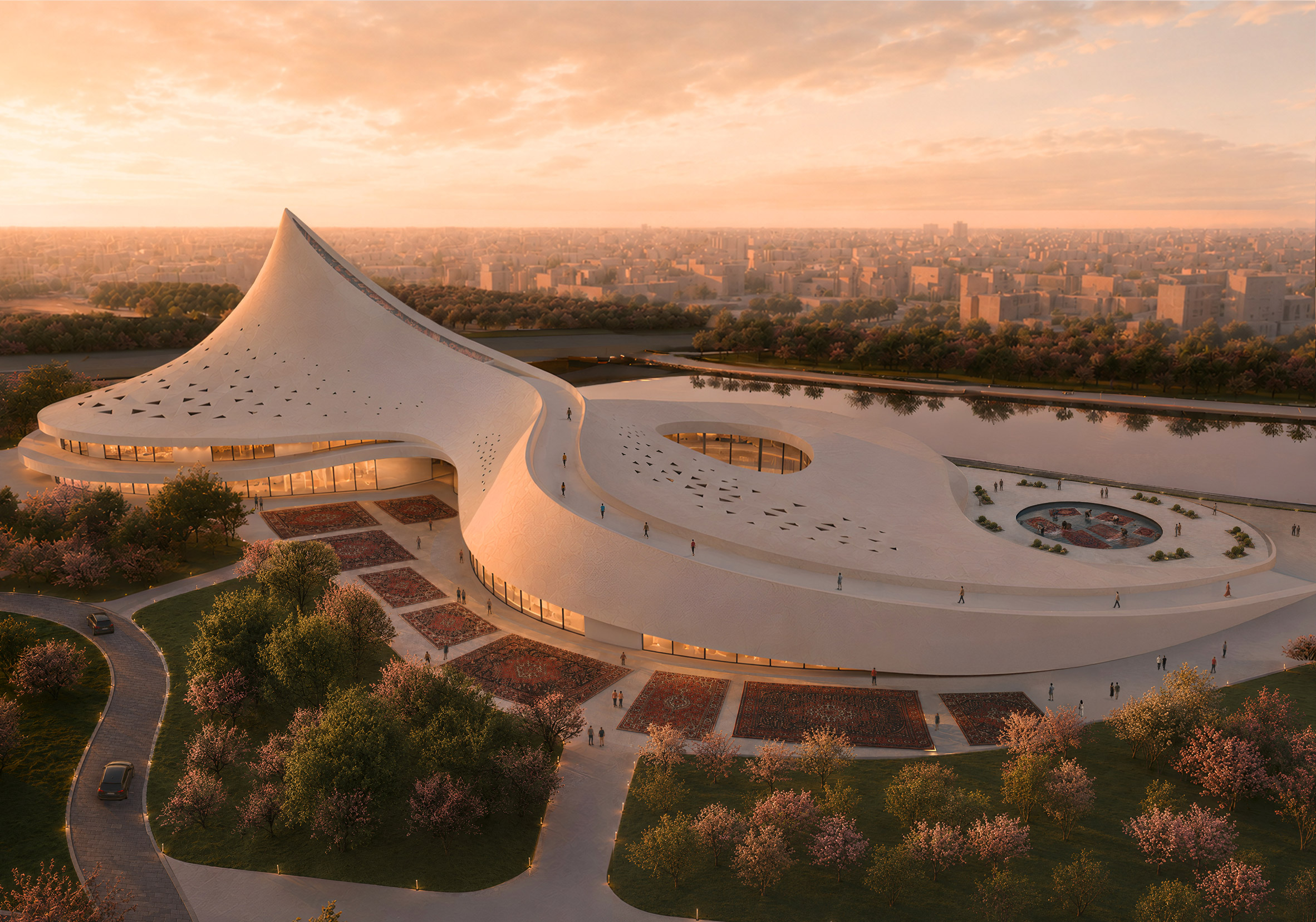
Woven Sounds by Marieh Khalighinasab
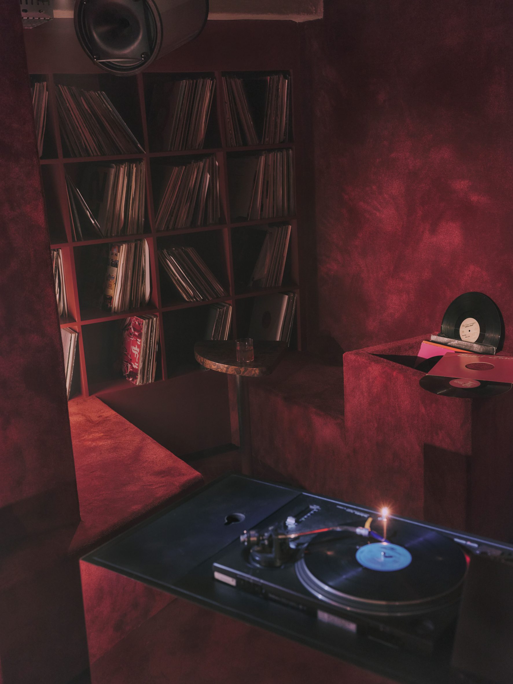
"Woven Sounds explores the preservation of Persian carpet-making as a living cultural practice.
"While Persian carpets are celebrated worldwide as symbols of cultural heritage, the knowledge, oral traditions and collective processes behind their creation are gradually disappearing.
"Woven Sounds responds to this gap by proposing a live carpet museum that shifts focus from the carpet as an artefact to carpet-making as an active cultural process.
"Located in Isfahan, one of Iran's historic centres of carpet production, the museum becomes a space where weaving, learning and cultural exchange remain active parts of the visitor experience.
"Rather than functioning as a display space for artefacts, the project preserves and communicates the intangible heritage embedded within the craft.
"Opening toward the Zayandeh Rud and Marnan Bridge, the project connects craft, sound, memory and landscape, presenting carpet-making as a living tradition that continues to be practised, shared and heard."
Student: Marieh Khalighinasab
Course: ARCH 502 – Architectural Studio X
Email: marieh.khalighinasab[at]mymail.aud.edu
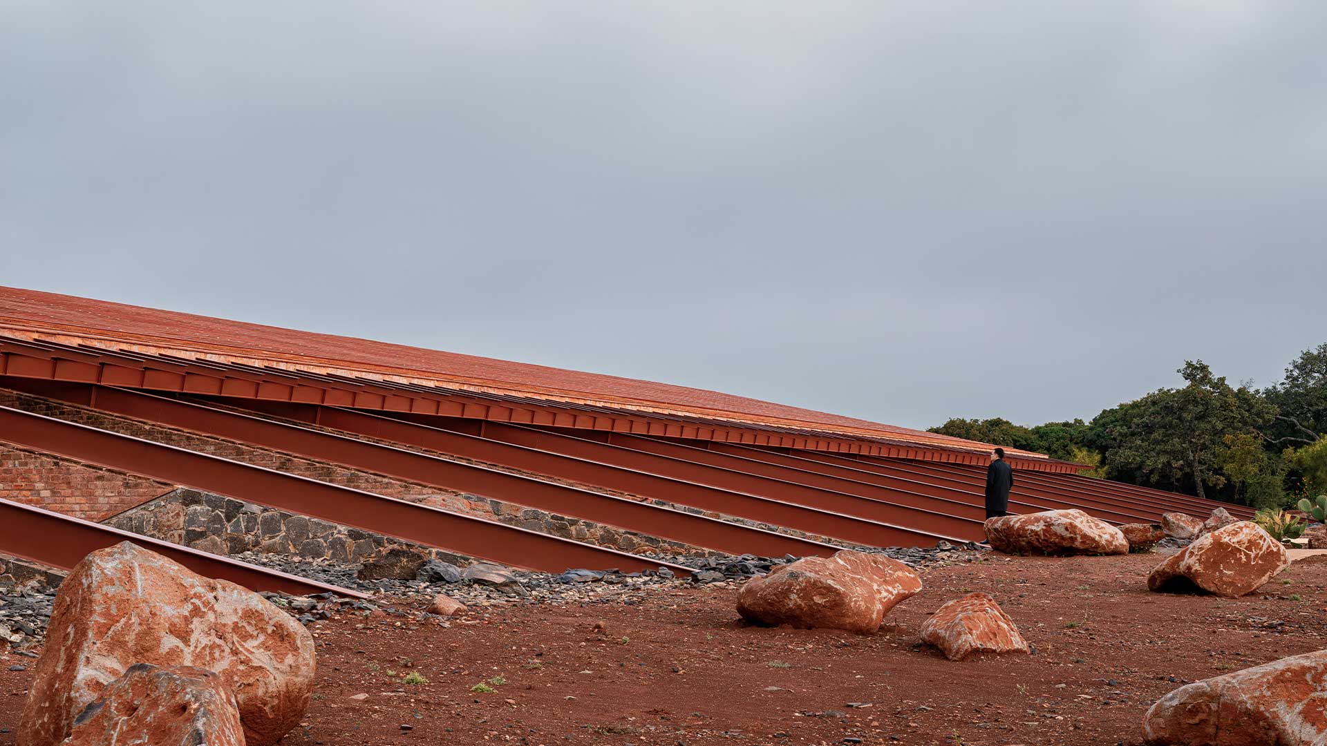
Al Silaa Desert to Destination by Rashed Ismail
"This project explores the intelligence of natural systems and the integration of ecology and architecture.
"Instead of imposing conventional hospitality infrastructure onto a fragile coastal desert, the design translates biological logic drawn from the Ghaf tree, Calotropis procera and desert microorganisms into architectural form.
"It's about building with nature's wisdom rather than against it.
"Taking inspiration from the Al Silaa coastal landscape and the Calotropis procera plant, the resort is organised around a field of funnel-shaped columns that simultaneously serve as structural supports, shading devices and atmospheric water-harvesting systems.
"Beyond Al Silaa, this project serves as a replicable prototype for desert eco-tourism across the Gulf, proving that when architecture truly learns from nature, it can be efficient, culturally rooted and deeply of its place."
Student: Rashed Ismail
Course: ARCH 502 – Architectural Studio X
Email: rashed.ismail[at]mymail.aud.edu
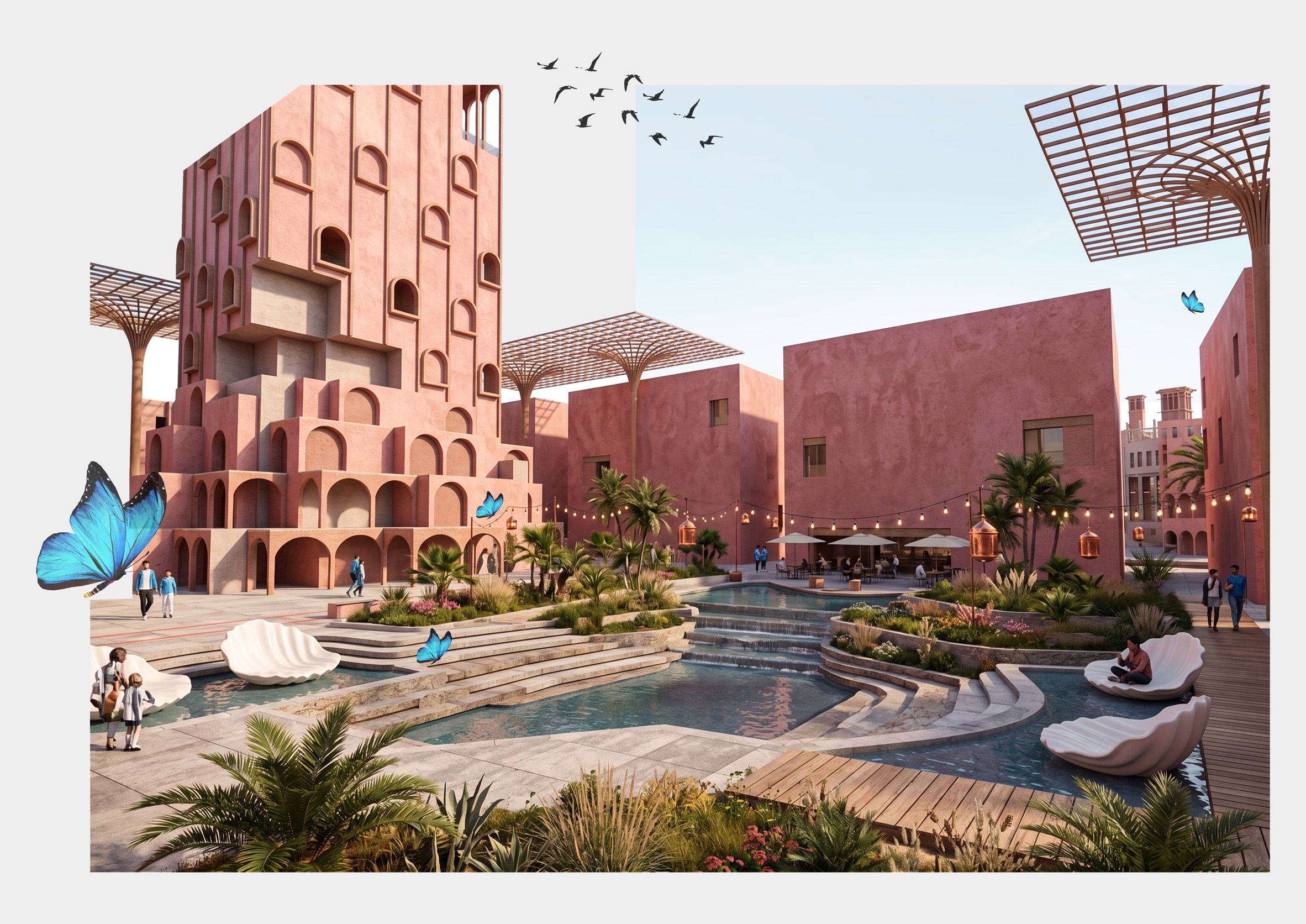
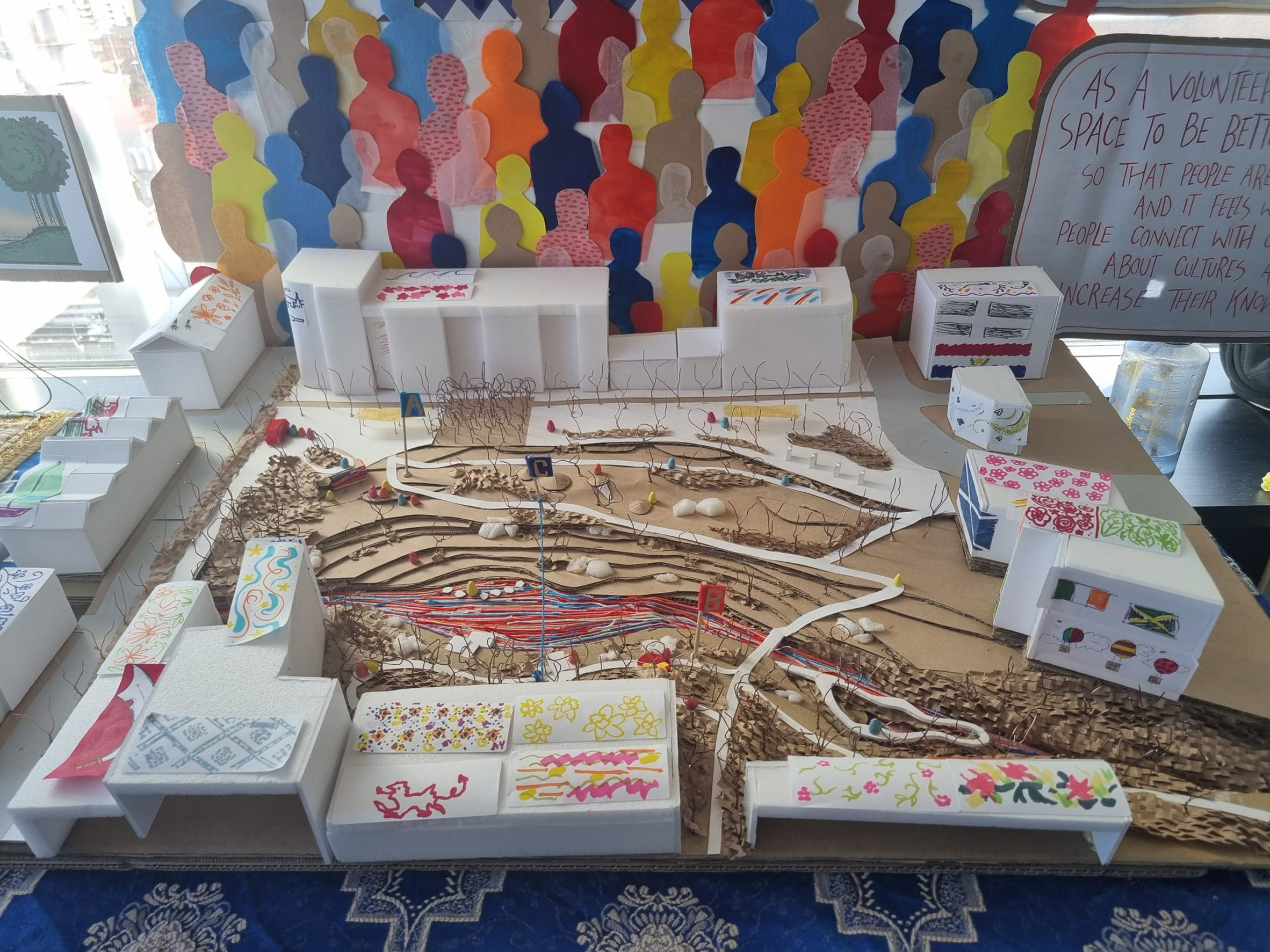
Souq ElTanbur by Areig Abdelmaguid
"Rooted in the living memory of Nubian displacement, this project asks: what does it mean to design for a culture that was physically removed from its motherland?
"The answer takes the form of a cultural market and gathering complex situated along the Egyptian Nile, one that treats culture not as something to be preserved, but as something to be lived in, traded in and celebrated out loud.
"This project uses architecture as an instrument of cultural reclamation, not through the literal reconstruction of what was lost, but through the creation of new spatial experiences that honour Nubian traditions of gathering, exchange and collective memory.
"The programme centres on a souq typology – a form historically embedded in the region's social and economic life – reinterpreted here as a platform for cultural continuity and community reactivation."
Student: Areig Abdelmaguid
Course: ARCH 502 – Architectural Studio X
Email: areig.abdelmaguid[at]mymail.aud.edu
Eternal Now by Tara Chopra
"Eternal Now explores how architecture can slow the perception of time within rapidly accelerating urban environments. Located within the Al Marmoom Desert Reserve in Dubai, the project responds to a growing disconnection from the natural and cosmic systems that once shaped how people understood the passage of time.
"Eternal Now proposes a wellness retreat that reconnects visitors with nature and the cosmos through architecture. The project is organised through a celestial framework derived from Orion and Canopus, two star systems historically significant within Arabian astronomy and navigation traditions.
"Embedded within the dunes, the architecture uses light, shadow, materiality and carefully framed views to make the passage of time physically perceptible.
"Residential, wellness and communal spaces are arranged to prioritise stillness, while preserving an uninterrupted relationship with the night sky."
Student: Tara Chopra
Course: ARCH 502 – Architectural Studio X
Email: tara.chopra[at]mymail.aud.edu
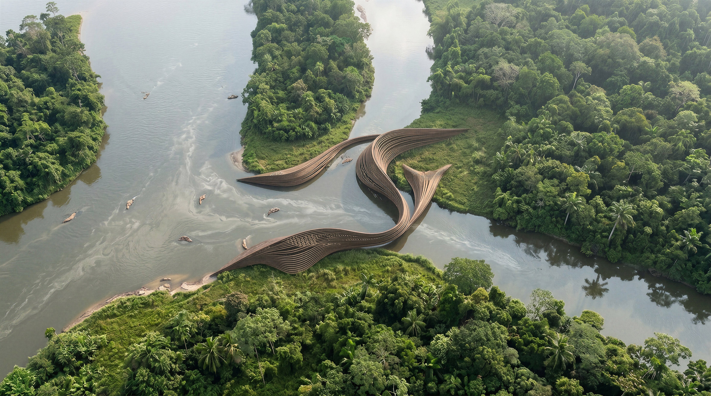
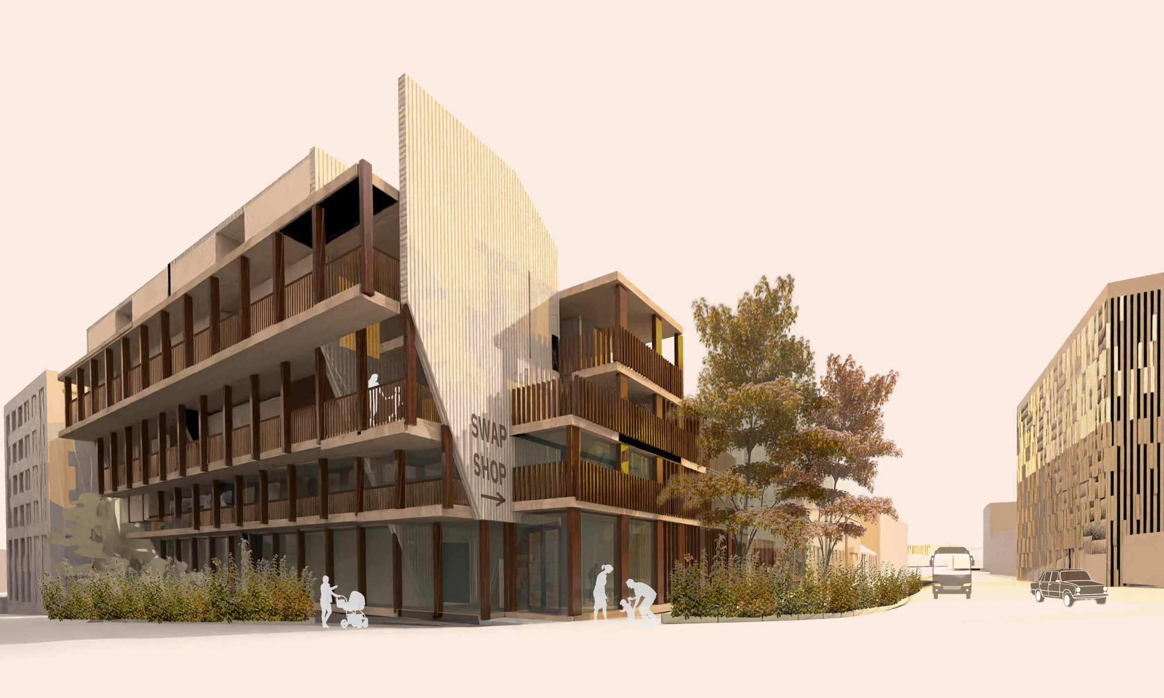
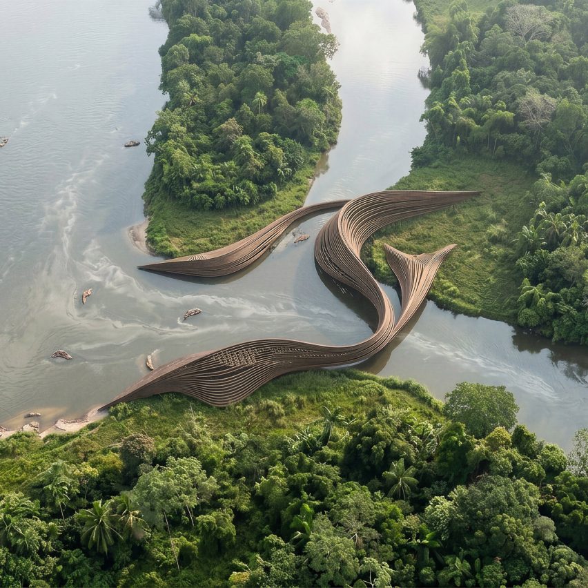
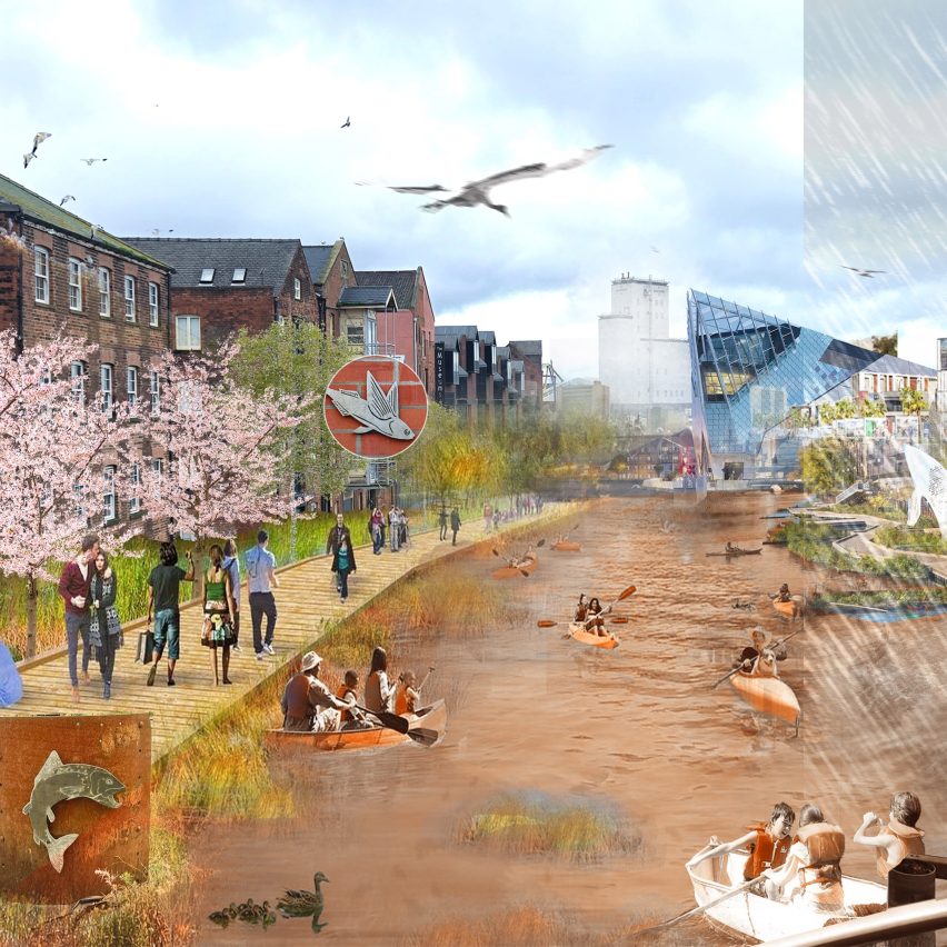
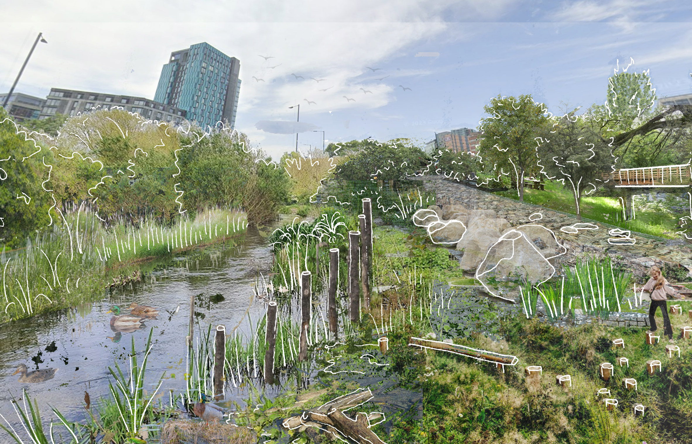
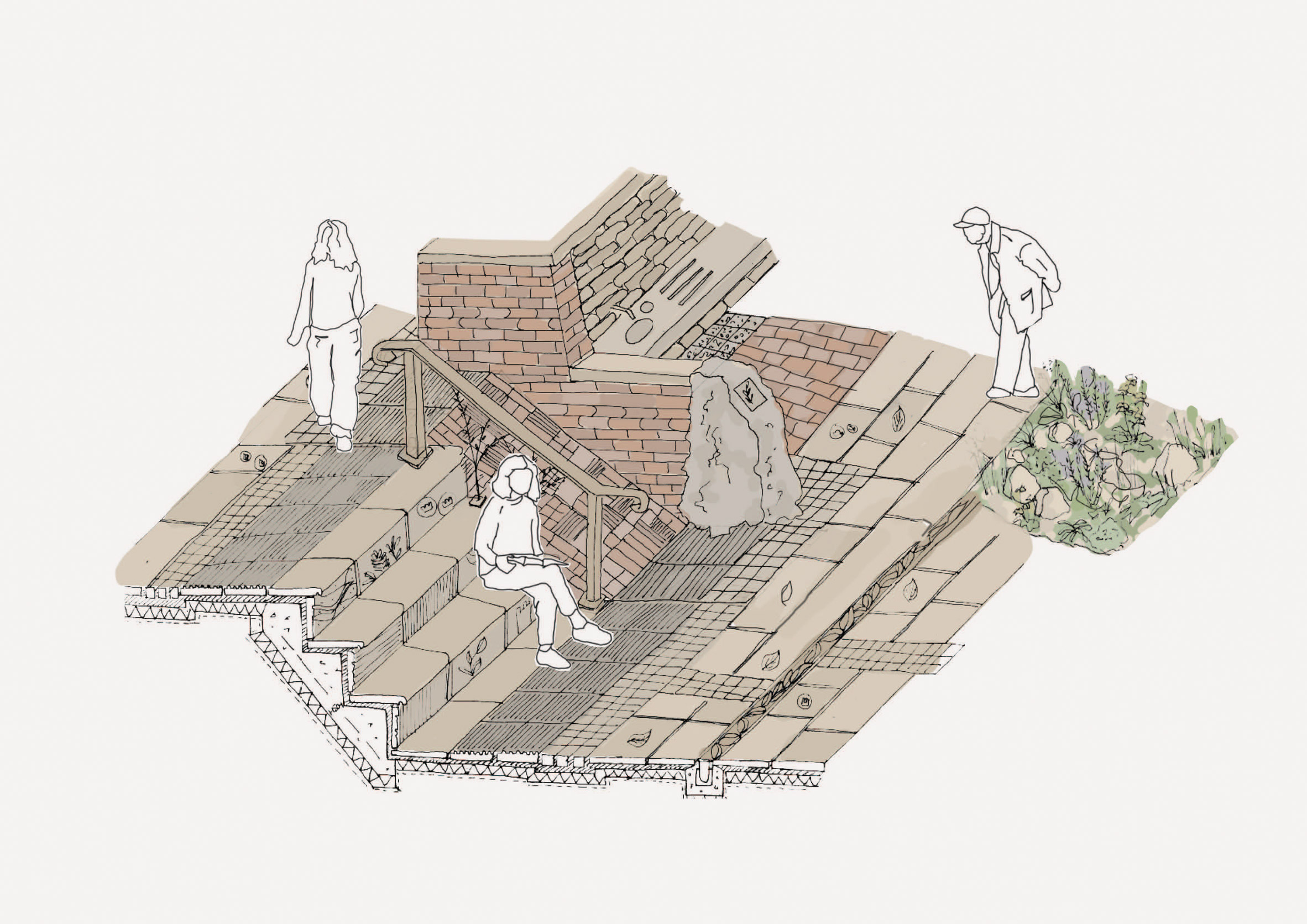
Magdalena: A Floating Corridor of Hope by Maria Somosa
"A Floating Corridor of Hope is an architectural thesis that addresses the challenges faced by displaced children and families living along Colombia's Magdalena River.
"By reimagining architecture as a tool for protection, education and community development, the project responds to the realities of conflict, displacement and limited access to essential services in some of the country's most vulnerable riverine territories.
"Located within one of Colombia's most important waterways, the proposal introduces a network of modular floating and anchored hubs that bring education, safe shelter and livelihood opportunities directly to riverside communities affected by displacement.
"The project delivers critical infrastructure to where it is needed most, creating safe spaces that foster learning, stability and social connection.
"Designed for flexibility and rapid deployment, the hubs can adapt to changing environmental and social conditions along the river.
"The system incorporates classrooms, community gathering spaces, workshops and areas for cultural exchange and skill development, providing children and families with opportunities to rebuild their lives while remaining connected to their communities and cultural roots."
Student: Maria Somosa
Course: ARCH 502 – Architectural Studio X
Email: maria.somosa[at]mymail.aud.edu
Partnership content
This school show is a partnership between Dezeen and American University in Dubai. Find out more about Dezeen partnership content here.
The post American University in Dubai promotes peace through culturally diverse projects appeared first on Dezeen.


