The Paper Fan Just Lost Its Ribs. It’s Better For It.The Japanese paper fan is one of those objects that seems to have already said everything it has to say. It’s been refined over centuries,...
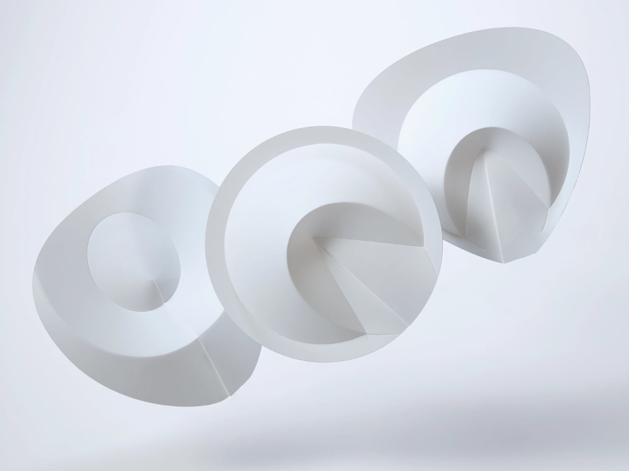
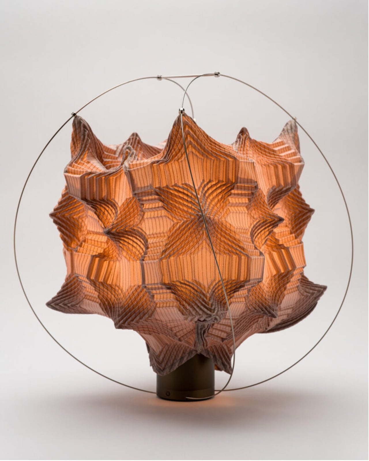
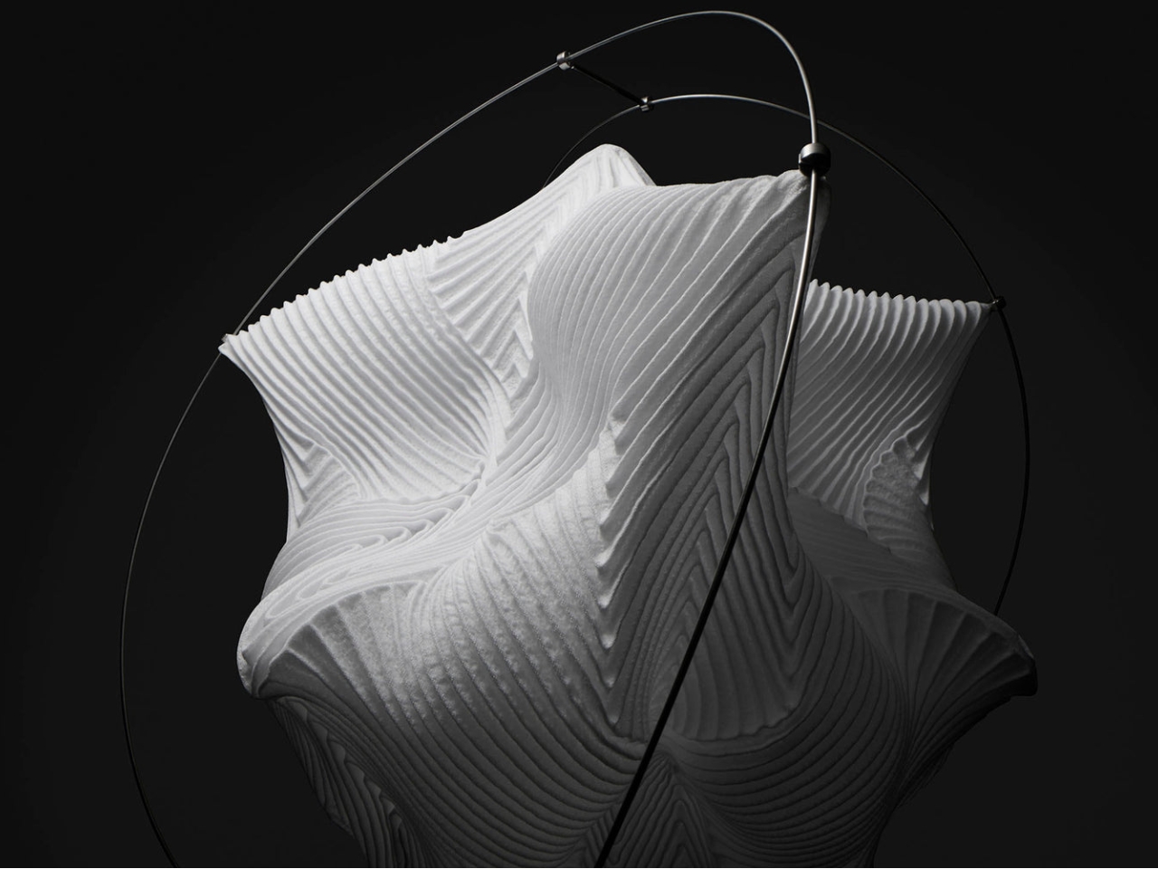
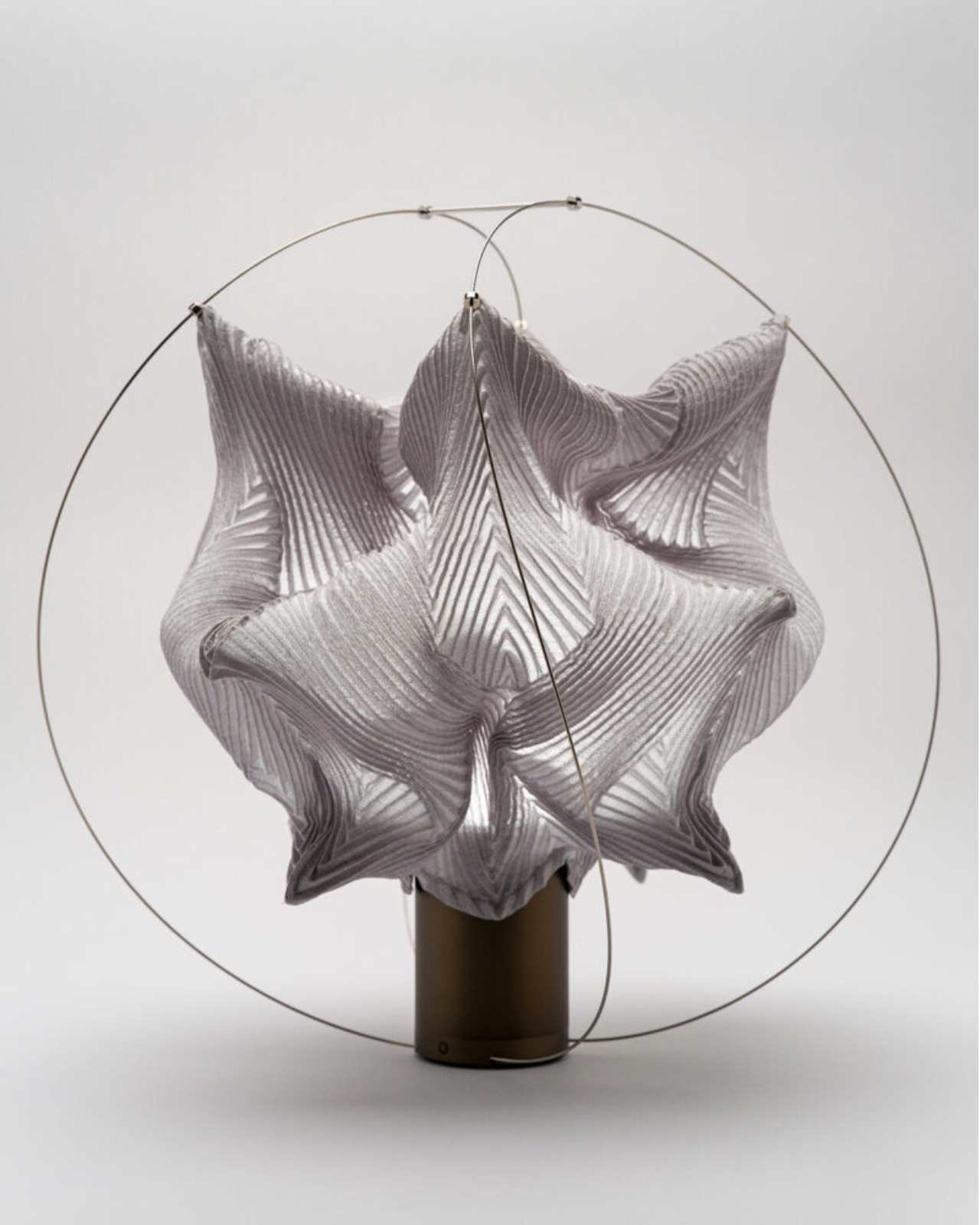
The Japanese paper fan is one of those objects that seems to have already said everything it has to say. It’s been refined over centuries, grown into a cultural icon, and been replicated so many times that it barely registers as a design object anymore. It’s just a fan. You flap it at yourself on a hot day and move on. So when KUMAnoTE and Professor Jun Mitani released Orikaze, a ribless folded paper fan that holds its shape through geometry alone, it felt like a genuinely unexpected development.
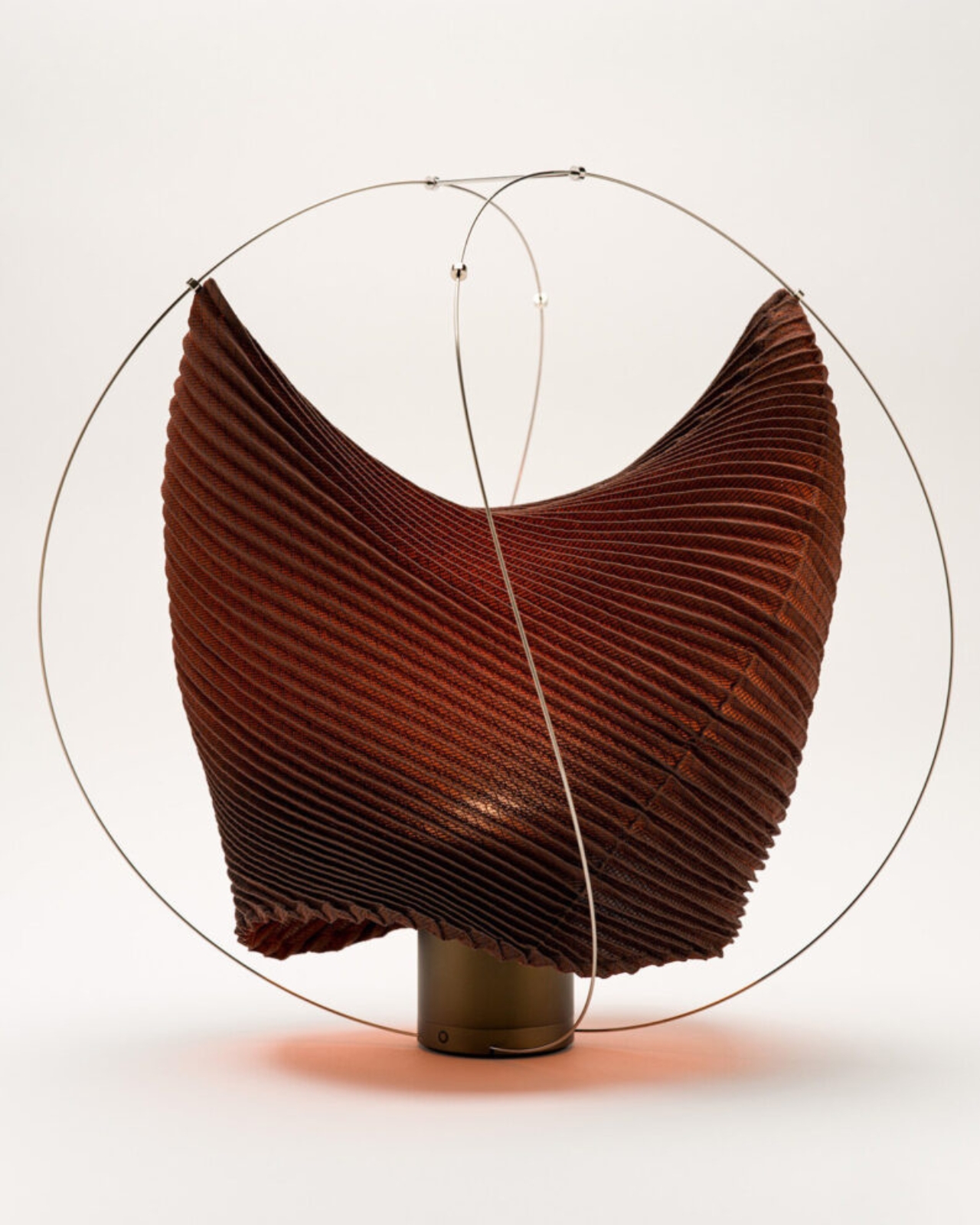
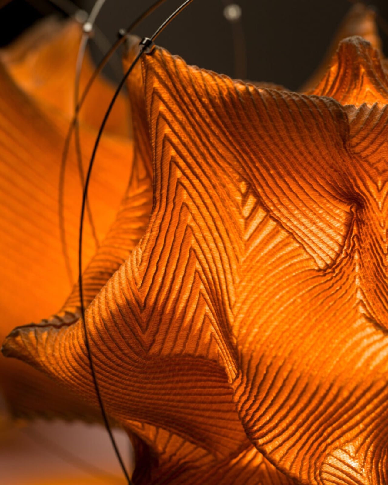
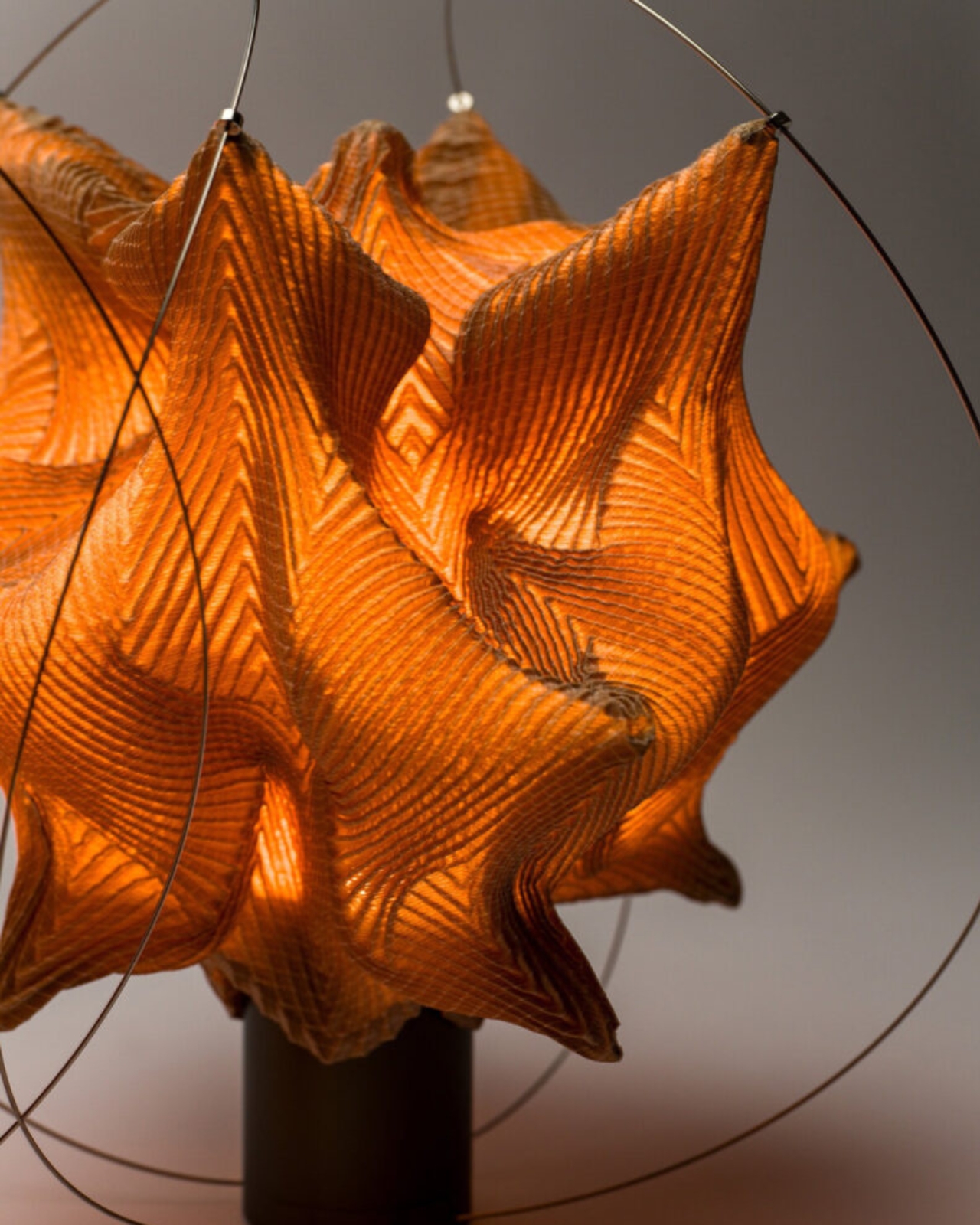
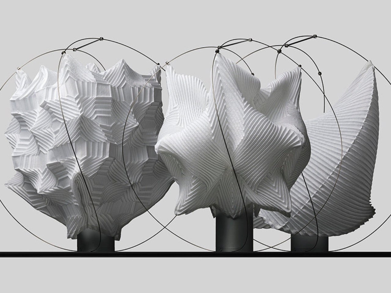
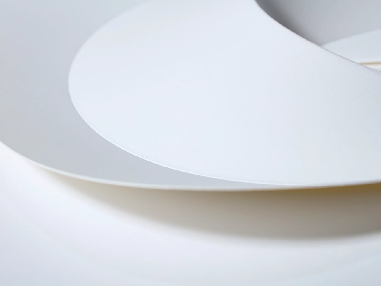
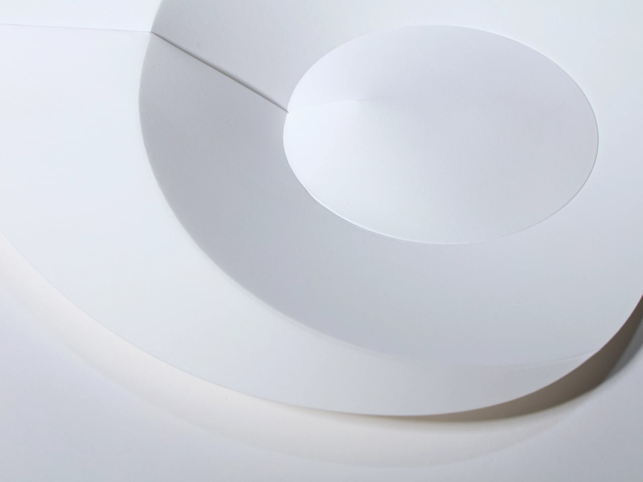
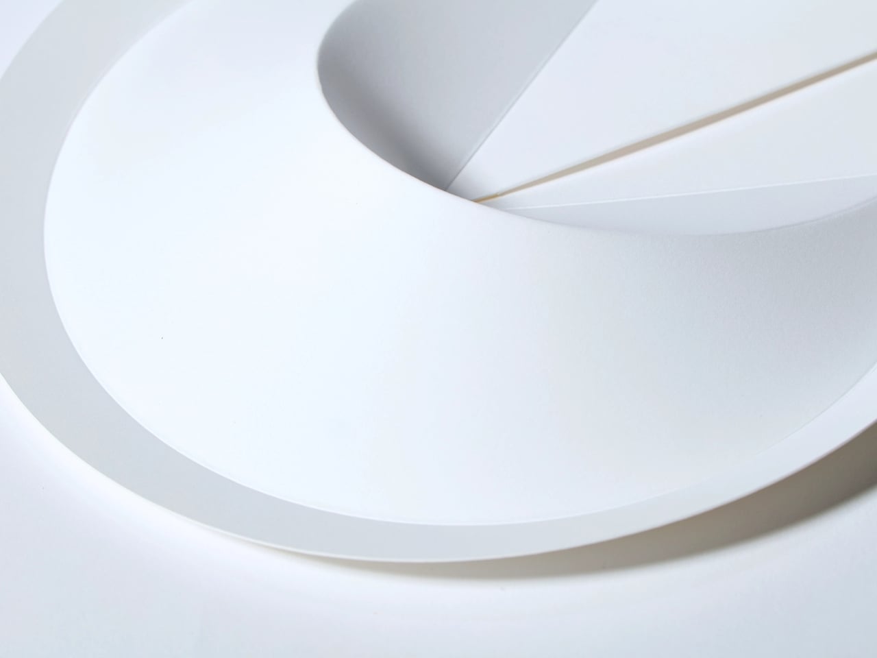
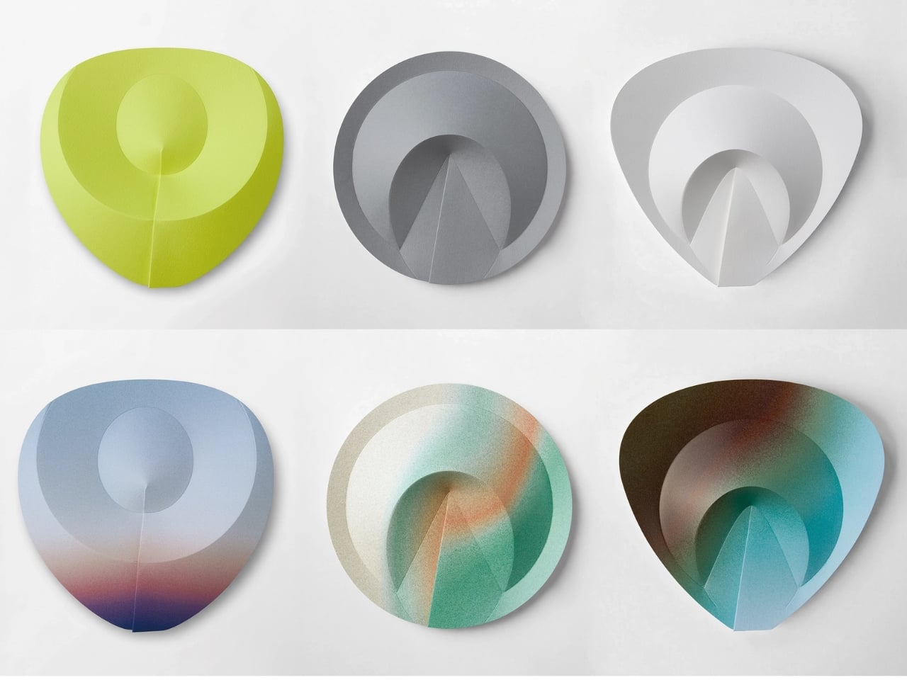
Let me explain the “ribless” part, because it’s more interesting than it sounds. Traditional Japanese fans, whether the folded sensu or the flat uchiwa, rely on an internal skeleton. Bamboo ribs, plastic frames, some kind of structure embedded within the paper to keep everything in shape. Without that skeleton, a fan is just a floppy sheet of material. Orikaze removes the skeleton entirely and replaces it with something far more elegant: the fold itself.
Designers: KUMAnoTE x Jun Mitani
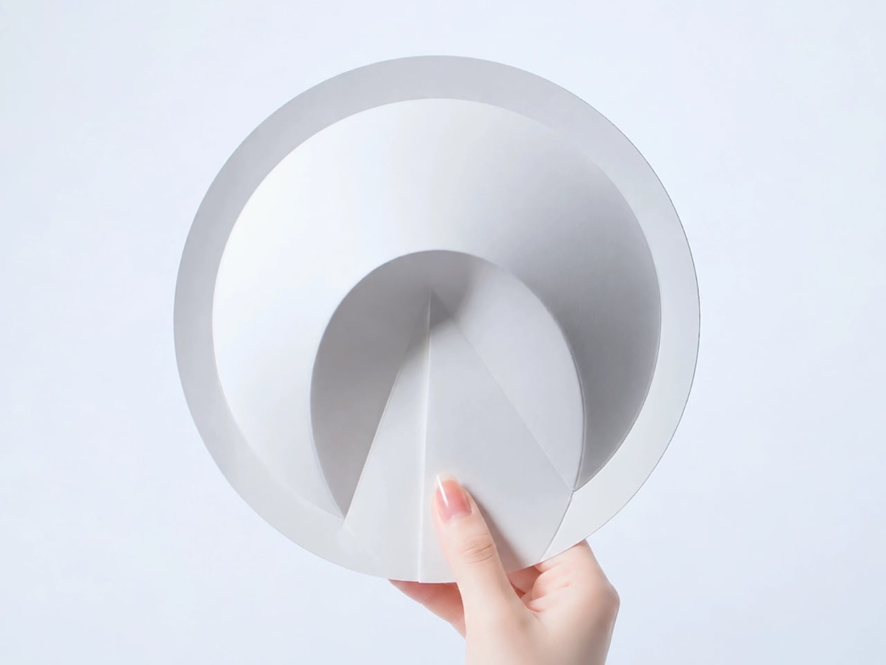
The design uses a system of mountain and valley folds that transforms a single flat sheet of paper into a self-supporting structure. The geometry does the engineering. The paper doesn’t need a spine because the folds create rigidity, distribute force, and hold the form together. Professor Jun Mitani, who researches computational origami at the University of Tsukuba, brought the mathematical backbone to this project, and you can feel that precision in the result. It’s not just a clever idea pitched in a studio meeting. It’s a concept grounded in real structural logic.
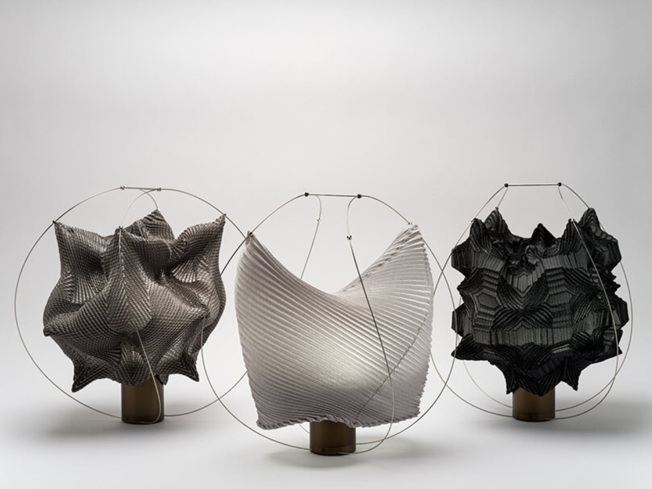
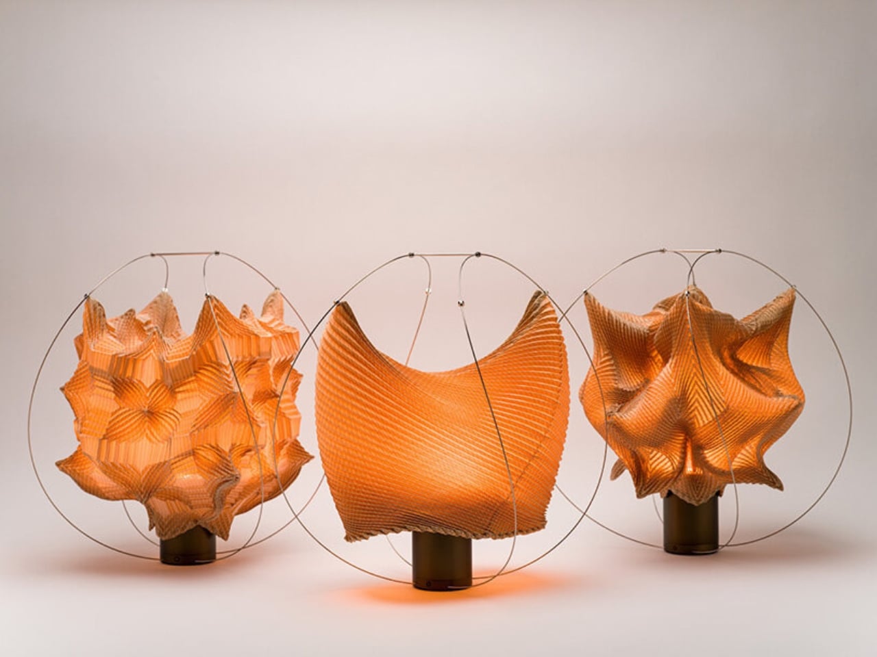
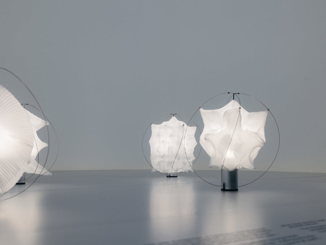
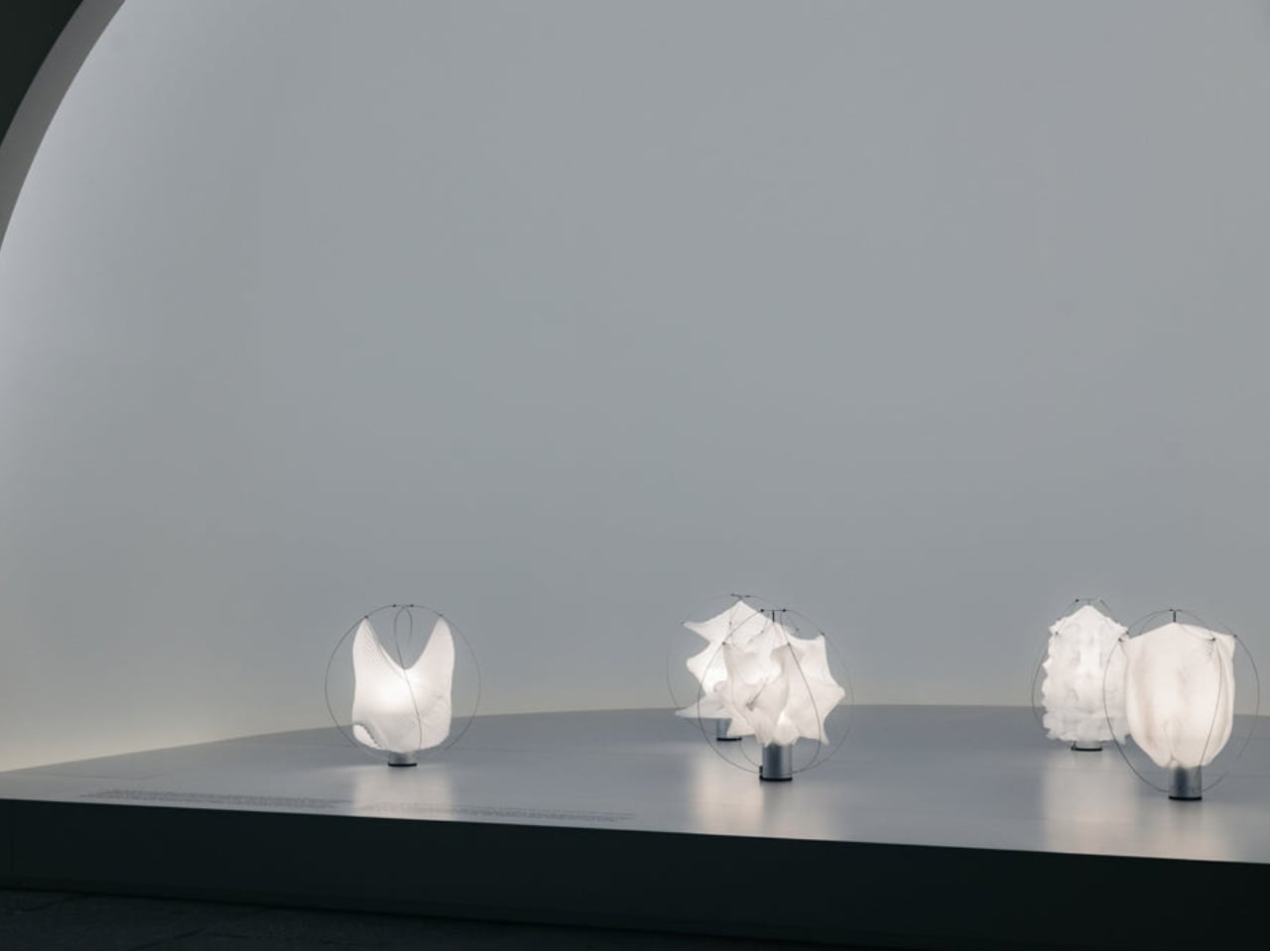
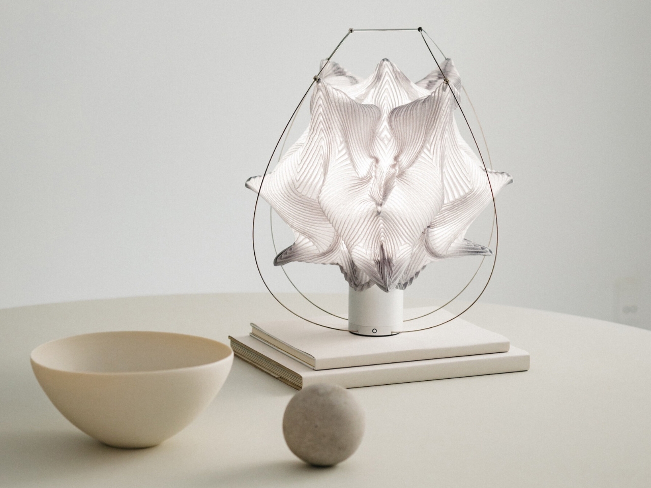
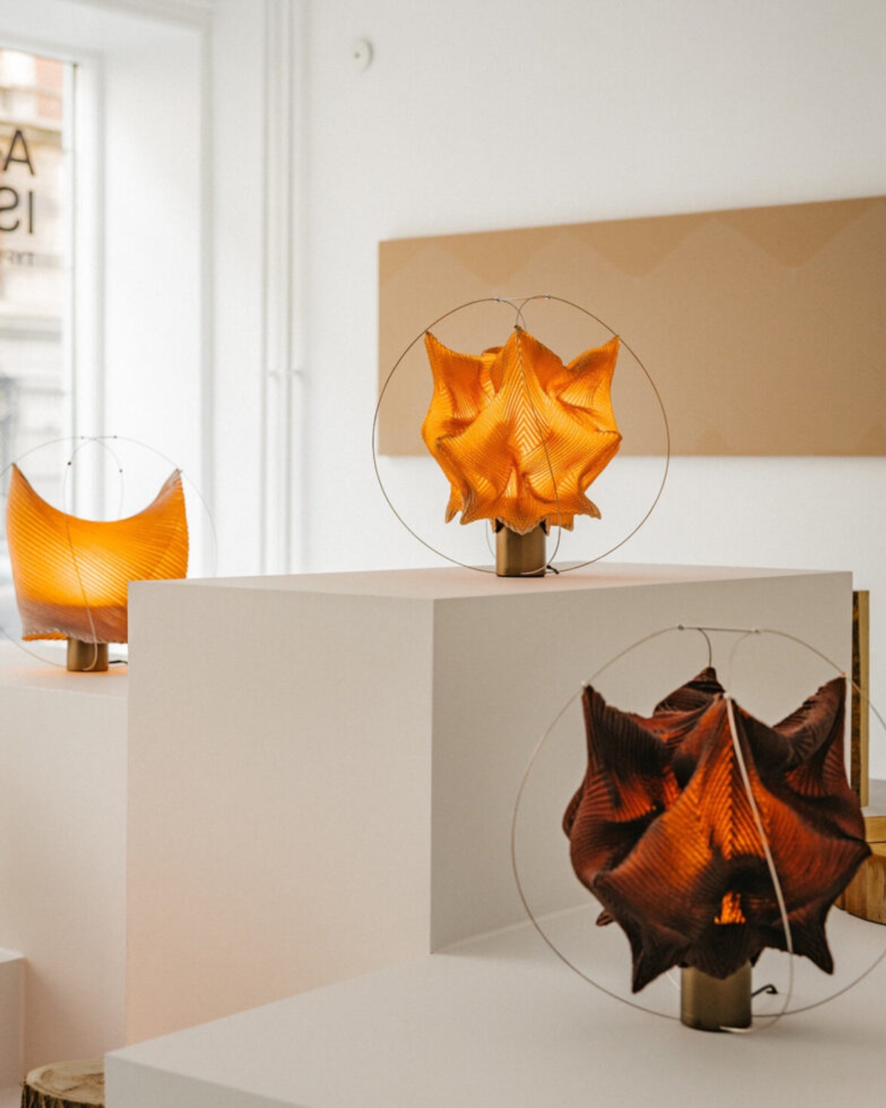
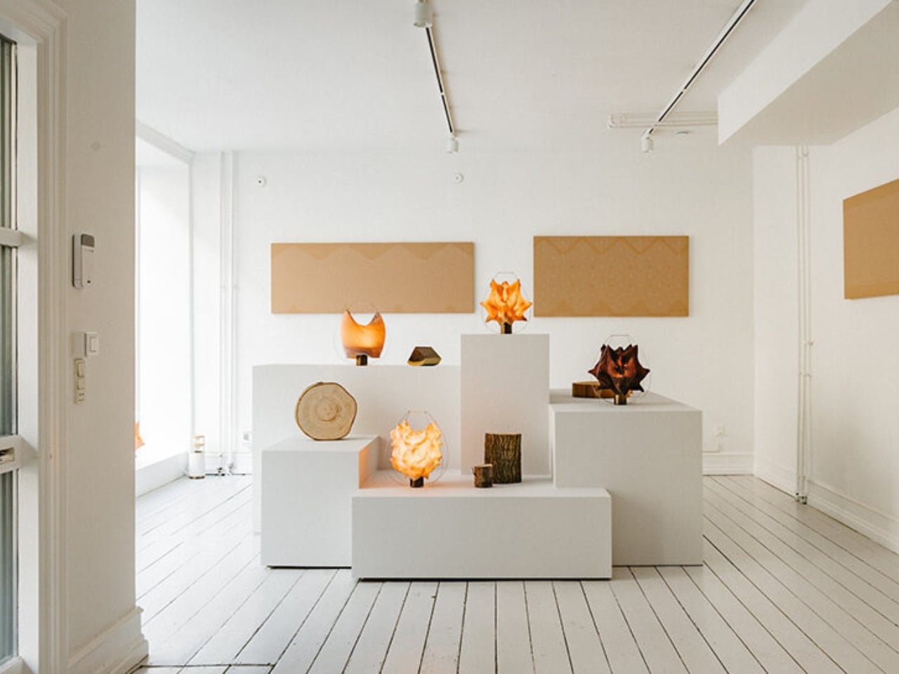
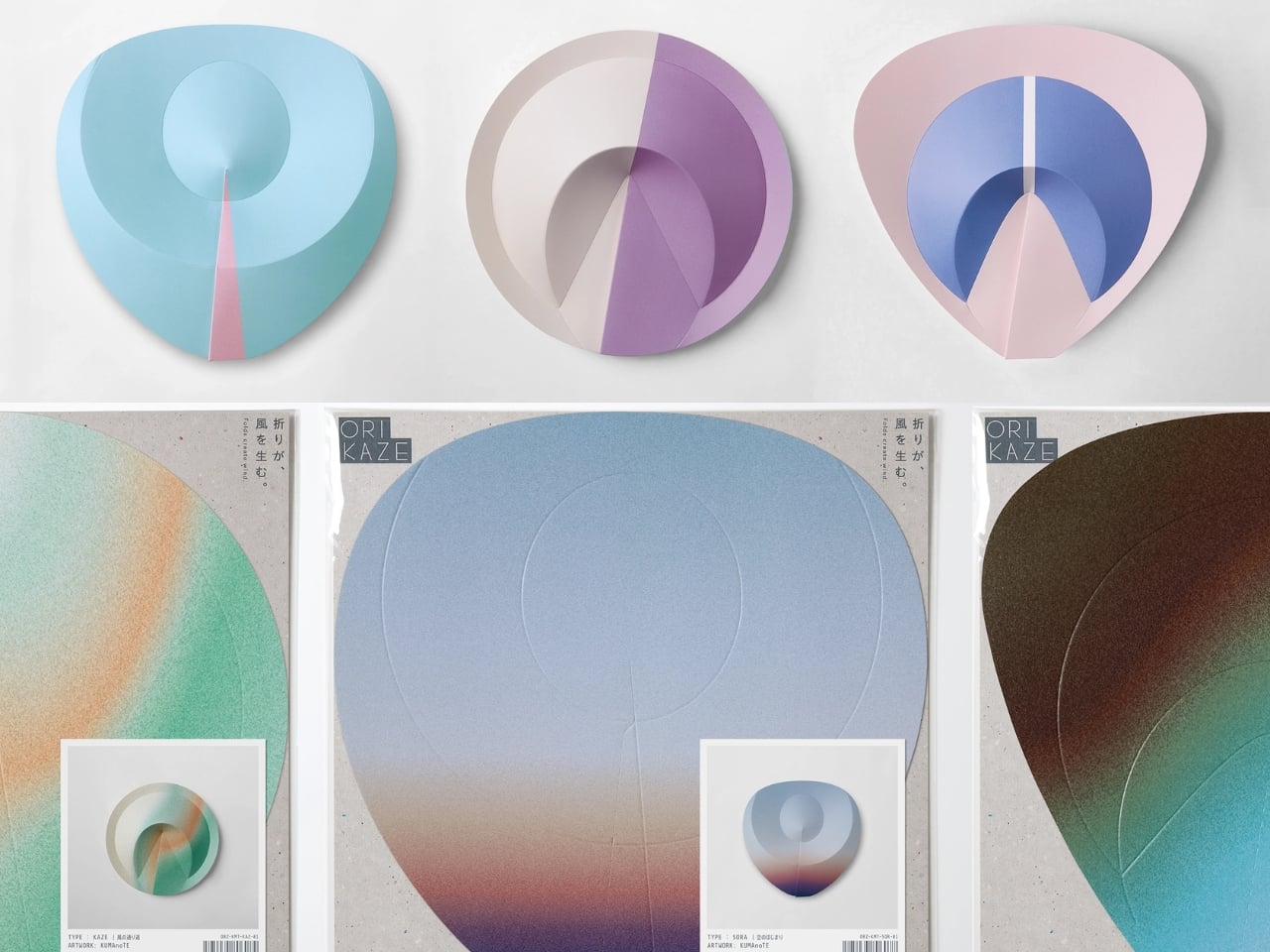
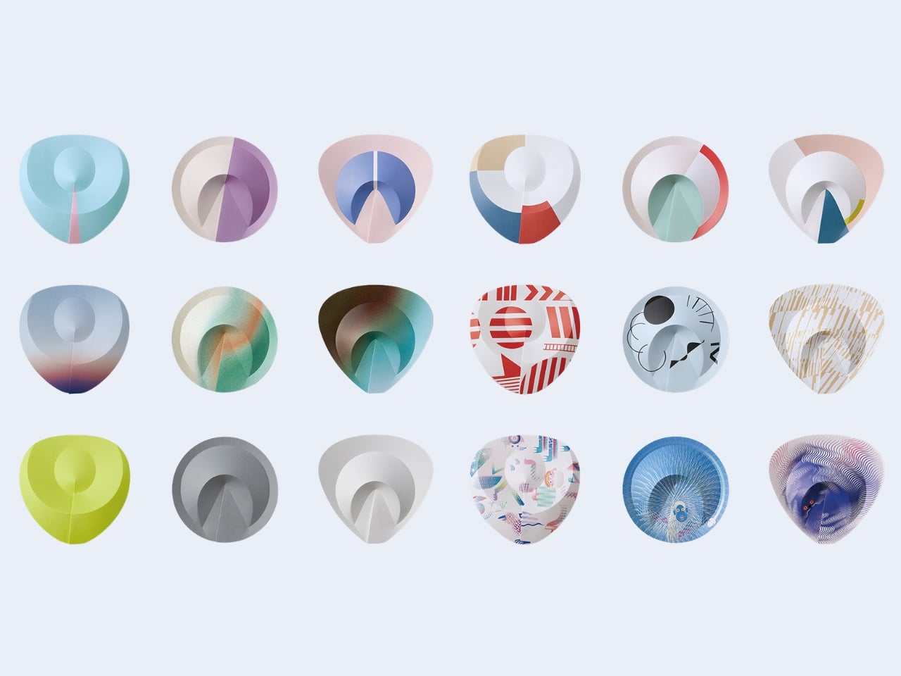
Orikaze comes in three forms, named SORA, KAZE, and TSUCHI. Sky, wind, and earth. KUMAnoTE could have just called them A, B, and C, or given them abstract model numbers, but the naming choice tells you something about how seriously the studio took the project. These are elemental references, and the visual result earns them. The folded surfaces catch light differently depending on the angle, throwing subtle patterns of shadow across the paper as you move the fan. It shifts. It breathes. For an object this simple, it does a remarkable amount of visual work.
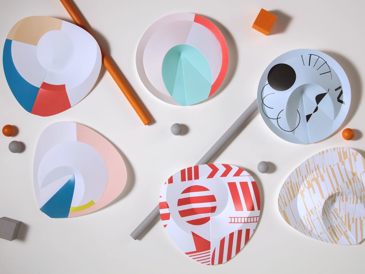
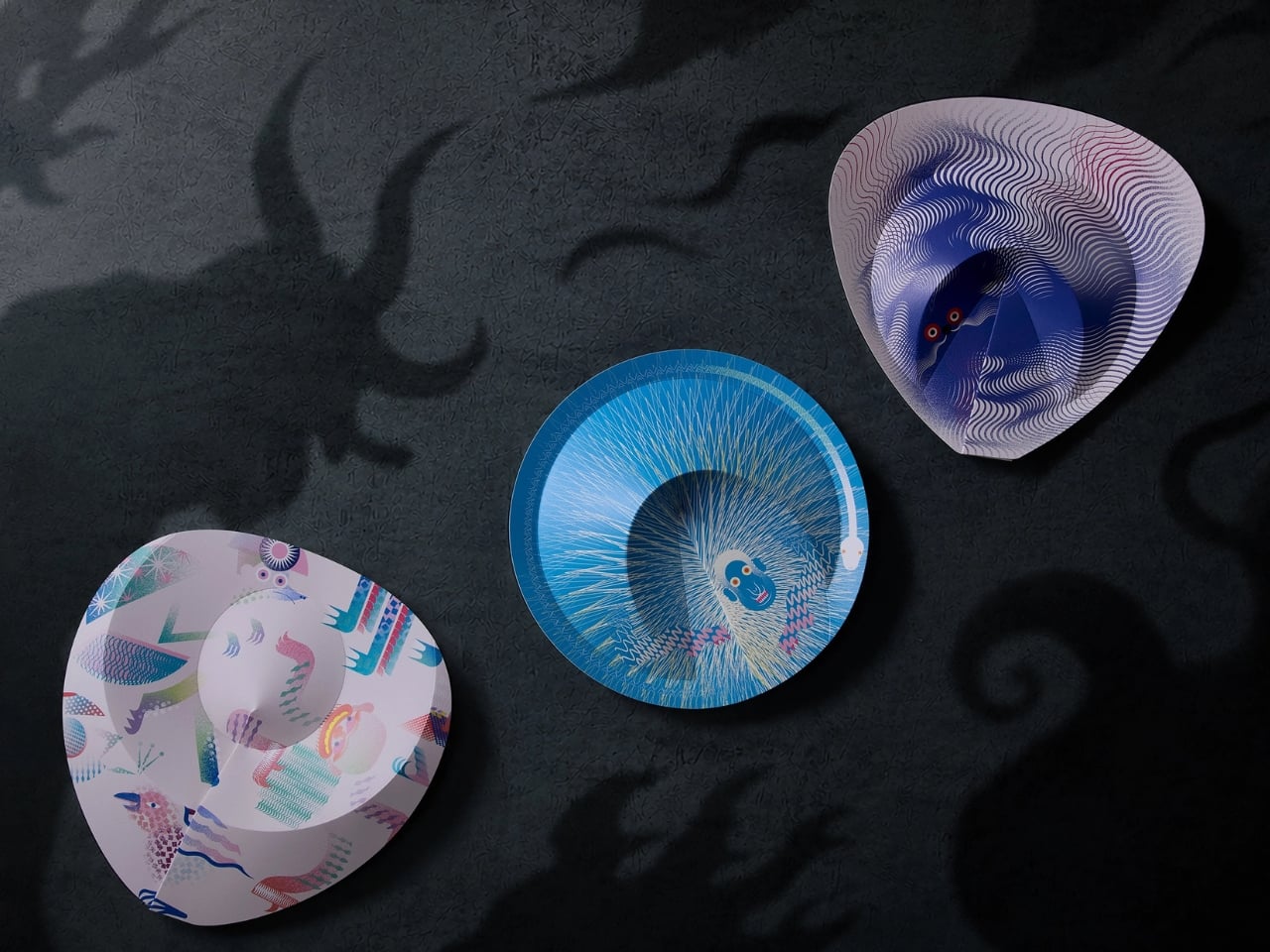
The design also exists in graphic editions. KUMAnoTE collaborated with graphic designer COYA on versions featuring Japanese yokai folklore motifs, and with Japanese fashion brand SNEEUW on a separate set. The structural logic remains the same across all editions; only the visual layer changes. That flexibility reveals something important about what Orikaze actually is. It’s not just a fan. It’s a design platform, a structure capable of carrying different visual conversations without losing its essential character.
Orikaze was presented at Interior Lifestyle Tokyo 2026 and is scheduled for release in summer 2026. Interior Lifestyle Tokyo is a trade show with genuine curatorial weight, so the placement isn’t incidental. The audience there isn’t shopping for novelties. They’re looking at direction, at ideas that signal where design is going. That context positions Orikaze as exactly what it appears to be: a serious design object that happens to be a fan.
My honest read on this project is that it succeeds because it doesn’t try to replace the traditional fan. It converses with it. The sensu has survived for over a thousand years because it solves a basic human problem well and does it beautifully. Orikaze doesn’t argue against that. It asks: what if we looked at the same problem with fresh eyes and different tools? What does paper actually need in order to become a fan? And then it answers that question through mathematics rather than materials.
That kind of thinking, where the constraint becomes the creative engine rather than the limitation, is rare in design. Most redesigns add. They layer on new materials, new mechanisms, new technology. Orikaze subtracts. It removes the internal frame and trusts the paper to do more than we usually ask of it. The result is lighter, quieter, and somehow more considered than anything with more moving parts. That restraint is the whole point. And the paper fan, it turns out, still has things to say.
The post The Paper Fan Just Lost Its Ribs. It’s Better For It. first appeared on Yanko Design.